Have you followed the One Room Challenge this fall? This is an event where featured designers and guests renovate/redo/remake a room (or more!) over a six week period. The room reveals happened this week, and I thought I’d share a few of the rooms that caught my attention.
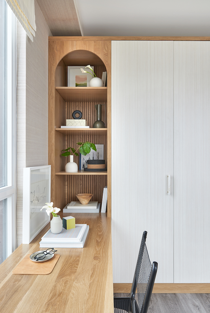
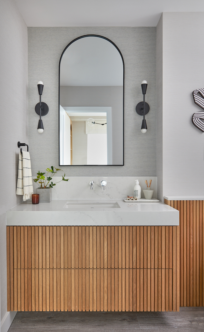
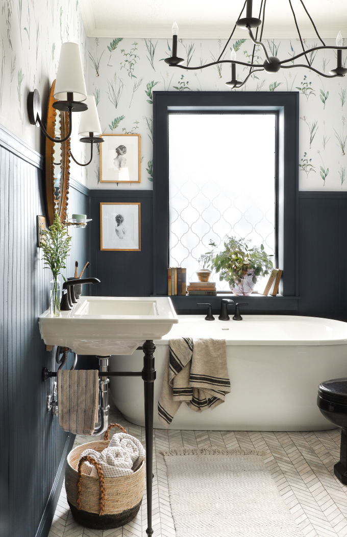
Tim (Design Maze) worked on Chris’ office and bathroom. I followed the progress in real life and listened to Tim’s plans for wallpaper, oak, and fabric. He’s a talented designer, and I love that these spaces are calm, but show off Tim’s ridiculously amazing attention to detail and pattern mixing. The millwork is beautiful in the photos and in real life.
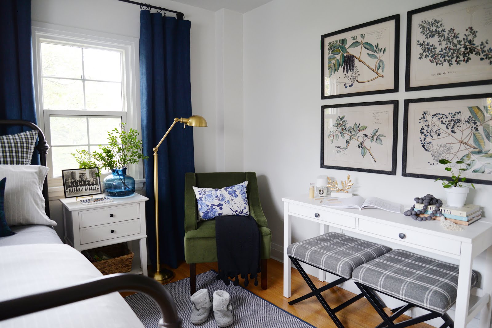
Jen (Rambling Renovators) made such good use of the space in her guest bedroom. The room is inviting and warm. I really like the Jen’s use of large art over the desk.
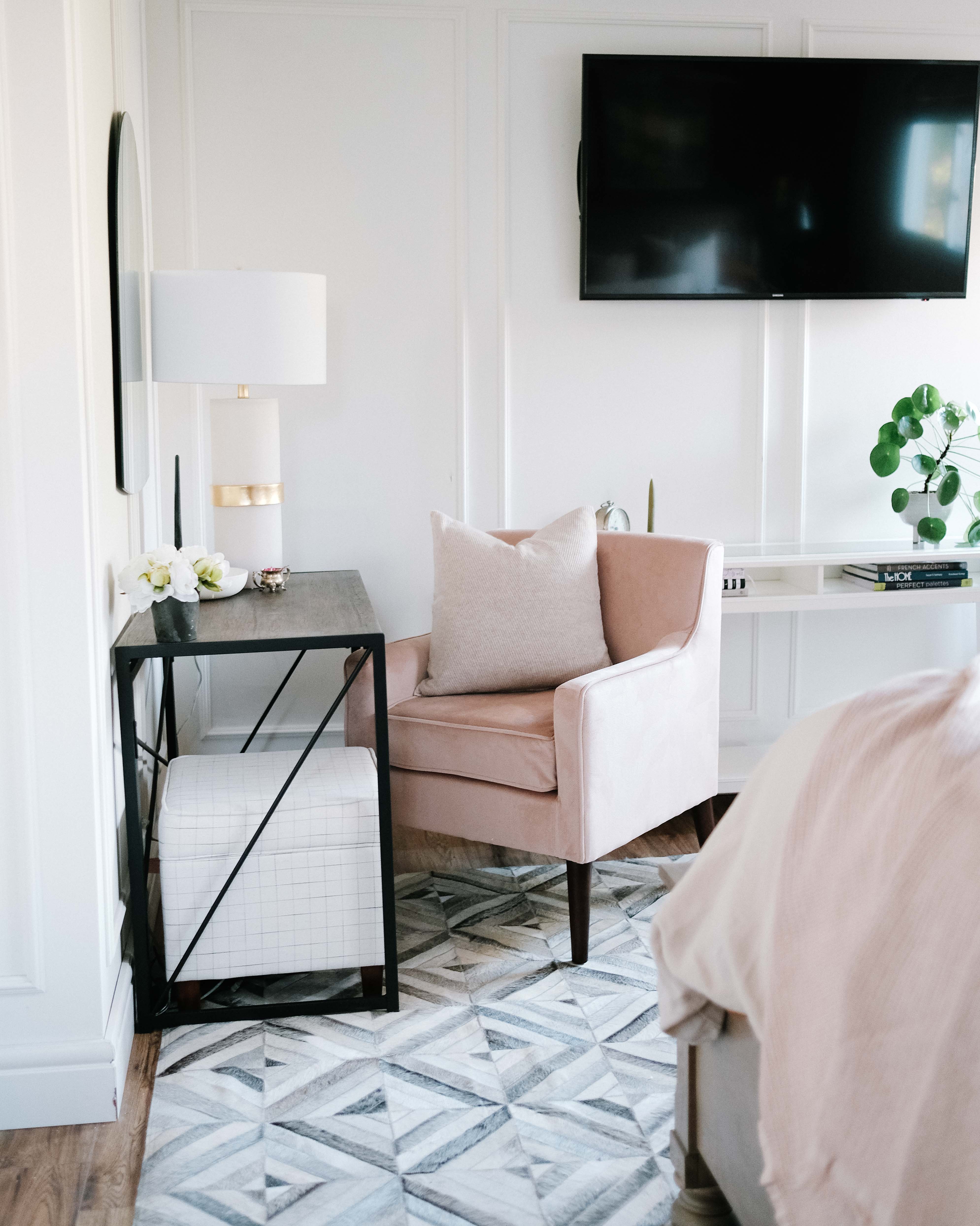
Thalita (The Learner Observer) also included a desk/vanity in her master bedroom. It’s a calm and serene scene.
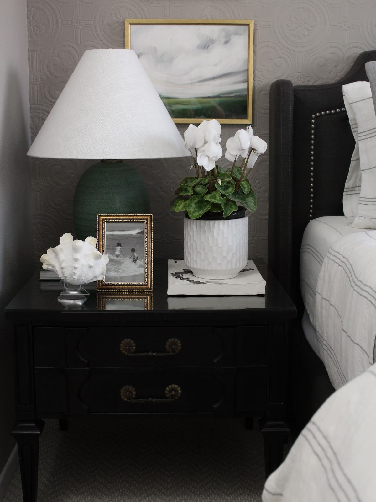
I like so much of the art in the bedroom makeover by Oscar Bravo Home. Everywhere you look, it seems there’s a beautiful piece of art waiting for you!
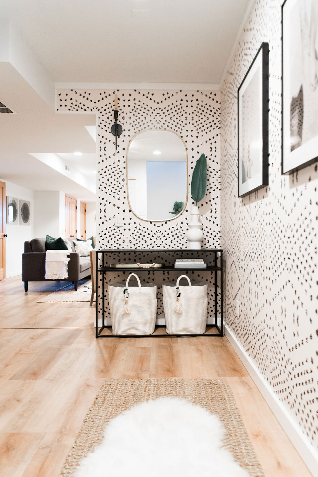
The wallpaper in This Life I Styled‘s laundry room (through an open passage area) caught my eye instantly. I like the thought that went into smaller details, too, like the baskets, handrail, and lighting
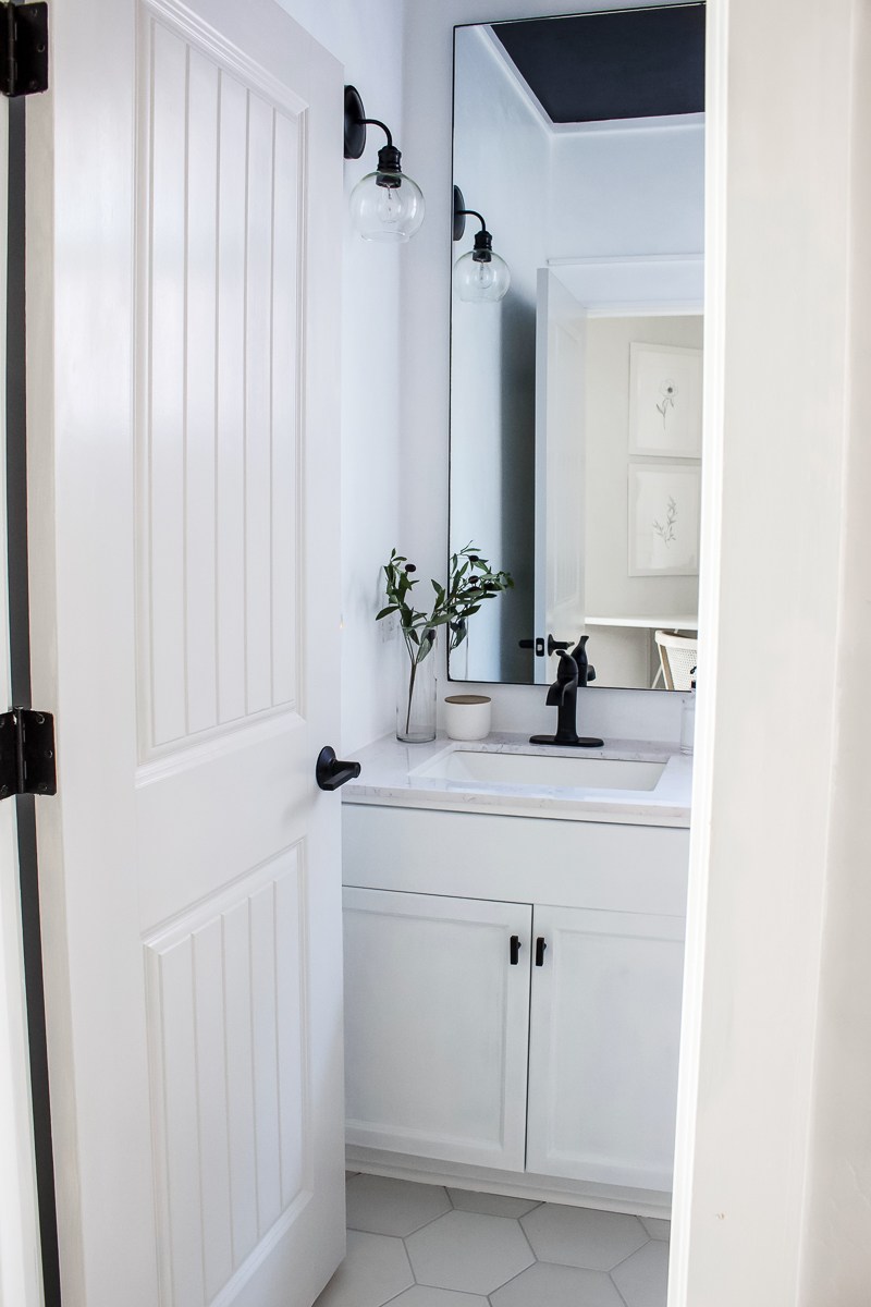
I never tire of a simple, white bathroom. This small bathroom by Designed Simple was done on a budget, and I think it looks great.
The before and after comparison of I Spy DIY‘s bathroom is jaw-dropping. This bathroom was a disaster zone pre-makeover.
Surprisingly, I also like a lot of the loud, colourful spaces from the designers. The Rath Project‘s dining room and sitting area has colourful art and fabrics (and paint, too!). Similarly, At Charlotte’s House used a lot of colour and a large mural in the dining room and living room makeover. The colours are definitely bold. And MSV Design‘s little boy’s room is sweet and the colour mixing is fun. Nicole (Making It Lovely) designed a new bedroom for her daughter, and I just love it. I really like the pattern mixing and the use of shades of pink.
There are a lot of reveals that include a lot of black paint and brown wood. Place of My Taste installed a dark, moody shower, and I love the large tiled floor. Clark and Aldine have a dark fireplace and plenty of warm, brown wood in the living room. Hommeboys, too, have a dramatic reveal of several spaces. The entryway is all black which is definitely moody
Did you follow along the One Room Challenge event this fall? Any favourites? What rooms do you like to see the most from designers?




I loved so many of these too. I missed the Designed Simple one. It was a great update. I noticed there were some huge, multi-room transformations this year too. Not sure how I feel about that. I feel like it kind of drives the misconception that good design is quick. Those designers did a wonderful job but it’s much easier to get contractors and vendors working together when it’s a sponsored project and there’s something in it for everyone. Not so much the case when you’re Jane Smith doing your own IKEA kitchen renovation. Deep thoughts!
Woohoo! I made your list! Thanks so much Jordana.