by Johanne
As some of you know, my thoughts are typically walking the aisles of the fashion world although, these days, my ukulele is doing all the walking and talking.
Today I’m featuring images from two advertising campaigns that are getting a lot of rubber-necking. The campaigns have much in common:
– Both are in black and white
– Both feature ‘it’ model Lara Stone
– Both are photographed by ‘it’ photographers Mert Alas and Marcus Piggot of Mert & Marcus
– Both are for spring/summer 2011
– Both are a little arresting.
Without further ado, our first campaign:
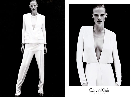
Calvin Klein’s Spring/Summer 2011
photographed by Mert Alas and Marcus Piggot of Mert & Marcus
I really like this Calvin Klein campaign: the simplicity of the styling works with the clothes’ minimalist cuts. Klein is known for his love of black & white in everything that communicates the brand: campaign photos and his logo, for instance, continue to stick to the recipe after all these years. He’s also infamous for launching the so-called anorexic model look of the ’90s and his affinity for half-naked bony models had us complaining enough that he’s toned it down a notch for 2011.
With Lara Stone for spring, we see the gender-bender play he’s also fond of but we get a few curves and not-so-straight lines among all the symmetry. The campaign images are classic examples of photo compositions that are perfect because of a slight disturbance in the proportions. In the top left photo, an otherwise symmetrical image gives the illusion of a longer leg because of Lara’s off stance.
In the top right image, the perfect symmetry of Lara’s face and her outfit’s geometric lines are challenged by the asymmetry of her sloped shoulders. It’s simply stunning.
And now for our second campaign:
Givenchy Spring/Summer 2011
photographed by Mert Alas and Marcus Piggot of Mert & Marcus
I like this campaign; it’s definitely one we’d call ‘unconventional’. Prints are a contrast to solid white and black, people are layers to each other within the images and odd shadows lurk about. Not a hair is out of place- literally- except perhaps on Lara Stone, and we can forgive her for that because of a certain menacing-looking and albino Stephen Thompson hovering behind. And he really is albino- that’s not his fault, either.
In terms of selling clothes, I’m not sure that this Givenchy campaign works. If it’s to relate a mood, a weird moment in time or the beauty in the odd, then it’s a perfect sales pitch.
Images courtesy of Givenchy and Calvin Klein.


Givenchy gone wild!
Givenchy is wild-! I honestly never expected this from the label but I’m pleasantly surprised. It’s bizarre but very intriguing.
– J 🙂
Agreed…unexpected. I don’t know if I like the campaign yet. The ghost like images kind of freak me out. I’m sure these photos will have people talking though.
-Jordana