This week I’m back with more concept work, this time it’s from designer Niklas Hessman.
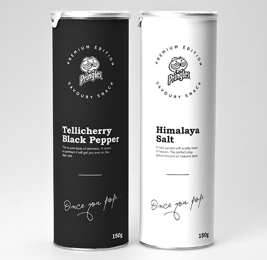
Behold: fancy Pringles chips in beautiful packaging!
This is what Niklas has to say about his concept:
“Myself and others feel that there is a lack of a premium Pringles product line. Therefore I decided to design one.
There is also a need for this to compete with other brands and their eco-products like oven baked and farm chips. Also those others with the special flavours. [The outcome] is a product that will stand out from the other Pringles but still have the well-known tube.
Simple and clean packaging design that will work in the Scandinavian market for sure. We also like the idea of branding the product with a little poem instead of photoshop effects.”
Pringles- premium inside and out. Concept design by the talented Niklas Hessman
Oh my gosh – love, love, love this packaging – not to mention the delightful treat inside the tube. Thanks for bringing this to us Johanne. I want to buy one right now!
Thanks for saying what I’m thinking too!
This packaging is really elegant, isn’t it? I wish more manufacturers aimed to create a distinctly modern and monochromatic feel for their products- we need this so badly in our over-coloured, blinged-out culture.
-J
I think this packaging would totally stand out on a shelf of vibrantly coloured products. I’d be drawn to it, obviously, and I’m sure I wouldn’t be alone.