Before I tackle my bathroom renovation, I thought I would get a smaller project out of the way – my foyer. It’s a small space, and all I have to do is install some marble tiles. Yup, that’s all. This project, however, is likely going to take a few weeks. It’s funny how the seemingly small projects take an extraordinary amount of time.
My dad was kind enough to rip up the old linoleum (bye bye linoleum!). I then used my newest gadget – a handy dandy jamb saw – to trim the door jamb frame and the frame around the stairs. (Sorry, I don’t have photos of the process, and I can’t even find a photo of the exact jamb saw I bought online. It’s Dewalt brand and it was $14.99 from the Home Depot.)
We then cut and installed a new sheet of plywood. This step was essential as it provides clean base to install my tiles. Since the space is small, installing the plywood was a real pain in the arse. After a bit of cursing, some deep sighs of frustration, and lots of discussion about the best installation approach, we got the plywood in, and it’s a nice fit, too!
Now comes the fun part – tile installation. I honestly love installing tiles (tile project 1: powder room floor; tile project 2: kitchen backsplash). I think I like it because the adhesive mixing and spreading reminds me of icing a cake, and installing the tiles is like a giant puzzle.
I bought marble tiles (for a crazy good price at the ReStore last year), and I spent a bit of time in between other weekend chores dry fitting them in different patterns. Dry fitting is an important step for me on this project because I really want to be sure of the pattern and the tiles that I’m going to lay down (e.g., I’m going to avoid using the darker shades).
I started with a herringbone pattern where the lines are perpendicular to the door.
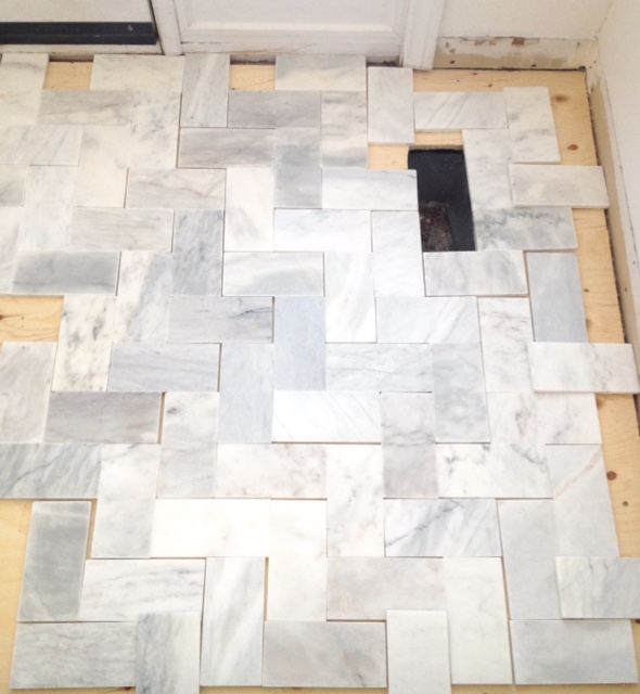 Option 1: vertical/horizontal herringbone
All I could see in this pattern were the vertical and horizontal lines, and it was not making me happy.
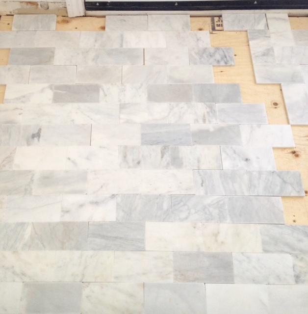
I then tried out a classic brick pattern.
I think it’s pretty, and, like several Instagram friends, the variation in each piece of marble stands out. I’m not against the brick, but it seems sort of normal and expected. This pattern would definitely limit the number of cuts and reduce tile waste.
Back to the herringbone – the horizontal/vertical lines were annoying me, so I switched the layout so that the herringbone V pattern (or zig zag) would be perpendicular to the door. Do you see what I’m talking about?
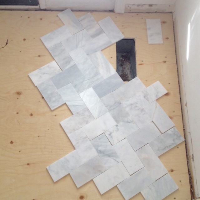 Option 3:Herringbone V along the width
This looked instantly better in my opinion, but I released the photos to Instagram and let my friends weigh in. I LOVED reading everyone’s comments! Most people still opted for one of the herringbone patterns over the brick.
A few friends (and my mom via phone call) suggested I switch the direction of the herringbone so that the V shape would run lengthwise (i.e., parallel to the door). I ran with this suggestion and end up with this:
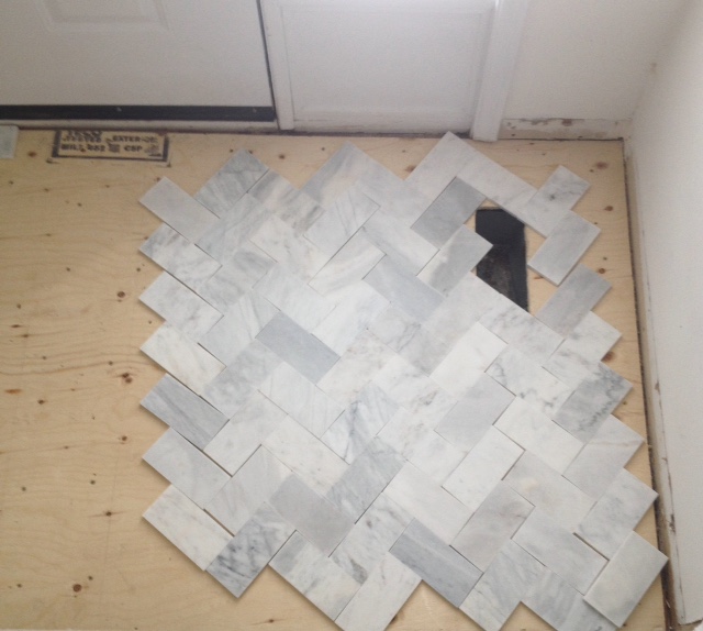 Option 4: Herringbone V along the length
Much better. I did this quickly, so I didn’t actually verify that everything was lined up, but you can still get the idea of the shift of direction. I find this easy on the eye and flattering for the space.
A few people suggested inserting a border, so I tried that too.
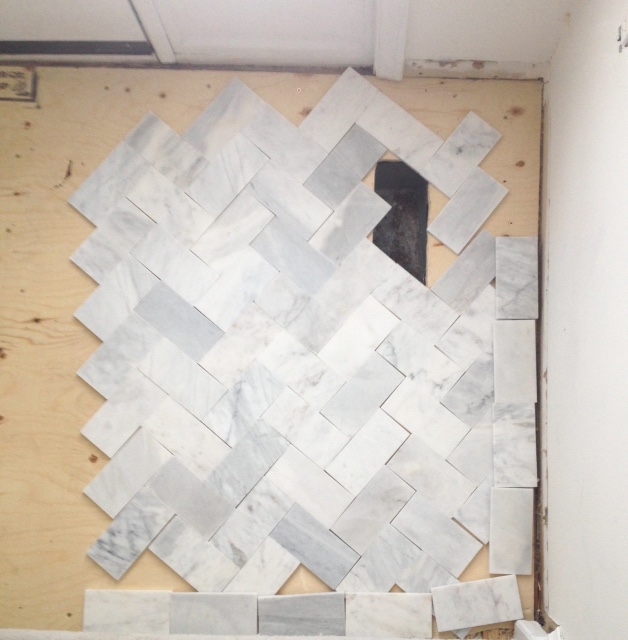 Option 5: Herringbone with simple border
I don’t actually think the space is large enough for a border (or carpet as I like to call it), but I can see how people like this option. It sort of finishes things off. It reminds me of colouring within the lines. All the fun happens inside the boxed border. For this foyer, I feel like the carpet style would just make the area feel smaller.
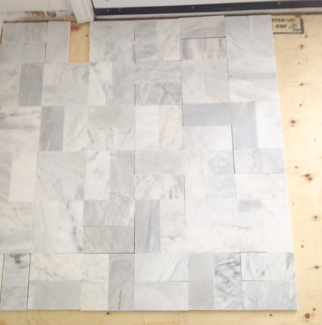
Shannon (8Foot6) suggested I try a basket weave, so I did. Here’s how it looks:
I thought I was going to hate it because the basket weave reminds me of outdoor patios, but I don’t mind it. It’s certainly tidy, and it would require very few cuts, but I’m not sure that I love it for this space.
What do you think? What’s your vote? I’d love to know!
What was that about it takes a village…
To everyone who follows me on Instagram and offered input – thank you!



When I saw the herringbone, i thought for sure, now that I see the basket weave and knowing the small space you have in the front, I really like the basket weave. the colour variation displays nice.
too many options!
Thanks, Anita! One tile…many choices! I’d probably go crazy if I had to use more than one tile.
Basket weave is kind of neat! I like 2 and 4 as well. But for 4 I shudder to think of all those cuts!!
I love the herringbone but that basket weave stopped me in my tracks! I never thought I would like that but it looks amazing! Lesson learned, always lean on your instagram friends for help 😀
I like option 3 – I like how the veins on the grains of the marble look.
You’ve definitely done your homework and outlined many options.
I don’t like a border around the small space.