Well, it’s official. I’m taking part in my first One Room Challenge (ORC) as a guest participant. If you’re unfamiliar with the One Room Challenge, it’s a twice-yearly event that happens in the design blogger community where design bloggers makeover a room in 6 weeks. 6!
Calling it Home started the challenge over a decade ago, and ever since, design bloggers have been putting their best foot forward. There are two lines of participation at this point. First, on Wednesdays, a group of 20 featured participants will share their progress (see their week 1 posts). Then, on Thursdays, any design blogger can participate as a guest participant. You can check on everyone’s progress at the One Room Challenge site as well as on individual blogs.
So how will I participate this year? So what am I going to feature over the next 6 weeks? My combo laundry room/bathroom. And I’m pretty darn excited! (If you’re new to White Cabana, here’s a peek into my home.)
To be honest, I started this project weeks ago, but progress has been s…l…o…w. Given my work/life schedule and my lack of contractor contacts in Waterloo, renovating the space from top to bottom in 6 weeks wasn’t looking promising. 12 weeks, maybe. 🙂 But I can definitely feature it in 6 weeks! And that’s what I’m committed to doing.
Warning: This post contains some colourful before photos that may hurt your eyes.
Here’s what this room looked like on the day I took the first tour of my (future) house five years ago. Soon after I moved in, I removed the support bar (and about 30 others around my house), the shelf unit above the toilet, and the glass shelf. I also painted the wood strip on the sink cabinet and covered almost the whole floor with a big, white bath mat.
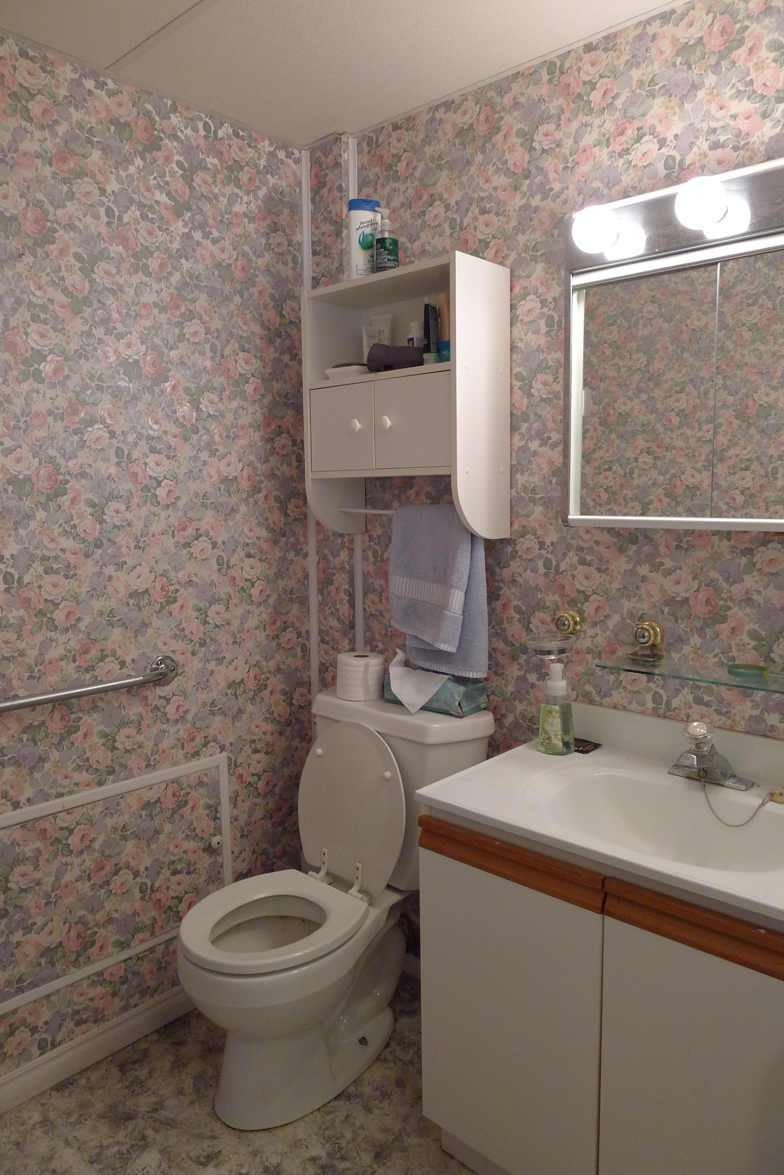
And then I lived with it. Year after year. I lived with a hideous pink/grey/gold laundry/bathroom. It hurt my eyes every time I had to do laundry.
Here’s what my space look liked a couple of weeks ago. Note the floral wallpaper. Awful. And the accordion door. Awful again. And the drop ceiling. Convenient but awful. And the lighting. Awful.
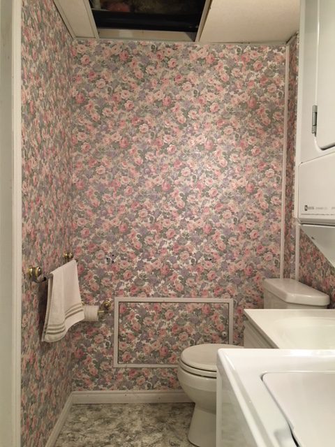
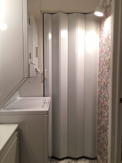
To be honest, I’ve had a love-hate relationship with this space. It’s been great to have a finished laundry space and extra bathroom for guests. It’s also been really enjoyable for me to see people’s reactions when I show them this space. Easy entertainment. On the other hand, though, the wallpaper and floor combo has always made my eyes hurt. And I hate not having a big laundry sink. A little vanity just doesn’t cut it for my needs.
While I did hire tradespeople for this makeover, my DIY-loving self could not leave it to them to have all the fun. I spent about two weekends in demolition mode. We took everything back to the studs, so that I could have a blank slate.
The space is small, but the makeover is going to be mighty!
Here’s what the space looked like post-demo day:
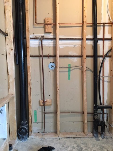
I know it’s not pretty and tidy, but I actually like this part of the reno process. I like to see all the pipes exposed, to see how things were originally set up, and to think about ways to make things better.
I know the tradespeople I have hired are going to make it better than ever before. On the technical side, new electrical and new plumbing is being installed. I also said goodbye to the awful accordion door, and my framer installed a fabulous pocket door. Things are already looking bright.
As for my design plan?
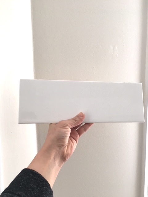
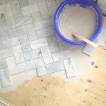
I’m going with this marble-like ceramic hex tile on the floor: 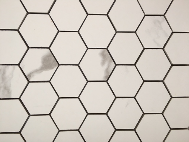 this classic 4×12 subway tile on the walls:
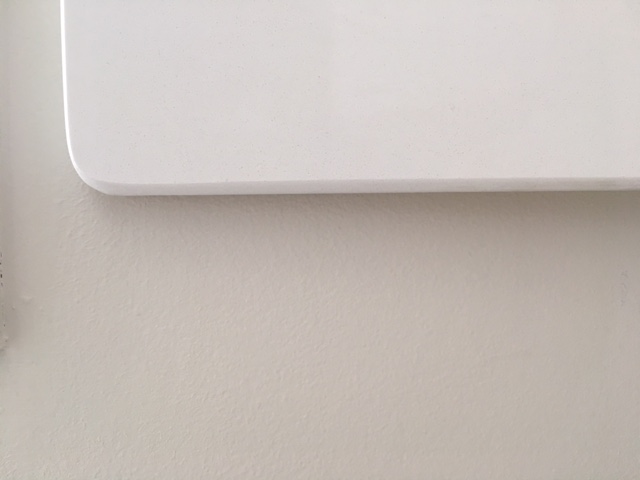
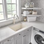
this quartz counter on the cabinet:
this Blanco Urbena faucet on the sink: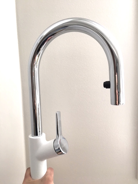
My crew is also going to do some more reframing and add a heated floor. Hello luxury!
My custom cabinet is ready for pick-up, and my Blanco sink is going to look gorgeous on top of it. I have settled on a shower trim kit (finally…after buying and returning a couple). My original design plan continues to guide me, but I have had to make changes to it. Overall, my space’s design could be described as “a massive dose of white with a touch of grey”.
Thanks for following along my first One Room Challenge! If there’s anything specific you’d like to see or learn, let me know in the comments.
Looking fabulous already. Good luck with the contest!
that faucet looks so chic!!! can’t wait to see things happening in this small little gem!