Well, my first impression of the One Room Challenge event is great! I have been enjoying learning about the people and the projects in this new-to-me community. There are so many creative people out there doing beautiful things, and I encourage you to have a look at the One Room Challenge featured designers and guest participants to be inspired about home renovations and interior design.

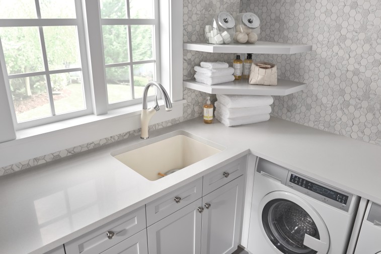
As you may remember, I’m currently tackling a laundry/bathroom renovation (see my Week 1 post for before photos). I keep calling the space my laundry room, but, in fact, this space serves a dual purpose. I primarily use it for my weekly laundry sessions, but it is also used as a guest bathroom. I was fortunate to have a finished and functioning space when I moved into my home five years ago, but it was beyond dated.
A refresh has been in the pipeline for quite some time.
The layout of the space – laundry, sink, toilet – will not change in my new space. But I have broken down a wall to squeeze in a shower. This is major. This has required quite a bit of plumbing.
While my family and I tackled the demo, I have four people working on putting things back together: a framer/drywaller, a plumber, a tiler, and my dad (aka pseudo-electrician). Each person is super skilled, and while I hadn’t worked with three of these people prior to my project, they have each lived up to my standards of high quality craftsmanship. These people are gems, let me tell you! I feel very lucky!
My framer, plumber, and electrician were the first people on the scene. My framer took down existing doors, installed (or reinstalled) studs, and installed a pocket door.
While the framer took a bit of a break, the plumber got to work. I had a lot of items on my plumbing to do list on this job: installation of brand new shower plumbing, switch out/clean up of old pipes, installation of new ball-valve switches, etc. The space got dusty and messy, and I enjoyed watching the progress each day.
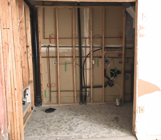
This laundry/bathroom turned open concept!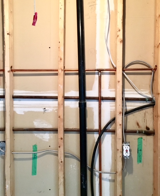
a grid of pipes and 2x4s
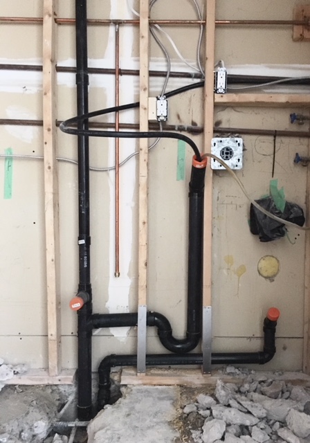
This p-trap makes me happy because it means a more efficient plumbing set-up for my laundry and sink.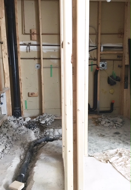
I lived with a trench for a little while.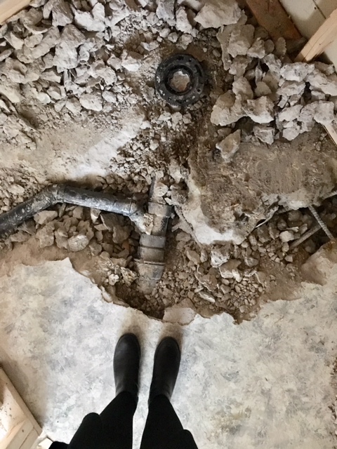
There wasn’t much left of the original floor. No loss there!
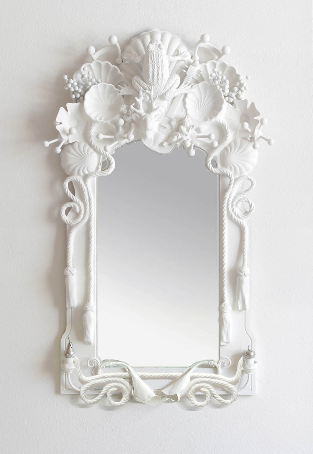
And because I know some of you like to see pretty things during the One Room Challenge recaps, here’s the art I’m going to use in my new room:
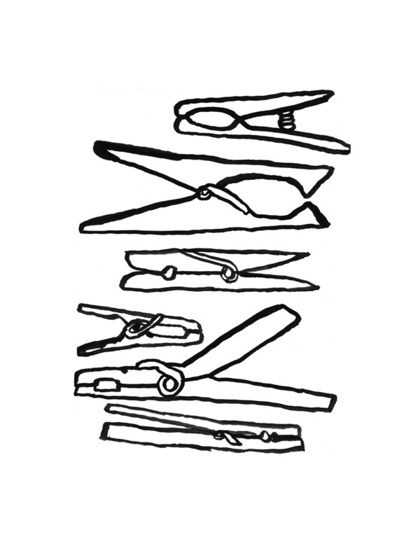
Clothespins (c/o)
I encourage you to check out what the One Room Challenge guest participants and featured designers have been up to during week 2.
Note: See my Week 1 post to get updated on my One Room Challenge project.