These blog headers have one thing in common: capital letters.
The D Pages (design)
The Design Confidential (design)
Hege in France (design)
 My Attic (design)
These blog headers have one thing in common: capital letters.
The D Pages (design)
The Design Confidential (design)
Hege in France (design)
 My Attic (design)
I currently have two large canvases leaning against my office wall waiting for me to paint. My parents commissioned me. (Can I pretend it’s a real art gig?). While I’m not quite ready to paint them (lack of free time as of late), I am ready to share some of the interesting pieces art I’ve been eyeing lately.
Jenny Andrews Anderson – Moontower, $625, via Citizen Atelier
Jenny Andrews Anderson – Pearlseed, $625, via Citizen Atelier
Robert Mapplethorpe – Bike Couriers, $4500, via Caviar20
Jenny Holzer – Top Secret, $3500, via Caviar20
Joseph Albers – I-S VV 1, $4000, via Caviar20
Berenice Abbott – Sumner Healy Antique Shop, New York, 1936, via 1stDibs
Keith Carter – Boy with Bee, $1600, via 1st Dibs
Mario de Biasi – Trattoria Le Pergola, Milano, $2000, via 1stDibs
Life – Natural Curiosities, $1988, via Domino
There’s more black than white in most of these pieces, and I love how different they are from one another. The “top secret” piece is so amusing (to me, anyway).
After seeing the Oogi by Moluk on Swiss Miss, I ordered 4 for my nephews and niece. They are loving them.
Oogi, $11.99, Amazon
Last year, my nephews each received a Moluk Bilibo from Santa last year and they continue to make good use of them. Moluk has been getting things right for these kids!
Brian Gluckstein. Damn, he’s good.
This past weekend, Brian Gluckstein and the Princess Margaret Welcome Home Sweepstakes invited a group of bloggers to attend Brunch with Brian at this year’s Oakville Showhome. Our private event included an detailed tour led by Brian, delicious food by Chef Logan, drinks from Pluck Teas and Rosewood Wine, and an amusing Q & A session with the man of the hour.
So, let’s go on a photo tour, shall we?
The foyer and grand staircase in the Oakville showhome is beautiful. It reminds me of entrances I’ve seen in France. I love the iron railing and the massive windows. The light in this foyer – and throughout the house – is enviable.
front foyer with grand staircase and herringbone porcelain tiles
Just off the foyer is one of my favourite spots in the house (but too dark for White Cabana). Believe it or not, the all-black powder room really caught my attention. Luckily, the dark powder room has natural light coming through, which makes it more moody than dreary. The tile work also reminded me of European homes. (Sorry, I don’t have any photos to post. You’ll have to go to the showhome to see what I’m talking about!)
Just to the left of the foyer is the grand living room. The see-through fireplace that connects the front foyer to the living room is a beautiful addition. It was manufactured in and shipped over from Portugal. Classic shades of cream made this space bright and classy, and the floor-to-ceiling windows are impressive.
white mantle in the front living room
the see-through mantle in the front foyer
bright and white in the living room
the living room and dining room viewed from the staircase
Q & A session with Brian Gluckstein
How many pot lights around the perimeter?
Everyone and their sister is talking about the indoor tree in this showhome. Yes, an actual tree…planted in the ground! I was fascinated by Brian’s explanation about the amount of thought went into this tree; flooring, ventilation, etc. were all considered when Brian designed this room around the tree. I’m such a sucker for offices, as you may know, and this one is stunning.
a house built around a tree
This house is full of interesting art and gorgeous skylights.
one of the many beautiful pieces of art
one of the many skylights
The kitchen’s toaster wall is completely unique. The collection of toasters from the 1930s turned into a beautiful art installation and feature wall in the reasonably-sized white kitchen.
toasters – just for looks
there’s a fridge behind these doors
Of course, the La Cornue stove adds to the beauty in this space. I could make killer scrambled eggs on that gem, I’m sure!
La Cornue + Pluck Teas
There is more delight upstairs. The master bedroom is big and airy. The white bedding and layers of pillows add luxury to this space, the sofa adds comfort, and the walk-in-closet is, well, pretty much perfect.
white linens in the master bedroom
creamy details in the master bedroom
Who wouldn’t love this closet?
Brian is a wizard when it comes to bathroom design. The tile work in each bathroom in this house (I lost count of how many there actually are…six maybe?) is something to really note. The master bathroom is generously sized and the layout is flipped. Here, the vanity is in front of the windows and the bathtub is floating on the other end. I loved it when Brian talked about the affordable route he took to install the vanity mirrors. Brian and affordability – not the combo you’d really predict, right? Although it looks like the mirrors are framed in steel, they’re actually framed in painted wood. The bars are made of shower rod holders and pipes. That’s where the affordability ended, though. The cast iron Kohler bathtub costs a pretty penny! It’s the same one that Brian has in his own home.
here I am in the master bathroom
double vanity surrounded by natural light
white monogrammed towels in the bathroom
floating Kohler tub in the master bathroom
floor tiles in the master bathroom
my favourite light fixture in the house
the jack-and-jill bathroom vanity
here I am in the white jack-and-jill bathroom
Also upstairs is a sweet little office. Brian maximized storage in here with floor-to-ceiling shelves. In fact, this space was originally a hallway, but Brian suggested that the walls be bumped out (and a foot taken from each of the rooms on the other side of the walls) to make it a useable room. The skylight provides loads of natural light. And, yes, I could see myself working in here as well. I’m a sucker for offices, remember?
a white hallway leading to the office area
a bright place to work on the second floor
Another one of my favourite spaces in this house is the wine cellar. Just look at it.
I want one.
Brian, the wine cellar, and the exercise room
You can work off the calories you drink in your private exercise room.
The basement family room is darker than I normally like, but I’m wondering if this is something I should consider for my own basement. Would I dare go dark? The white matting on the gallery wall art brightens up the room as does the sofa and the lighting.
the basement family room (it doesn’t feel like a basement, does it?)
The white and grey laundry room in the basement is spacious and has top of the line machines. The cabinetry, we learned, is from a big box store that was painted and framed with additional moulding.
laundry room details
the spacious laundry room in white and grey
Brian was kind enough to take photos with all his blogger fans. Here we are…
Brian Gluckstein and Jordana
Other things I learned during #BrunchWithBrian that might interest you:
1. Brian eats the same breakfast every day: yogurt and berries. Brian, I eat the same thing every day, too (toast, berries, and a latte).
2. Brian enjoys Pinterest just like the rest of us!
3. About 60-70K people come through the Oakville showhome each year.
4. Brian can’t imagine a space without art.
5. Brian reads the blog The Blue Remembered Hills.
6. Brian’s design influences include Billy Baldwin, Jean-Michel Frank, Edwin Lutyens, and Kalef Alaton.
7. It took less than a year to buy the Oakville showhome lot, demolish the original house, build a new house, and decorate it.
8. Brian did not shy away from mixing metals in this house.
9. Brian is as classy, approachable, and intelligent as you may imagine.
10. The foyer drapes are 30 feet in length and the trim is made of one continuous piece.
As if you need any more convincing! Order your ticket!
Photos by Jordana. For more photos (really beautiful ones) of the Oakville showhome, click here.
To see the 2013 Oakville showhome design by Brian Gluckstein, click here.
Remember the time I toured the GlucksteinHome design office? That was fun.
Many thanks to Brian Gluckstein, Cheryl K., Laura Z., Chef Logan, Rosewood Wine, Pluck Teas, and the Princess Margaret Lottery Foundation for hosting a classy and fun brunch.
Did you know that it’s actually possible to be tired and energized at the same time? It’s true. This is exactly how I’m currently feeling. I have been pretty worn down this week for all sorts of reasons (full-time job, taking on an additional course, blogging, MBA, trips to Toronto, social events, back-to-school germs, etc.), but I am so full of ideas and energy (in my mind at least) after last weekend’s BlogPodium conference. I have been itching to write this post, but I have spent every ounce of my free time in bed this week trying to get back to feeling normal. Concentrating on computer work has been just a bit too challenging. Anyhoo, enough about me and my bout of sickness. Let’s get to the good stuff…five thoughts about BlogPodium.
One of the major highlights for me at this year’s conference was the fact that I had the opportunity to design a collection of pottery. Although the design timeline was tight, I had fun brainstorming ideas, sketching up my designs, and consulting with Victoria at Inspirations Studio. Victoria and her team of women brought my designs to life. Under her guidance, the Inspirations Studio women learned new skills that they can apply to their future projects. The pottery was auctioned off at the conference, and I’m beyond happy that my pieces sold. I managed to squeeze in at the last minute to buy three little bowls, but I will be placing an order for additional items.
chatting with Lindsey, a table full of blogger-designed handmade items
If you’re interested in purchasing any of my designs for yourself (and you live in Toronto or Waterloo), please email me asap (white cabana at gmail dot com). Prices range from $30-$50, and all money goes directly to Inspirations Studio. Ordering anything from my collection will put money directly in the hands of women in need.
Avery Swartz bought the two vases/pitchers, and she set them up on her beautiful white mantle:
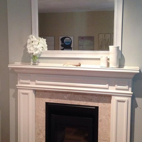 photo by Avery Swartz
I attended two fabulous sessions in the morning. The first was led by Nicki Lamont and the topic was SEO (Search Engine Optimization). Even though I’ve been blogging for 4+ years, I never give SEO as much thought as I know I should. I’m usually focused on creating content and photos, and I make little (or no) time for the more technical side of blogging. SEO is important and I now have more tools in my toolbox to make SEO work for me and White Cabana.
I learned about bounce rates, keyword searches, and short-term and long-term keywords, meta-tags, alt-tags, etc. If you’re a blogger, I would recommend that you read up these concepts, especially if you aim to grow your blog.
I also learned about a new search engine – DuckDuckGo – that is supposedly going to be even better than Google. Yes?
Nicki was a clear, amusing, and professional speaker, and she obviously has a very relevant skill set. Thanks, Nicki!
here I am listening attentively during a presentation
The second session I attended was Avery Swartz‘s session about Google Analytics. Avery has a really personable and engaging presentation style, which I completely appreciated. She brought humour into her presentation about tech and stats and analytics settings. Awesome. I followed Avery’s advice when I got home from BlogPodium – I transferred to Universal analytics (do this if you haven’t), refined some of my settings, and I am now feeling much more confident about understanding my Google stats. I know that this information will help me speak with brand partners in the future. I’m now eager to sign up for one of Avery’s CampTech courses (offered in Waterloo, too!).
You can see by my session choices, I was really focused on learning about the more technical side of blogging. One of my current goals (and ongoing goals, I guess) is to increase my technical skill set. I don’t have much time to focus on this side of the blogging world, which is why I think it’s taken me 4 years to get to the point where I can actually use terms like SEO and analytics without sounding like I’m really clueless.
I am generally a fan of panel presentations. You get to hear from several speakers and panels present a variety of points of view within a dedicated time period. I have been attending BlogPodium since it began, and Leigh-Ann Allaire Perrault has often moderated the panel presentation. Half the reason why I enjoy the panels is because Leigh-Ann is such a quick-witted, smart, and on-the-ball moderator. She asks intelligent questions, keeps the discussion moving, and always always makes the audience laugh. She didn’t fail us this year. She worked her magic and the panel presentation was informative and entertaining.
This year’s panel was made up of BlogPodium founder Jennifer Flores, Income Property whiz Scott McGillivray, and fashion blogger extraordinaire Monika Hibbs. They have three very different backgrounds, which made for an interesting presentation. Jennifer’s spoke intelligently about the importance of collaboration and networking in blog life, Scott encouraged bloggers to set achievable goals, and Monika generously shared her secrets to gorgeous photography (apps to try: SnapSeed, WhiteaGram, AfterLight, PicTapGo).
Jennifer, Scott, Monika, Leigh-Ann
Fortunately, I have had some really positive experiences working with brands and PR agencies over the last 4 years. In my case, brand collaborations have evolved rather organically and they continue to do so. I do really enjoy learning about people, what they do, their products, and their stories. I think – and I hope – my readers appreciate when I share others’ stories, and draw a personal connection to them.
Brand-Blog-Fit continued to be a theme at this year’s BlogPodium. If you’re a blogger, why should a brand work with you? If you’re a brand, what blog fits your mission? How do you go about making the partnership work for both sides?
I was pleased to see some long-time blog supporters at BlogPodium (e.g., Delta, FirstAlert, UrbanBarn, GlucksteinHome, Chapters-Indigo, Etsy, ParaPaints), and I was thrilled to have the opportunity to speak with newcomers as well (e.g., LinenChest, Metrie). Brands and bloggers are really learning how to work together, how to speak the same language, and how to create mutually beneficial and long-lasting relationships. I have been fascinated by the partnership opportunities, and I’m interested in seeing how these partnerships will evolve.
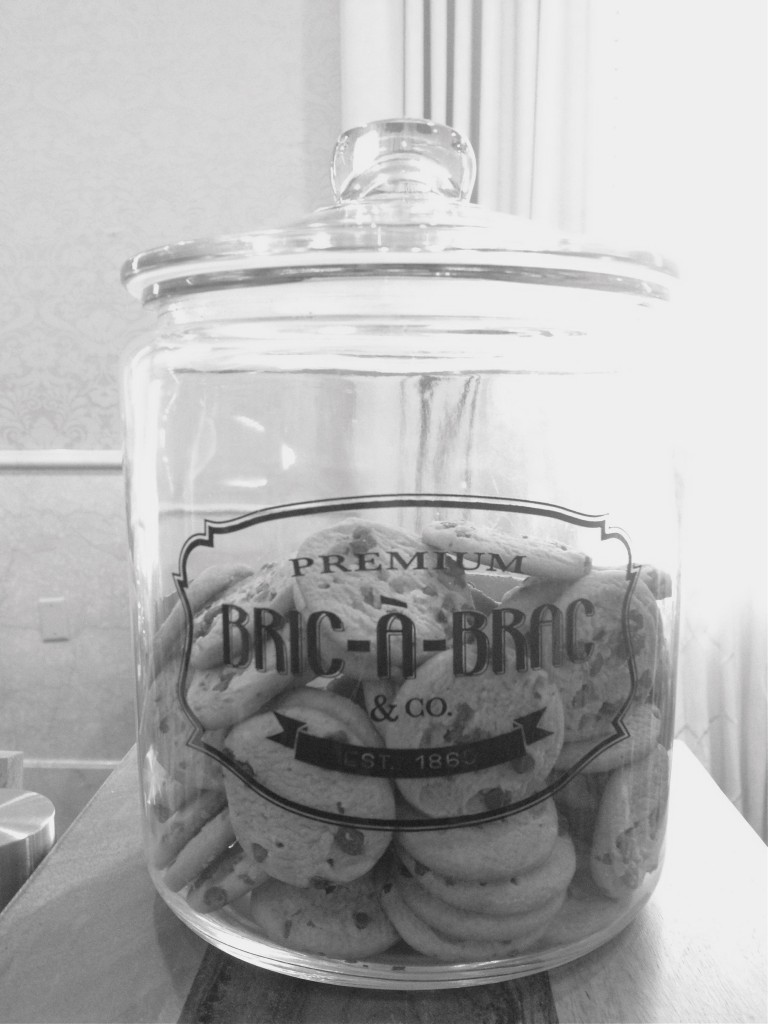
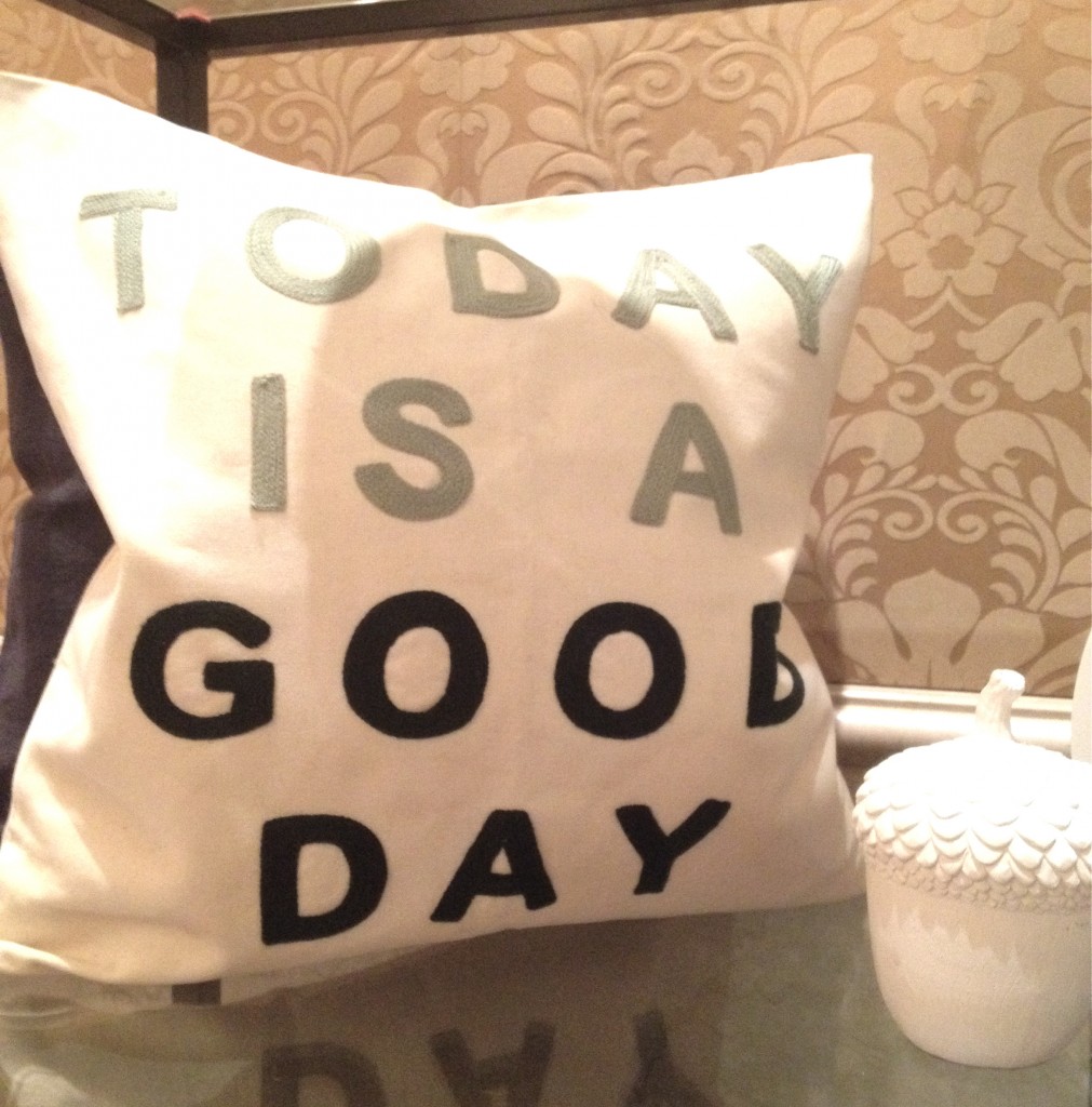
home decor items from Chapters-Indigo
Oh, the Royal York. It’s a classic. I wanted each and every chandelier.
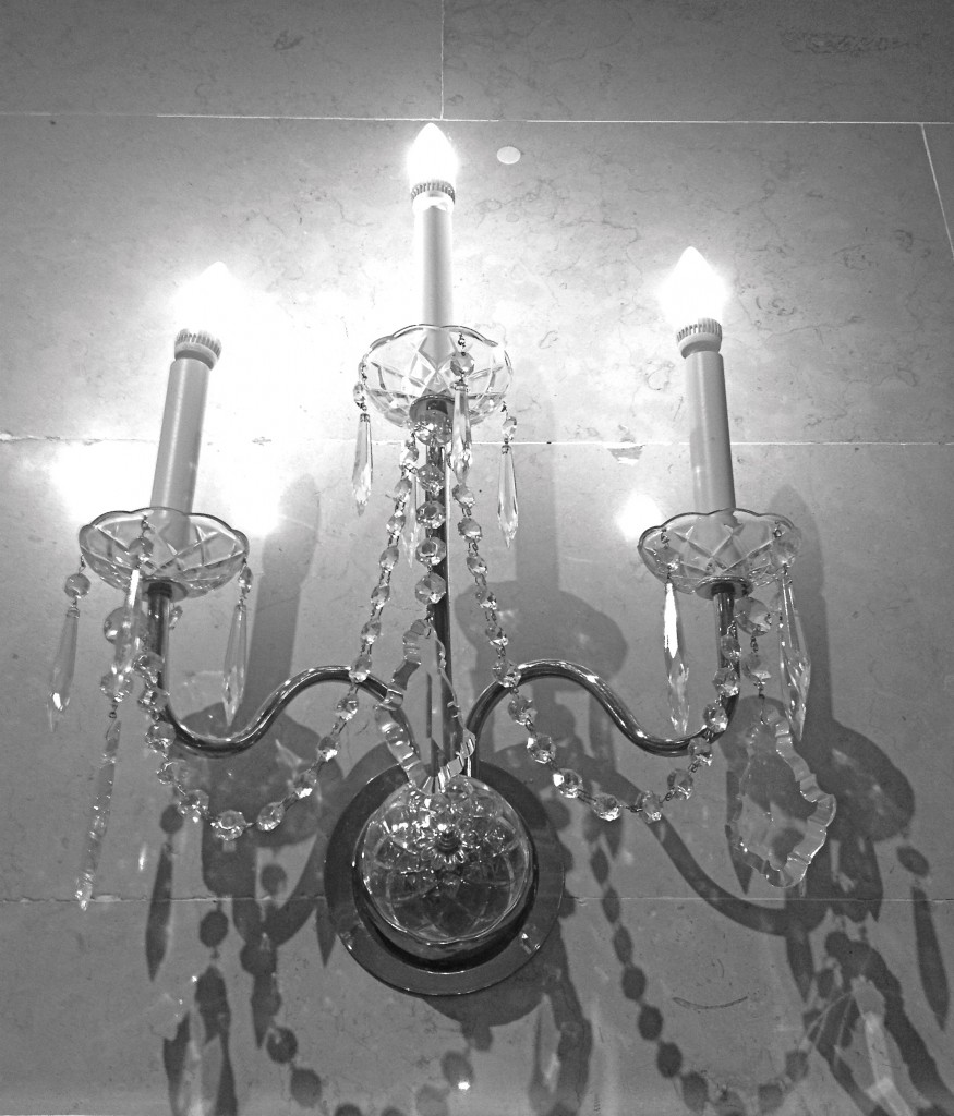
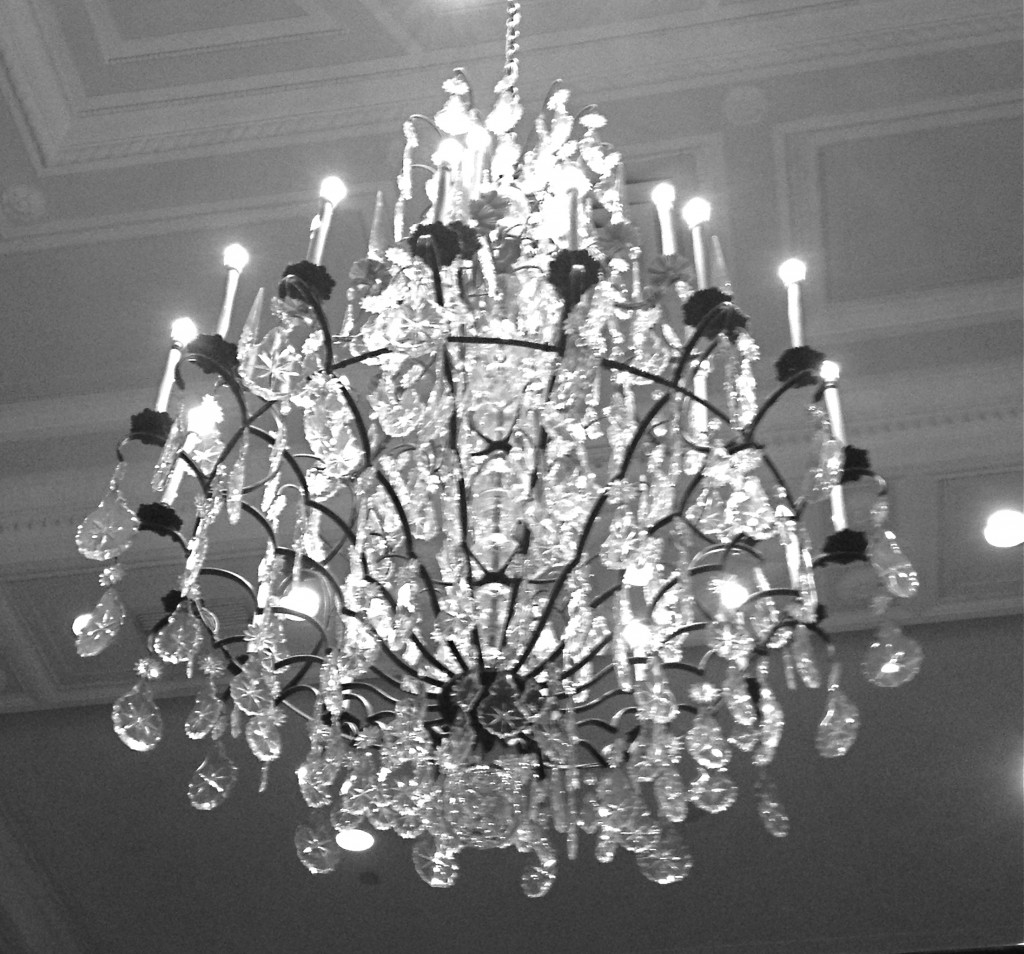
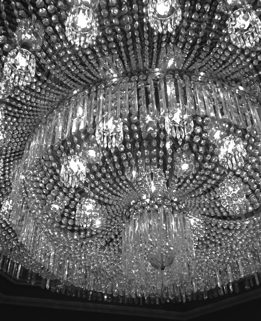
Having a beautiful backdrop for BlogPodium is essential. We are design bloggers after all! The food, decor, and service at the Fairmont Royal York was top-notch. I have pretty high expectations of fancy high-end places, and the Royal York did not disappoint.
One of the things that I value most about blogging is the chances I’ve had to meet new people. The Canadian design blogging community is full of people who are hard working, committed, interested, friendly, and dedicated. I have reached out to other bloggers on numerous occasions asking them for advice, and others have reached out to me. Our community is strong and helpful, and I think we should be really proud of the work that we do on and offline. We are a group that is committed to learning, sharing, and engaging with others.
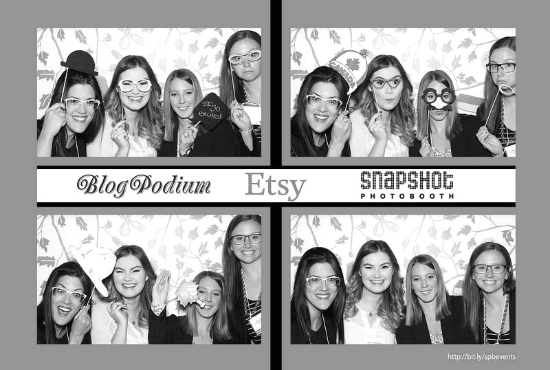 having fun in the Etsy photobooth with Brittany, Brittany, and Tia
And there you have it – my BlogPodium 2014 update in a few short paragraphs.
Thanks especially to Jennifer and her hard-working team for making BlogPodium another event to remember. You successfully brought a group of 300 friends together for a day of fun and learning! Thanks also to the many sponsors and exhibitors who filled our day with contests, giveaways, and beautiful products.
Photos by Flow Photo and Jordana.