Repetition. Check. Balconies. Check. Summer light. Check.
photo by Joel Lopata
Now if only people could fix their curtains.
Repetition. Check. Balconies. Check. Summer light. Check.
photo by Joel Lopata
Now if only people could fix their curtains.
These plywood glasses by London architect Lynton Pepper caught my eye.
Lynton Pepper plywood eyeglasses, via Dezeen
Ideas. Inspiration. Innovation. What more does one event need?
My experience at this year’s Interior Design Show began with The Party, continued with BlogPodium, and ended with a lot of photos and information about what’s new and exciting in the design world. Mix these elements up with designer talks, the Studio North exhibit, and a crowd full of beautiful people and it’s no wonder that I’m still on an IDS high.
Reports and reviews of cool design, innovative products, and designers’ takes on trends have been circulating around the web for a few days now and hopefully you’ve had time to read some of them. As for my recap? Well, here it is…all in white!
At the entrance to the Metro Toronto Convention Centre, event goers were greeted by Strip Tease, the collaborative effort of RAW and Mark Tholen. Not only were the hundreds of white felt strips interesting to look at, but they doubled as a projection screen. A white welcome…yes, please!
La Clôture is a hold all for coats, hats, mail, umbrellas, and anything else you might want to drop off – or pick up – at the entrance to your home.
 La clôture, $149.95, Six Point Un
It was wonderful to see Tahir Mahmood’s beautifully crafted pieces in person and I appreciate having the opportunity to chat with Tahir about his background, his design process, and his plans for future projects. While many of his designs are colourful, my eye was drawn to this wood and white spinner.
 Spinner by Tahir Mahmood
Like almost everyone at IDS, I fell in love with the space designed by Italian architect and designer, as well as International Guest of Honour, Piero Lissoni. Ah – those books!
While many of us are now used to our stainless steel appliances, Jenn-Air is bringing back white and making it super sleek and simple.
I can always count on IKEA for injecting a dose of white into a space and this time was no different. The white kitchen (with black counters and back splash) was in classic IKEA style – storage galore, simple design, and repeated forms. I could really use a wall of cabinetry like the one below for my growing shoe collection.
The display at Eurolite was gorgeous overall but it was this white fixture’s layers and form that really caught my eye.
The Hansgrohe faucet is sleek and sophisticated. Gorgeous.
The texture on the chairs at the Andrew Richard Designs exhibit was just lovely.
 patio chair at Andrew Richard Designs
The Magus Julius chair was transformed by a selection of designers for Cherish, an auction in support of the ONEXONE non-profit children’s foundation. I wonder who were the winners of these two white chairs.
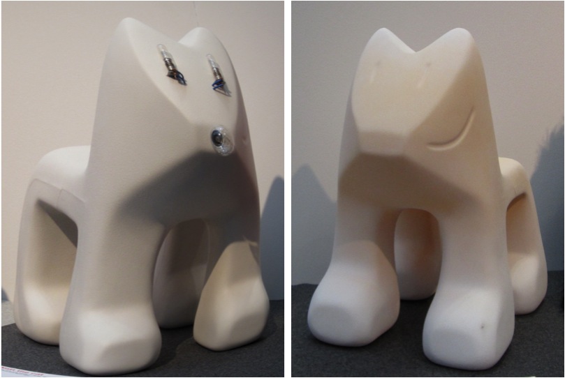 Magis Julian chairs in white (right: with lights; left: textured)
And, of course, the people were great!
 Troy Seidman, Mazen el-Abdallah, Suzanne Dimma at the How do you live? exhibit
So, there you have it. My recap in white. What are your thoughts? Did you attend IDS this year?
Photos by Jordana.
Each February, the gorgeous Gladstone Hotel in Toronto gets taken over by talented artists who transform twelve rooms with their innovative, creative, and jaw-dropping installations. The event, Come Up to My Room, began in 2003 and was co-founded by Pamila Matharu and Christina Zeidleris. I had a chance to see the installations in person this past weekend and I was impressed by the talent of the artists, designers, engineers, and architects at this year’s exhibition.
Among Bruno Billio and Sam Mogelonsky’s mirrored room with shiny spinning things, and Matthew Blunderfield and Skanda Lin’s hanging installation exploring the disposable nature of the digital world, there was plenty of whiteness to be seen.
Did anyone get to Come Up to My Room this year? What was your favourite exhibit?
Photos by Jordana.
Now – is this a chair, or is this a chair?
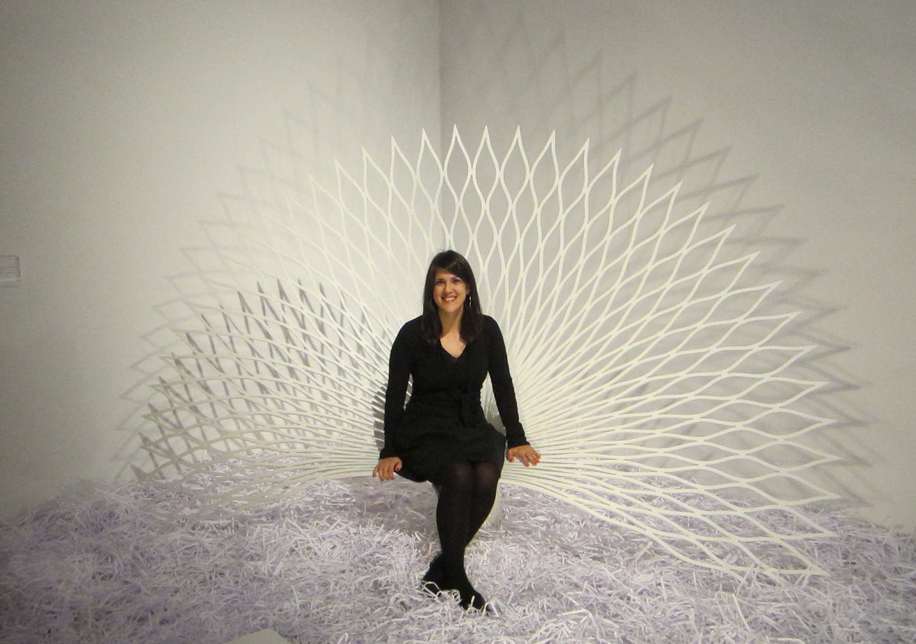 Jordana sitting on the Peacock chair, at the Interior Design Show, Toronto
The Peacock chair is the result of a collaboration between UUfie architectural firm and DuPont Corian (yes, as in the countertop material) which was completed for IDS 2012. If you can believe it, the Peacock is made from a single sheet of DuPont Corian which has been cut, bent and folded through a process of thermoforming (sounds like quite a process, right?).
If you want to see the Peacock chair up close, be sure to get yourself to IDS this weekend.
I know I’ve posted a lot about NYC in recent weeks but I spent a good chunk of my Christmas holidays there and I’m eager to share some of the photos that I took. For today’s Friday Five I’m happy to share with you some of the very pretty houses I came across when my family and I hit the ‘burbs. (Yes, that’s right, we escaped Manhattan for a morning to explore the surrounding neighbourhoods.)
Photos by Jordana.
I’ve walked by The Plaza Hotel in NYC more times than I care to count but I can never resist taking a photo (or several) of this amazing building. For my most recent photo I zoomed in on the windows – I just love how they are perfectly in line.
Photo by Jordana.
I never get bored of looking at really amazing architecture. This time I am focusing on train stations. Apparently I also never get bored of dreaming of travel.
Happy Weekend!
Five sets of staircases. Five different architectural beauties. Which set of steps are you most drawn to?
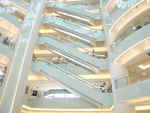 photo by RosLol
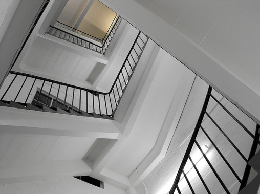 photo by Shotlandka
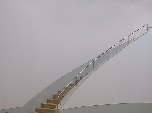 photo by Leo_B
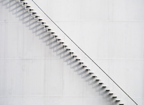 photo by Bob Jagendorf
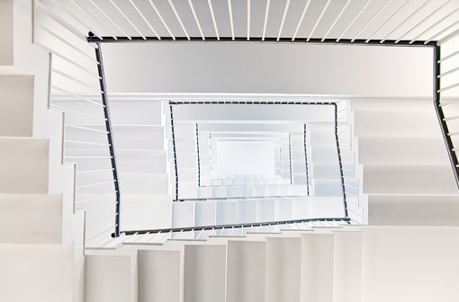 photo by SophieMuc
Greetings from Florida! I thought I’d take a break from working on my tan (I know, hard work, right?) to post a vacation update.
Although my friend Shannon and I are in Florida at the moment, our US tour actually began in Chicago. We spent four amazing days eating our way through the city. We also saw some incredible art and made time for shopping too (of course!). This was my second time in Chicago and I’m happy to say that I loved it as much as I did the first time around. The city has so much to offer and the people are so friendly.
Today I thought I’d share five of my favourite photos from the trip.
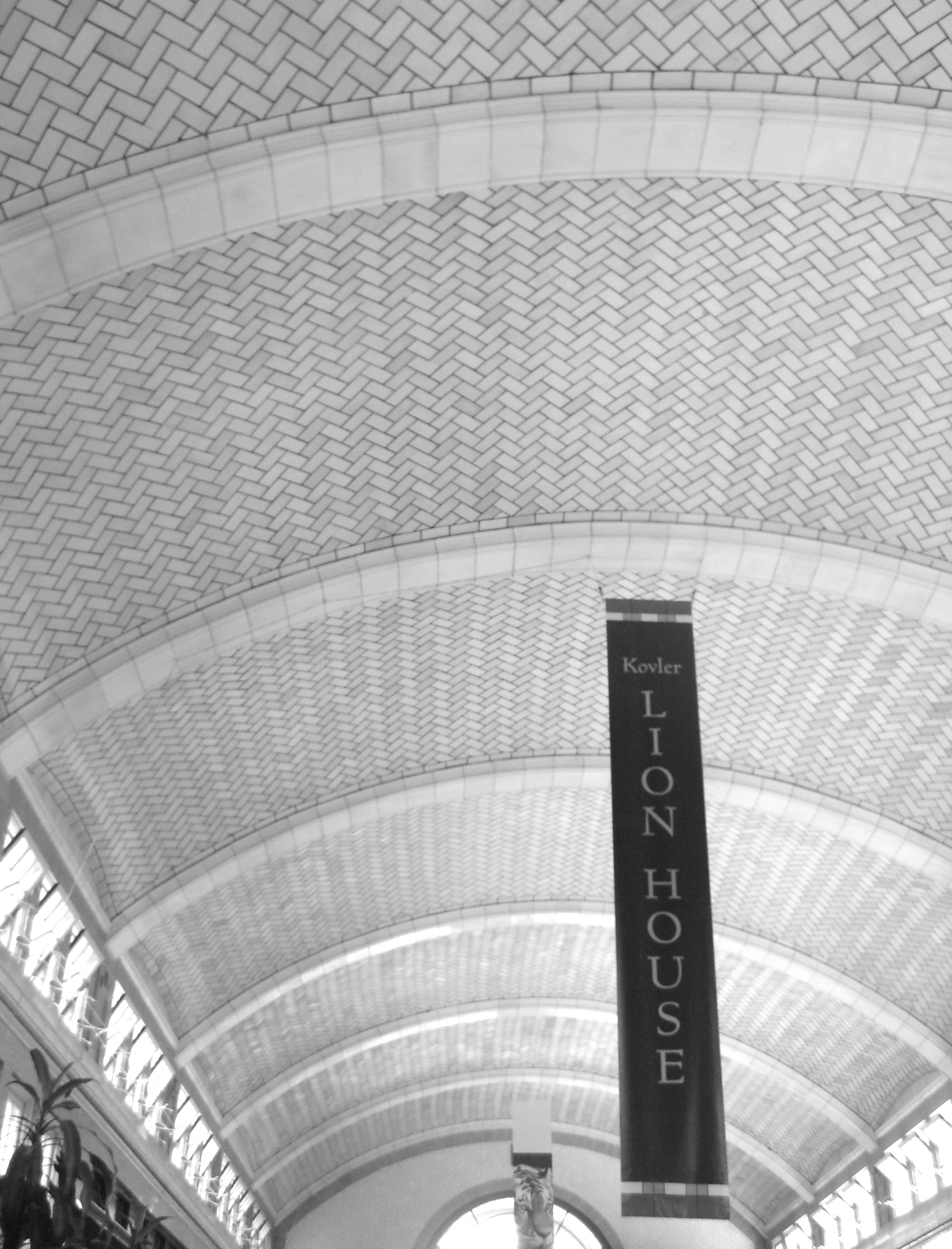 The Lion House at the Lincoln Park Zoo
 The Rookery building – by Frank Lloyd Wright
 Monument with Standing Beast by Jean Dubuffet
As always, thanks for reading White Cabana!
Hello summer heat!
Although I am very thankful to have air conditioning at a time like this, I would definitely be open to having one of these pools (and matching pool houses) to keep me cool.
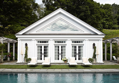 via Traditional Home
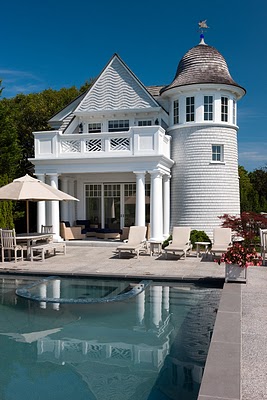 via Willow Decor
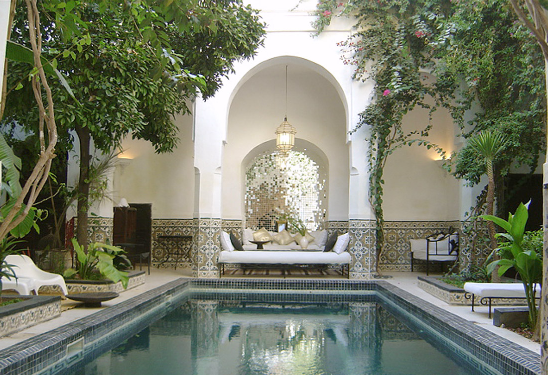 via 1st Option
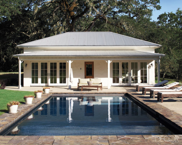 via Elle Decor
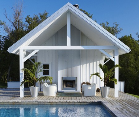 via House & Home
How have you all been staying cool this summer?
If you’ve been reading White Cabana for a while then you will have noticed my fascination with white doors. On my recent trip to Fredericton, however, I was struck by the number of windows, not doors, on buildings around the downtown core and at the University of New Brunswick. This architectural detail really allows for maximum exposure to the beautiful outdoors.
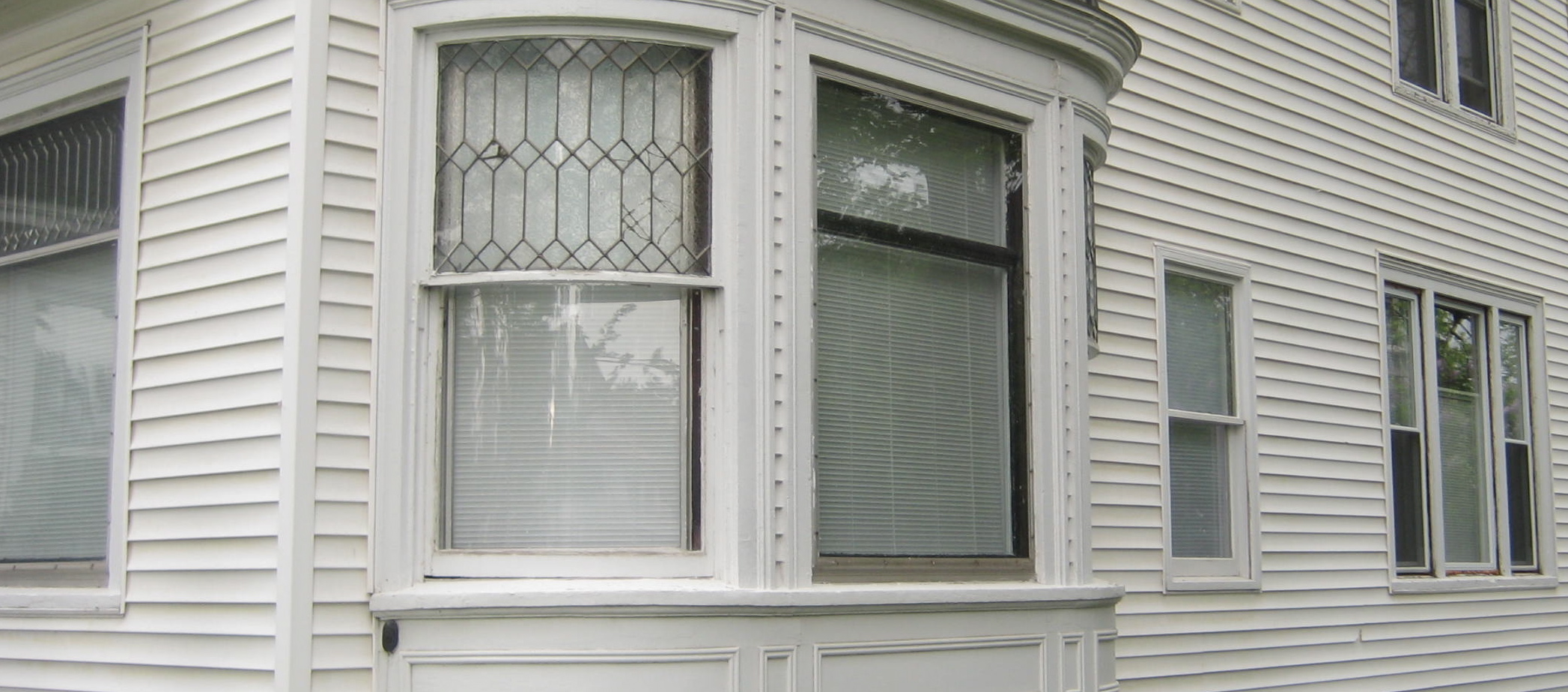 a wall of windows at a Fredericton home
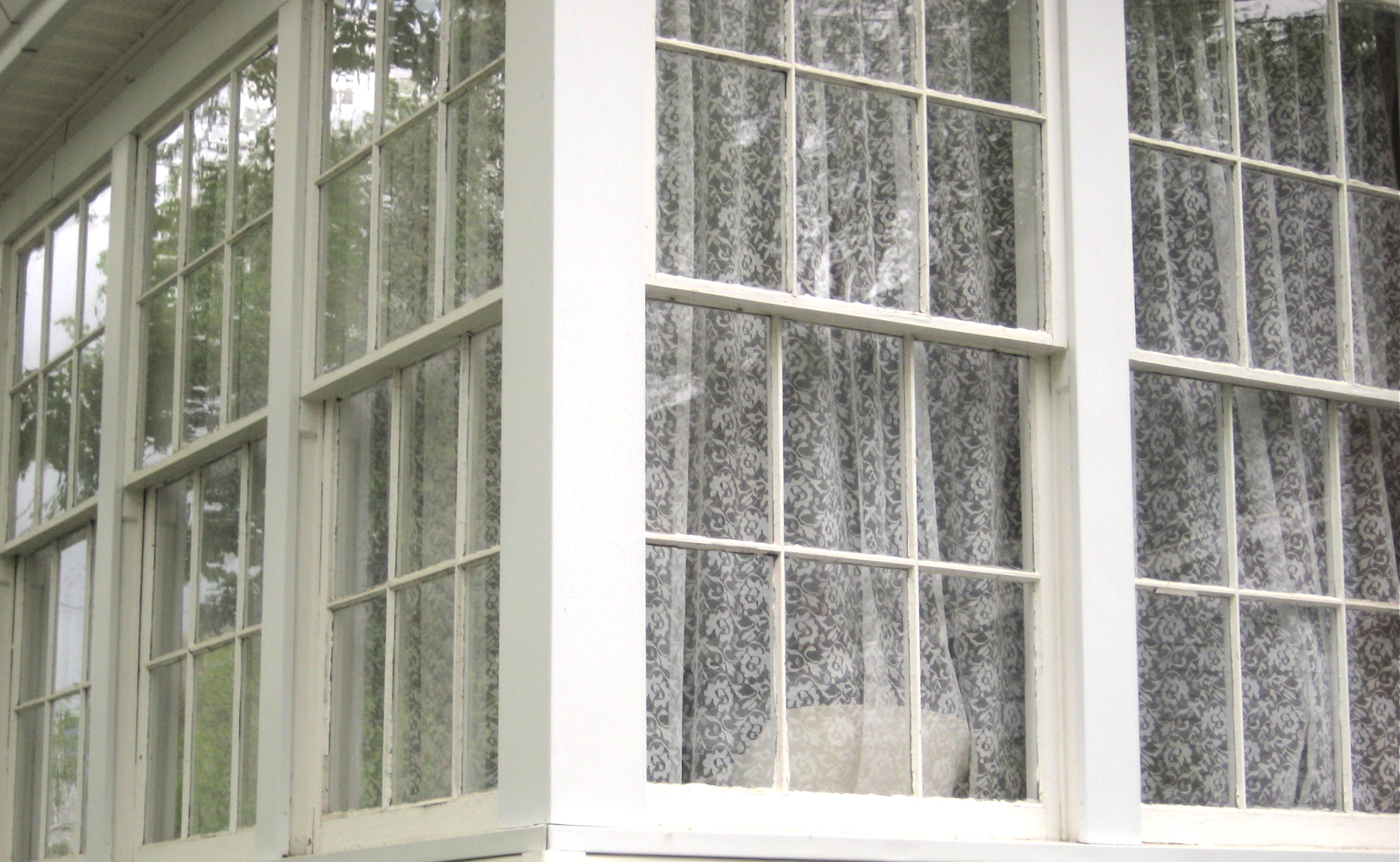 sunroom windows on a Fredericton home
 plenty of windows at the University of New Brunswick
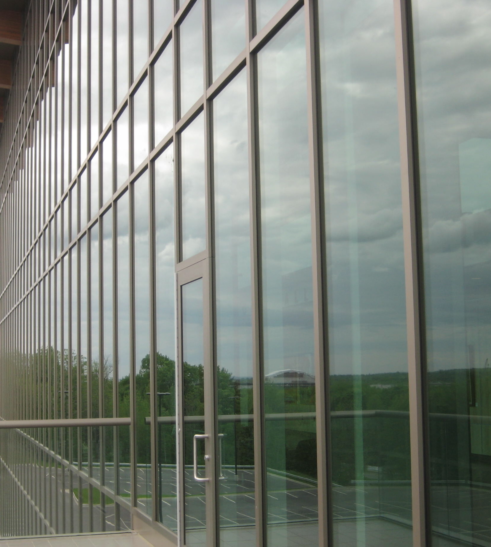 Currie Center at the University of New Brunswick
I hope you enjoyed this week in Fredericton. Wishing you all a wonderful weekend.
Photos by Jordana.
I was in Fredericton, New Brunswick last week and had a great time both working and touring. If you’re planning a trip to Fredericton, stay tuned to White Cabana this week as I’ll be sharing with you some highlights from my trip.
I thought I’d start the week off with some photos of the architectural details on homes and buildings in Fredericton.
Photos by Jordana.
The subject of one of the columns featured on Houzz last week was cool white spaces. Instant inspiration, I’d say.
Photos courtesy of Houzz. Thanks to Boba for inspiring this post.
Ever since White Cabana began, I have watched my dad’s interest in white grow (read this). He recently sent over some photos he took of churches and buildings on his most recent trip to New York City.
It seems as though my dad has become inspired by white. Great news, right?
Founded in 2006 by architects Stephanie Davidson and George Rafailidis, Touchy-Feely, is a design and consultancy firm interested on the ways our bodies interact with the architectural surfaces around us. The architects’ designs encourage physical interaction with the built environment.
Touchy-Feely’s found space tiles, relief forms taken from people leaning against walls, is one of their most recognized design projects. These ceramic wall tiles are designed in posture-specific clusters of two or more but can also be integrated into standard tiled surfaces. As Davidson and Rafailidis say, these are tiles that “reach out” to be touched.
Trigger points, another Touchy-Feely project, are heated wall surface elements. Why? For self-massage, of course! Again, this project encourages physical interaction between body and building.
Touchy-Feely offers a complete service package – everything from design conception to planning to realization. For more information click here.
Keep all those files in order with these fun paper clips. I know I’d have a hard time letting go of the Eiffel Tower clips – I’d save them for only the most important pieces of paper!
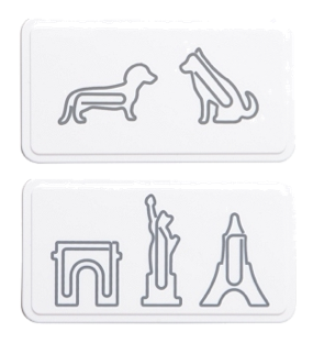 Dog & Landmark paper clips, Muji
Forged Artistry, based in New York, makes hand-crafted iron gates, railings, doors, etc. in styles ranging from neo-classic to realist. The Forged Artistry portfolio is chock-full of beautiful iron work. I am happy to feature some of their work in white spaces here.
All images courtesy of Forged Artistry.
Each pod in The Parlour‘s restroom is an individual toilet. So cool.
 Restrooms at The Parlour at Sketch, via A Girl, A Style
Sketch London
The resemblance is incredible. Don’t you think?
1. The White Box by The Walther Collection:
2. The Fish Hotel by Umbra:
Images courtesy of The Walther Collection via Minimalissimo, Unica Home.
It seems fitting to end this week in Paris with a Parisien edition of the Friday Five. I hope you all enjoyed some of the white sights of this glorious city.
All photos by Jordana.
The buildings in Paris never cease to impress me. I love the variety of designs, the details of the carved stone, the ironwork and the grand arches.
For more information about these locations visit: Les Halles, Centre Pompidou, Sacre Coeur, Place Vendôme, Apple.
All photos by Jordana.
I’m currently testing out Apple gadgets at the Paris Apple store. Besides the cool products, the architecture of this building is white and fresh! Just took a photo using the MacBook Pro. Loving the classic Parisien iron work.
Image taken by Jordana at the Paris Apple store;
Greetings from Switzerland! Today’s Friday Five is a collection of white beauties from my travels in this country of cows, clocks and chocolate.
Even though the mountains are shades of green, there is still plenty of whiteness that is catching my eye so please stay tuned for more white goodies from La Suisse.
All photos by Jordana.
Images courtesy of McGill Design Group via Flourish Design + Style.
Now this would be a very cool vacation experience.
Images courtesy of airbnb via A Cup of Jo.
The Canary Islands, although actually part of Spain, are located only about 10km off the coast of Morocco. This archipelago is made up of several islands including: Tenerife, Fuerteventura, Gran Canaria, Lanzarote, La Palma, La Gomera and El Hierro. Very cool.
A few years ago, my friend Shannon and I had the most fabulous vacation in the Canary Islands. In our too-short holiday, we managed to tour Tenerife and Gran Canaria with our friend (and local Gran Canarian), Ignacio. We ate great food, met many nice people, and enjoyed visiting small towns, driving around in our little rental car, and brushing up on our Spanish. We also managed to jump our way across the two islands – at the Dunes at Maspalomas, Parque Nacional Teide, in Mogan, and at one of our gorgeous hotels, the Reina Isabel in Las Palmas. One of our favourite photo shoots was at El Auditorio, the Tenerife Opera House.
If you’re looking for a beautiful vacation destination chock-full of adventure, I would encourage you to consider the Canary Islands. They don’t disappoint.
All photos by me.
Last week I had the fortunate pleasure of discovering Denver, Colorado. To tell you the truth, this city surprised me…I was completely impressed with all that it had to offer. Great restaurants, so pedestrian-friendly and a museum chock full of interesting artefacts. It was easy to get around on foot and by public transportation. Around almost every corner, there was an interesting outdoor sculpture. Although a tad on the chilly side, it was sunny each day which made for some really great days.
Here’s a look at some of Denver’s white beauties:
All photos by Jordana.
Today’s Friday Five is dedicated to Villa Roxie, the former Miami home of the talented Lenny Kravitz. It’s so so so white and there are so many beautiful things to drool over.
I love the scalloped doorway, the circle-embroidered bedspread, and those crazy octupus hanging lamps in the living room. So fun!
Photos courtesy of Freshome.
Today marks White Cabana’s 100th post! Many thanks to all the readers for making White Cabana part of your day!
Photo courtesy of Buckingham Interiors.
Photos courtesy of Aubrey Road, Design Sponge, Dezeen, Minimalissimo.