Design

Art: Black Works

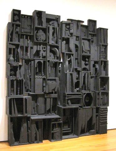
Would you hang an all black art work in your home (or fantasy museum)? What if we said it was a work by Robert Motherwell, Louise Nevelson, Kara Walker, Richard Serra, or Robert Mapplethorpe?

Reconciliation Elegy, 1978, Robert Motherwell (at the National Gallery, Washington DC)

Sky Cathedral, 1958, Louise Nevelson (at the MoMA)

Kara Walker, 2008 (from an installation at the Whitney)

Untitled, 1973, Richard Serra (from the Richard Serra Drawing: A Retrospective at the Metropolitan Museum, 2011)

Parrot Tulips, 1988, Robert Mapplethorpe

Images courtesy of Spencer Alley, Art in the Studio, June Joon Jaxx, The New Yorker and Me, Christie’s.

Dear Readers: Do not adjust your computer screens. Troy is taking over White Cabana this week and, as you can see, he’s really shaken things up around here! Enjoy. – Jordana

Art & Design: Ian McChesney

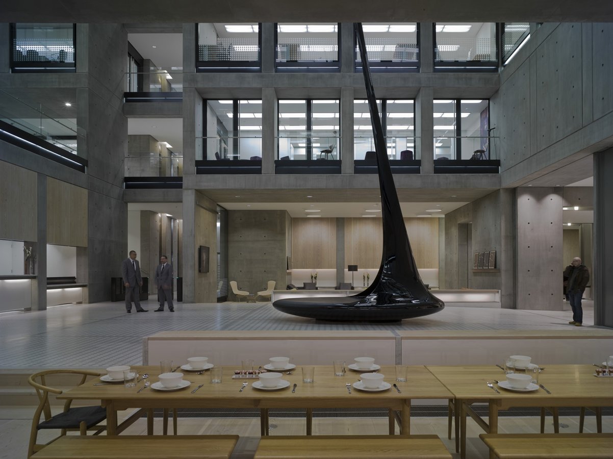
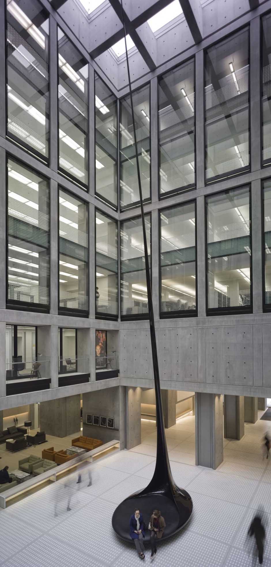
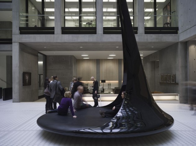
Fiona Chan is Caviar20‘s hard-working, tireless, charming, and clever intern. An interior design student at Ryerson University, Fiona had a lot of great ideas for Caviar20’s “paint it black” week on White Cabana. She alerted us to this sensational sculpture, located in London, by British artist Ian McChesney.

Titled Out of the Strong Came Forth Sweetness, the 72-foot high (!!!) sculpture resembles the upside-down form of tar dripping off of a spoon. Made of carbon fibre by a company that does ship building, the base is actually a leather-covered round seating area. Wild!

Images courtesy of the Contemporist.

Dear Readers: Do not adjust your computer screens. Troy is taking over White Cabana this week and, as you can see, he has really shaken things up around here! Enjoy. – Jordana

The Friday Five: Isamu Noguchi

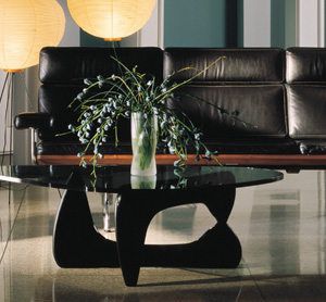
You’ve seen it 100,000 times. The Noguchi Coffee Table is one of the best-known icons of 20th century design. It has been copied, imitated and become so ubiquitous it approaches design cliche (like the Barcelona chair).

Nevertheless, Isamu Noguchi (1904-1988) is a fascinating and talented artist/furniture designer who deserves recognition beyond this single table. Like many great 20th century furniture designers, their biggest “hits” often overshadow their other accomplishments. So Caviar20’s first Friday Five is dedicated to Noguchi, both his design icons (like the Cyclone Table) and other lesser-known but highly sought after collector’s pieces like his radio and “Chess Table”. Noguchi’s work, mostly in metal, stone and occasionally wood, was realized with a very austere palette including lots of black. For more on Noguchi, we recommend visiting the Noguchi Museum in Long Island City (minutes from Manhattan) or exploring their handsome website. For today’s Friday Five we’ll introduce Noguchi with a selection of his most famous, fantastic and coveted design pieces.

1. Noguchi coffee table, designed in 1948. Manufactured by Herman Miller.

Image: Herman Miller

2. Cyclone Table, designed in 1953. Manufactured by Knoll.

Image: Knoll

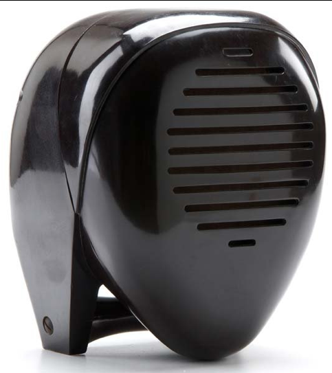
3. Noguchi Radio Nurse, designed in 1937. Manufactured by Zenith.

Image: Live Auctioneers

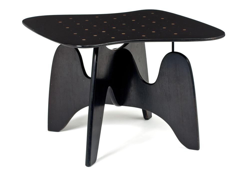
4. Chess table, designed in 1947. Manufactured by Herman Miller.

Image: Noguchi Museum

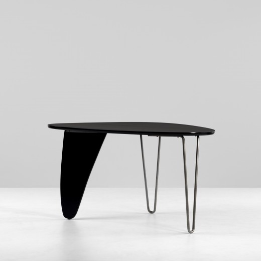
5. Rudder Table, designed in 1945. Manufactured by Herman Miller.

Image: icollector

Dear Readers: Do not adjust your computer screens. Troy is taking over White Cabana this week and, as you can see, he’s really shaken things up around here! Enjoy. – Jordana

A good boy

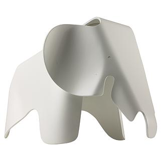
We’re still into animals this week, and really- what’s not to love about our sweet elephant?

Charles and Ray Eames were apparently really into elephants, having documented circuses and their adventures in India, both of which prominently feature the impressive animal. The Eames designed two prototypes made of molded plywood that was too complicated to produce for sale and so were displayed at the MoMA from 1945-6.

We hear that today, only one of the original elephants remains and is privately held by the Eames family. The copycat toy elephant we’re featuring below is made of white polypropylene and is created by the Vitra Design Museum and made in Germany. A perfect toy for the stylish toddler.

Eames Elephant, $290 at Design Within Reach

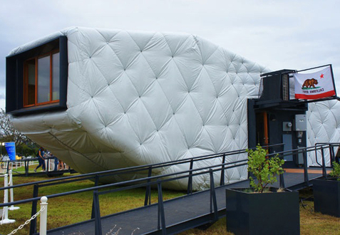
The Chip house

Have you heard of the CHIP house?

Neither had I until I found it in this feature on Dwell.

What you need to know about the CHIP house:

1. Your instincts are correct: at first glance, it appears to be a giant quilted Chanel handbag:

2. Upon looking inside, we discover innovations in storage and maximizing its bizarre shape:

3. The project is one of the highlights from this year’s Solar Decathlon, an annual program by the US Department of Energy to challenge collegiate teams to “design, build and operate solar-powered houses that are cost-effective, energy efficient and attractive.”

4. The CHIP home arrived to the Washington, DC, event with the help of a team of more than 100 SCI-Arc and Caltech students who designed and built it to promote a new kind of sustainability.

5. CHIP is an acronym for Compact, Hyper-Insulated Prototype.
6. The home is a 750 square foot wonder of tucked-in furniture made of foam for easy wall-lining storage

7. There’s also this great video about the concept and the build.

All images courtesy of Dwell online magazine.

Thank You Delta!

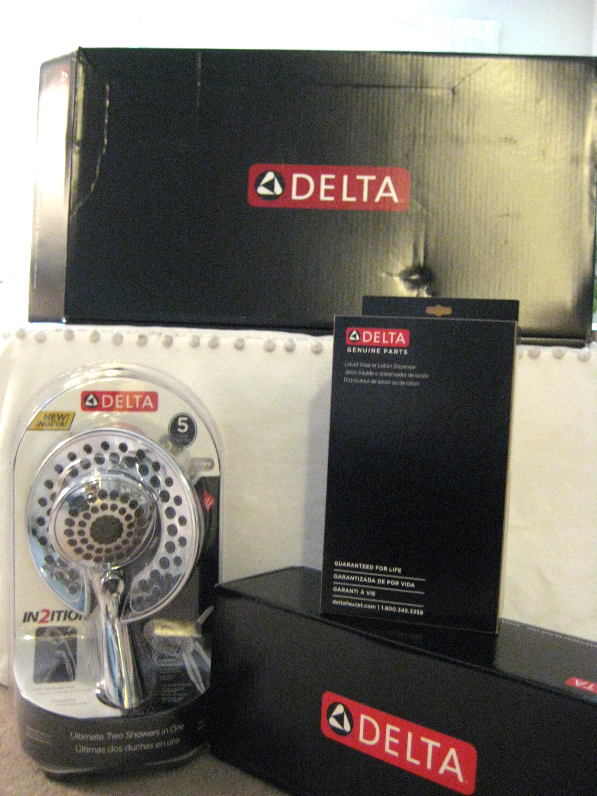
A little while ago, via the Canadian Design Blogger Meetup, I entered a Delta faucet giveaway and guess what? I won! Big time!

As the winner of this giveaway, I got to create and send off my faucet wish list to the generous folks at Delta so that they could make my faucet dreams come true!

As I’m currently in a rental, I was not about to install new faucets so I gifted the giveaway to my parents. They have more bathrooms and kitchens than a retired couple would ever need but one kitchen and one bathroom in particular are currently in need of a major overhaul and these faucets are going to be put to perfect use.

So how did I compile the faucet wish list? Well, my parents and I each completed the Delta Find Your Perfect Faucet online survey and, not surprisingly, we ended up with the same results.

For one of the second floor bathrooms, we chose the In2ition two-in-one showerhead…so cool! My dad has already installed it and it’s working out beautifully.

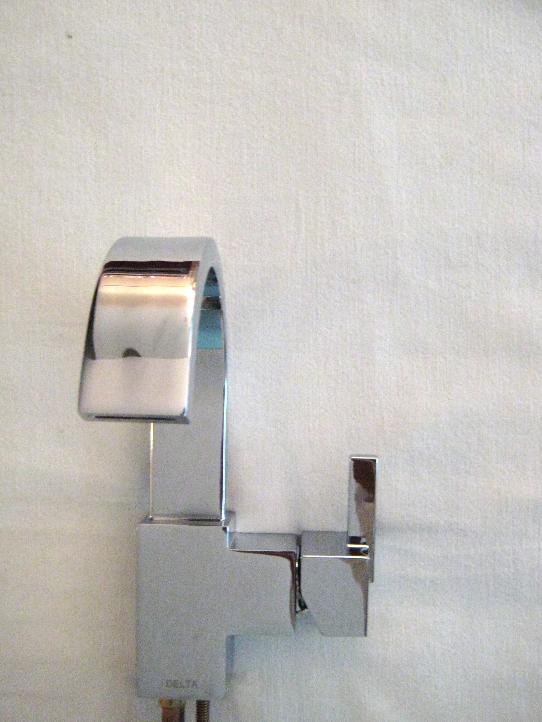
For the main floor powder room, we chose the Vero single handle centerset lavatory faucet. It’s one hunk of shiny chrome goodness!

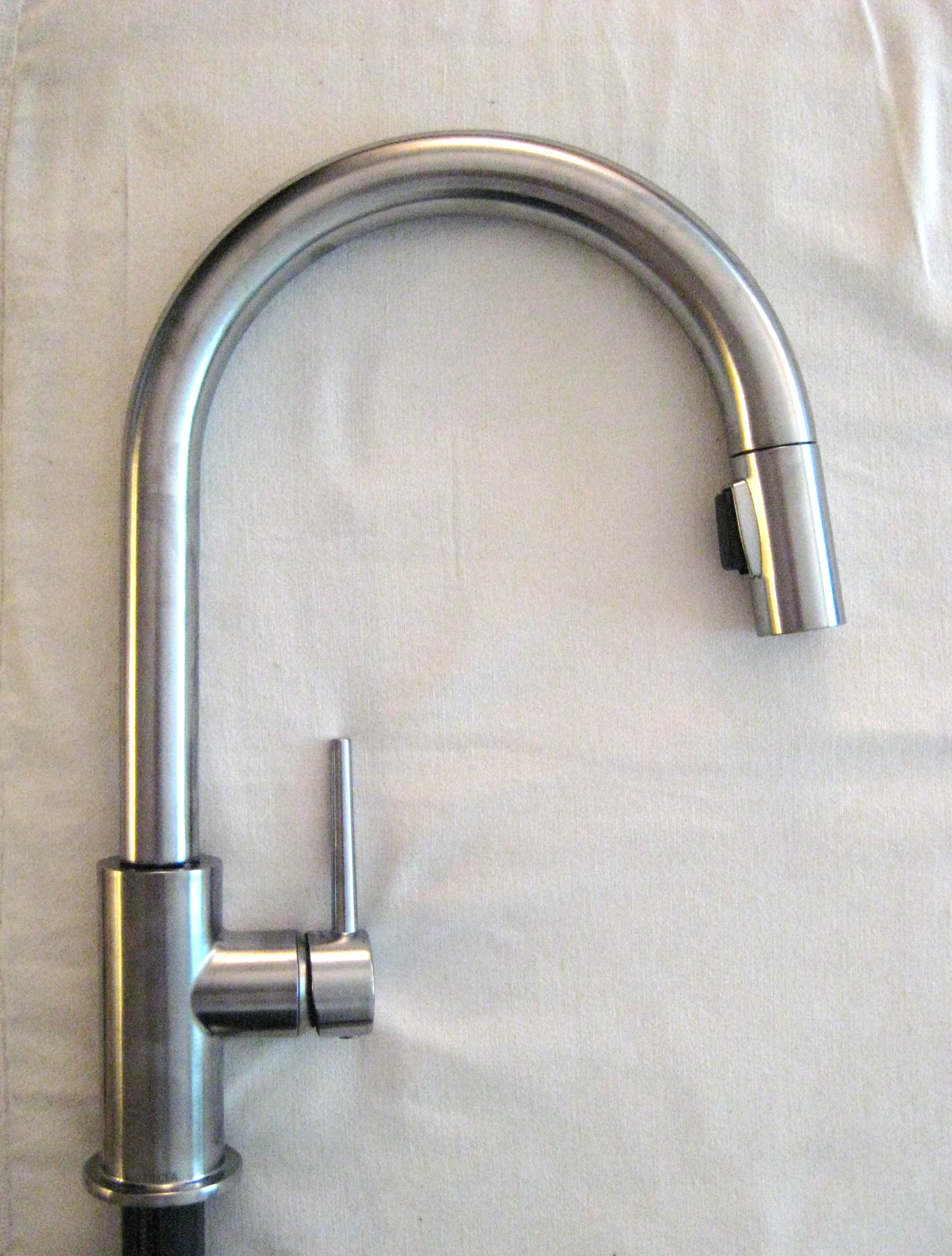
For the kitchen, we all agreed that the Trinsic in the arctic stainless finish was the perfect choice. We got the matching soap dispenser too. I never thought I’d be so crazy about faucets but I just love the simplicity and strength of this one.

See what I mean? This was a BIG win!

When my parents do eventually do their big reno, I’ll be sure to take photos. And if they don’t do it – I’ll be donating these beauties. You heard it here, folks!

Many thanks to Farah at Delta and Beth at Cohn & Wolfe for arranging this win. Thanks again to Vitania and Daniella for organizing a fab blogger meetup.

Photos by Jordana.

Marketplace: Molla Space

Molla Space, based in California carries such a great selection of fun, quirky and interesting desk accessories, electronics, and things for basically every room in your home. These are some of my favourite items currently in stock:

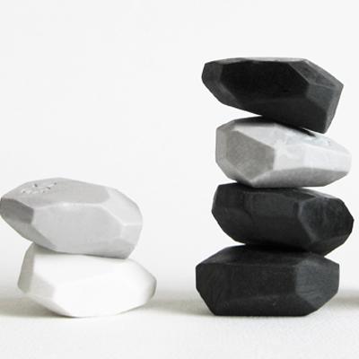
Megawing Pebble eraser, $5

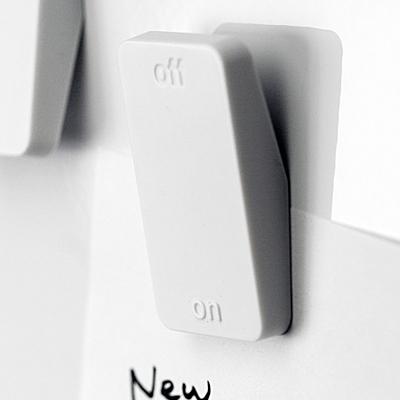
Megawing On Off magnet, $16

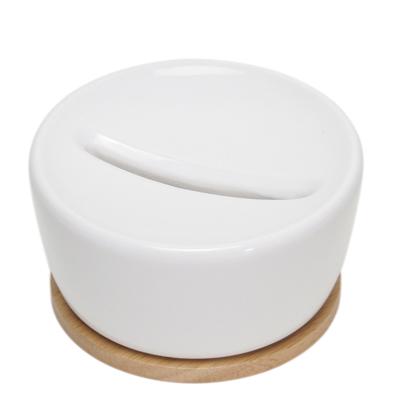
Ideaco & Associates coin storage, $32

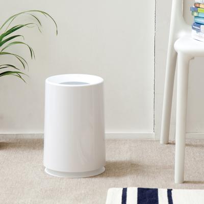
Ideaco & Associates Tubelor trashcan, $46

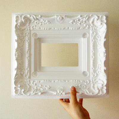
Molla Space pinup frame, $10

The Friday Five: Urban Barn

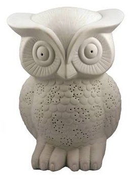
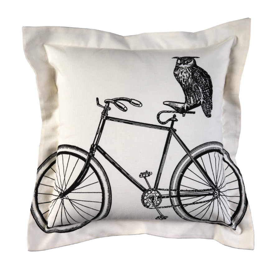
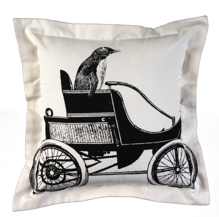
We’re always keen to see what’s new and white at Canadian retailer Urban Barn. This fall bring some brighten up your home with an owl lamp or take a seat on the Jack stool and pour yourself a drink at the bar. Here are five great new products to look out for on your next visit to Urban Barn.

Owl Glow lamp

Perele Table lamp

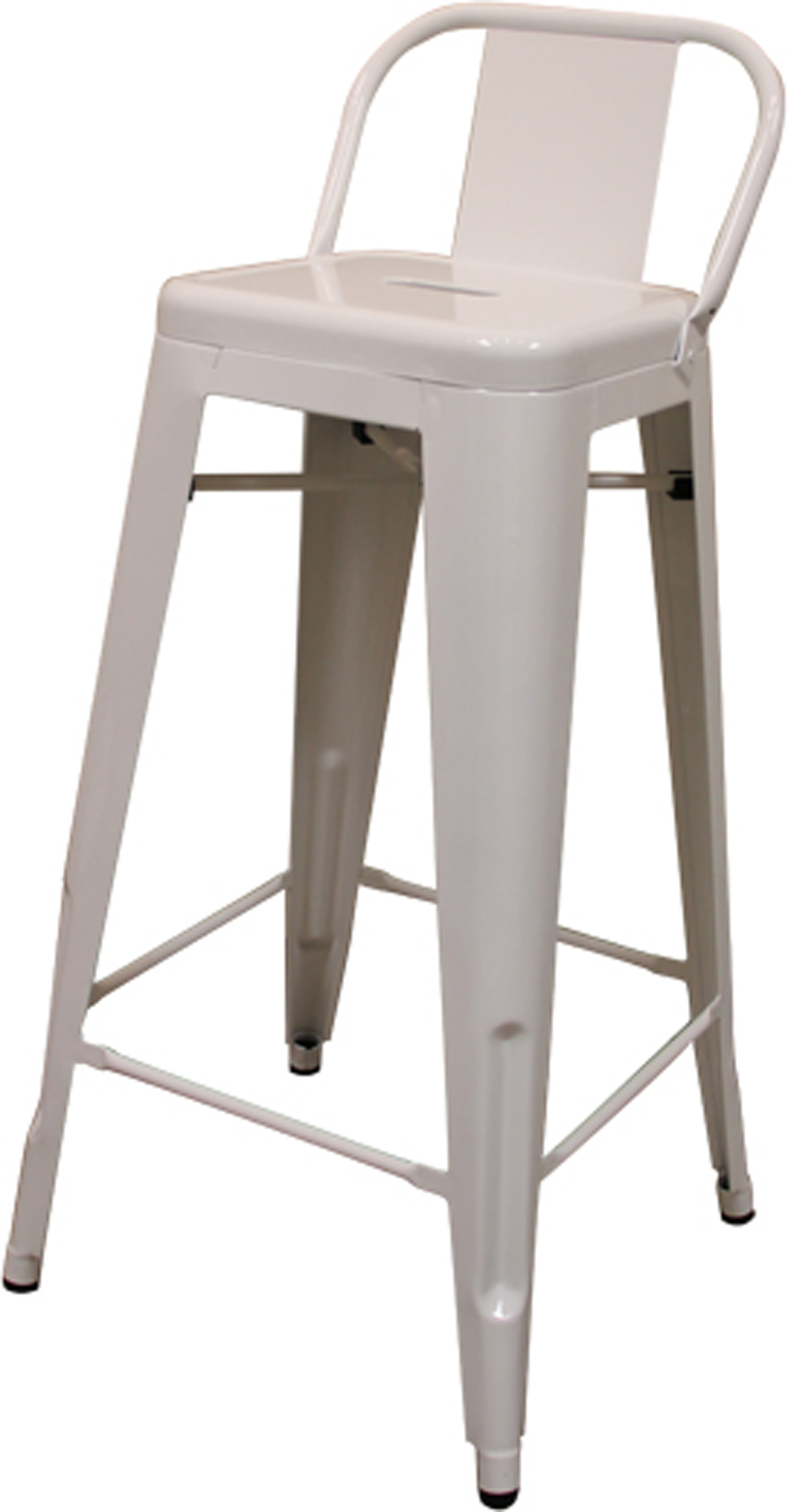
Jack Stool, $199

Owl on a bike cushion

penquin cushion

Images courtesy of Urban Barn.

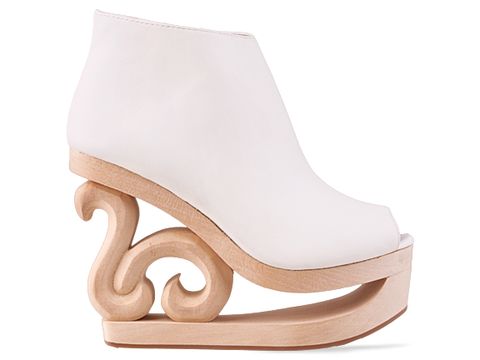
Jeffrey Campbell Shoes

Does Jeffrey Campbell make cool shoes or what?

Jeffrey Campbell Skate, $189.95, SoleStruck

Jeffrey Campbell MR, $139.95, SoleStruck

Jeffrey Campbell Tick, $169.95, SoleStruck

I know I probably wouldn’t be able to walk in any of these shoes but they are such great pieces of art that I would be happy to display them on one of my shelves or perhaps under a glass cloche.

Painting

It’s been at least a year since I painted anything and this fact makes me a bit depressed as I used to paint quite often. But time has moved at lightning speed this past academic year and it’s only now that I’m finding more chunks of time to paint. Here’s a piece that I worked on last week.

artwork & photo by Jordana

The Friday Five: Canadian Designer Series – Debbie Travis

The fabulous and talented Debbie Travis rounds off today’s Friday Five. Technically, she’s a Brit, but she’s been part of the Canadian scene for so long that she must surely have citizenship here. I just had to include her in today’s series…accent and all.

Her first show, Debbie Travis’ The Painted House, aired in 1995 and it was here that I learned all about faux finishes. I clearly remember watching her create this Fornasetti dining room and this wild blue wall. It was because of Debbie that I added words like crackle varnish, anaglypta, and battik into my vocabulary.

Debbie Travis is an accomplished artist, designer, author, and business woman. In addition to Painted House, her more recent shows, Facelift and From the Ground Up have been successful in Canada and abroad. She has written many books and has won several prestigious awards. She also has a line of products available at Canadian Tire. Needless to say, Debbie is a woman who wears many hats.

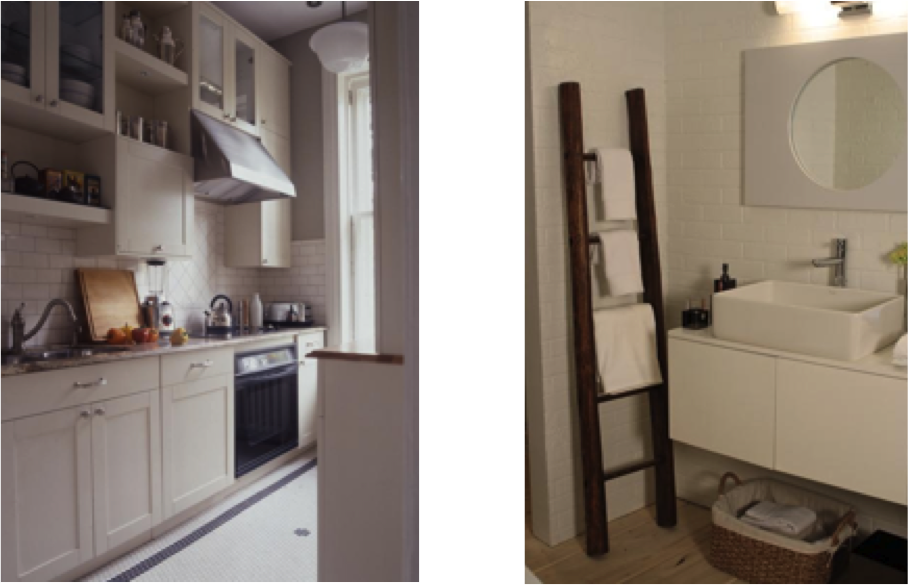
Debbie Travis’ designed kitchen and bathroom

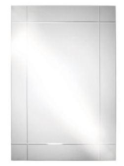
Debbie Travis Expo Cut mirror, $39.99, Canadian Tire

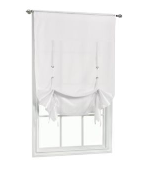
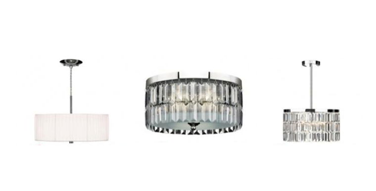
Debbie Travis Tie-Up shade, $24.99, Canadian Tire

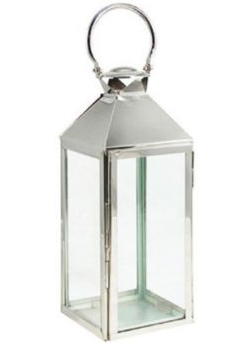
Debbie Travis lantern, $34.99, Canadian Tire

Debbie Travis lighting

In recent years, Debbie has headed to Tuscany and now hosts a Debbie Travis’ Girls’ Getaway. The experience includes 7 nights accommodation at her Italian villa (wow!), delicious meals and drinks, winery tours, and more. La dolce vita, I’d say!

You can learn more about what Debbie is up to on her blog or you can follow her on Twitter.

***

Wishing you all a wonderful weekend. Happy Canada Day!

The Friday Five: Canadian Designer Series – Steven Sabados & Chris Hyndman

I hope you’re enjoying today’s series of posts and that you’re learning a little bit more about Canadian designers.

Next on the list are Steven Sabados & Chris Hyndman. It’s a two-for-one post because these guys are such a dynamic design team and I just couldn’t bare to break them apart for the purpose of a post.

Johanne & I quickly met Steven and his partner Chris after a Toronto taping of their show, Steven & Chris, a couple of years ago.

Chris, Jordana, Johanne, Steven

Like Brian and Candice, I first learned about Steven Sabados’ talent for design via CityLine (Have I been a long time fan of that show or what?).  Steven & Chris were the original Designer Guys and are now the hosts of the Steven & Chris show. In addition to their TV hits, this pair has designed a line of furniture, linens, lighting, and wines, yes wines! These guys are busy!

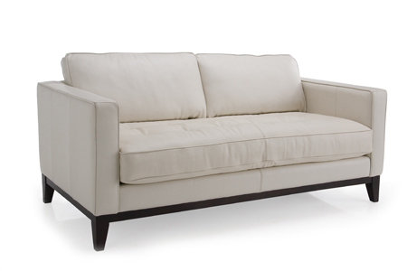
Castlefield sofa

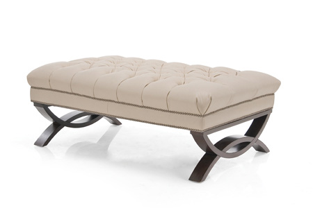
ottoman

decorative accessories

Trend wines by Steven & Chris, available at the LCBO

I like these guys because they’re friendly, personable, charismatic, and their clean design aesthetic definitely works for me. There’s no fussing around for this duo. Oh – and Steven also spent time in London, Ontario (which is where I am now living). Bonus.

The Friday Five: Canadian Designer Series – Sarah Richardson

Who doesn’t love Sarah Richardson?

She’s a favourite among many designers, bloggers, and TV watchers. Her home transformations are gorgeous and appeal to so many viewers and DIYers. Sarah’s got a TV show for everyone! Have you seen Sarah’s house, Sarah’s cottage, or her recent installation at the Interior Design Show?

I like Sarah because she seems friendly, she’s got an awesome sidekick (hello Tommy Smythe) and she also looks a whole lot like a good friend of mine. Oh – and she wore Smythe jackets long before the Duchess of Cambridge did.

Here are some of the white rooms she has designed.

mid-century family home

oceanview estate

Sarah’s house – hallway

Sarah’s house – bathroom

(all photos via Sarah Richardson porfolio)

Like the other designers I am featuring today, Sarah has also worked on some beautiful product lines (honestly – where do these people find time to do all of these things?). In partnership with PARA Paints, Sarah has created a designer paint palette of 75 colours. In addition to this colourful endeavor, Sarah has a beautiful collection of indoor and outdoor furniture.

Alexander

Harry

Claremont

Click here to find out where to buy these and other Sarah Richardson products.

Read Sarah’s short diary entries here.

The Friday Five: Canadian Designer Series – Candice Olson

The second designer for today’s series is Candice Olson – designer extraordinaire and all around funny lady.

I have been watching Candice Olson’s Divine Design since the very beginning. I love the interaction between her and her crew and I especially like her room sketches.

In addition to her TV and interior design work, Candice has been busy with her various product lines – lighting, fabric, rugs, and more! Here’s a quick peek:

Candice Olson sofas – Bette, Brady, Floyd – ready for fabric

Candice Olson furniture: Hollace daybed & Jean chaise

Candice Olson wall covering, Kravet

Candice Olson drapery, Kravet

Candice Olson paisley wallpaper, York Wallcoverings

The Friday Five: Canadian Designer Series – Brian Gluckstein

Happy Canada Day!

In honour of today, Canada’s 144th birthday, I’m going to be doing something a little different with the Friday Five. In a series of five posts throughout the day, rather than in one single post, I will be featuring five fabulous Canadian designers. These  designers, and many many other talented Canadians, bring creativity, beauty, and good design to diverse spaces in Canada and abroad.

First up is the talented Brian Gluckstein.

Brian Gluckstein’s classic aesthetic caught my eye when I first “met” him on CityLine back when Marilyn Denis used to be the host. I am always impressed by his professionalism and style. He has been been named Canada’s favourite interior designer by the readers of House & Home which may not come as a surprise to many readers who know his work.

Forest Hill bathroom

Georgian Estate

Neoclassical home

Brian has a collection of homewares which are available at The Bay. Click here to see the full Gluckstein product line.

Peyton

Studio

As if his interior design company and home collection isn’t keeping this guy busy enough – Brian’s blogging too – see what he’s up to here.

photos via Gluckstein Design Residential Portfolio & Gluckstein Home

inVU Drapery Co.

A few weeks ago I got the chance to finally – yes, finally – visit inVU Drapery Co. in person. This company has been good to us here at White Cabana (remember this giveaway) so I feel a bit ashamed that I hadn’t visited one of their stores. Well, I’m happy to report that it didn’t disappoint.

In addition to the colourful Cobi Ladner line, and a great selection of fabrics in various textures and colours, inVU Drapery Co. carries wonderful white fabrics and curious, quirky and classic accessories for the home. Here are some photos from my visit.

Fabrics:

Giftware:

photos by Jordana

Have you been? Click here to learn about the inVU Drapery Co. locations.

Michael Sodeau Desk Accessories

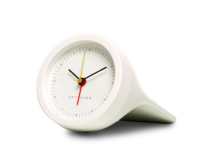
The stapler is designed by Michael Sodeau and it’s part of his Anything desk accessories collection available at the A+R store. The collection represents the first collaboration between Michael Sodeau and Japanese firm Suikosha. Each piece in this collection is $39.

Thanks to Design for Mankind for introducing me to this line of office supplies.

Images courtesy of A+R.

The Friday Five: Scenes from at Home

For today’s Friday Five, I’m taking you inside my apartment.

1. I may one of the last people to own a land line. I know. But look how cool it is!

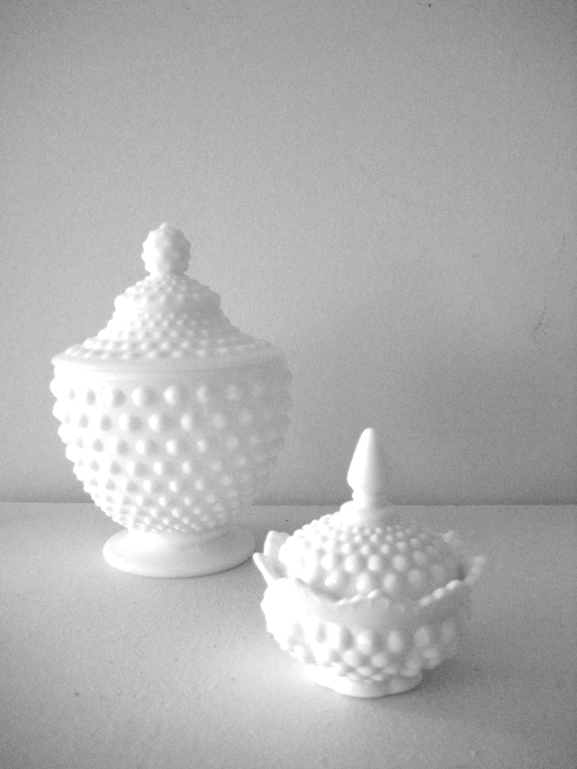
2. My milk glass collection never ends. The little one isn’t true milk glass but it’s cute.

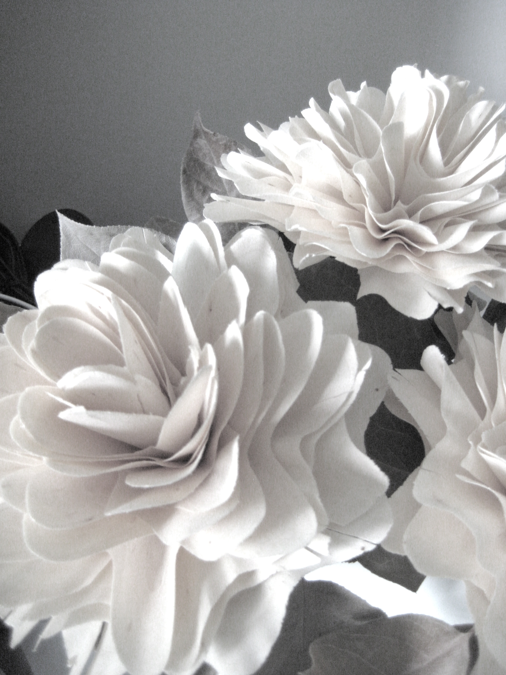
3. These flowers, carved from wood, are from Easter Island. (Thanks Corie & Jeff.)

4. My ink blots. What do you see? (Apparently it’s a trend – look at what Christian from Maison 21 posted on Tumblr.)

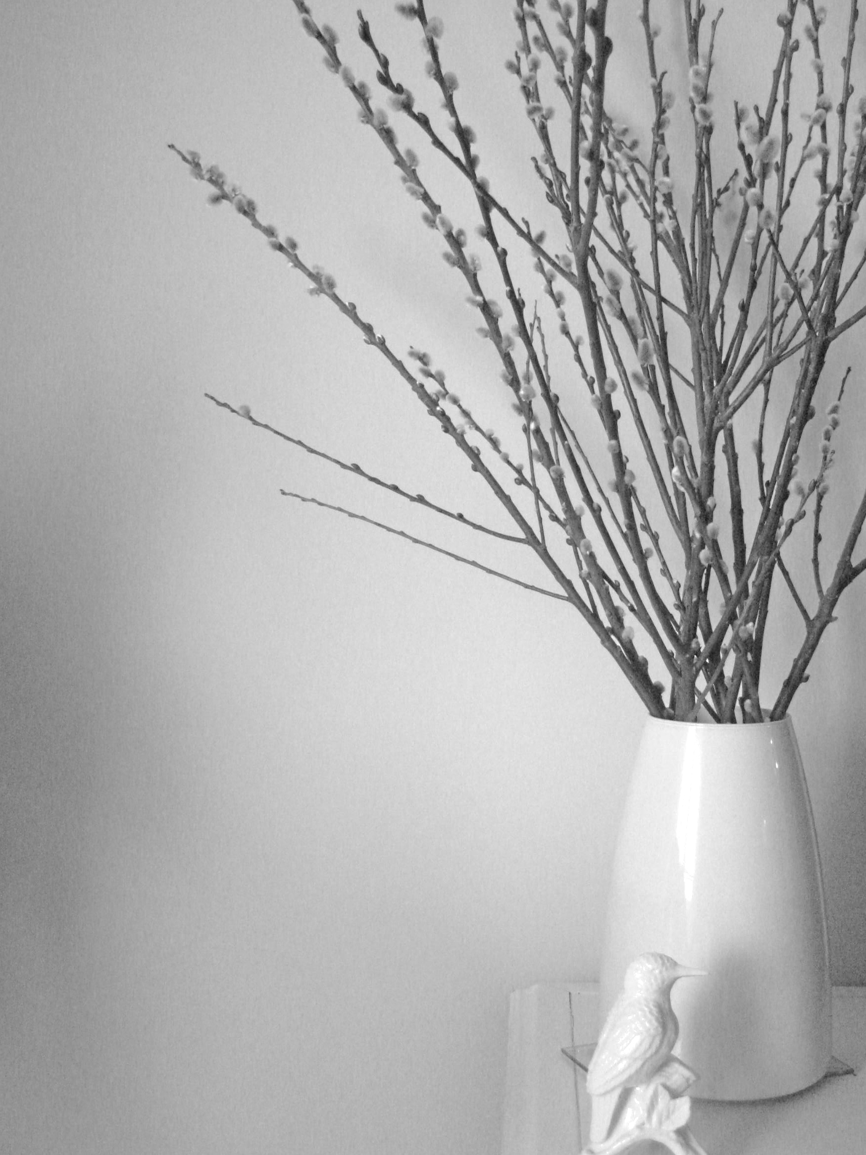
5. Pussy willow branches are so pretty. I feel like it brings good luck too. These branches are from Easter but they’re still growing!

all photos by Jordana

Thanks for coming on this very mini house tour and thanks, as always, for dropping by White Cabana!

Have a wonderful weekend!

p.s. For the record, everything in the above photos is white – except for the ink blots (black) and pussy willow (brown) – but I liked how the photos turned out in black & white.

Typography: Photocopied Hands

I remember in my younger days how I used to get a kick out of photocopying my hands (and – gasp – face) whenever I encountered a photocopier. It was so cool to see all the lines of my palms and fingers. Who’s with me?

Although the novelty wore off for me, it hasn’t for one creative graphic designer in Germany. JosĂ© Ernesto Rodriguez has taken this activity to a whole new level with his photocopied hands typography. Handschrift, as Rodriguez names it (rough translation is, I believe, hand font), is literally, handmade typography. Cool, right?

Handschrift by José Ernesto Rodriguez

The process did take some thought as Rodriguez demonstrates through his sketches.

Handschrift sketch by José Ernesto Rodriguez

I first came across Handschrift via Fast Company.

Obsessed with FIAT

Well, if you’ve been following me on Twitter then you are already aware of my new found obsession with the FIAT 500. (Thanks to Caroline from Paloma’s Nest for getting this obsession going.)

Now, let’s be honest, I’m not really into cars. I don’t really like learning about them, I don’t remember makes/brands/model numbers and as far as car maintenance goes, well, let’s just say that I’ve got car washes under control.

I currently drive a Jeep and it’s the only car I’ve ever had. I really, really, really love it. But, now it’s getting old and it might just be time for me to invest in something smaller and more efficient.

In comes the FIAT 500.

FIAT 500 Pop

FIAT 500 Sport

FIAT 500 Lounge

The FIAT 500 made its début in North America just a few months ago. Founded in Torino, Italy, FIAT has been designing and manufacturing stylish and efficient cars since 1900. The concept behind FIAT was to design a car as beautiful as the hills, towns, and coasts it was built to explore. In 1957, the Nuova (new) 500 was marketed as a city car. Dante Giacosa, its designer, described it as a scooter with a roof. In 1972, the last model in the 500 series was made and production ended in 1975.

A vintage FIAT in Abruzzo, Italy; photo by Jordana

Now, after over 35 years since production of the original 500 ended, FIAT has brought a new and improved version to North America. Hip hip!

This zipity zip car just might work for me. The differences between the three models (Pop, Sport, & Lounge) don’t look to be much of a big deal (for my untrained eye, anyway) so I’d be happy with any of the three. I’ve rented Fiat cars on many occasions in Europe so I already know I like driving them. Not only that, it’s Italian. Need I say more?

FIAT rental cars in Italy and the Canary Islands (1. Panda, 2. Panda, 3. Punto; parallel parking is so easy!)

Me: The Happy Driver

If I do ever get a FIAT 500, I’d obviously have to get all the accessories to match! How perfect that this car company loves white just as much as I do! I think it might be a match made in car heaven.

First, I would get a tumbler for my latte. There are cup holders galore in this little car so maybe I’d have to get two – to treat my passengers to an authentic Italian beverage.

Ceramic tumbler, $18.95

I would use the FIAT pen to write down my grocery lists and driving directions.

FIAT Mokina ballpoint pen, $150.95

I’ll need this tote for my groceries. Wouldn’t my pasta, tomatoes and basil look good in it?

tote, $12.95

The super white FIAT watch (and the FIAT 500 car) would get me to meetings and appointments on time.
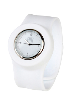
FIAT slap on watch, $24.95

Although I don’t need cuff links, I would have to get them just because they’re extra cute. I’d probably make some sort of DIY project out of them. Maybe.

FIAT 500 cuff links, $69.95

I’ll need the FIAT wallet for gas money. That’s just a given.

FIAT 500 wallet, $124.95

Now onto wardrobe. Well, first I would get some sort of cool driving gloves (but FIAT doesn’t make any). Then I would put some of the Fiat clothing into rotation – to make me feel like a hip Italian race car driver, of course.

FIAT Technical sweatshirt, $99.95

FIAT technical jacket, $174.95

And for my wee little nephews who will be passengers while I’m on babysitting duty, I would give them each one of these:

FIAT infant body suit, $12.95

So what’s stopping me? Well, it’s a major purchase. Major price tag. Major decision. Oh – and it still makes me sad to think about giving up my Jeep.

If you understand Italian, you might enjoy the videos and additional information provided on the FIAT Italy website.

In some countries (but not Canada), the 500 by Gucci is available for pre-order (if you can manage to get on the Priority List). It’s sleek and black. Click here to learn more.

For a review of the FIAT 500 from someone more experiences than me, click here.

Photos of FIAT Pop, Sport & Lounge, and FIAT merchandise courtesy of FIAT USA.

Spotlight on Areaware

New York based Areaware is a manufacturer that brings to its customers a unique selection of well-designed products. Over 25 designers are connected to Areaware and its product range, in addition to being useful, is artful, eccentric, and often humorous. Part of Areaware’s mission is to create products which inspire an emotional response and which create dialogue between people and their everyday surroundings.

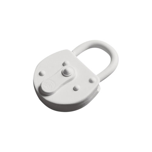
Harry Allen silicone keychain, $19

Harry Allen pill box, $12

Harry Allen bank in the form of a pig, $125

Paul Loebach candlestick, $24

Harry Allen candlestick, $50

Harry Allen peanut bowl, $35

Jonas Damon clock, $130

Areaware products are available in countries around the world. Check the store listings here.

Images courtesy of Areaware.

Etsy Taste Test

Even after all of these years I am still amazed by the unique selection of items at Etsy. Here’s the latest from my recent Taste Test search.

elephants, 35 Euros, Go Go Berlinette

egg lamp, $99, Rhan

tiered pendant light fixture, $195.99, StudioJOTA

Leentu lounge chair, $500, Lunar Lounge Design

salt & pepper shakers, $40, Kina Gorska

candlesticks, $36.95, Revisions

parchment paper snowball lampshade, 67 Euros, Nellianna

Costa del Sol porcelain bracelet, $180, MaaPStudio

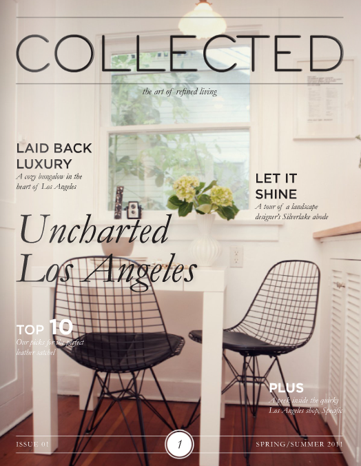
Collected: Issue 1


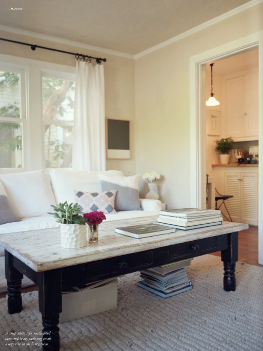
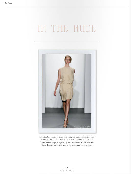
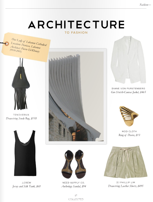
Collected, the latest design magazine to hit the Internet, highlights the art of refined living. Co-founded by Los Angeles-based interior designers & bloggers Krista Schrock (of A Note on Design) and Jessica Comingore (of Destined to Design), Collected brings to its readers inspirational interiors, carefully curated products, mouth-watering recipes, ideas for travel and fashion, and even a design history lesson. Talk about a great Saturday morning read!

Click here to read issue one of Collected.

Lonny Magazine: May/June

Lonny office

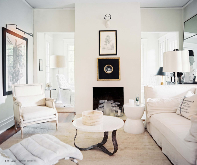
The May/June issue of Lonny went live yesterday – oh yay! I’ve been reading Lonny since its debut in October 2009 and I have yet to be disappointed.

In true Lonny fashion, the most current issue is a beautiful feast for the eyes. From the New York offices of Lonny to New Orleans to South Carolina, this issue covers lovely home, office and outdoor spaces across America.

Angie Hranowsky’s bathroom, Charleston, South Carolina

I’ve previously highlighted my favourite Lonny moments here, here and here. Today I’m sharing with you my favourite white pieces from the current issue.

Kosta Boda Cleopatra series, $300, Unica Home

Besta Burs desk, $249, IKEA

Format square tray, $39.95, CB2

McCoy Design jewelry box, $395, Barney’s New YorkParsons tower, $499, West Elm

So, what do you think? What are your top picks from this issue of Lonny magazine?

Marc Newson & the Supersized Zipper

Industrial designer Marc Newson‘s most recent collaboration with G-Star RAW has resulted in a unique collection of t-shirts, sweatshirts and pants. Striking graphic prints, bold colours and metallic finishes make these pieces worthy investments this spring/summer.

I think this white-on-white t-shirt with the larger than large zipper print is pretty cool.

Marc Newson for G-Star RAW via Dezeen

p.s. What do you think of Marc Newson’s astronaut sweatshirt?

House ring

by Johanne

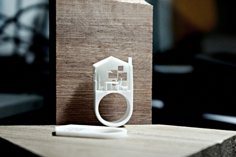
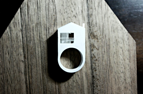
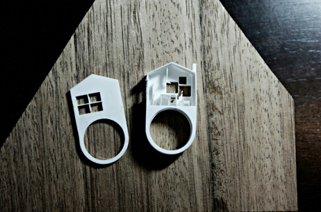
I’m quite smitten with today’s house ring by Melbourne, Australia-based designer Michael Ong of Michael Ong Design Office (MODO).

I love that the house ring is internally 3-D and if you are a miniature person, you can now live on someone’s finger. It’s kind of like living in a motor home, right?

Images courtesy of Michael Ong Design Office (MODO).

Traditional Home + Lonny

Lonny paired up with Traditional Home this month to bring us TRADhome, one very amazing online magazine. Almost 350 pages worth of gorgeous photography and interior design ideas. Today I am featuring some of my favourite pieces and spaces from the magazine but you can read the full issue if you click here.

Couchoid Studio sofa, $1599

Townsend sectional, $3297, Room & Board

Isabella day bed with trundle, Ballard Designs

Sheesha pillow, $325, John Robshaw Textiles

Incanto lace large cake stand, $203, Vietri

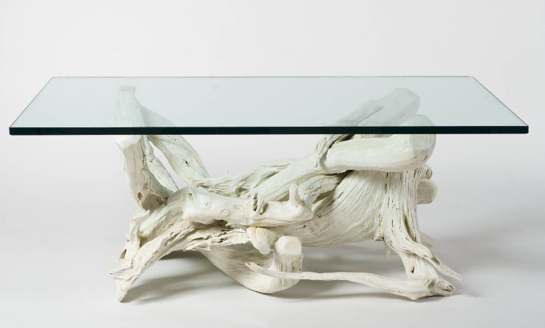
driftwood coffee table, $3355

tulip chair, Baker

kitchen designed by Jeff Andrews

bath designed by Jeff Andrews

living room designed by Tom Delavan

bedroom designed by Sara Gilbane

den designed by Jamie Herzlinger

bathroom designed by Jamie Herzlinger

living room designed by Patrick Lonn

designed by Ron Marvin

designed by Jayne & Joan Michaels

Photos courtesy of TRADhome.

Touchy-Feely Tiles: Sensory Conversations

Founded in 2006 by architects Stephanie Davidson and George Rafailidis, Touchy-Feely, is a design and consultancy firm interested on the ways our bodies interact with the architectural surfaces around us. The architects’ designs encourage physical interaction with the built environment.

Touchy-Feely’s found space tiles, relief forms taken from people leaning against walls, is one of their most recognized design projects. These ceramic wall tiles are designed in posture-specific clusters of two or more but can also be integrated into standard tiled surfaces. As Davidson and Rafailidis say, these are tiles that “reach out” to be touched.

found space tiles

Trigger points, another Touchy-Feely project, are heated wall surface elements. Why? For self-massage, of course! Again, this project encourages physical interaction between body and building.

trigger points

Touchy-Feely offers a complete service package – everything from design conception to planning to realization. For more information click here.

The Maskros at IKEA

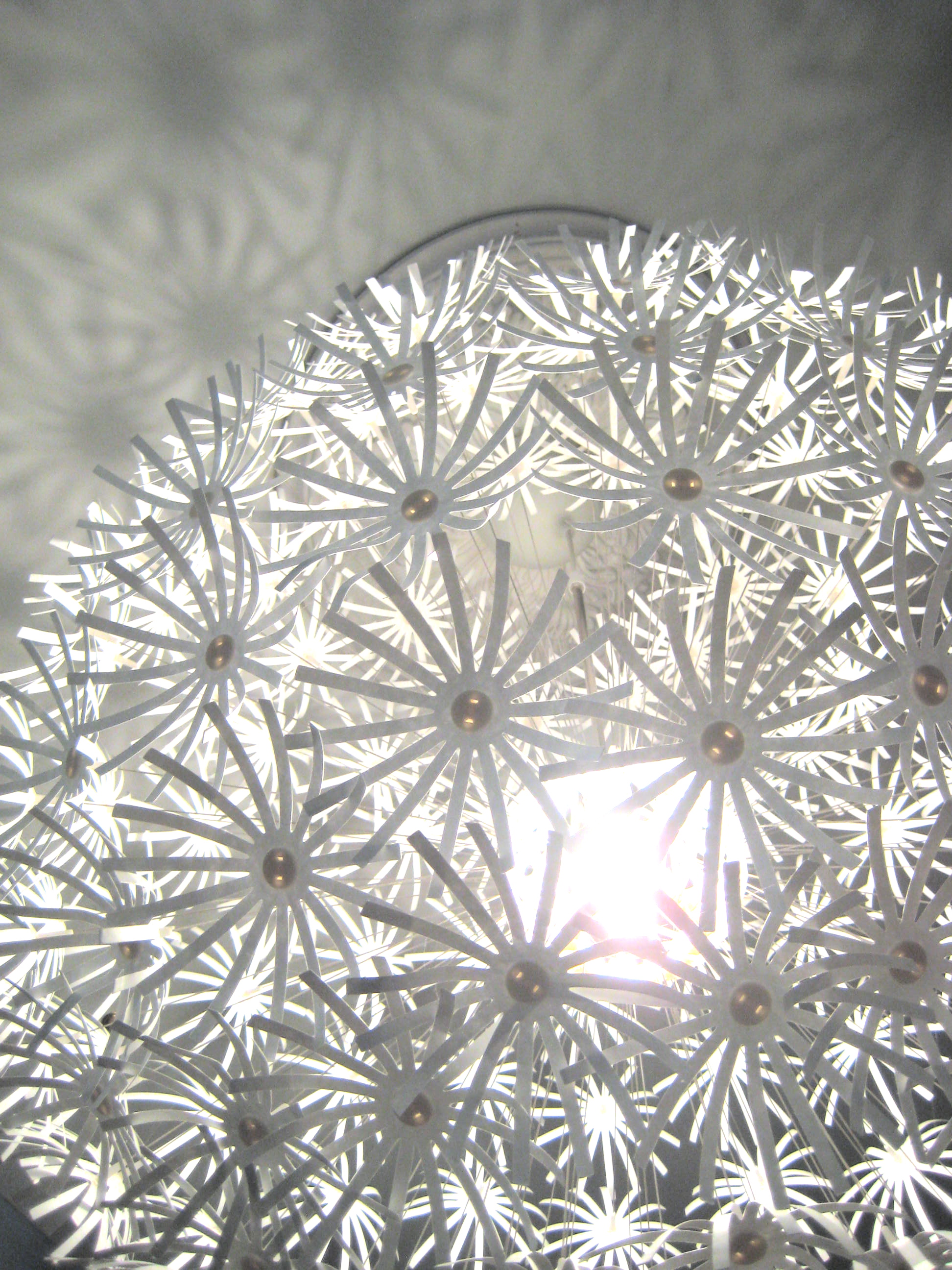
I have loved the Maskros light fixture ever since it made its debut at IKEA. I don’t have a space that’s large enough for it and I haven’t seen it in anyone else’s home…until now.

The Maskros (photo by Jordana)

A friend hung it in her kid’s room – high ceilings, loft-like space – and it looks amazing. The shadows it casts are quite cool too. We had a whole conversation about what to name the shadows on the walls…spiders, snowflakes, stars, flowers. Oh, the fun!

p.s. Maskros, in case anyone wants to know, means dandelion. Of course!

Bouroullec album

Bouroullec brothers Ronan and Erwan feature show in Bordeaux, France, until March 27, 2011

Ronan and Erwan Bouroullec are France’s hottest young designers right now.

With commissions to design for Alessi and Vitra, the brothers have made quite a name for themselves over the years. Their fun and -dare we say ‘organic’- take on furniture is light-hearted and modern.

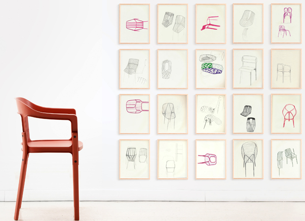
album is the Bouroullec brothers’ first exhibition in France as a duo and is currently on show in Bordeaux at the Arc en rĂŞve d’architecture until March 27, 2011. The exposition is a glimpse into the creative process leading up to today and inspiring what the future may bring from these two.

“Arranged thematically in six exhibition areas, album presents around 800 framed pieces – from documents and inspirational drawings to archive photographs – referencing everything from industrial product design to architecture.

“A key aim was to present the documents on one level, regardless of their content or the work they may relate to, and as such each visual is framed in exactly the same way regardless of whether the subject is a sketch for an item of furniture or a photograph of a finished building. The whole effect is both a unified and multi-faceted look at all the projects and approaches that coexist at any one time in their studio.”

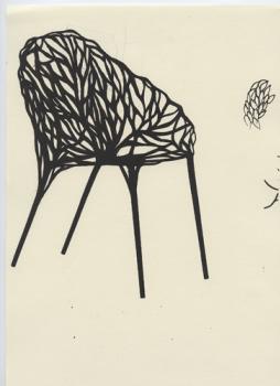
You may not instantly remember the Bouroullec brothers’ work and to help jog your memory, we thought you’d probably remember seeing this 2008 Vegetal Chair that the duo designed for Vitra (which received much acclaim and press since its inception):

Designer Spotlight: TOMA

I read about TOMA Objects just the other day in the March issue of Canadian House & Home. It was instant attraction. Designer Anne Thomas and her team make ordinary objects look extradordinary and all TOMA products are made in Montreal.

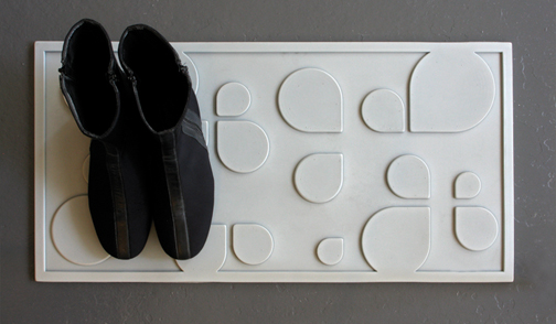
My favourite of TOMA’s current collection is the gorgeous water drop boot tray. I mean…come on…have you ever seen a more chic boot tray? I love it!

water drops bootwear mat, $45

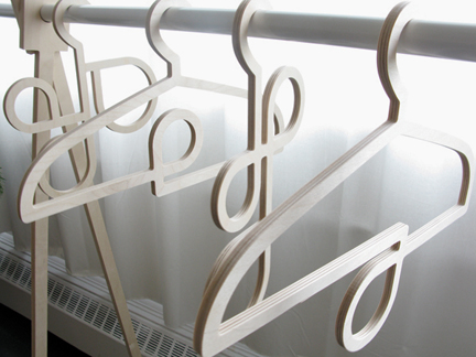
I’m completely attracted to these stylish and so very functional hangers. Scarves and accessories would look beautiful looped through the whimsical loops.

hangers, $20 each

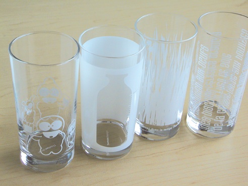
Aren’t the designs (little chap, milk bottle, grass, typo) on these milk glasses sweet?

milk glasses, $12 each

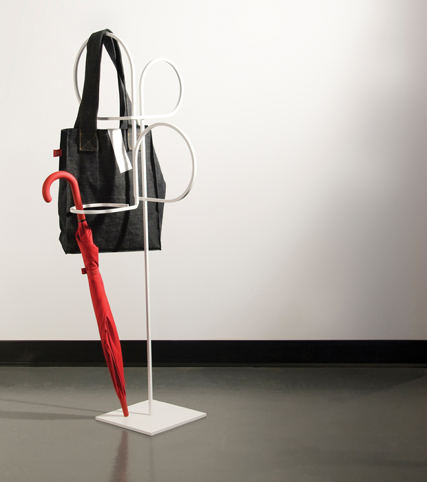
Another favourite object is the sculptural umbrella stand. It’s a beautiful and simple design and when it’s not full of umbrellas, it’s a gorgeous work of art.

umbrella stand, $250

All images courtesy of TOMA.

The Friday Five: Parzinger

I have a new love…Parzinger.

Tommi Parzinger cabinet via Shop Rago

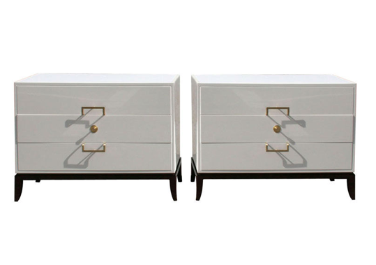
Tommi Parzinger white lacquered chests, via Todd Merill Antiques – 1st Dibs

Tommi Parzinger silver-plated serving pieces, Dragonette Ltd. – 1st Dibs

Tommi Parzinger bar, Palumbo – 1st Dibs

Tommi Parzinger side table, Metro Interiors – 1st Dibs

Now all I need to do is win the lottery!

Many thanks to Troy for introducing me to the fabulous world of Parzinger.

Table Tonic's Ikat Cushions

If you’re still swooning over Ikat, Table Tonic is worth a visit.

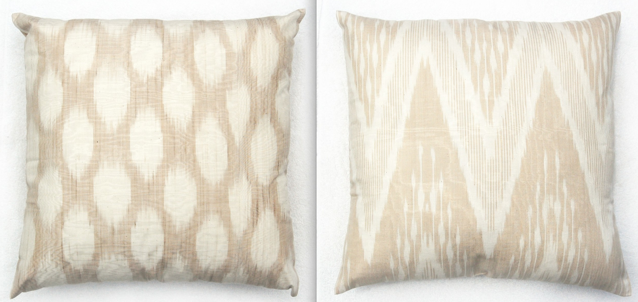
large (45cm x 45cm) hand woven Ikat cushions, $79AUD each, Table Tonic

In addition to hand-woven Ikat cushions, the Australian store continues to stock some amazing hand made vintage suzanis, Moroccan pouffes and Mexican throws in all colours of the rainbow. And right now – almost everything is on sale!


Update: I just learned that the home of Louise Bell (of Table Tonic) and family has been featured in the current issue of Style at Home. Read more here.

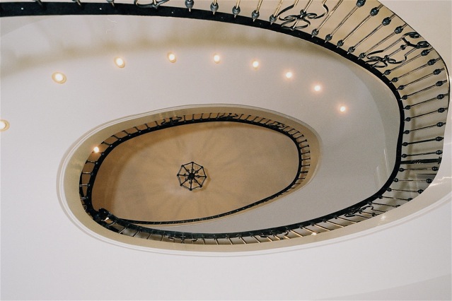
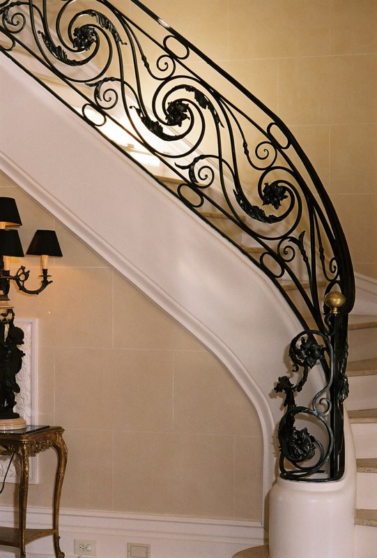
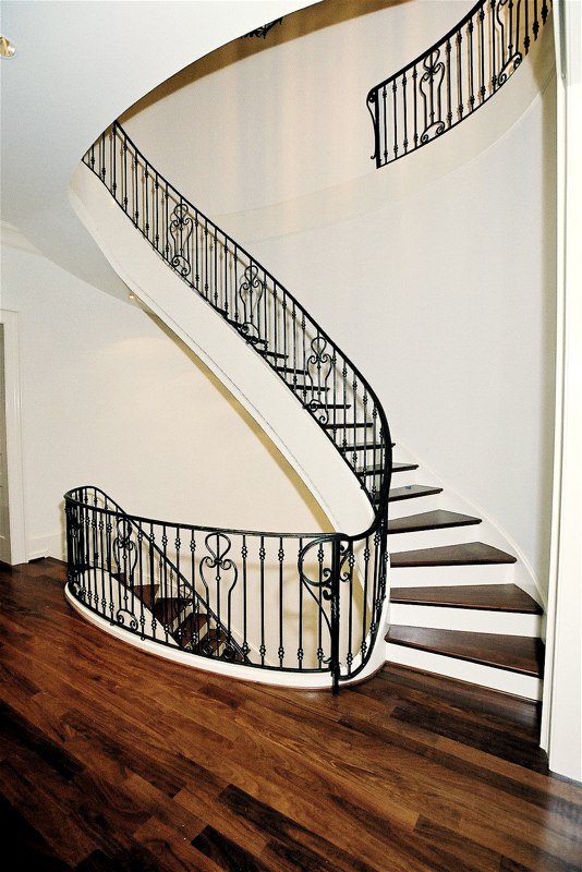
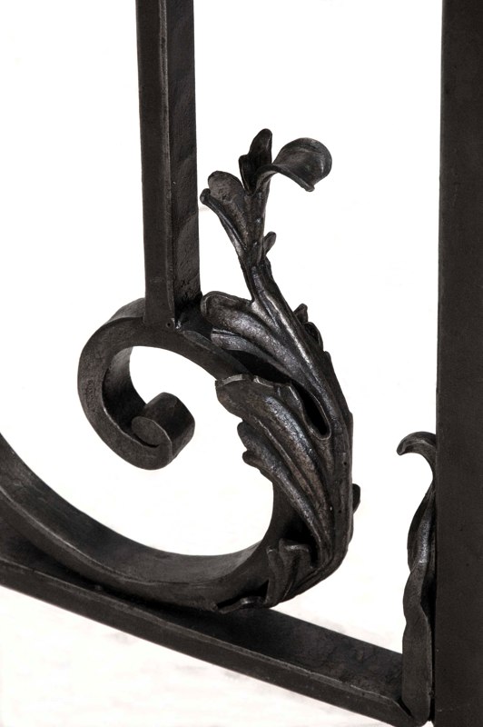
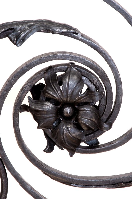
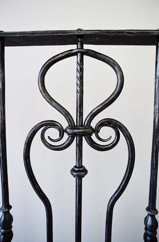
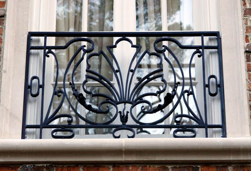
Forged Artistry: Architectural Ironwork

Forged Artistry, based in New York, makes hand-crafted iron gates, railings, doors, etc. in styles ranging from neo-classic to realist. The Forged Artistry portfolio is chock-full of beautiful iron work. I am happy to feature some of their work in white spaces here.

All images courtesy of Forged Artistry.

Deep Design

Post by Johanne

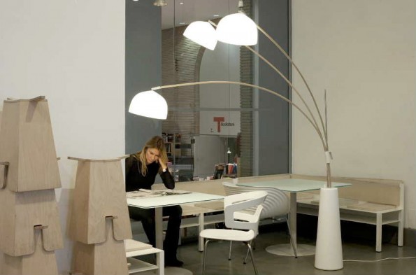
Deep Design hard at work. The Bluebell prototype floor lamp takes its name from the plant it so perfectly embodies.
In case you missed it when you were traveling in Milan last year, lucky for you, we have images of the deepdesign exhibit at the Triennale Design Museum in Italy.

The fascinating exposition is about “l’anima sensibile delle cose” (“the sensible soul of things”) and showcases six objects and an assortment of photos featuring the innovative creations by Matteo Bazzicalupo and Raffaella Mangiarotti of the Milanese design agency Deep Design.

The show’s press release explains the design duo’s philosophy and approach to commercial and industrial design: “Taking as their model the dynamics of the natural world, deepdesign’s research aims to harmonize functional complexity and formal organicism to achieve a pure one economy of the shape.”

Here’s a sampler of the Milanese exhibit:

Dandelion

Deep Design duo Matteo Bazzicalupo and Raffaella Mangiarotti with the Dandelion lamp: a thin stalk topped with dandelion-like seed puffs, light as air.

Flexica

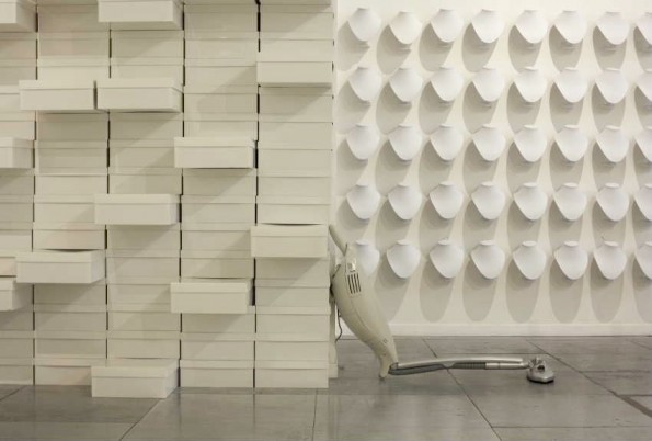
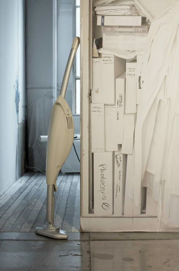
The Flexica is designed to be able to slide under low-lying furniture in the home- unlike many electric vacuum appliances that simply don't fit. The reality of our furnishings is that there isn't a lot of space underneath our chairs, recliners, and love-seats and somehow, other vacuums on the market fail to address this challenge.

Deep Design's Flexica

Pulse

The Pulse washing vessel is Deep Design's washing machine prototype based on the concept of centripetal force. The vessel is designed to keep air and water in continuous flow, and with the help of various membranes and pressure changes, the laundry gets done. When the device is in use, a light icon is activated via electroluminescence.
Flat Piano

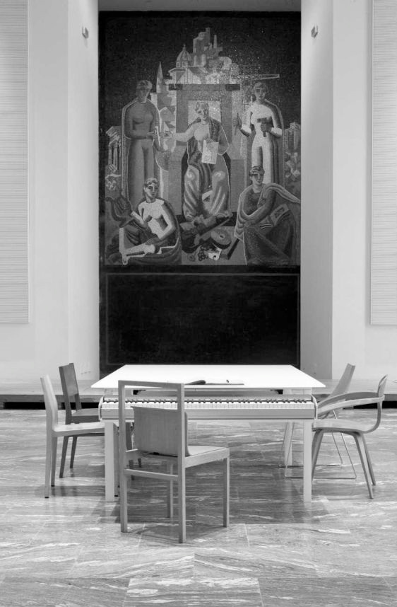
The Flat Piano addresses that interior design question of where to keep the space-greedy but beautiful grand piano in today's smaller homes. Deep Design suggests an alternative to the dining room or work table: an electronic keyboard that runs under a large glossy white top with an electronic device that acts as its sound board. When not being played it becomes a work or dining table. With built-in amplifiers meticulously designed to evenly deliver 3D sound across the surface of the table, it's practical without compromising sound quality.

Winds

Deep Design's prototype hair dryer is designed to address the hairdresser's uncomfortable posture from using typical hair dryers. Its double airflow, L-shape and redesigned internal components are also intended to direct the airflow directly at the hair for better styling while also reducing the strain on the hairdresser's arm from twisting the typical hair dryer into a 90 degree position.

Images and more information about the Deep Design exhibit prototypes can be found at Plus Mood. For more information about the Triennale Design Museum in Milan, we suggest visiting the Museum website.