A classic, inviting, and functional foyer design generally includes a bench or console with a mirror on the wall. These foyers share common elements: a wood bench/console and a large round mirror. It’s a great combo!
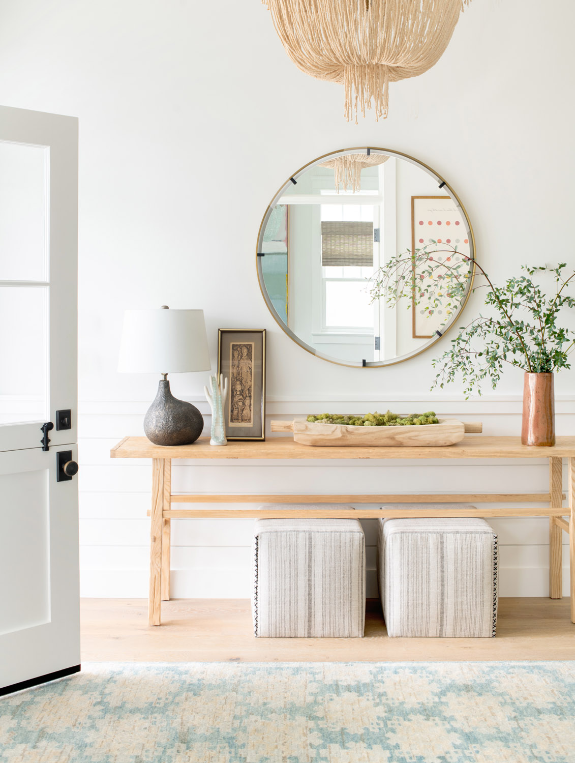
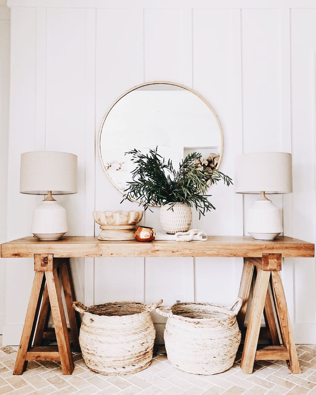
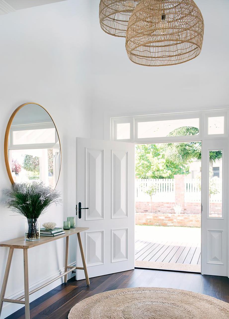
A classic, inviting, and functional foyer design generally includes a bench or console with a mirror on the wall. These foyers share common elements: a wood bench/console and a large round mirror. It’s a great combo!


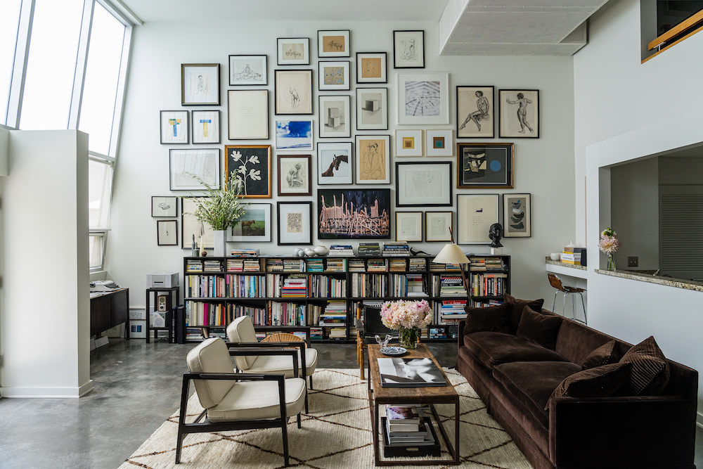
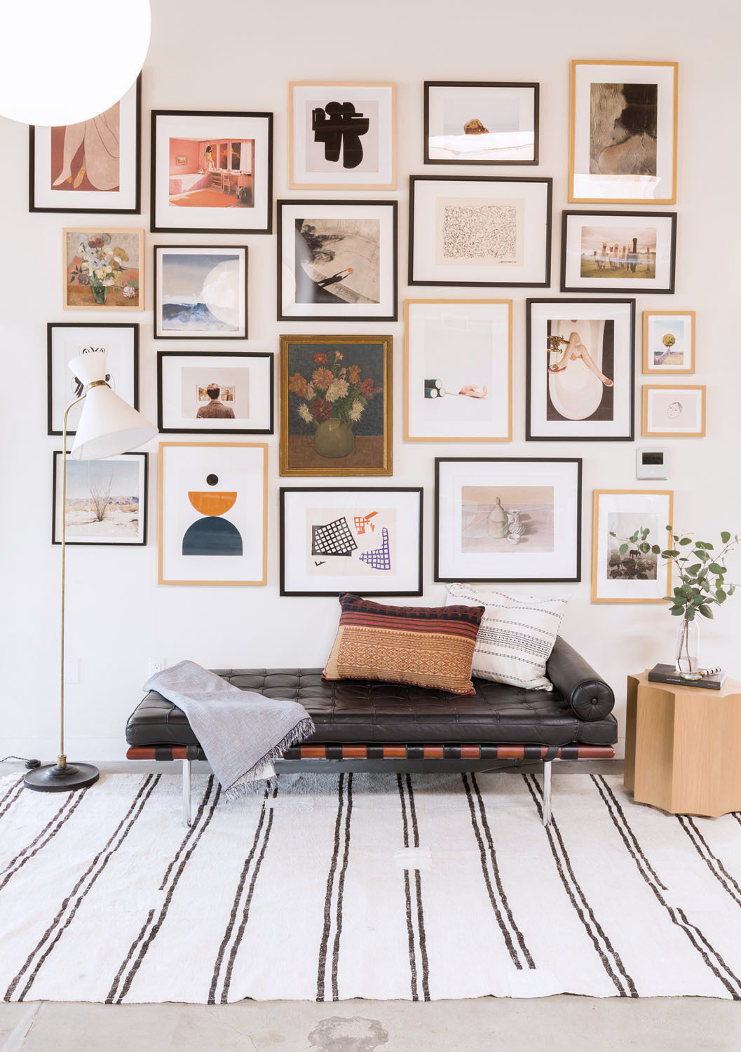
I adore Julia Leach‘s home in Los Angeles (as seen on Cup of Jo). I love homes like this one which is overflowing with books and art.
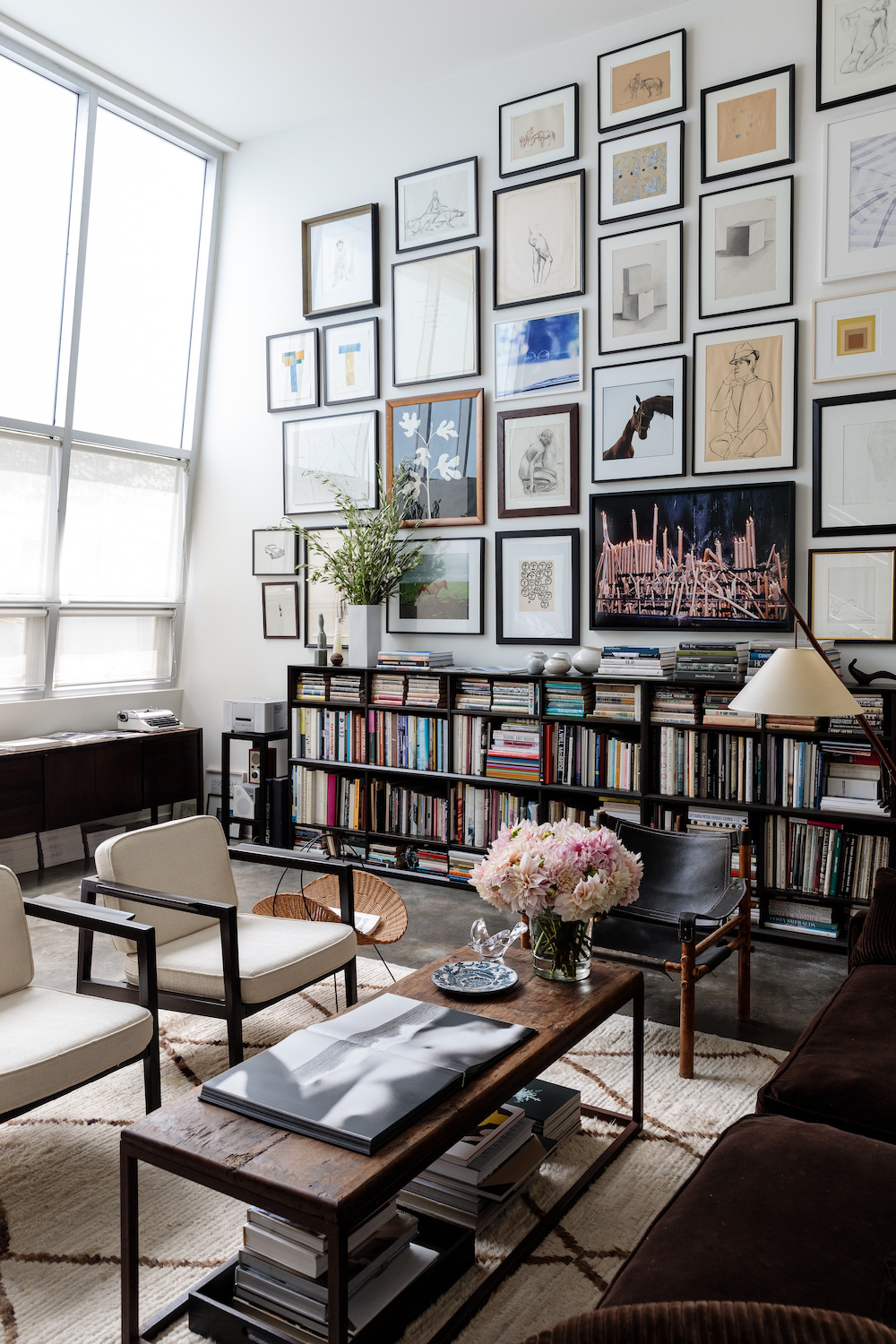
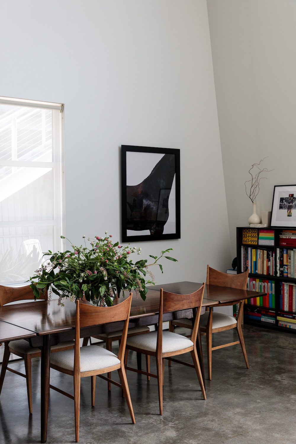
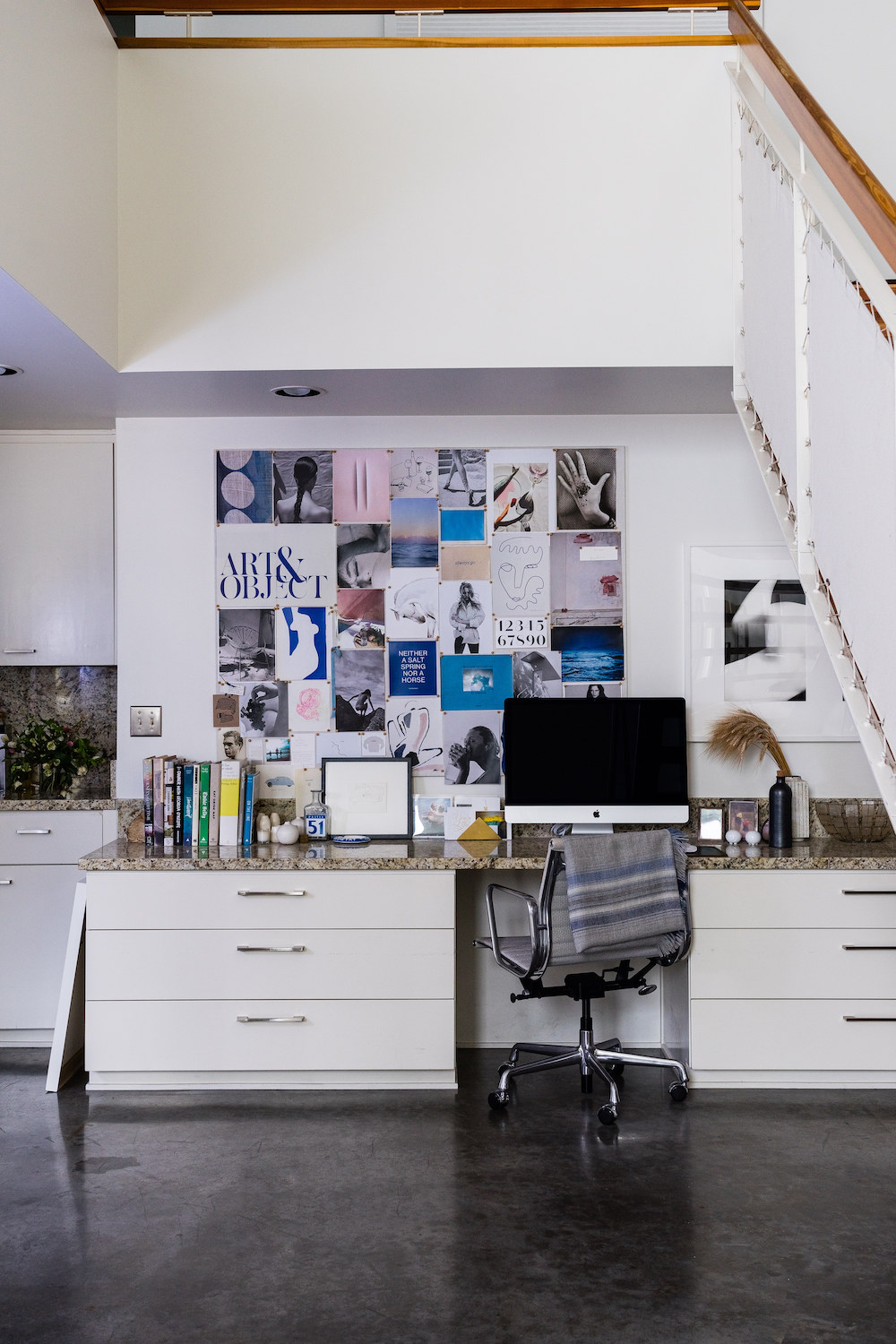
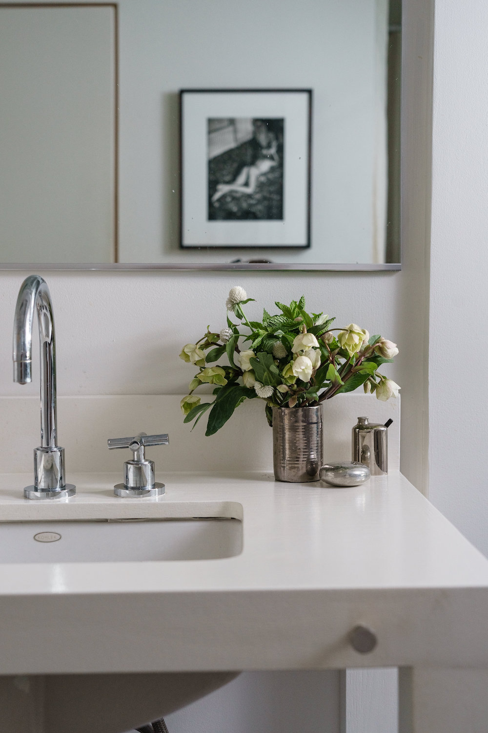
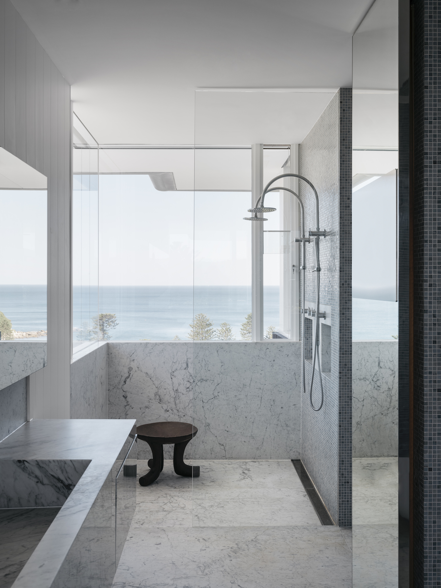
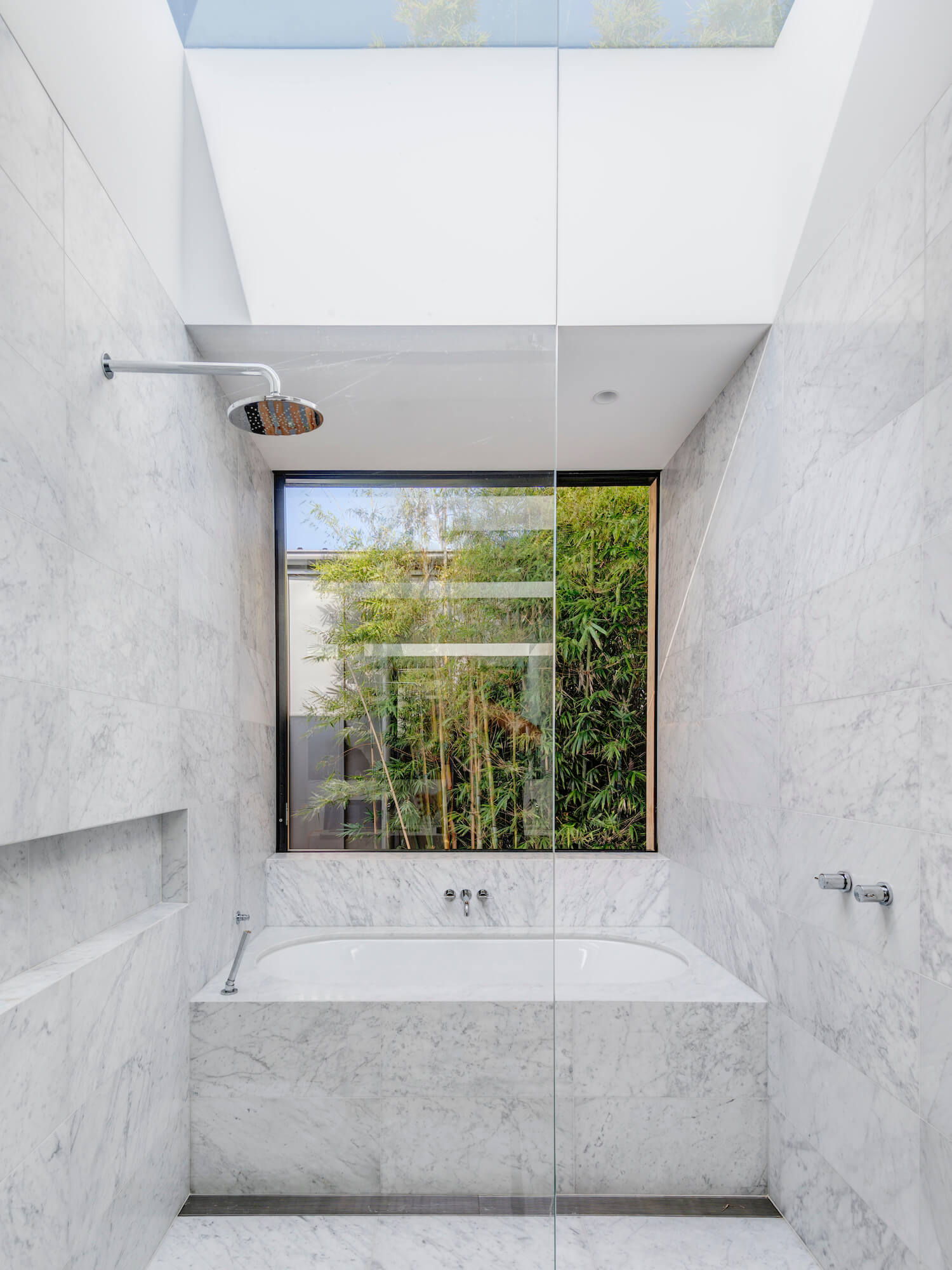
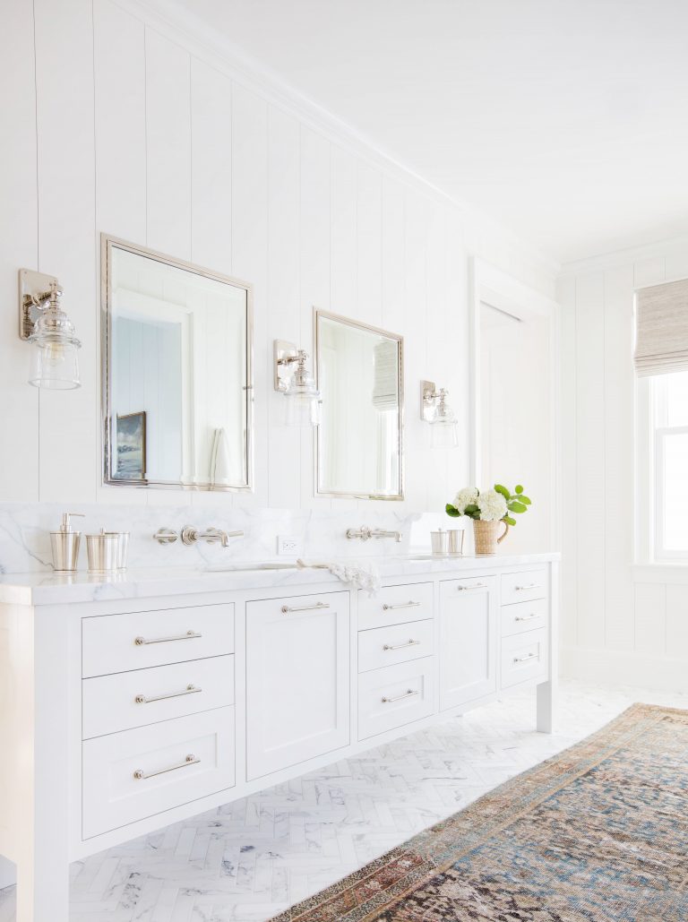
I have yet to tire of white bathrooms with lots of marble in them. If you look through my blog archives, you’ll see that I have been featuring white, marble bathrooms since I began writing about design over 10 years ago.
Large slabs of marble mean there are few grout lines and a lot of continuity. Alternatively, classic rectangular marble tiles can be laid down in a herringbone pattern (see final image below) to add more interest to a space. In my home, I have marble herringbone in my foyer and marble counters in my kitchen.
When I was in university (the first time), I spent my third year abroad in Bordeaux, France. I loved every minute of my experience there. My French improved drastically, I learned so much about the French way of living, and I met incredible people along the way. Bordeaux is a beautiful city and region. If you like wine, this is an incredible destination. The city is manageable in size, and the people are friendly (or friendlier than Paris, definitely).
I’ve only been a couple of time post-university, and each time, I have enjoyed my stay. If I get to the Bordeaux region again one day, I think I’ll have to stay at Les Sources de Caudalie. It is on a beautiful property surrounded by vineyards; it also has an exceptional restaurant and spa. And the rooms? They are unique and a pretty mix of traditional and modern.

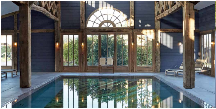
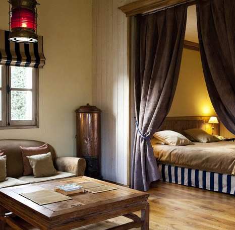
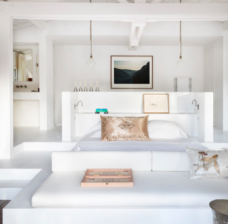
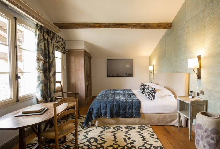
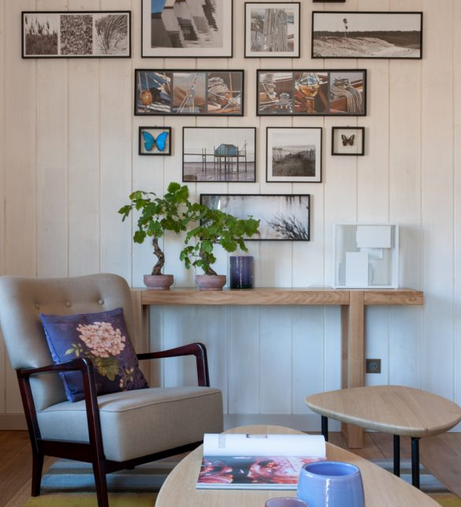
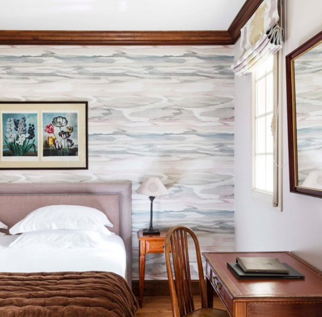
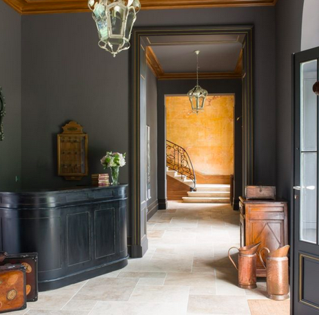
All photos from Les Sources de Caudalie. I learned about this amazing property from Daphné of Mode and the City.
I have written about terrazzo before here on White Cabana (see this post from 2018), but since it recently came up in a real life conversation, I thought it was time I bring it back up here, too.
Have a great weekend, everyone!
Do you ever go down a Pinterest rabbit hole, looking at everything and nothing of interest? Me too. Here’s what has caught my eye on Pinterest recently.
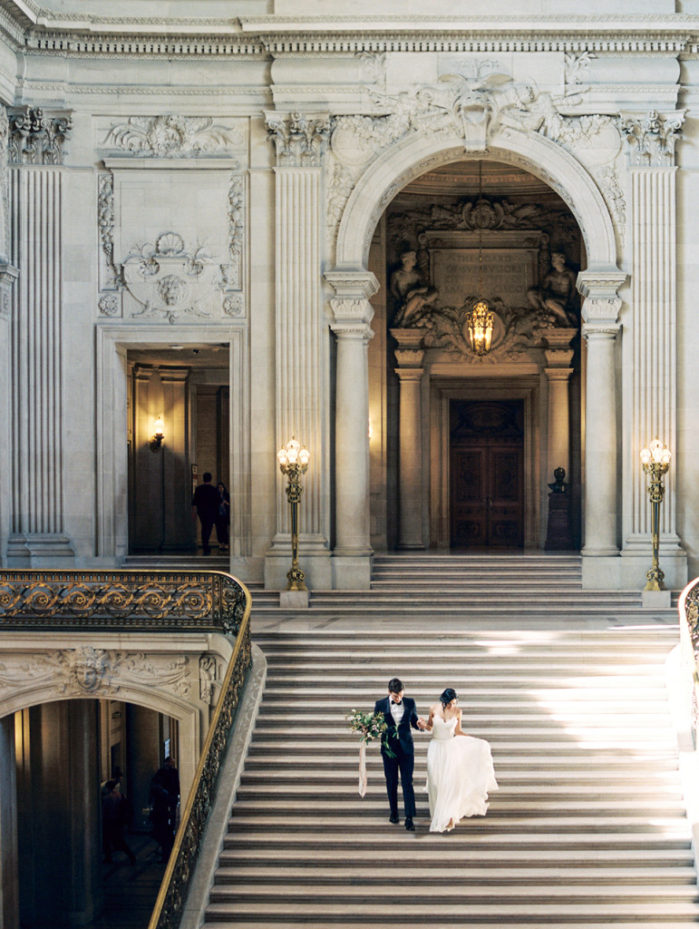
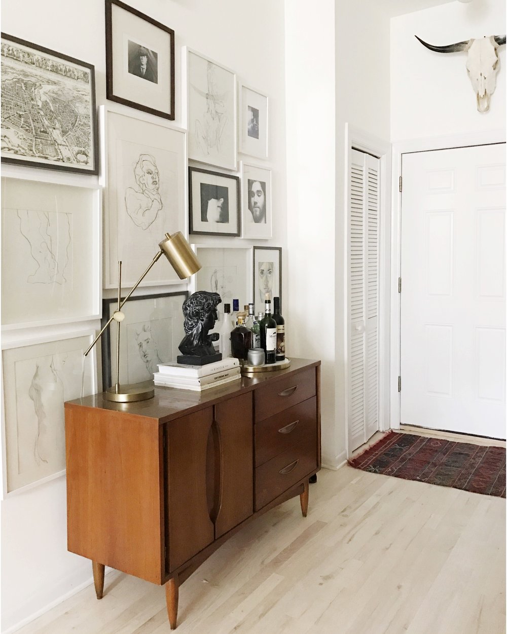
What do your Pinterest searches revolve around these days?
I’ve noticed a bit of a design trend in terms of Christmas mantel decor. What, you ask? Asymmetrical garlands! Have a look.
What do you think? I’m more of a traditionalist, so while I appreciate the talent that went into the design of these mantel, I much prefer a symmetrical garland.
My jaw dropped when I saw these progress photos from Waterloo-based designer Kendra Bester. I think I need French door hardware in my future! (Note: This hardware is called cremone.)
Here’s another look at cremone hardware in Ellen’s kitchen.
I absolutely love minimalist Christmas decor. It doesn’t take much to add some simple winter greenery to vases, candles, and wooden structures.
Maybe next year, I’ll try a minimalist design and only use my white decorations. Maybe.
We got hit with an awful freezing rain and snow storm yesterday, which meant that it was the perfect day to decorate my home for Christmas, drink multiple cups of tea, and take a nap by the fireplace. It was a good day.
The dreary day also had me down an internet rabbit hole of cozy, white cabins. I’m a cottage person more than a cabin person, but you wouldn’t have to twist my arm to stay under soft blankets and reading all day if I had a gorgeous mountain cabin of my own!
There are several elements that these spaces share: warm white tones, textured fabrics, wood accents, and fireplaces.
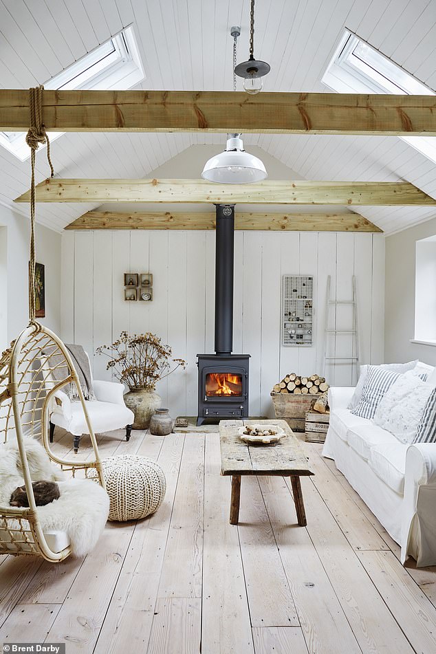
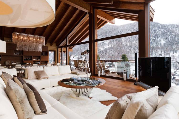
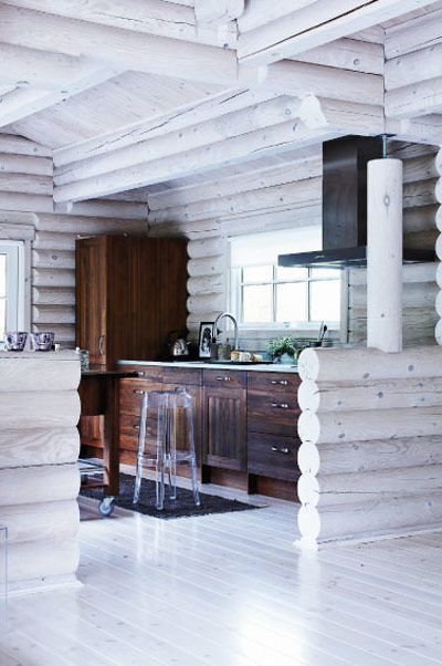
What would be your must-haves in a cabin of your own?
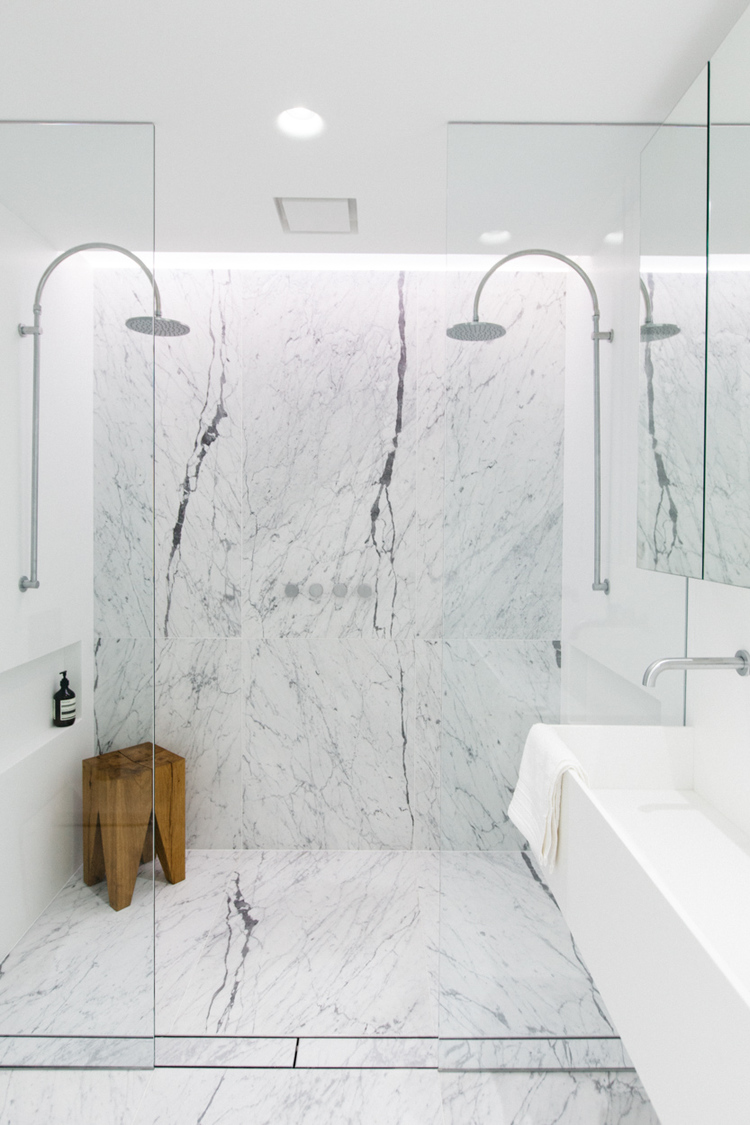
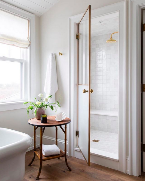
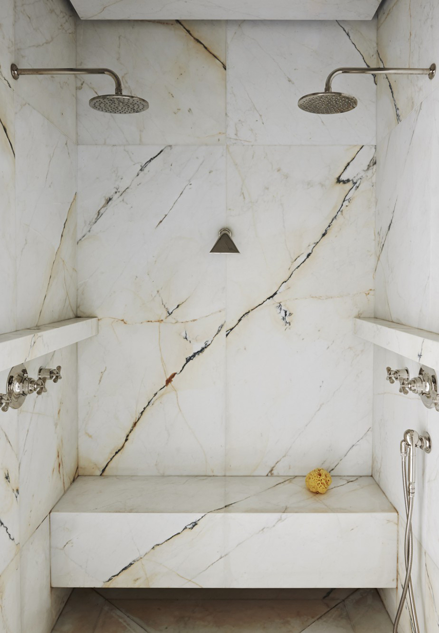
What do you get when you mix a little marble with a little shine? A gorgeous shower!
Have you followed the One Room Challenge this fall? This is an event where featured designers and guests renovate/redo/remake a room (or more!) over a six week period. The room reveals happened this week, and I thought I’d share a few of the rooms that caught my attention.
Tim (Design Maze) worked on Chris’ office and bathroom. I followed the progress in real life and listened to Tim’s plans for wallpaper, oak, and fabric. He’s a talented designer, and I love that these spaces are calm, but show off Tim’s ridiculously amazing attention to detail and pattern mixing. The millwork is beautiful in the photos and in real life.
Jen (Rambling Renovators) made such good use of the space in her guest bedroom. The room is inviting and warm. I really like the Jen’s use of large art over the desk.
Thalita (The Learner Observer) also included a desk/vanity in her master bedroom. It’s a calm and serene scene.
I like so much of the art in the bedroom makeover by Oscar Bravo Home. Everywhere you look, it seems there’s a beautiful piece of art waiting for you!
The wallpaper in This Life I Styled‘s laundry room (through an open passage area) caught my eye instantly. I like the thought that went into smaller details, too, like the baskets, handrail, and lighting
I never tire of a simple, white bathroom. This small bathroom by Designed Simple was done on a budget, and I think it looks great.
The before and after comparison of I Spy DIY‘s bathroom is jaw-dropping. This bathroom was a disaster zone pre-makeover.
Surprisingly, I also like a lot of the loud, colourful spaces from the designers. The Rath Project‘s dining room and sitting area has colourful art and fabrics (and paint, too!). Similarly, At Charlotte’s House used a lot of colour and a large mural in the dining room and living room makeover. The colours are definitely bold. And MSV Design‘s little boy’s room is sweet and the colour mixing is fun. Nicole (Making It Lovely) designed a new bedroom for her daughter, and I just love it. I really like the pattern mixing and the use of shades of pink.
There are a lot of reveals that include a lot of black paint and brown wood. Place of My Taste installed a dark, moody shower, and I love the large tiled floor. Clark and Aldine have a dark fireplace and plenty of warm, brown wood in the living room. Hommeboys, too, have a dramatic reveal of several spaces. The entryway is all black which is definitely moody
Did you follow along the One Room Challenge event this fall? Any favourites? What rooms do you like to see the most from designers?
Do you ever find yourself scrolling through 1stDibs and drooling over all the incredible, innovative, unique designs of years past? Yes? Great! I’m not alone. Recently, I was scrolling through the chairs, and I rounded up nine beautiful pieces. These are pricey, let me warn you. But they’re also not any chairs you’ll be finding at Ikea or CB2. These are investment pieces and works of art.
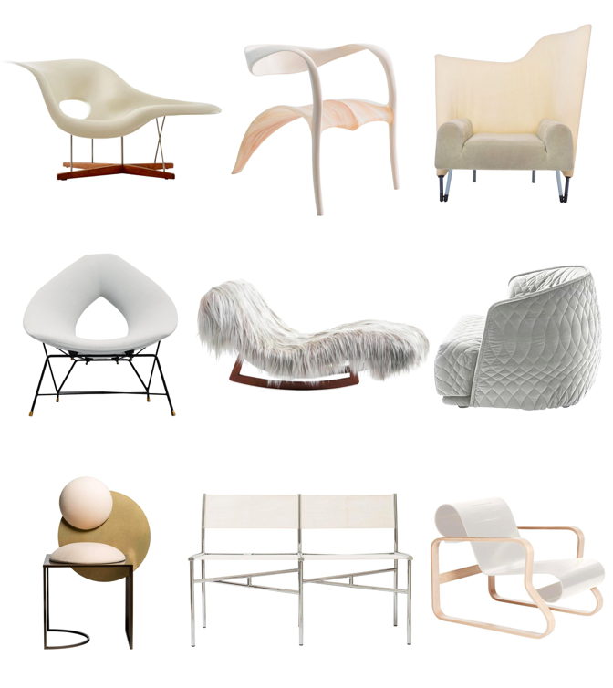
What do you think of these nine chairs? Is there one that you’d buy if money wasn’t an issue? I’d take the Alvar Aalto (bottom right) without hesitation!
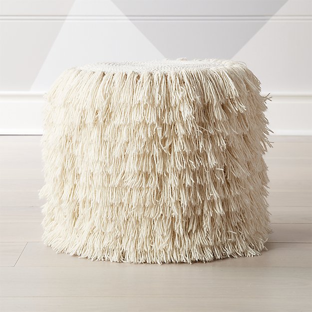
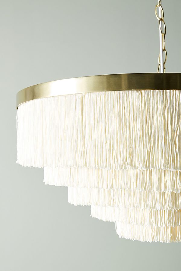
Fringe continues to be a hot trend in home decor, so here are two pieces that could add some fun texture to your home.
I think the one of the easiest ways to add a little spooky flavour into your decor is by adding bats to your walls. Wall bats are an especially easy decor option if you’re on the last-minute decor train (like me…I don’t even have a pumpkin this year!). This is an inexpensive decor strategy as you can DIY bats from black construction paper using this Martha Stewart template. It’s also not as messy as pumpkin carving. And the bats – paper or plastic – are easy to store and re-use in future years. Finally, these bats are suitable Halloween decor for inside or outside the home.
If you’re not so into bats, perhaps these skeleton flamingos are your thing. I still think they’re the best bit of outdoor Halloween decor I’ve seen this season.
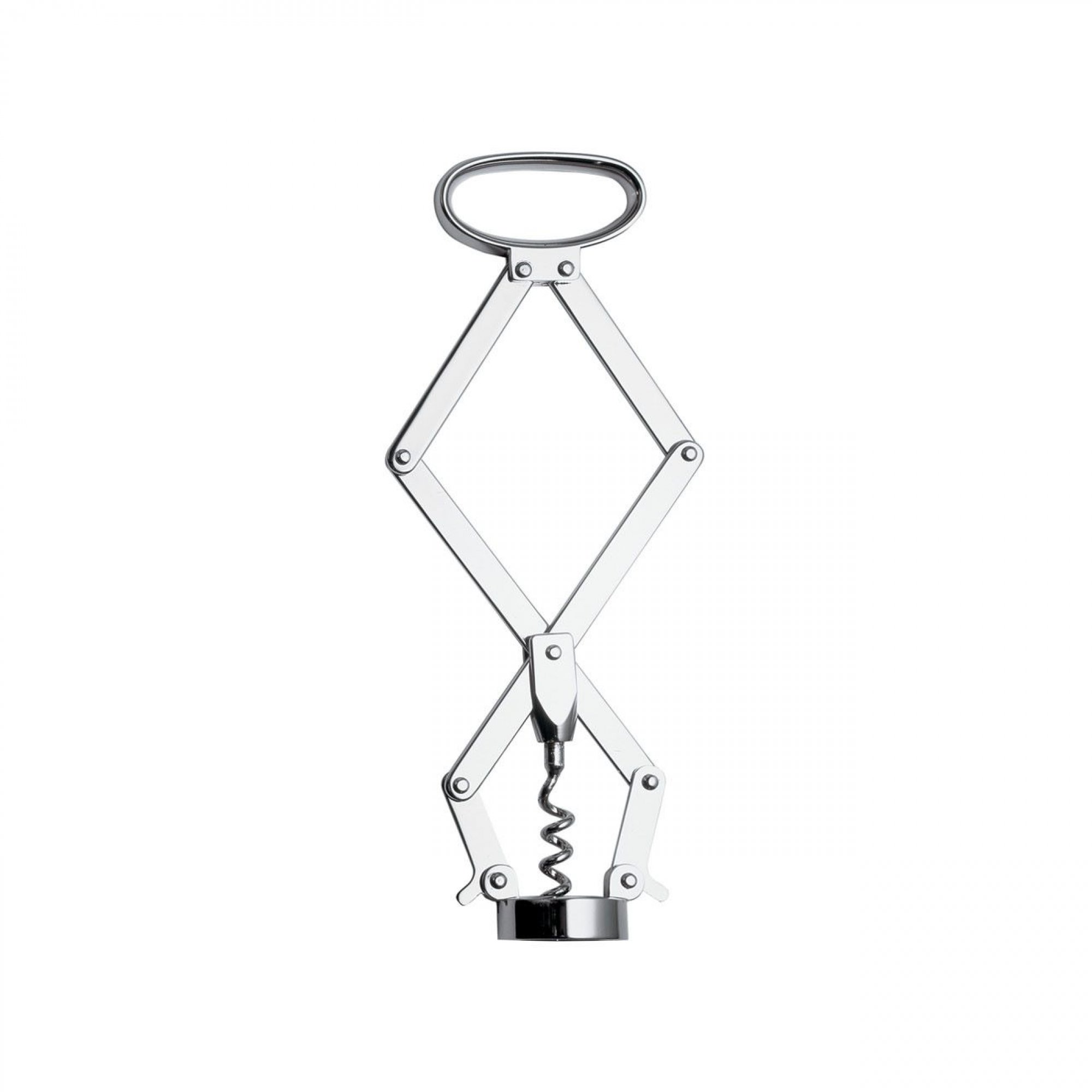
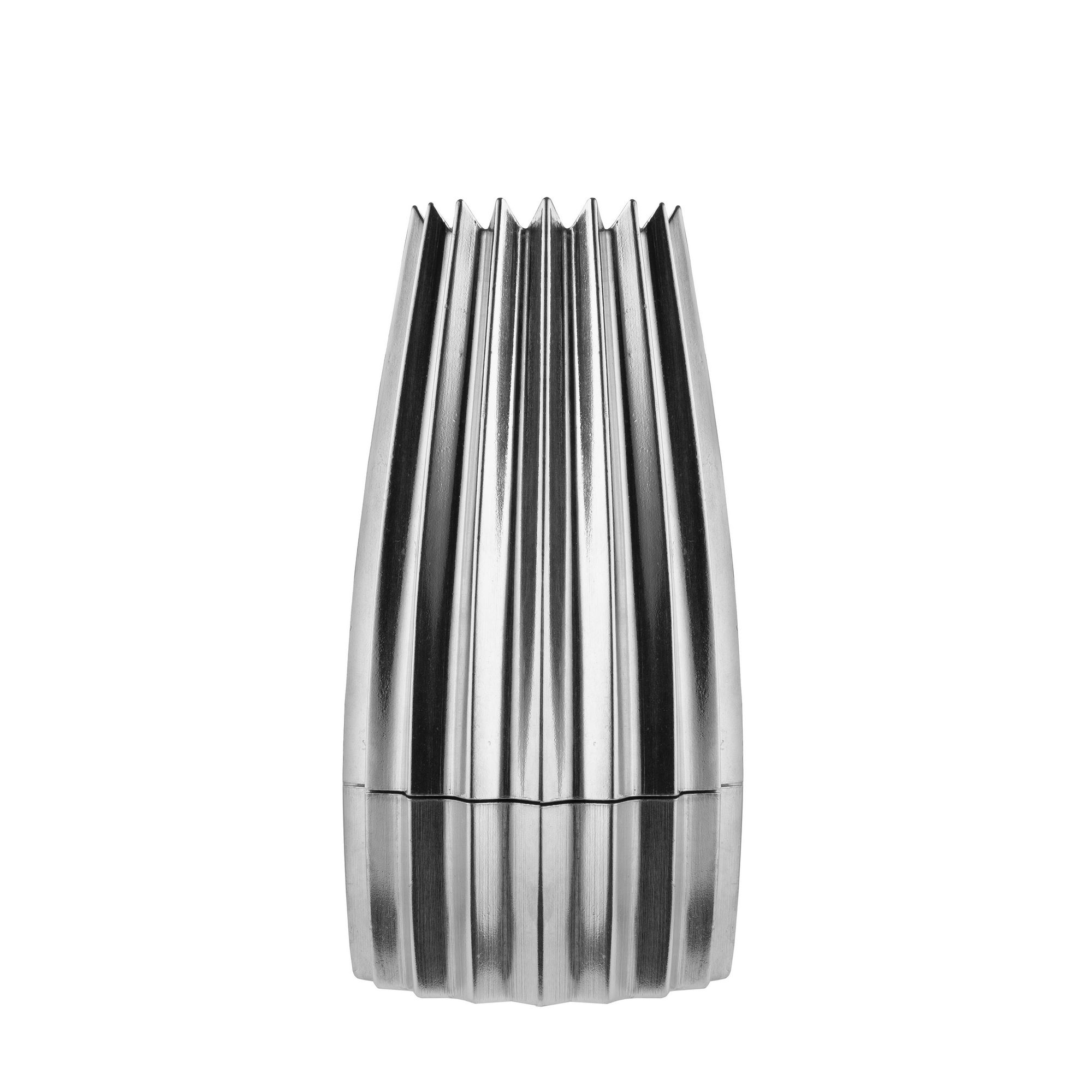
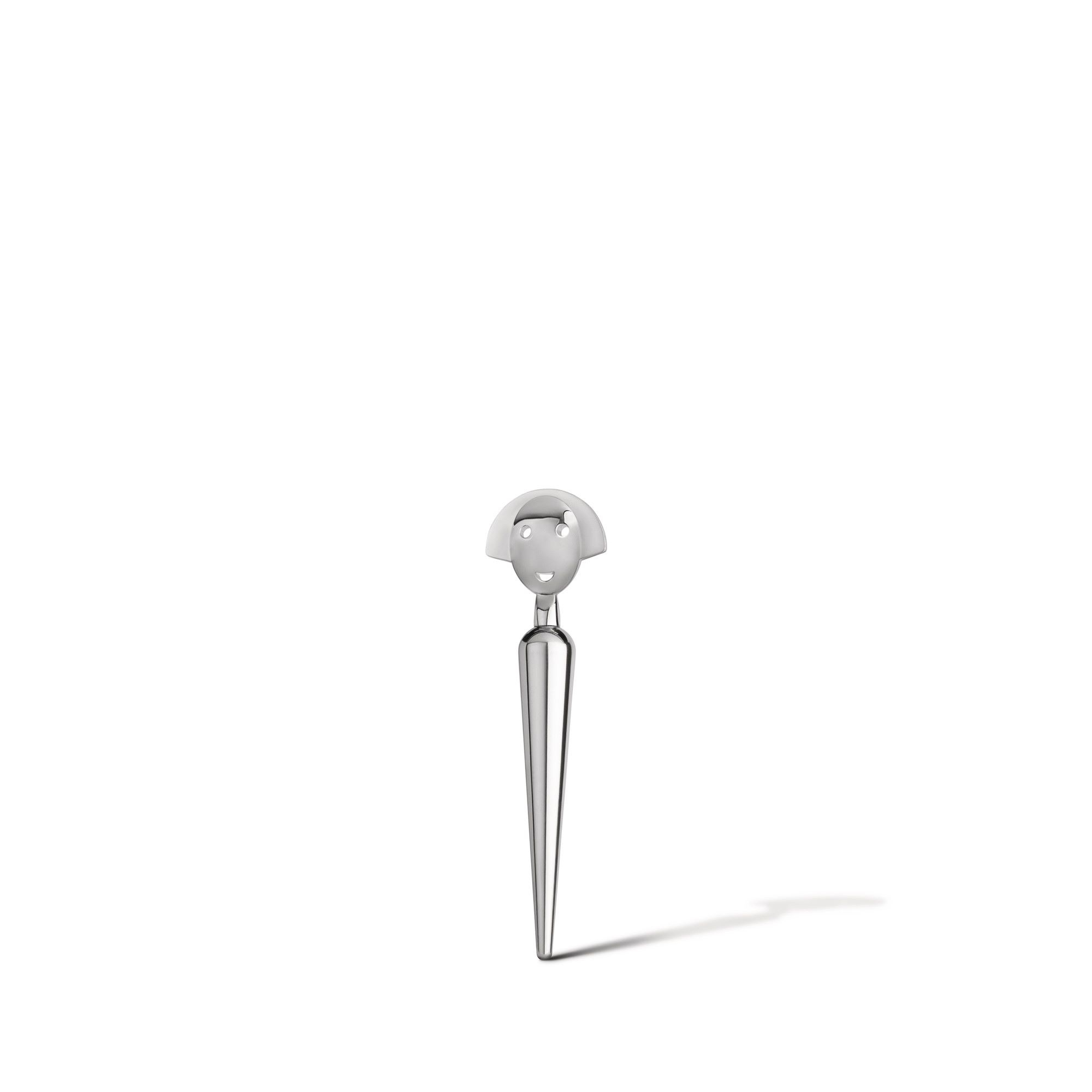
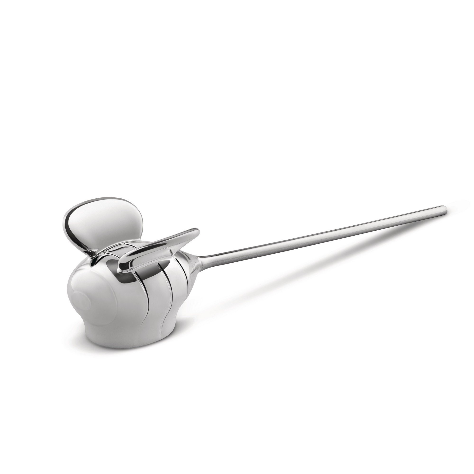
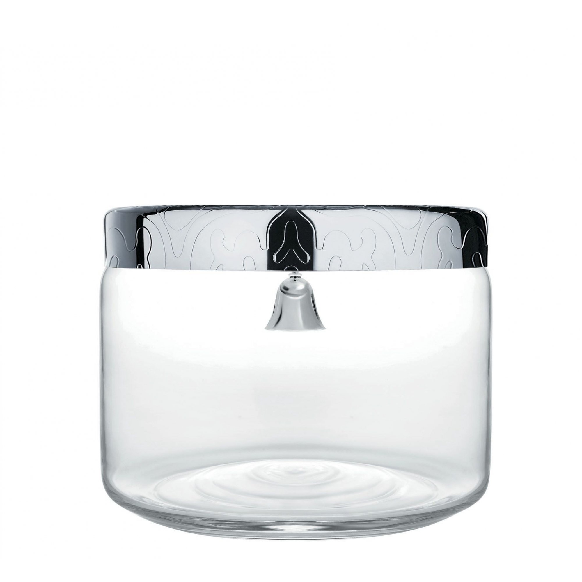
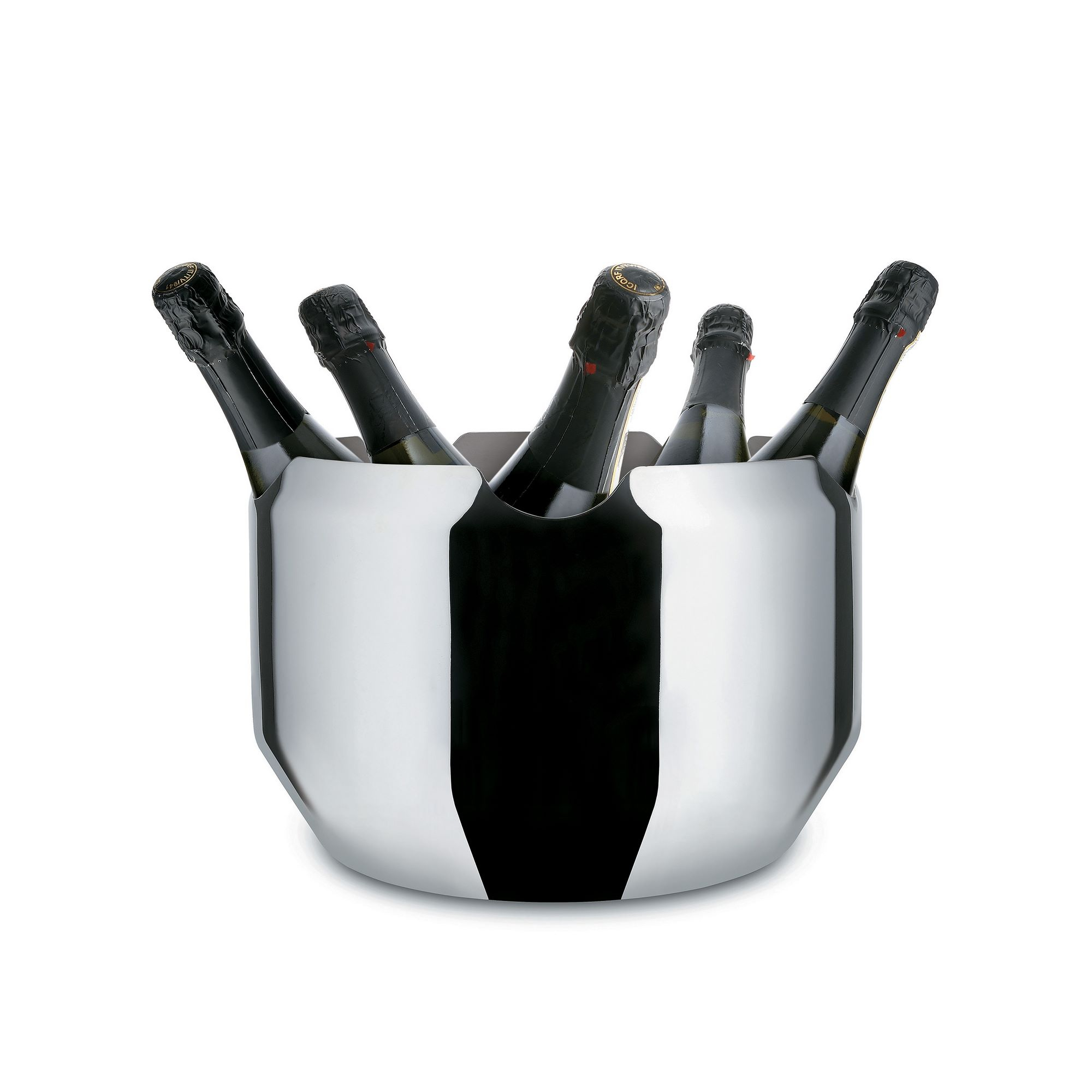
If you have read White Cabana for a while, then you know I’m a super fan of Alessi. I adore the products from this Italian brand, and my personal collection makes me so happy. My pieces are on display in my curio cabinet, but I use them regularly, and each piece is special to me because of when I bought it or who gave it to me.
I have written about Alessi several times over the years, but I haven’t in while, so today is the day to showcase some of the pieces that are holding my attention.
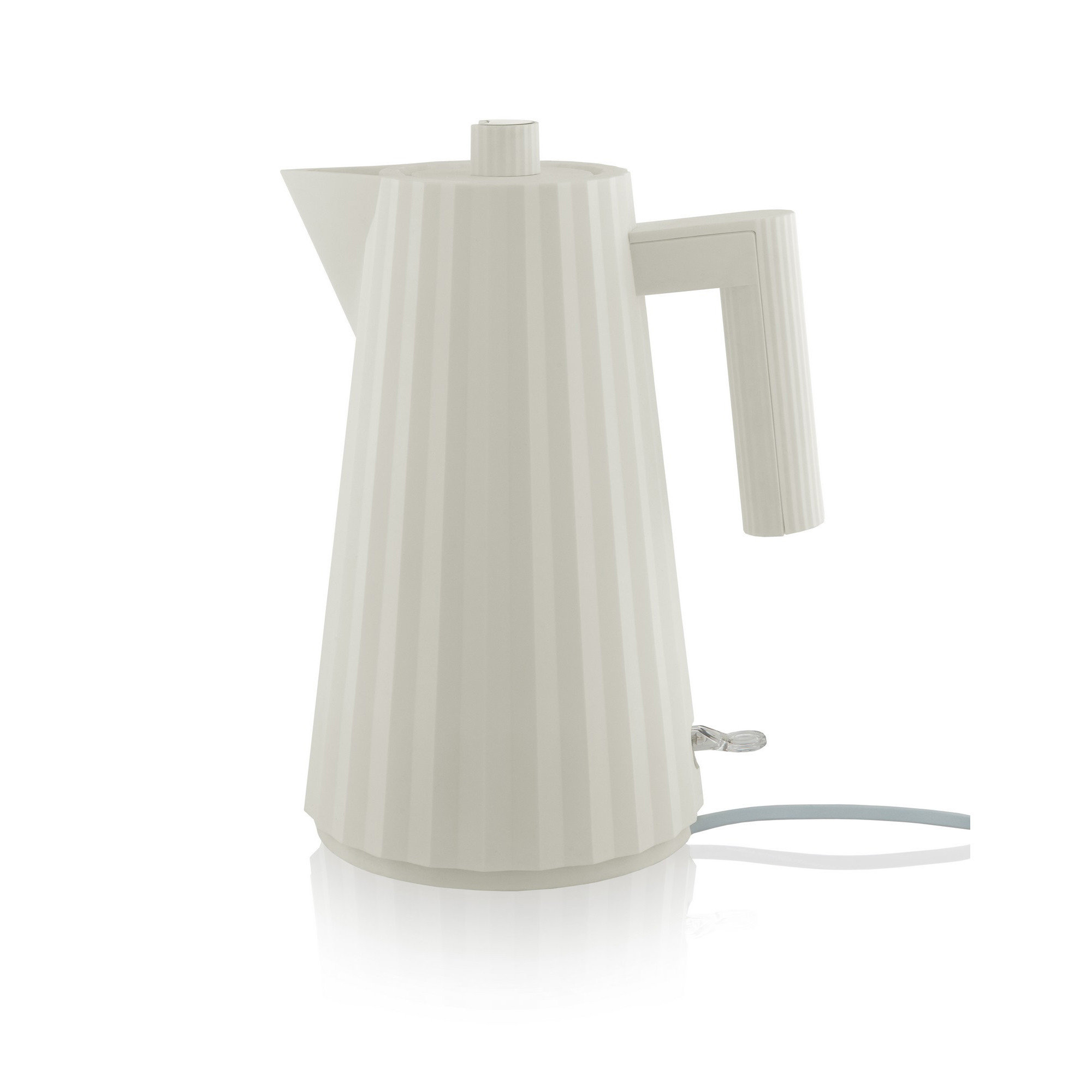
I have written about coffee quite a bit over the years of White Cabana’s history. I love coffee. The taste. The ritual. The variety. Love it all! I have been on a drip coffee kick for at least 6 months now, and my Cuisinart is working well! But I still like looking out for other interesting coffee making concepts, prototypes, and products.
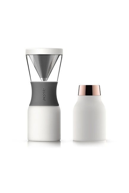
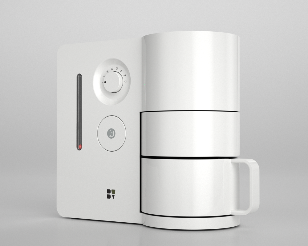
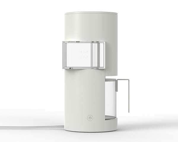
I like them all, but I really love the concept from Yu Huiyang. It combines architecture and coffee – two of my favourite things!
Have a great weekend, everyone. Happy Thanksgiving to my Canadian readers!
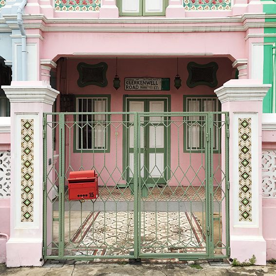
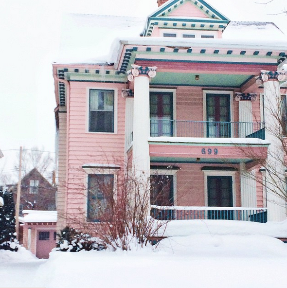
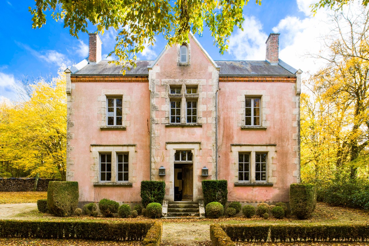
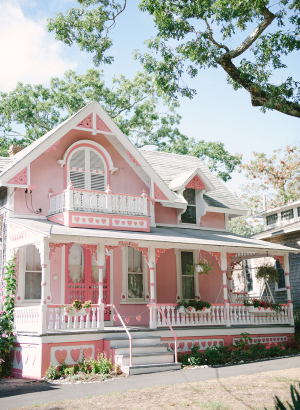
As you may remember, pink takes over some of the pages of White Cabana this month in my #WhiteCabanaWearsPink series. It’s one way that I can raise awareness and funds for breast cancer research. Last weekend, I ran 5K (I ran! The whole 5K! I surprised myself, to be honest, as it’s been a really long while since I’ve run!), and I dressed in head-to-toe pink (as did just about everyone else in the run. It’s always an emotional day, and I’m so thankful for my family and friends who supported me and donated generously. Thank you.
Today, I’m bringing pink to the blog in one of my favourite ways – architecture. These pink homes and buildings are from all around the world, and I can imagine how many people walk in and out of these beautiful buildings each day to gather, laugh, share stories, eat, and support causes that are important to them.
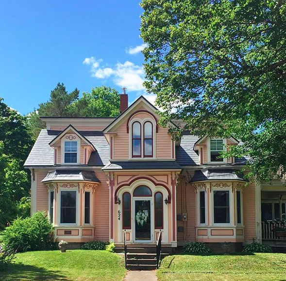
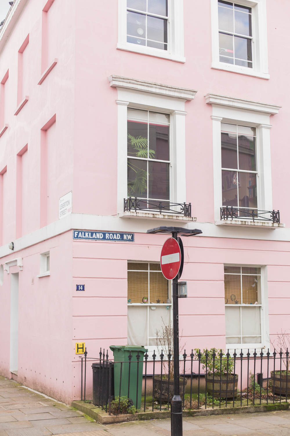
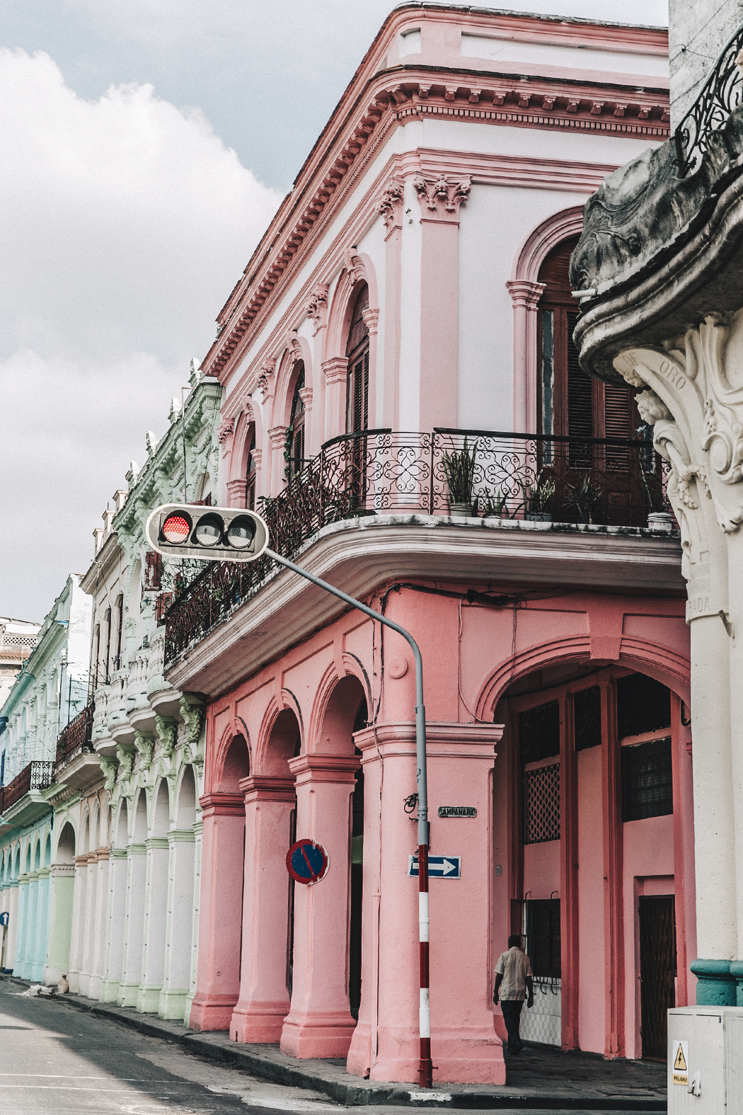
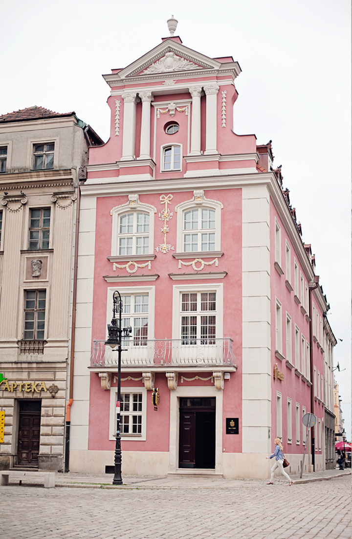
Who else has turned on the heat in their home? I tried to hold off for as long as possible, but it has been cool these last couple of weeks!
Given the change of seasons, here is today’s hot pair.
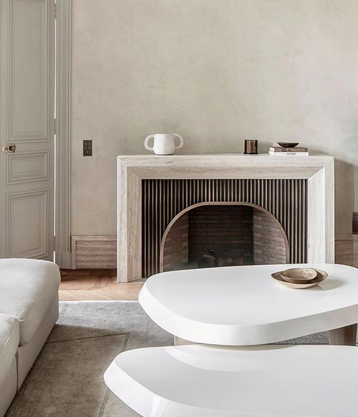
I love all the shapes in this first room. The room is balanced. The hard edges of the fireplace surround, rug, and door are balanced with the soft edges of the tables, sofa, and the accessories. The fireplace’s curved opening is balanced by the hard-edged vertical slats that frame it. It’s beautiful.
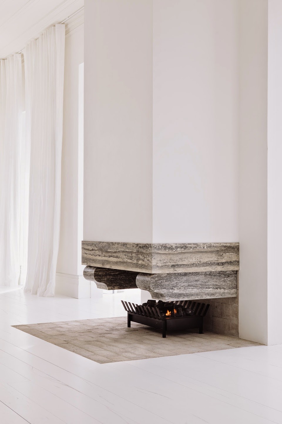
This second design is beautiful in its simplicity. The floating stone seems like an optical illusion. How does it stay up? This fireplace would heat up a room in no time since it’s open, so the design showcases a great pairing of function and form.
I have loved the simplicity of bentwood chairs for quite a long while. My parents have them in their kitchen, and they look so good. Every time I see them in cafés, I appreciate the shape. And I love them in each of these spaces, too.
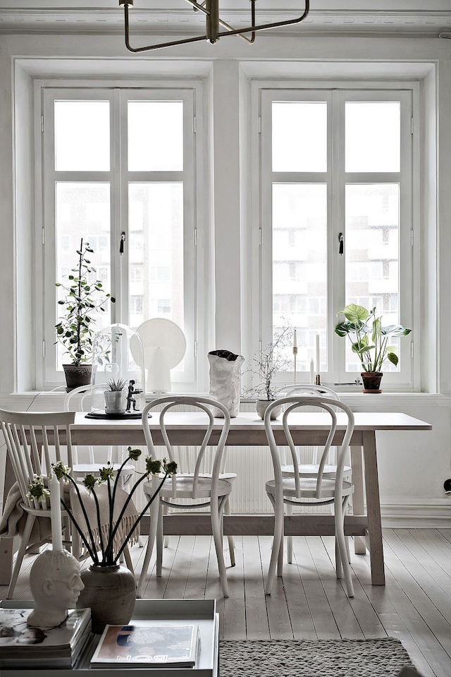
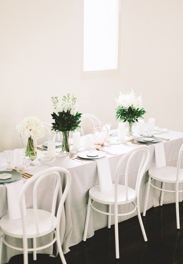
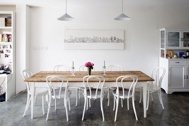
What do you think? Too simple for you or just right?
In July, when the September issue of Style at Home arrived, I challenged myself to create an even lower version than the low version of the office in the magazine’s high/low feature. Phew. Wasn’t that a mouthful? At the time, I thought that I could replicate the low office (priced at $931) into an extra low office. And I did! See what I did here.
The October issue of the magazine arrived last week, and once again, I was curious about creating an even lower version of the high/low feature. So here’s Episode 2 of How Low Can You Go?
Here’s the magazine’s high or low challenge. Take a guess!
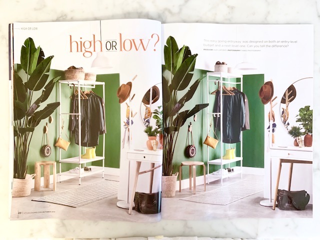
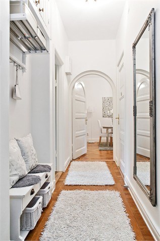
In this issue, an entryway was featured. The high version (left) was $1815, and the low version (right) was $742. They are nearly identical though, aren’t they?
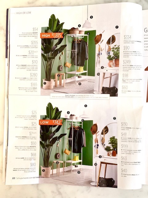
While I tried my best to find exact matches with online retailers, I have a few variations in my product choices. Read on to see the total cost of my version of this entryway design.
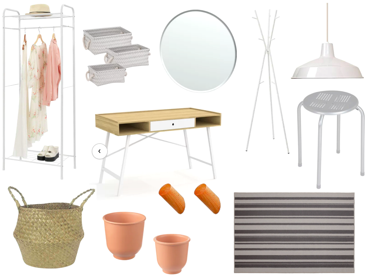
Add some plants and green paint, and this entryway is complete.
The total cost for my extra low version of the entryway is $479.23 CAD, which is $300 less than Style at Home’s low version! I find it so interesting that you can get similar items at such different price points. The two hardest items to find for my version were the wooden stool and the rug. I found it a challenge to beat Ikea’s versions and price points of these two items.
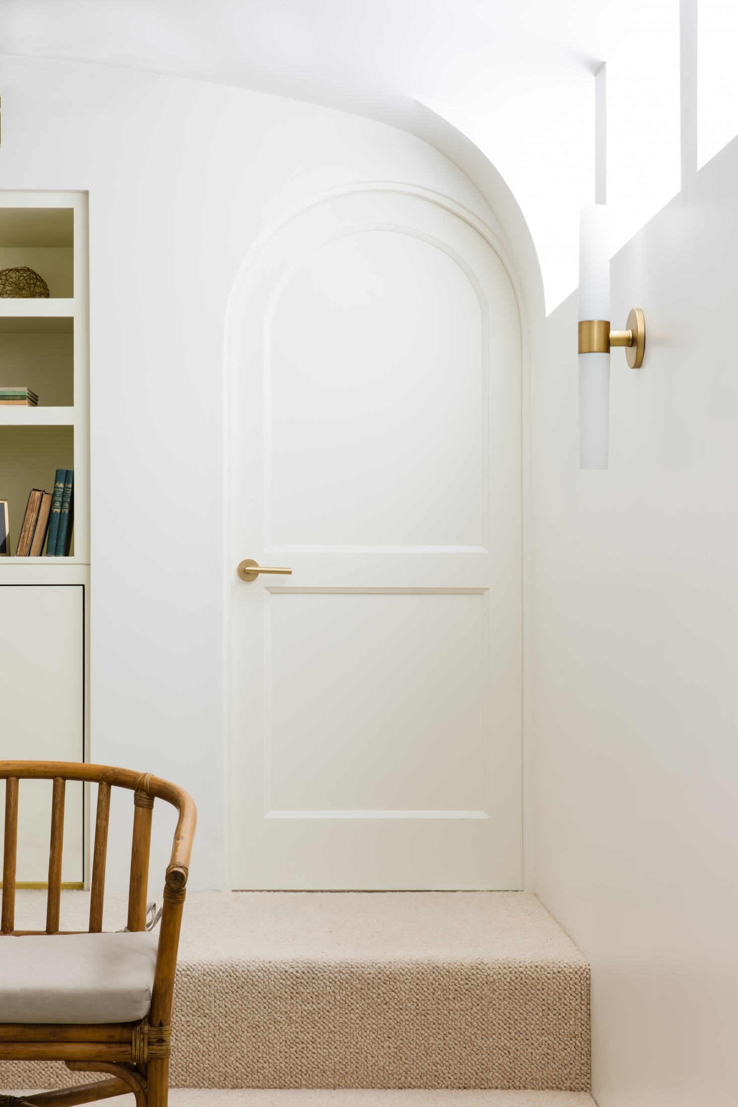
When I move to Italy or France in the future, I hope to have a place with at least one curved door/doorway. The same goes for my future potential cottage. A curved doorway would put a smile on my face.
The September issue of Style at Home magazine arrived this week, and one of my favourite features in this magazine is the high-low article. In this issue, the Style at Home team designed two versions of an office – high/low, of course!
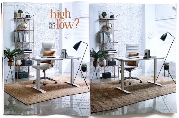
Before you scroll down, make your guess!
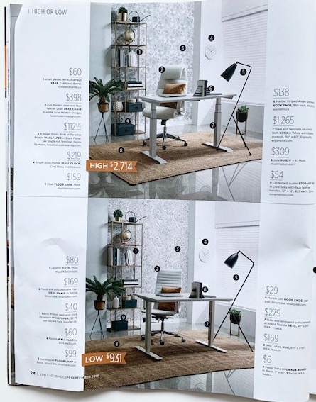
Did you guess correctly? What gave it away? The rooms are so similar, so it’s definitely hard to decipher between the two! I usually look at the lighting to help me determine which room is high and which one is low.
In this feature, the magazine writes, “We set up this chic home office on both a three-figure salary and a minimum wage budget.” You know I love Style at Home, but I have an issue with this statement. First, what’s a three-figure salary? Should it be a six-figure salary? Also, if you earn minimum wage ($14/hr in Ontario) and work 40 hours a week, your weekly earnings (before tax) is $560. Would you really then spend nearly $1000 for a home office?
So I wondered if it was possible to design a similar room at an even lower cost. When I spotted an $80 vase in the low version (compared to a $60 version in the high?), I thought I could do better. So I took on the project, and here’s what I came up with.
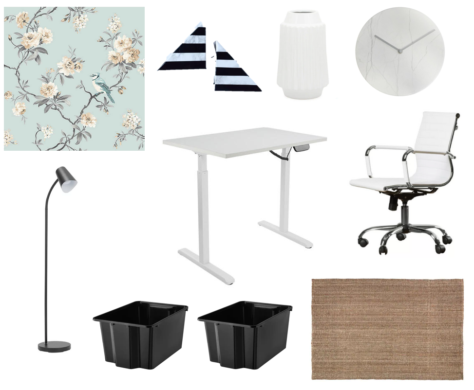
The total cost for this “extra low” version is $674 CAD. I know I could create an even lower cost version if I was shopping in actual stores (including second hand) rather than doing my shopping in online shops only. In this design, it was especially challenging to find a more affordable rug, so I opted for a slightly smaller size than the ones featured in the magazine.
I’ve been thinking about cottages for years now. I want one. I want to design one. Want. Want. Want. Yes, it’s true. I am back to dreaming about a cottage. These dreams are especially strong after spending the last two weekends at two friends’ cottages in two opposite ends of Ontario. My friends’ cottages are charming and have that cottage smell that I would love, too (not the musty cottage smell…the “come in, relax, take a load off” smell).
With the dreams, naturally, comes the design! Of course! Here’s what’s currently on my cottage design wish list.
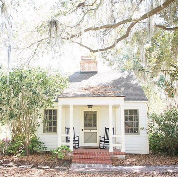
The cottage would be small and cozy. It would have rocking chairs on the porch. I’d rock there with a cup of coffee in the morning. I could be lazy since I’d be on cottage time.
The kitchen would have some open shelving for dishes, serving pieces, and art. I’m not normally a fan of open shelving, but I think it’s a good option for a cottage kitchen (or at least part of it).
I would make stacks of pancakes for guests because a stack of pancakes looks so pretty.
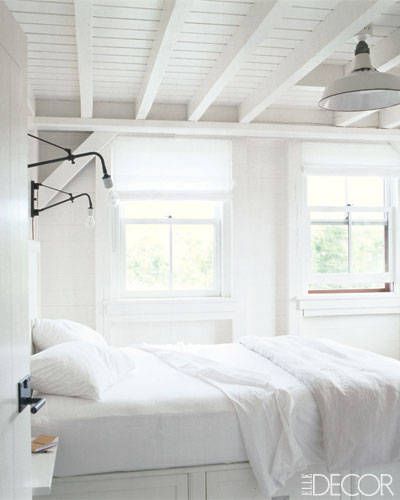
The bedroom(s) would be sparse. A bed, a nightstand, and that’s about all.
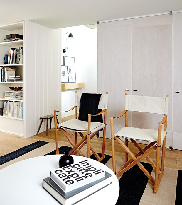
The bedroom(s) would have vintage director chairs. There would be extra director chairs in the cottage that would fold neatly for storage, but could come out for extra seating.
The living room would have couches you could sink in to with slipcovers for easy care.
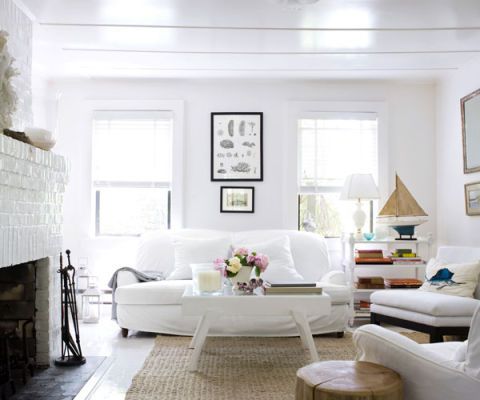
I don’t think I’d use blue as an accent colour. I’d use shades of white. Maybe grey. Even a touch of black. I’d have rocks in every shade in bowls around the cottage with white and grey paint available for guests to get creative.
Blankets would be in abundance for year-round cottage going.
And there would be a fireplace, too, for winter living.
The bathroom would be minimalist and white, white, white.
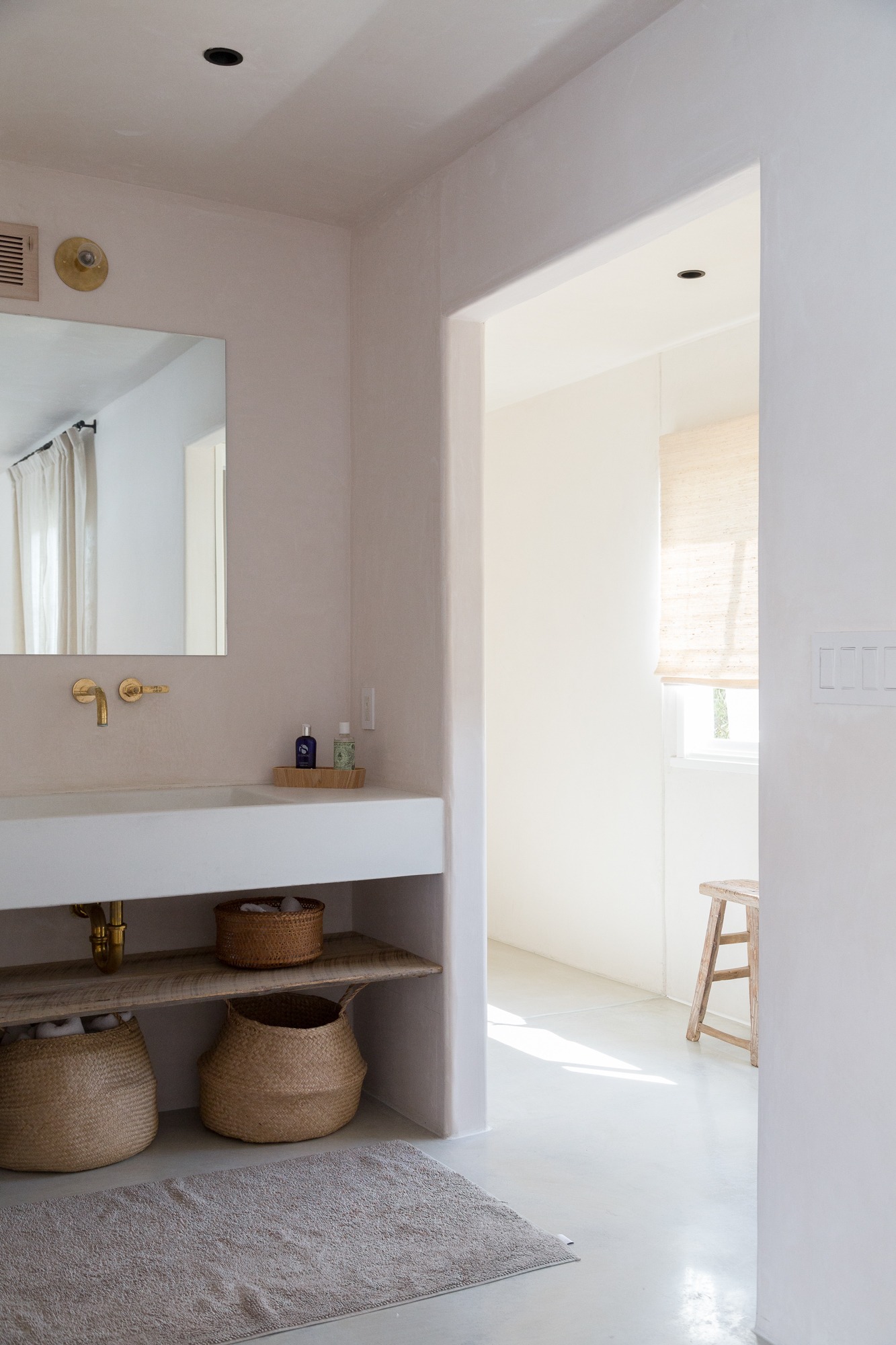
There would be wicker baskets placed strategically so I could easily grab them to load them up with market purchases or beach necessities.
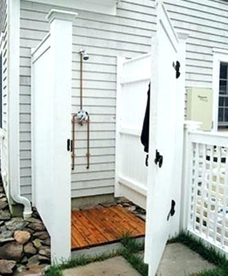
I would have an outdoor shower because it seems like the best place to wash off sandy feet.
I’d also have an outdoor hammock for afternoon naps.
Books and magazines would be piled everywhere.
And I’d end evenings with an outdoor fire.
These are just a few of the design details I’m dreaming up for my future cottage! Do you have a cottage? Do you want one?
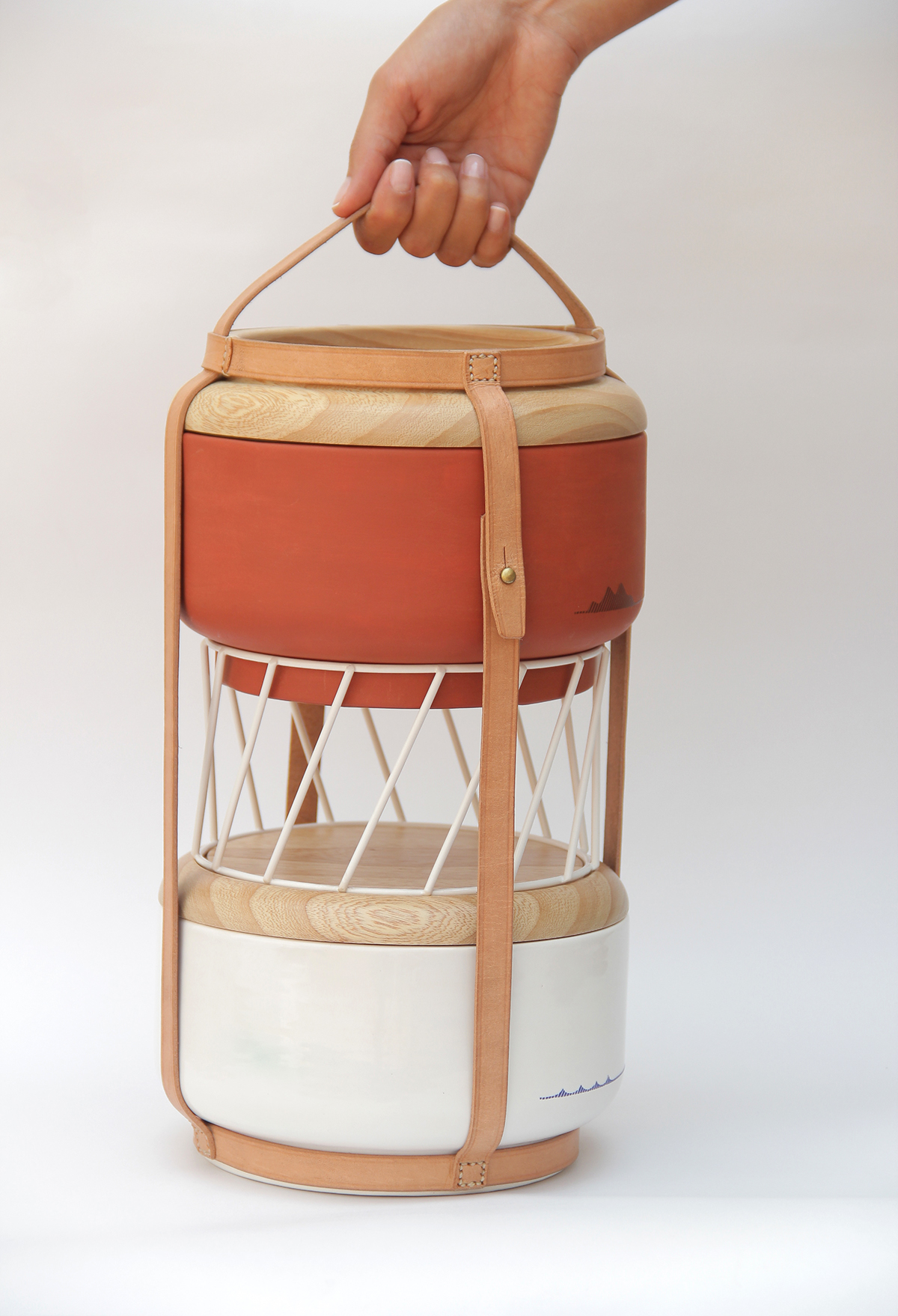
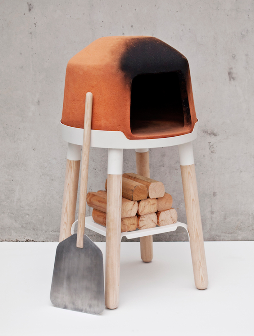
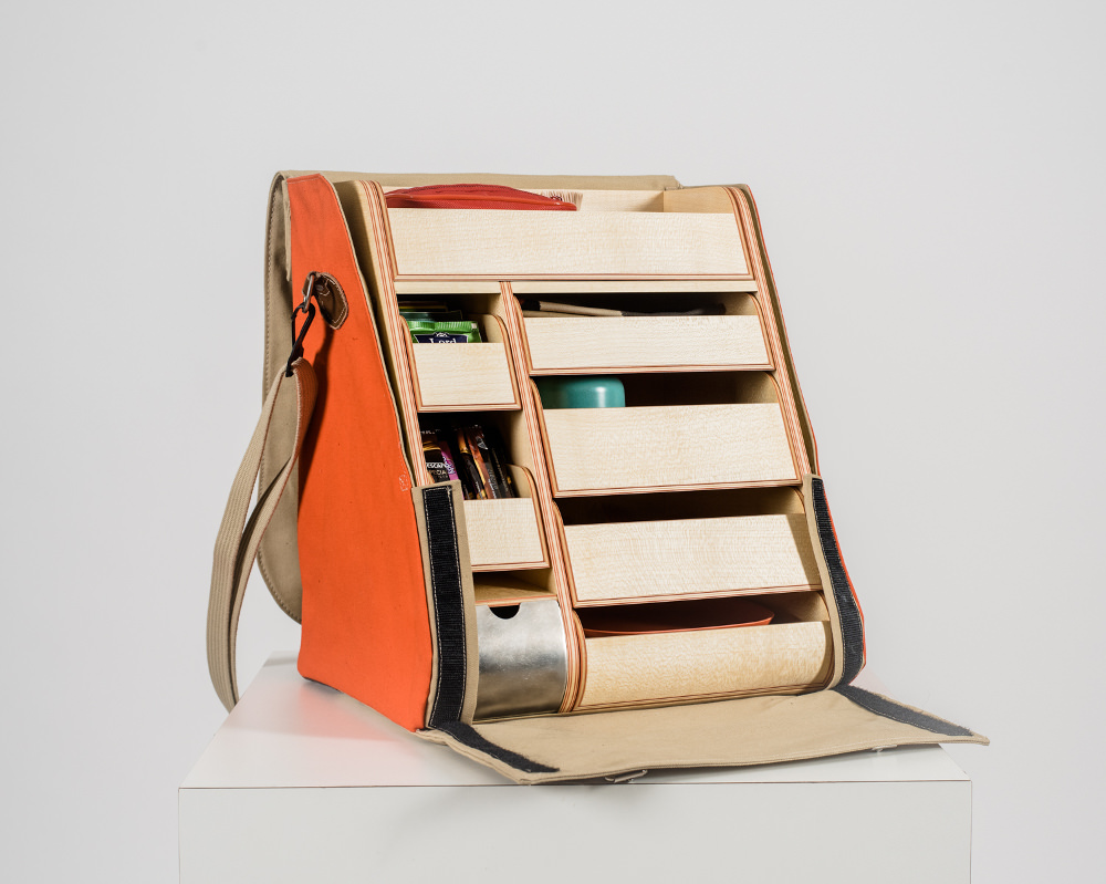
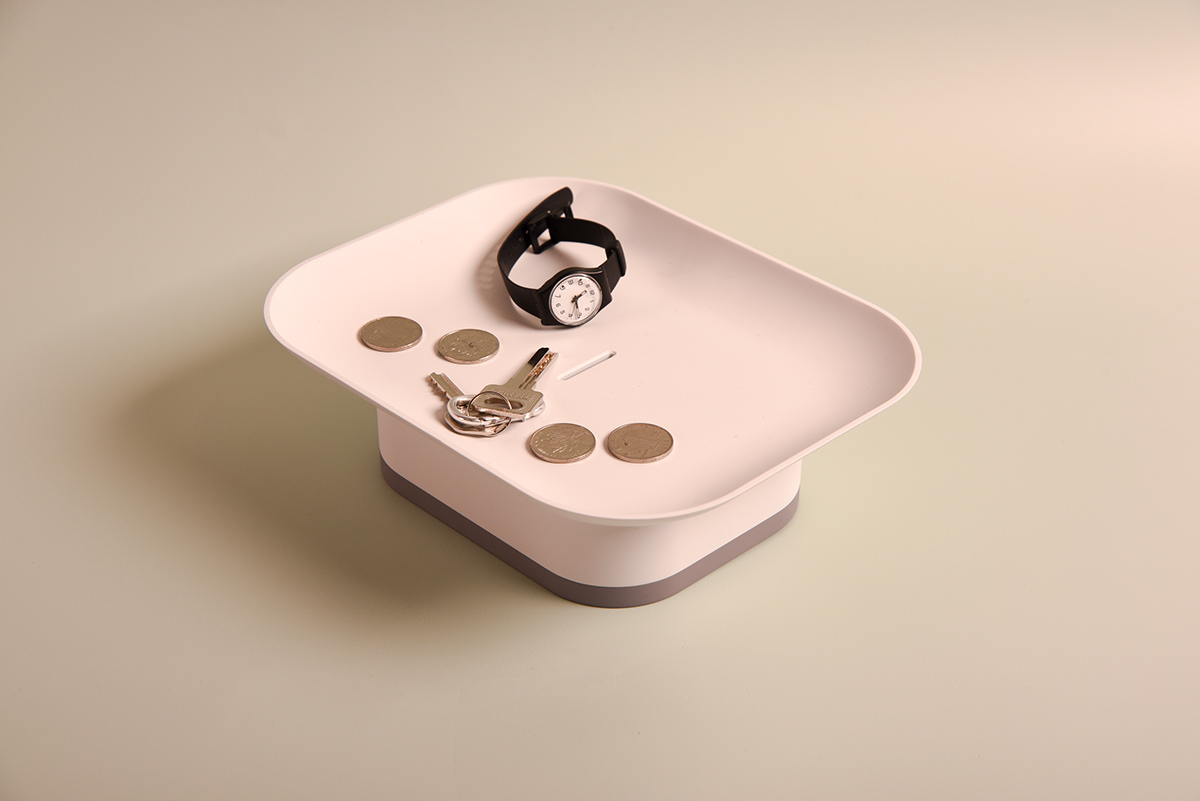
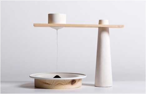
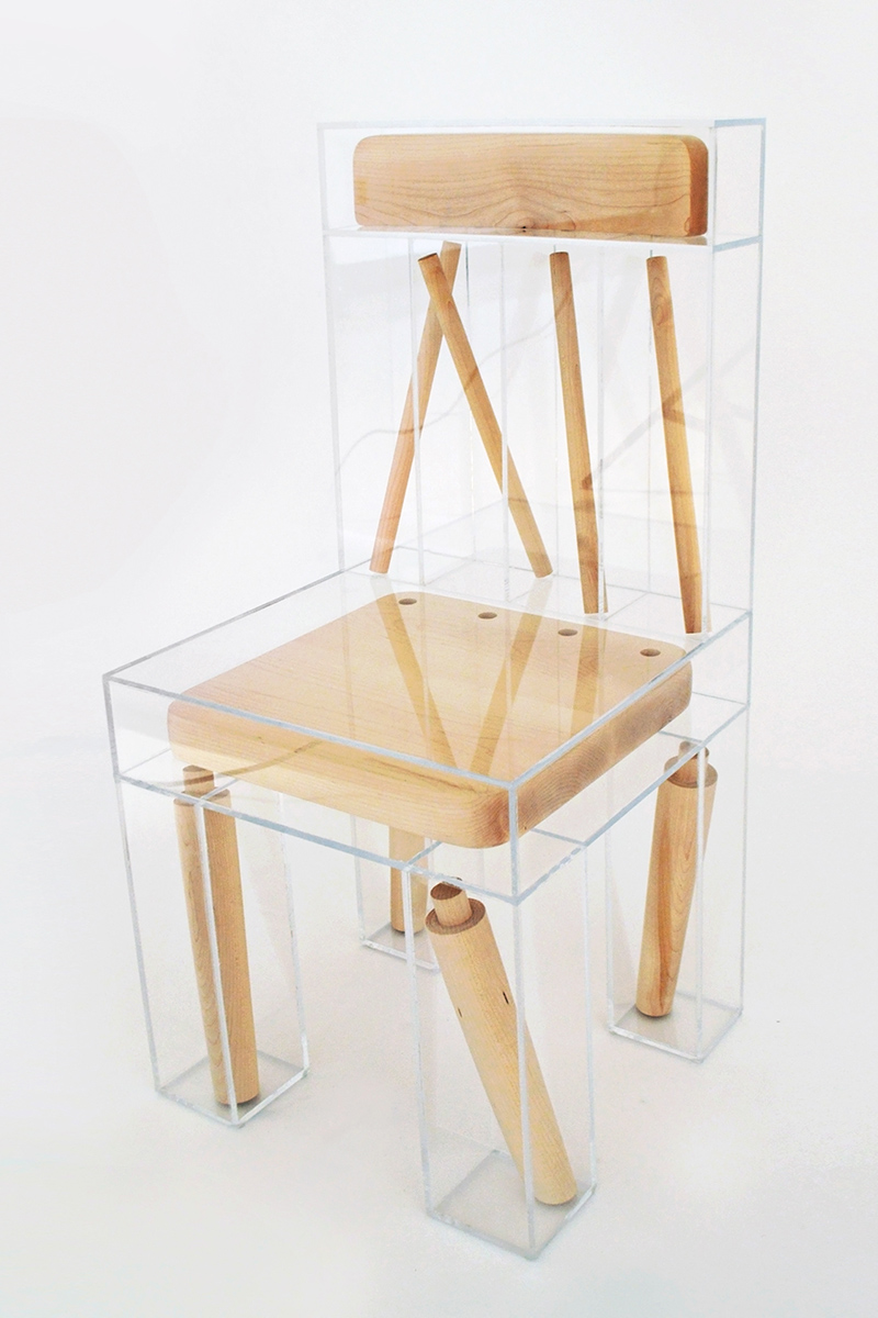
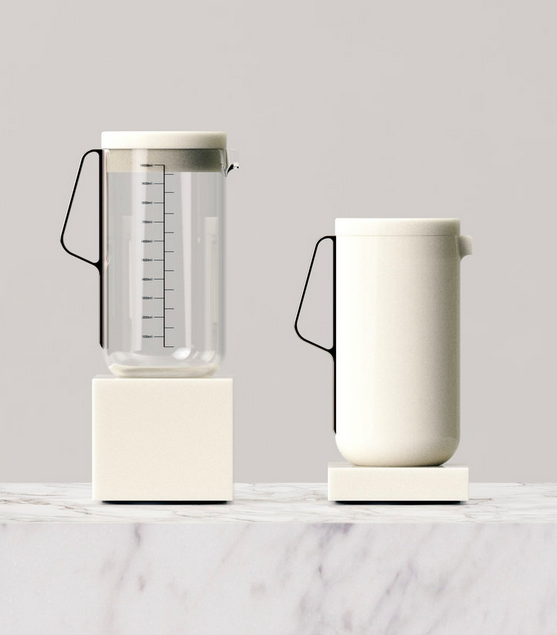
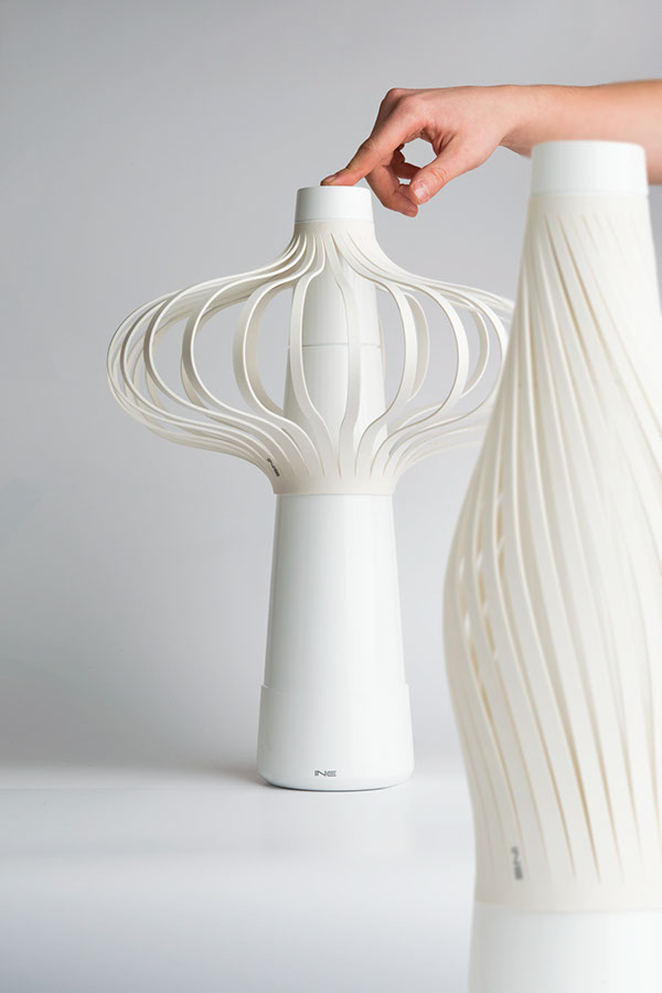
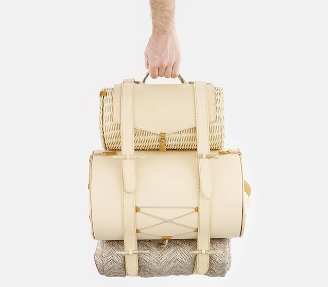
In my travels online, I’ve come across some interesting products – or concepts for products – that have caught my attention. The designers of these items have so much talent. I tried to include their websites whenever possible, so you can click through and see what other designs they’ve dreamed up.

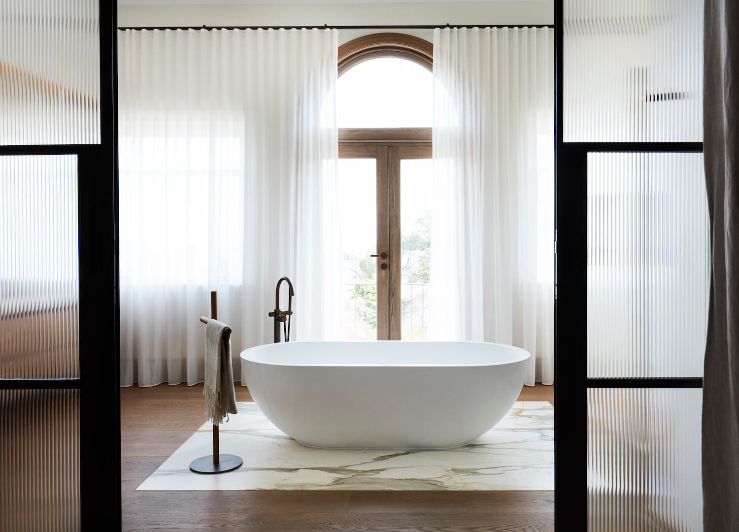
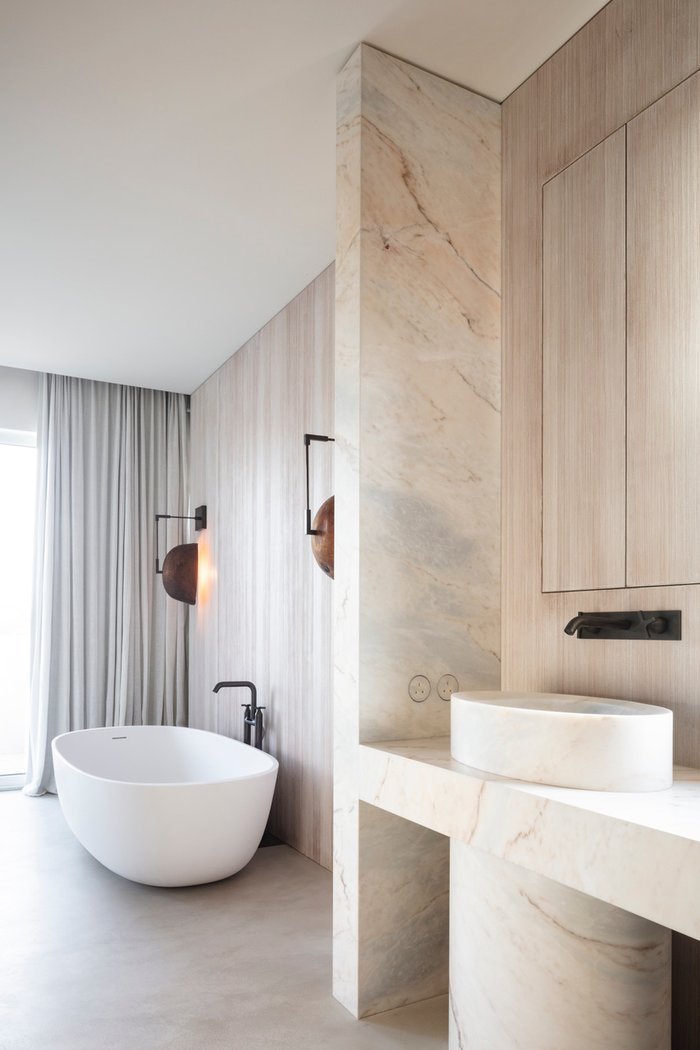
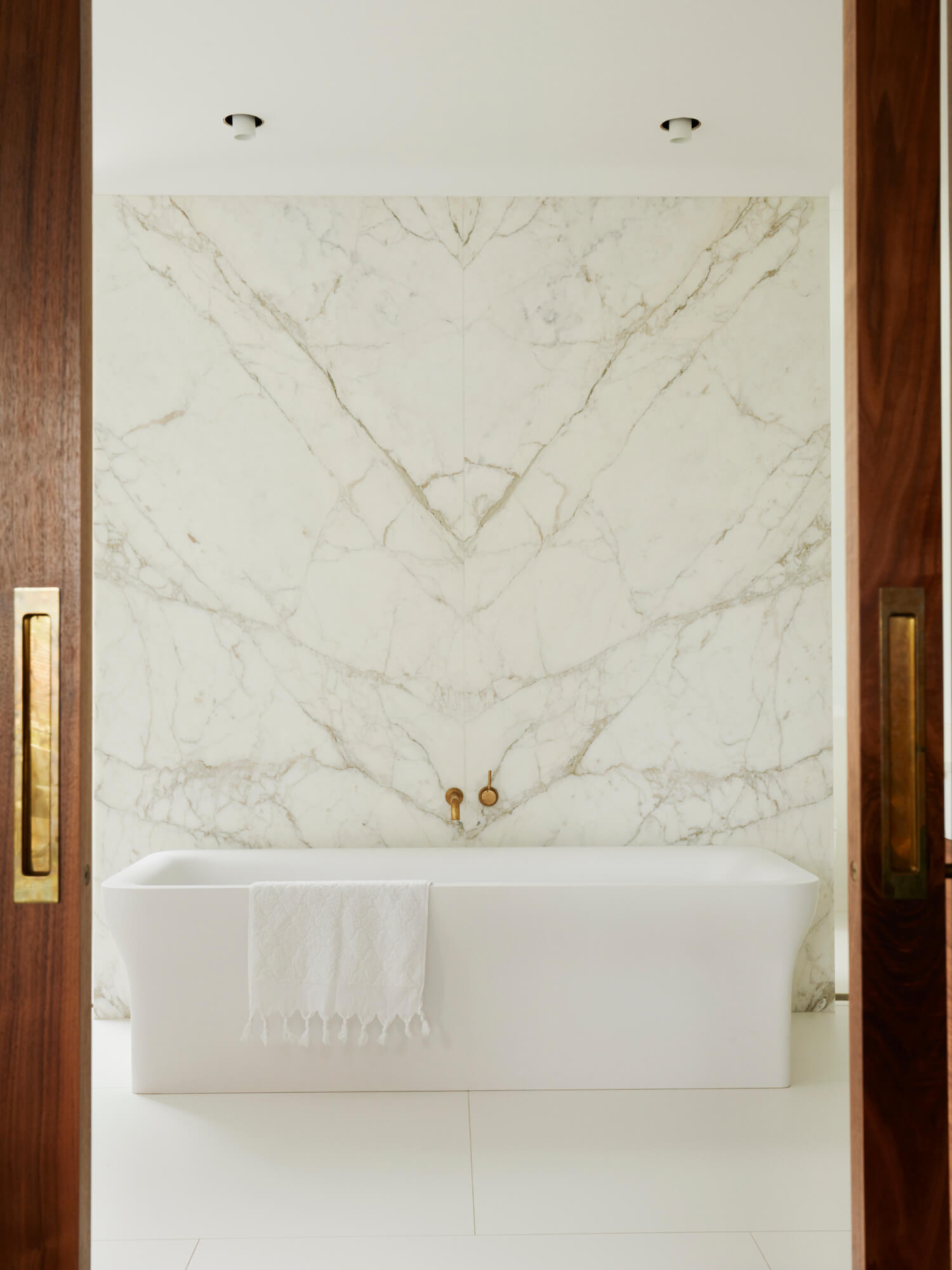
I love these bathrooms with their freestanding bathtubs.
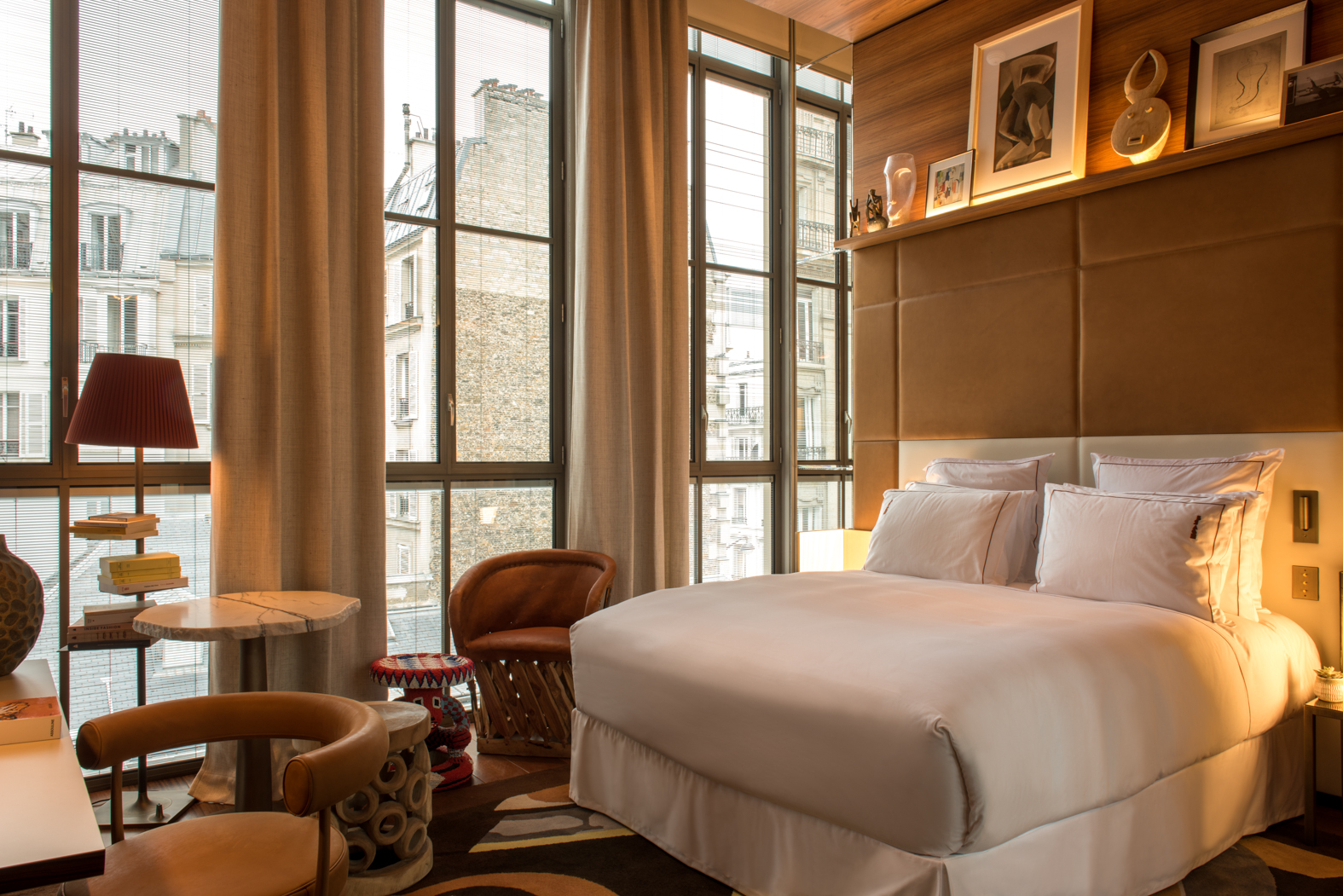
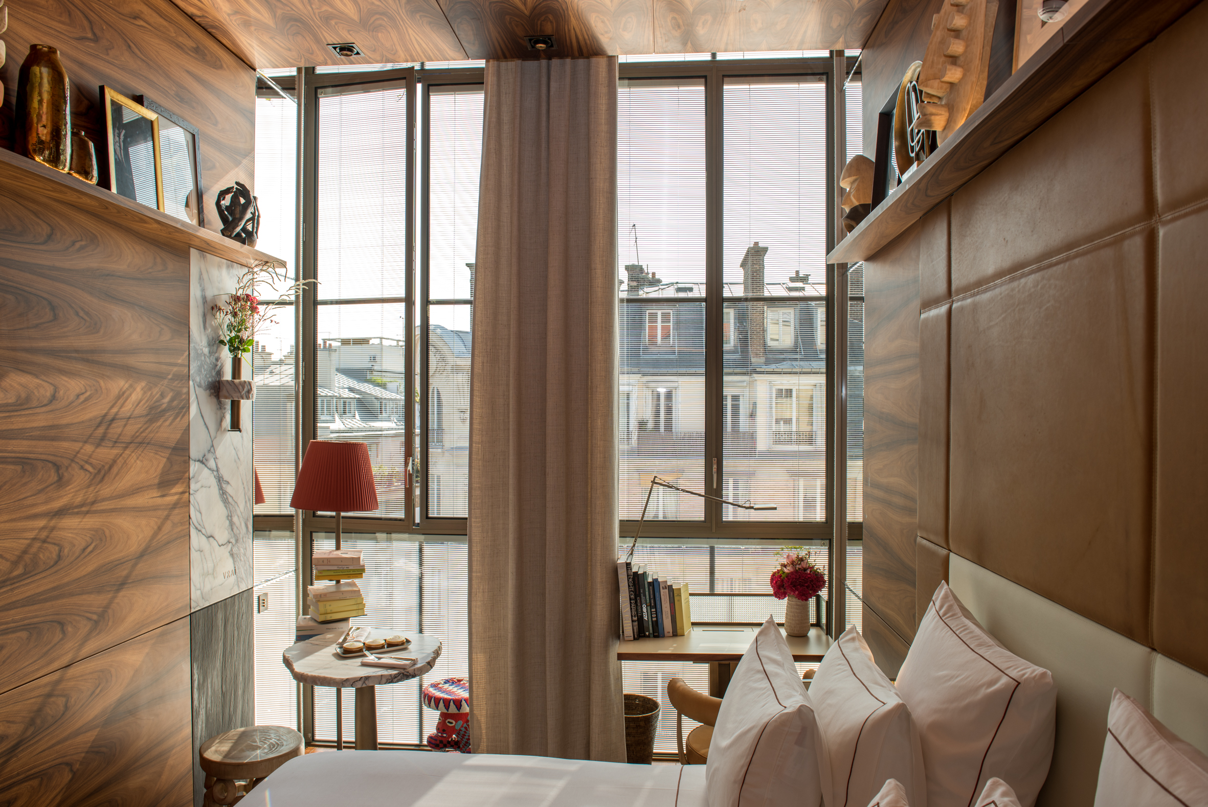
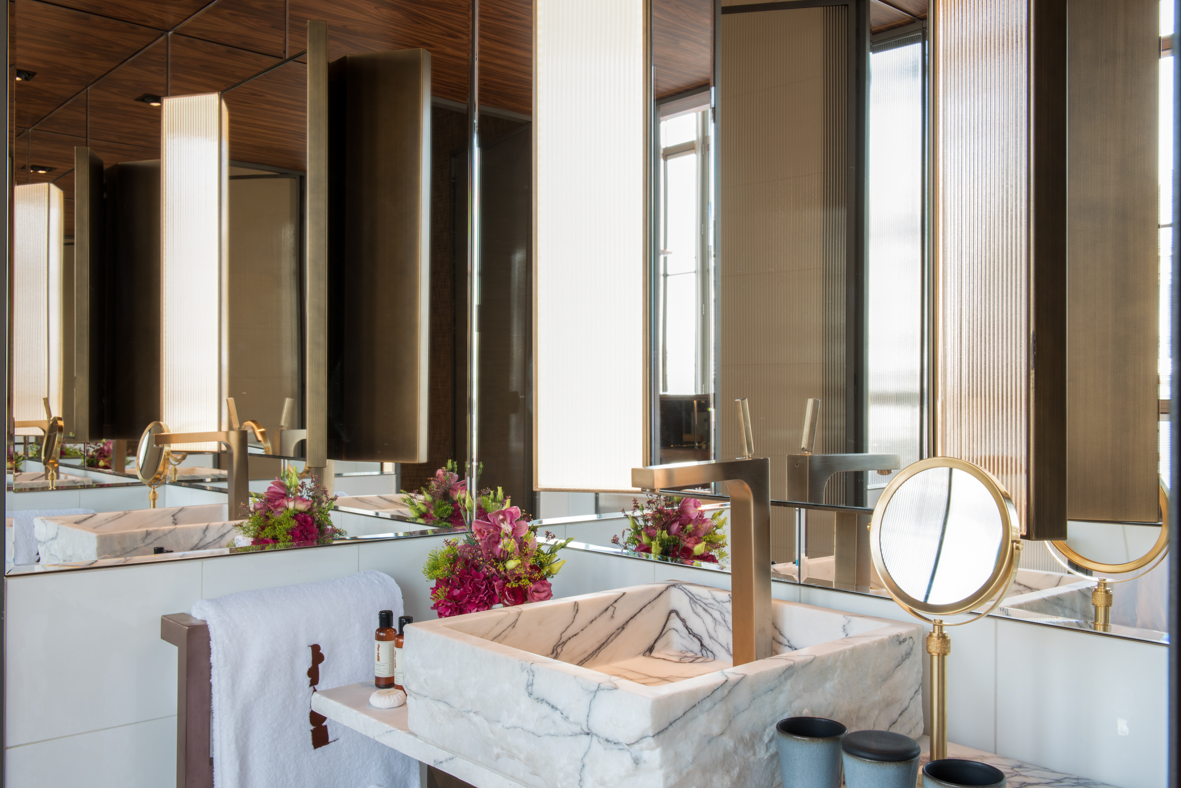
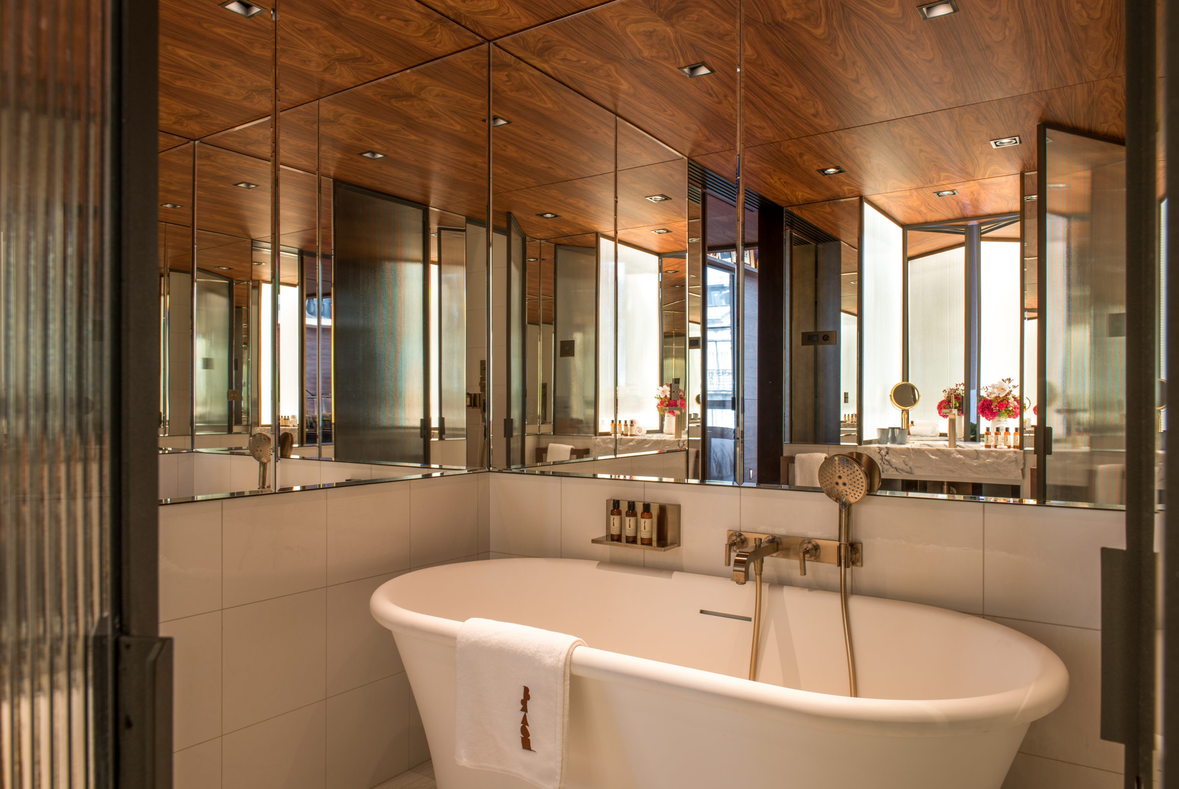
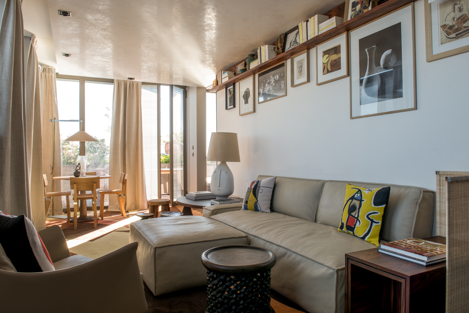
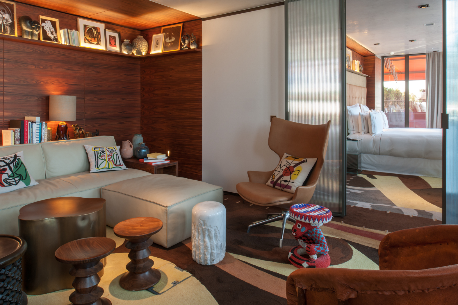
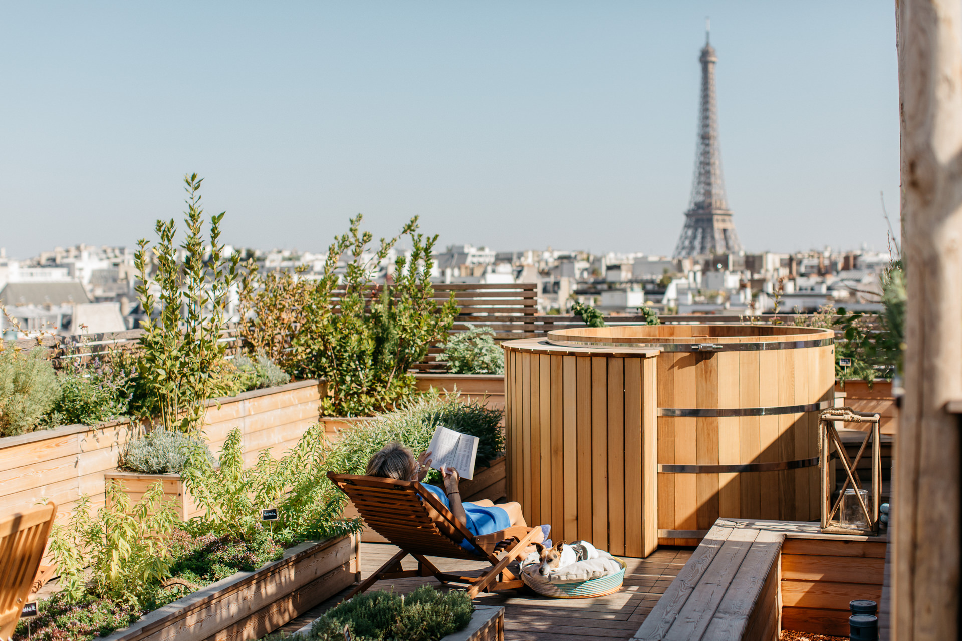
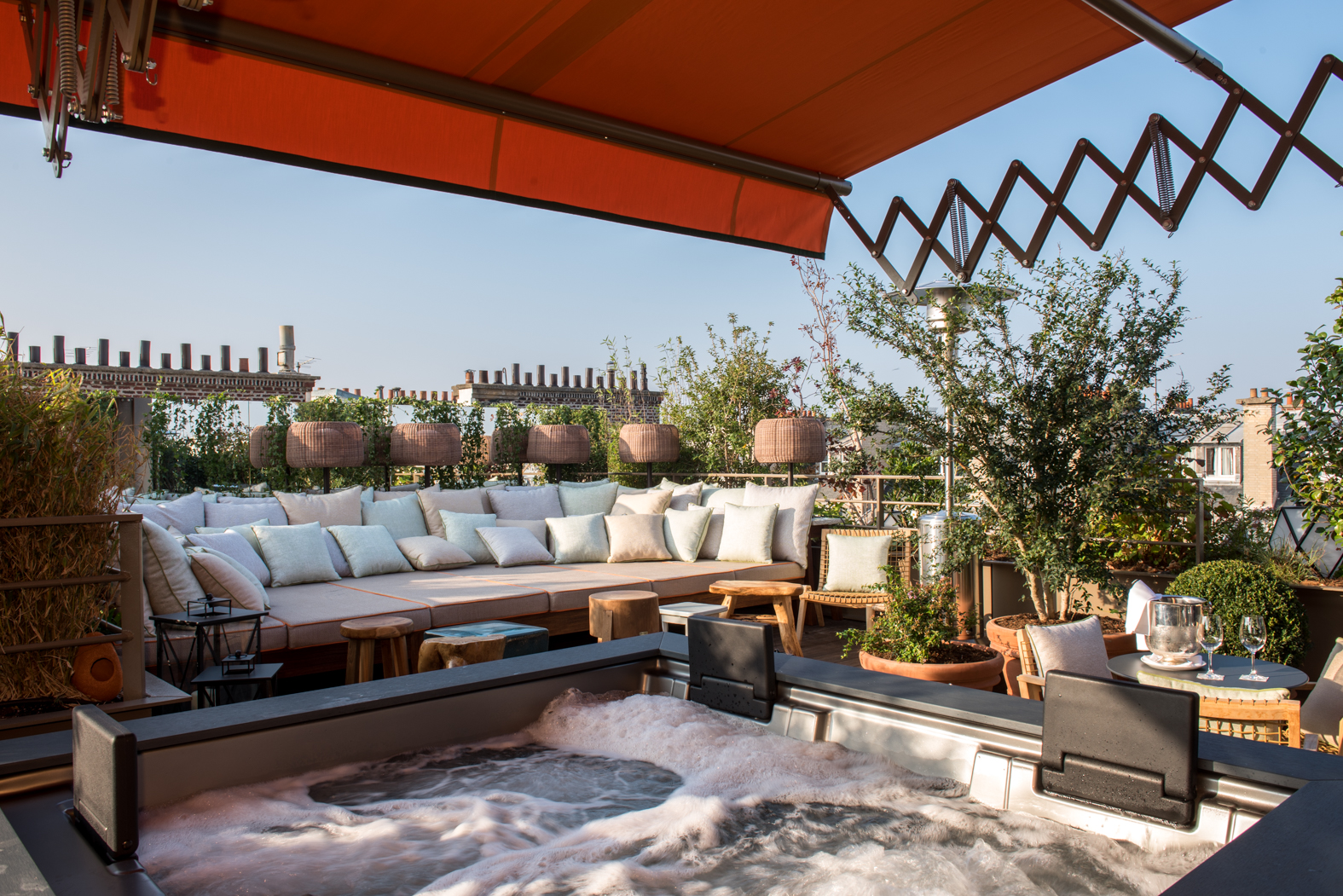
You all know that I love Paris. Along with all the restaurants and museums, there are so many beautifully designed hotels to discover. The Brach hotel is one that is new to me, and it looks lovely. The suites look to have have well-curated art, comfortable beds, and luxurious linens. And the rooftop terrace looks incredible!
Let’s go to France today. More specifically, let’s travel to the Chateau Lafaurie-Peyraguey hotel which is not only part of the Relais & Chateaux group, but is also a Lalique hotel (as in the famous French crystal company). This combo means that the Chateau has the best-of-the-best of decor, food, and services.
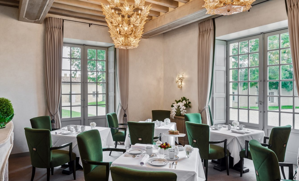
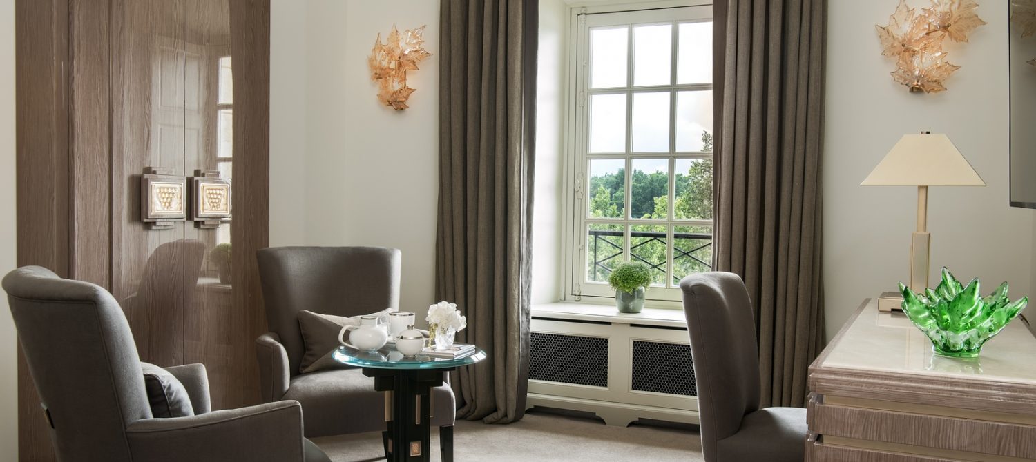
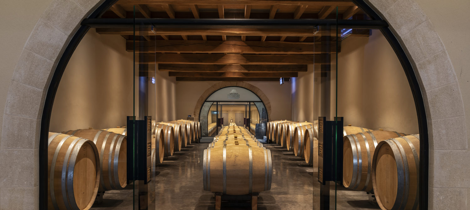
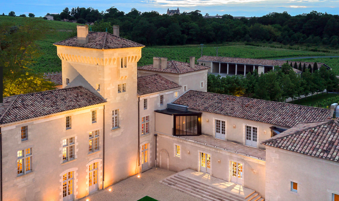
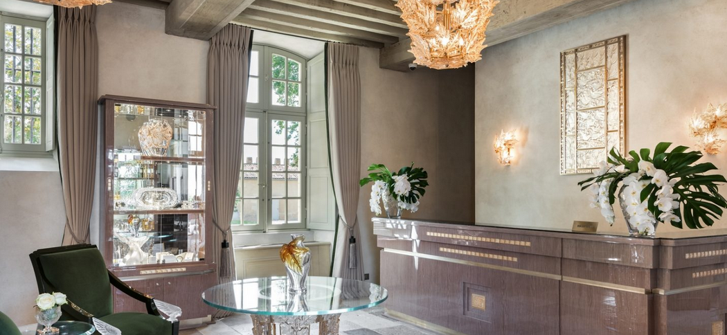
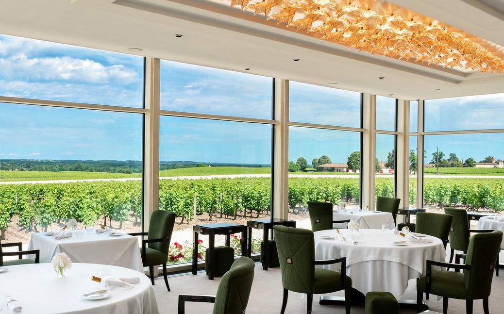
Who is ready to book a flight to Bordeaux to discover this gorgeous property?
Did you see Travel + Leisure’s 2019 list of best new hotels. I loved it. There are a few hotels that really stood out to me in terms of design. One is the Palazzo Bozzi Corso in Lecce, Italy (Puglia). Let’s start in the Cappuccino room:
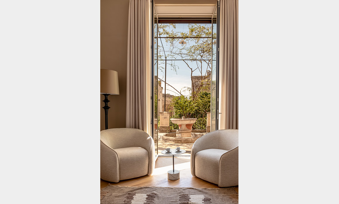
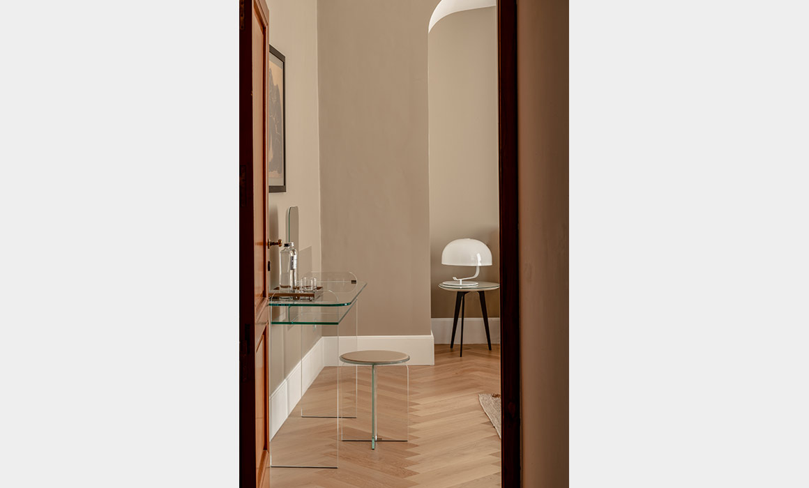
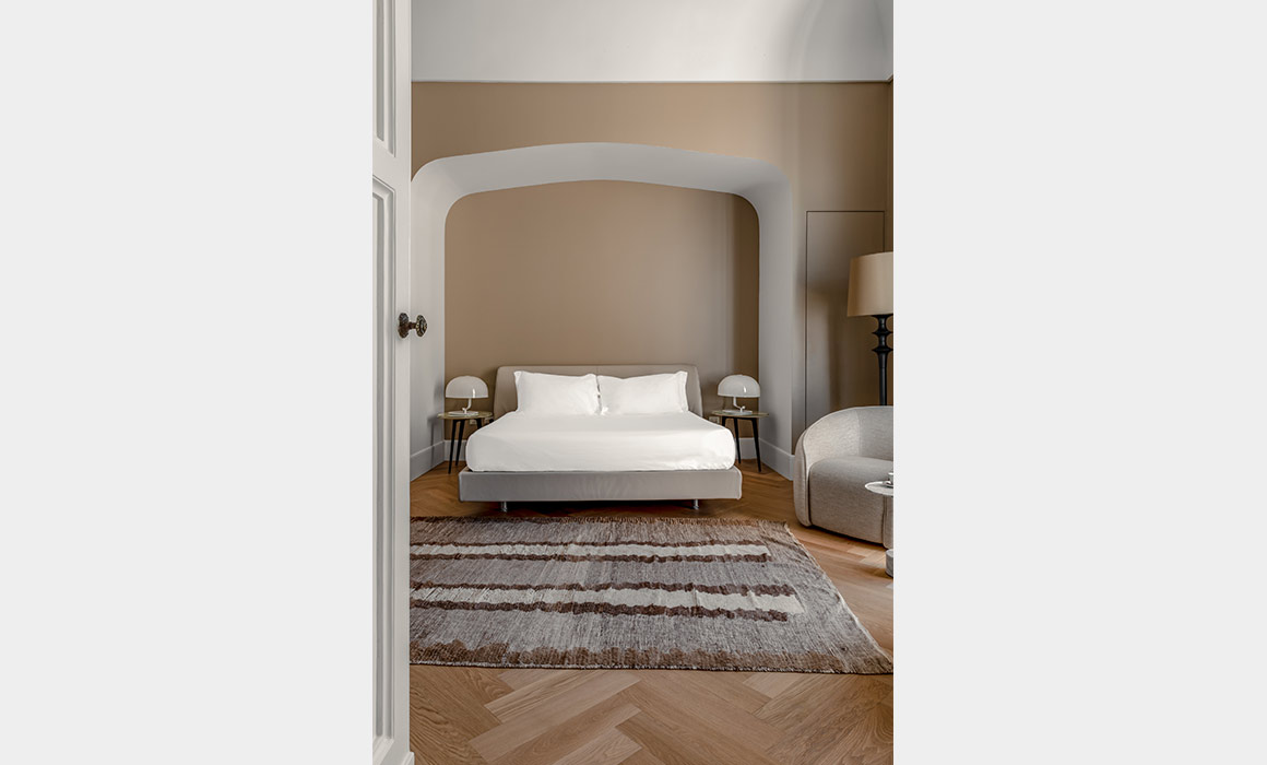
On to Lady Astor’s suite:
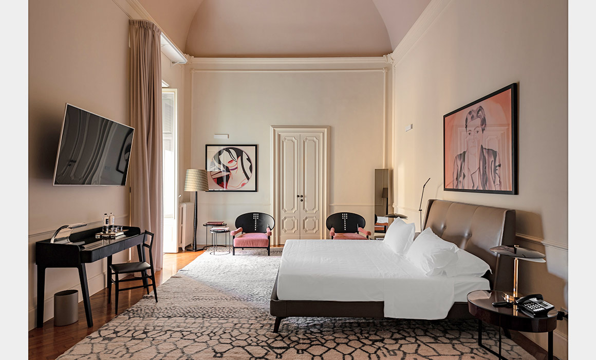
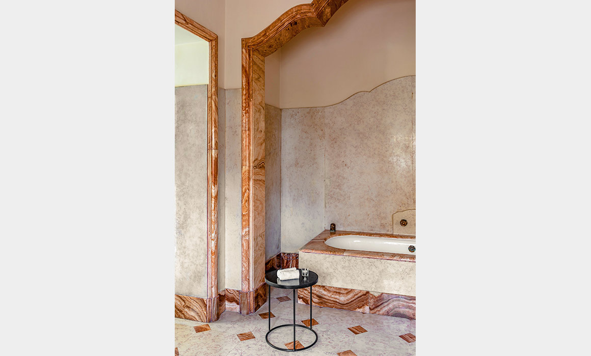
The art, the details, the tile work, the views…this hotel is beautiful!
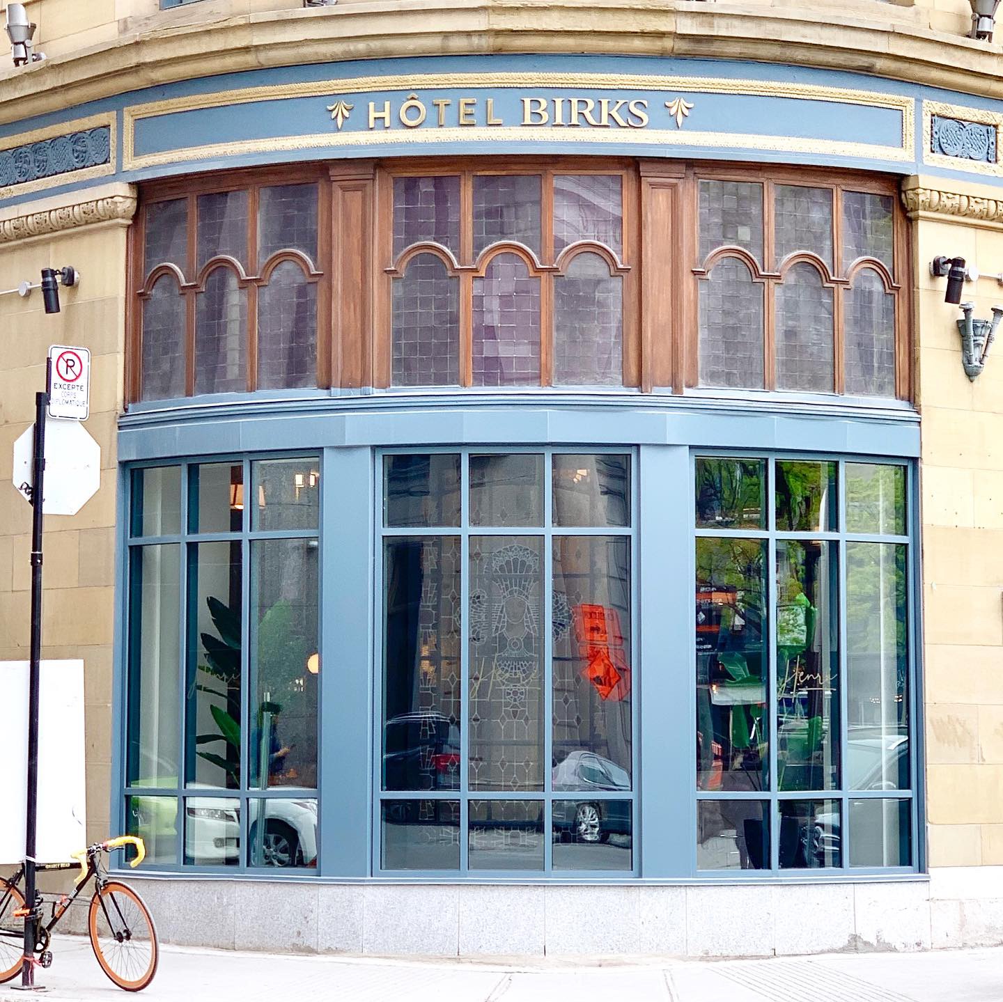
Back in the fall, when I was talking to someone about Montreal, she started raving about her new discovery – Hotel Birks. She told me that she wandered into the Birks store, kept walking around, only to discover a hotel attached to it. She said the lobby was beautiful, and that considering my interest in luxe hotels, I must check it out. So I did.
Hotel Birks gets reviews like “exceptional” and “outstanding” on Trip Advisor, which made me that much more eager for my weekend stay. One of the things I noted in the reviews were the reviewers’ use of staff names. I take note of things like this because it means that staff and guests had real interactions or they interacted more than once. I also liked that I saw responses from the Rooms and Reservations Managers. When I see hotel staff interacting with Trip Advisor comments, I feel like they’re taking them seriously. So…all-in-all, my pre-trip research was positive! (Note: I received a press rate for my stay.)
My friend Shannon and I stayed for three nights, and we both commented on how much we enjoyed the beds. They were extremely comfortable and the linens were top-notch. We also made use of the fireplace in our room; it was perfect to warm up the room on the surprisingly cooler days of May. The hotel provided robes and slippers, and I made use of both.
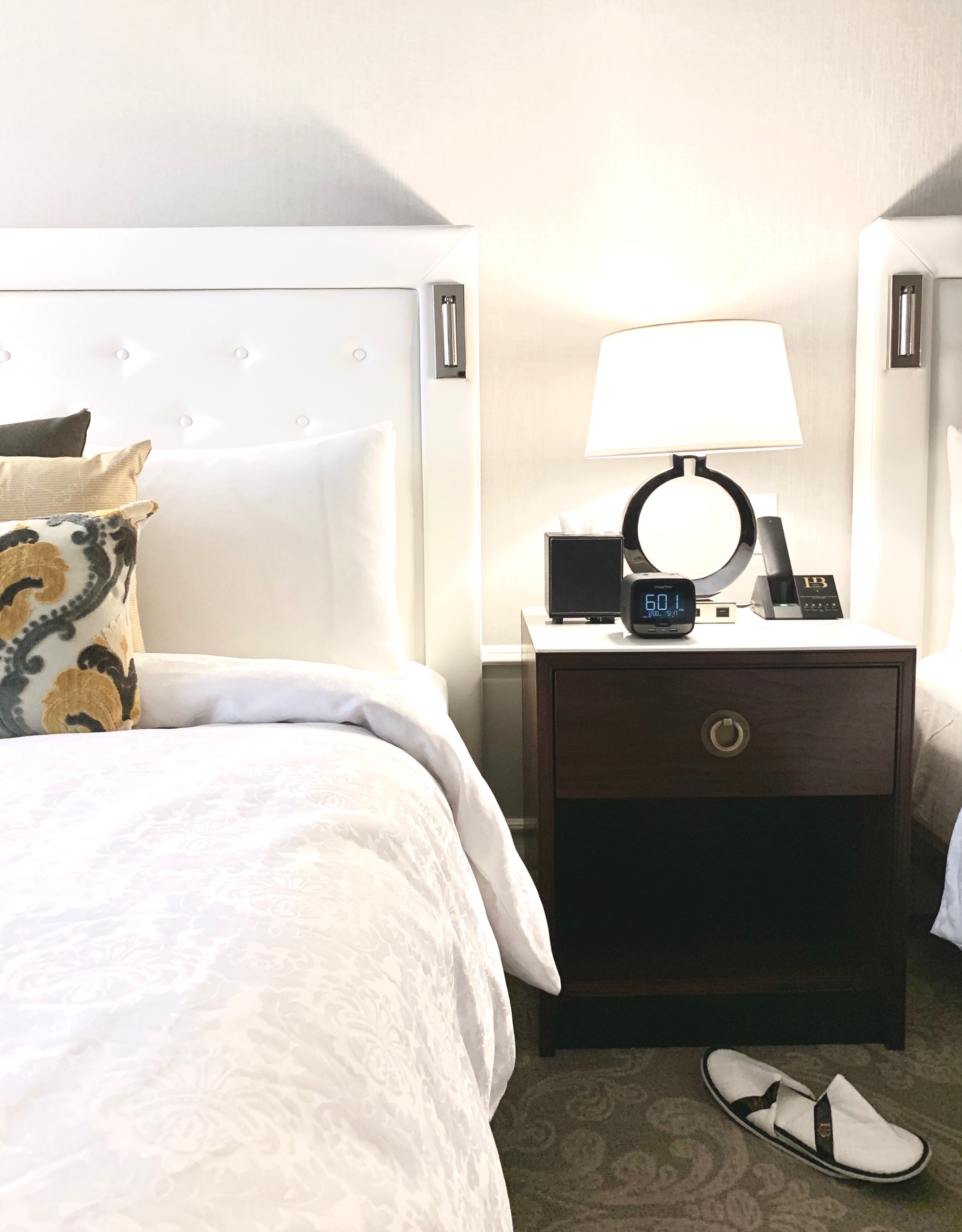
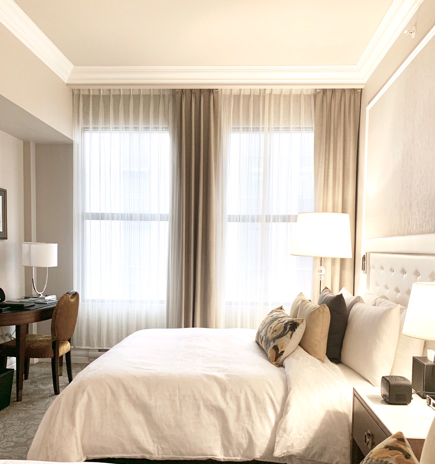
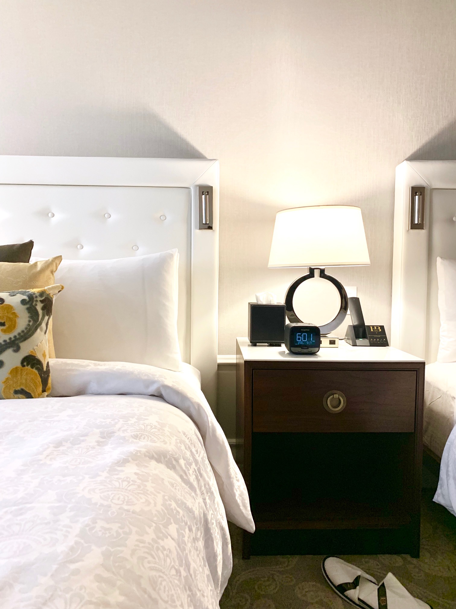
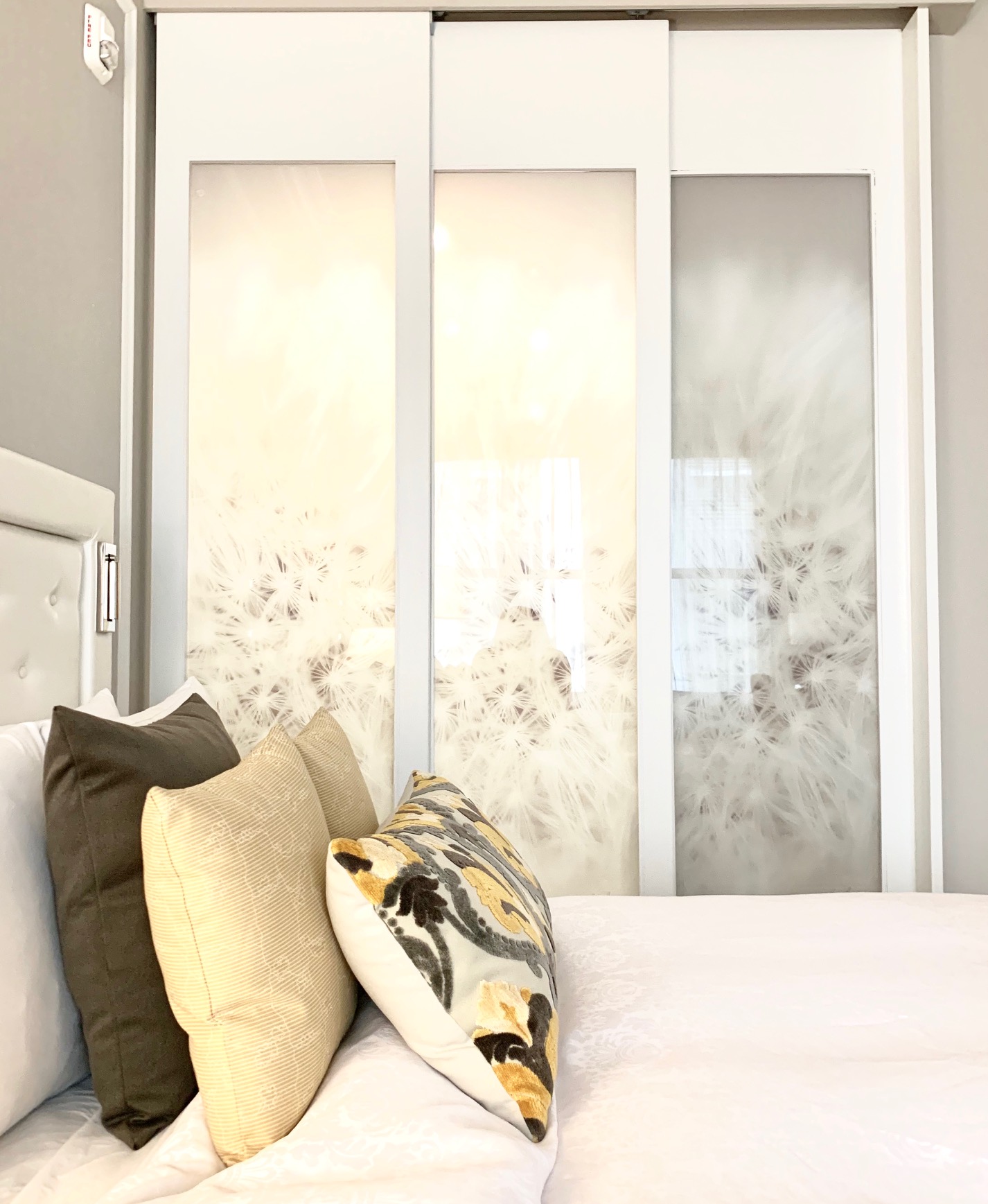
The bathroom had every product we would need, and I was smitten by the use of marble throughout.
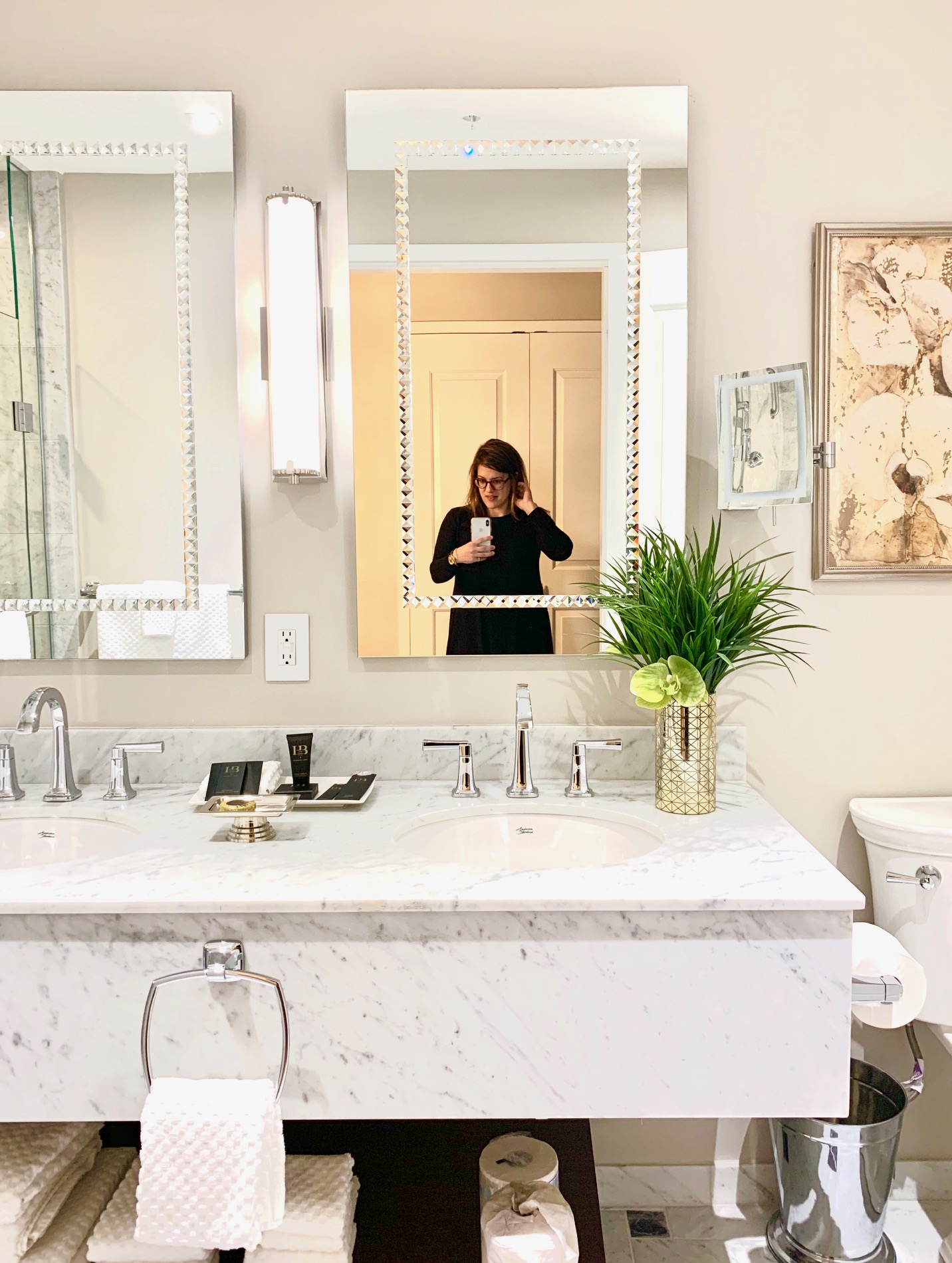
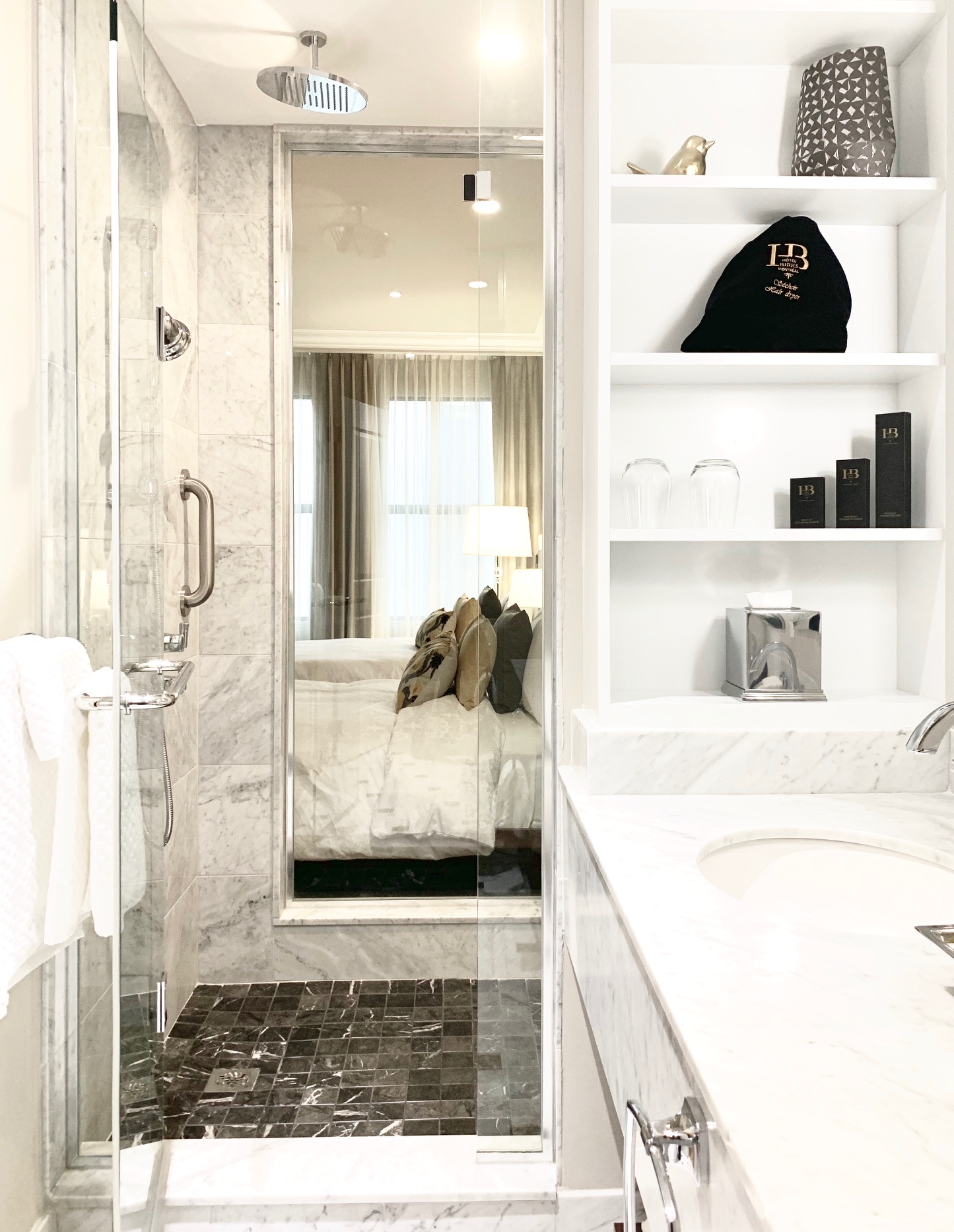
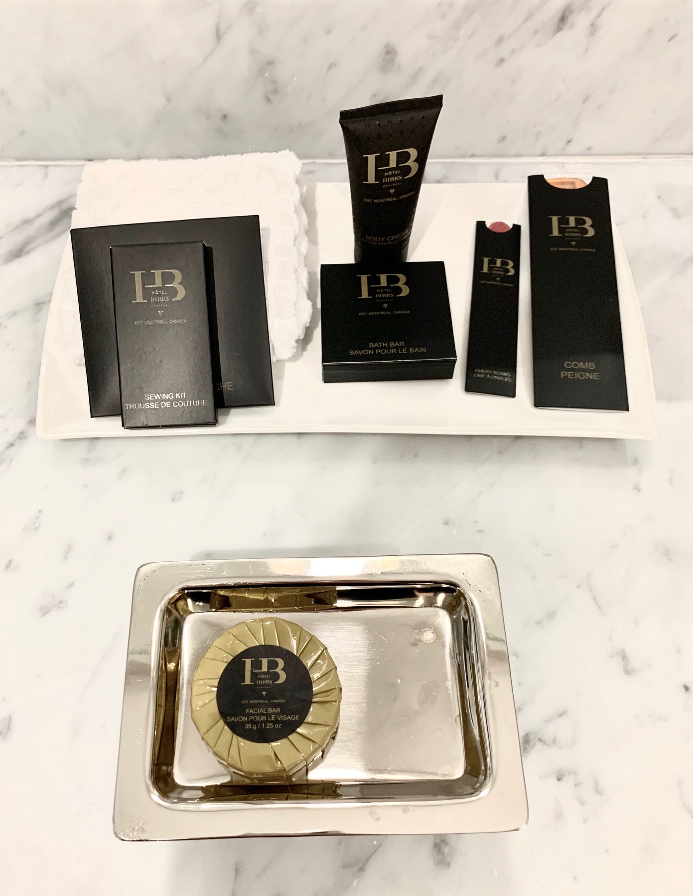
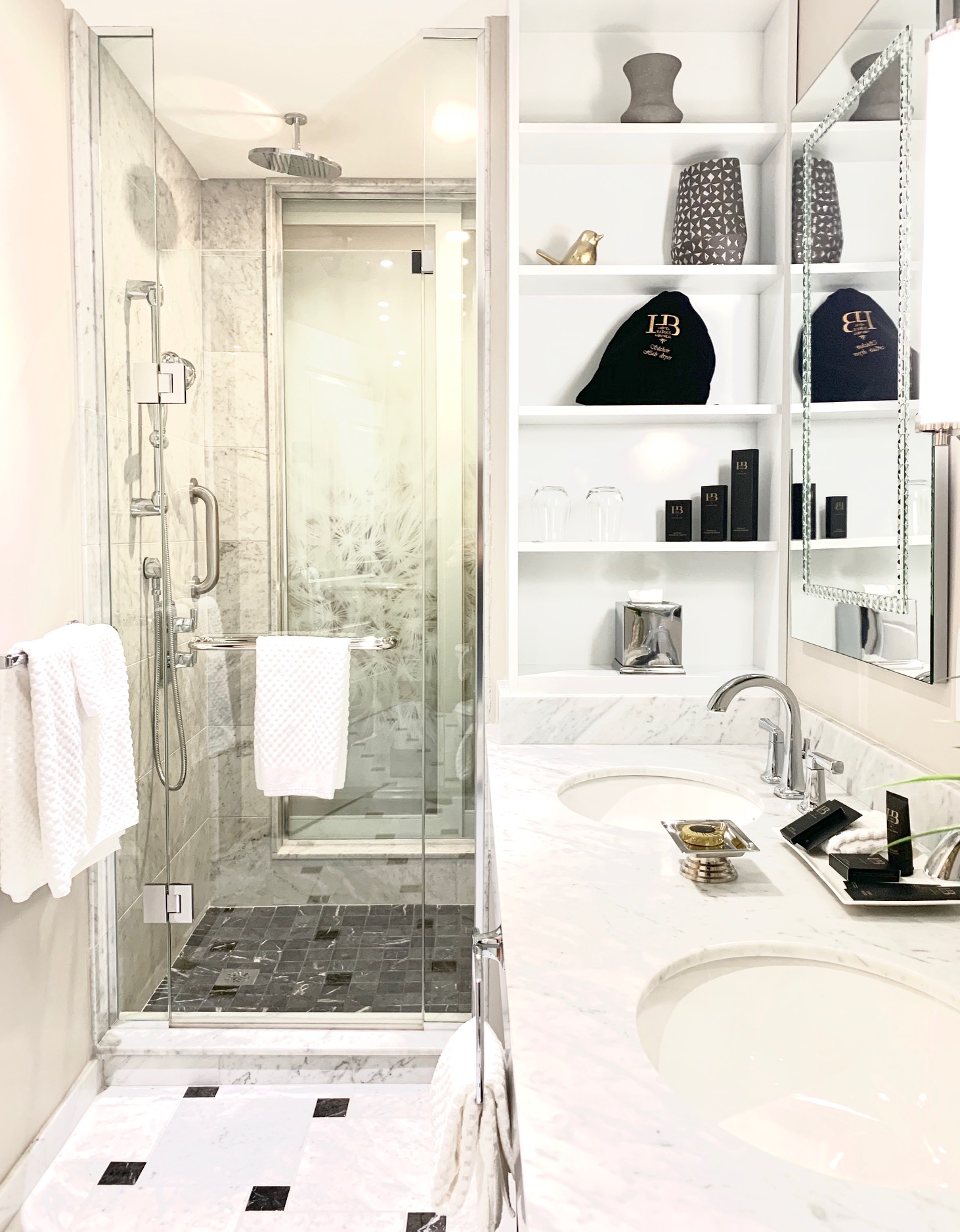
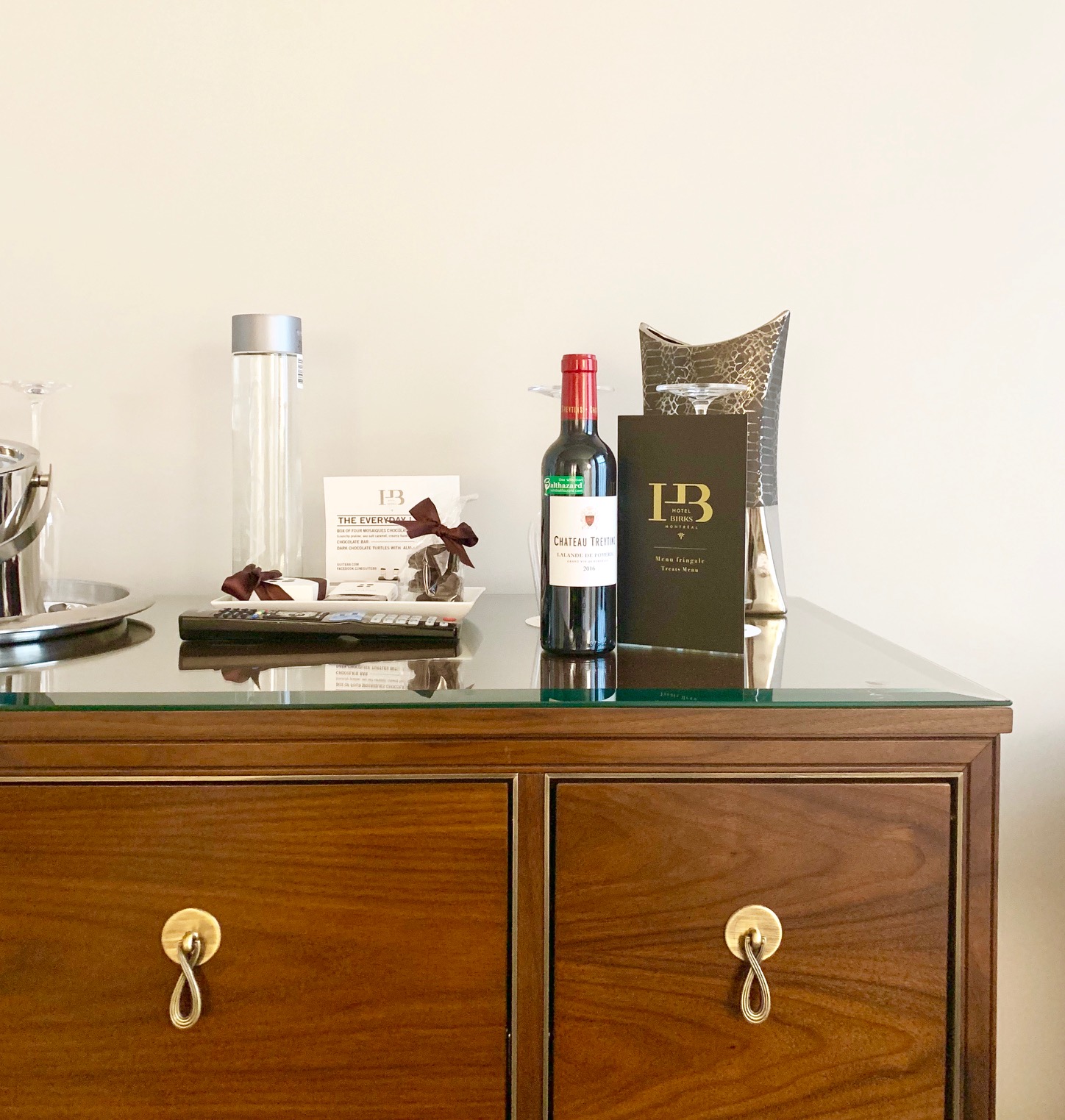
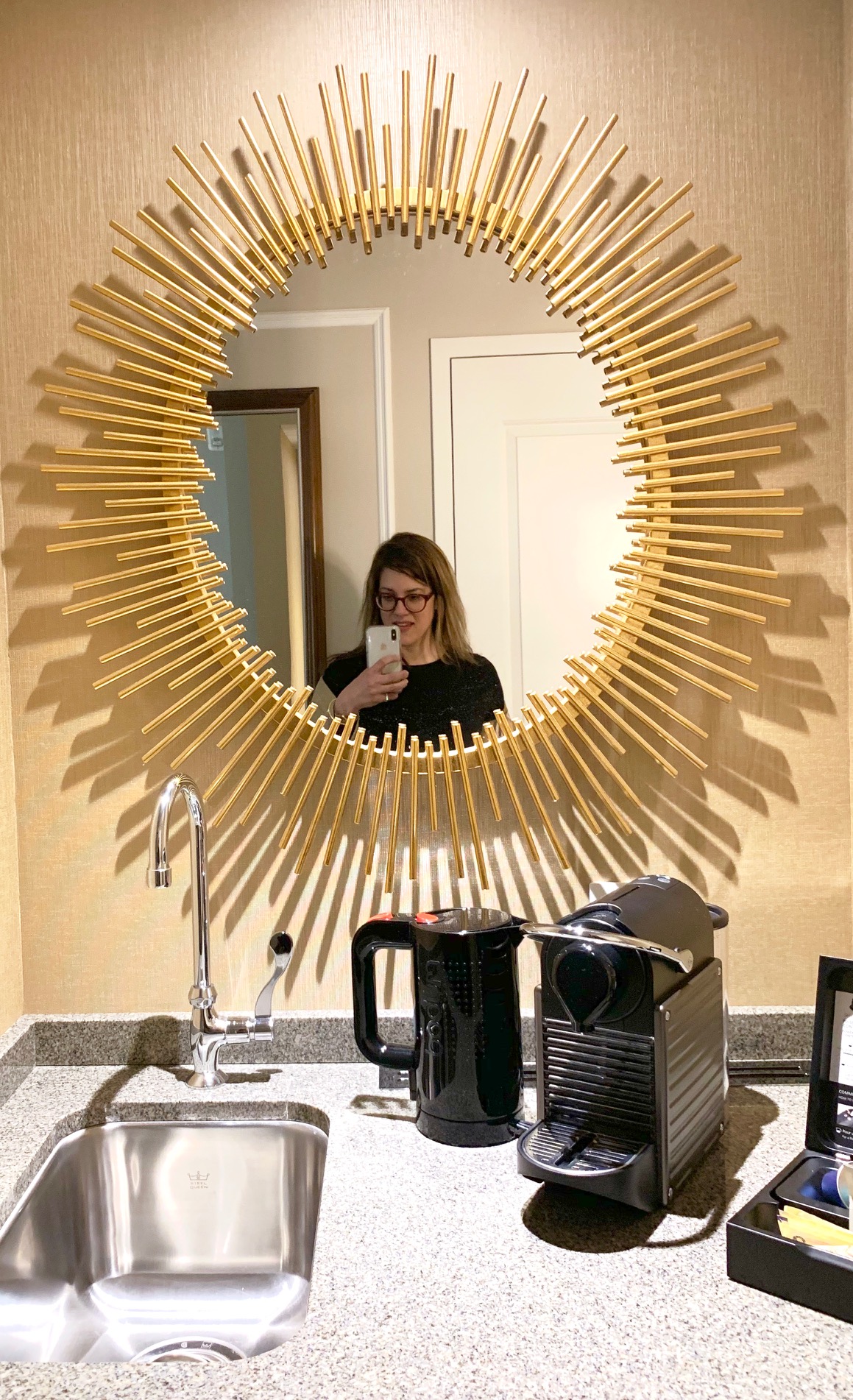
Our room had a little wet bar, which was perfect for our morning coffee and evening tea break. Beyond the room, the lobby of the Hotel Birks is full of charm and old architecture. The building was restored beautifully, and the main floor Brasserie Henri was lovely.
Service was good. I found the front desk team and concierge to be genuinely interested in helping. The room service was a touch inconsistent. Turn down service was different each night, and one day the cleaning crew completely missed our room. I’m not sure why, but the issue was resolved quickly.
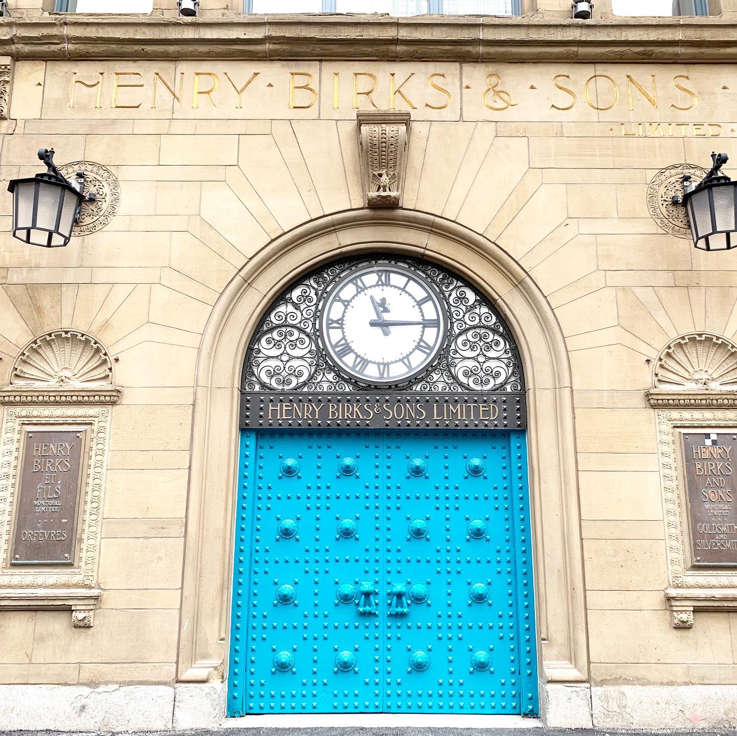
The location is central. Hotel Birks is on Saint Catherine – one of Montreal’s main shopping areas – kitty corner to The Bay. From here, we were able to walk to the train station, to the Bell Centre, and to stores and restaurants. We also walked from here through Chinatown to Old Montreal. When we didn’t feel like walking, we easily grabbed an Uber to take us to places like Outremont and Atwater Market.
I didn’t have a chance to experience the Spa or Brasserie Henri on this trip, but both looked luxurious and inviting.
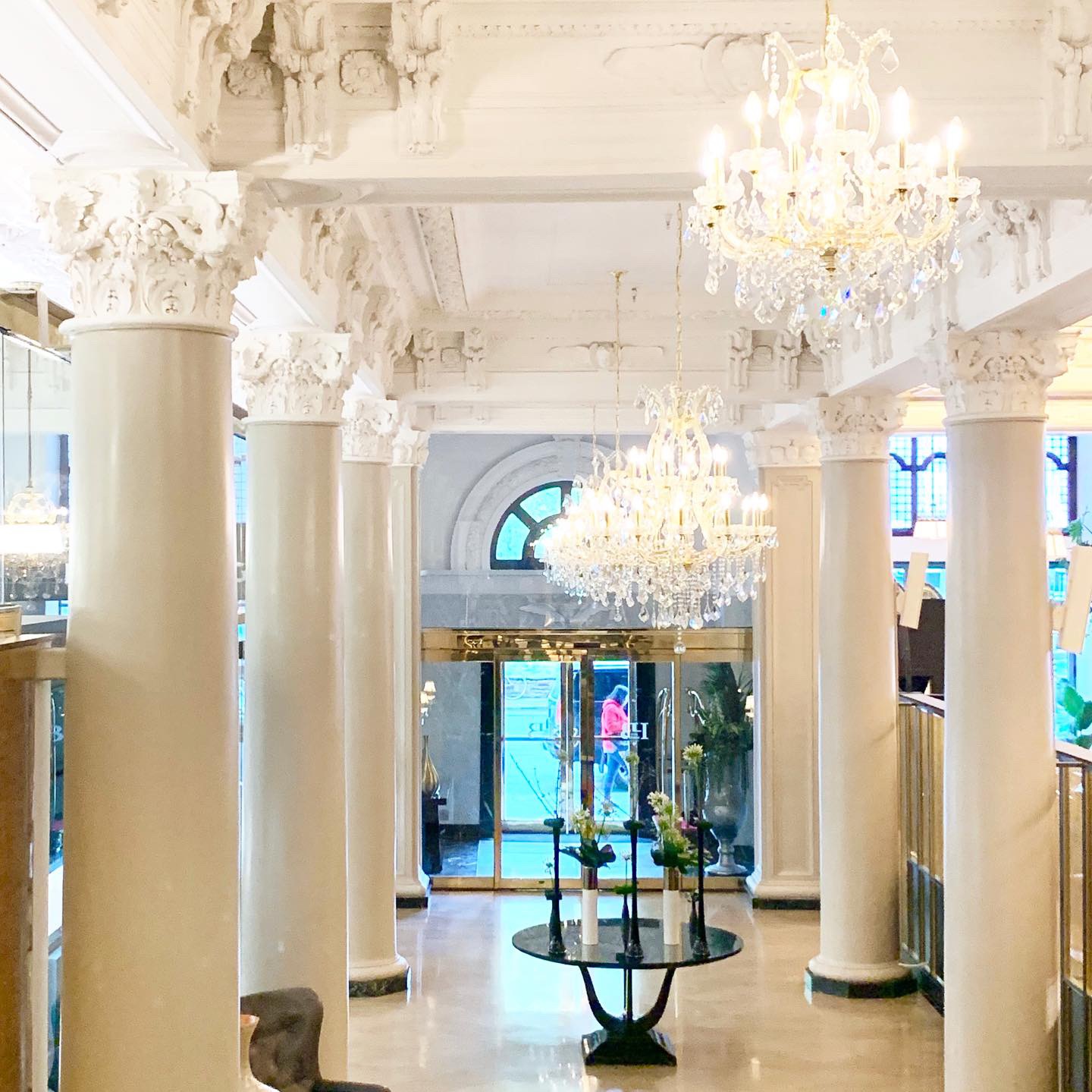
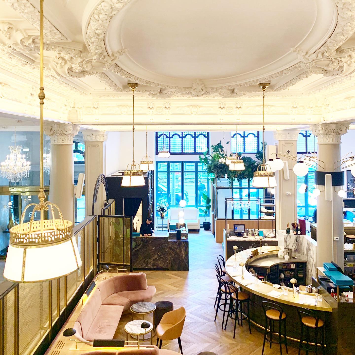
Would I stay at Hotel Birks again? Most definitely!
Note: I received a press rate for my stay. All opinions and photos are my own.
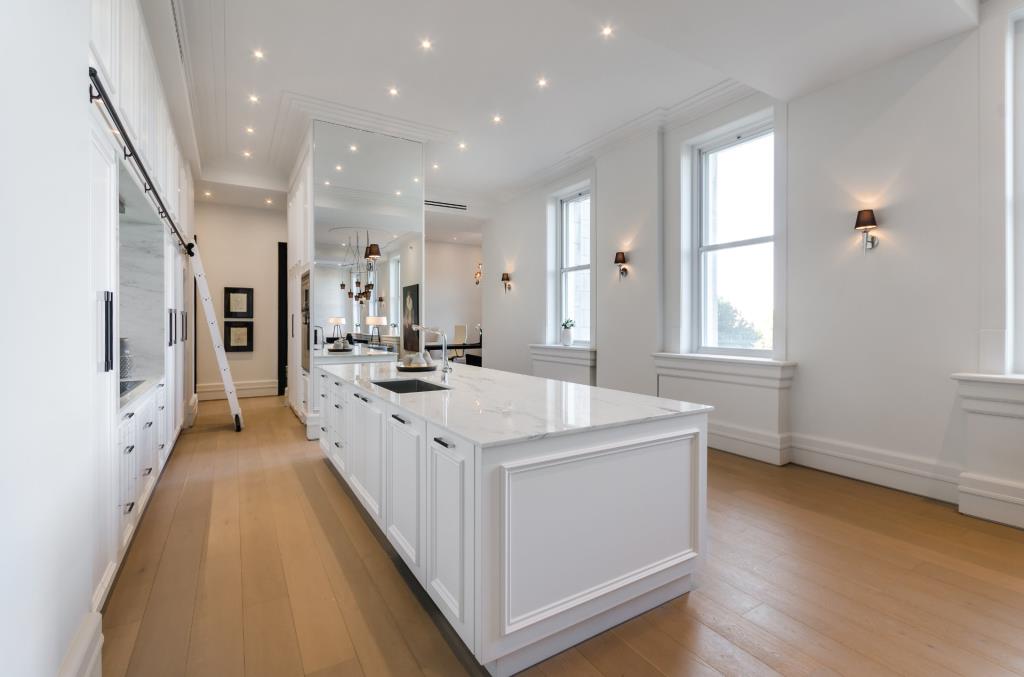
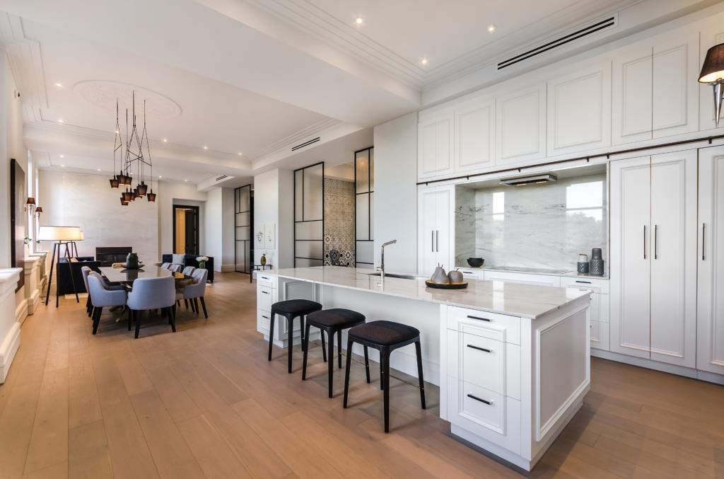
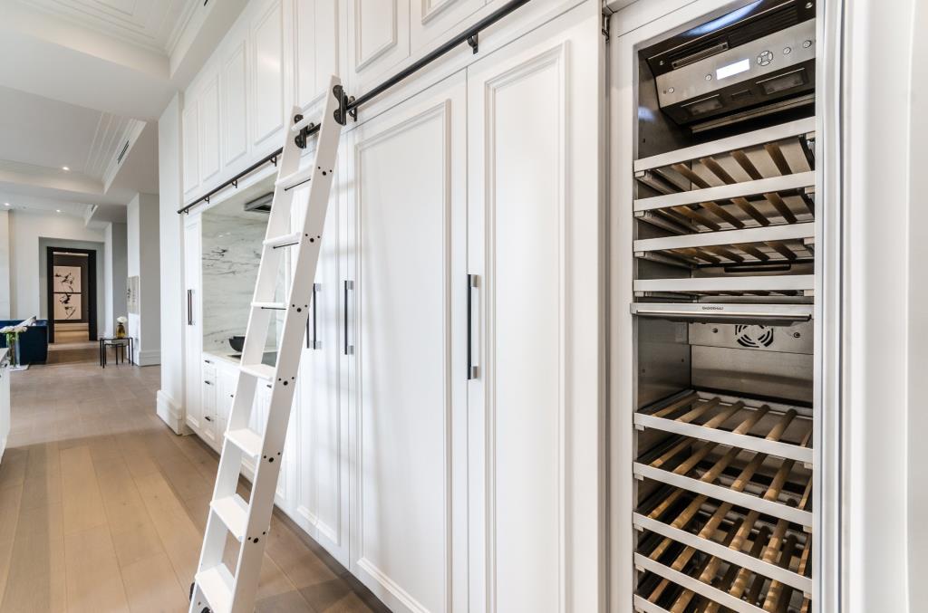
When I find a neighbourhood that I like when I travel, I tend to look online at real estate websites. Does anyone else do this? I guess I’m curious about the real estate market and the design of homes. I think I also have the “Where could I live if I moved here?” question in my mind, too. You know how it is, right?
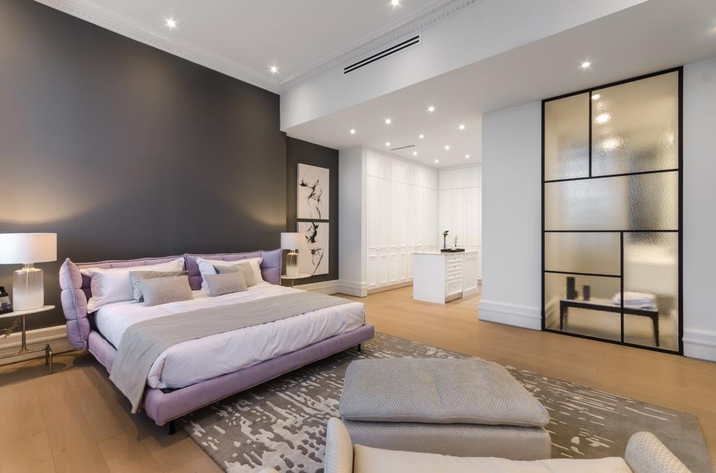
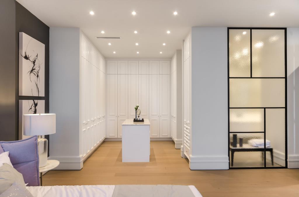
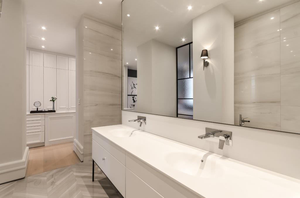
On my recent trip to Montreal, I became most curious about real estate in the Outremont area. Here’s one condo that has me dreaming of moving to Montreal and living the luxe life!
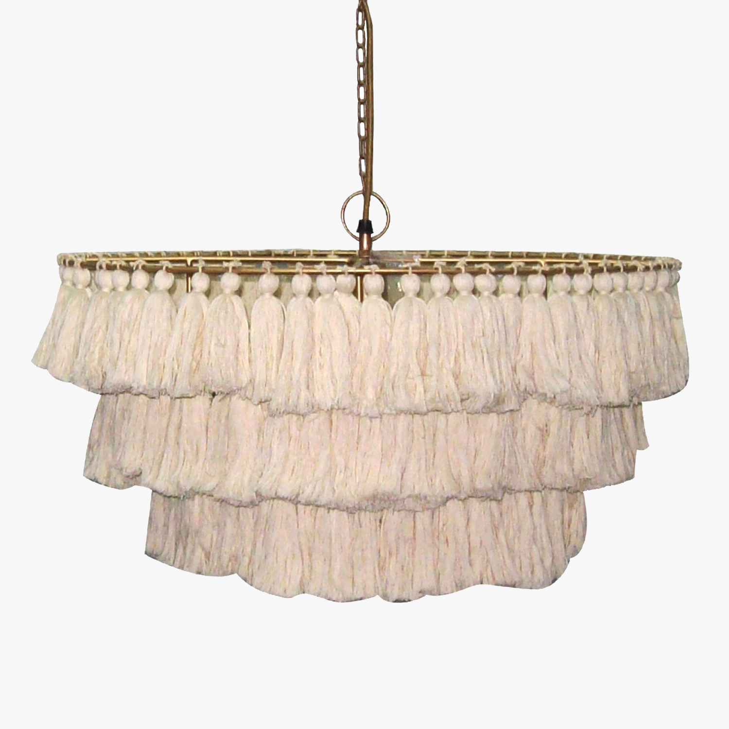
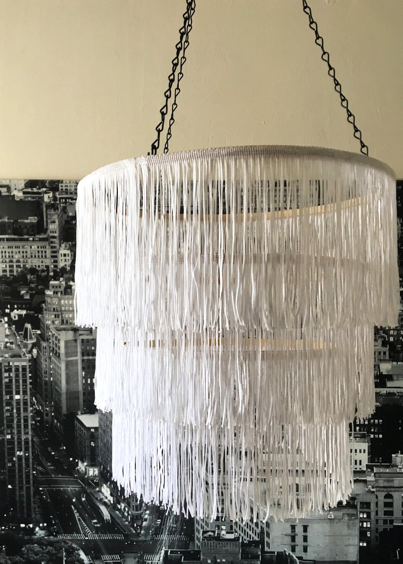
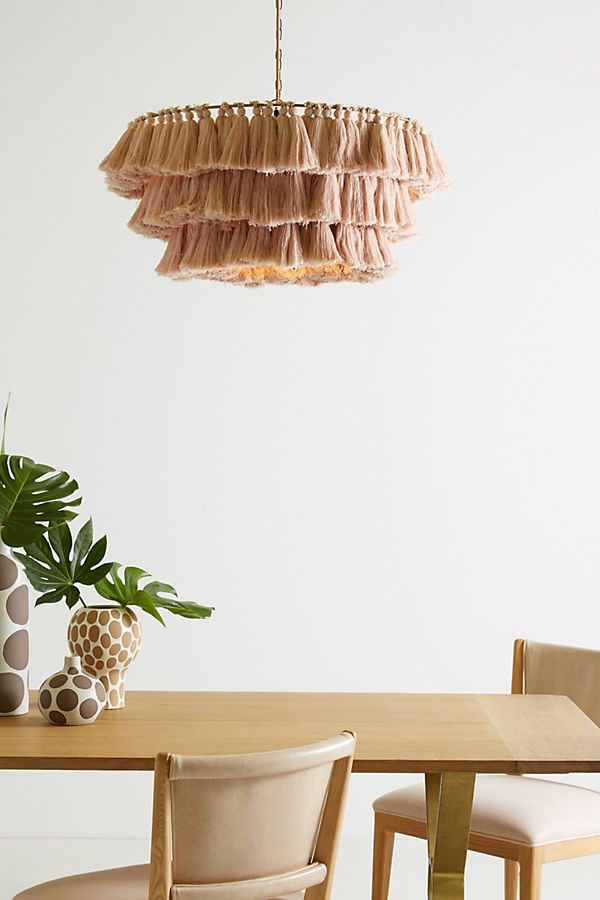
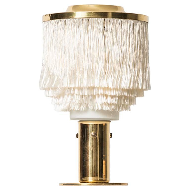
Fringe and tasseled chandeliers have been around for a while, but I’m seeing them used more frequently recently. They’re soft and delicate, so I thing the the style is ideal for a bedroom or powder room. They come in a range of prices and materials, and there are even DIY instructions floating around online, too. I’ve included one DIY version in the selection today. Can you tell which one it is (without looking at the caption info)?
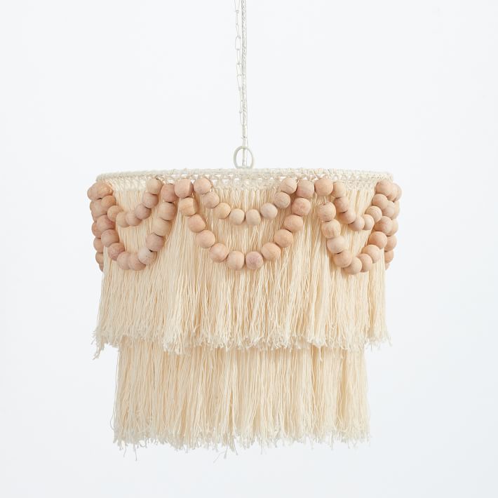
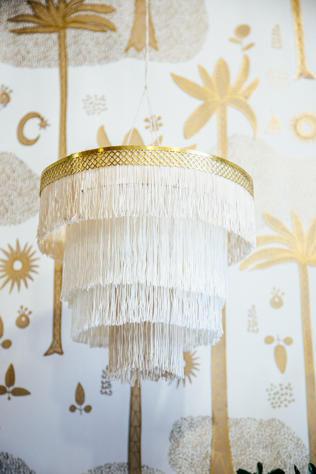
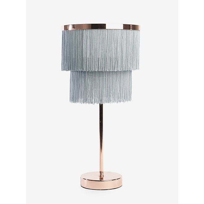
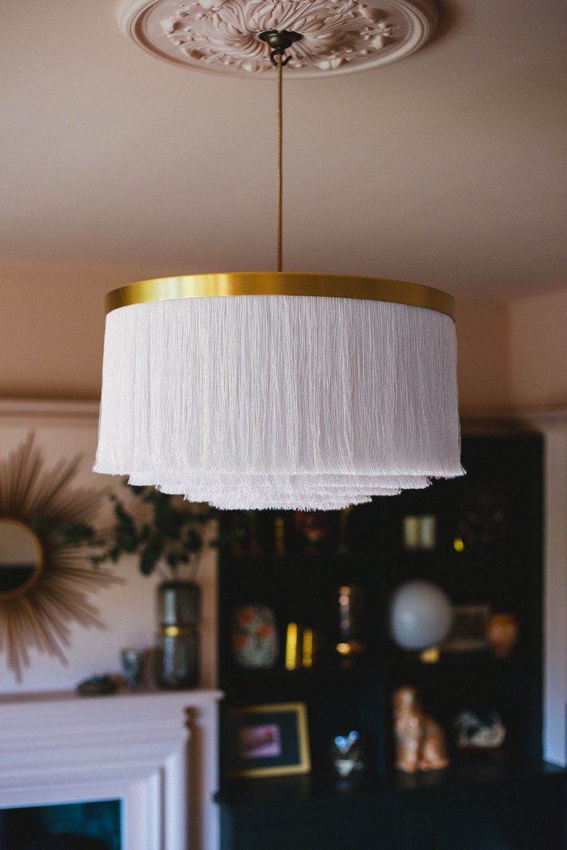
Have you seen an increase in dark kitchens floating around design sites and magazines? I’ve been seeing hunter green and black more than usual along with an increase in shades of blue on walls and cabinetry. While I do appreciate the moodier aesthetic, I think a white kitchen is the way to go (no surprise, right)? Just look at the kitchens here – they’re bright, clean, and inviting. Food looks great on white dishware…and it also looks perfect in white kitchens!
The first few kitchens below were part of the One Room Challenge Spring 2019 event, so I encourage you to click through to see the before photos of these spaces.
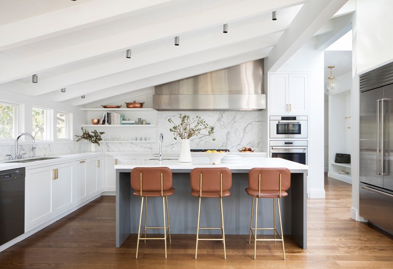
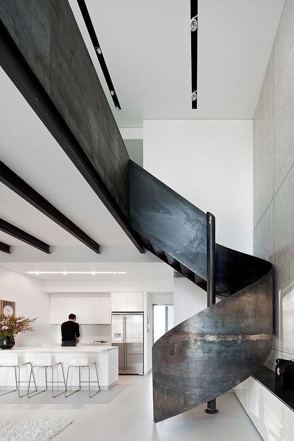
What are your thoughts about kitchen colours? Are you a fan of white, colour, or natural wood?
There’s nothing so obvious tying these images together. I’ve collected them over the last while, and I think each image is of such a pretty scene.
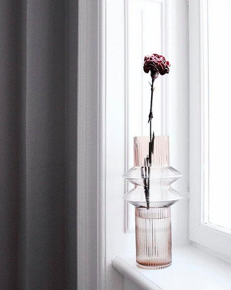
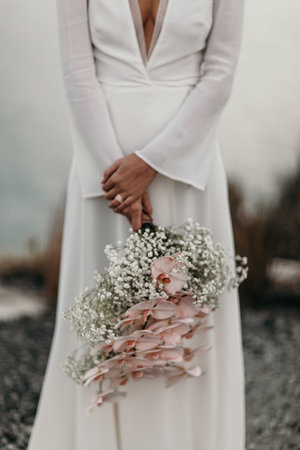
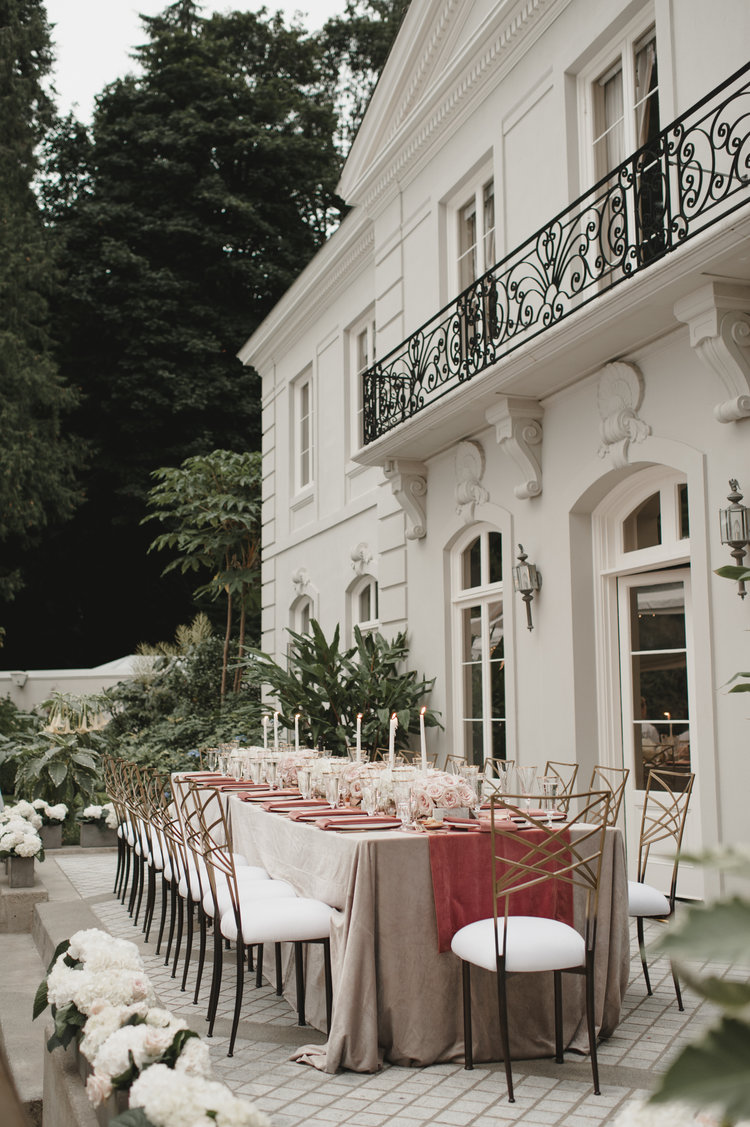

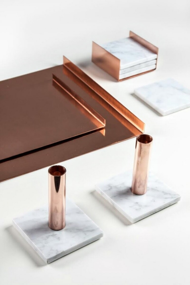
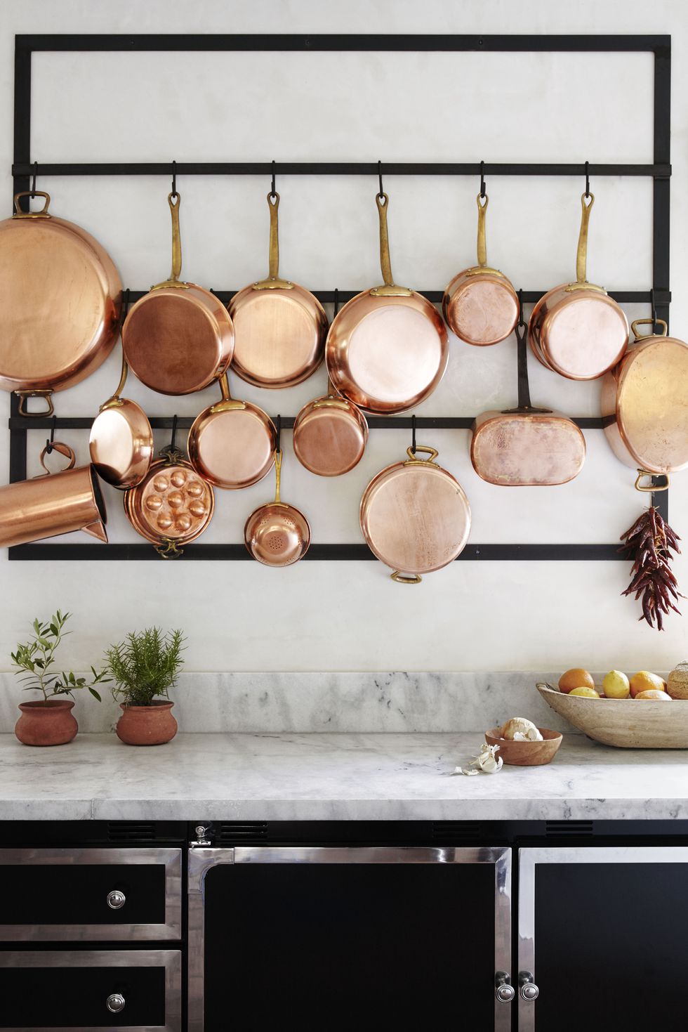
I haven’t written about a design trend in a while, but today is the day. Each of the spaces and items share two luxe materials: marble and copper.
Have a great weekend, everyone!
As I mentioned last week in this post, I stayed in five hotels during my two weeks in Japan. I would not hesitate to stay in each hotel again if I had the same itinerary on a future trip. But one hotel definitely stood out to me – Hoshino Resorts KAI Nikko. The hotel is on Lake Chuzenji, which is about a three-hour train+bus trip from Tokyo. It’s a hot spring ryokan which means that it has traditional hot spring baths and the rooms are traditional Japanese, meaning rooms with tatami mats and rice paper screens. Rooms have lake and mountain views with lovely sitting areas, dressing areas, and cedar-lined bathrooms. This place was special.
I stayed at KAI Nikko for two nights and I included breakfasts and dinners in my hotel package when I booked it. It was a good decision to do this because I was spoiled with beautiful and delicious meals, and I was able to meet so many of the hotel staff. Most of the staff spoke perfect English, and their attention to service and detail did not go unnoticed.

Each of KAI Nikko’s spacious rooms (there are only 33) incorporates regional crafts, a yukata and sash for guests to wear at the hotel (along with socks and sandals), and a pretty furoshiki (cloth) for carrying small belongings.
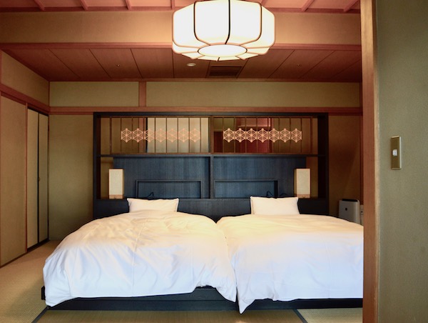
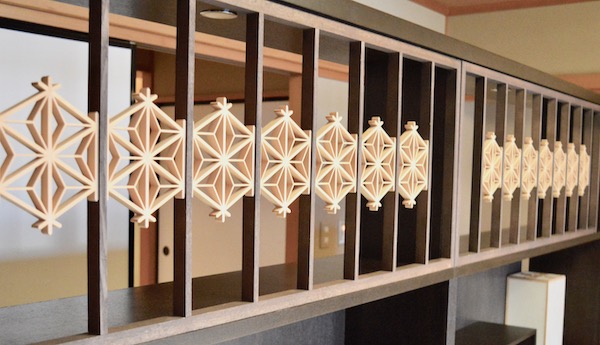
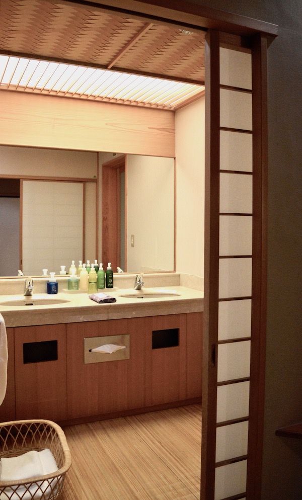
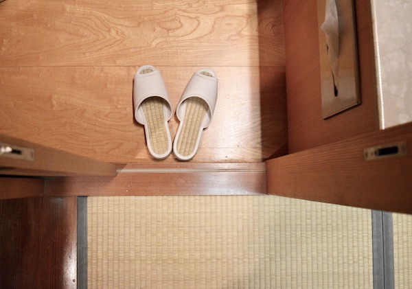
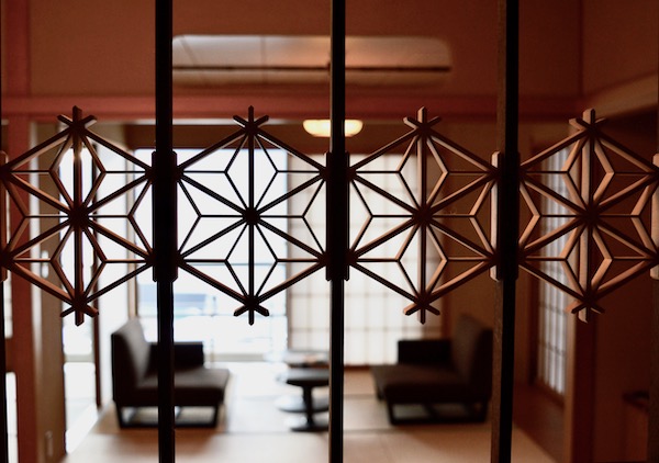
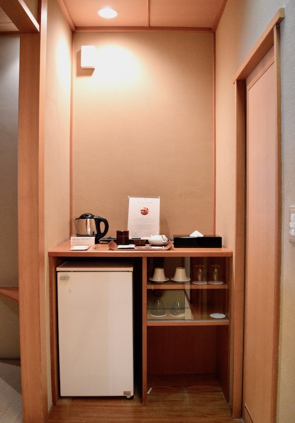
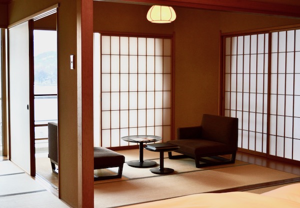
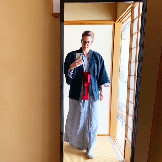
Here’s a quick video I made of my KAI Nikko room.
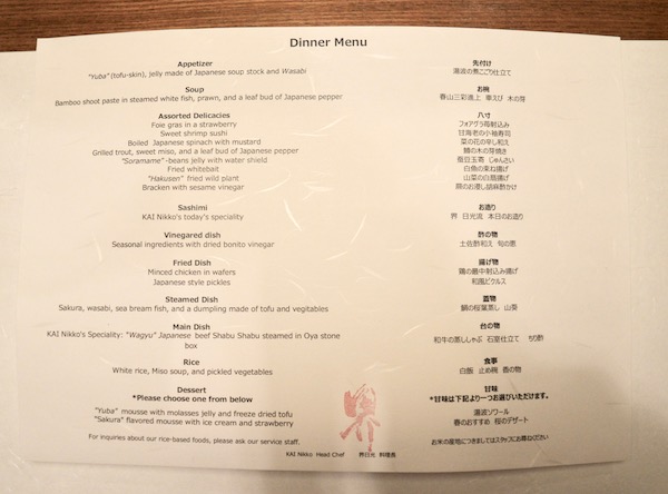
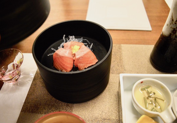
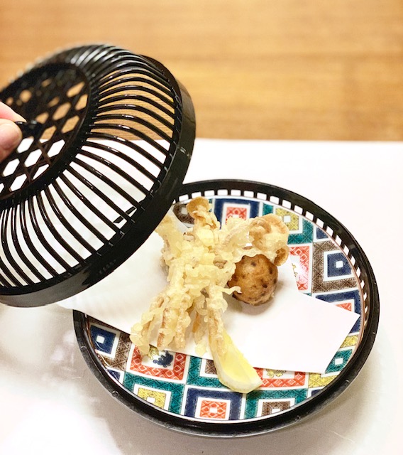

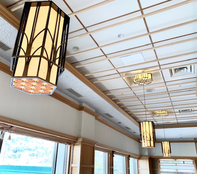
When I go back to Japan one day, I’m going to see if there are other KAI resorts I would like to visit. I have a feeling that each one is unique and has something spectacular to offer its guests. They also seem to be in locations that are just slightly away from the routes of many tourists.

If you’d like to see more of my trip to Japan, check out #WhiteCabanaGoesTo Japan or read these blog posts.
Japan content is going to continue here for a little while, so I hope you enjoy it! Today is all about chopsticks!
I used chopsticks for the two weeks I was in Japan (minus one day in Kobe). I could use them well to begin with, but my skills definitely improved or became more natural each day. Many of the restaurants that I went to had the wooden chopsticks that you break apart. Others had really refined lacquer and wood sets. They were beautiful. So many shops sold chopsticks that ranged in price from $10 a pair to hundreds of dollars. I had no idea! While I didn’t use any white pairs of chopsticks while I was in Japan, this set is just too refined and luxurious not to share!

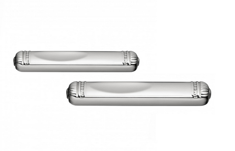
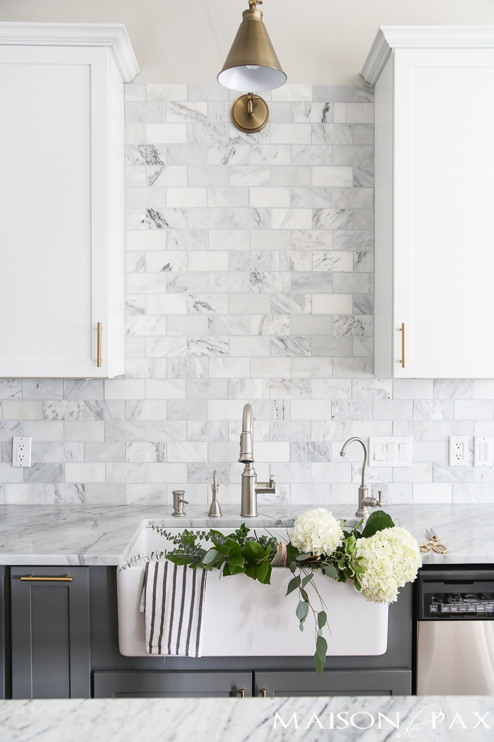
One way I see kitchens styled is with flowers in the sink. The photos look so pretty. In reality, it’s rarely as picturesque. Who agrees? When I bring flowers home, my sink is full of stems and leaves. The flowers are also in the sink for less than 5 minutes. But photos of flowers in kitchen sinks looks so pretty!
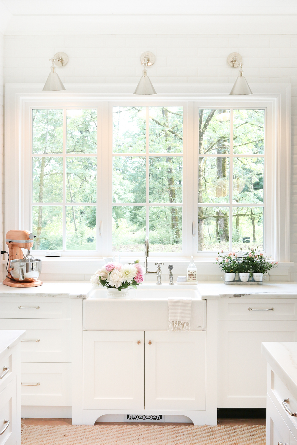
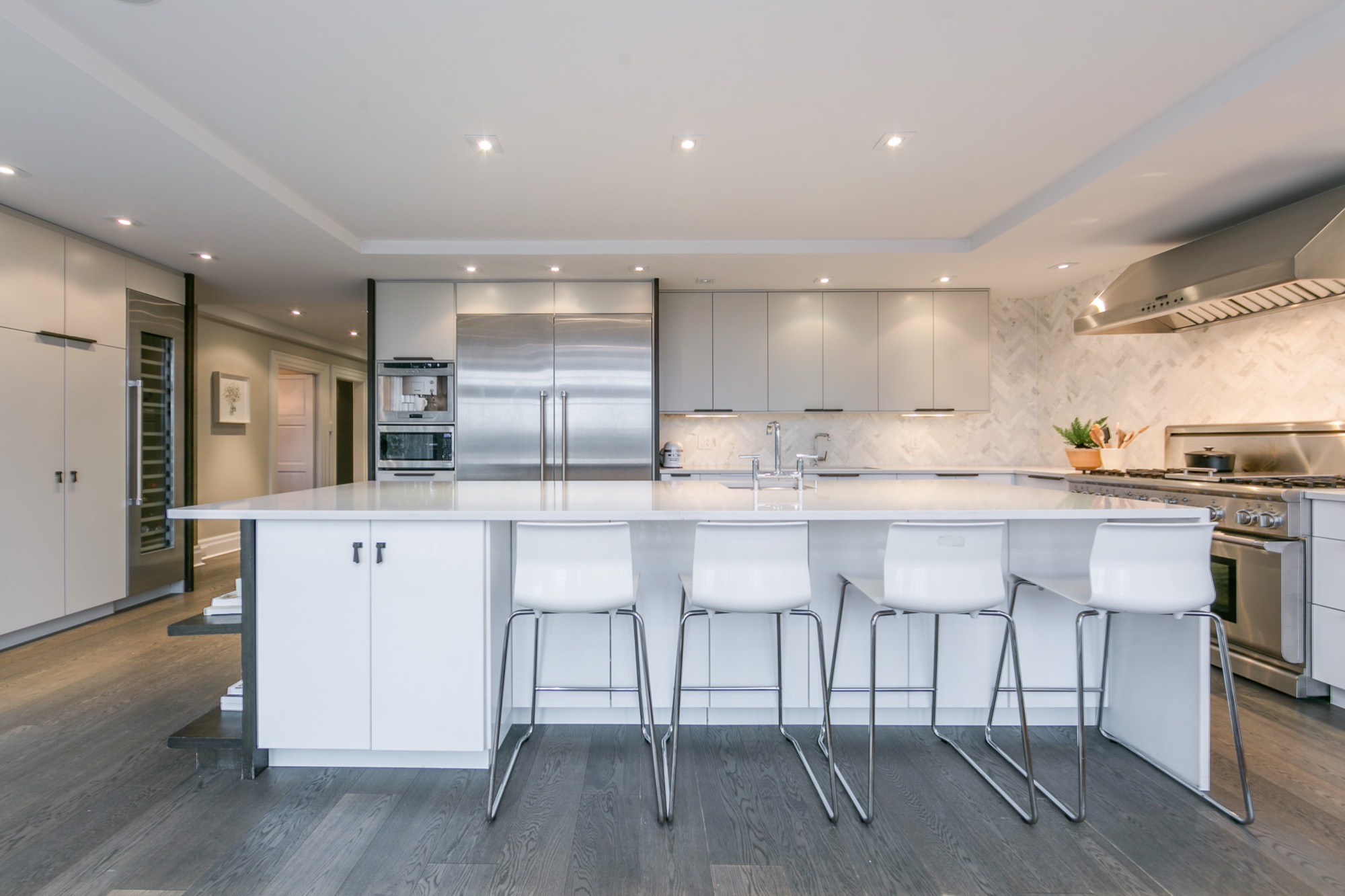
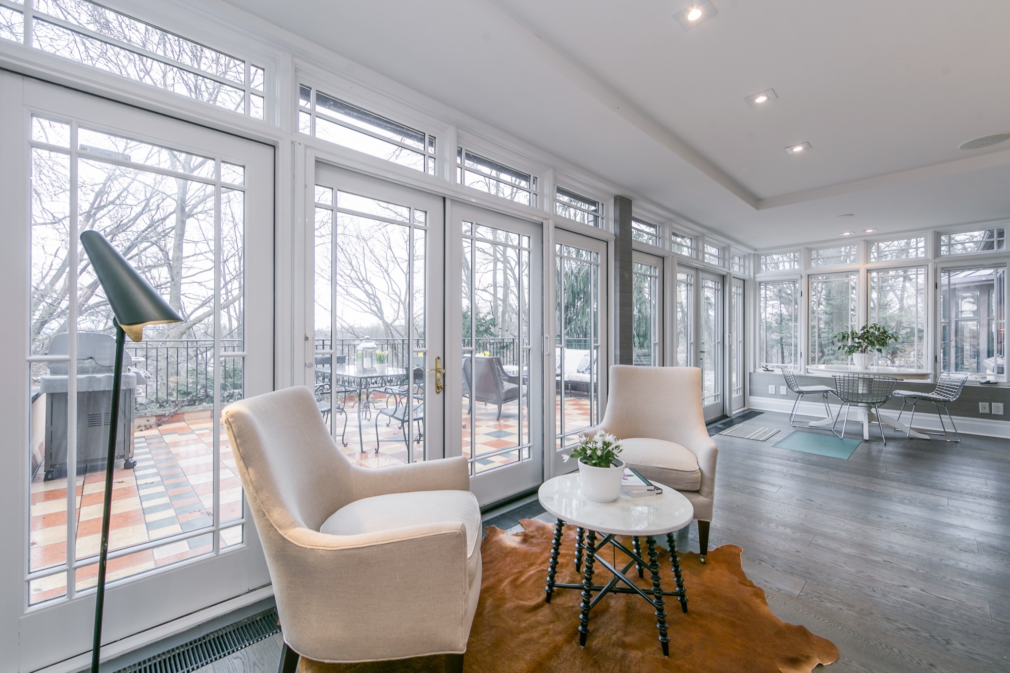
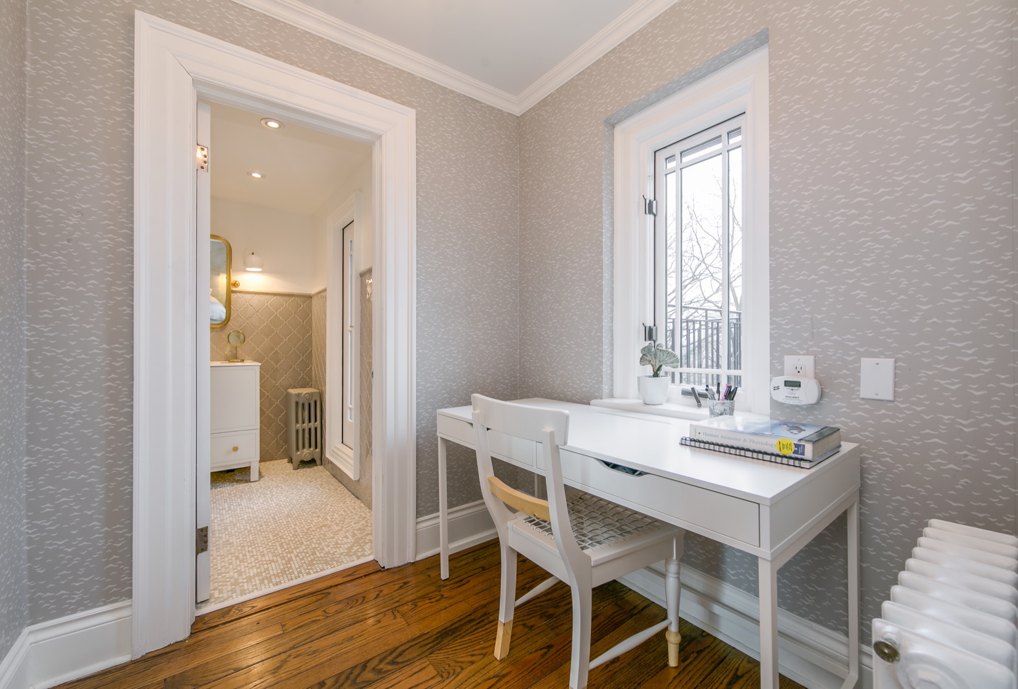
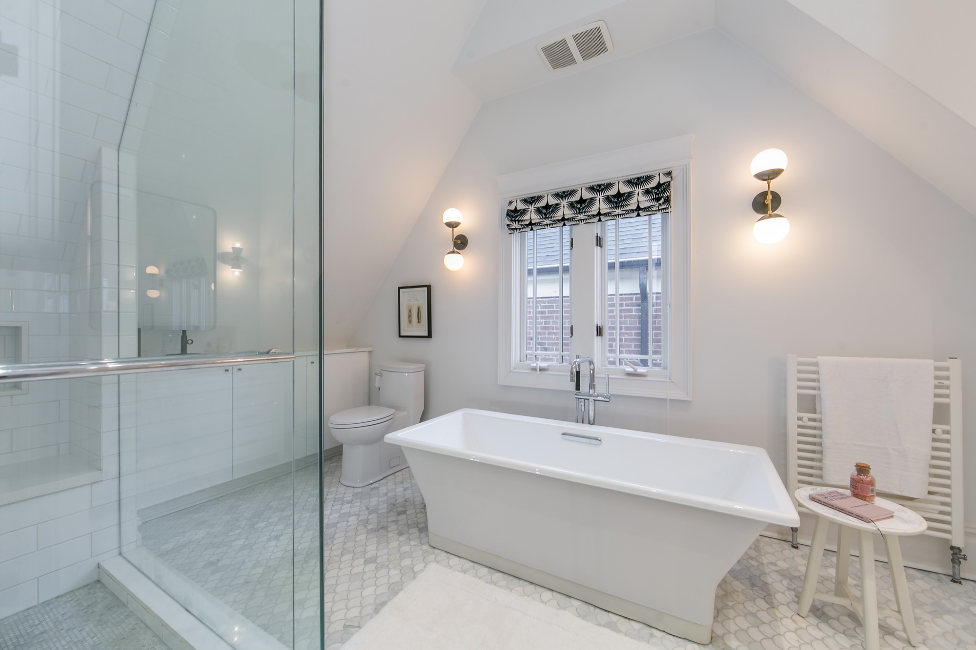
This home. Oh my goodness. I have drooled over every photo of it. My friend Shannon spotted it first on Erin McLaughlin’s (Style at Home Editor) Instagram feed. I quickly hopped on to the listing, too. It’s just so beautiful!
It’s hard for me to choose a favourite room, but if you twisted my arm and I had to choose, I think it would be the kitchen as it’s hard to resits the brightness and the wall of windows. I also love the foyer because it’s dressed beautifully in white.
Would you like a tour? Here you go! You may recognize a space or two from Erin’s home as it was previously featured in Style at Home magazine.
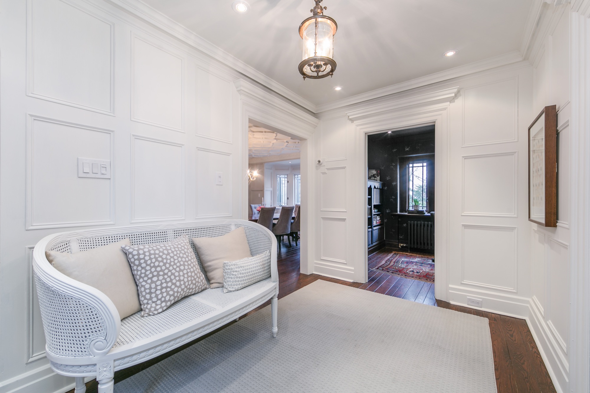
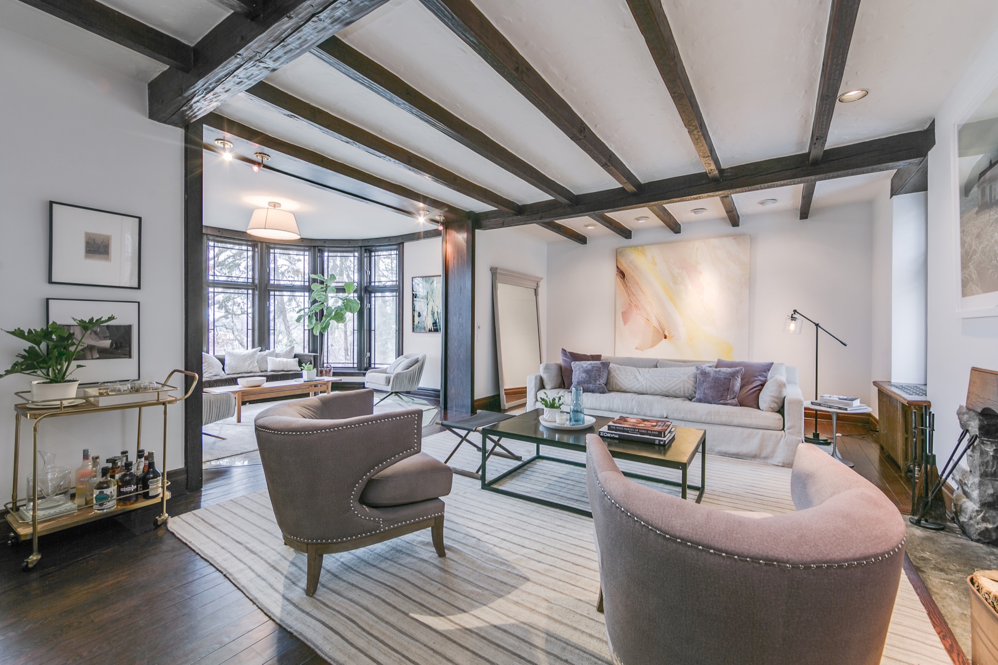
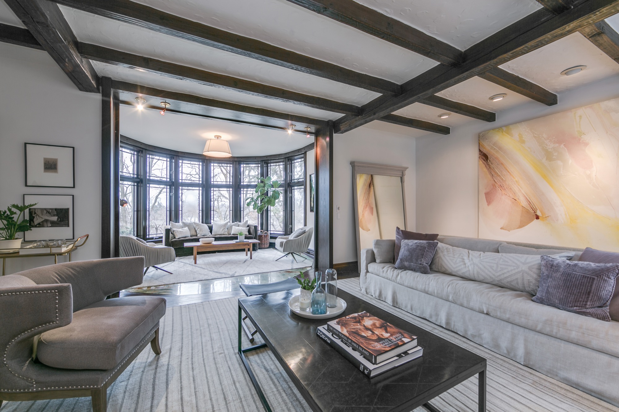
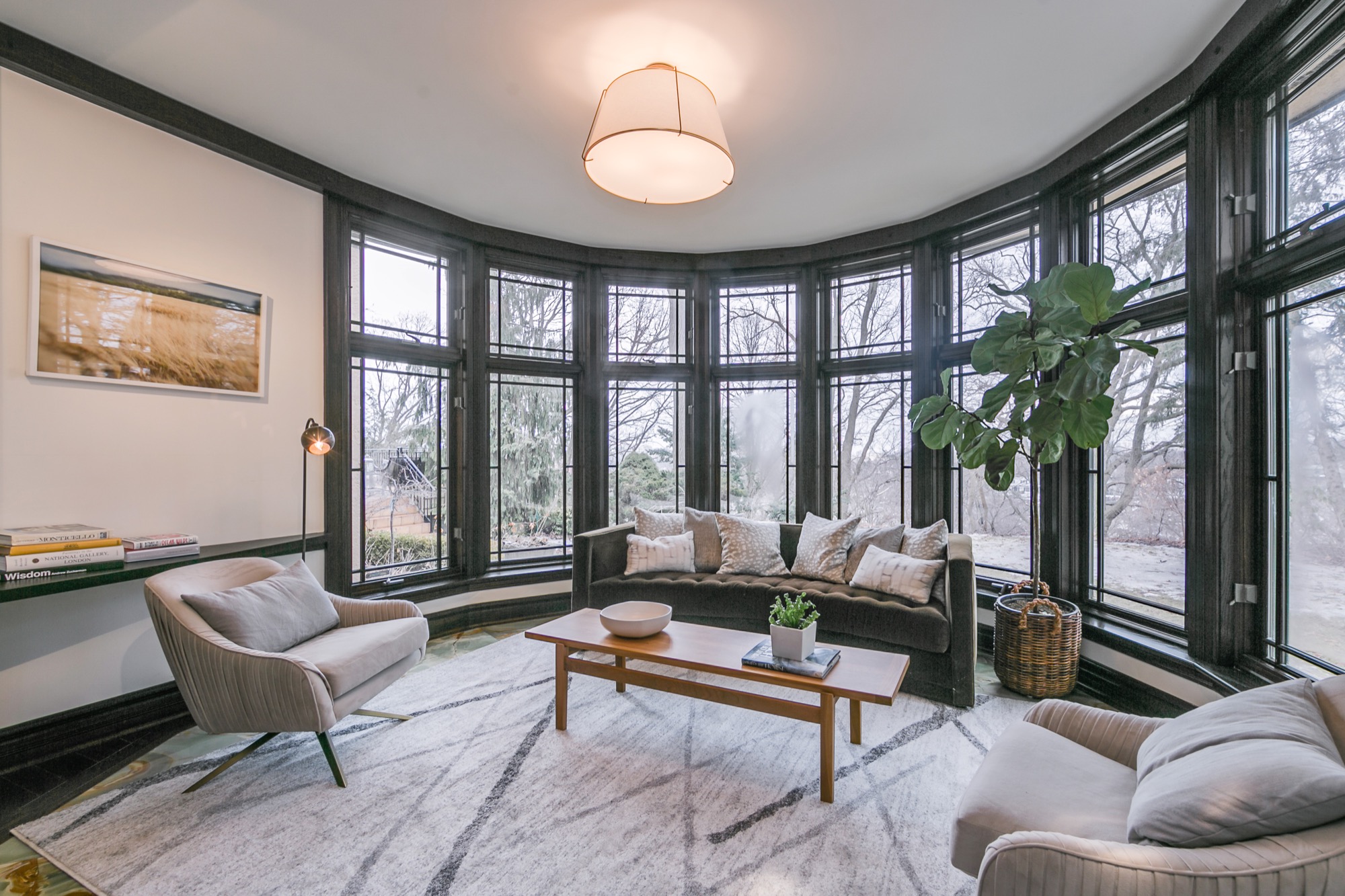
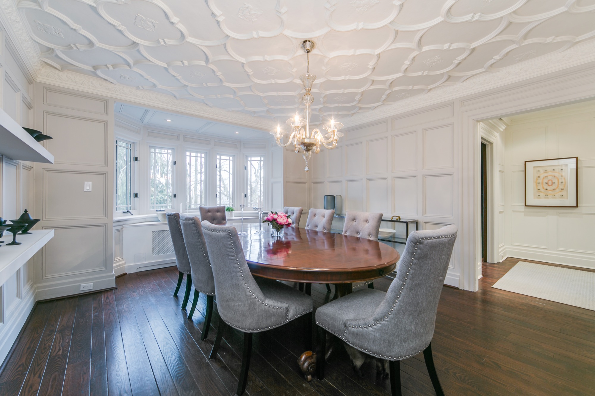
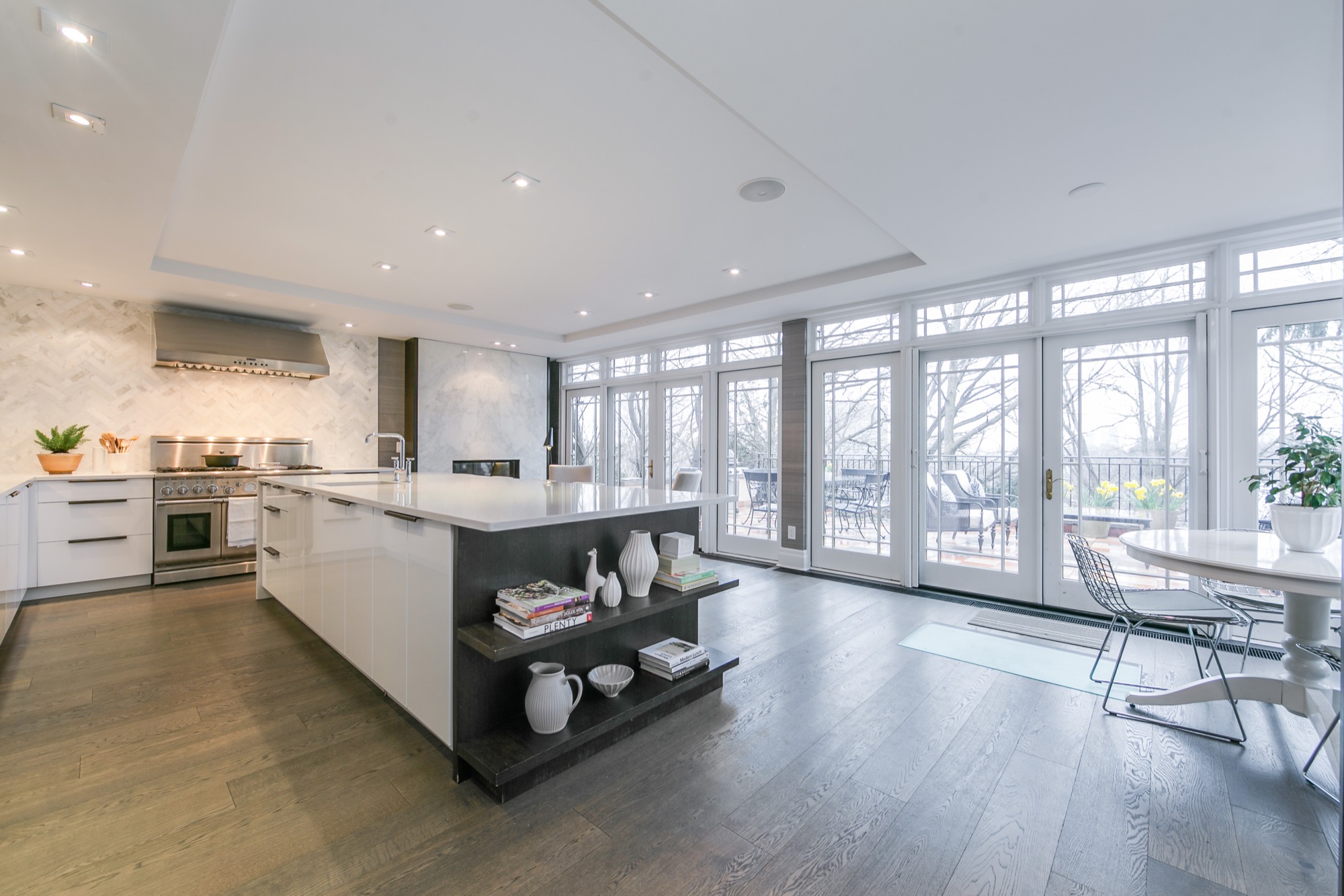
Today’s post is a bit random. In no particular order, I’m sharing a whole lot of gorgeous photos, spaces, and inspiration that have caught my attention on Pinterest.
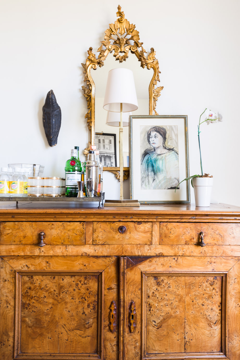
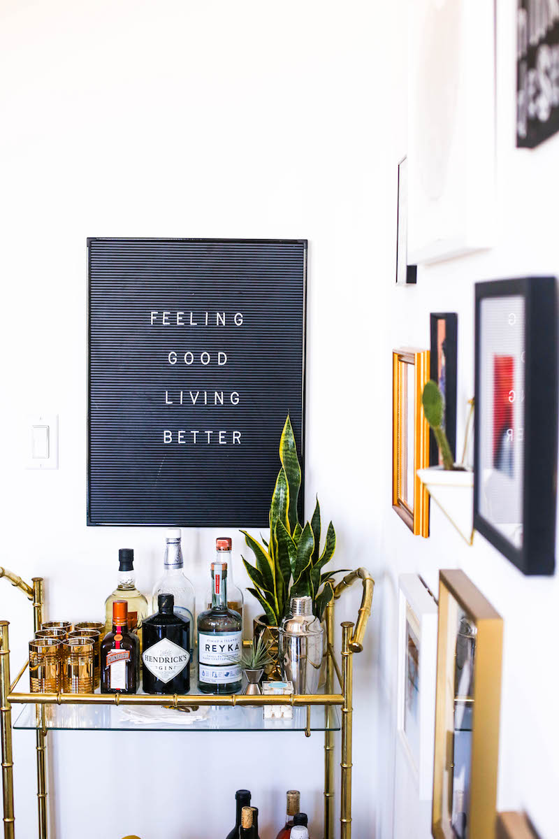
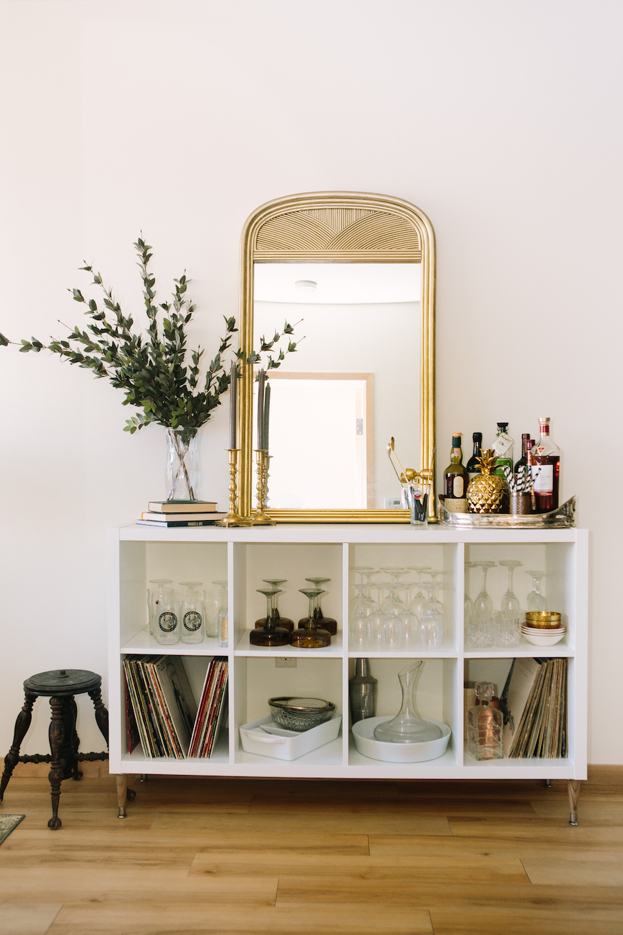
Are people still keen on including bar carts in their spaces? I haven’t seen them as often as I have in the past, but every time I do see them, I think they look so chic and inviting. The same is true for general bar areas on shelves and furniture within the home.
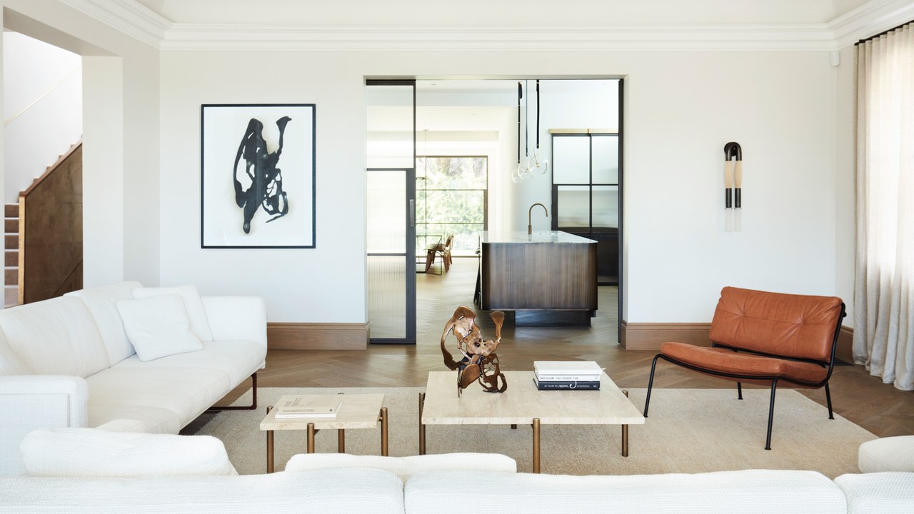
When I see spaces like the one below, I feel like paring everything down in my own home and live with fewer things around me. This Australian home is full of rich textures and beautiful details.
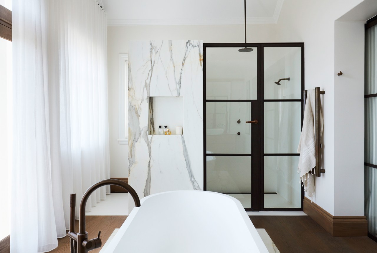
Images via Architectural Digest.
I’m drooling over all of the gorgeous apartments for sale. I’ve been on realty sites far too often these days! This stunning 4-bedroom, 2-bathroom apartment is in the 7th arrondissement.
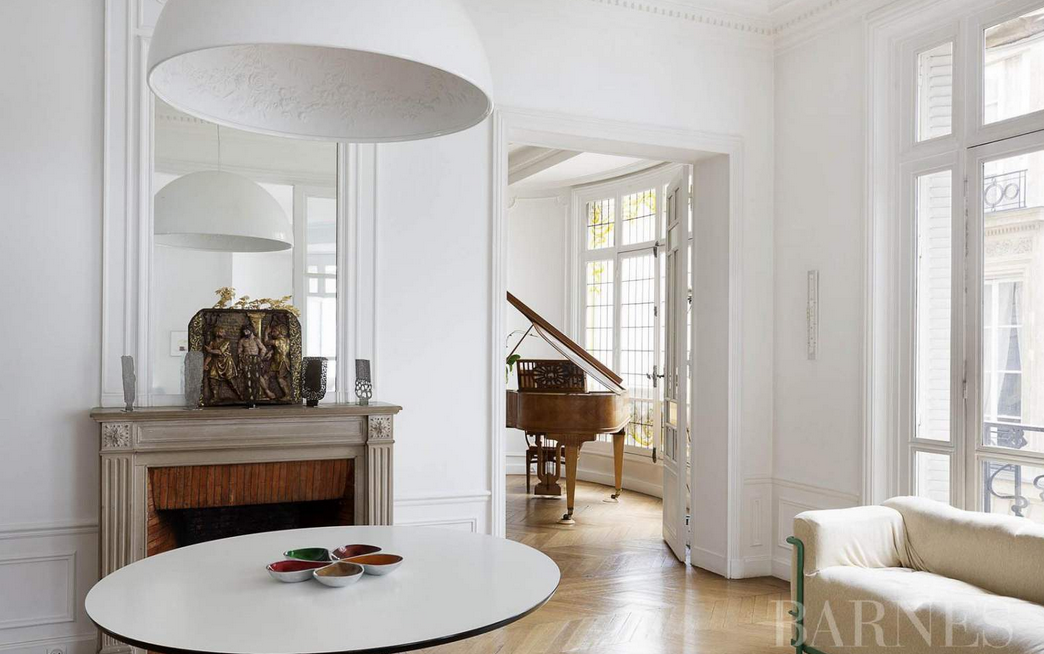
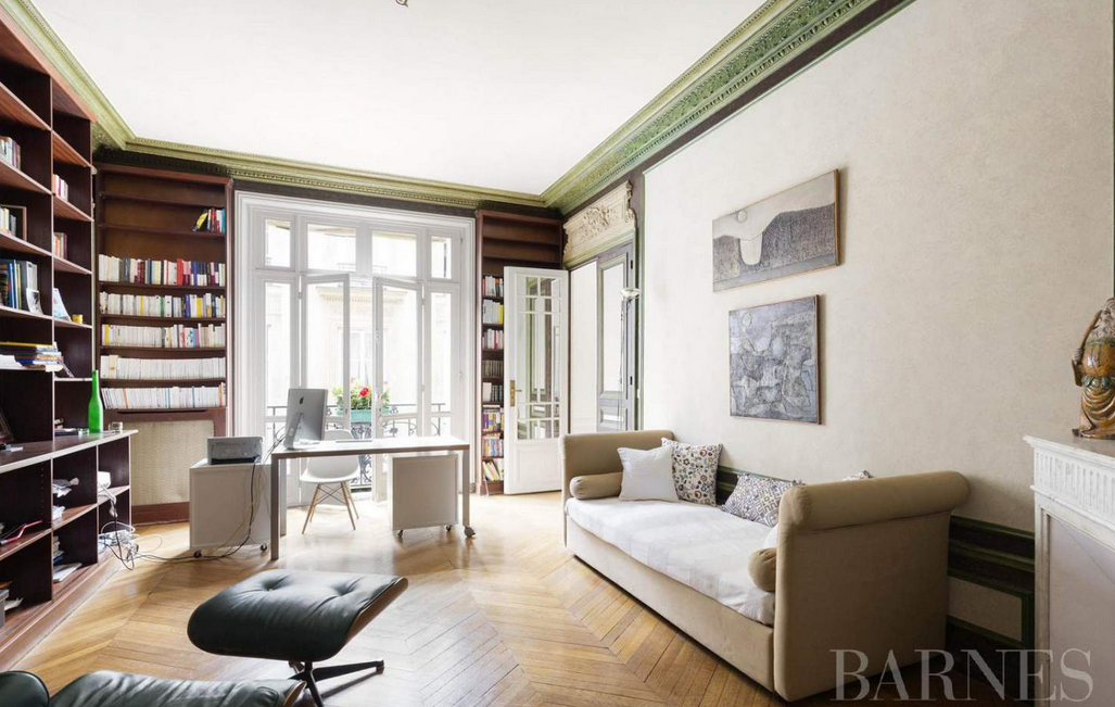
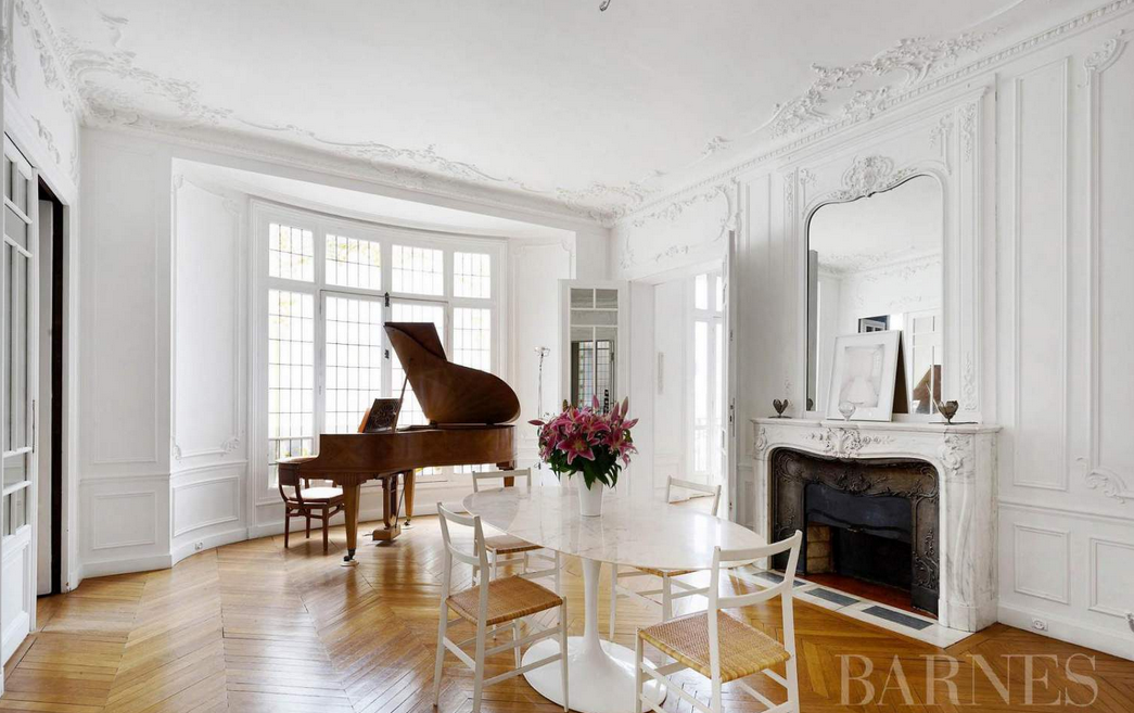
The price tag? 4.5million €.
All photos via Barnes International Realty.
Roche Bobois may be one of the first furniture brands that comes to mind when we think about French furniture. Its furniture is easy, slouchy, and effortless, even if the price tags tell a different story.
Ligne Roset began as in 1860 and it remains a family-owned company. It collaborates with designers to bring interesting, creative, and memorable pieces to the marketplace.
Pierre Frey was founded in 1935, and since then, it has been manufacturing luxurious textiles.
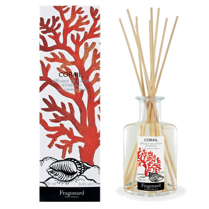
The next brand may be a stretch for the “homeware” category, but because it has home scents in its collection, I feel it’s appropriate to include it here. I’m speaking of Fragonard – the French parfumerie.
La Cornue produces the ultimate in luxurious kitchen appliances. The pieces are absolutely impressive.
A couple of weeks ago, I attended the Interior Design Show opening night party in Toronto. It was a fun evening full of great food, drinks, and design. I was impressed by the creativity, technology, and style that is coming up in the design marketplace.
Today I’d like to shine the spotlight on a few brands and products that caught my eye.
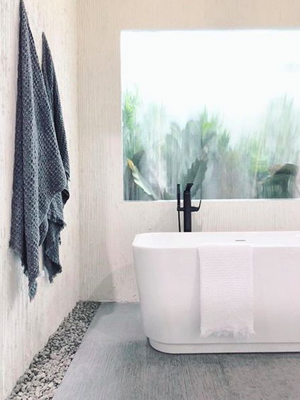
First up is this free-standing tub from DXV Canada. I appreciate it’s simple elegance. And since a bathroom reno will be in my future (no date set quite yet), this is a great option that I think would work well for my space.
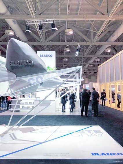
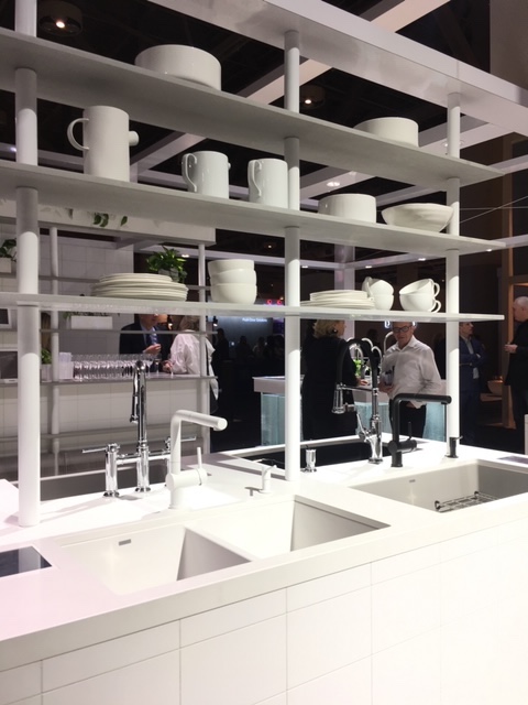
There was a lot of buzz about Blanco’s booth. It’s concrete installation sure caught people’s attention. I have a soft spot for Blanco as you may know because of the work I did with the company when I renovated my basement bathroom/laundry combo room. Side note: I still absolutely adore my laundry sink and faucet. Beyond the entrance display, the faucets and sinks on show were as sleek as ever.
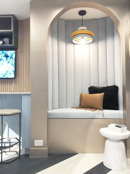
Harrison Fae Design worked with Microsoft to create an interactive booth where attendees could create a design that would then be lasered/burned onto a white macaron. The technology was definitely amusing, and I appreciated the design of this little nook.
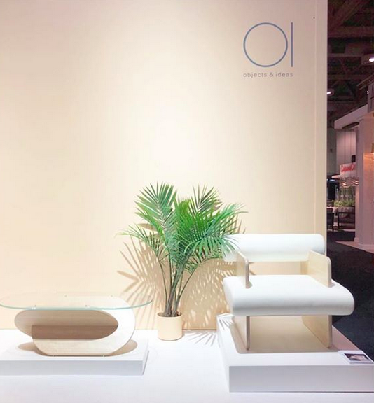
At Objects & Ideas, many people focused on the design of this chair, but it was the coffee table that I really liked.
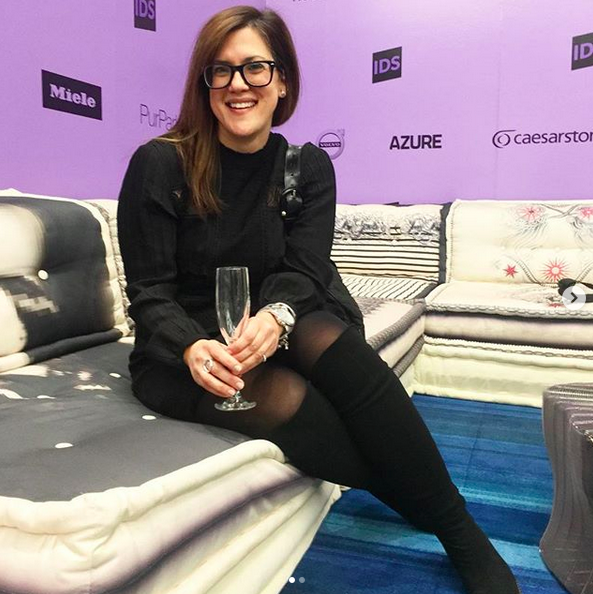
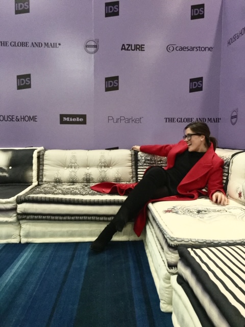
And you can bet I enjoyed the Roche Bobois modular sofa in the media lounge! It was a great spot for a pre-show toast and a post-show break!
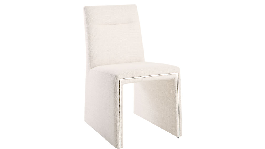
Spotted this on CB2 and thought it was pretty sleek.
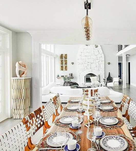
I love when so many lovely spaces pop up on my Instagram. Here are the latest gems that have come across my screen.
And a great reminder, too.
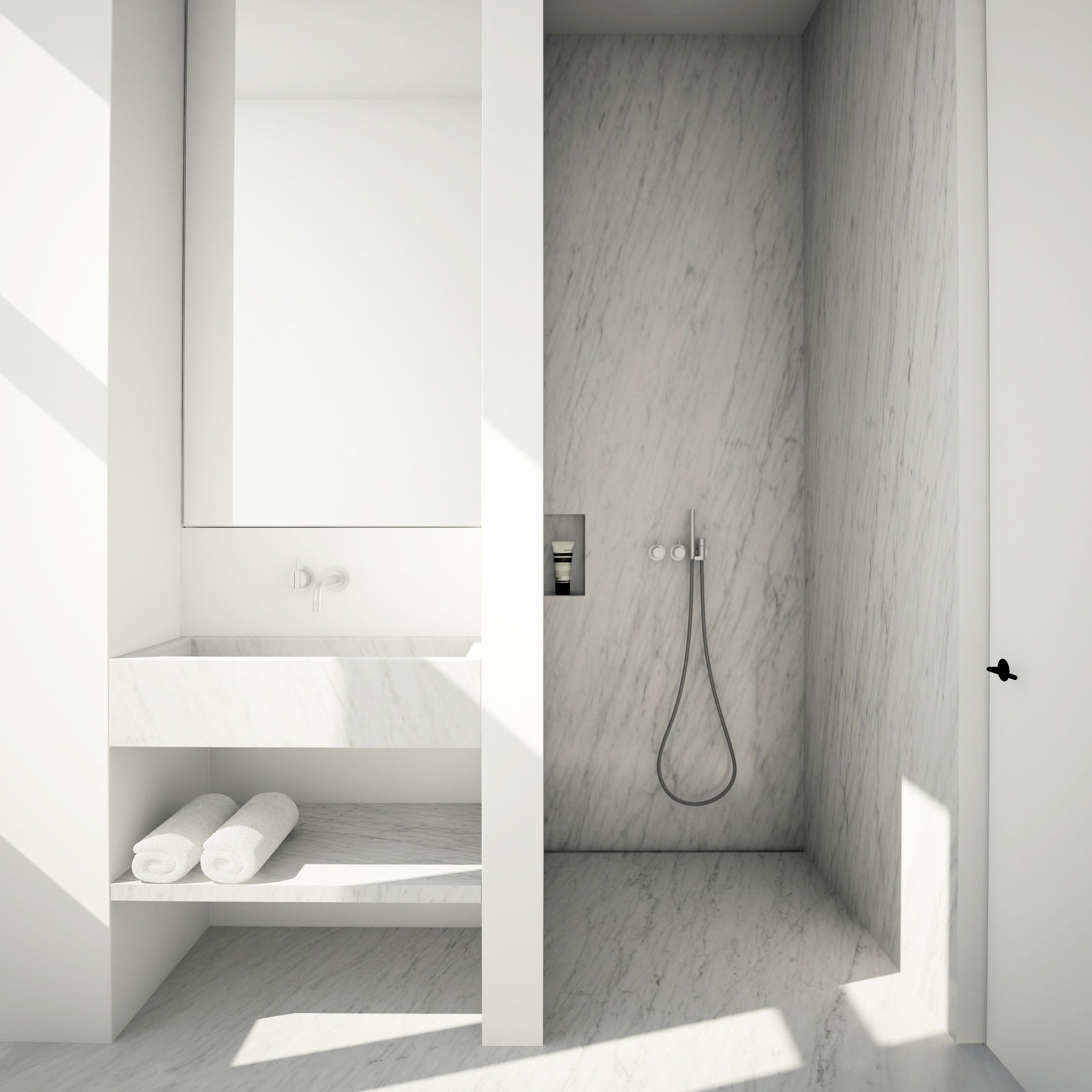
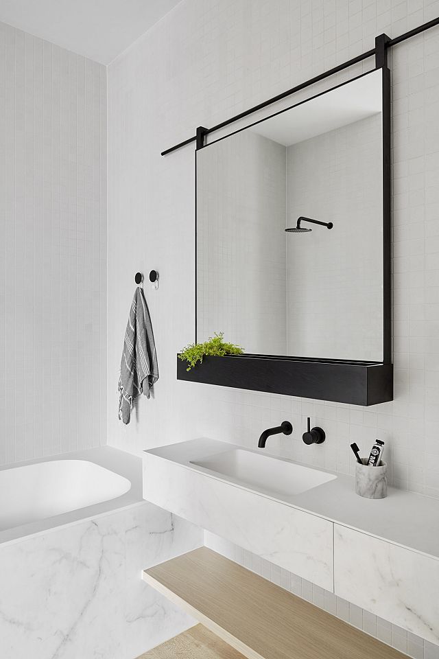
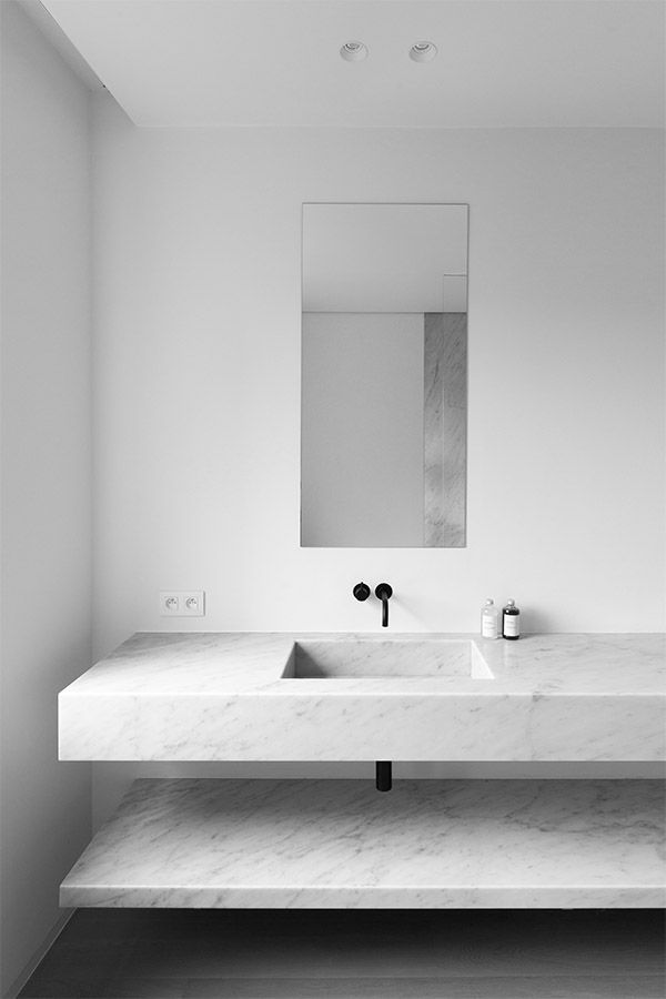
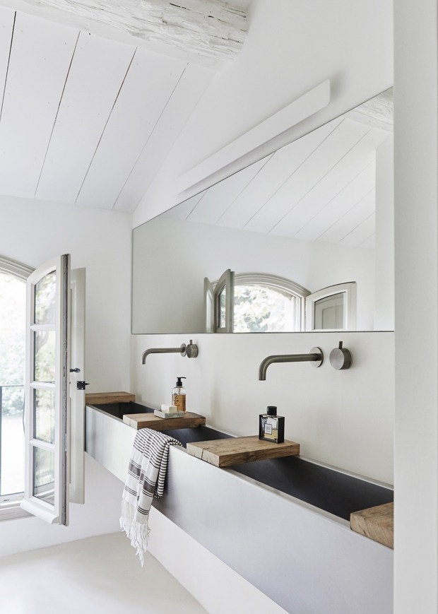
I’m ending the week with five gorgeous, white bathrooms that are bright, airy, luxurious, and inviting.
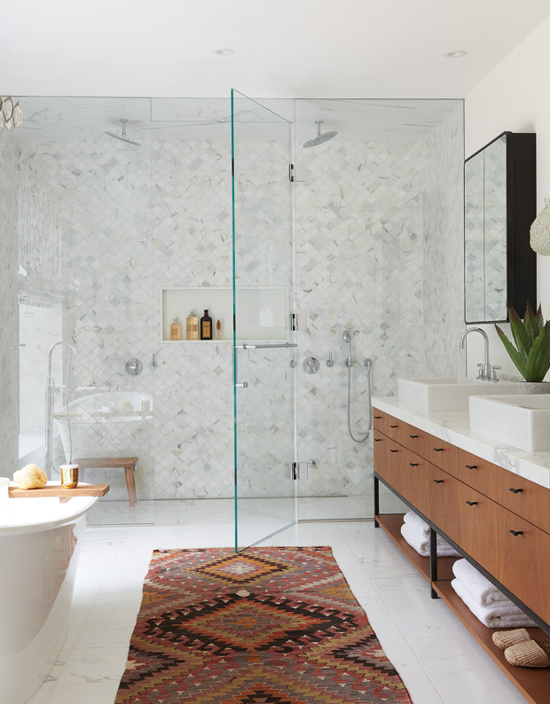
An event that many in the Canadian design community look forward to every winter is the Interior Design Show (IDS) held each January in Toronto. I have a great time every year – learning about what’s new and upcoming in design; meeting talented artists, creators, and designers; and sharing ideas and commentary with friends.
IDS begins on Thursday, January 17th (first trade day) with some keynote speakers and the opening night party (open to the public). IDS is open to the public on Saturday and Sunday (with trade days on Thursday and Friday). It is sure to be inspiring! Have you seen the line-up of speakers? Canadian design favourites Lynda Reeves and Brian Gluckstein will be giving talks on Sunday, January 20th. Before then, talks by designers, writers, and architects will be shared. The schedule is jam-packed, and can certainly get overwhelming. My advice? Have a look at the schedule ahead of time to see what interests you, then take a day to stroll around the booths and interact with the exhibitors. You’ll learn so much through conversation! And the face-to-face interaction with experts will be a highlight of your experience, I’m sure!
There’s much to look forward to. Here are some of the booths that are on my must-see list.
Blanco. Well, we know I’ve been a fan of Blanco for quite some time, so I’m eager to see its exhibit and new product launches.
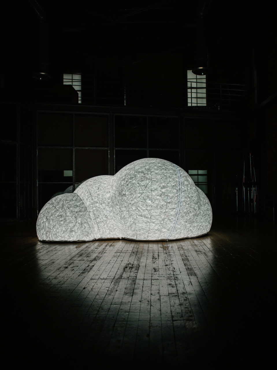
Haven by Tangible. I’m looking forward to seeing Haven’s whimsical cloud-like pop-up space.
Swiss watch company Rado‘s installation of objects will include a variety of materials, forms, and textures. The company is also showing off the results of the design competition where students from Vancouver’s LaSalle College designed the IDS information desk. I am expecting precision with Rado’s work!
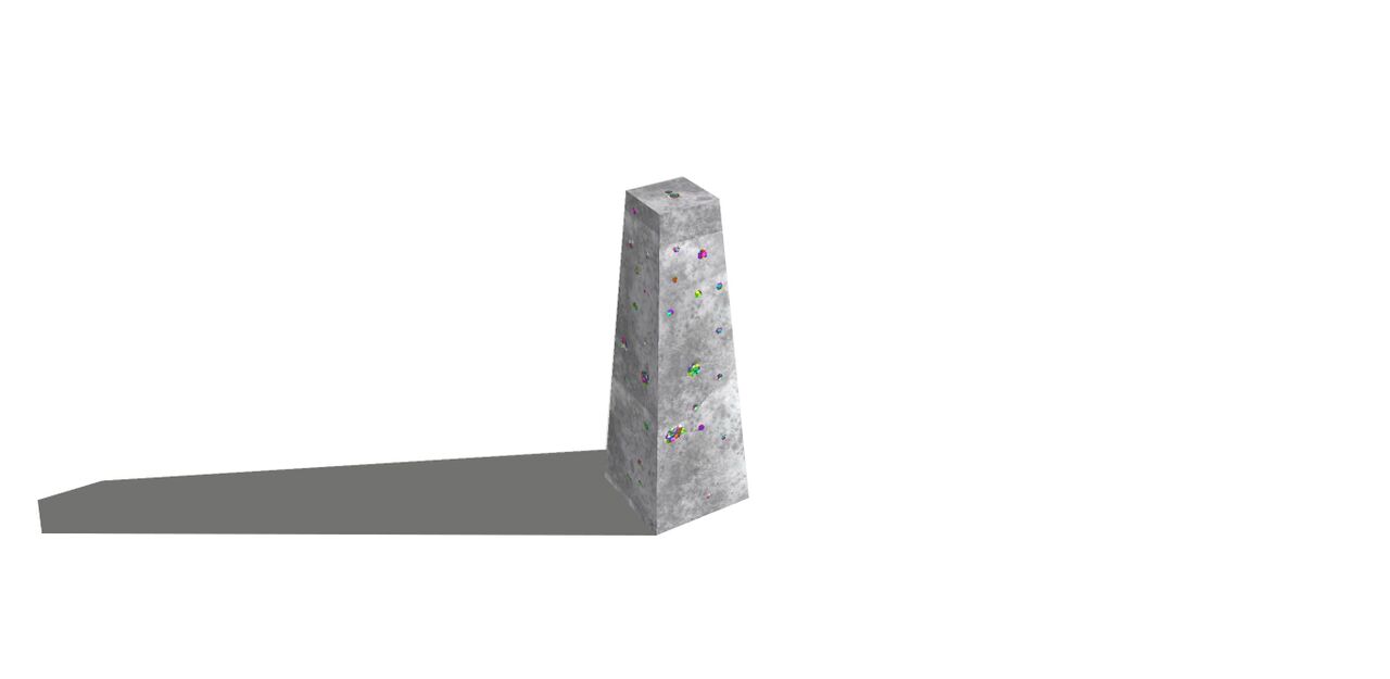
Studio North & Prototype is always a popular destination of IDS. Over 65 Canadian and international designers will be presenting their limited-editions of furniture, lighting, glass, ceramics, textiles, and surface design. It is one of my favourite features of IDS, so you can bet I’ll be talking a walk through to see the presentation of so many talented creators!
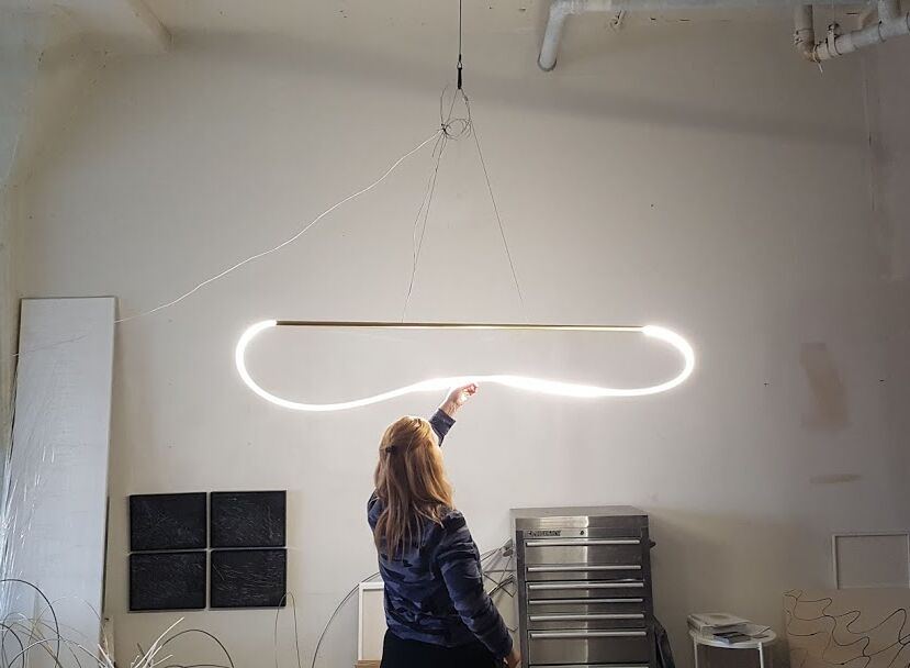
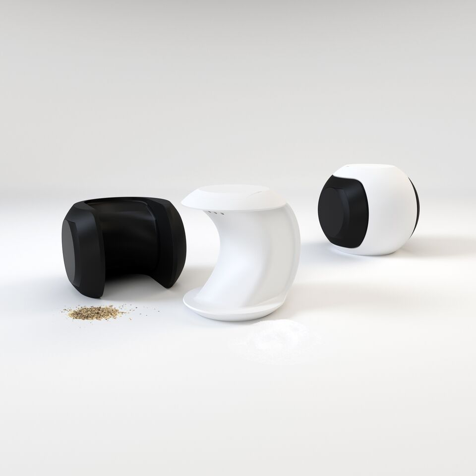
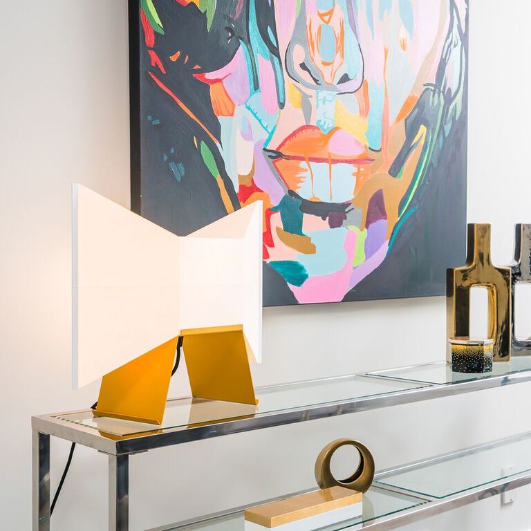
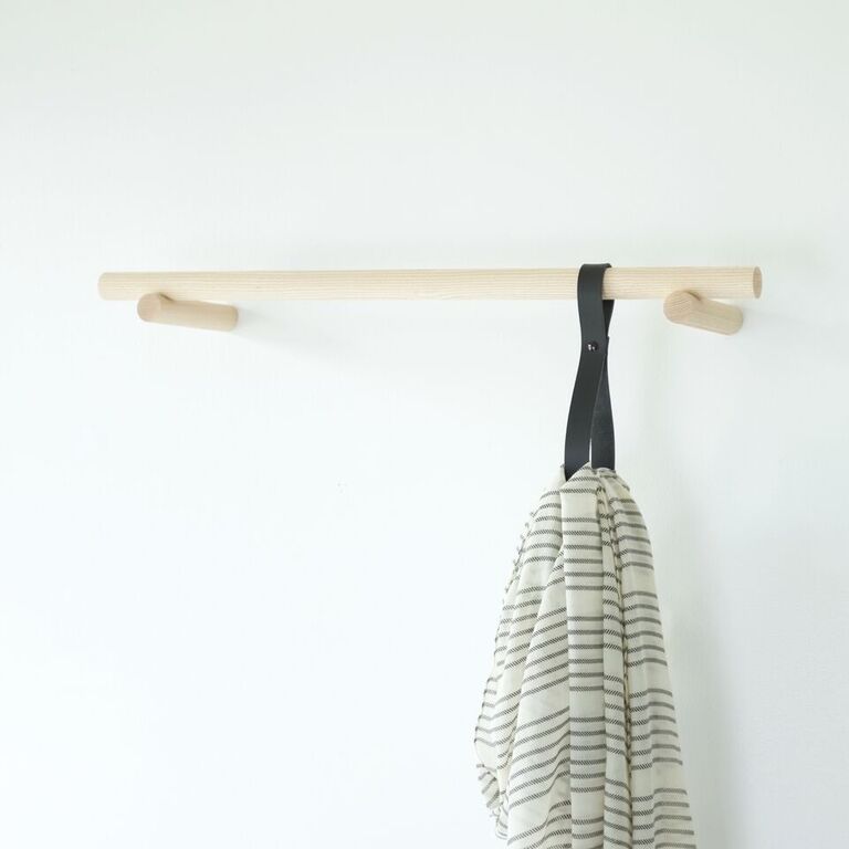
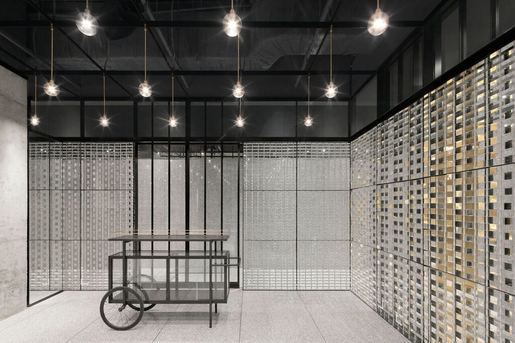
Lyndon Neri and Rossana Hu of Shanghai-based Neri&Hu Design and Research Office will be giving a talk on Friday at 1pm. Their work is streamlined and dynamic, and I love the contrast of lines and light of their projects.
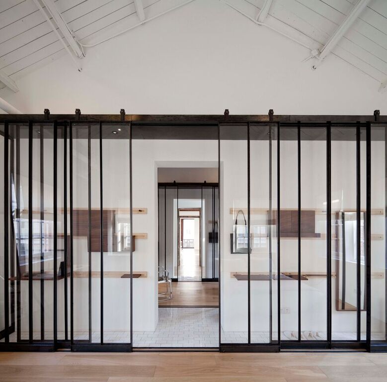
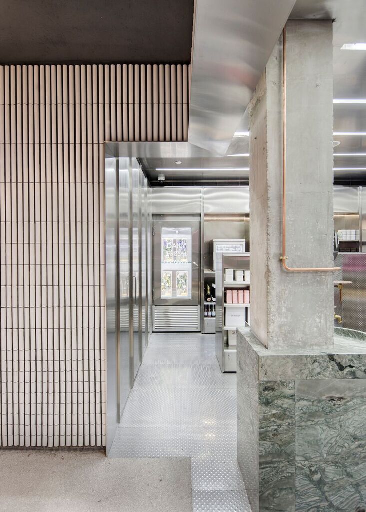
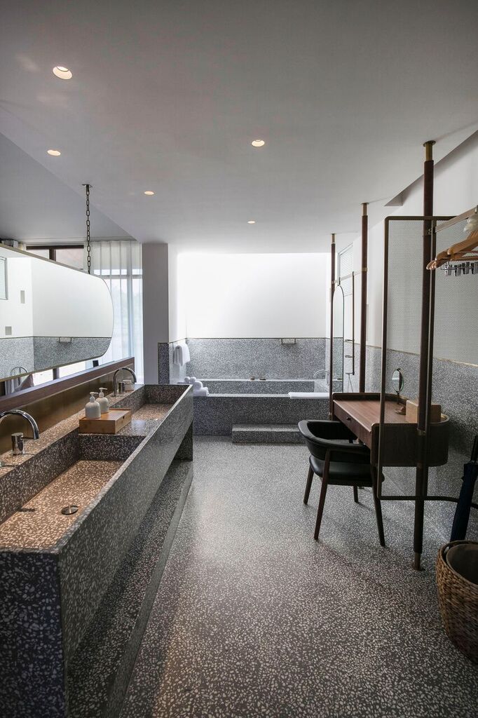
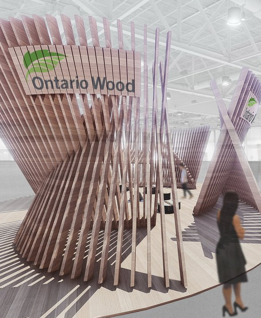
I’m also looking forward to seeing what Izen Architecture brings to IDS. They are collaborating with Ontario Wood, which is a government initiative to help us all identify and purchase locally made wood in a variety of species most suitable to our design projects.
These are just a few of the IDS exhibits and speakers that I’d like to see this weekend. And you? Have you bought your ticket? What are you looking forward to seeing or learning?
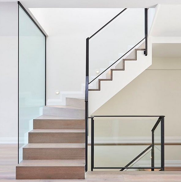
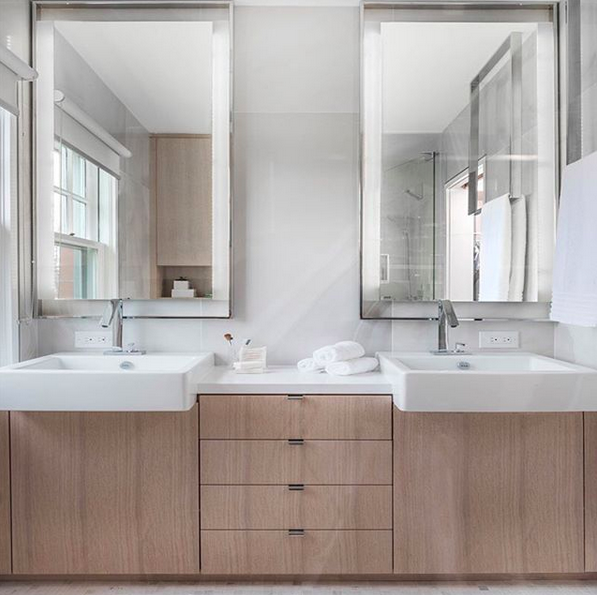
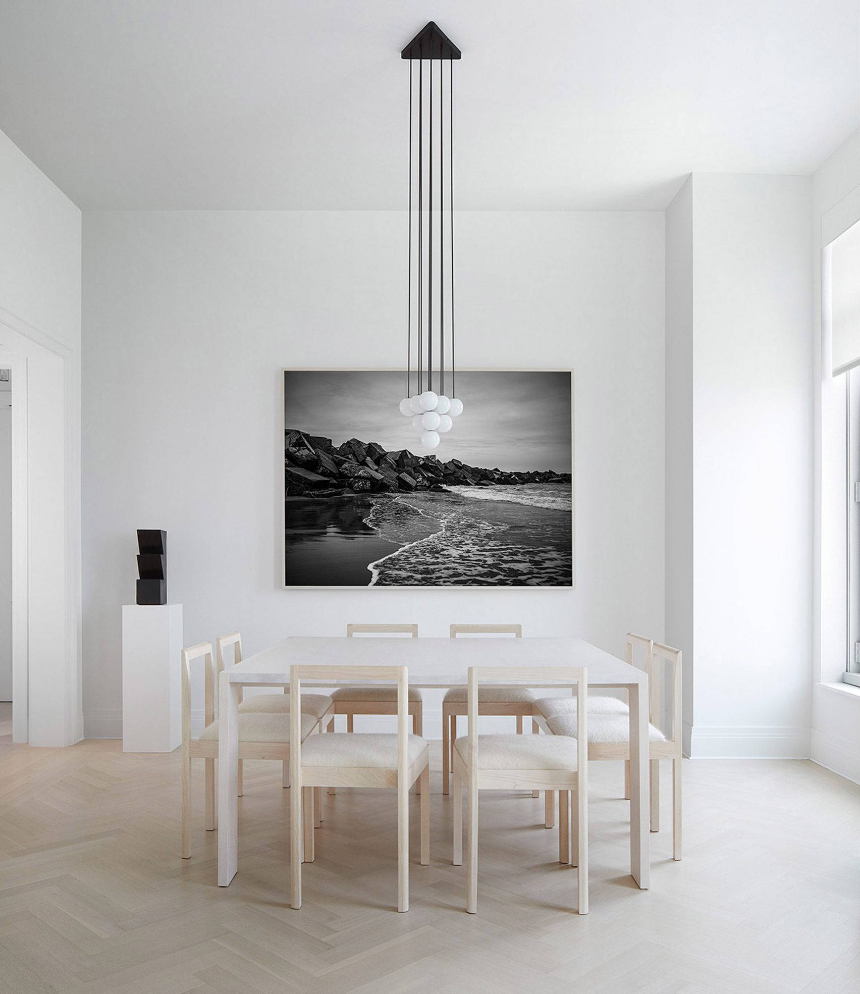
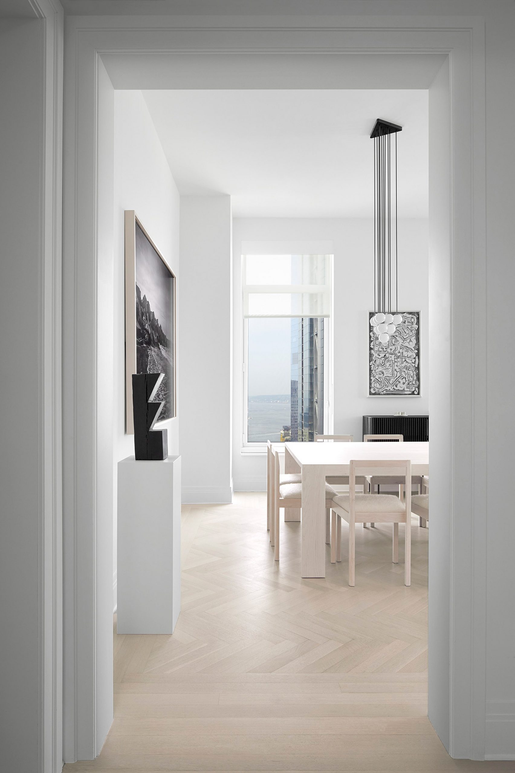
Let’s go to Manhattan, shall we? More specifically, let’s go to this minimalist 2-bedroom home in Tribeca.
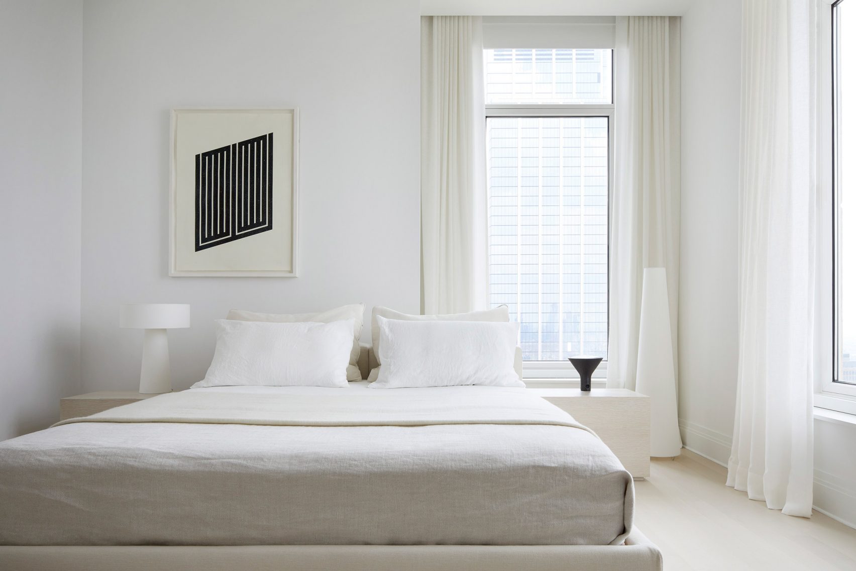
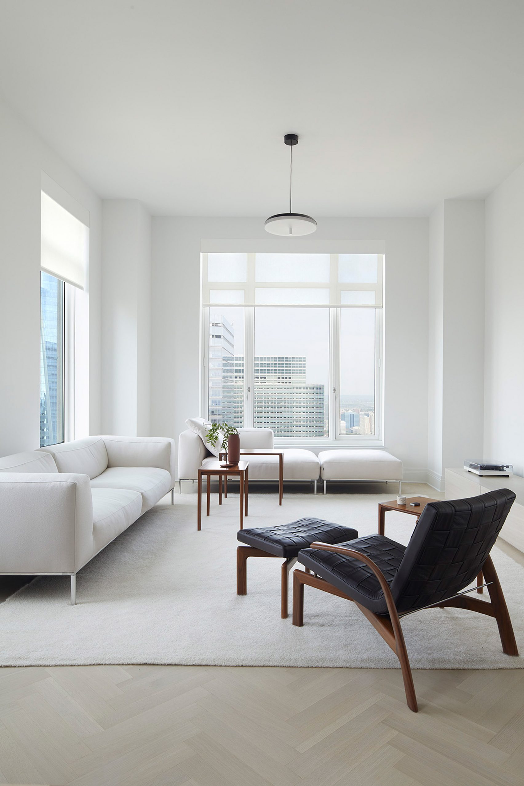
images via Dezeen