Design

Trivia Thursday: Bullion Fringe

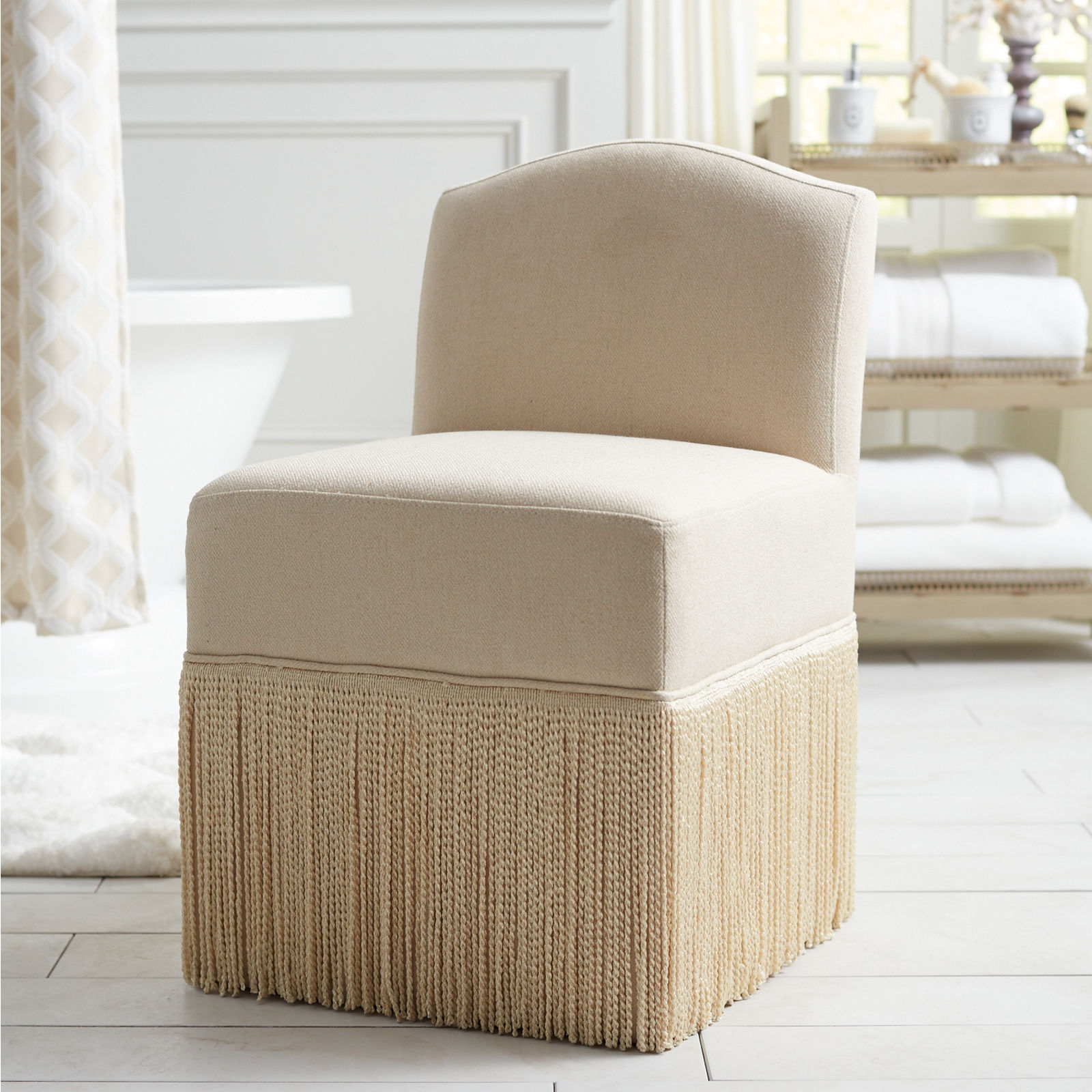
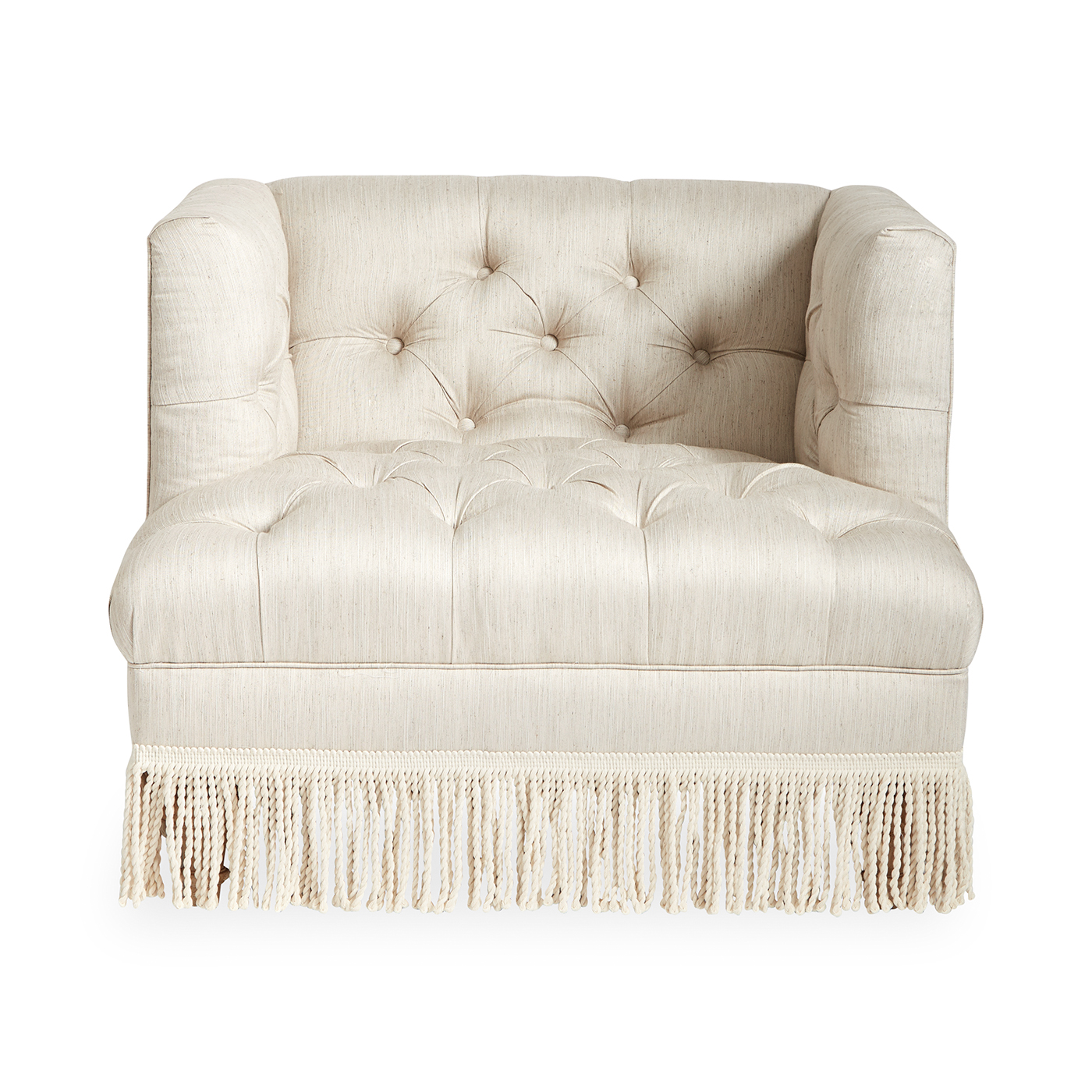
You know that massive fringe we sometimes see on furniture like…

Pier 1

Do you know what it’s called?

It’s called bullion fringe.

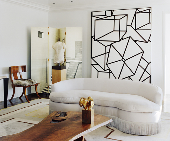
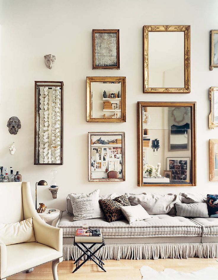
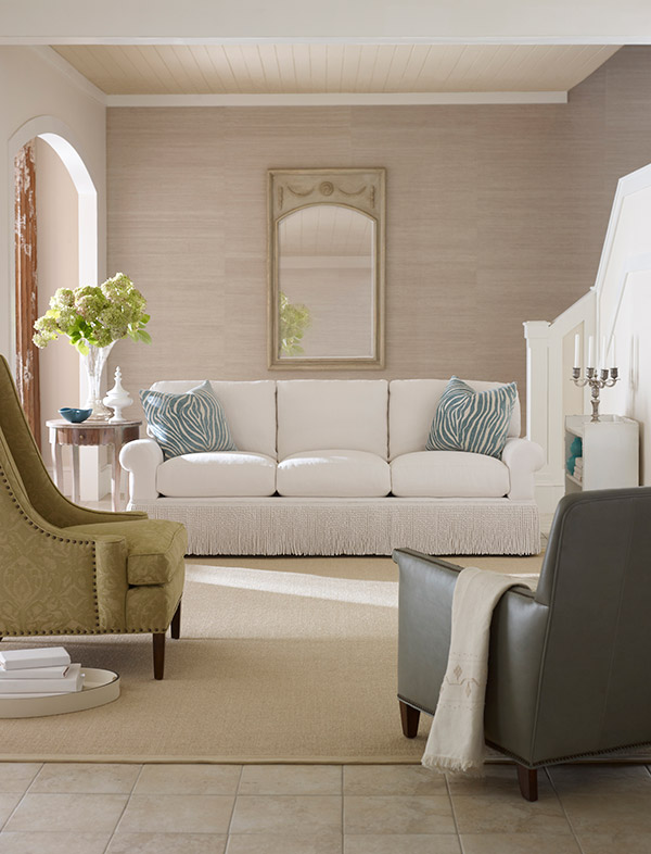
And I think we’re going to be seeing it more often in years to come. This type of ornamental trim is very traditional and has been around since the 17th century (according to Wikipedia). This particular trim, bullion, has a twisted texture, and it is generally 3 to 9 inches in length (also according to Wikipedia).

Look at how these bullion fringe pieces look beautiful in modern and traditional decor.

via Pamplemousse Design

via Interiors by Candace

via Fresh Sofa

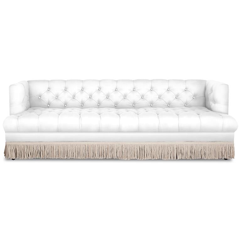
And here are a couple of pieces that I found in online stores ready for your modern-day homes.

Jonathan Adler

Jonathan Adler

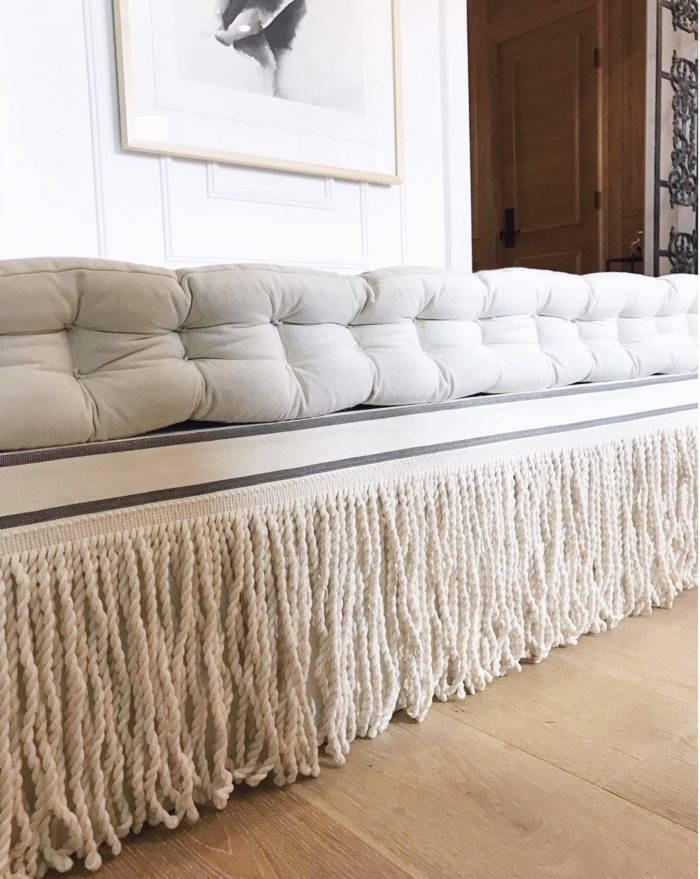
Finally, if you’re more into DIY, check out Christine Dovey’s take on a bullion fringe daybed DIY.

Christine Dovey

Pretty neat, right? I love how classics work in so many ways!

Final note: Some of you may recall that I’ve recently decided to end my weekly Hotel to Home series. Trivia Thursday is a new series I’ve just debuted. It’s currently in test mode as I’d like to know if you are interested in the series, and if it’s one that I feel passionate about, too. If you have any questions, or would like to learn about something in the design world, let me know!

Save

Save

Save

Hotel to Home: Boscolo, Nice, France

I realized earlier this week that I have been featuring hotels in this hotel to home series weekly since March 2016. That’s over a year’s worth of hotels! Isn’t that wild? There have been so many beautiful hotels that I’ve drooled over, and I certainly cannot pick a favourite! Can you?

I’m debating bringing this series to an end and starting something else (I have a few thoughts), but I’d love to have your input. Do I keep going with “Hotel to Home” series? What else would you like to see here on White Cabana? What would you like me to write about? What would you like to learn? What stories can I share?

While we’re all thinking about our next steps…

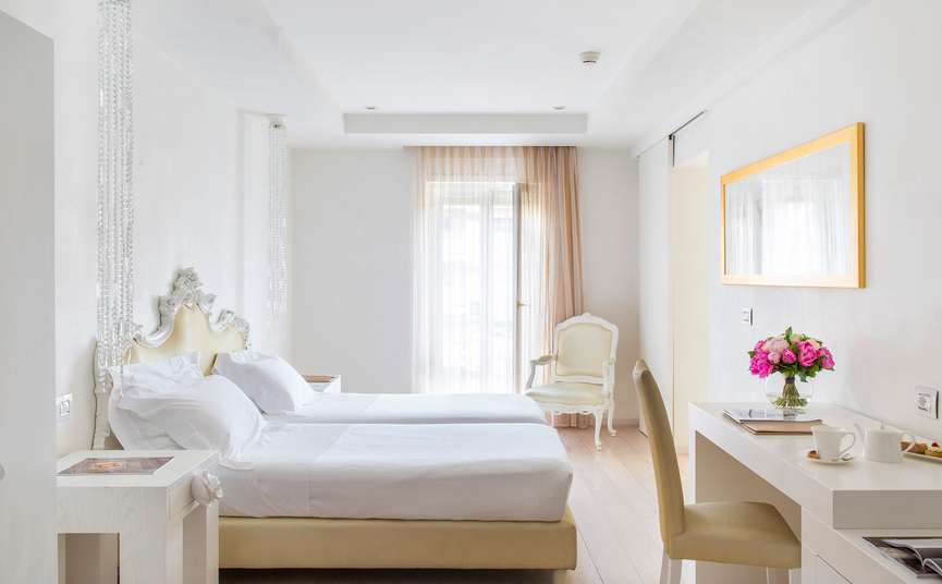
Let’s head on over to Nice, France, to look at the Boscolo hotel.

via Boscolo Hotel Nice

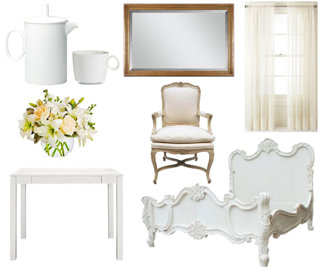
Here’s my version with the bed as really the most dramatic piece in the room:

bed, chair, desk, flowers, mirror, curtains, coffee cup, coffee pot

Save

Save

Save

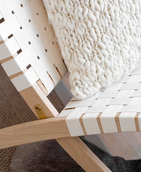
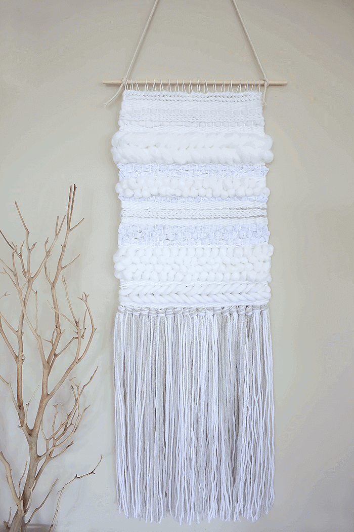
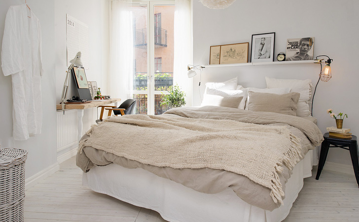
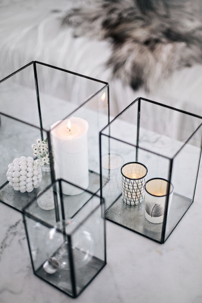
Design: Texture in White

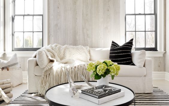
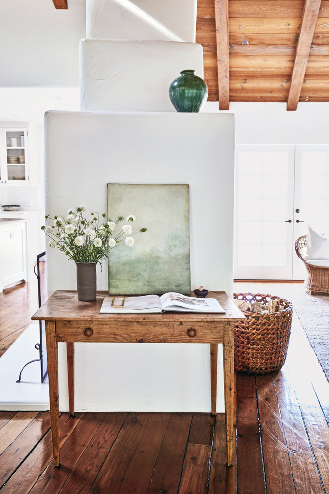
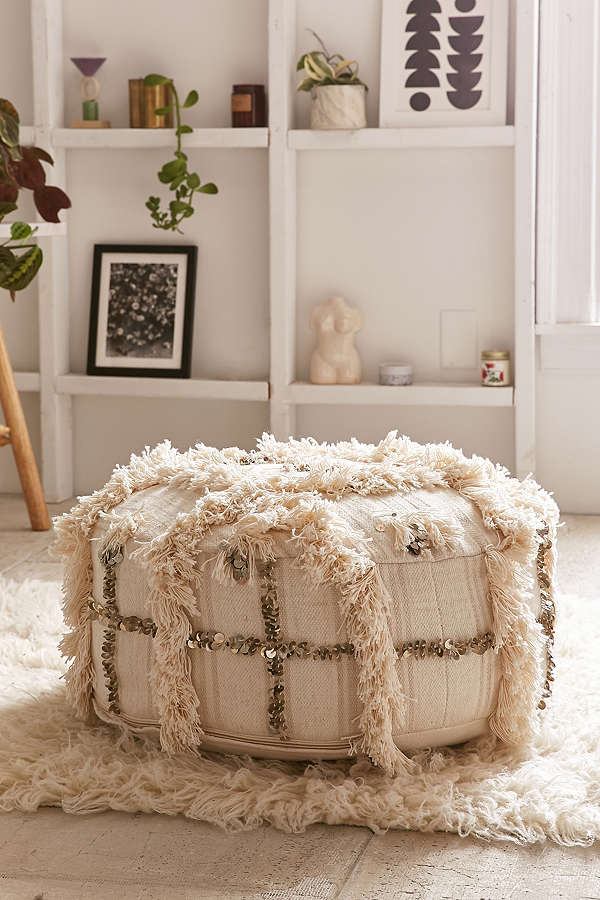
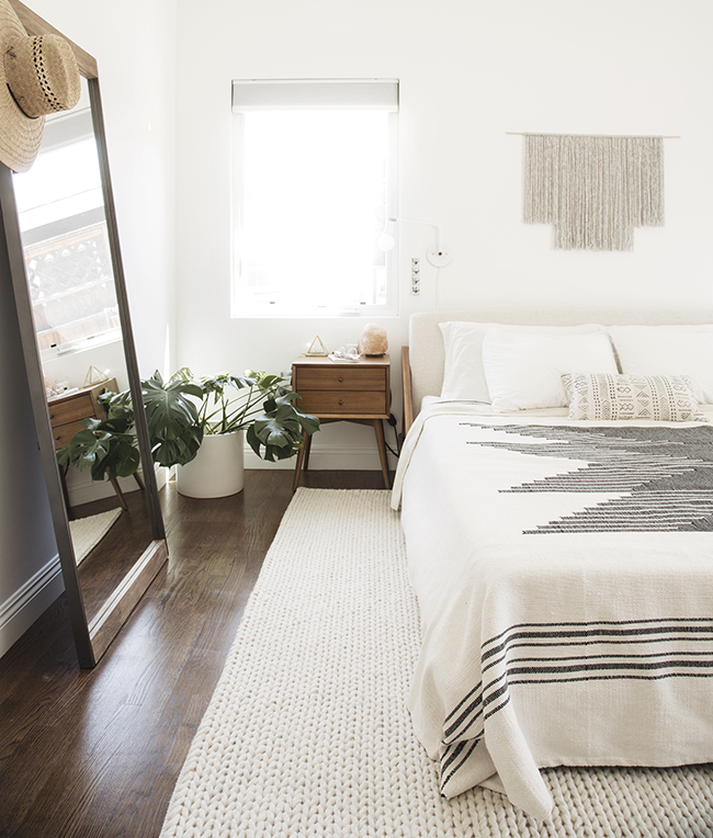
We’ve had all sorts of weather this fall. I’ve had to turn on the heat, the fireplace, the air conditioner, and I have even had the windows open. We even had a really warm Thanksgiving! It’s been wild! But the cooler weather is coming – and I think will be here to stay. And cool seasonal weather means many of us crave texture.

Thinking of texture, I found a ton of inspirational images to share today.

via Tamara Magel

via Domino

via Urban Outfitters

via 204 Park

via Tamara Magel

via A Pretty Fix

via Shake My Blog

#WhiteCabanaWearsPink: Flowers and Bows

As you know, every Monday in the month of October, #WhiteCabanaWearsPink. These pink posts are meant to raise awareness and funds for breast cancer. I’m raising funds in various ways, including donating proceeds from all affiliate links this month to the Canadian Breast Cancer Foundation. Get click happy!

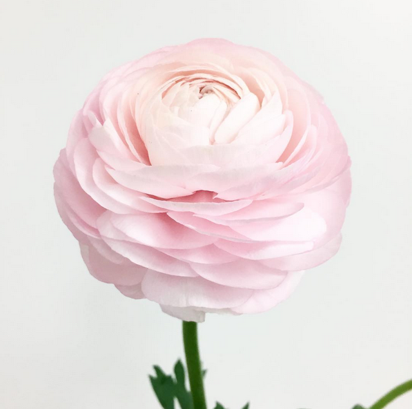
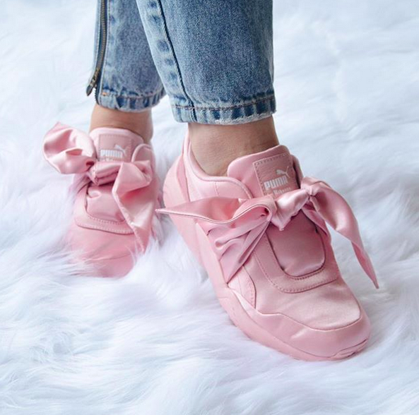
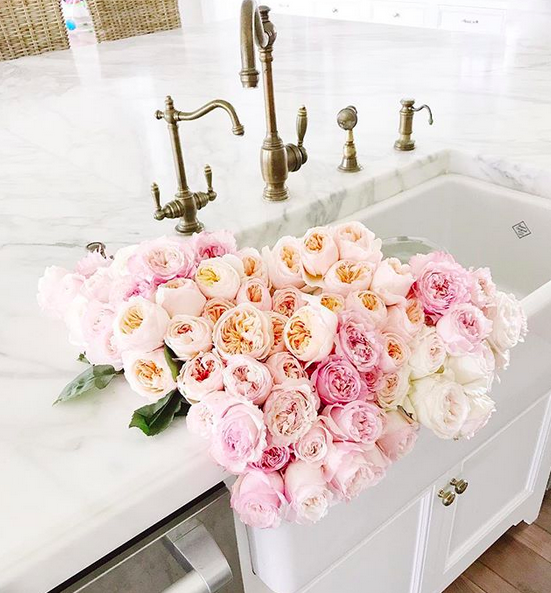
Today might be one of the prettiest pink posts I’ve ever drafted. The theme is flowers and bows, and these photos ooze plenty of lovely!

Humphrey and Grace

Krystin Lee

Stephanie Jolly

Blair Eadie

Living Fresh

Canadian Fashionista

Lady Hayes

Blair Eadie

Rachel Parcell

Isa Tapia

Thanks, everyone, for your support!

Save

Save

Save

Save

Save

Save

Save

Save

Save

Save

The Friday Five: Vaulted Ceilings

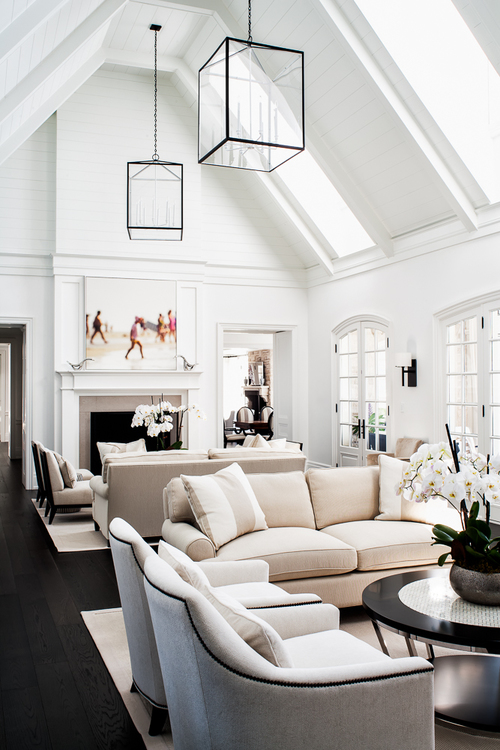
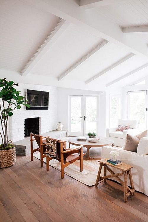
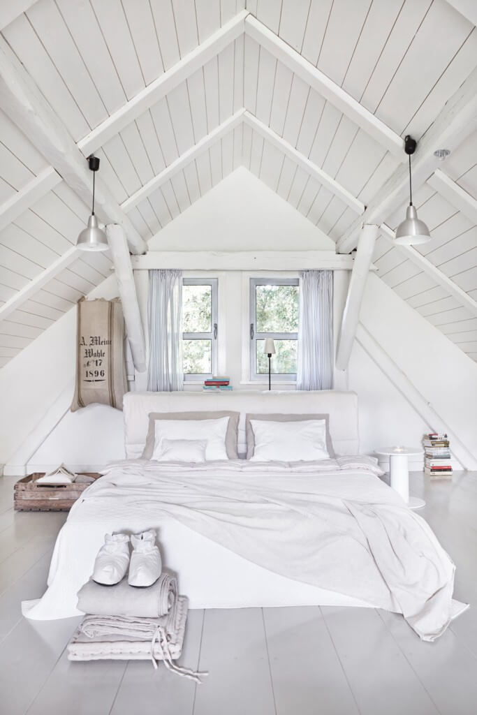
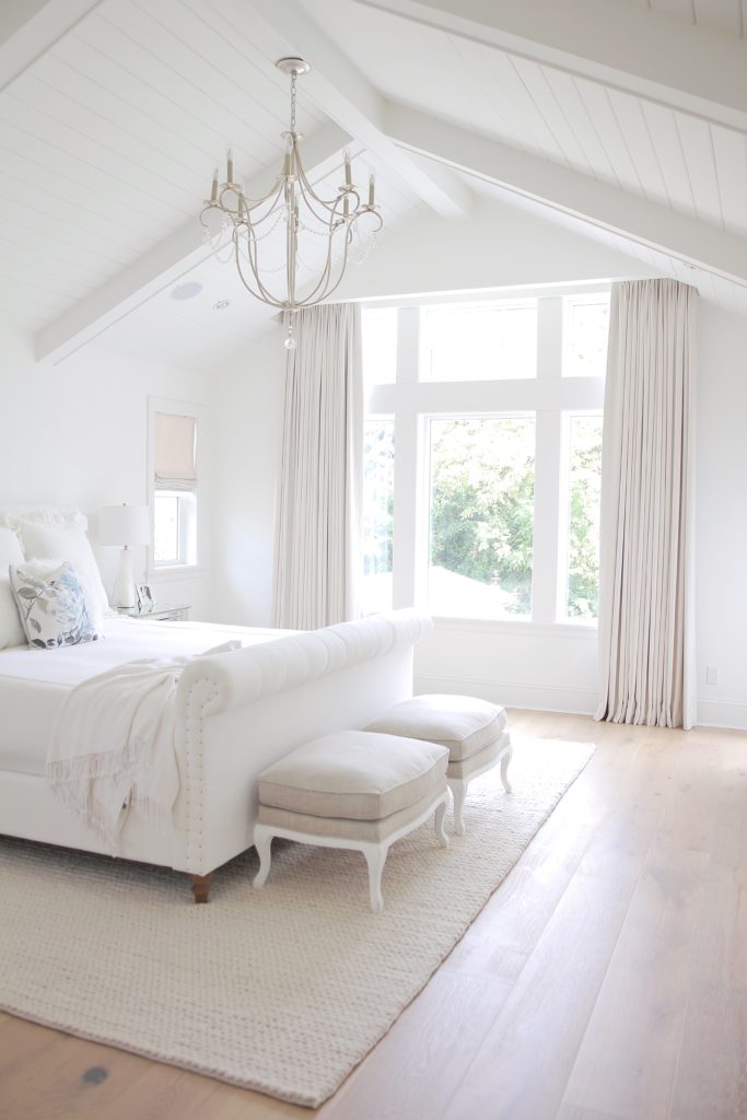
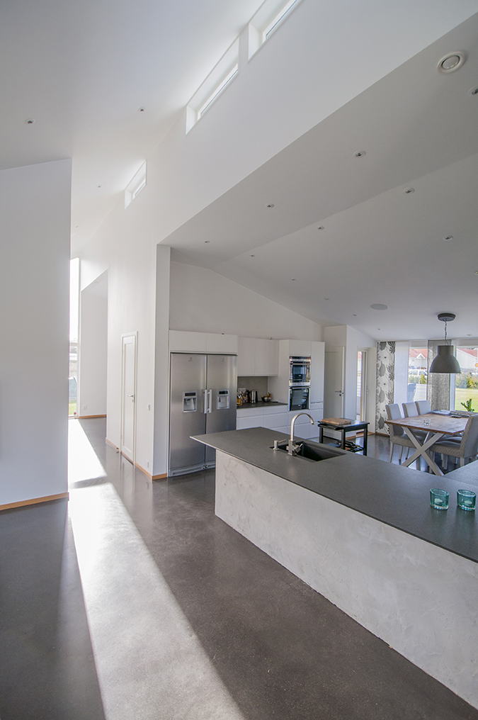
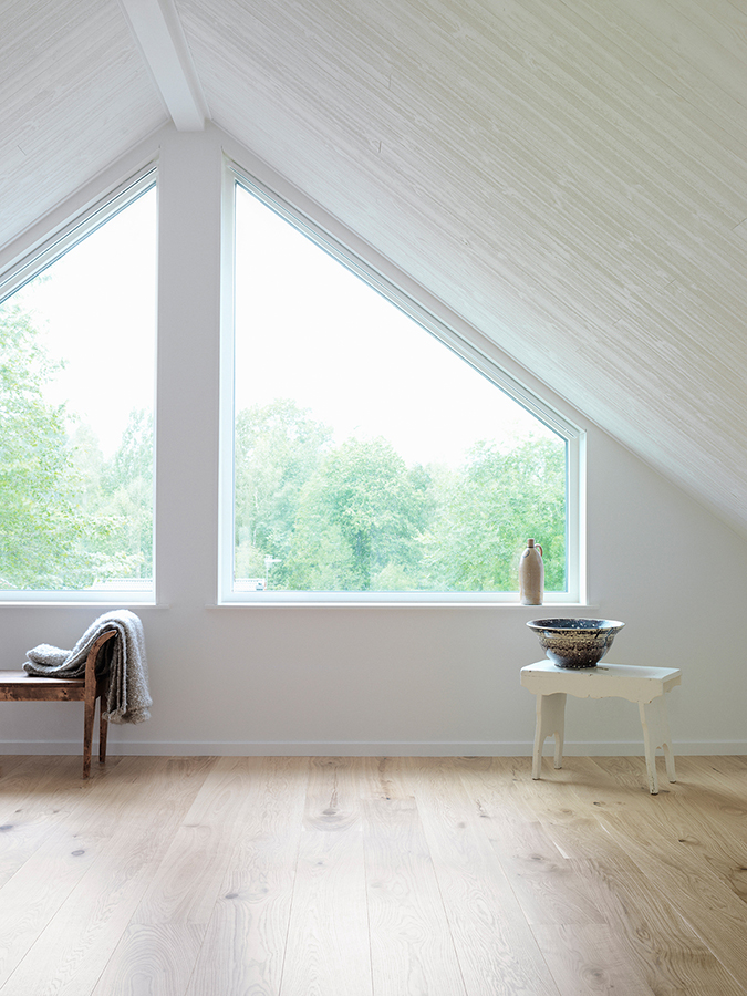
I know many people might associate vaulted ceilings with breezy, summer homes, but I think they’re beautiful in any environment. The spaces I’m featuring here show how a white, vaulted ceiling brightens and enlarges a room. I just love this design option for both traditional and modern homes.

Sharon Mimran

via Shelterness

Erin Featherston

Jam Kolektyw via Home Stratosphere 

JS Home Design via Summer Adams

Have a great weekend, everyone!

Save

Save

Save

Save

Hotel to Home: Hotel Josef, Czech Republic

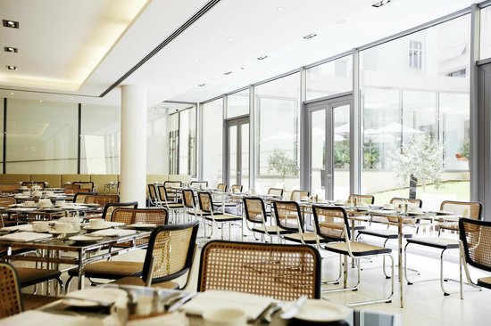
We’re traveling to the Czech Republic to have a closer look at the restaurant at the modern Hotel Josef.

Hotel Josef restaurant via Best Reisen

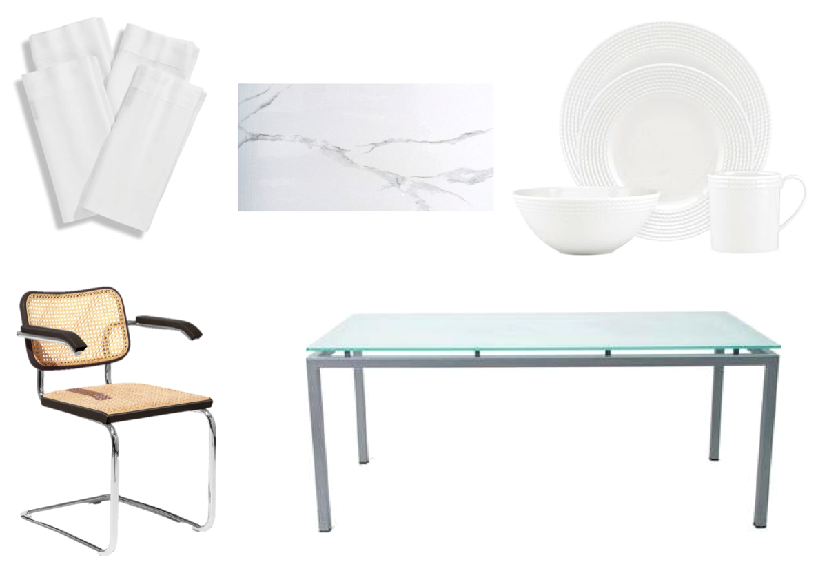
chair, table, place setting, napkins, tile

Architecture: Jean Verville

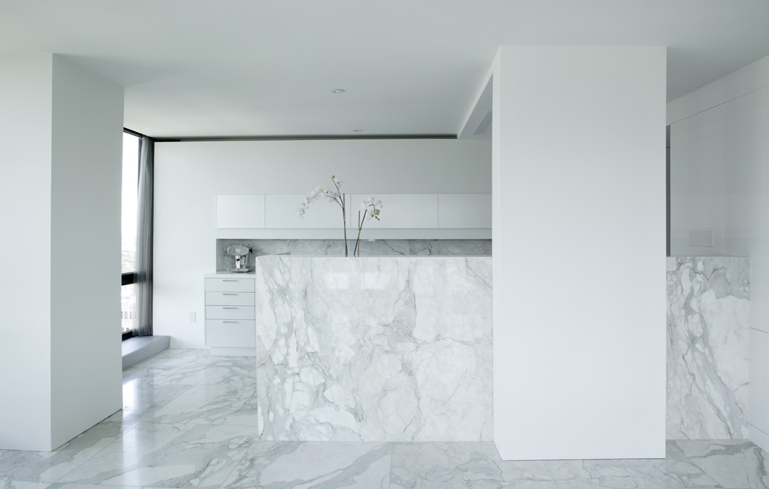
I recently came across the work of architect Jean Verville, and I was soon lost in a website of beautiful design projects. Here are some spaces that really caught my eye.

unité d’habitation Westmount Square

Fahouse 

In 2

whitepaper

Save

#WhiteCabanaWearsPink: A Pink Thanksgiving

Happy Thanksgiving to all of my Canadian readers!

It’s been another busy weekend on my end. I found my inner German on Friday to celebrate the first night of Oktoberfest in Kitchener-Waterloo, then feasted on turkey with family on Sunday to celebrate Thanksgiving. Today, I’ll enjoy a day of rest (and take care of a few chores, too)!

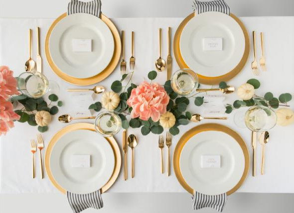
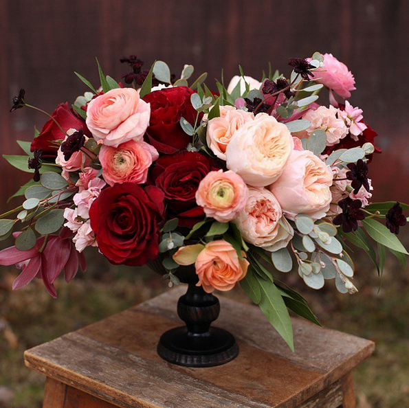
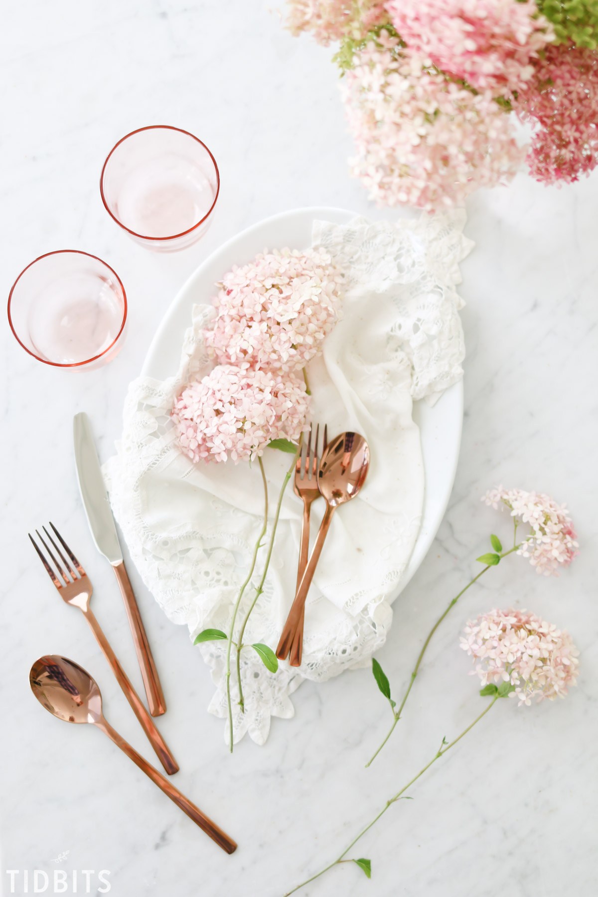
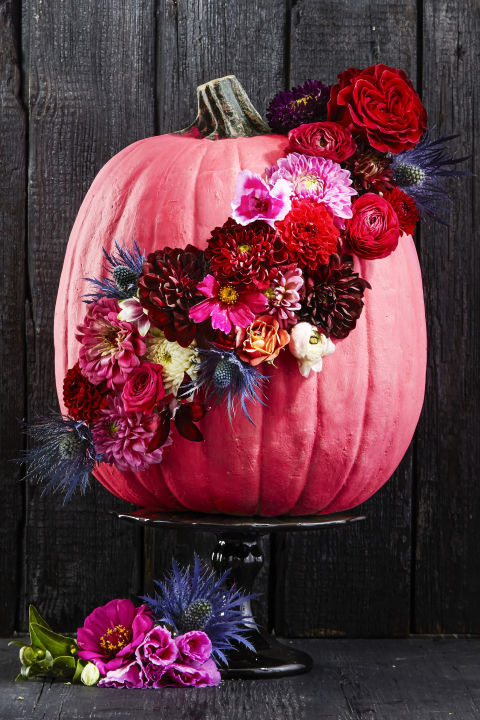
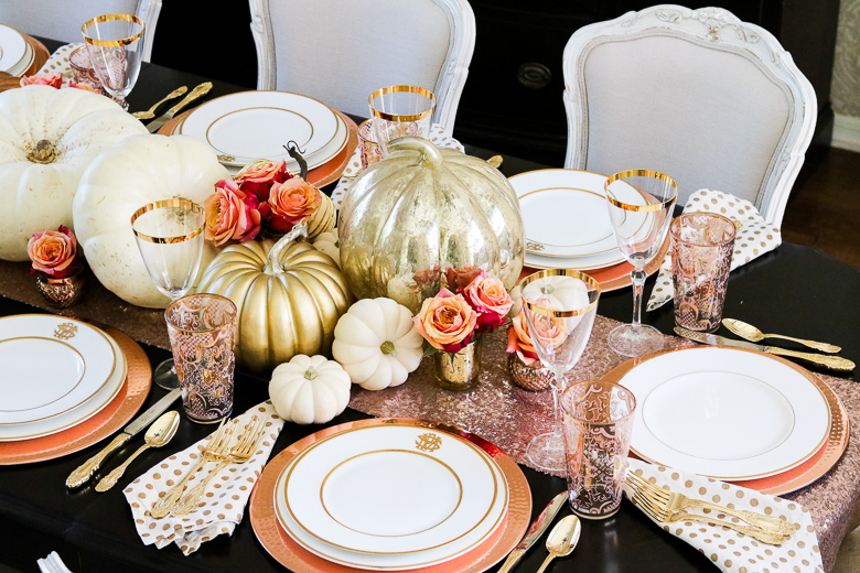
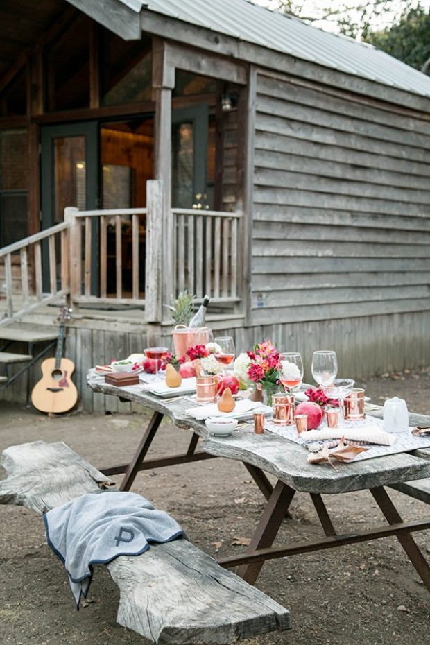
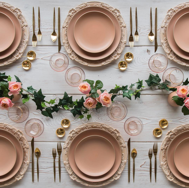
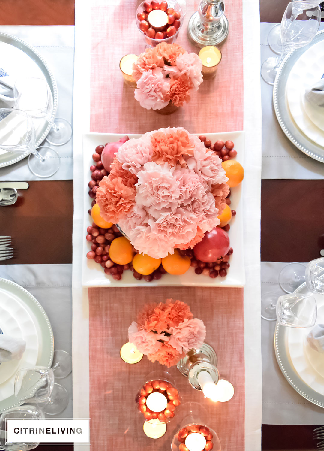
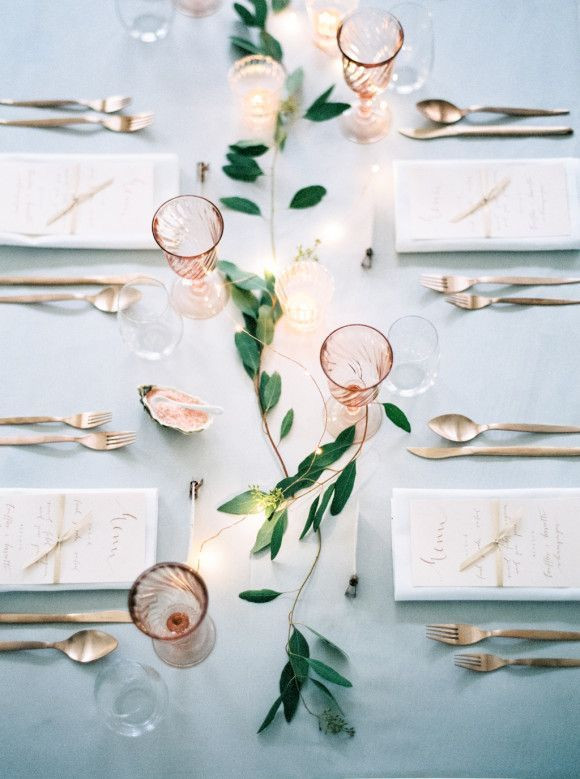
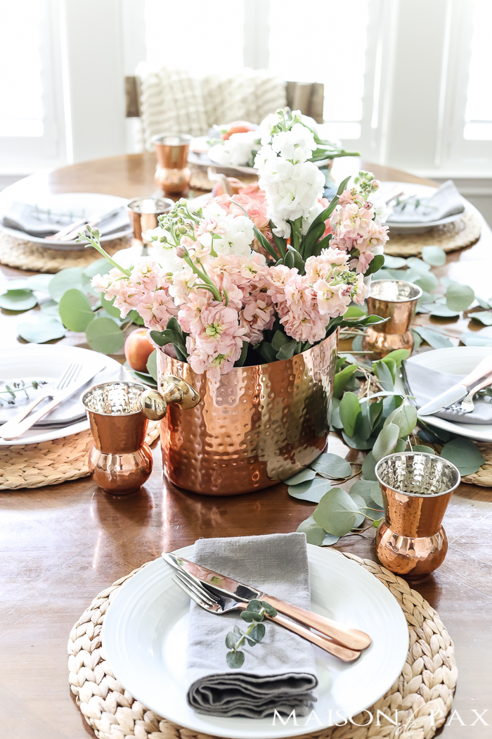
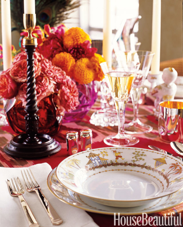
Since today is Thanksgiving Monday, for today’s #WhiteCabanaWearsPink, I’m focusing on beautiful Thanksgiving table decor in shades of pink, rose, and fuchsia. Infusing pink into a tablescape is easy to do for other occasions as well. Just keep layering the shades, and switch out the pumpkins for something more appropriate. Miniature disco balls or ornaments would be perfect to include for a Christmas table setting.

via The Glitter Guide

via Sugar Paper

via Floral Verde

via Oh Happy Day

via Tidbits

via Good Housekeeping

via Randi Garrett Design

via Sugar and Charm

via Poppy Talk

via Citrine Living

via Domino

via Maison de Pax

via House Beautiful

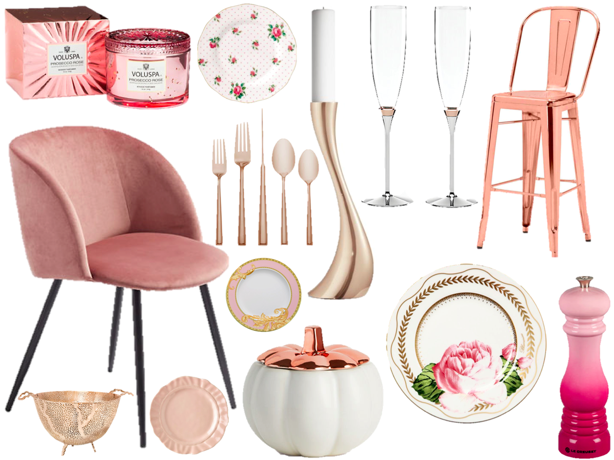
Here are some items you could consider to get the look at your home.

candle, pepper mill, chair, cutlery, pumpkin, candelabra, bar stool, champagne flute, dessert plate, serving bowl, pink plate, plate, plate,

* Affiliate links have been used. Get click happy!

Thanks again for supporting #WhiteCabanaWearsPink. I will be donating funds raised through affiliate links this month to the Canadian Breast Cancer Foundation.

Save

Save

Save

Save

Save

Save

Save

Save

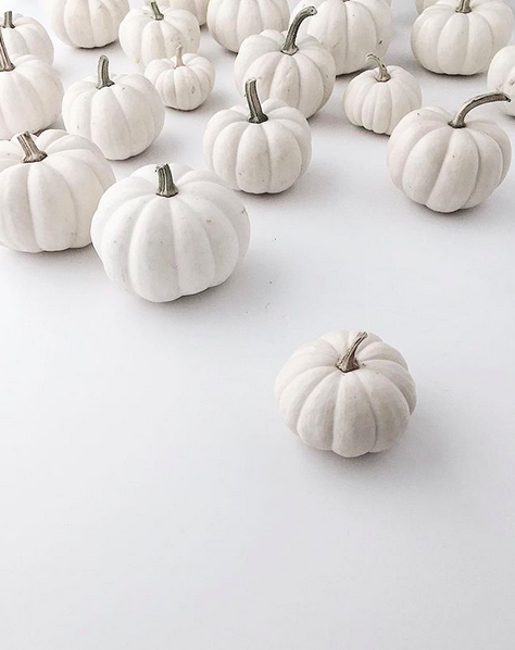
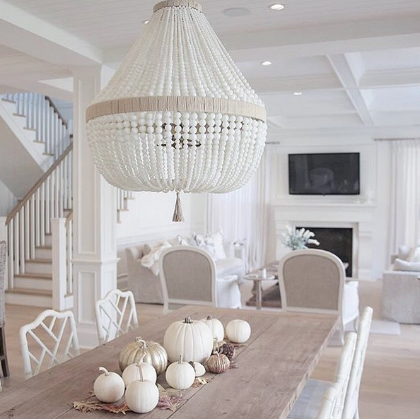
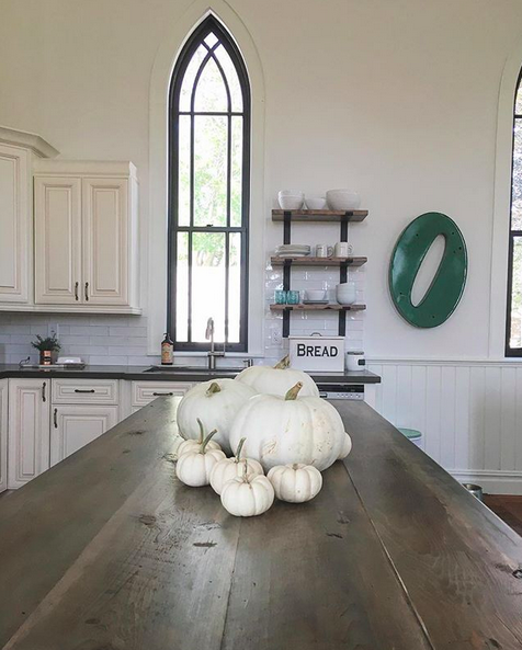
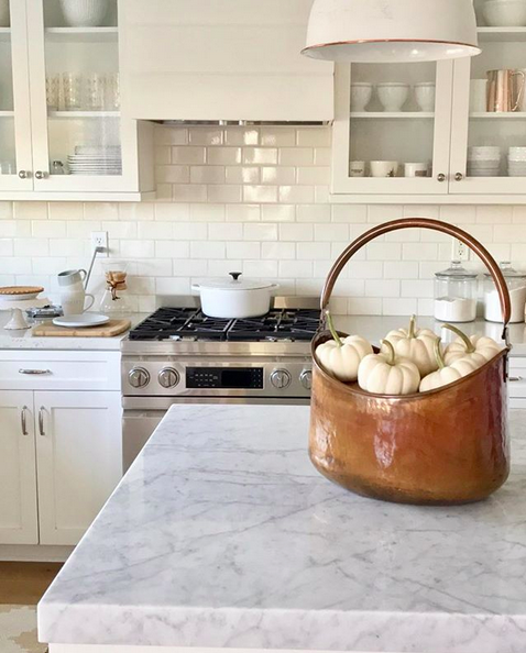
The Friday Five: White Pumpkins

Fall is here…and pumpkins are absolutely everywhere!

I am amused by all the white pumpkin photos I’ve been seeing on my Instagram and Pinterest feeds. It’s incredible! A few years ago, white pumpkins were rare! And now? They’re everywhere!

Fall decor isn’t my favourite, but I do like a good white pumpkin or two for my home!

Homey Oh My

JS Home Design

Chris Kauffman

My Grey Skye Home

Juler 54

Have a great weekend, everyone!

Save

Save

Save

Save

Save

Save

Save

Save

Save

Save

Save

Hotel to Home: Apotek, Iceland

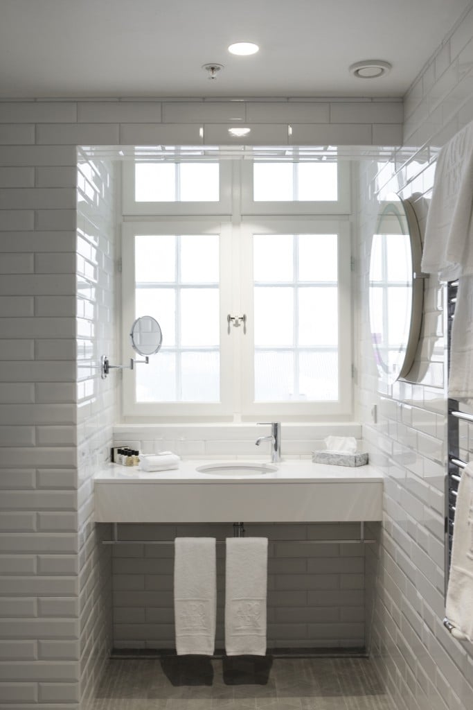
We’re heading north to the hot-spot-destination of Reykjavik, Iceland today. Here, we’ll take a peek inside the beautiful Apotek hotel. This is a four-star boutique hotel in a historical building that once housed Reykjavik’s pharmacy. Apotek – get it? (Apotek means pharmacy.)

While there are so many stylish suites to feature, I’ve settled on this bathroom instead:

Apotek hotel

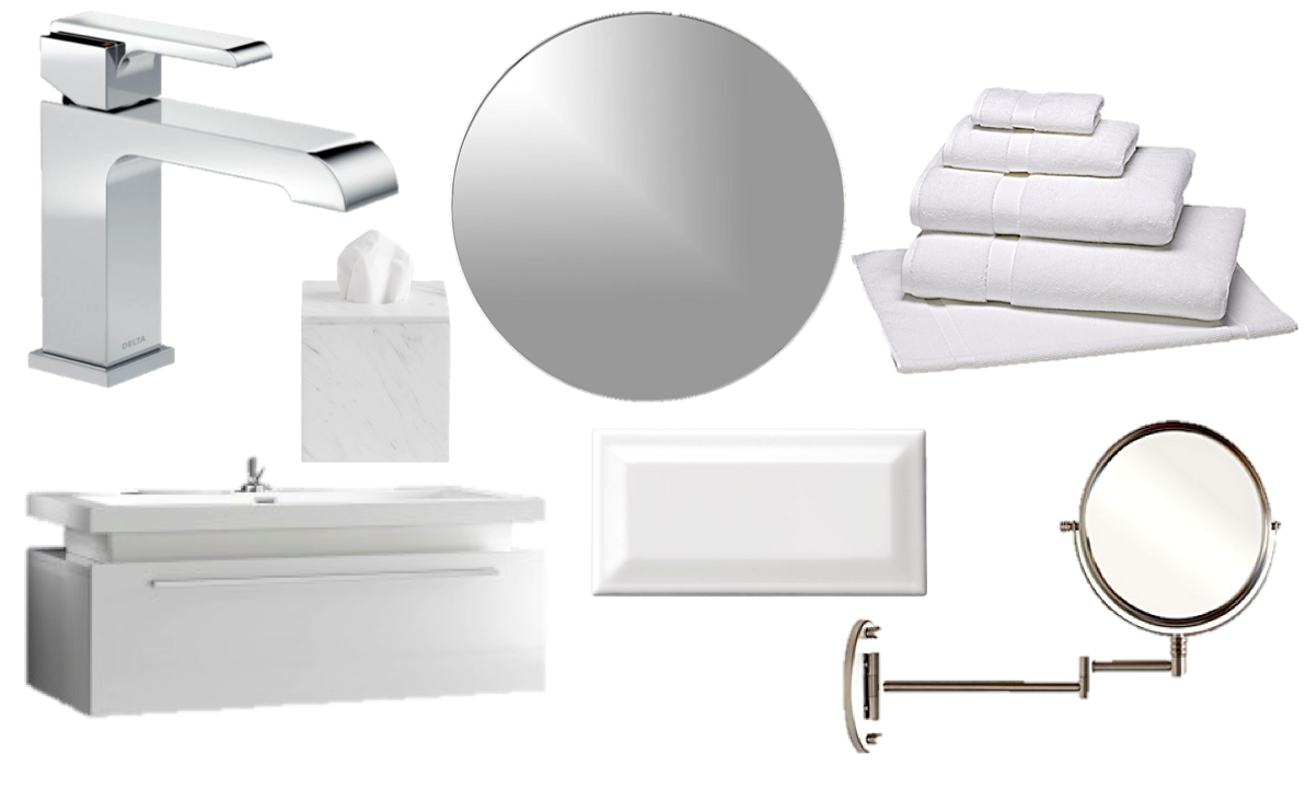
Sleek, right? If you really love it, here’s some inspiration for you to take this look into your own home.

tile, wall mirror, towels, round mirror, tissue box cover, faucet, vanity

Save

Save

Save

Save

Save

Save

Save

Save

Save

Save

Save

The Friday Five: Instagram Interiors

Today I’m sharing five beautiful, inspirational interiors I’ve saved from my various Instagram search sessions.

The Slow Traveler

Gray & Co

My Miaou

Raquel Langworthy

Lustre Home

Which is your favourite space?

Have a great weekend, everyone!

Hotel to Home: 1 Hotel South Beach, Miami

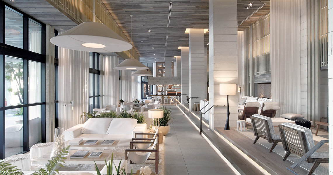
When I was at Sheridan Oakville last week (giving a talk about blogging! #WhiteCabanaGoesToSheridan), one of the students in the class suggested that I check out 1 Hotel in Miami and to look especially for the white lobby. He was certain that I would be impressed. And guess what, I am! And I think you will be, too. Just look at this space:

1 Hotel South Beach, Miami (photo via JetSetter)

Absolutely gorgeous! I want to move in!

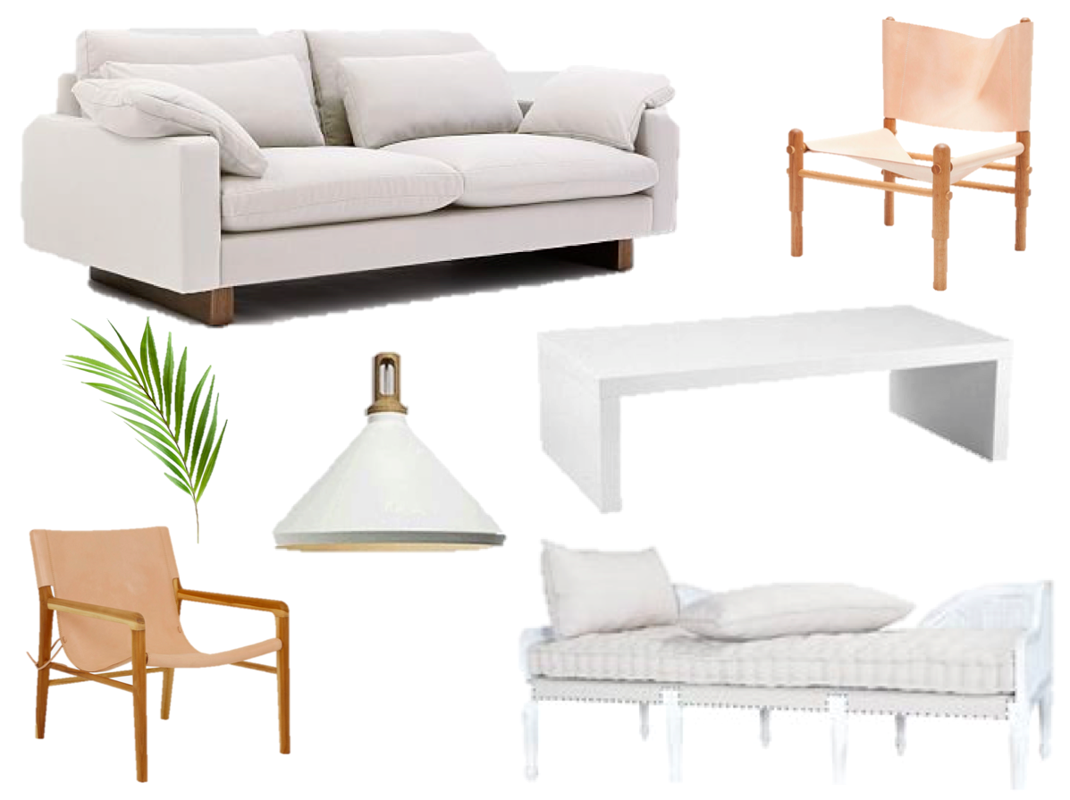
But since I can’t move in, I can design a room inspired by this gorgeous space. Here I go:

sofa, chair, chair, fern leaf stem, pendant light, daybed, coffee table

Save

Save

Save

Save

Save

Save

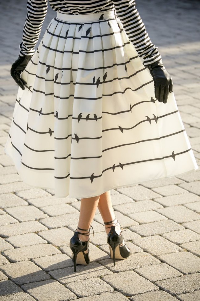
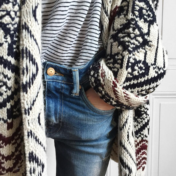
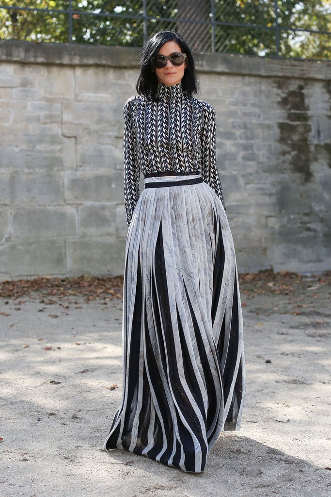
Design: Mix and Match Prints

I’m oddly drawn to this outfit even though I normally usually always avoid pattern mixing myself in both wardrobe and home design.

photo Diego Anciano, via Vogue Espana

Here are some other images from over the last several years that showcase print mixing in fashion:

Olivia Palermo, via Daily Mail

via LoLoBu

via Mon Monde Fou

menswear, via Pattern Prints Journal

via Maja Wyh

via Taaora

via PopSugar

And here’s what’s going on in the world of interior design:

via Rue Daily

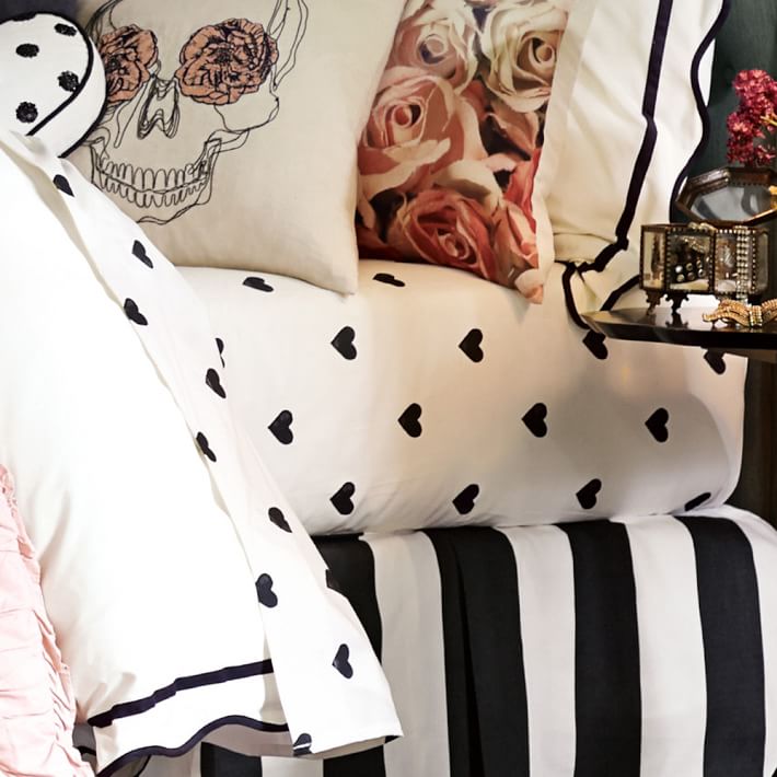
heart sheet set, via PB Teen

via Alquimia Deco

via Sophie Burke Design

via Rue Daily

via Simply Grove

Nashville home of Gen and Ben Sohr, via One Kings Lane

What do you think? Do you mix patterns regularly? How about colours and patterns?

Save

Save

Save

Save

Save

Save

Save

Save

Save

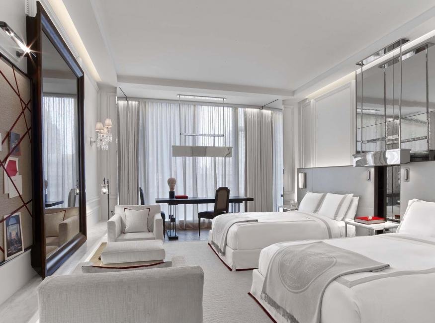
Hotel to Home: Baccarat Hotel, New York

How have I not yet posted about the luxe Baccarat Hotel in New York City? This one is right up my crystal-loving, luxury-dreaming alley. I know New York is all about the city, but wouldn’t this just be a fantastic retreat from the noise and pollution of the city streets?

This room goes for over $1000 USD per night. It’s slightly over my travel budget. But – wow! Gorgeous!

And before I move on to my version, take a moment to drool over the Baccarat Suite and the city car.

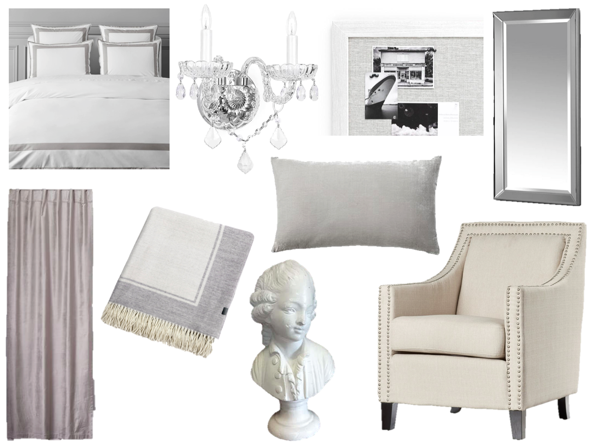
And now onto my interpretation:

blanket, duvet, wall sconce, armchair, mirror, pinboard, pillow, curtains, bust

Save

Save

Save

Save

Save

Save

Save

Save

Save

Save

Save

Save

Save

Save

Save

Hotel to Home: Hotel Mono, Singapore

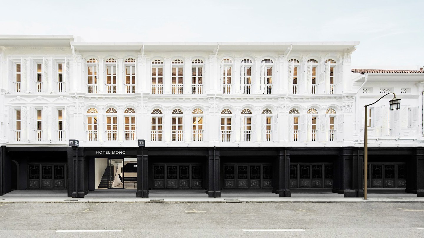
The colour palette at Hotel Mono is limited – black, white, grey. Classics, if you ask me! This minimalist hotel in Singapore opened just a few months ago in March 2017.

I’m definitely heading toward a reinterpretation of one of the rooms, but before I do, look at the hotel from the outside.

Did your jaw drop? Yup. It happened to me, too.

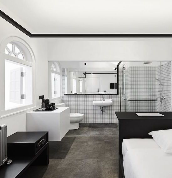
There are several room options available at Hotel Mono, but today I’m focusing on the most unusual: the single room. Everything in one room. Why create real walls when you don’t have to?

The room is affordable, too, at just about $100 CAD per night (depending on day of week month, and promotion, of course).

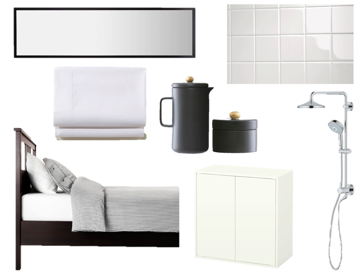
If you can’t make it all the way to Singapore, but you are looking to do a mini reno in your own home, here are some options that might get your plan going.

black jug and sugar bowl, tiles, black bed frame, mirror, sheet set, rainshower system, cabinet

Save

Save

Save

Save

Save

Save

Save

Save

Save

Save

Save

Save

Save

Save

Save

Save

Save

Save

Design: Caribou Cabin in My Home

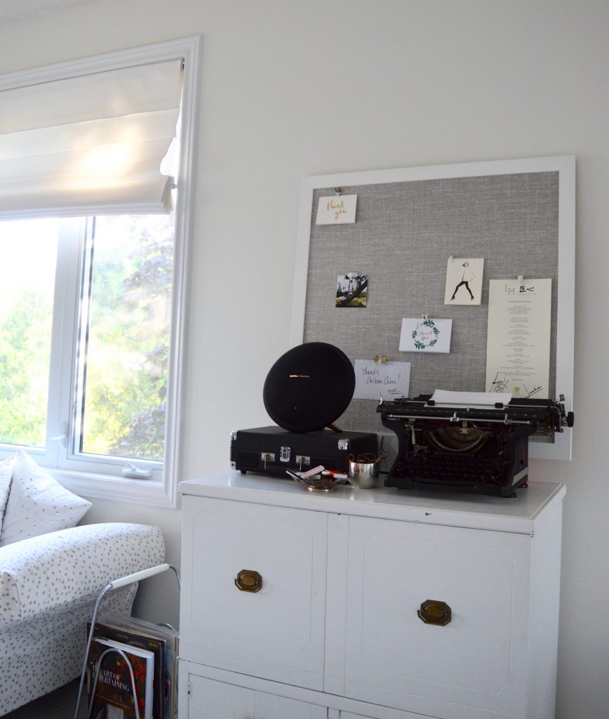
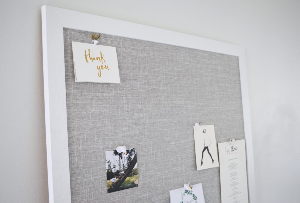
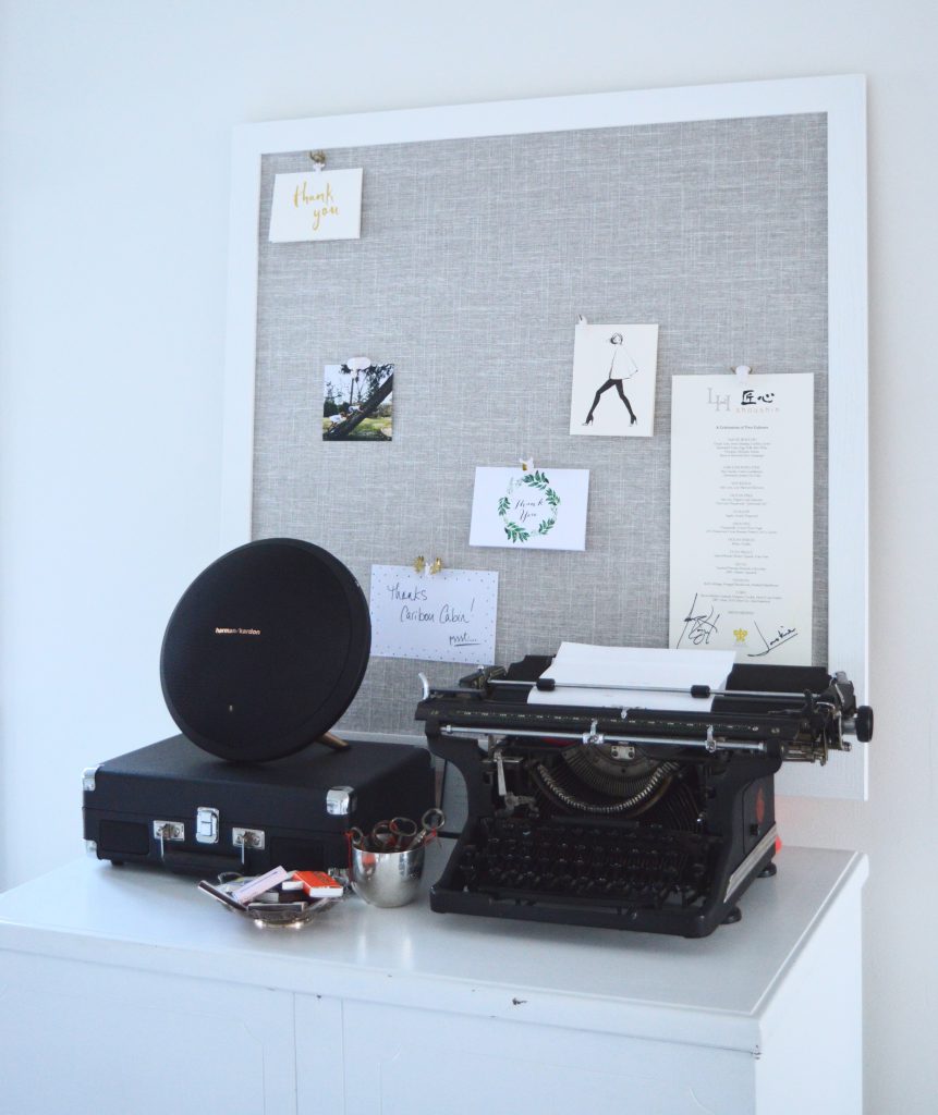
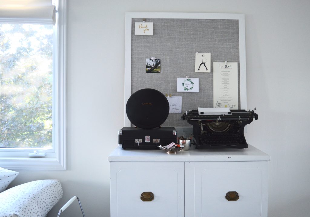
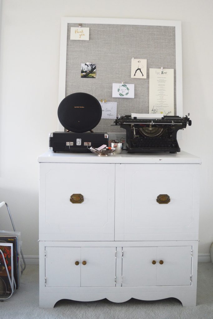
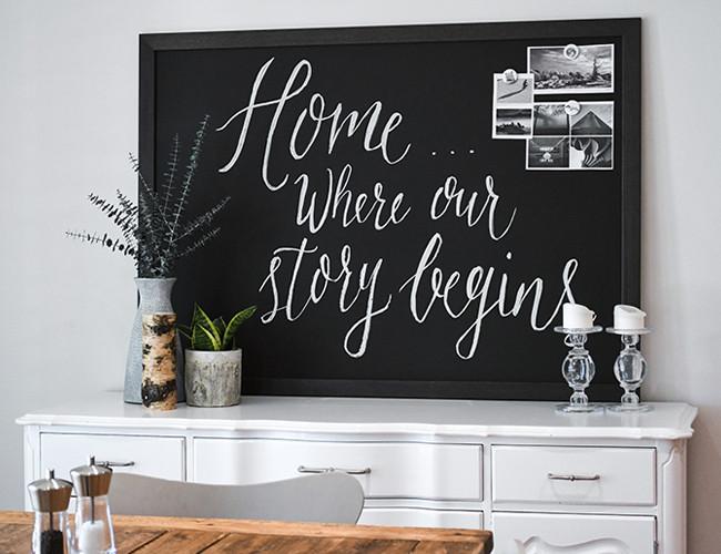
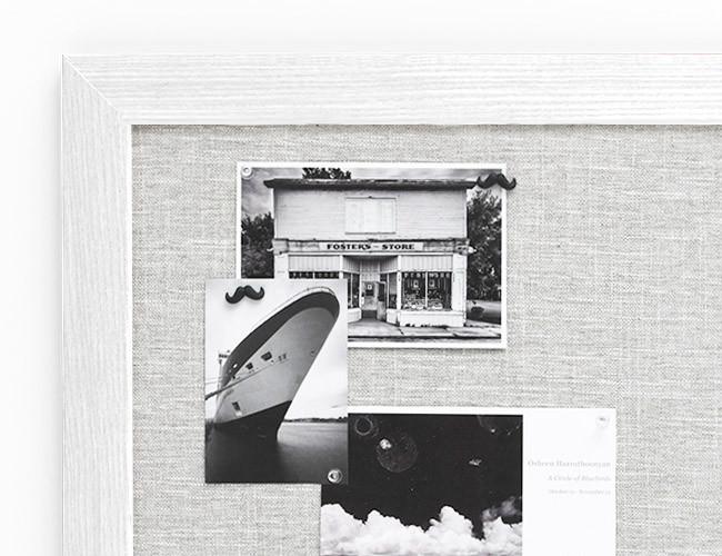
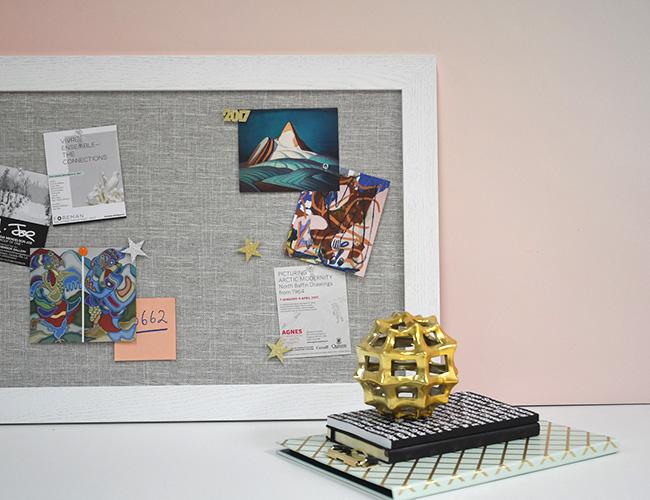
A couple of weeks ago, I shared news of Canadian newcomer Caribou Cabin. This shop designs, customizes, and manufactures chalkboards, magnetic whiteboards, and pinboards. The company generously sent me a beautiful square (34″ x34″) linen pinboard – white a white frame, of course.

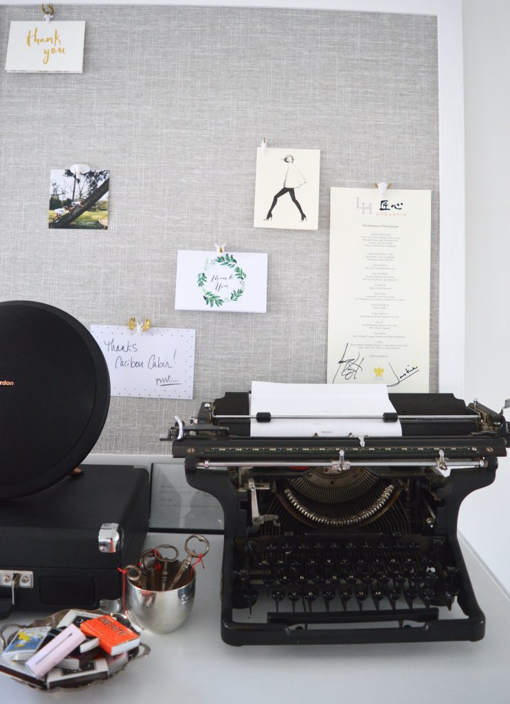
Soon after the order was placed, my massive shipment arrived at my doorstep. The board was wrapped carefully and arrived safely to my home in Waterloo. When I saw the grey linen for the first time, I was impressed by the quality of the item. And the grey matched my home perfectly.

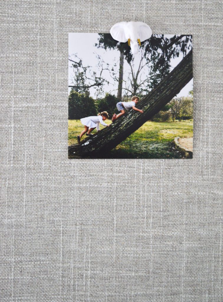
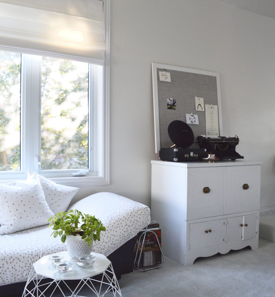
I leaned it up against the wall behind a cabinet in my living room which houses my radio, record player, and typewriter. I pinned up some memorable items from my office that I knew would look pretty and would also remind me of happy celebrations.

As I took my photos, I thought that the pinboard in my living room would be the perfect spot to showcase Christmas cards. And the great thing about the pinboard is that I can move it to other areas of my home such as a hallway landing area or office. The office is certainly an obvious spot for a pinboard, but I don’t think it’s the only place for it.

Thanks to Caribou Cabin for sponsoring this post. All photos and opinions are my own.

Save

The Friday Five: Round Mirrors

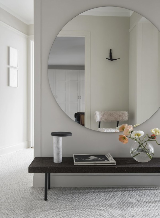
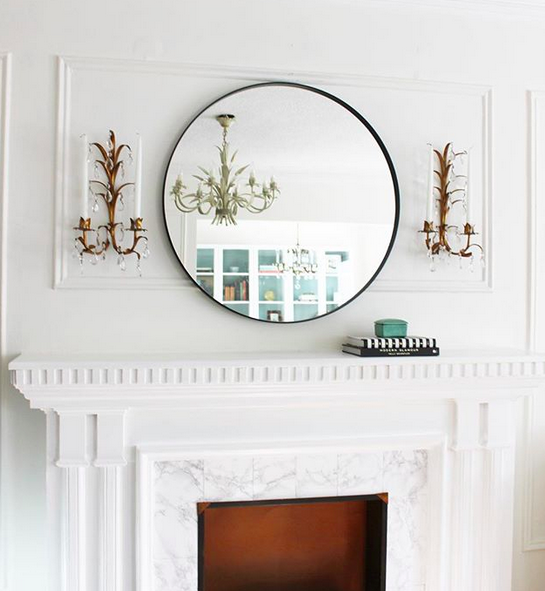
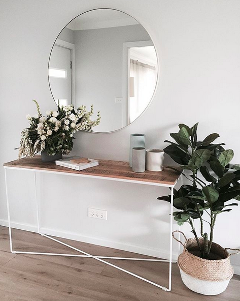
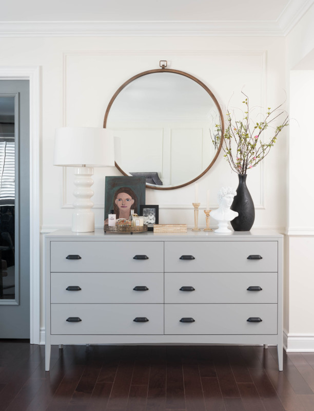
Round mirrors haven’t ever gone away in the design world, but I haven’t written about them in a long while, so I thought I’d revisit this stylish accessory today.

via The Design Chaser

via Tiffany Leigh Design

via The Stables

via Vanessa Francis

via Kristina Lynne

via Homey Oh My

via Rambling Reno

Here are five round mirrors to consider if you’re in the market for one.

mirror, Wayfair, $149.99 CAD

mirror, Ikea, $99 CAD

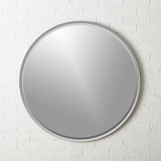
mirror, CB2, $299 CAD

mirror, Umbra, $130 CAD

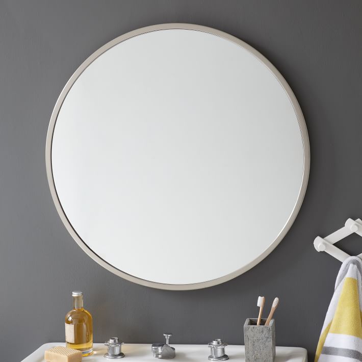
mirror, West Elm, $392.55 CAD

Save

Save

Save

Save

Hotel to Home: Taj Lake Palace, Udaipur, India

With positive testimonials from Nicole Kidman and Mick Jagger, it seems like a no brainer to stay at the Taj Lake Palace in Udaipur, India.

While there are many spaces that I could have featured in today’s post, I settled on this indoor-outdoor dining area. It looks to be traditional with a beautiful view. I wonder if Mick Jagger ate here.

via Taj Lake Palace

And here’s my simple take on this look:

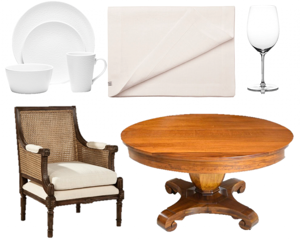
cane armchair, table, table runner, place setting, wine glass

Save

Save

Save

Save

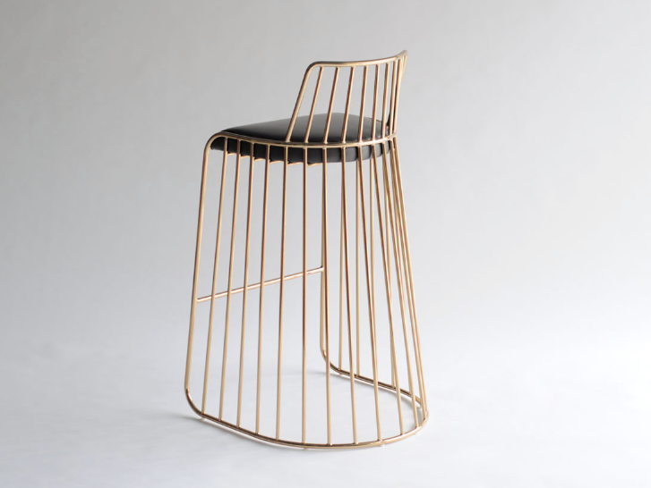
Two for Tuesday: The Caged Stool

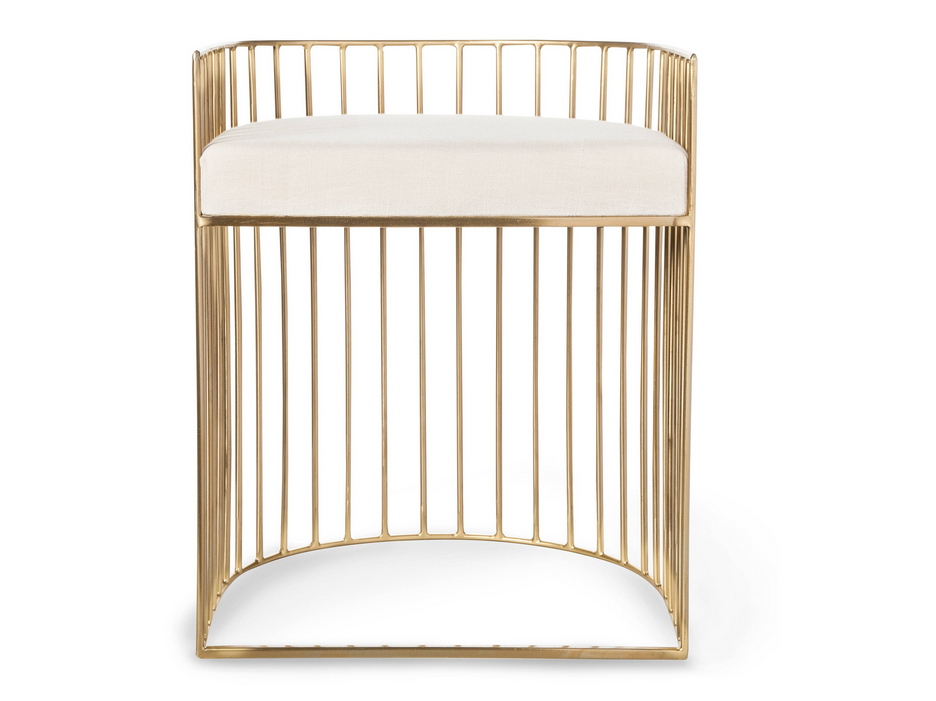
Today’s pair oozes glam with sleek gold lines and curves.

 Nate Berkus – caged stool, $105.47 CAD, Target

bride’s veil stool, Phase Design, $1540 USD at Twentieth

Design: Peg Boards

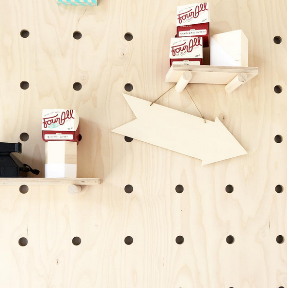
A new ice cream shop opened up in Kitchener this summer (Four All Ice Cream), and I’m loving it. Each time I go, I try new flavours, and I have yet to be disappointed! Local ingredients are used and flavours change according to what’s been growing around the community. My favourite flavour has been the strawberry-rhubarb sorbet.

In addition to the delicious ice cream, though, I love the design of this small-sized ice cream shop. On one end of the little shop, you’ll find the ice cream. And on the other, you’ll find this peg board display wall.

Four All Ice Cream shop, photo by me

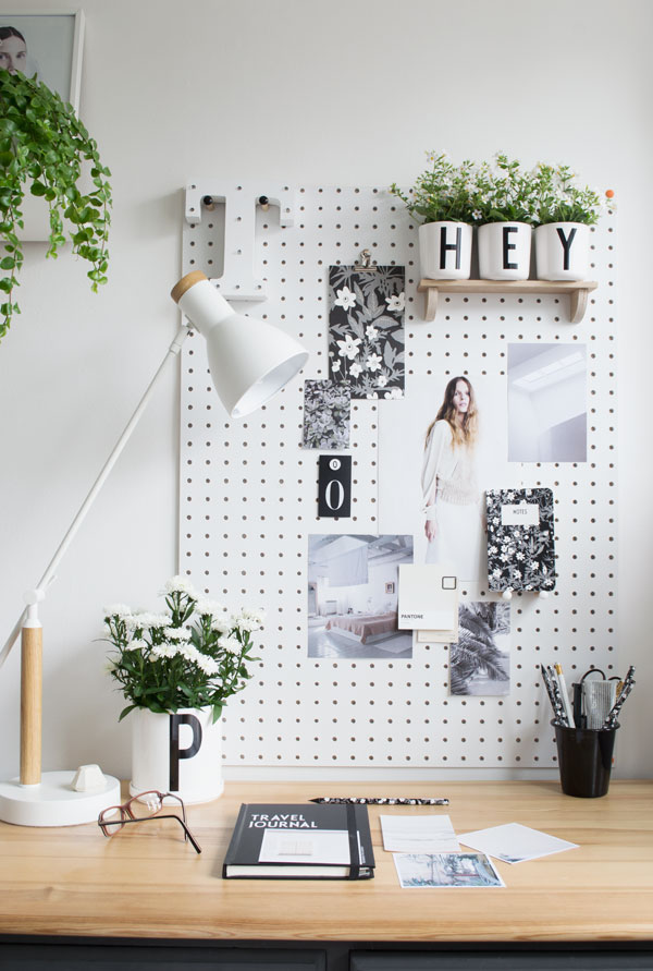
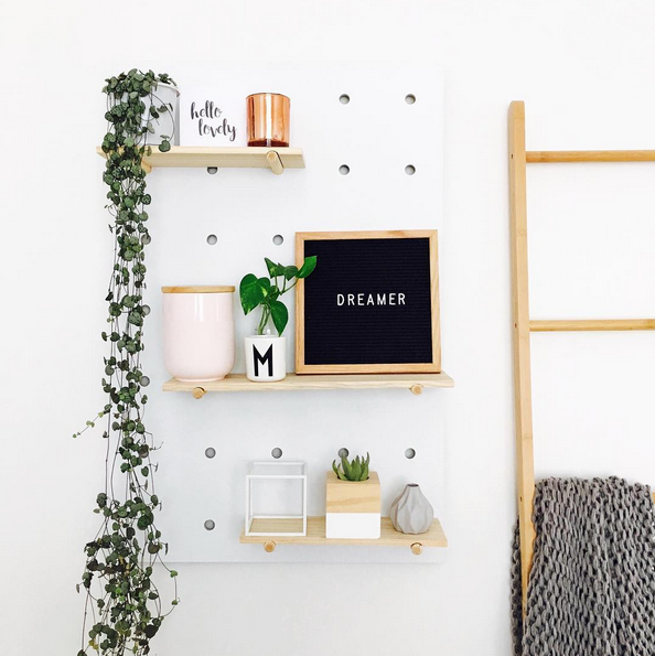
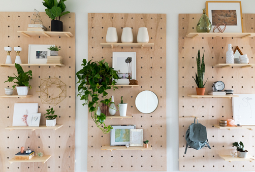
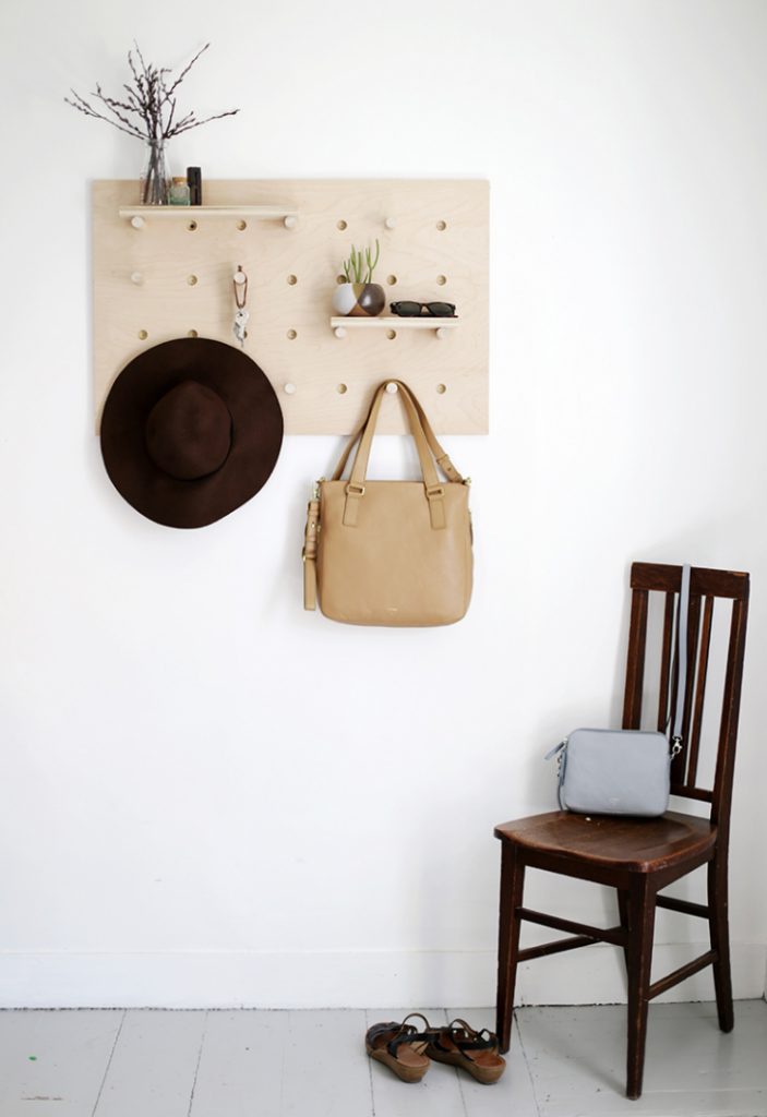
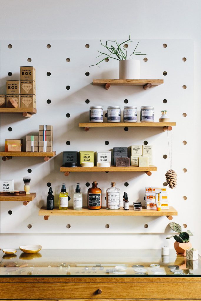
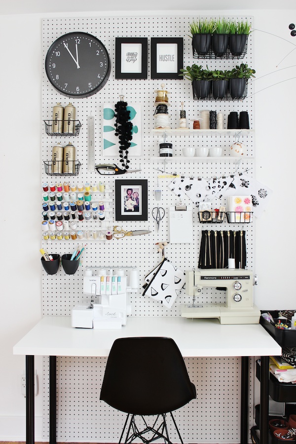
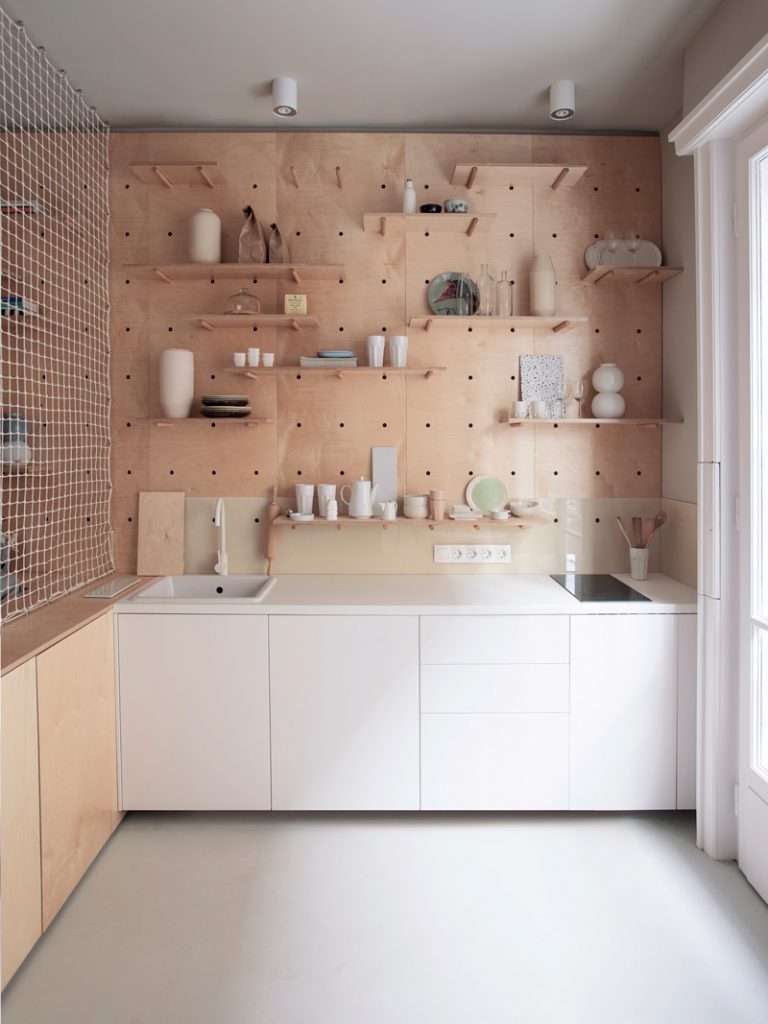
And it was this peg board – designed and made by Boko – that has inspired this peg board design post. As you’ll see by the photos here, there’s a whole lot of things that can be mounted onto a peg board!

via Curate & Display

mel_zag

via Vintage Revivals

via The Merry Thought

via Loyal Supply

via A Girl & A Glue Gun

via Nordic Days

Save

Save

Save

Save

Save

Save

Save

Save

Hotel to Home: Borgo Santo Pietro, Italy

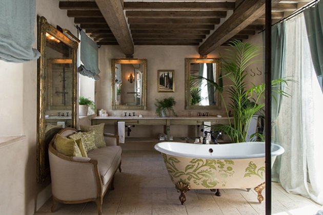
Today we’re traveling over to Tuscany to peek into a gorgeous bathroom at the Borgo Santo Pietro. The classic clawfoot tub, antique mirrors, and greenery makes this bathroom special.

Dina Ferri room, Borgo Santo Pietro

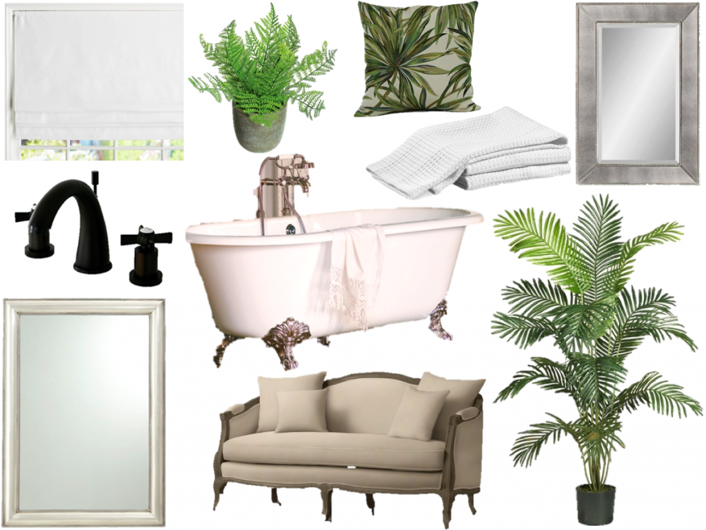
And here’s my take on this luxurious bathroom:

settee, tub, plant, towels, floor mirror, roman shade, faucet, fern plant, wall mirror, pillow

Save

Save

Save

Save

Save

Save

Save

Save

Save

Save

Marketplace: Caribou Cabin

I’m thrilled to share news of the recent launch of Caribou Cabin – a Canadian company specializing in well-designed and beautifully manufactured chalkboards, corkboards, whiteboards, and pinboards. Organization and art all in one item? Yes, please!

One of the reasons that I’m eager to write about Caribou Cabin is because I have known one of the owners – Tim – since highschool (aka – years and years) and when he emailed to let me know about his newest venture, I was happy to help spread the word.

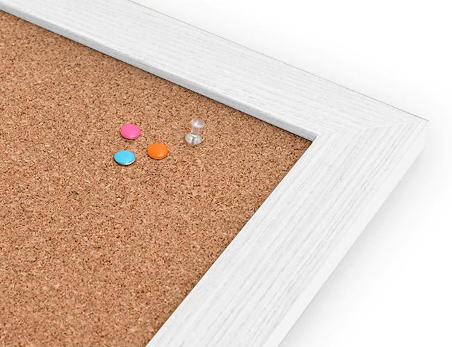
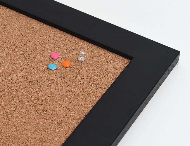
Each board is manufactured in the company’s Toronto workshop, and great care is taken to design and manufacture high-quality products that suit individual styles and homes. Frames come in multiple finishes for every board category, but you’ll see that (as per usual) I lean toward the white, black, and grey options.

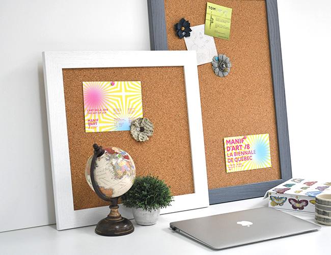
magnetic chalkboard (top: black frame, bottom: white frame)

corkboards

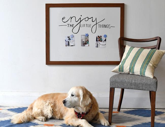
magnetic whiteboards

linen pinboards

Whether you’re in the market for a chalkboard, corkboard, whiteboard, or pinboard, you can browse the selection at Caribou Cabin, choose your size, select your frame, and easily place your order online. What’s not to love?

Stay tuned for another Caribou Cabin feature soon as I’d like to give you an up-close look at the linen pinboard that I have in my own home. Spoiler alert – it’s lovely!

Design: Scandinavian Summer

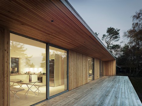
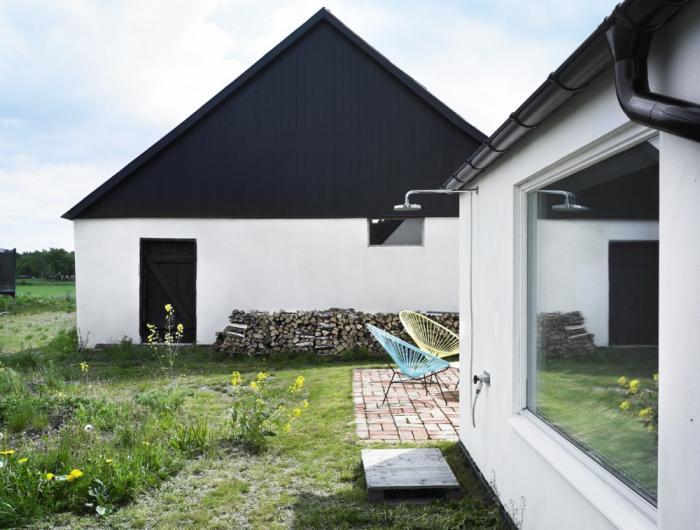
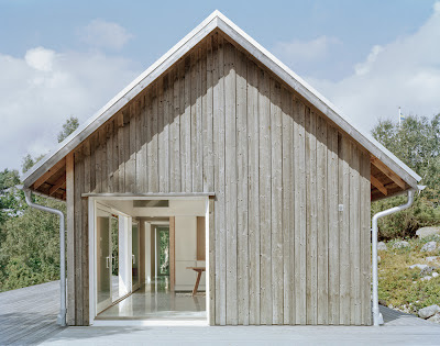
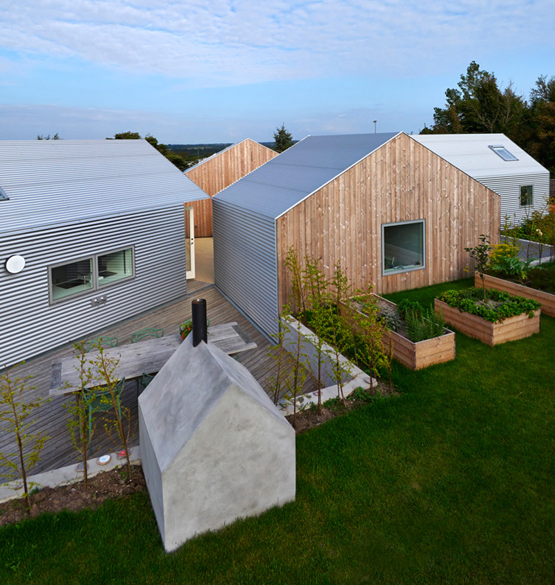
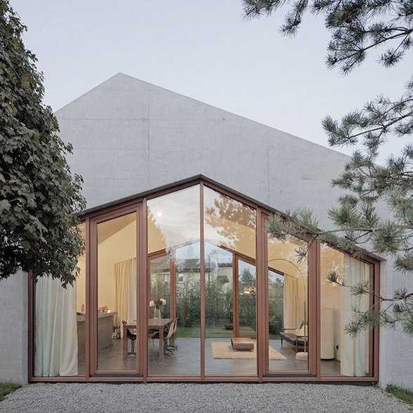
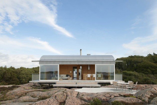
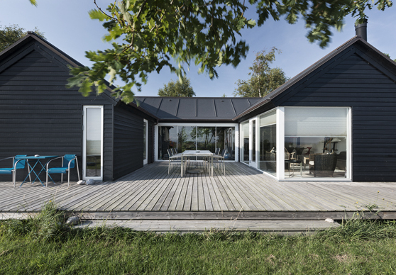
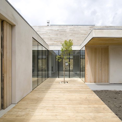
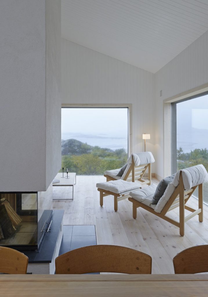
A few weeks ago, I shared a collection of white beach houses. Today, I’m doing another round-up of gorgeous architecture, but this time focused on the simplicity of Scandinavian design (with the exception of one building in England).

Mikael Bergquist architecture, via Dezeen

via Remodelista

Mikael Bergquist

via Contemporist

via Simple Form

designed by Mats Fahlander, via Contemporist

via Mønhuset

via Dezeen (in England)

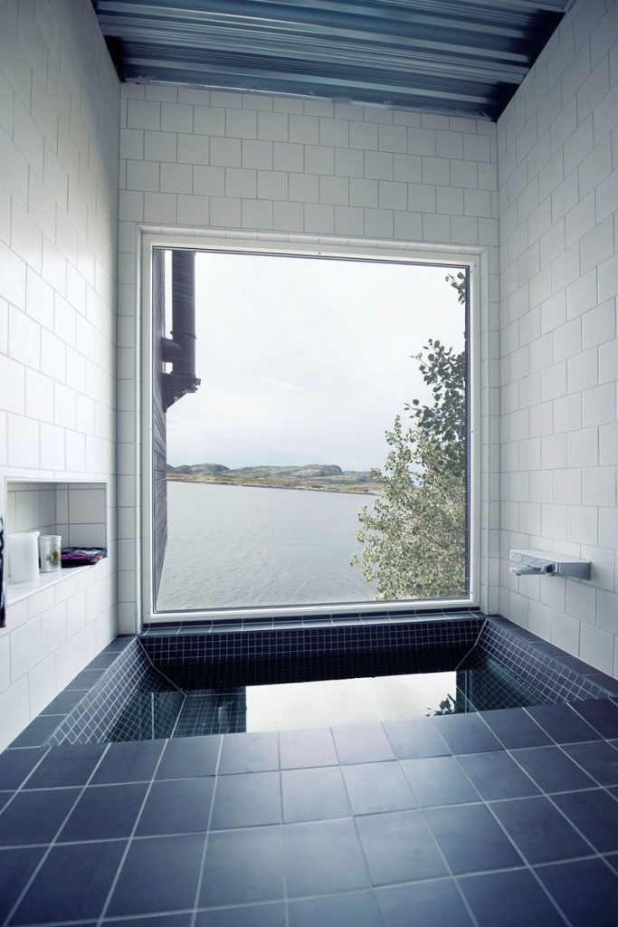
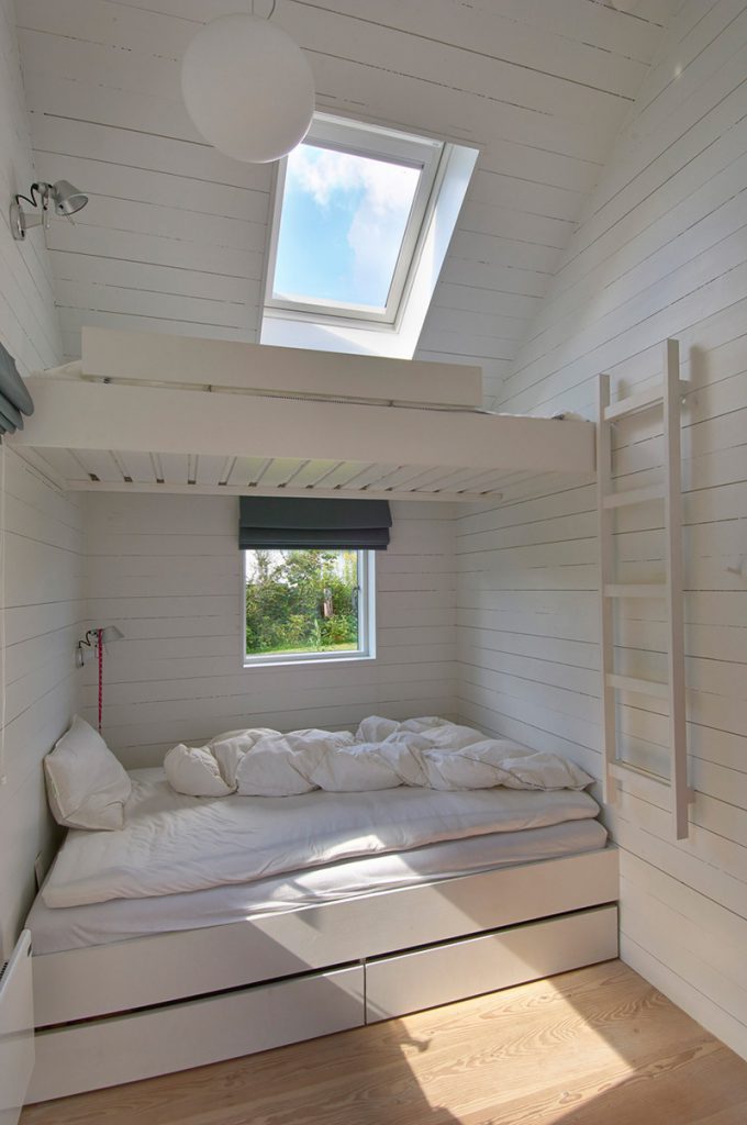
As I was preparing this post, I really wanted to remain focused on exteriors to showcase the architectural design, but I couldn’t help but save a few inspirational interiors, too.

Asante via Contemporist

via Contemporist

via Remodelista

via Asante

via Asante

Save

Save

Save

Save

Save

Save

Save

Save

Save

Save

Save

Save

Save

Save

Save

Save

Save

Hotel to Home: Anantara, Oman

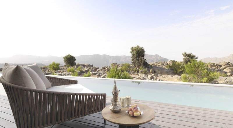
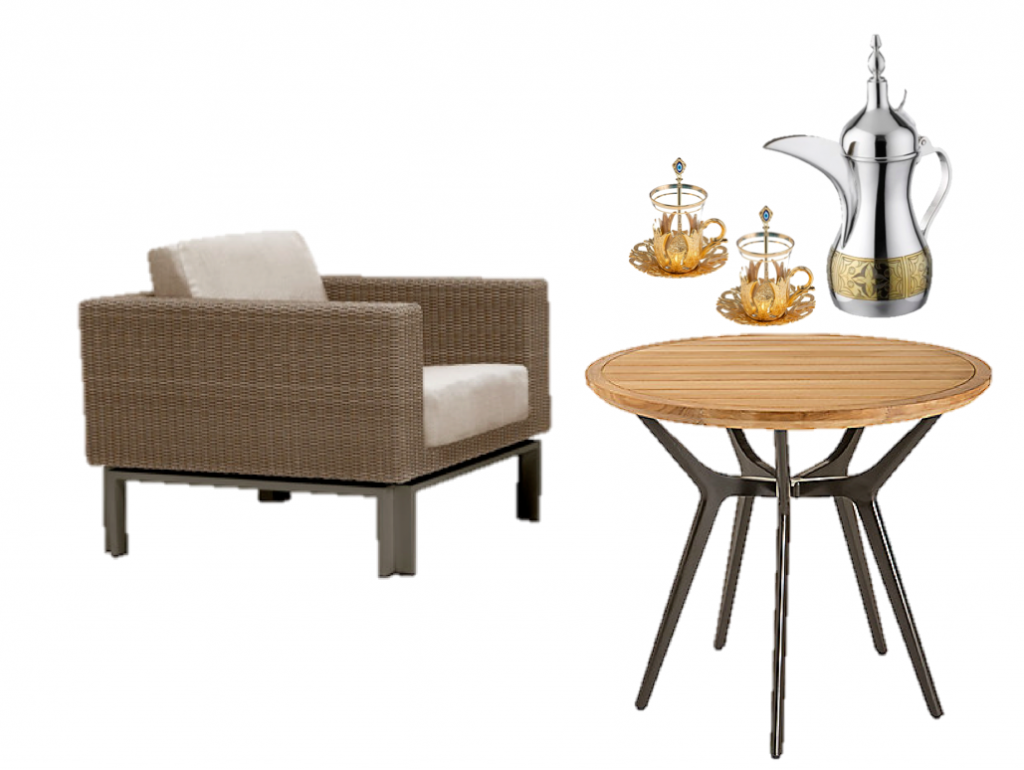
Today we are traveling all the way to Oman to take a mini-peak inside the Anantara Al Jabal Akhdar Resort. There are so many beautiful spaces to inspire us all, but today, I’m taking us to one of the outdoor patios. Could you imagine having your coffee here?

via Anantara Al Jabal Ahkdar

It’s easy enough to bring the exoticism of Oman into your own home even if you don’t have a pool to lounge by. Just pick up a cool coffee pot and some metallic glasses and pour yourself a delicious coffee or tea.

lounge chair, side table, coffee pot, glass

Save

Save

Save

Travel: Review of Hotel Henry, Buffalo

When I first learned about Buffalo’s newly opened Hotel Henry, I was intrigued. And I was curious. And I was dubious, too. A must-see hotel? Sure. In Buffalo? Not so sure. You see, the Buffalo I have known up until this summer is all outlet mall and Target. Honestly. I have not seen much more than that on any of my trips to Buffalo. Well, let me tell you, Buffalo surprised me. Really! So much so that I’d definitely make a return trip! Isn’t that what you’d like the result of every vacation to be? I was pleasantly surprised!

You’ve seen a couple of photos of my trip on Instagram (#WhiteCabanaGoestoBuffalo), but here’s a proper tour of the hotel.

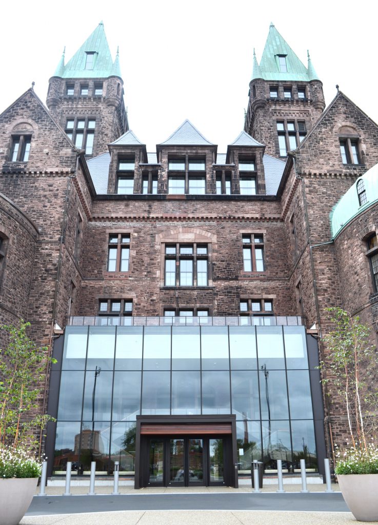
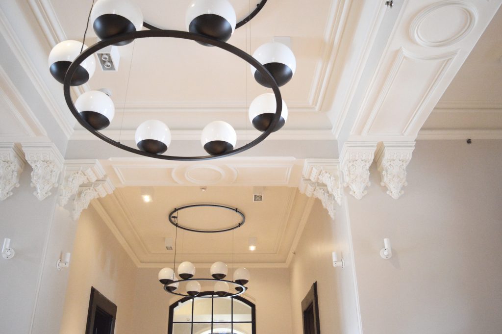
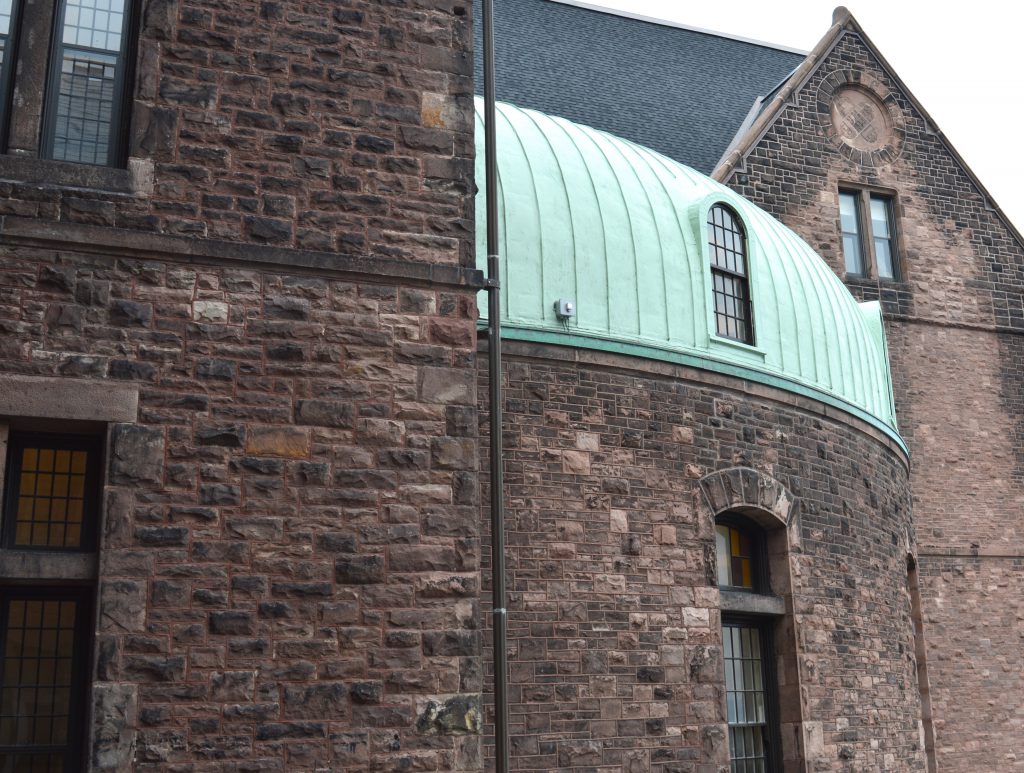
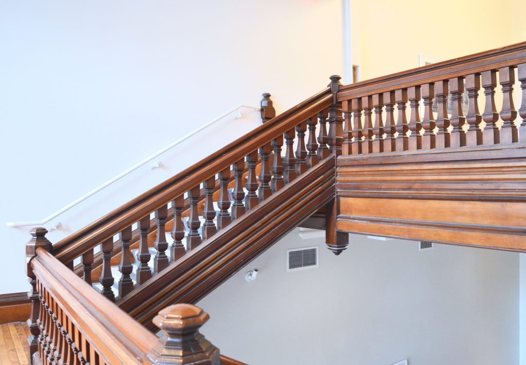
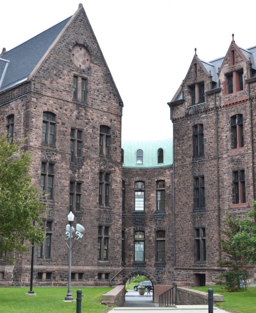
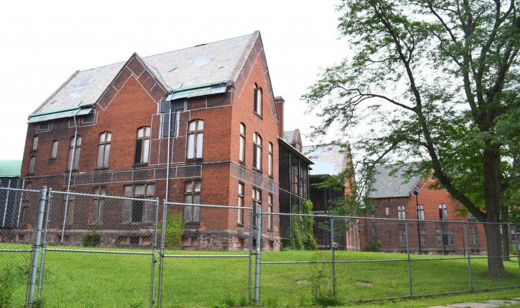
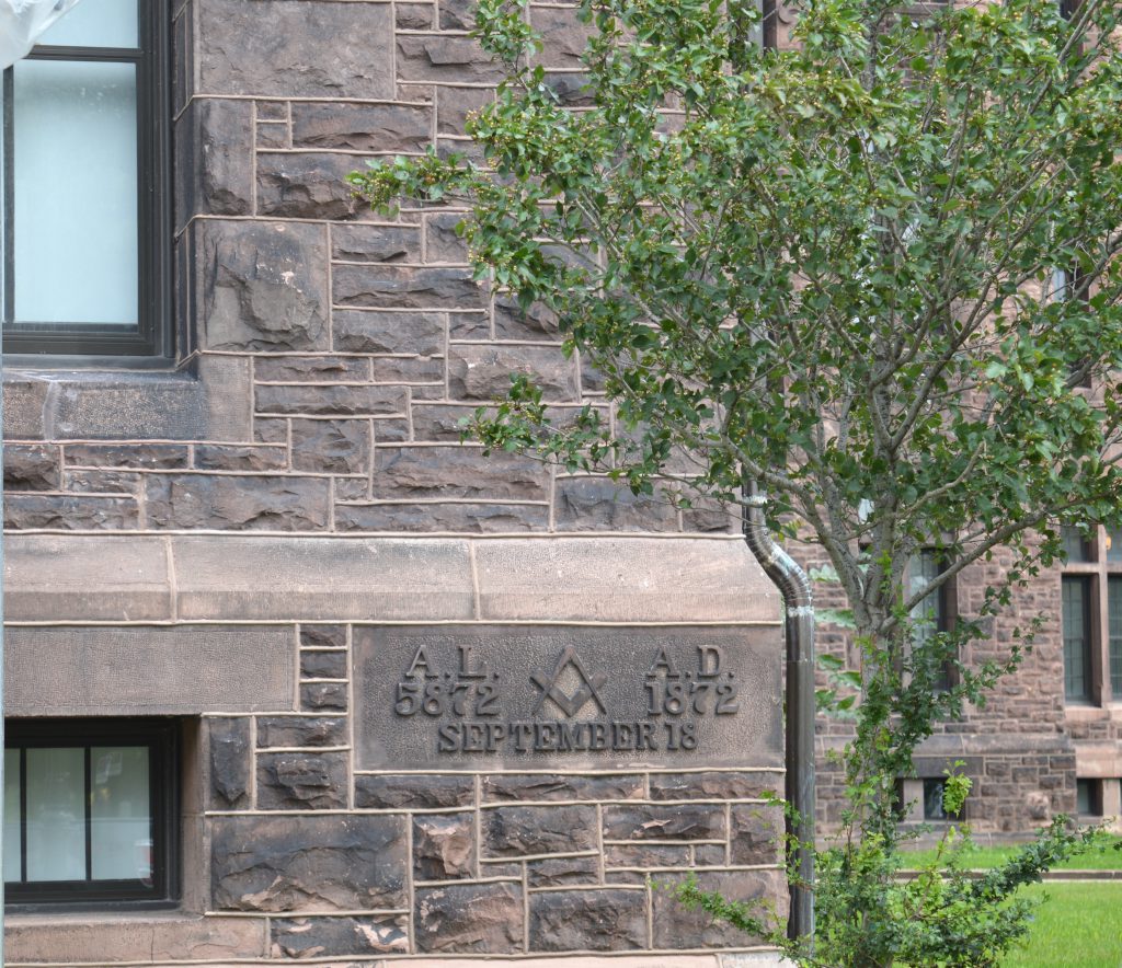
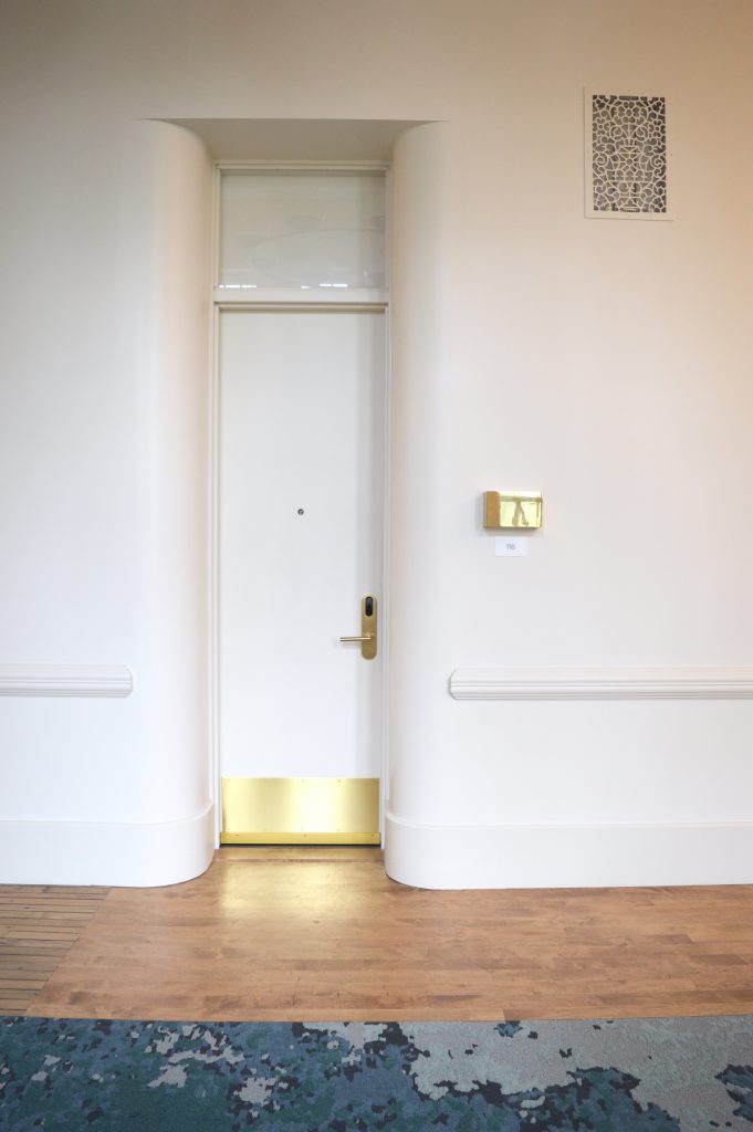
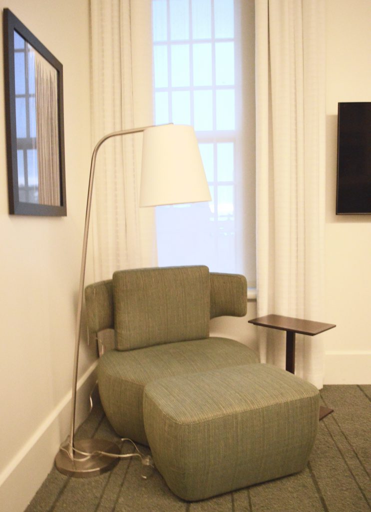
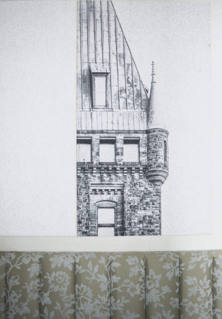
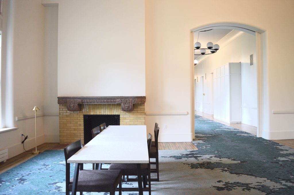
Hotel Henry, a national historic site, was built in the 1872 as a psychiatric hospital (aka known as the Buffalo State Asylum for the Insane). I didn’t know much of this history before I arrived which I think is a good thing. I was too googly-eyed over the design and architecture to get too engrossed in all the historical – and spooky!? – stories. As we pulled up to the property, I was floored. Amazed at the large scale and the absolutely beautiful architecture. I was definitely excited as I stepped inside.

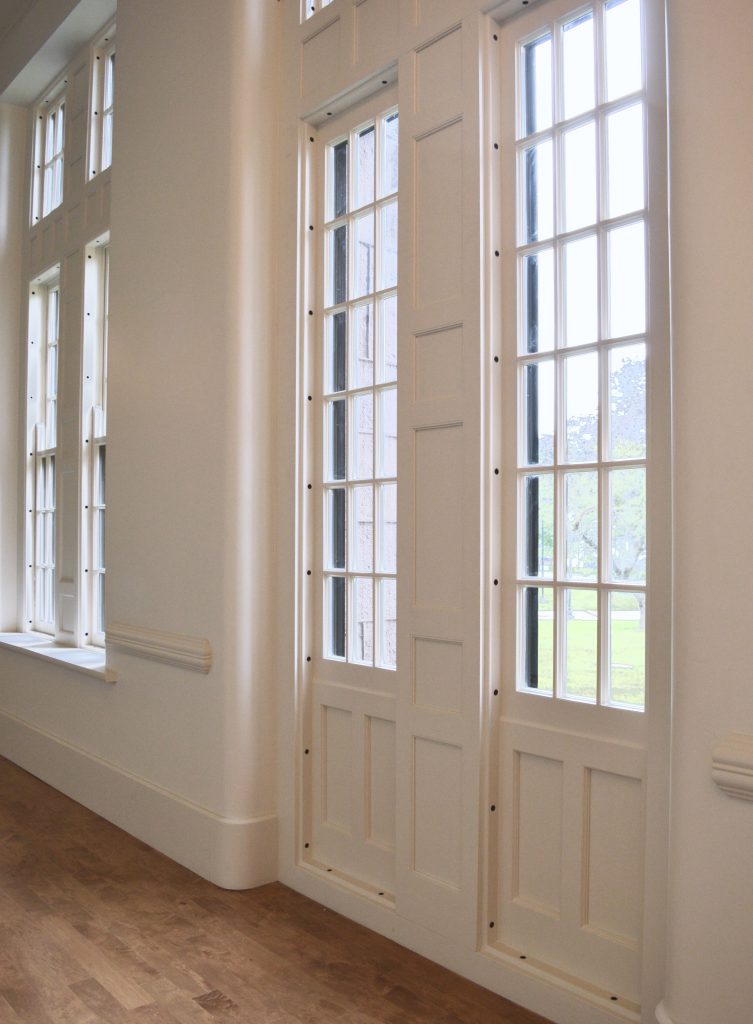
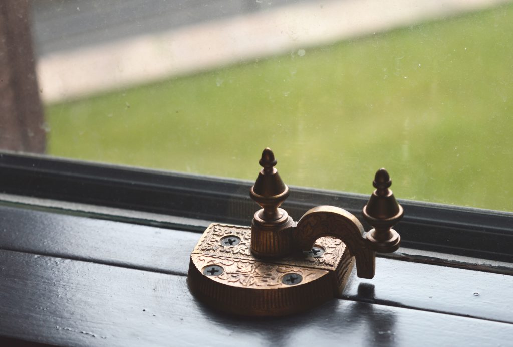
The hotel has been part of a 3-year, $102 million renovation project. The hotel is located on a 42-acre site and occupies three of the eleven buildings of the former asylum. The project was led by Deborah Berke Partners and Flynn Battaglia Architects. Just to give you an idea of the scale and work involved, the restoration of 600 windows cost $7 million.


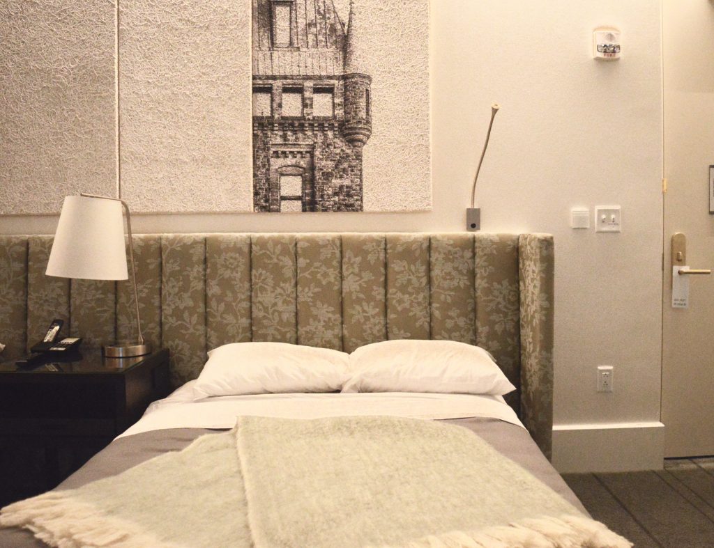
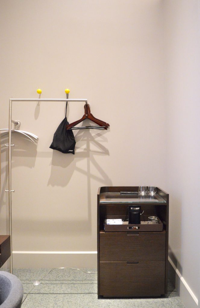
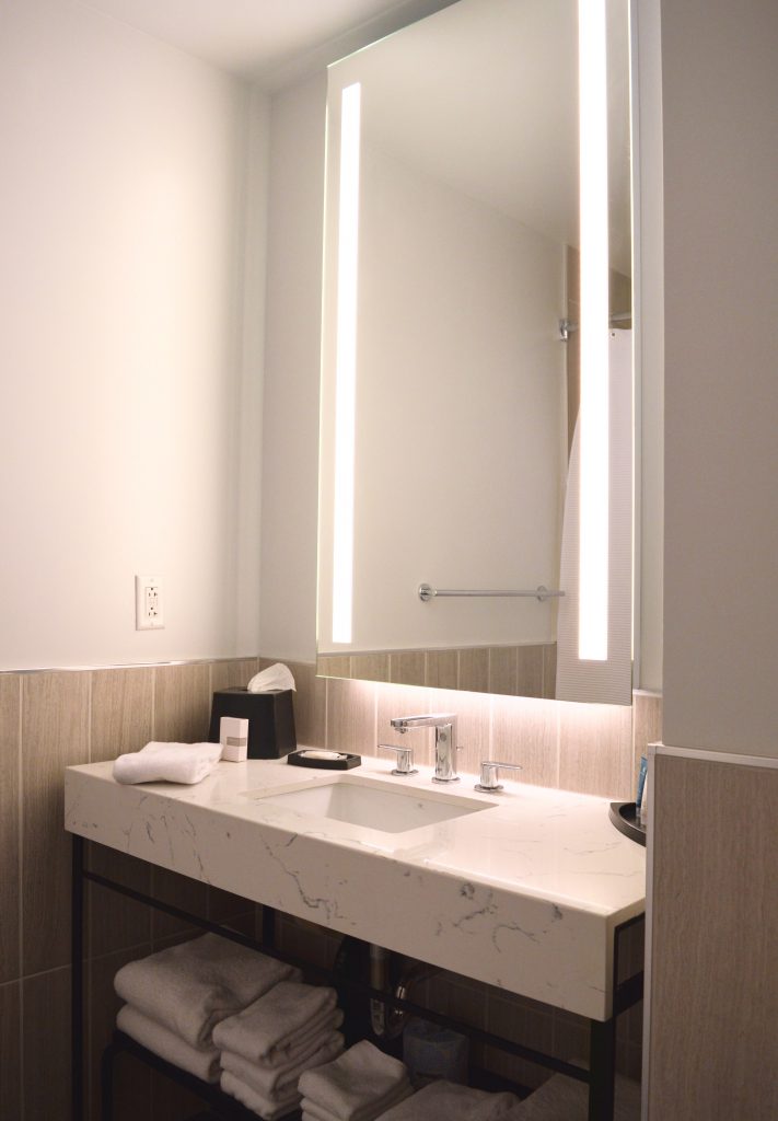
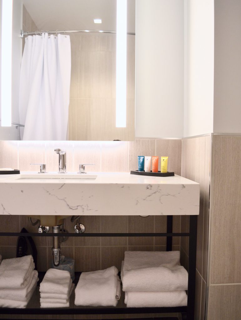
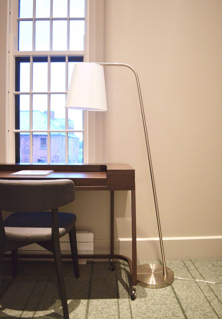
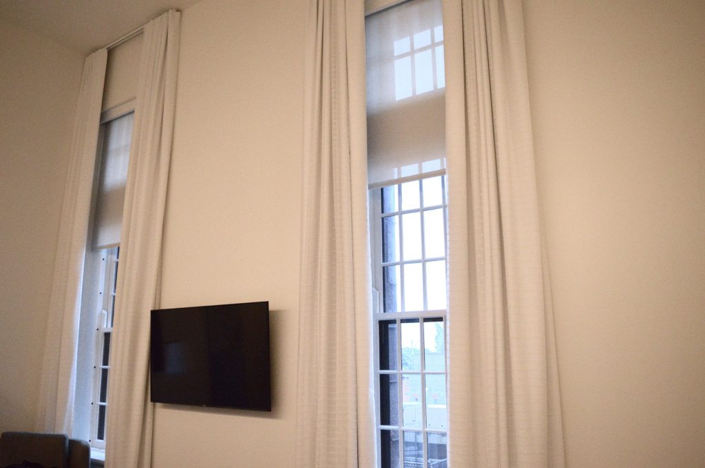
Check in was smooth and quick. My room was spacious with ridiculously high ceilings that definitely caught my attention! Beds were comfortable, and the bath products were lovely. Towels were fluffy, and the coffee/tea station was a nice addition. There was plenty of space to spread out, rest, and work (the desk in front of the window was well-planned).

I think it would be lovely if Hotel Henry added robes to the room and a mini fridge, too. These items aren’t essential, but they’re nice pluses for a luxurious stay.


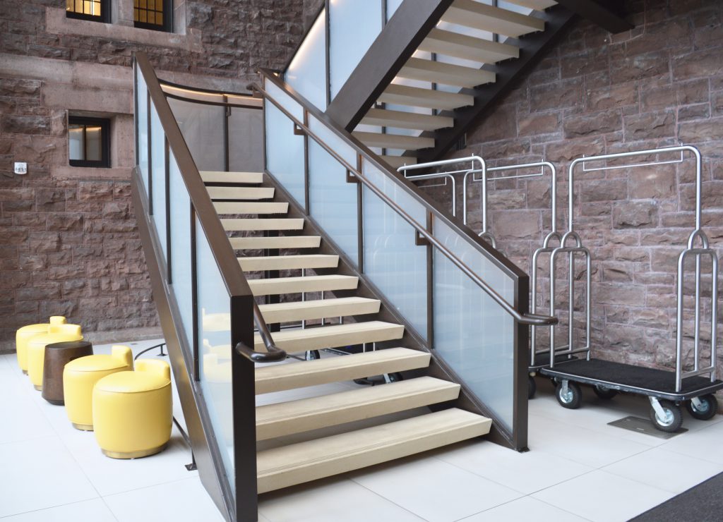
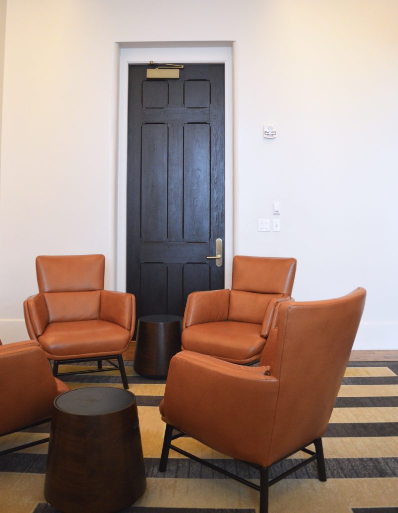
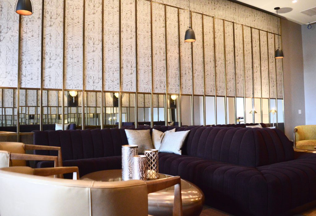
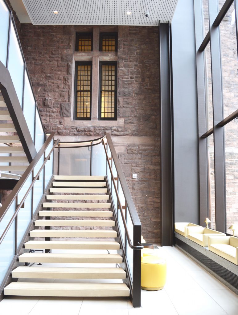
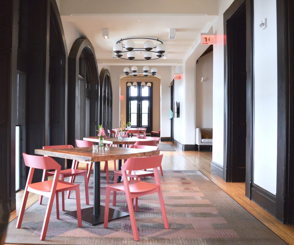
Beyond the room, the hotel is absolutely stunning. The foyer and lounges are well-appointed with beautifully designed furniture and accessories. Interesting and unique art is everywhere in the public spaces and guest rooms. The lighting is dramatic and eye-catching.

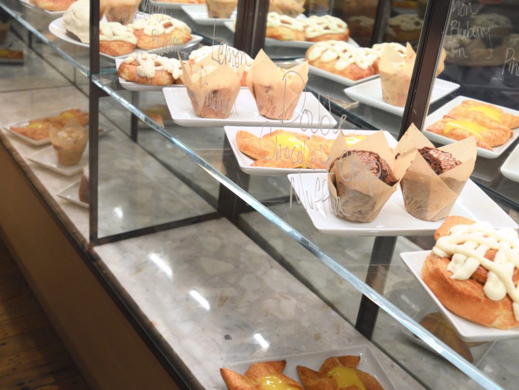
During my stay, I had the chance to enjoy the bar one evening and breakfast by 100 Acres – the hotel restaurant that is becoming one of Buffalo’s hot spots! I enjoyed both, and loved parking myself in different areas around the hotel to enjoy my drink and meal. Each area offers lovely seating options and great views of the architecture and art.

The next time I go to Hotel Henry, I’m definitely going to sign up for a tour of the abandoned/non-renovated part of the Richardson Olmsted property. If I had known about these public tours before I arrived, I would have signed up, but it completely escaped my research and planning path. In addition to the tour, I’d like to explore other architectural, artistic, and neighbourhood gems.

Prices per night vary depending on day and month, but they average about $150 USD per night. Check the availability calendar for the most accurate price.

Thanks to Hotel Henry for sponsoring this post. All photos and opinions are my own.

Save

Save

Save

Save

Save

Save

Save

Save

Save

Save

Save

Cars: Review of the Audi Q5

Have I caught your attention with the title? Audi. Q5. Who’s excited for a little car review? Honestly, I am most definitely thrilled to be writing this post about my recent experience with the Audi Q5 – aka #WhiteCabanaDreamCar.

I’ve been keen on the Q5 for a while now, but it hasn’t always been that way.

A long(er) while ago, you may remember that I became pretty obsessed with the Fiat 500. I loved the look of this little Italian go-getter, but eventually my want/need for this little one faded. I rented it for a weekend, and while I enjoyed driving it around Toronto, it barely fit my luggage, and it was quite a noisy highway ride.

In recent years, it was the Audi Q7 that caught my attention, and I wrote about it here. What a beautiful car. It’s sleek, stylish, and roomy. In fact, once I saw it up-close, I realized it might be a touch too roomy for my liking. With no children in tow, I don’t have a need for its third row of seats.

Enter the Q5. I kept seeing this car on the road, and I kept liking it. And liking it some more. When I drove home from Montebello, Quebec, I spotted many on the highway, and each time I saw one, I thought, “now that’s a nice looking car,” sometimes I said it to myself before I was close enough to confirm that the car I was eyeing was in fact an Audi Q5.

Given that I grew up with an Audi 5000, I have fond memories of the Audi brand. My parents bought our grey Audi 5000 at the Audi factory Ingolstadt, Germany, then shipped it over to Toronto way back in 1985! We traveled everywhere in that car as a family. When my Dad finally retired it in 2006 after 21 years and 344,996kms, it was a pretty sad day for all of us. We all knew it was at the end of its life (21 years!), but it was emotional to see it go. Is that weird? To be so emotionally attached to a car? Hope I’m not the only one!

Dad and our Audi 5000 in Ingolstadt, Germany
(my sister and I are in the backseat – camera shy, I guess)
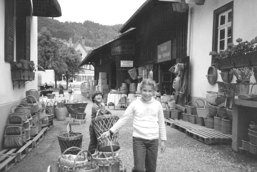
Okay, so we weren’t too camera shy. My sister and I at a basket shop in Germany. I’m flexing my muscles by carrying the biggest basket I could find, I guess!

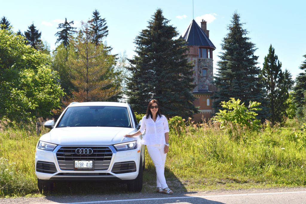
So this brings me to my recent, super up-close encounter with the Audi Q5. The AudiKW team generously loaned me a white Q5 for a couple of days of adventuring around the Waterloo region (see #WhiteCabanaxAudi on Instagram for a few more photos). What a treat! I was happy to explore the white, sleek AudiKW showroom while I waited for my car. While dealerships can be easily intimidating for someone like me (who knows very little about cars), I was pleasantly surprised by everyone’s welcoming attitudes. I felt comfortable.

I met with Deon and Robert who set me up with the Q5. Robert – a brand specialist – walked me through all the features of the Audi Q5 Komfort. This model is the lowest end of the Audi Q5 spectrum, so some elements I really liked, and others would come in a higher end model (like the Progressive or the Technik).

When I got in the car, the first things I noticed were the driver’s seat and the size of the front window. The driver’s seat was made for me (or so I like to think). It was comfortable from the beginning right up until I dropped off the car. The front window panel was large and free of obstructions. I know this should always be the case, but it isn’t. Sometimes the frame is too thick or the rear view mirror is bulky. I also loved that the windshield wipers tucked away beautifully – they weren’t visible when not in use. Great design detail!
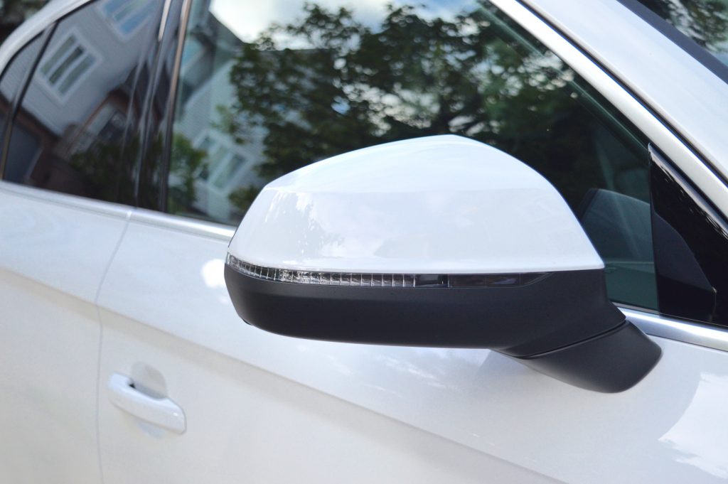
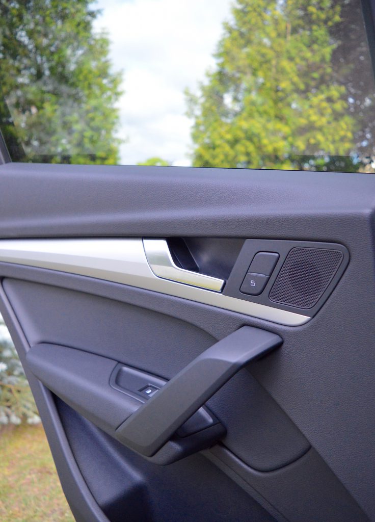
I love the design of these mirrors.
I currently drive a 2004 Toyota Rav4 – which I really do love – but it doesn’t have the modern features of new cars, so it took me a little while to get used to all the tech in the Audi Q5. Okay – not that long, but you know what I mean. In the Audi Q5, I could actually plug in my phone and connect it to bluetooth. I know many new cars have this feature, but my Rav4 doesn’t, so it took a moment to get used to it. Once I did – let me tell you – I made as many hands-free phone calls as I could while I was driving! I get amused so darn easily!
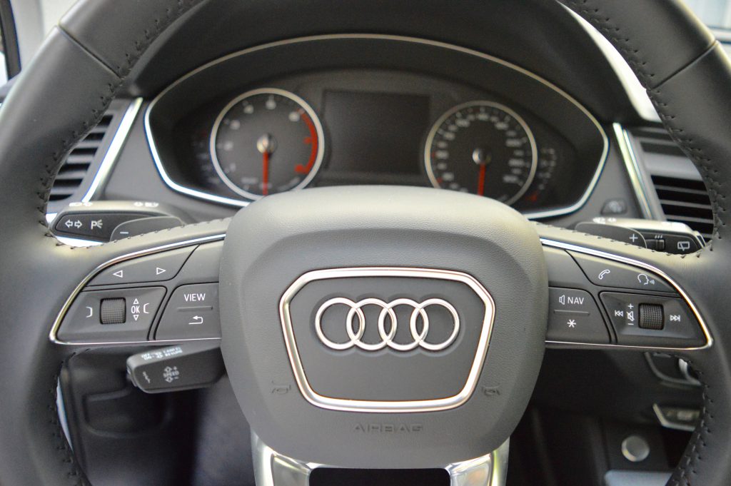
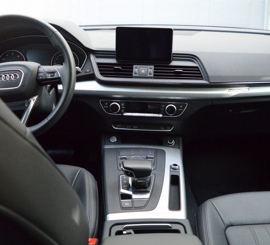
I think I only managed to use about one or two of these buttons! I’m pretty tech-savvy, but not when it comes to cars!

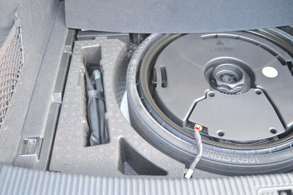
The cargo space is decent in the Komfort (26.8 cubic feet), but I definitely noticed that it’s smaller than the space in my Rav4 (about 38 cubic feet). The seats fold down, of course, which helps for large loads, but it would be something I’d have to consider and test out before I’d purchase it as I do end up carrying large loads on random trips in and out of town. The cargo space in the Q5 is tidy with a hidden spare tire and a privacy cover, too.
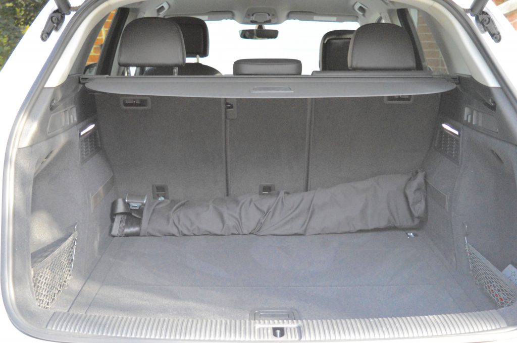
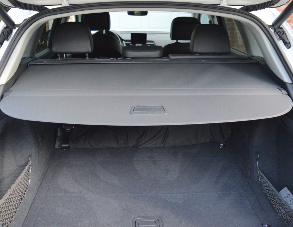
 

Great design – everything has its place!

Because I live in Uptown Waterloo and normally walk or bike to the places I need to go, I forced myself to venture out a bit for a longer drive to get the full experience of this car. I took the highway-route to Cambridge so I could go fast! FUN! The pick-up in the Q5 was amazing, and my comfort level remained high! The car drove smoothly and quietly, and I definitely liked driving fast (within speed limits, of course)!

When I was going over the features with Robert at the dealership, he told me that the car can adjust to various driving modes – dynamic, comfort, auto, etc. I opted for dynamic for the majority of the time because the ride felt fast and smooth. Dynamic mode has tight steering and more aggressive gear shifting. Comfort, on the other hand, has softer, easier steering and less aggressive gear shifting.

Look at the little lights underneath the handles – love them!

Having the Audi Q5 in my possession made my birthday celebrations extra fun! In fact, since my parents came for a visit, they, too, experienced the luxurious drive! This was especially fun for my dad who recreated his Audi pose from 1985. 

Notice my approach to parking? The farther and emptier, the better!

Over the course of my Audi Q5 ownership, I drove as much as I possibly could. In addition to driving to and around Cambridge, Kitchener, Waterloo, and St. Jacobs, I drove over to the sweet town of Elora for a birthday dinner celebration. On the way, I stopped by the Montrose kissing bridge – the last covered bridge in Ontario, and the oldest of its kind in Canada.
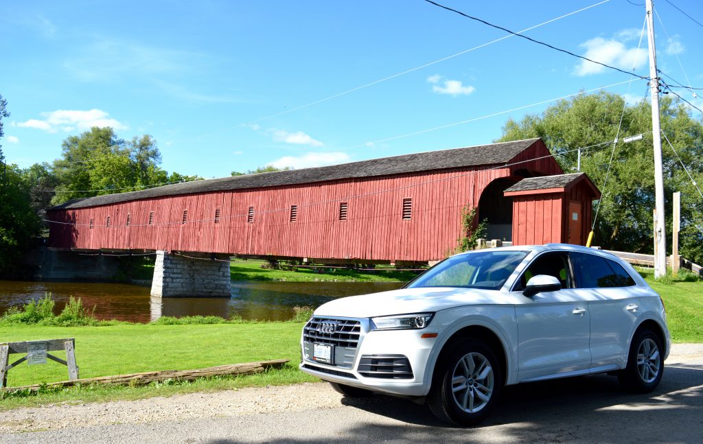
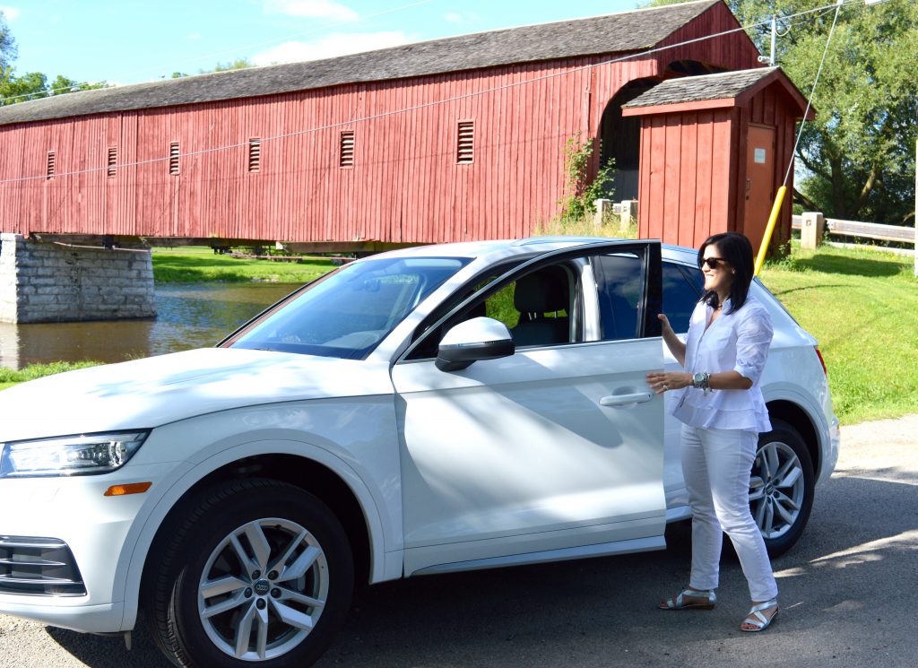
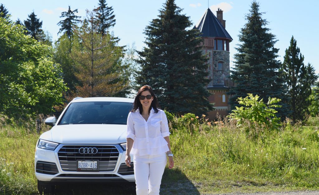
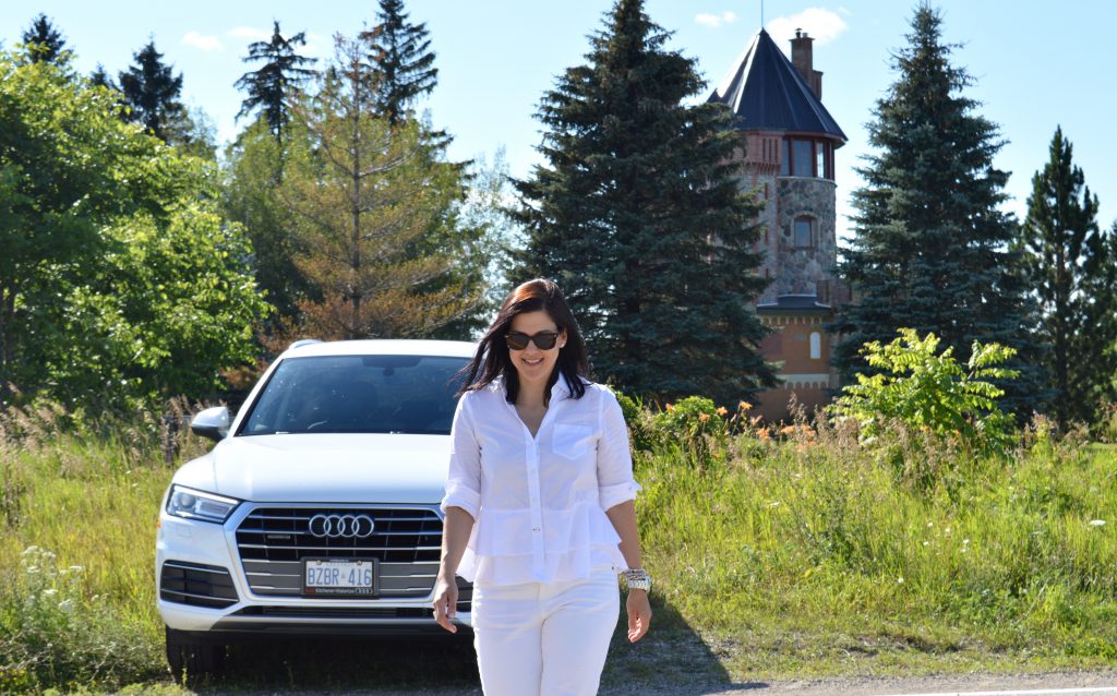
And I also stopped by the castle-house on Middlebrook Road (between Montrose and Elora).  While in Elora, I checked out the progress of the Elora Mill. Construction is well underway, and I’m very much looking forward to a return trip here to eat, stay, and relax! It’s going to add so much more prettiness to the already-pretty town of Elora. As you can see in these photos, parking the Q5 was a breeze. Backing into grassy areas and stone-covered roads was a-okay!
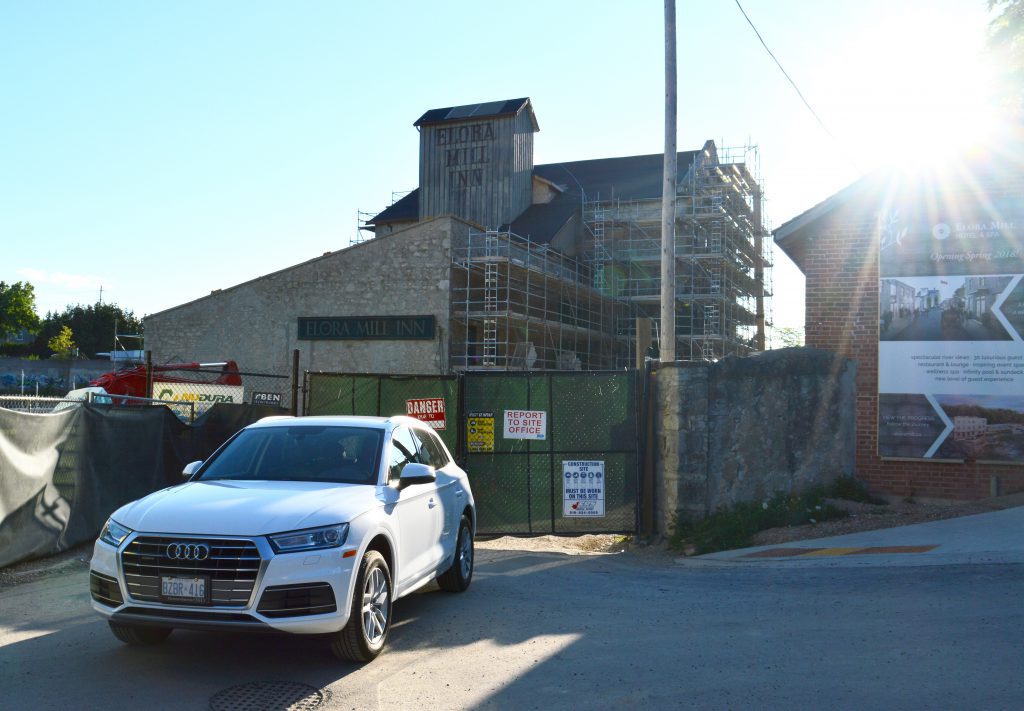
For an SUV, the Audi Q5 is extremely fuel efficient. I love this aspect of the car! Apparently, it’s good to go 1000km on a tank of gas. Isn’t that amazing for an SUV?

I took on several passengers over the course of my mini-ownership. Every passenger loved the experience. All agreed that the car was definitely sleek and luxurious and beautifully designed. Back-seat passengers felt that the ride was spacious and comfortable and enjoyed the adjustable back seats as well as the back-seat air conditioning controls.

As a driver, I got easily used to having the control buttons at my fingertips on the console. While some passengers assumed that the navigation screen was touch-screen, it wasn’t. This didn’t bother me at all. I really liked having the circle button on the console to control music, phone calls, settings, etc. It was very easy to operate and comfortable because I didn’t need to extend my arm for touch screen.

While I did absolutely enjoy the Audi Q5 Komfort, and my interest in purchasing one has been confirmed because of this recent driving experience, there are some features that did not come with this model that I would want. My top priority would be a sunroof. I love having a sunroof in my Rav4, and I would definitely want a Q5 that had one. The model that I drove didn’t have all the snazzy sensors and cameras that I would want in a new car. I’d definitely upgrade to include these as I think they’re especially handy for parking and highway driving.

If you can’t already tell, overall, I have become more attached to the Audi Q5 after this driving experience. It’s a beautiful vehicle from every angle, and it made me feel safe, happy, and secure. I also loved walking up to it knowing that I got to get in the driver’s seat. This car definitely suits my style and personality!

Do I still think that this is the car for me? You bet!

Unless, maybe, I should try out the Audi TT first? 🙂

Many thanks to MC and the AudiKW team for sponsoring this post. All opinions and photos are my own.

p.s. Outfit details: jeans – Joe Fresh (last year), top – Kate Spade, eyeglasses – Polette, sunglasses – Rayban, purse – Longchamp.

Save

Save

Save

Save

Save

Save

Save

Save

Save

Save

Save

Save

Save

Save

Save

Save

Save

Save

Save

Save
Save
Two for Tuesday: Birthday Balloons

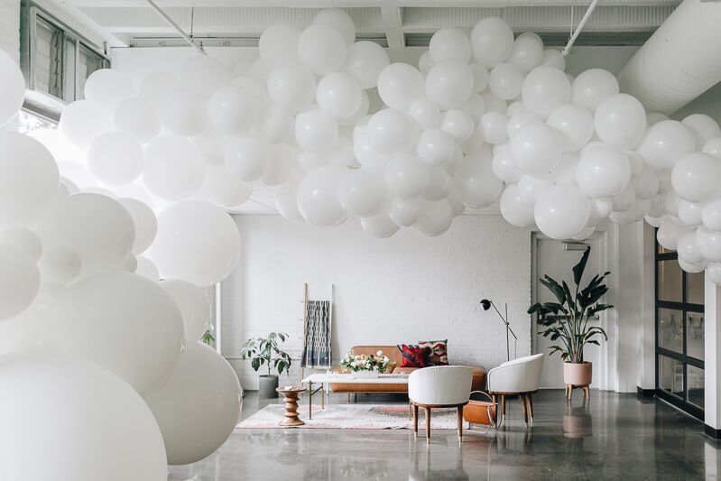
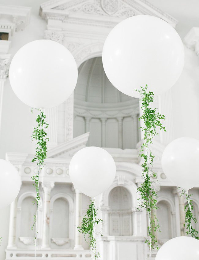
It’s all about balloons today because it’s my birthday! Yipee! Hip hip hooray!

via Wit & Delight

via Green Wedding Shoes

I’m taking the rest of the week off from the blog because I like to really make sure my birthday extends for as long as possible!

Save

Design: The White Beach House

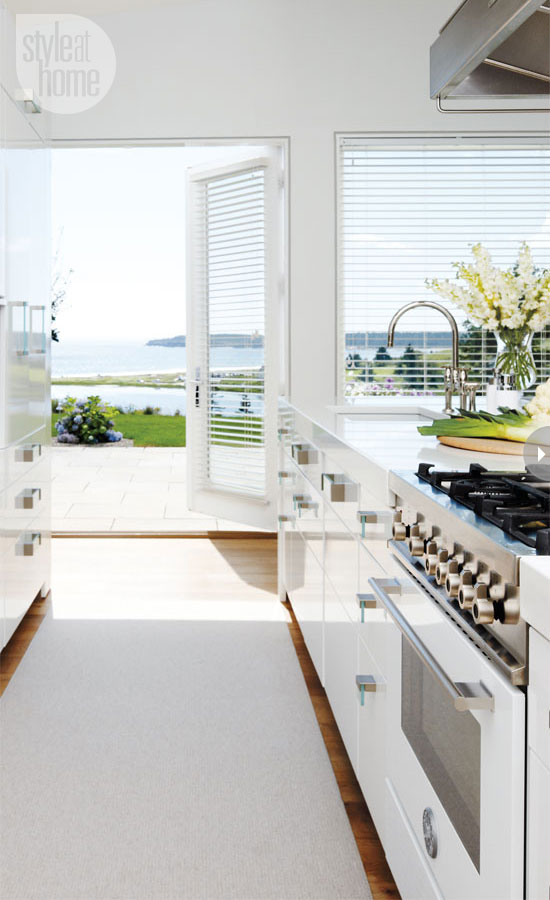
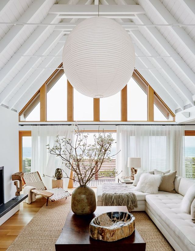
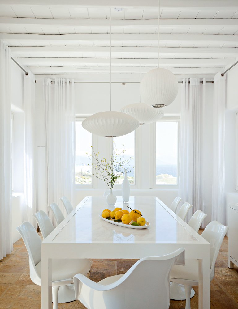
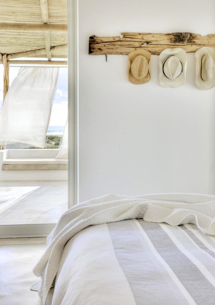
If you ask me, there’s no better colour for a beach house than white. These beach-side/lake-side/water-side interiors have the prettiest palettes of whites, which keeps them looking serene and easy all day long.

via Style at Home

via My Domaine

via Marie Claire Maison

via 79Ideas

via Marit Folland

via Beach House Life and Style

Piet Boon via 79 Ideas

Gorgeous, right?

Save

Save

Save

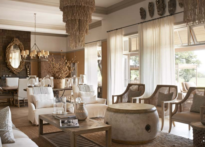
Hotel to Home: Serengeti House, Tanzania

We’re traveling all the way to Tanzania today because the Serengeti House – and its surroundings – is definitely worth a visit! Here’s just one of the many beautiful rooms in this luxurious hotel.

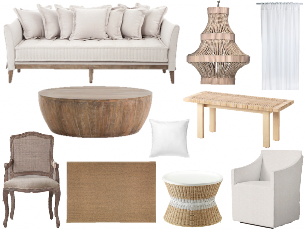
If you like the combination of warm whites and muted sand, then here’s a starting off point for the look:

curtains, rug, table, tray table, pillow, chandelier, sofa, armchair, cane chair, coffee table


Save

Save

Design: White with a Dash of Gold

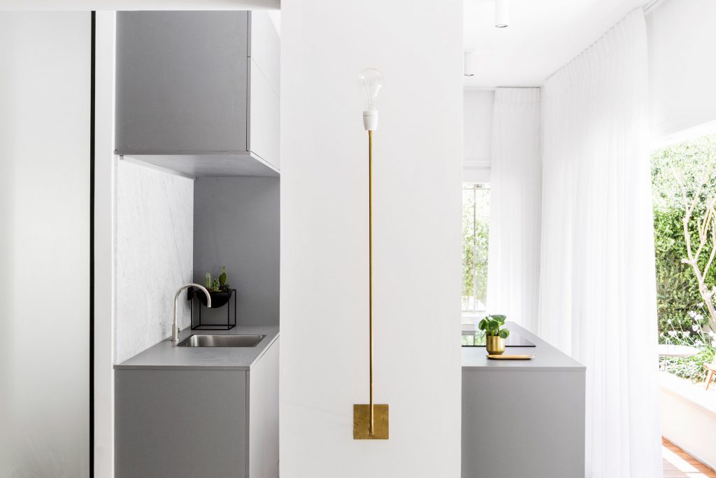
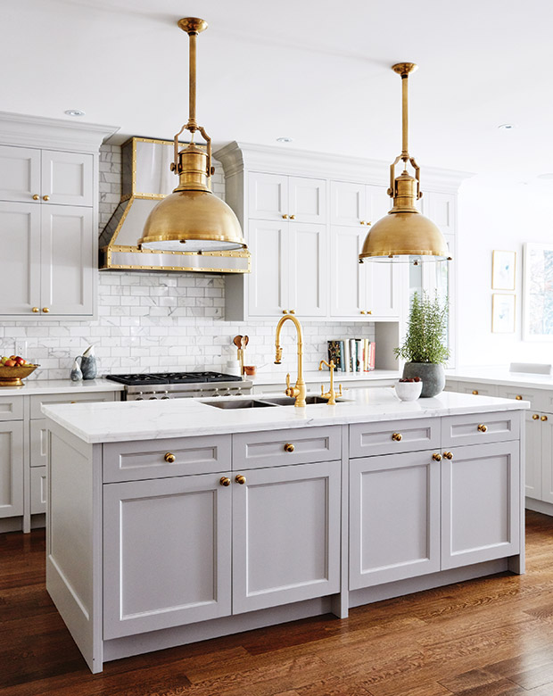
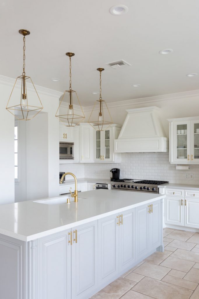
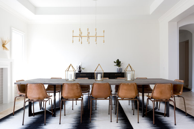
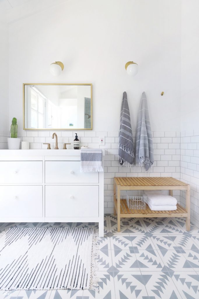
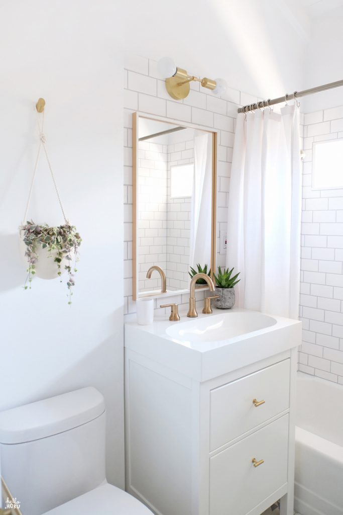
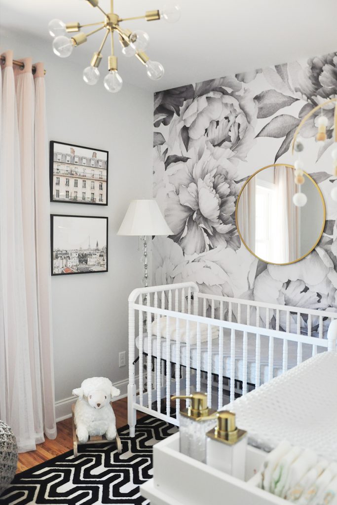
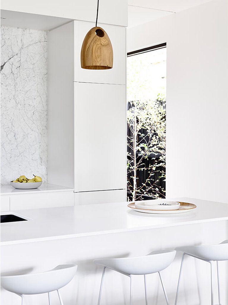
Gold has been around in the world of design for a few years now, and there’s no sign that its leaving us quite yet. All of the spaces I’m showcasing today feature pretty gold lighting in pretty white spaces.

via Style at Home

via Dezeen

via House & Home

via Veneer Designs

via Veneer Designs

via Hello Hoku

via Hello Hoku

via Foxy Oxie

Design: Round-up of White

The only goal that I have for today’s post is to share a collection of images that have recently caught my eye. There’s no method. Just easy, breezy, inspirational images of design in white. Happy Wednesday!

via Greige Design

via Curated Interior

via New Chic

via Sabo Skirt

via The Design Chaser

via Lindsay Marcella

via By Garmi

via Style at Home

via Style Caster

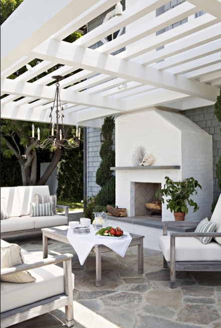
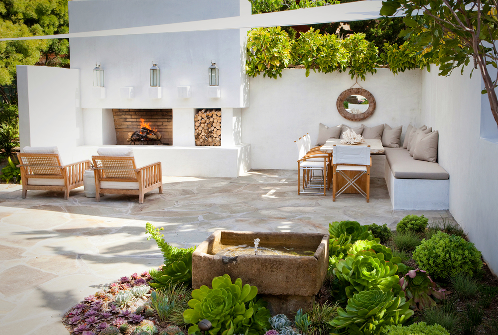
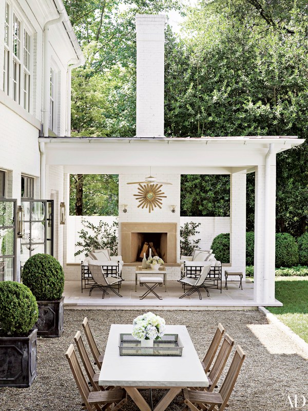
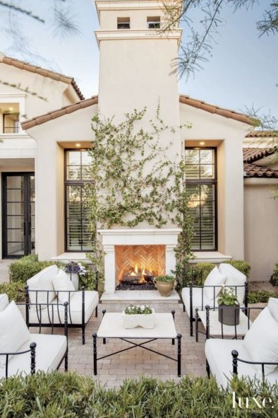
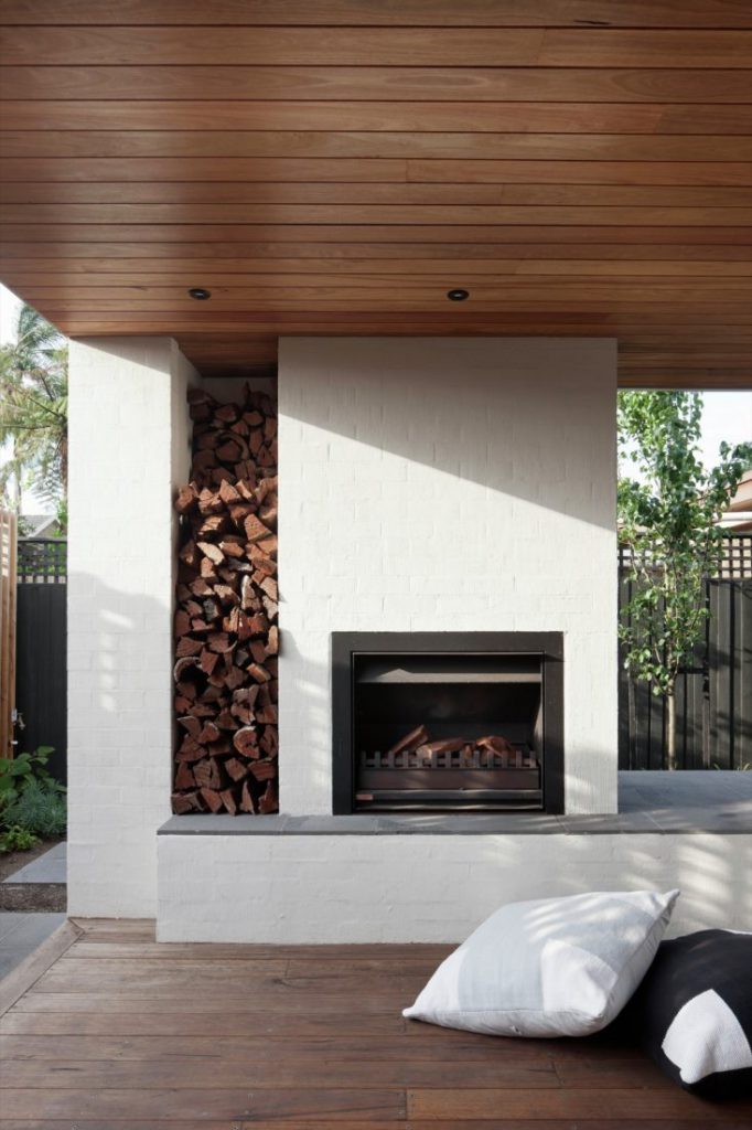
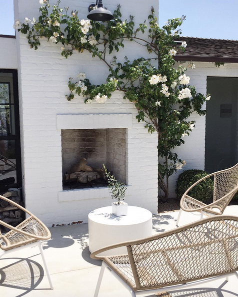
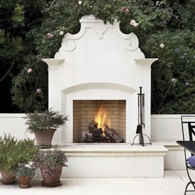
Design: The Prettiest Outdoor Fireplaces

It’s all about the outdoors these days. Even with the rainy summer we’ve had so far, it’s been great to spend as much time as possible outside – biking, walking, and enjoying a coffee on the patio. Many of the spaces I’ve been pinning on Pinterest are of the outdoors. These outdoor rooms that are designed around a fireplace are especially inviting, don’t you agree?

Tim Barber Ltd. via Houzz

via Molly Wood Garden Design

Susan Kasler’s Atlanta home, via Architectural Digest

via Luxe

Bower Architecture via Gardenista

via Kelly Nutt Design

source unknown

Save

Save

Save

Save

Save

Save

Save

Save
Save
Save
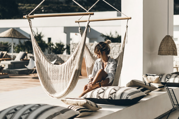
Hotel to Home: Casa Cook Rhodes, Greece

I’m making note of the Casa Cook hotels now in case I ever make it to Greece in the future. Casa Cook – part of the Thomas Cook travel company – currently has two hotels in Greece. Casa Cook Kos is opening in July, and Casa Cook Rhodes has been open for about a year.

Both hotels look to be uber stylish, luxurious, and welcoming. I’m only showing you one of the outdoor spaces at Rhodes today, but I’m sure you’ll drool over the design of all the other spaces, too, if you have a browse through the gallery.

via Casa Cook Rhodes

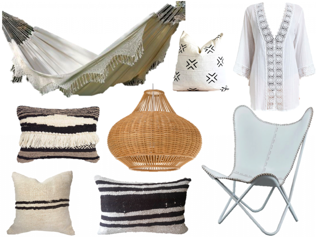
If you have an outdoor space that you’d like to spruce up this summer, maybe give these items a try to recreate the ease of this gorgeous Greek hotel.

hammock, beach cover-up, pendant, butterfly chair, pillow, pillow, pillow, pillow

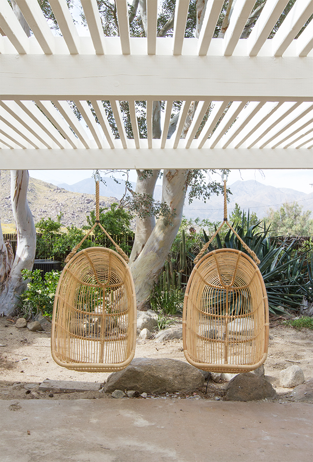
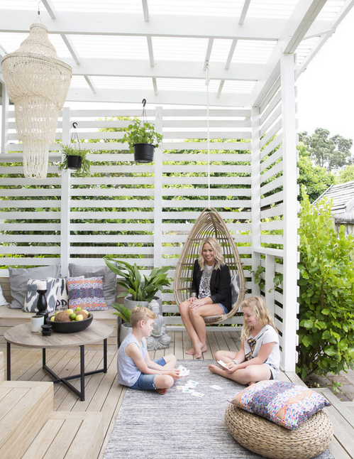
Design: The Hanging Chair

Aren’t these outdoor spaces just so inviting? How much would you love to swing your day away in one of these hanging chairs?

via Sarah Sherman Samuel

source unknown

via Home Beautiful

Hannah Blackmore

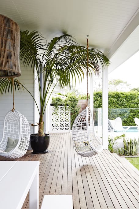
Magnolia House, Byron Bay, Australia via Air BnB

Save

Save

Save

Save

Save

Save

Save
Save
Design: White and Wood

The combination of white and light wood is inspiring at this time of year. The duo evokes charm, ease, and adventure. This is a perfect pairing for all rooms in the house as you’ll note from the inspirational room designs featured here.

via DIY Decorator

via Sarah Sherman Samuel

via Anthropologie

via Apartment Therapy

via Amber Interior Design

via Reno Guide

via Entrance Makleri

via Homepolish

Tell me, is there a room you’d move into? Recreate in your own home?

Save

Save

Save

Save

Save

Save

Save
Furniture: Outdoor Patio Inspiration

With the arrival of summer weather, don’t you just want to spend every spare moment outdoors? I do! I keep pinning photos of outdoors spaces on my Pinterest boards, and large patios (overlooking water, ideally) can be so darn dreamy.

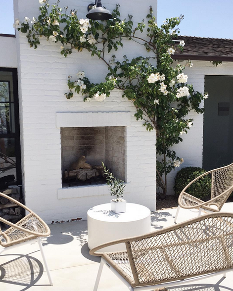
via Annette Nordstrom

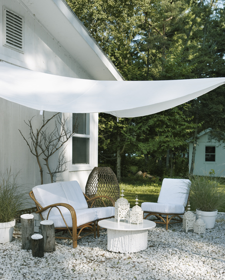
via House & Home

via Margarita Wyld

via Kelly Nutt Design

via House & Home

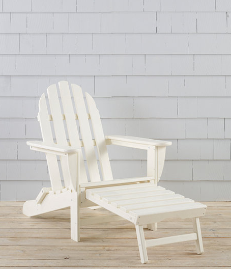
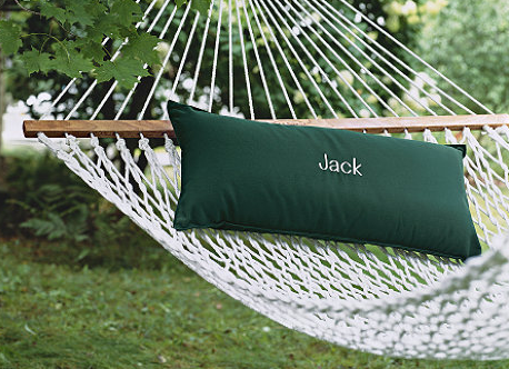
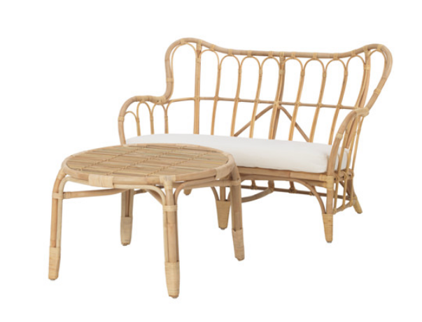
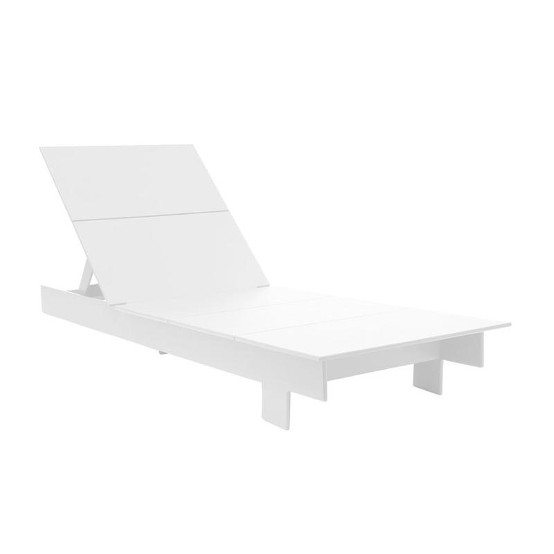
If you’re looking to recreate a look like any of the above, here are a few furniture options to get you going.

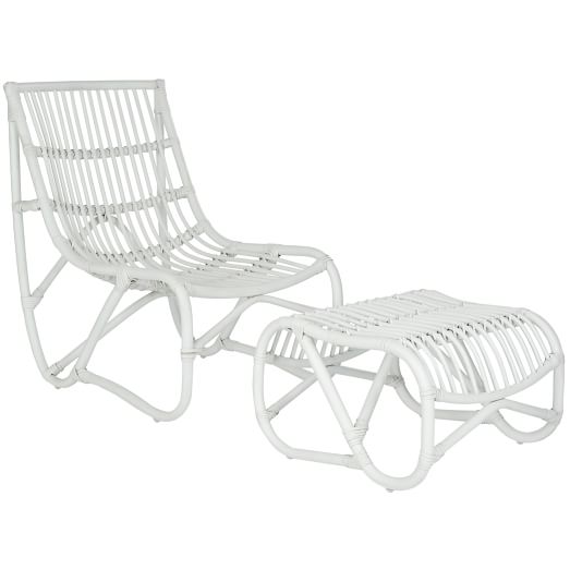
wicker chair + ottoman set, $599 USD, West Elm

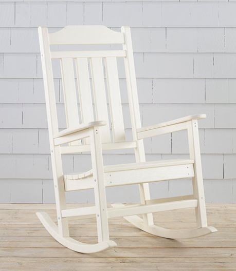
rocker, $329 USD, L.L.Bean

lounger, $399 USD, L.L.Bean

hammock, $199 USD, L.L.Bean

Mastholmen conversation set, $349 CAD, Ikea

Lollygagger chaise, Hauser

Save

Save

Save

Save

Save

Save

Design: McKinley Burkart Architecture

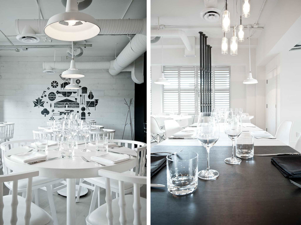
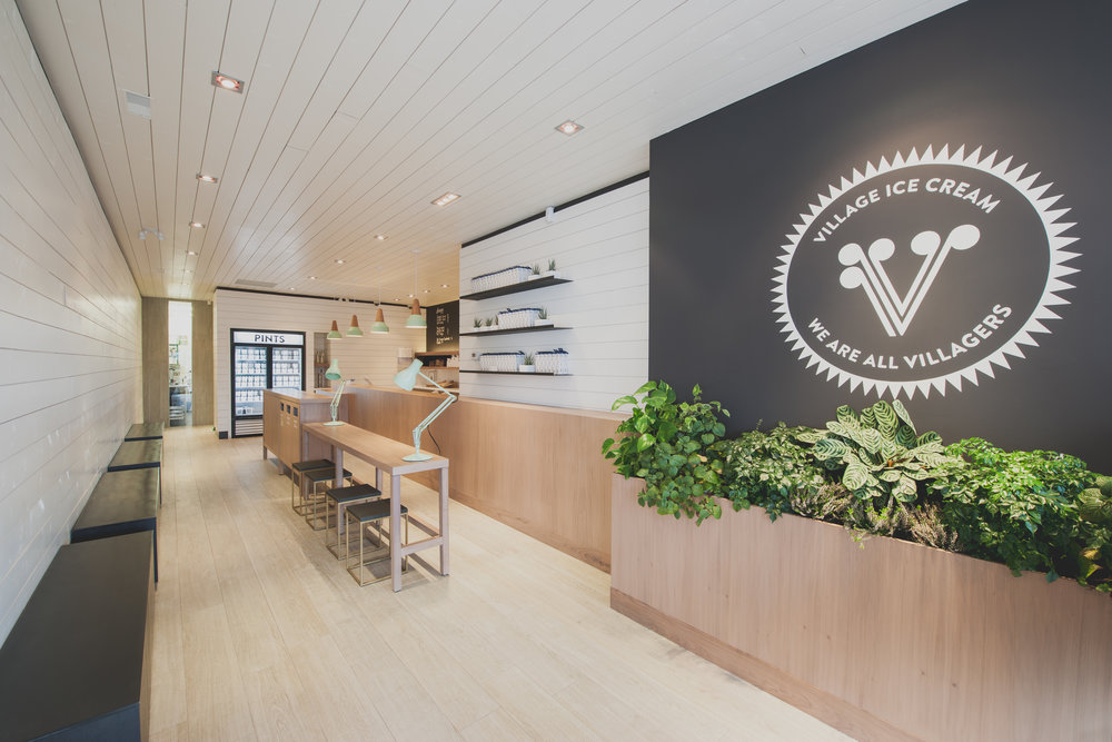
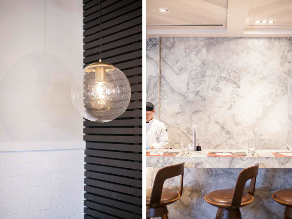
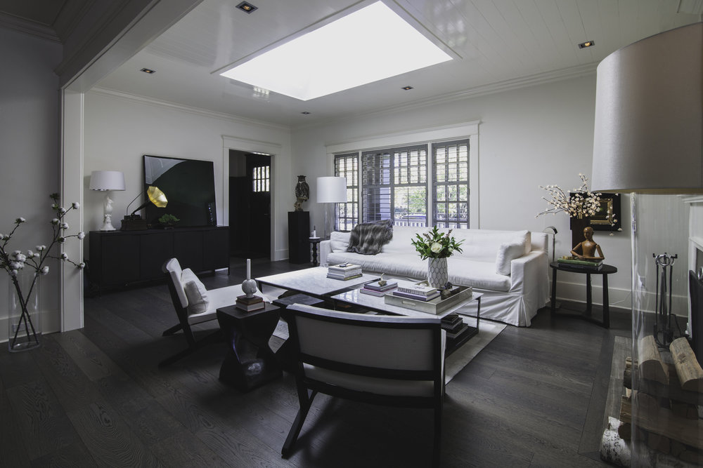
I don’t know how Instagram algorithms work, but sometimes the fancy behind-the-scenes technology really works in my favour. Recently, Instagram introduced me to the work of McKinley Burkart. This architecture and interior design firm, which has studios in Calgary and Vancouver, has an extensive portfolio of beautiful restaurants, retail, residential, and work spaces.

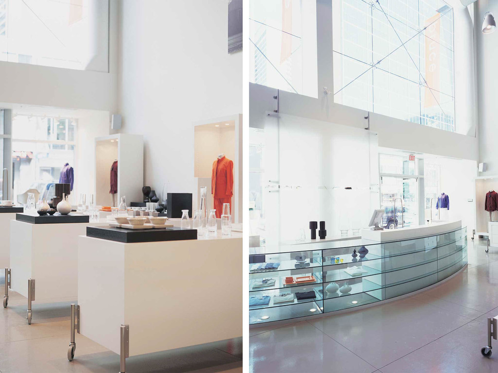
Bruce Lifestyle Store

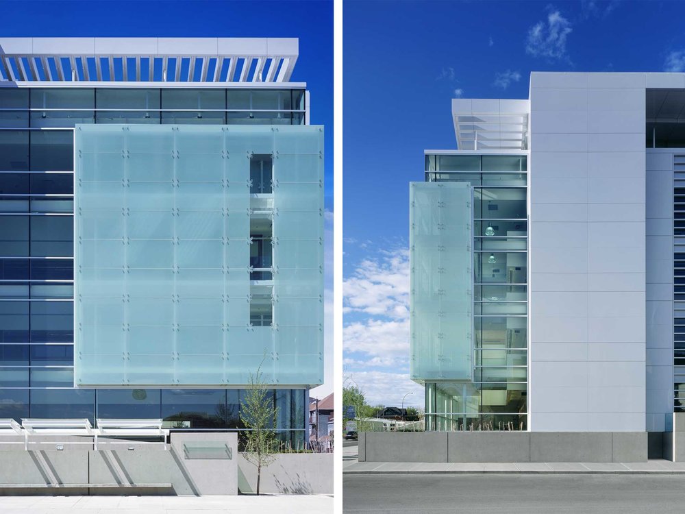
M-Tech

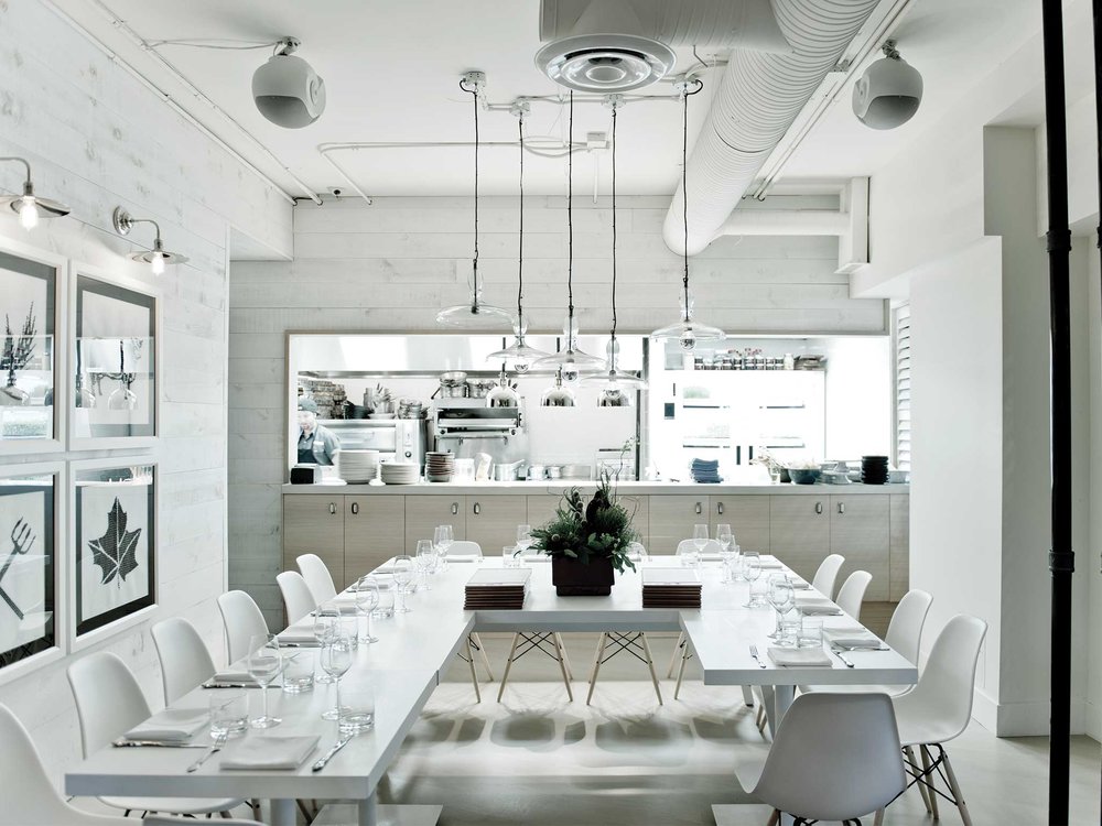
Market

Village Ice Cream

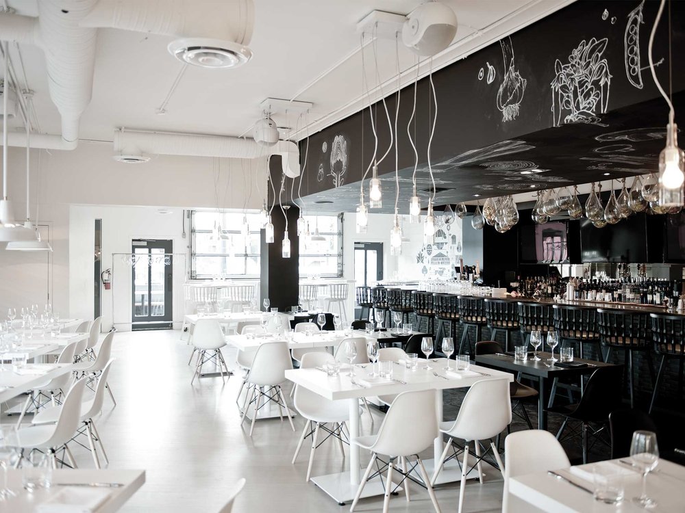
Earls Westhills

Elbow Park House

The Shore

IHS

Save

Save

Save

Save

Save

Save

Save
Hotel to Home: Soneva, Maldives

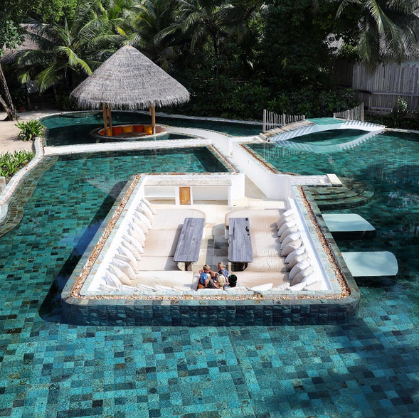
I continue to be fascinated by The Bucket List Family – a young family that travels absolutely everywhere in the world and documents their adventures on YouTube. Recently, they headed to the Maldives, and I was absolutely stunned at the beauty of the area and where they stayed. I just had to bring one little part of it to White Cabana.

We’re heading to one of the outdoor spaces at one of the Soneva resorts in the Maldives. I grabbed this photo from The Bucketlist Family’s Instagram page, but I definitely recommend you head on over the Soneva’s site to drool over the magnificent views.

via The Bucket List Family

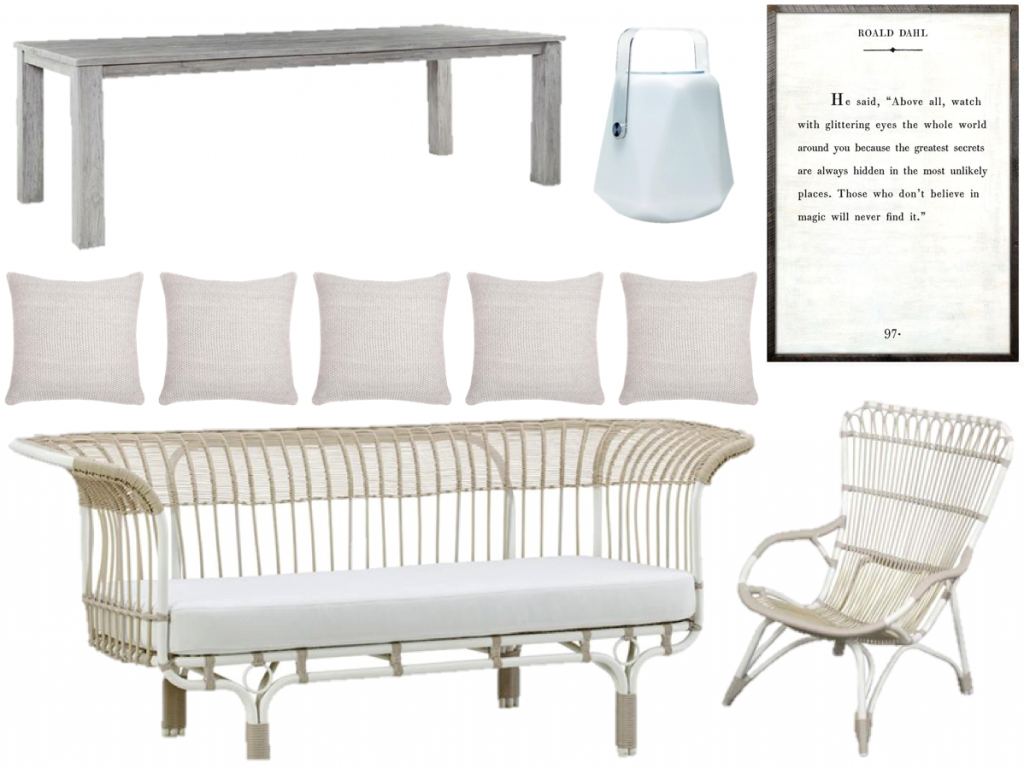
Even without a beach, ocean, pool, or waterfront of any kind, it’s easy enough to recreate this look in your own home. Here’s what I’d recommend:

sofa, pillow, speaker light, dining table, chair, Roald Dahl art

You’ll notice that I gathered items from Waterloo-based Hauser. What a beautiful selection of indoor and outdoor furniture. I can’t believe I haven’t yet visited in person! I must!

I would definitely be interested in a trip over to Soneva. The water, the service, the decor, the peace…I’d definitely soak it all in! On the list it goes!

Save

Save

Save

Garden: Let’s Get Growing

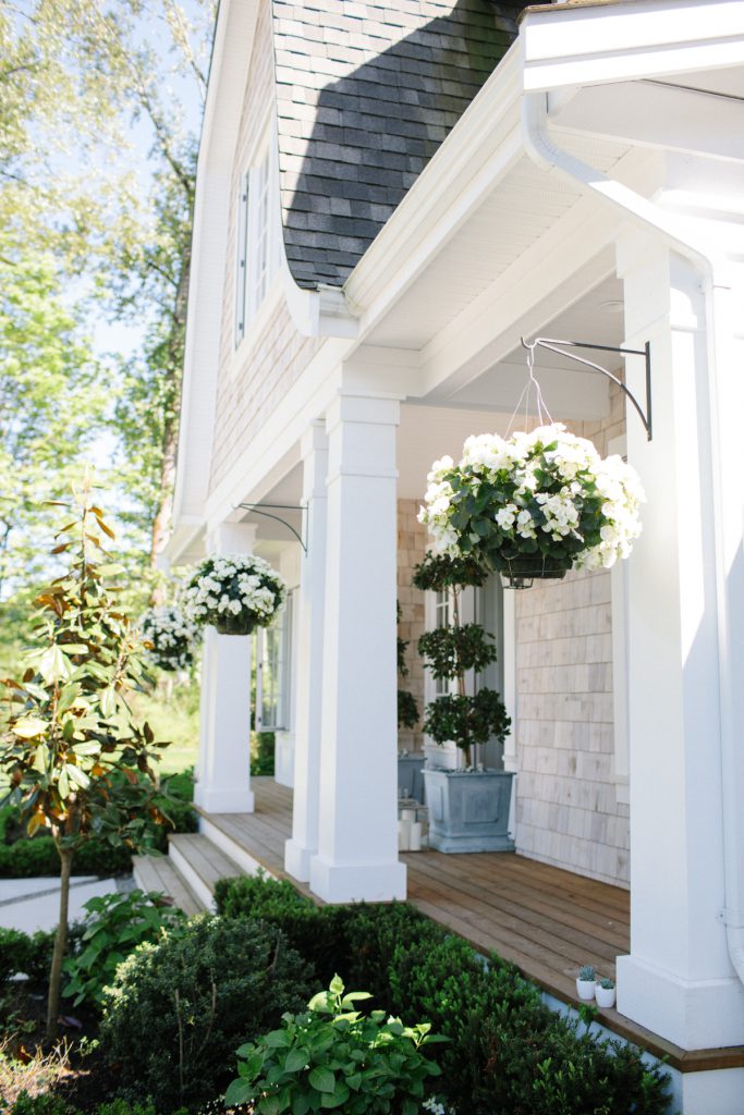
I don’t have a lot of garden space to work with – or time to tend to it, for that matter – but I do enjoy a bit of gardening, and in usual-Jordana-style, I like to keep things simple. In my back garden, I have a ton of hostas. They’re incredibly easy, they grow like champs, and they’re pretty. I also have herbs in planters, and this year, I’m trying out spinach, too.

In the front, I get a ton of sun, so I plant my tomatoes there, and they produce like crazy! I plant red geraniums in my planters because they flourish in the sunshine. Geraniums always remind me of my time in Switzerland, so I’m happy to have them outside my home.  I was considering white begonias this year because they looked so pretty at the market, but I’m sure the sun would have burned them, since they prefer shade.

And the new addition to my garden are a few peony plants that I split and transplanted from my parents’ garden last year. The buds are still quite little, so I’m not certain they’ll be fruitful this year, but I’m hopeful they’ll produce beautiful blooms for years to come.

I just love that the garden can produce so much goodness. After trudging through such a long winter, I love seeing spring surrounding my home.

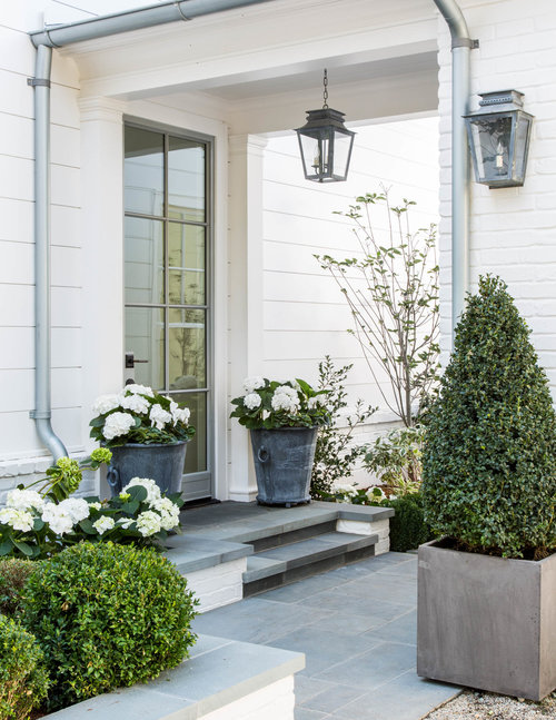
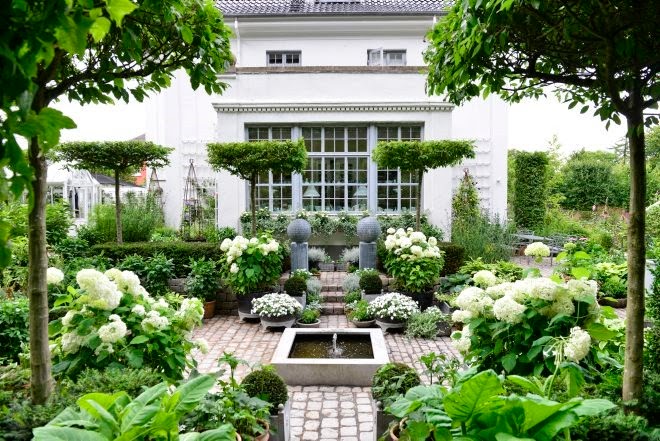
And speaking of beautiful homes in spring, here are a few that have caught my eye.

the gorgeous home of Canadian blogger Monika Hibbs

Giannetti Home – Atherton

Claus Dalby

Save

Save

Save

Press: My Home in Style at Home Magazine

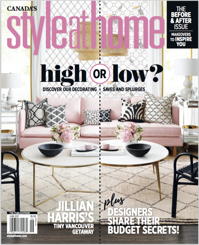
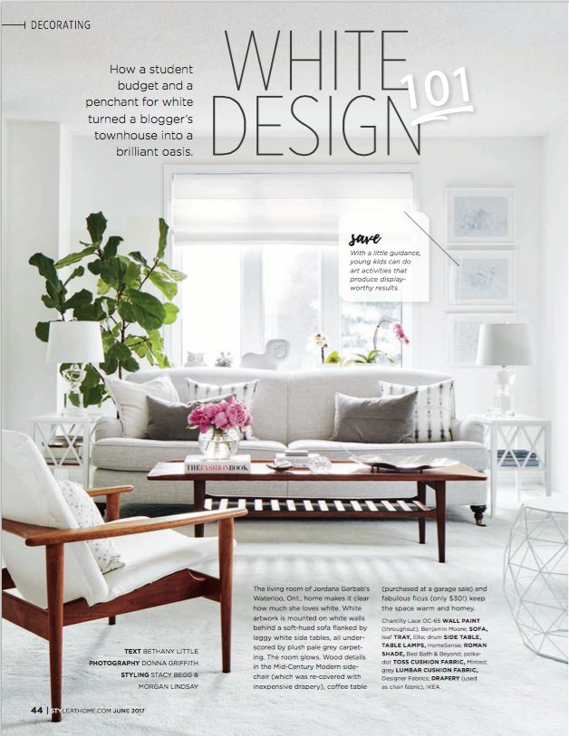
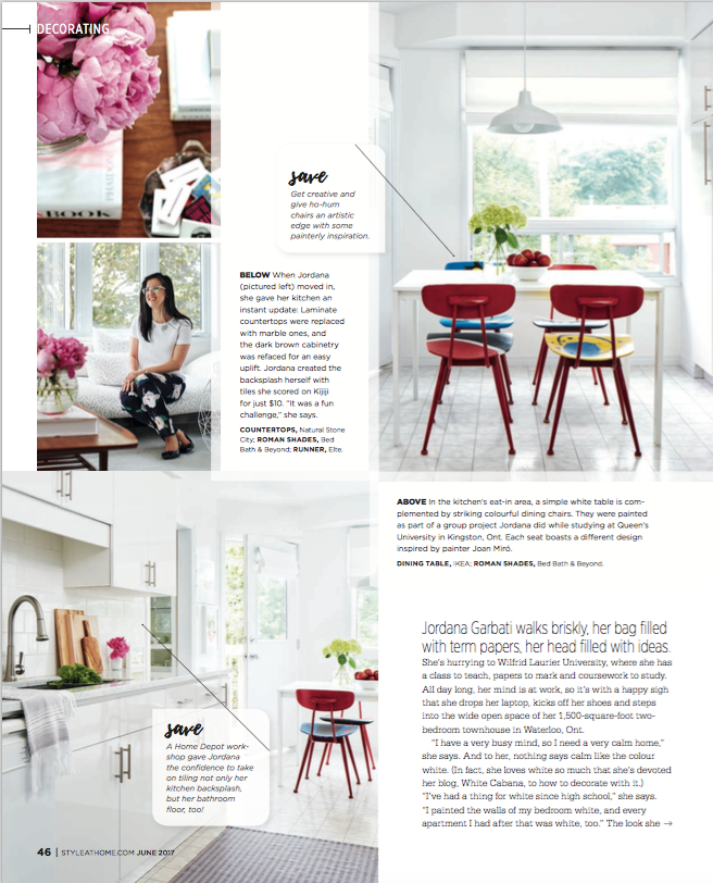
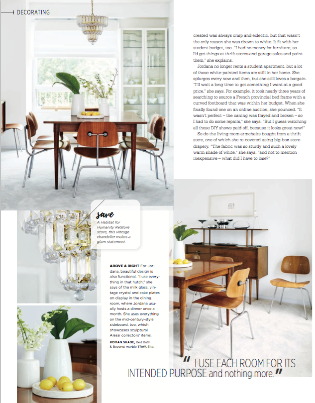
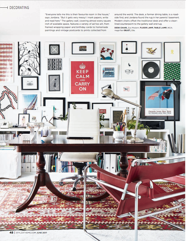
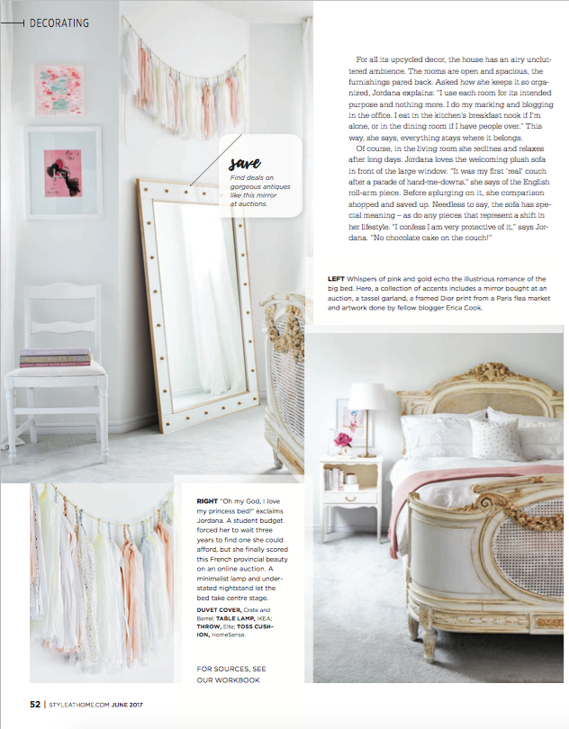
By now you may know that my home was featured in the June issue of Style at Home magazine. I’m so so so proud of this achievement, and it is truly an incredible honor to be in the presence of such amazing Canadian designers, stylists, and bloggers in this issue. I love this Canadian publication because it features designs that readers can recreate. On top of all of this, I always learn something new.

It was a pleasure to work with photographer Donna Griffith; stylists Morgan Lindsay and Stacy Begg; and author Bethany Little. As the article was being prepared, I also connected with a couple of additional fact-checkers on the Style at Home team, and our interactions always made me smile. One conversation included repetitions of the question “And it’s white?” The fact-checker asked this question because she hadn’t yet seen photos of my home, but was asking me questions about the items and designs. I couldn’t stop laughing. “Yes, yes, everything is white,” I told her.

I hope you’ve been able to pick up a copy of this very special issue. Here’s a peek into the feature, and you can read it in full online at Style at Home.


And a few truths…if you’re curious:

  • I do walk briskly to and from work…with a backpack.
  • I definitely do call my bed “my princess bed.”
  • I absolutely adore my couch, and I would buy it again in an instant.
  • The trio of white artwork in the living room was made my my three nephews as a house-warming present.
  • The Style at Home team didn’t actually rearrange too many things. Except for a few items (e.g., flowers, silver platter on coffee table, marble tray with lemons, lettuce in the sink, tea towel), everything is mine. I loved that they worked with my own items. It wasn’t what I was expecting to happen on photoshoot day.
  • I had so much fun when the crew came for the photoshoot.

Thanks for reading, everyone! I’m taking tomorrow off from the blog, so I’ll leave you this whole weekend to read the feature!

Save

Save

Design: A Notting Hill Kitchen

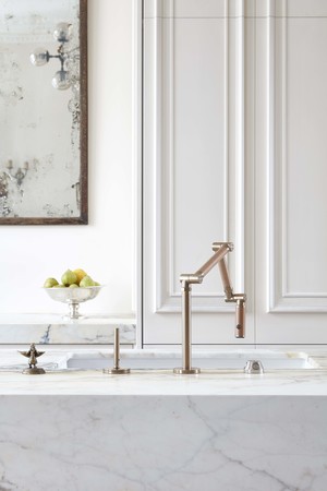
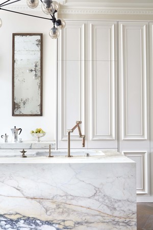
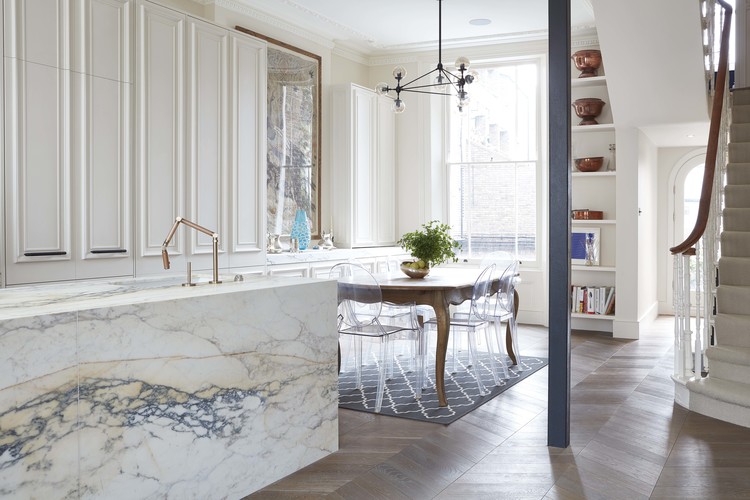
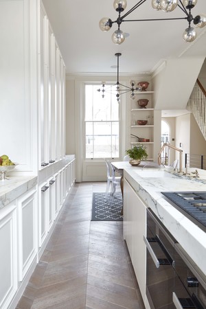
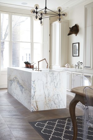
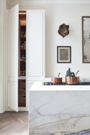
This kitchen in Notting Hill, UK has so many stunning details. The marble, the moulding, the brass, and the floors have all caught my eye. And since there’s already a Bialetti espresso maker in place, I can basically move in. Yup. I could!

Blenheim Crescent kitchen by Blakes London

House to Home: The Cellars-Hohenort, Cape Town

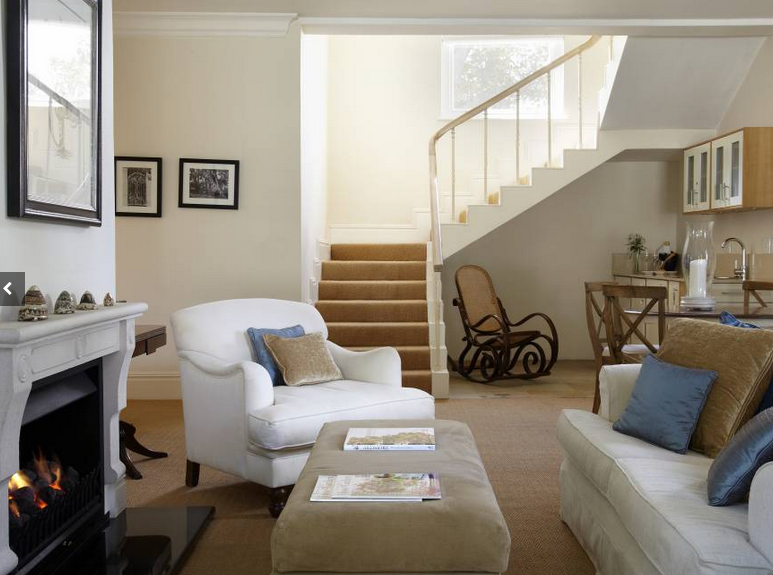
We are going all the way to South Africa today to Cape Town’s The Cellars-Hohenort. This 5-star hotel is luxurious and comfortable. Easy and welcoming. The mix of white and soft blue, pink, and green make each room unique.

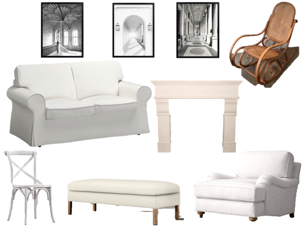
I’m taking us into one of the sitting areas today and recreating the look for home.

via Cellars-Hohenort

arm chair, vintage bentwood rocker, sofa, mantelpiece, art, art, art, chair, ottoman

Save

Hotel to Home: La Maison Champs Elysées, Paris

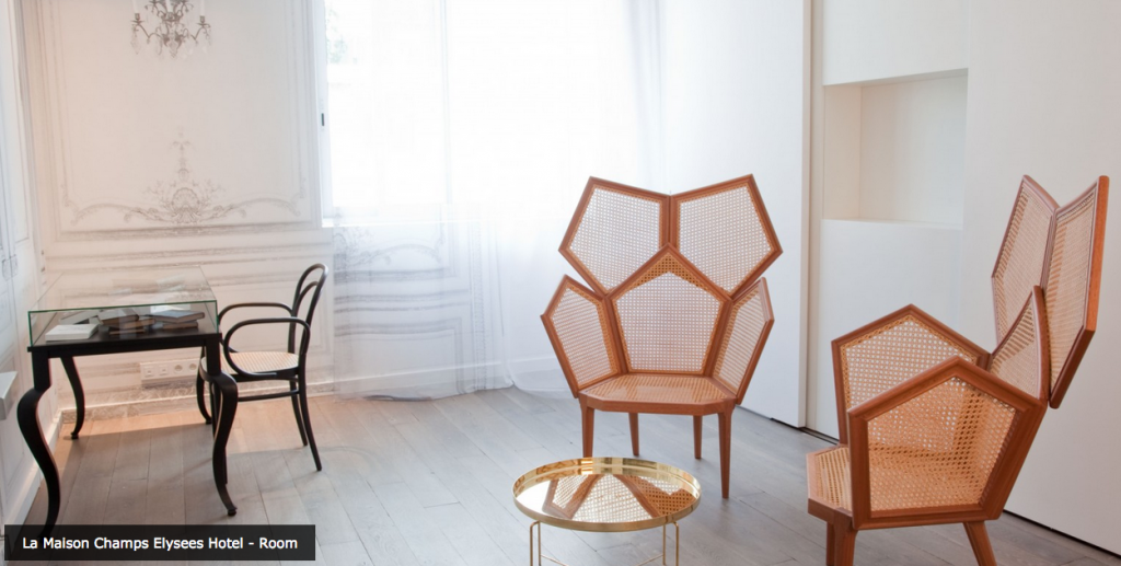
How have I not yet come across this gorgeous, boutique hotel of white cloudy goodness in Paris? La Maison is absolutely stunning, and although I’m only showing you one photo here, I encourage you to check out its gallery. It’s a completely breathtaking hotel, and even if you don’t like white as much as I do, I’m sure you’ll be impressed by La Maison’s design and decor. If you notice a bit of a fashion influence, it’s because fashion designer Martin Margiela served as artistic director for this hotel.

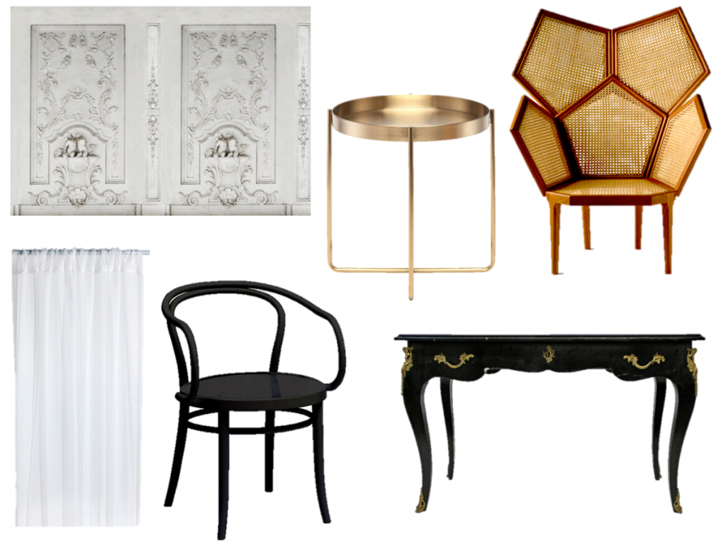
Since I’ve recreated many bedrooms and bathrooms in this Hotel to Home series, I have opted for an office area from one of the hotel’s suites. Look at those sculptural chairs! Absolutely cool!

via La Maison Champs Elysées

armchair, side table, desk, wallpaper,  sheer curtains, chair

Save

Save

Save

Save

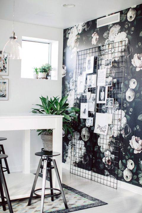
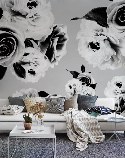
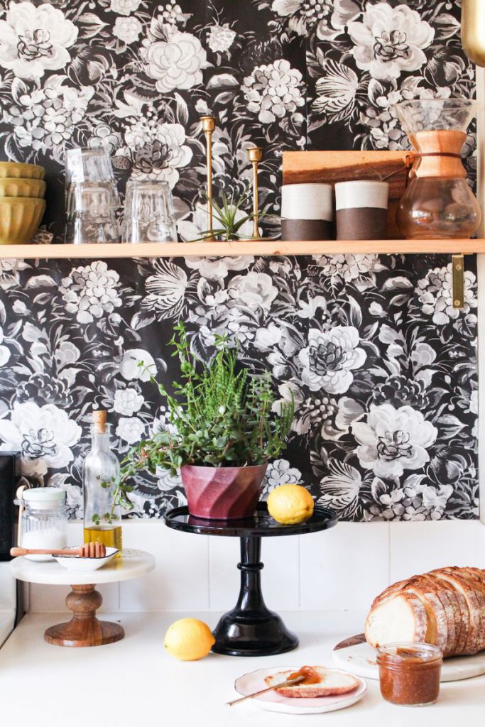
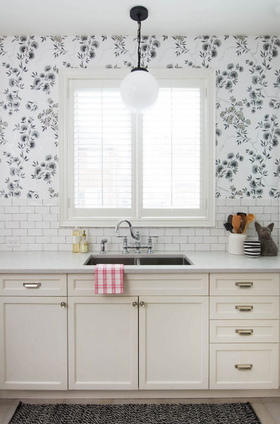
Design: Black and White Floral Wallpaper

While I don’t like wallpaper in my own home, I definitely appreciate how others use it in their homes. Fellow designers/bloggers Tim Lam and Christine Dovey work wonders with wallpaper (have you seen their recent One Room Challenge reveals: Tim’s dining room, Christine’s basement), but I’m happy to sit on the wallpaper sidelines.

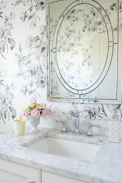
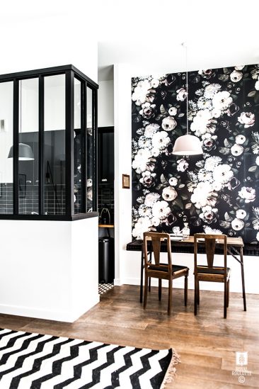
That said, I do love flowers, and these floral wallpapers have certainly caught my eye. I could easily frame up samples and add them to my office gallery wall or switch out my inkblot wall for a wall full of florals! Now, there’s an idea!

via Style Me Pretty Living

via Tubulences Deco

via Domino

via French By Design

via Planete Deco

via House Beautiful

via Domino

via Etsy

via The Everygirl

via Vanessa Francis

Save

Save

Save

The Friday Five: Classic White Dressers

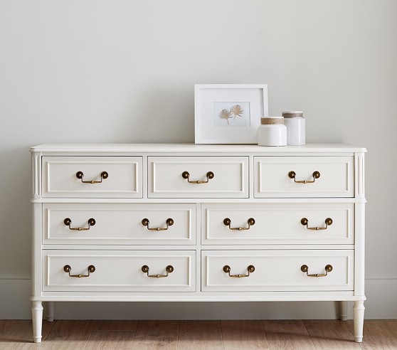
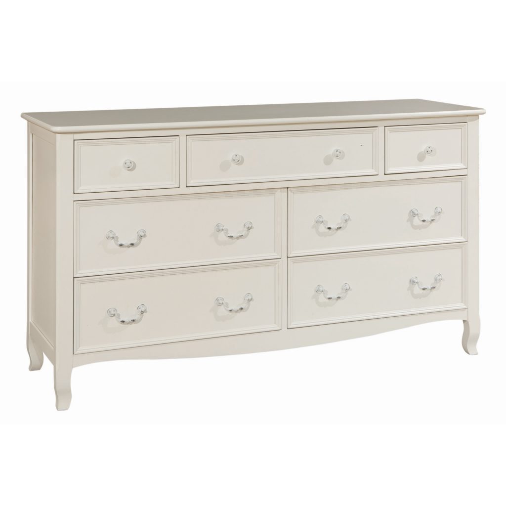
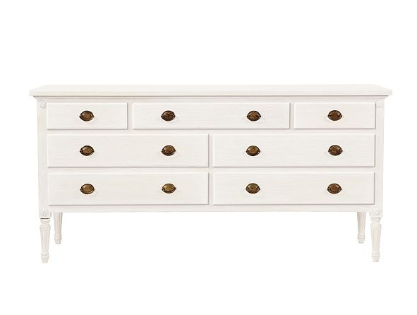
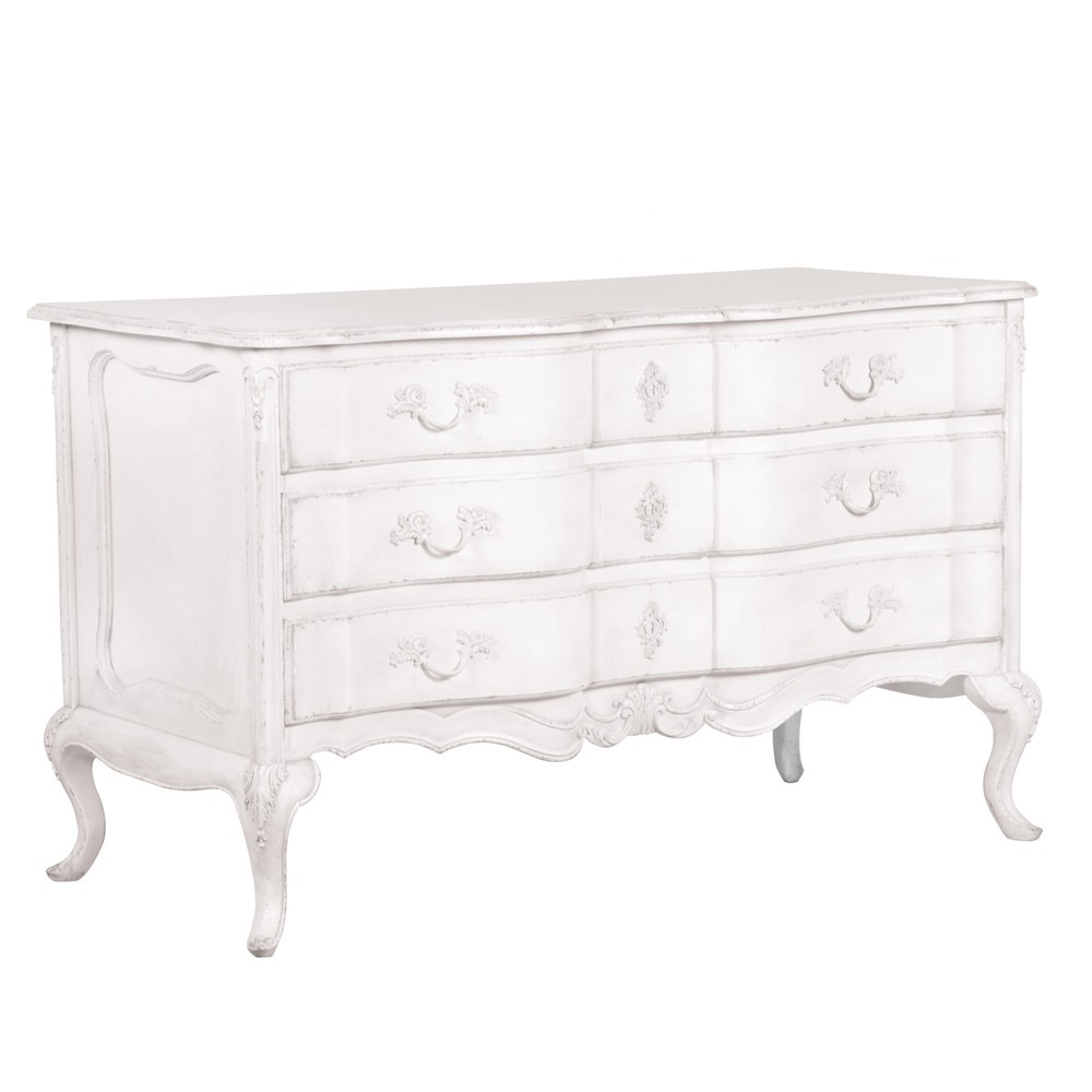
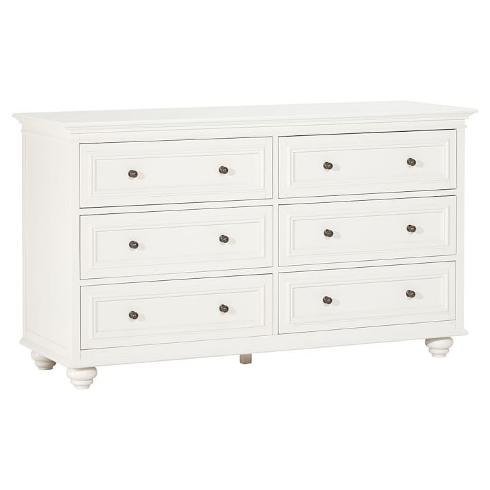
I’m looking to replace one of the dressers in my bedroom. If you’ve seen my house in the June issue of Style at Home (#WhiteCabanaxStyleatHome), then you know that I’ve got a bit of a French theme going on in there. I’d like a simple white/cream dresser that has more of an open bottom than anything solid. This will allow the air to travel through the vent underneath it.

dresser, $1199 USD, Pottery Barn Kids (spotted at Sarah Gunn’s home)

dresser, $1479 CAD, Wayfair

dresser, $2586 CAD, Ballard Designs

dresser, $893 USD, French Bedroom Company

dresser, starting at $999 USD, PB Teen

Have a great weekend, everyone! It’s a long weekend here, and you can be sure I’ll be taken advantage of some extra downtime.

Save
1 2 3 4 5 6 7 8 18