Furniture

Furniture: Decor-Rest

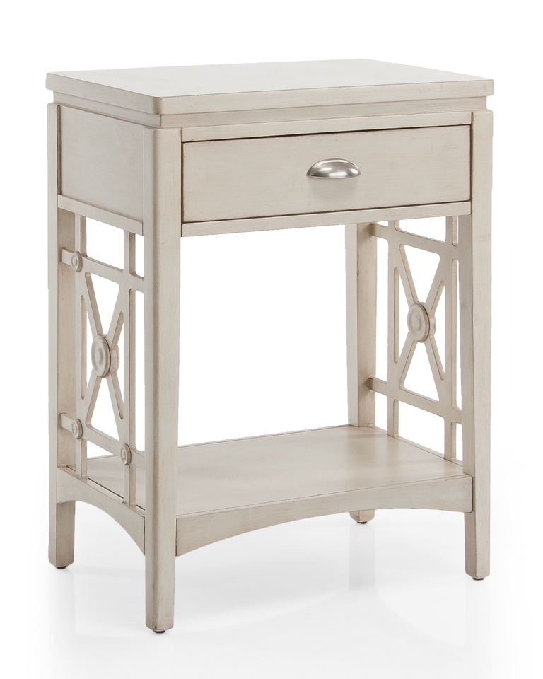
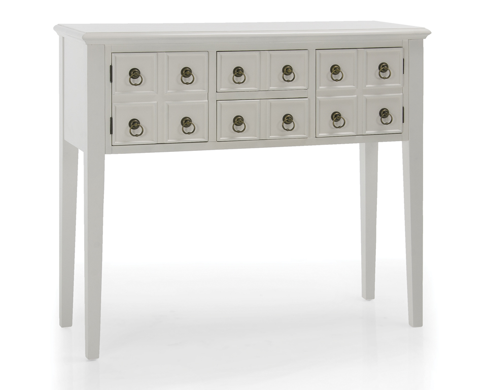
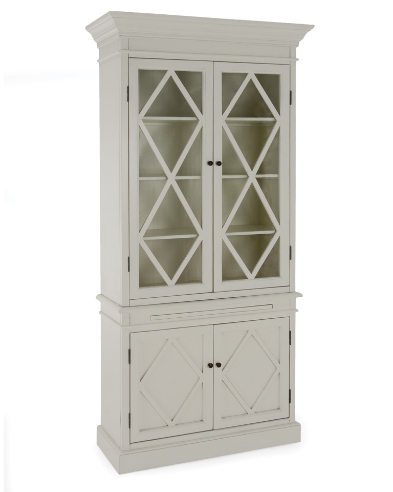
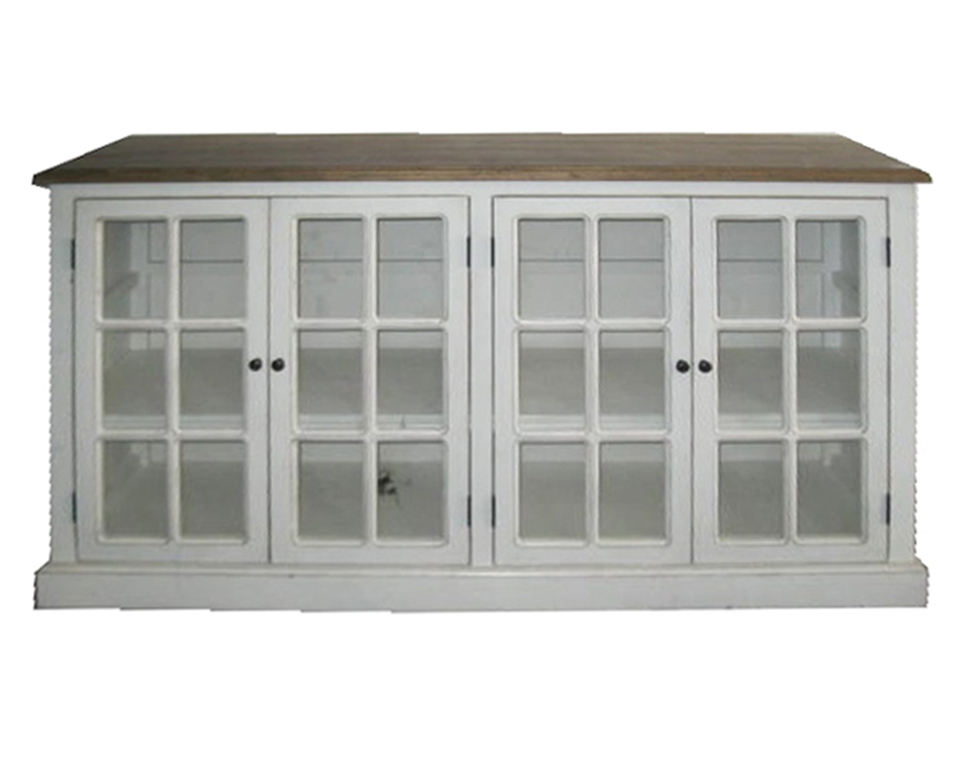
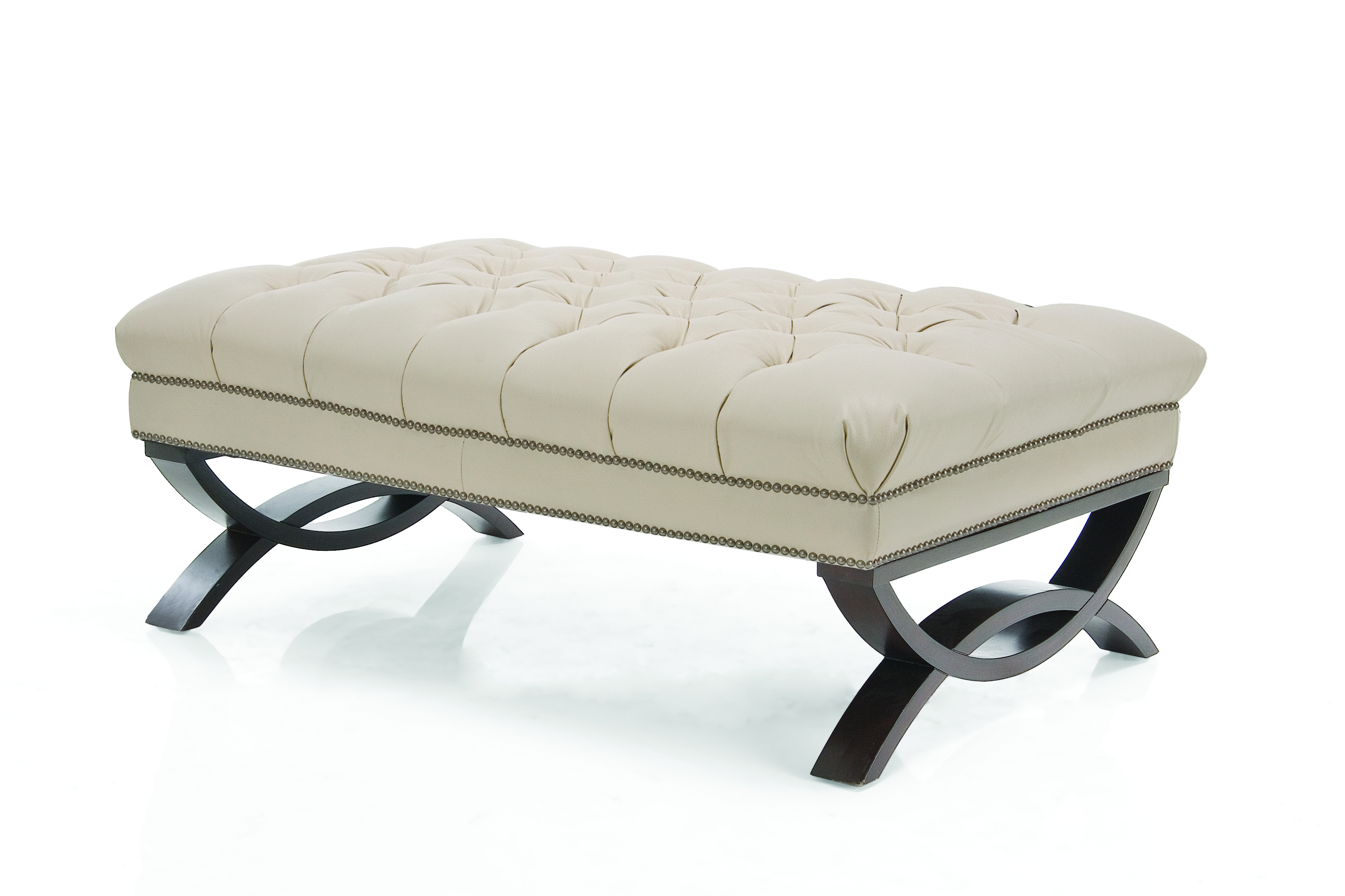
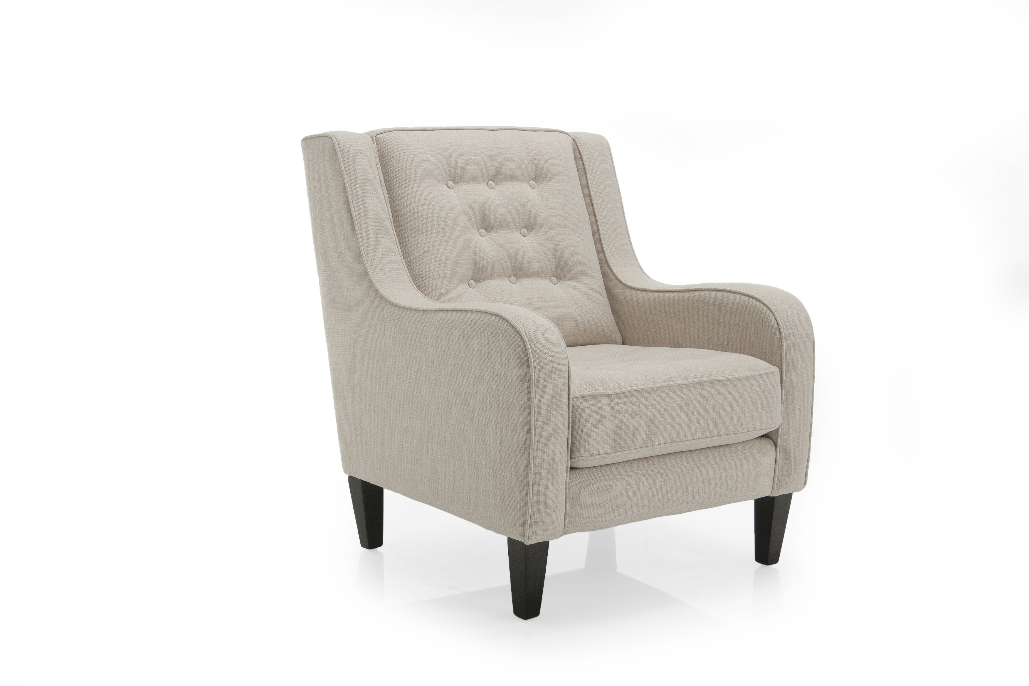
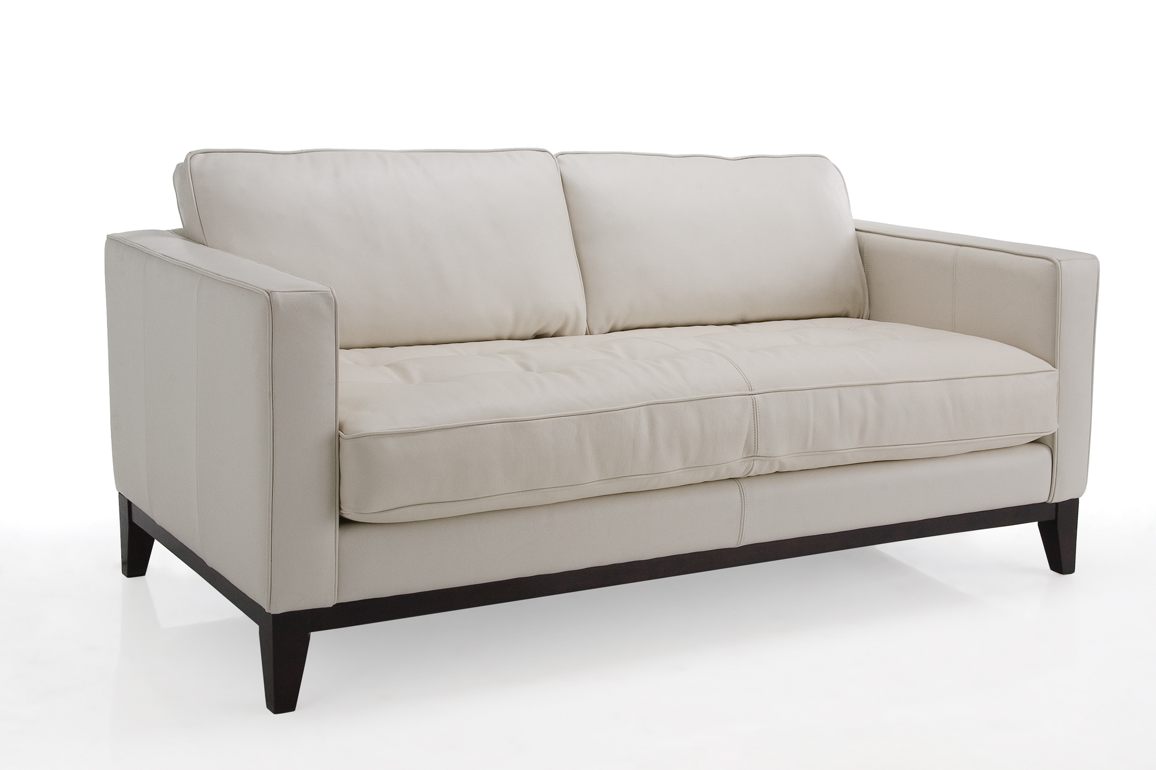
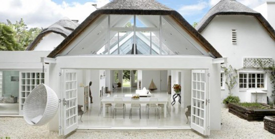
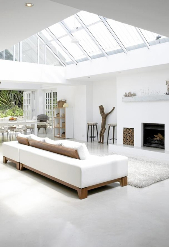
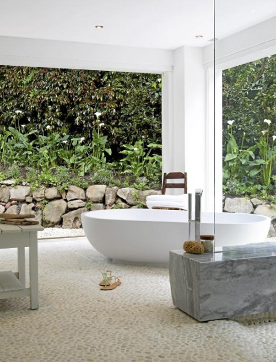
Let’s shine a spotlight on a successful Canadian furniture manufacturer this morning, shall we? Since 1972 Decor-Rest has provided customers with quality products and a commitment to honest service. Decor-Rest is headed by owners Angelo and Christina Marzilli and the company currently occupies a 200,000 square foot plant located in Woodbridge, Ontario as well as a 8,000 square foot industry showroom in High Point, North Carolina. And you can bet that Decor-Rest is filling up their furniture retailers with thoughtfully-designed furniture. In addition to manufacturing the collections of Steven & Chris and Cobi Ladner (cobistyle), Decor-Rest’s inventory includes fabric and leather upholstered sofas and chairs as well as accent items to suit contemporary and traditional styles.

decor-rest_1

decor-rest_3 decor-rest_4 decor-rest_5 decor-rest_6 decor-rest_9 decor-rest_10 decor-rest_11

  Images courtesy of Decor-Rest.

Marketplace: EQ3 – Proudly Canadian

EQ3 is a Canadian furniture and home decor design company that strives to offer well-crafted and highly attractive products which are (mostly) made in Canada. I think EQ3 has a lot of great things to offer in terms of their inventory as well as in its design aesthetic and business philosophy. While you discover EQ3’s collection, be sure you don’t miss out on the work by some of my design favourites – Marimekko, Vitra, Alessi, and Herman Miller.

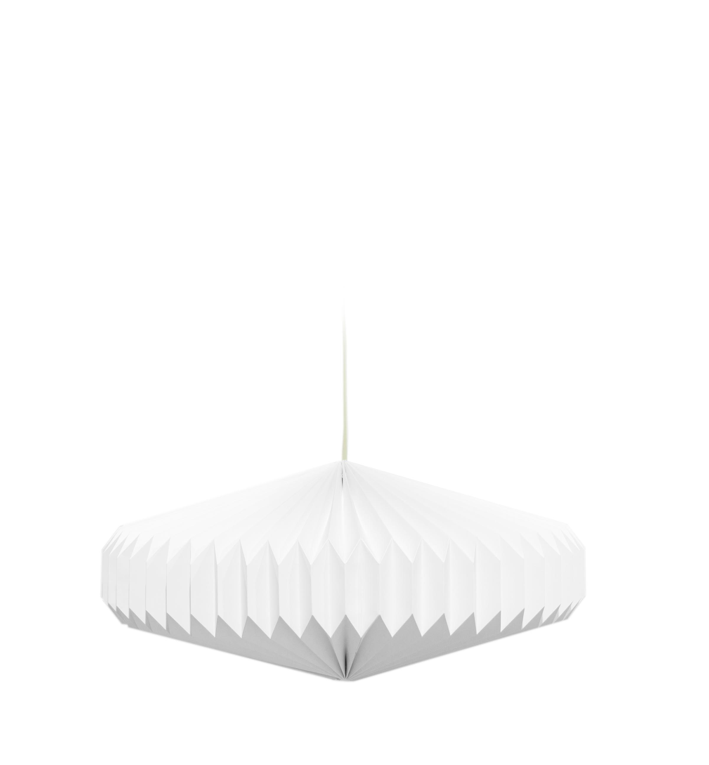
EQ3 Oblong Lamp

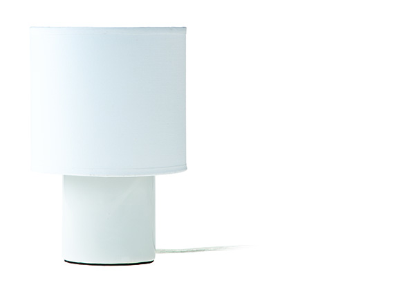
EQ3 Mini Table Lamp White

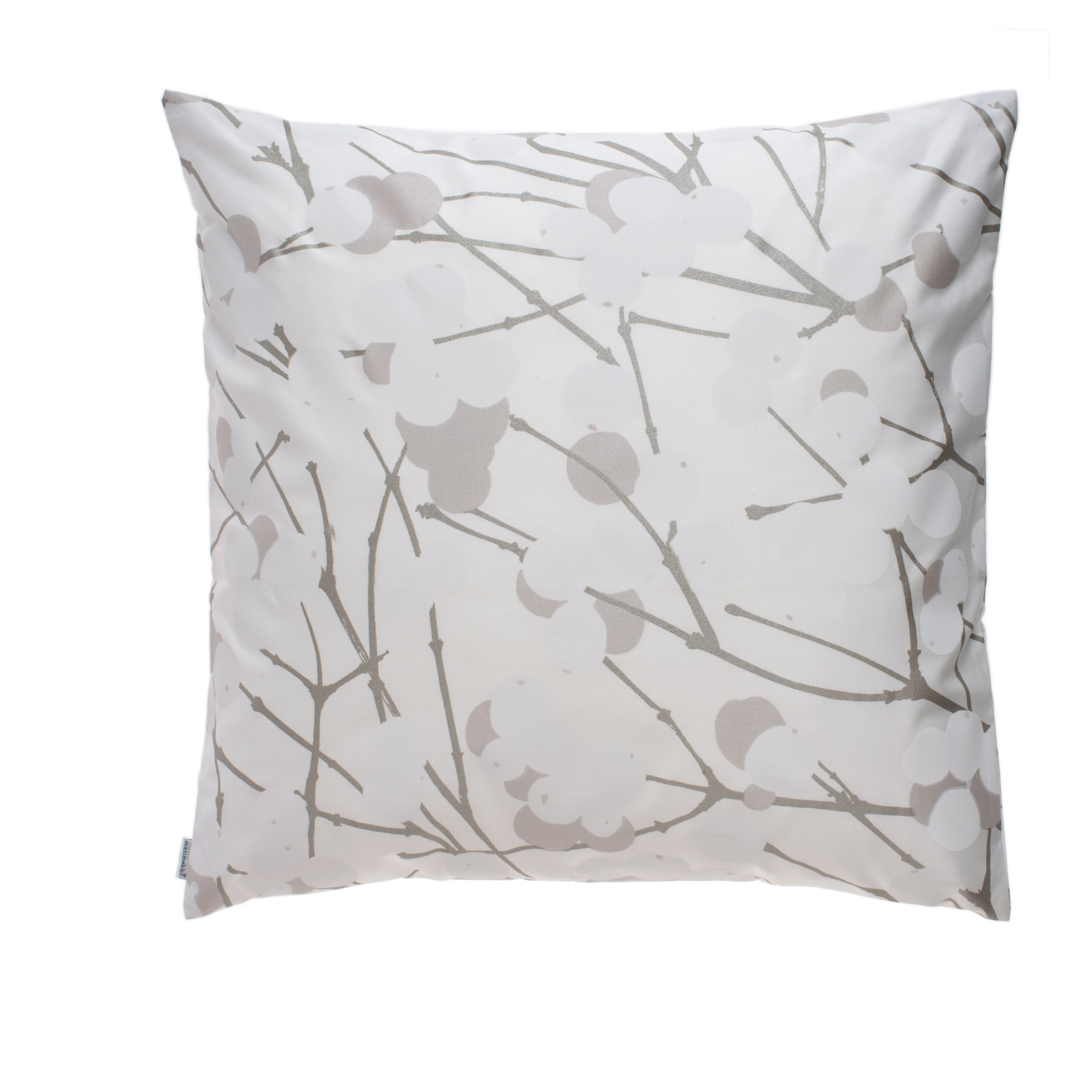
Marimekko Lumimarja Pillow Case

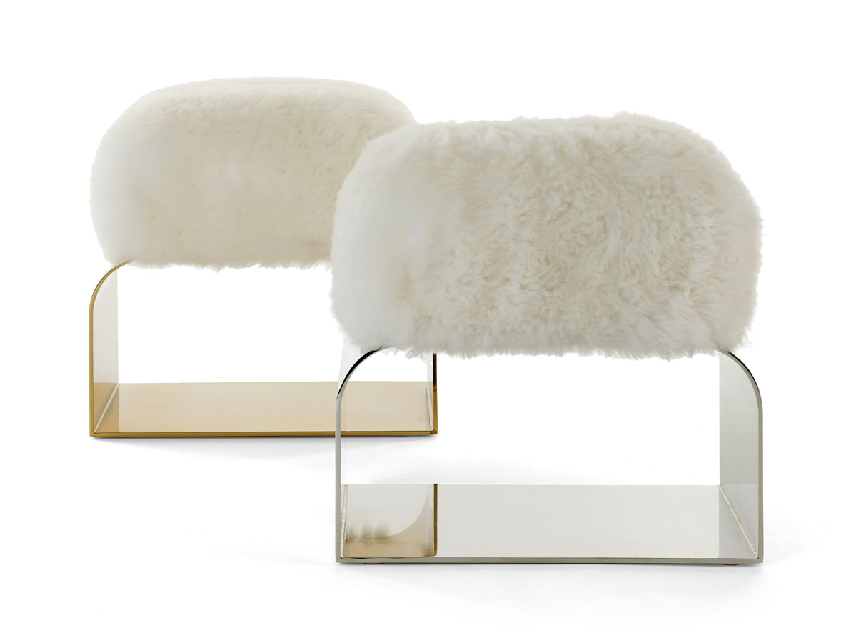
EQ3+ Vitra Elephant White

Images courtesy of EQ3. EQ3 locations.

Friday Five: Living Rooms

It’s Friday! I’m ending the week here on the blog with five inspiring living room spaces and sharing with you what I like and dislike about each space. I welcome your opinions too so feel free to comment below!

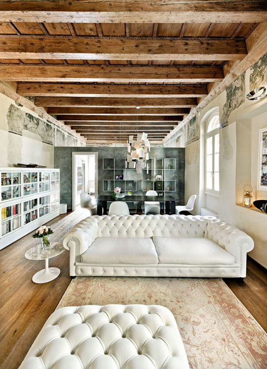
1. There are a few great aspects in this first space. The juxtaposition of old and new is attractive to me as is the awesome tufted white couch. I could to without the rug in this space though as I think it should be a touch larger.

Le Case di Elixir via Desire to Inspire

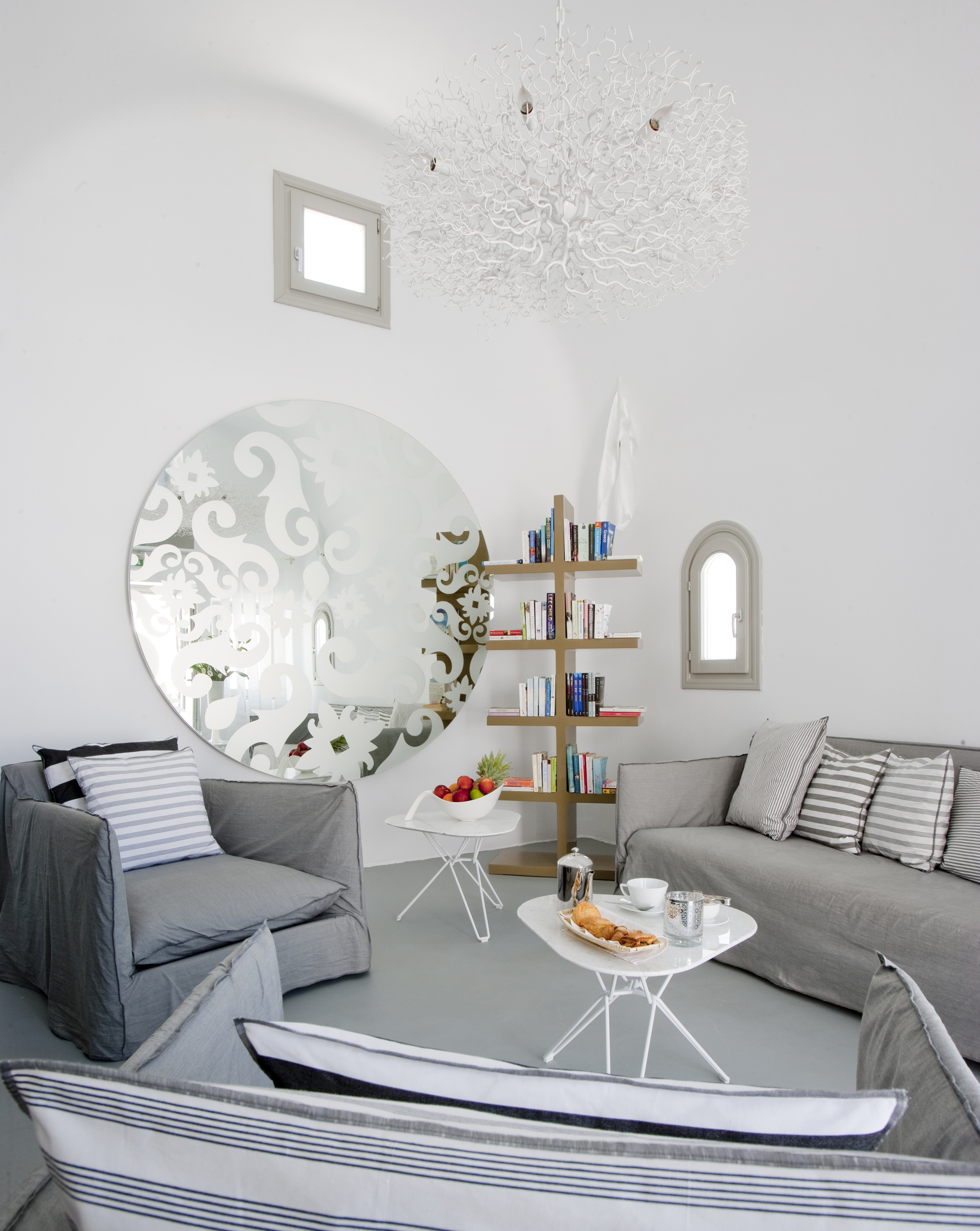
2. In this corner at the Grace Hotel in Santorini, I love the white, white walls and the high curved ceiling. I also like the sculptural light fixture and sweet curved window. I would get rid of the mirror though and maybe add some art in its place.

Grace Hotel Santorini

3. I love almost everything in this third space. The layered art pieces leaning against the paneled wall and the comfortable side chair are very appealing. The substantial stone fireplace is a beautiful feature in the room and the variety of textures in the room draw me right in. I would probably opt for a different sculpture although I can’t say that I completely dislike cupid.

via EclecChic

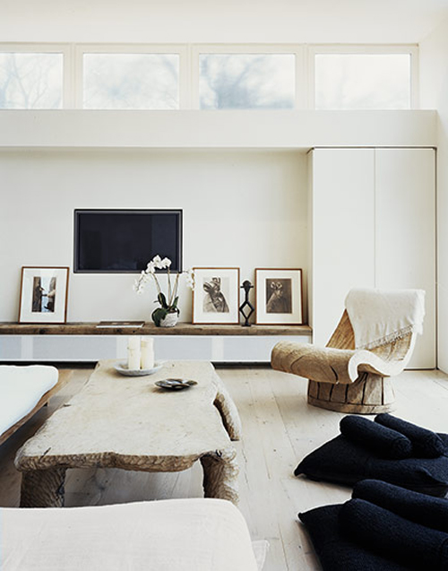
4. In this Douglas Friedman space I love the mix of textures – wood, lacquer, soft fabrics. I also like the clean lines of the high rectangular windows. I do wonder, though, how comfortable the side chair really is.

Douglas Friedman via The Style Files

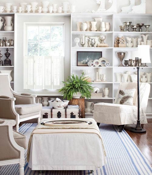
5. In this last space I think the collection of white trophies, goblets, and vases is incredibly impressive. I love multiples and I am always curious to see what people collect. The layers of shades of white is also attractive to me. I do wonder if there are additional touches of blue throughout this space or if it is restricted to the striped carpet. I am a fan of a comfortable couch so it’s a bit disappointing that there’s no couch in this space (or as far as the photo shows).

via The Painted Hive

Let me know what you think! And have a wonderful weekend! Happy Friday!

Design: Andy Martin Studio + Thonet

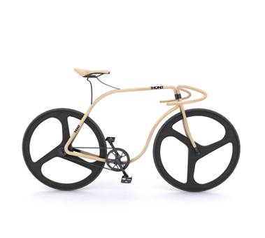
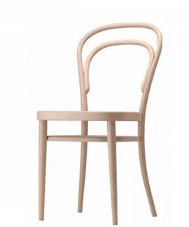
The collaboration between London-based designer Andy Martin and furniture manufacturer Thonet has resulted in a beautiful beech-framed bicycle. Yes – beech as in the wood. Isn’t it incredible how the form of the bicycle mimicks the classic Thonet bentwood chair? Simply gorgeous.

Andy Martin + Thonet = beech wood bicycle

Thonet’s classic steam-bent beech wood chair

Images courtesy of Andy Martin Studio.

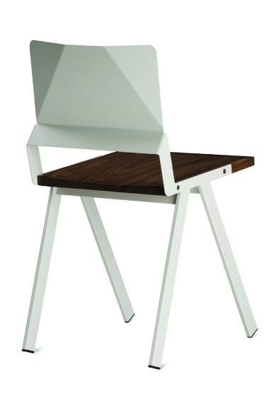
Origami chair

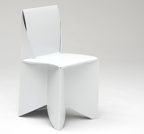
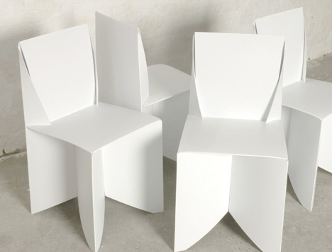
The lovely life-sized origami-style Folder chairs by designer Stefan Schoning are assembled by folding them just like an origami creation. How cool is that?

The ‘Folder’ can withstand your weight since it is made from paper-thin polypropylene, which means the look is very cool and the construction lightweight, rigid and tough. The chairs more durable than wood, plastic or metal and have been exhibited around the world: the National Design Museum in NY, Nike Design Library in Oregon, Colette in Paris, Salone Satellite in Milan, and 100% Design in London, UK.

What’s not to love?

Images courtesy of Stefan Schoning.

The Friday Five: Offices

I know it’s Friday and the last thing many of us want to do is to think about the office but trust me when I tell you that the offices I have featured below are worth your time (and stares). While they are quite different in style an aesthetic, each office is pleasing because of the minimalist (and complimentary) colour schemes, interesting textures and forms, and unique architectural details.

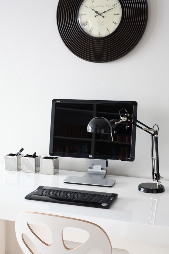
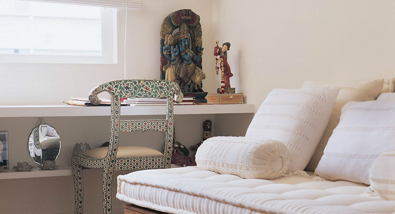
I’m taking you to office spaces around the world today beginning with a room of contrasts which includes the sleek Air Desk from Chicago-based Casa Spazio. Next is the minimalist black and white office area designed by Morpho Studio in Poland. The final three spaces, created by Brazilian designer Maristela Gorayeb, showcase amazing collections of books and artifacts in a pleasing and inviting way.

Casa Spazio via Escapade

apartment in Krakow, Poland; designed by Morpho Studio

interior design by Maristela Gorayeb, via Desire to Inspire

interior design by Maristela Gorayeb, via Desire to Inspire

interior design by Maristela Gorayeb, via Desire to Inspire

Happy Friday!

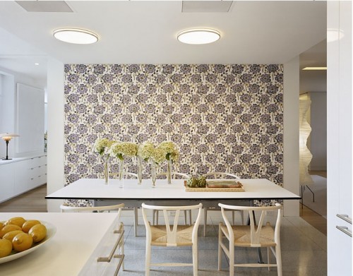
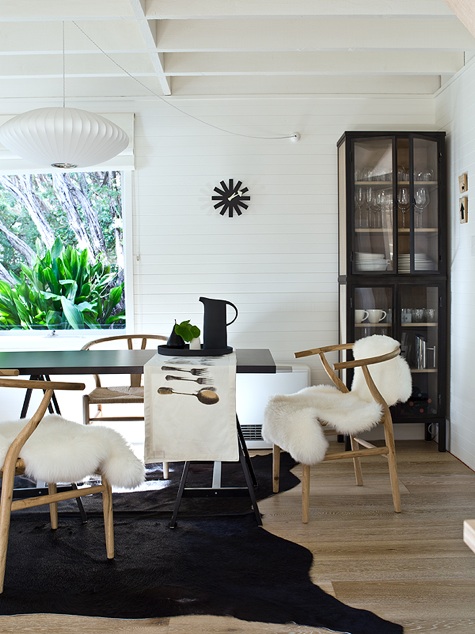
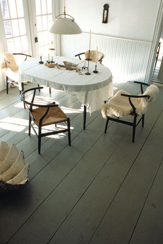
Furniture: Hans Wegner Wishbone Chair

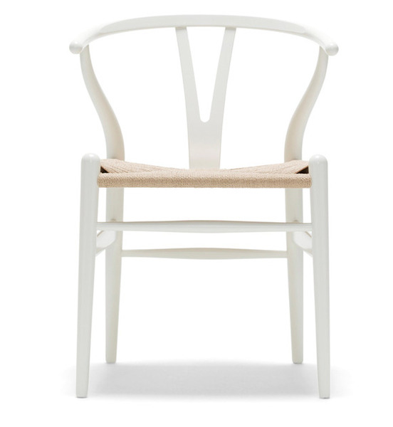
Hans Wegner wishbone chair

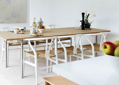
I love the Hans Wegner Wishbone chair (designed in 1949!) but it kind of bothers me that it doesn’t fully tuck in under the table. Does it bother anyone else?

via Design Serendipity

via Danish Design Store

via Adventure Journal

via Shelton, Mindel & Associates

via Remodelista

via Remodelista

Or maybe because it’s such a lovely, well-designed chair, it’s meant to stand out and remain on display.

Design: Review of King & Grove Tides South Beach

As I mentioned last week, during my two weeks in Florida, I made a quick trip down to Miami. South Beach to be more precise. While the beaches, the nightlife and the architecture were all selling points for me, one of the things that I was most excited about was staying at The Tides. As in The Tides! Perhaps you’re already familiar with this hotel because I featured it on my first ever post on White Cabana. The iconic hotel is also known for the interior design work by Kelly Wearstler. Yeah, her.

If you’ve not yet heard about The Tides, let me introduce you to it.

The Tides, one of the King & Grove group of hotels, is perfectly situated on Ocean Drive.
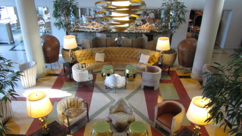
The Tides lobby

My friend Shannon and I were instantly impressed with the courteous service we received by all staff members. They treated us with a smile and did their best to make sure our stay was as perfect as it could possibly be. Check-in was a breeze and staff had answers to any question we asked. Over our two days at The Tides, we always felt extremely welcome.

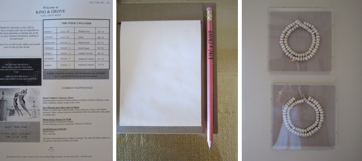
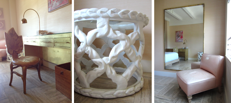
Photos from around the hotel (L to R; T to B) – console and lighting by the elevators, numbered door, cream window shades, Miami news of the week, K & G paper and pencil set, artwork

Each hotel room is at least 550 sq feet. This basically translates to spacious, larger than normal suites. Our room had two double beds, two desk areas, a seating area, a walk-in closet, and a spacious bathroom. While the hotels on Ocean Drive are not directly on the beach (as opposed to where we stayed at Madeira Beach), all rooms have an ocean view. Complimentary wi-fi is also offered which made our stay that much more comfortable.
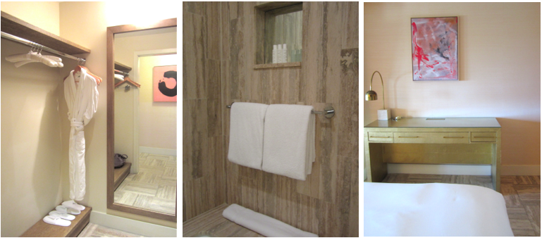
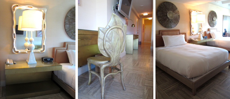
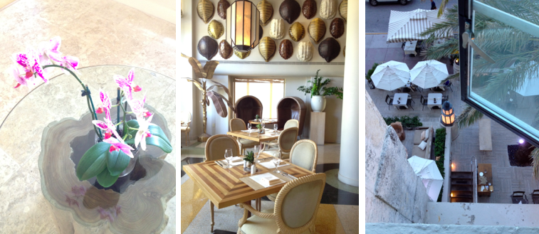
Photos from around the hotel – bathrobes, white linens, large furniture pieces, orchids, restaurant, outdoor dining area

In classic Kelly Wearstler style – big, bold, glitzy and glamorous elements are found throughout the hotel.The furnishings throughout the hotel are golden and pink with large hints of white. Linens are all white, of course. The number of mirrors in our room was impressive. There were two large full-length mirrors and another couple of large mirrors throughout the space (perfect for two ladies who like to admire their tans, hmm…). The bathroom was large, comfortable, and full of marble. Delightful!
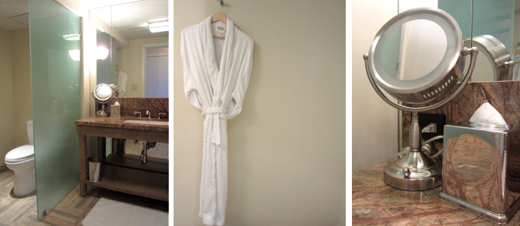

Bathroom included white linens and toiletries

The outdoor pool area was beautiful although much smaller than I expected. The chaise lounges were a perfect place to relax after a hard day at the beach (hee hee). On Troy‘s recommendation, we ordered the guacamole and had it delivered to us poolside (yes, we indulged!). It was perfect (although the delivery charge did make us laugh).

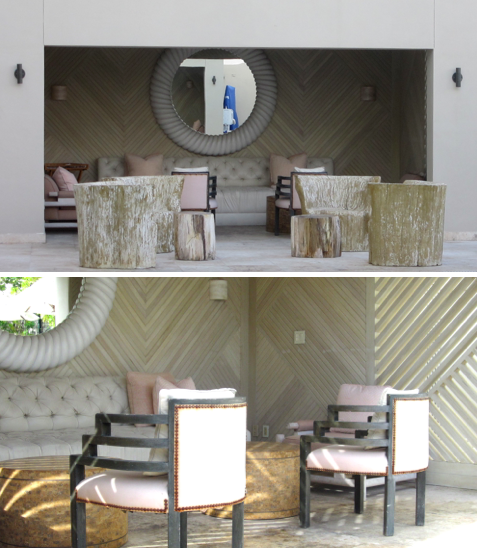
Poolside at The Tides

Complimentary breakfast in the hotel lobby was a good way to begin the day. The basics – coffee, tea, pastries and apples – were served in a casual and inviting manner.
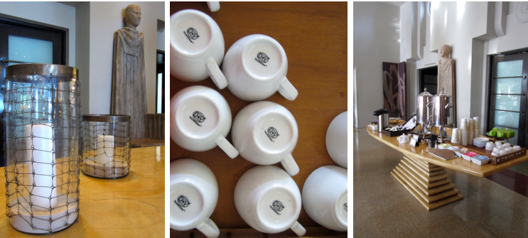
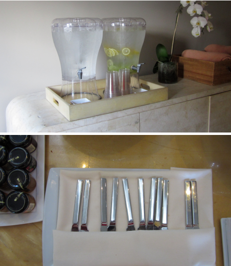
Breakfast at The Tides and a water station by the fitness centre

And, if you haven’t already noticed, a variety of patterns and textures were every where to be found!
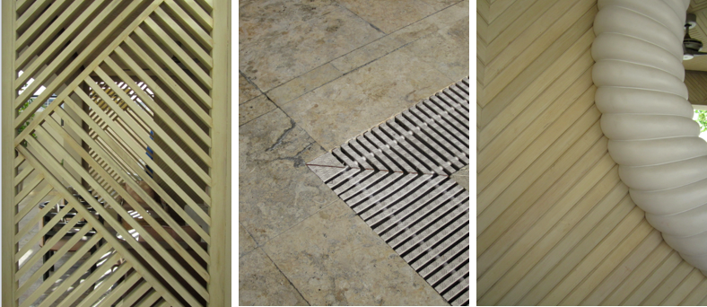
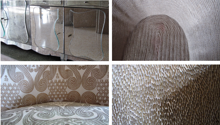
Patterns at The Tides – poolside and in the lobby

While we definitely did enjoy our time at The Tides, this review would not be complete without a brief look at some of the less luxurious aspects of the hotel. One of the first things that my friend and I noticed in the bathroom was the toilet paper. Um. It was so un-luxurious. I’m talking the 1-ply variety. I would have expected at least 3 ply. Right? I know it may seem ridiculous to mention the toilet paper but it really struck us as being a bit odd. Second, while the shower stall in the bathroom looked gorgeous, it did not function very well. Each shower resulted in a pile of water on the floor outside the tub area. The shower head was good – it was the hinged shower door that was the culprit. Not a very big deal but a definite design flaw. Third, while the bathrobes were comfortable, they were not as plush as I have experienced elsewhere. They did look great hanging on the padded hangers though. Finally, there was a $2 per coffee charge for the in-room coffee station (Nespresso I believe). I was surprised by this as I’ve stayed in many hotels where the coffee and tea in-room is complimentary. The issues I mention here really aren’t make-or-break issues but if The Tides is trying to be the best of the best, well, I would encourage the hotel to consider these points.

And a word of caution – be sure to make use of the in-room safe while you’re staying at this and any other hotel. Unfortunately our credit cards were compromised during our stay which has inevitably left a sour taste in our mouths. An unfortunate ending to an otherwise very pleasant experience.

Photos by me.
Marketplace: West Elm + South Africa

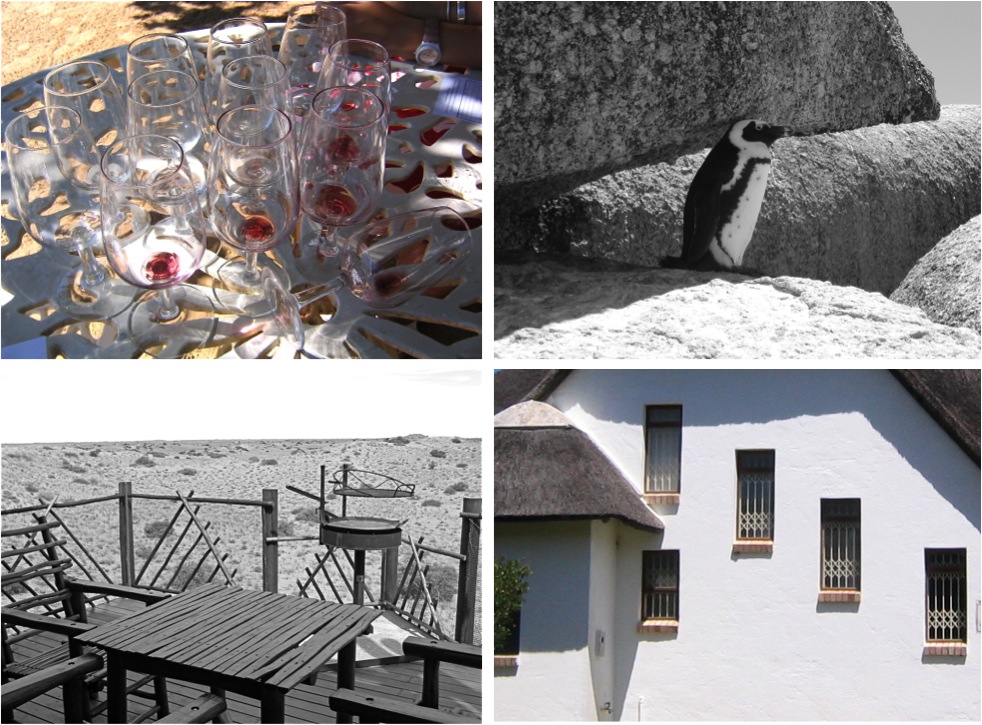
If you can’t make it to South Africa…

photos by Mathilde

photos by Corie & Jeff

but crave a South African vibe in your living space…

via

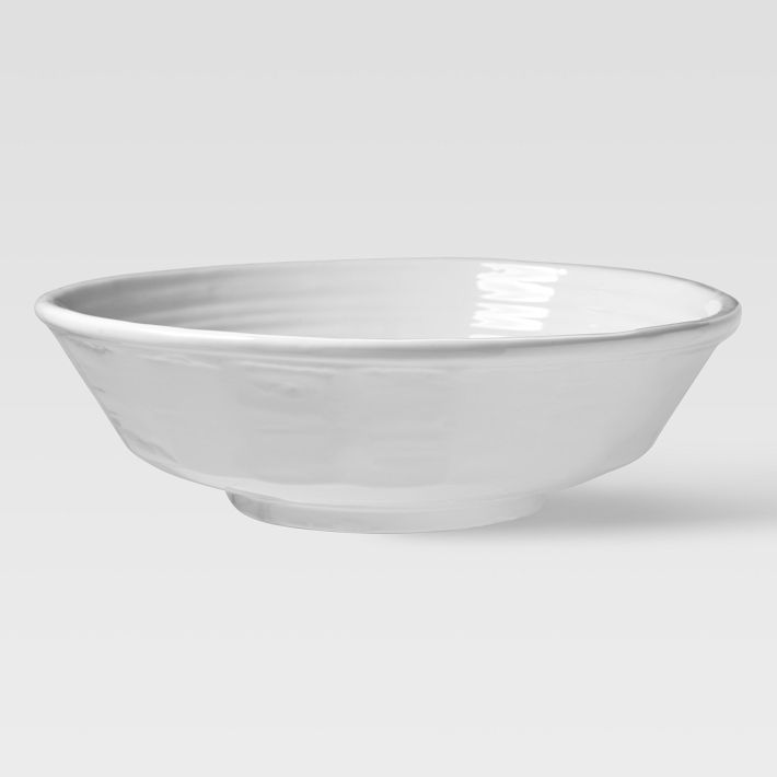
then West Elm’s recent collaboration with South African designers and artisans might be just for you! The collection of ceramics, textiles, furniture and home accessories has been growing in popularity since it hit the marketplace just a little while ago. Some of my favourite pieces are white (duh!) and they are simple, structural and functional.

Mick Haigh oversize serving bowl, $63.09

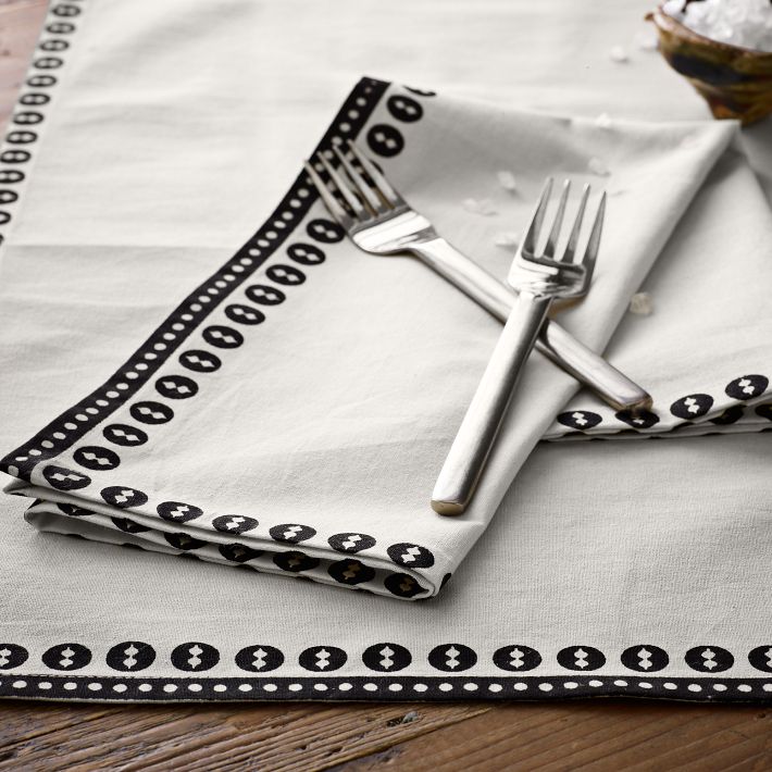
Potter’s Workshop napkin set – black shields, $21.39

Ceramic Matters candleholder, $63.09

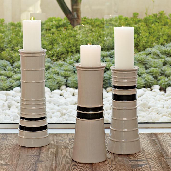
Anthony Shapiro pillar candleholders, $84.48-$105.87

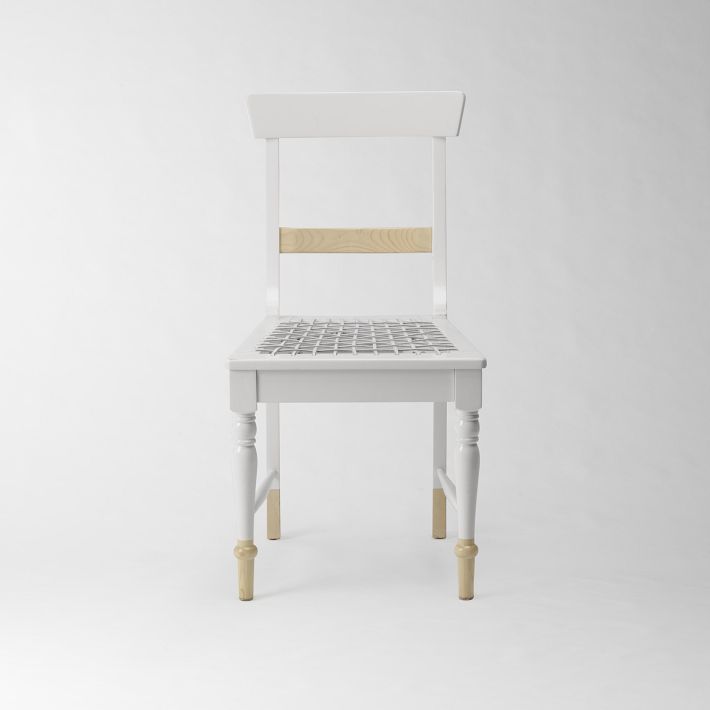
Source dining chair, $212.81

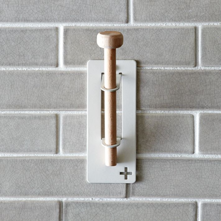
Pedersen + Lennard hooks, $12.81

Note: All prices are in Canadian dollars. Some items are not available for international shipping.

Many thanks to Mathilde, Corie and Jeff for allowing me to use their photos from their trips to South Africa.

Celebration: Father's Day at Urban Barn

Although Urban Barn is advertising their Belvedere recliner as the perfect Father’s Day gift, I’d say that more than just dads would like lounging in something like this.

Belvedere recliner, $1199, Urban Barn

If you’re interested in a chance to win a recliner (or an Urban Barn chair of your choice), go ahead and “like” Urban Barn’s Facebook page and share your story about why your dad is number one.
Event: International Contemporary Furniture Fair (ICFF)

The centerpiece of many design events taking place in NYC last week was the International Contemporary Furniture Fair (known as ICFF).
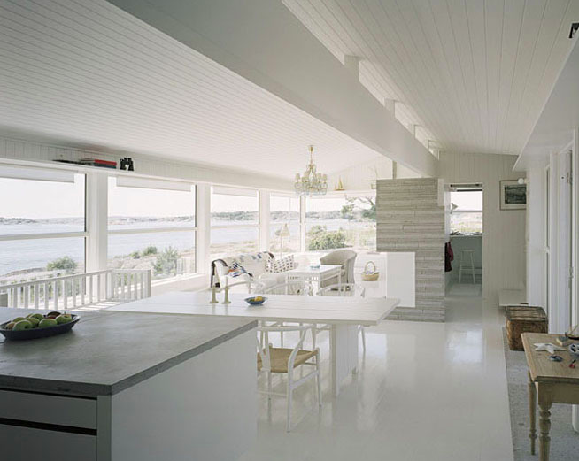
While oriented towards furniture retailers and “the trade” (aka interior designers and architects) the fair is open to the public for one of the four days.

This was my first year attending (for inspiration and potential new merchandise for Caviar20) and many design professionals I spoke with shared my enthusiasm for this year’s display.

While it was no surprise to see powerhouses like Vitra and Knoll, the strength of ICFF came from the small and medium sized studios that offer bespoke furniture or manufacture their own products (Grain, Rich Brilliant Willing, and Misewell are paradigms)

Strong American design was out in full force – earnest young talent creating work with great lines out of fine materials. Brooklyn-based studios were noticeably well-represented.

While some say ICFF lacks the avant-garde creativity found at the rival fair in Milan, there is a significant and consistent display of fresh, commercial, and livable furniture. Another surprise is how affordable many of the pieces are. If you’re looking for preposterously priced limited edition à la Marc Newson you’re at the wrong fair.

Below is a selection of amazing white pieces I encountered. With the exception of two pieces – everything is priced below $750.

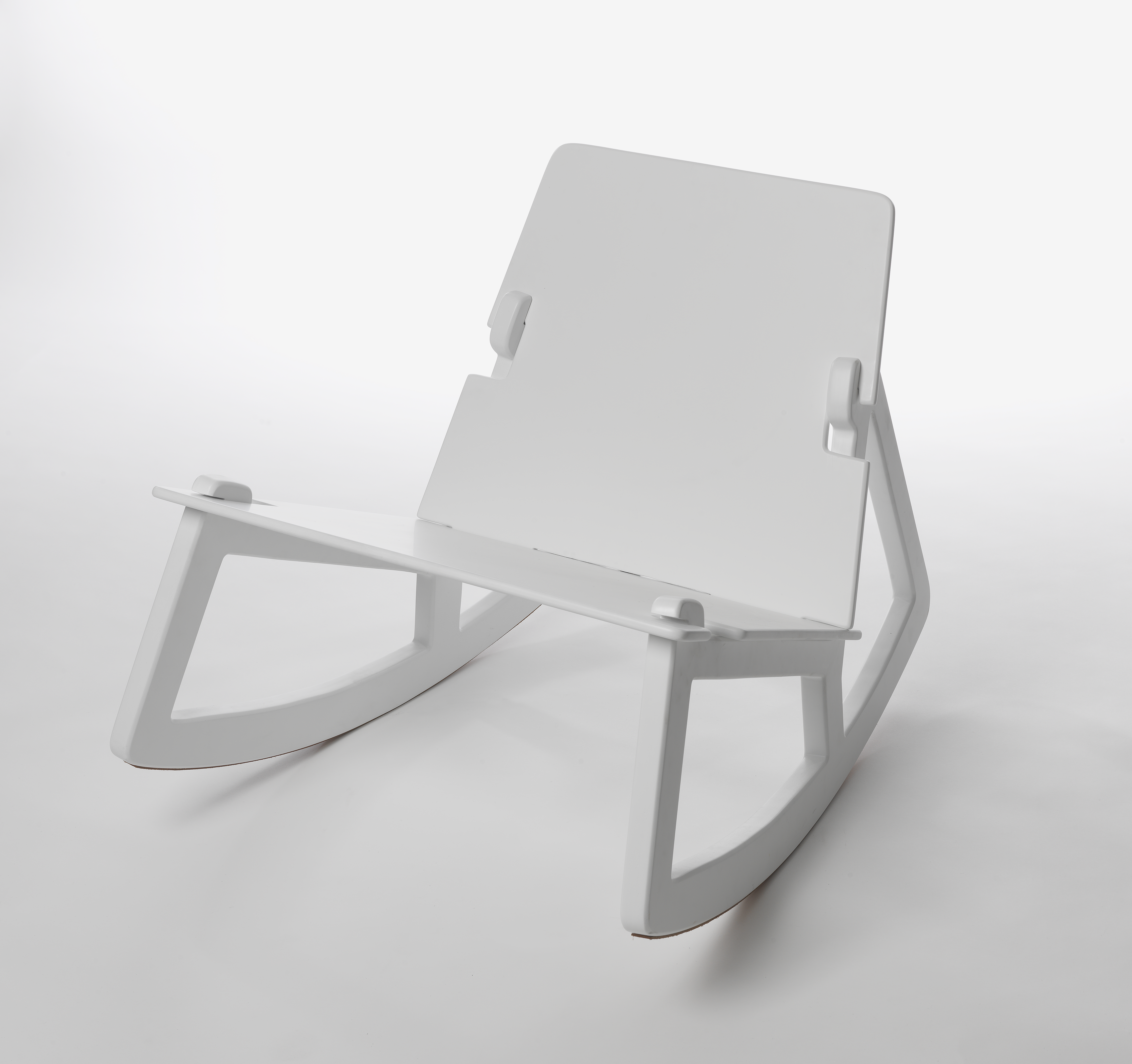
Rock Chair designed by Fredrik Färg

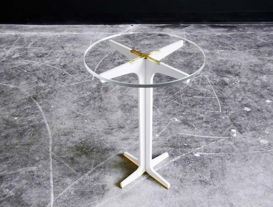
Grant side table by Gabriel Scott

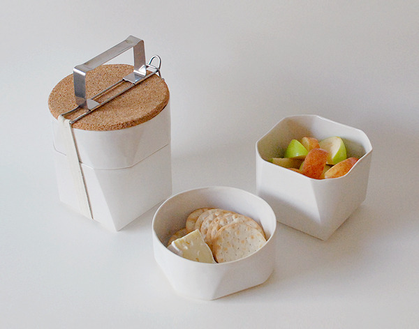
Tiffin lunch kit by Sinclaire

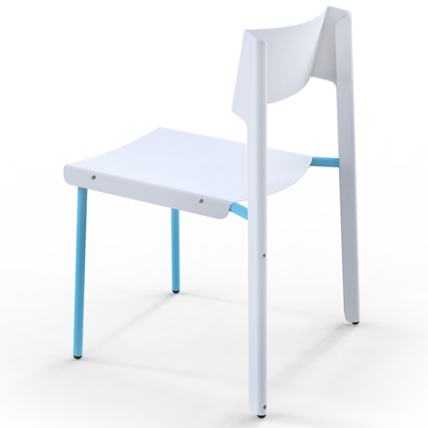
Dakar chair by Skitsch

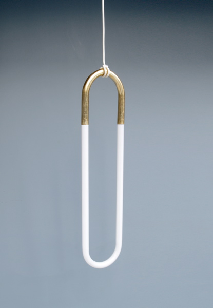
Hanging light by Lukas Peet

Fern table by Egg Collective

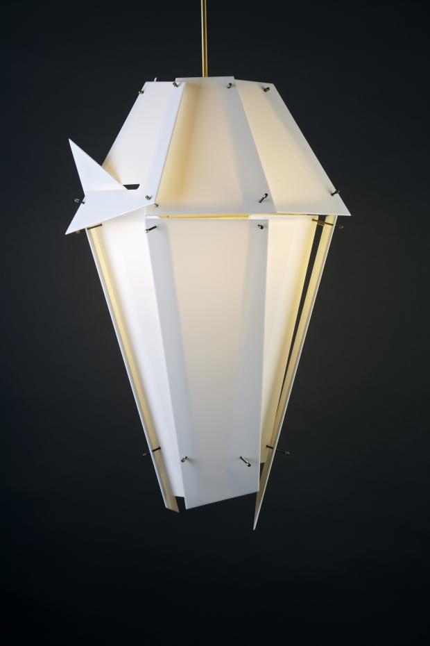
Sydney pendant by Mary Wallis

Delta V pendant by Rich Brilliant Willing

Lockwood chair by Misewell

Knot a bad seat

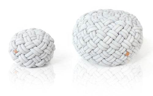
After coming across my second knotty pouf, I decided it’s time I feature the thing. Surely we’re onto a trend here.

The knotted ottoman we have here today is a beautiful thing (isn’t it?) by Prague-based design studio Kumeko. Inspired by old techniques of weaving fabrics and baskets, the pouf comes in two sizes and are said to be outstandingly comfy. I really like the weave pattern we have here in the Kumeko but CB2 does a similar pouf (no white option, sadly- just black, blue or red) that is knitted with large ribs.

The fabric, knotty pouf is a really nice way to round out all those harsh modernist edges in otherwise very angular spaces and well, let’s face it, it offers up a backup place to sit for when there’s just no more room on that loveseat.

Knotty poufs by Kumeko