Interview

Interview: Deborah and David from Green Light District

I recently had the pleasure of interviewing Deborah and David Peets, owners of Toronto’s Green Light District. The shop carries beautiful furniture and accessories from around the world, and it holds a prominent place in Toronto’s Roncesvalles area (Roncy, for short).

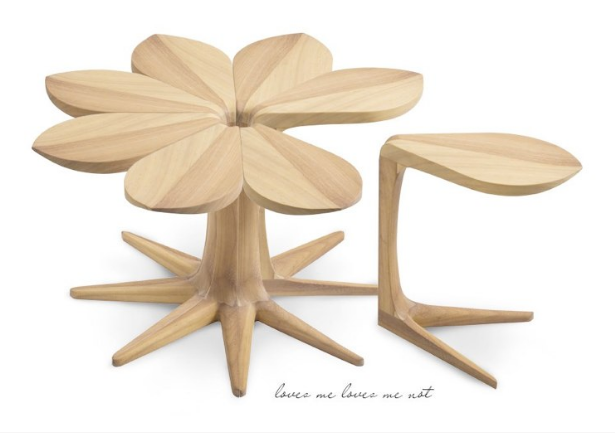
loves-me-loves-me-not-greenlightdistrict

Loves Me, Loves Me Not

Read on to learn about more about this duo’s approach to curation.

***

J: How did Green Light District come to be?

D & D: We restored a 160 year old country inn and ran it for a dozen years.  When we sold it all the furnishings went with the sale which left us with a completely empty condo to fill. We saw a need for something different and thought why not fill that need!

Where did the name Green Light District come from?

Our neighbourhood in Ottawa had formerly been a red light district but it was changing quickly and we were part of that change so we thought let’s be forward thinking (green=go) as well as referring to the home furnishings we were offering.

I believe the original Green Light District was in Ottawa, yes? Why did you make the move to Toronto?

We originally were from Toronto but had been away for 20 years in the Rideau Lakes & Ottawa but wanted to come home to be closer to family. A larger audience to sell to certainly helped make that decision!

Describe Green Light District in 140 characters or less (hashtags are accepted).

Personally sourced home furnishings; unique designs that are functional & timeless with a significant hand made component #warmcontemporary

What is your favourite piece currently in the shop?

Oh that’s easy! We just got in a hand stitched saddle leather Acapulco chair with a solid iron frame. It’s incredibly comfortable and you know it’s just going to get better with age.

How often do you travel to source products?

We’re big travellers so while sourcing is hard work it’s always thrilling going to Buenos Aires, or Paris or Cape Town …. We travel somewhere every year or two, sometimes multiple trips.

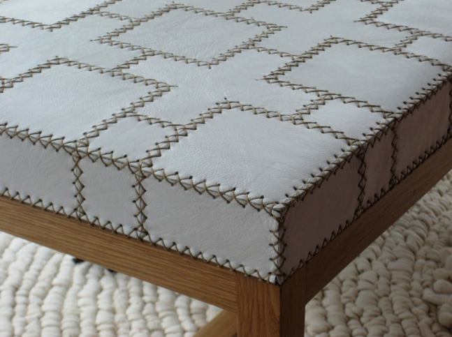
leather-bench

hand-stitched leather and oak bench

What is your favourite travel destination?

South Africa has a special place in our hearts. We first visited over 20 years ago and were blown away by their unique sense of style back then! The landscape, the people, food & wine but most of all their designs – so sophisticated, yet cool with just a whiff of Africa.

What is the best part of your job?

Sourcing in person of course. We knew it was important to get to know our suppliers; to see how and where their furniture & accessories are made. Every piece has a story to tell – then we found out how important it was for our customers too – to feel that personal connection as well – through us.

What is the most challenging part of your job?

Finding well made, hand crafted furniture & accessories that people will love at an affordable price – the search is never ending.

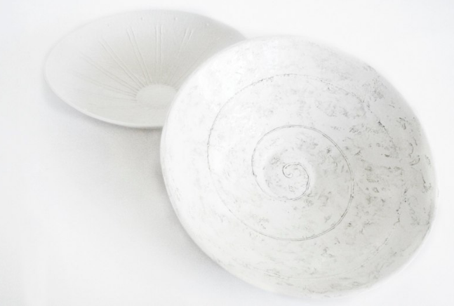
large-open-bowls-Green Light District

large open bowls

I know you actively engage with Twitter – this is, in fact, how we first met – and so I’m wondering if you have any social media advice for other small business owners. How has social media impacted your business?

There isn’t a better way than social media to get your name and business out there! I’d have to say firstly be true to yourself, be consistent in the amount you tweet or Instagram or blog, engage regularly with others on topics other than your business that interest you. Be helpful. Remember that is how we connected? Two women obsessing over fiddle leaf ficus and other indoor plants. Imagine – we connected via plants which led us to our love of design!

I am having so much fun with social media I’ve decided to take it to more of a personal level by visiting someone once a month in the city that I’ve connected with. It’s the reason we’re all on board right – to help promote each other!

***

Thanks so much for sharing a part of your story, Deborah and David!

Readers, browse Green Light District and find Deborah and David on Twitter and Instagram.
Interview: Charlotte Cosby – Head of Creative at Farrow & Ball

I’ve said it before and I’ll say it again – blogging has an amazing ways of bringing people together. I recently had the opportunity to interview Charlotte Cosby, Head of Creative at the elegant and classic Farrow & Ball. (Amazing, I know!)

Charlotte Cosby

While I did try to focus my questions to Charlotte about how she uses white in interior design, I couldn’t help but ask her about what she loves most about her job (I’m nosey like that). Head of Creative – isn’t that an awesome job title? Are you curious about Charlotte’s day job? If so, read on…

***

Jordana: How did you come to the position of Head of Creative at Farrow & Ball? 

Charlotte: It was really just a case of being in the right place and the right time, although a love of design, interiors and colour certainly helps as well!

J: What is the best part of your work day?

C: I like to be on the go so always enjoy it when I’m working on something new whether it’s experimenting with colour, drawing potential new wallpaper patterns or having ‘the idea’ with my team.

J: What is the most challenging part of your job?

C: Because the output and end product of my job is so subjective, this means that it’s often quite hard try to get something that everyone is happy with. However, I’m very lucky in that I’ve worked closely with my team for a number of years, meaning that we’ve been able to develop a style that everyone agrees on. It’s just getting agreement on each individual piece that can be harder!

J: Now, let’s talk about colour! At the risk of sounding childish, what’s your favourite colour? Why?

C: My favourite colour changes every week! Currently I’m really loving lush vibrant greens like Breakfast Room Green, Calke Green, and Studio Green as they remind me of tropical holidays and treks through the jungle! When mixed with a navy, like Stiffkey Blue, these colours can look extremely deep and mysterious.

J: What is/are your go-to colour(s) for your own home design projects?

C: I was obsessed with one of our new 2013 colours, Stiffkey Blue, for a long time as used on the walls, it really brings the whole room to life and makes all the furniture look amazing. I also really like the current trend of using copper and natural wood together as they go together brilliantly.

J: Now, at the risk of sounding selfish, let’s talk about my favourite colour – white! What are your thoughts about white?

C: I love white – it’s the one colour that allows you to be most creative. To me, white represents potential – it’s a blank canvas ready to be filled with colourful ideas!

J: What Farrow & Ball white would you recommend for the white enthusiast?

C: We really do have a white for every occasion! Currently, my favourite it Wevet – a delicate but extremely versatile white. One of our most popular whites is Wimborne White which works with absolutely everything! However, to be able to see the subtleties between them, you really need to have a reference point. For example, by putting both of these colours against All White, our cleanest and whitest white, you’ll be able to notice the very slight hint of colour that makes them so special and completely unique.

J: White can be used in every room in a home – even in children’s rooms. What do you think about using white in childrens’ bedrooms, playrooms, or bathrooms?

C: Children are among the most creative beings in the world so using white in a children’s bedrooms and playrooms would be a great way to encourage creative thought.

Not only would white be a great backdrop for the host of multi-coloured toys, it also means that if you did want to use a small amount of brighter colours, like our vibrant St Giles Blue, Yellowcake or Charlotte’s Locks, throughout the room – on furniture, woodwork or even in cupboards or shelving, using white on the walls and ceiling will really help to make these colours pop!

From a more practical point of view, white will also stand the test of time as they’re growing up.

J: What advice would you give parents who are hesitant to incorporate white (walls, furniture, toys, etc.) into their children’s spaces?

C: It’s easy to see why parents might feel hesitant to use white in their children’s rooms as children are well-known for being attracted to muddy places.

By using either of our Modern Emulsion, Full Gloss or Estate Eggshell finishes on the wall of your child’s room will allow for wiping away wandering hand and finger prints. These finishes are also more resilient and hardwearing meaning that the walls are less likely to scuff.

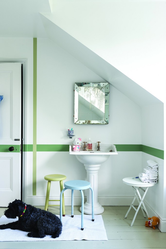
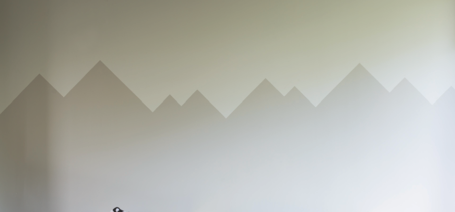
White rooms needn’t be boring and by adding a simple feature like a stripe, will instantly add fun to a plain white room. Another technique is to layer different whites on the walls which will help to add a real depth and softness to the room. You can get creative with this techniques, like we have here by painting a simple mountain scene onto the wall.

J: Thank you, Charlotte, for taking the time to speak with me about white!

***

So, how about that? Colour expert Charlotte Cosby loves white! I love that she thinks white is timeless, is a great backdrop for kids’ rooms, and represents potential. Amazing. Let the creativity shine on!

Here are the Farrow & Ball whites that Charlotte made reference to:

Wevet-Farrow-Ball

Wevet

Wimborne-White-Farrow-Ball

Wimborne White (there’s a sample there, I swear!)

all-White-Farrow-Ball

All White (another sample image, honest!)

And here are a variety of rooms – not just for children – featuring gorgeous Farrow & Ball paints.

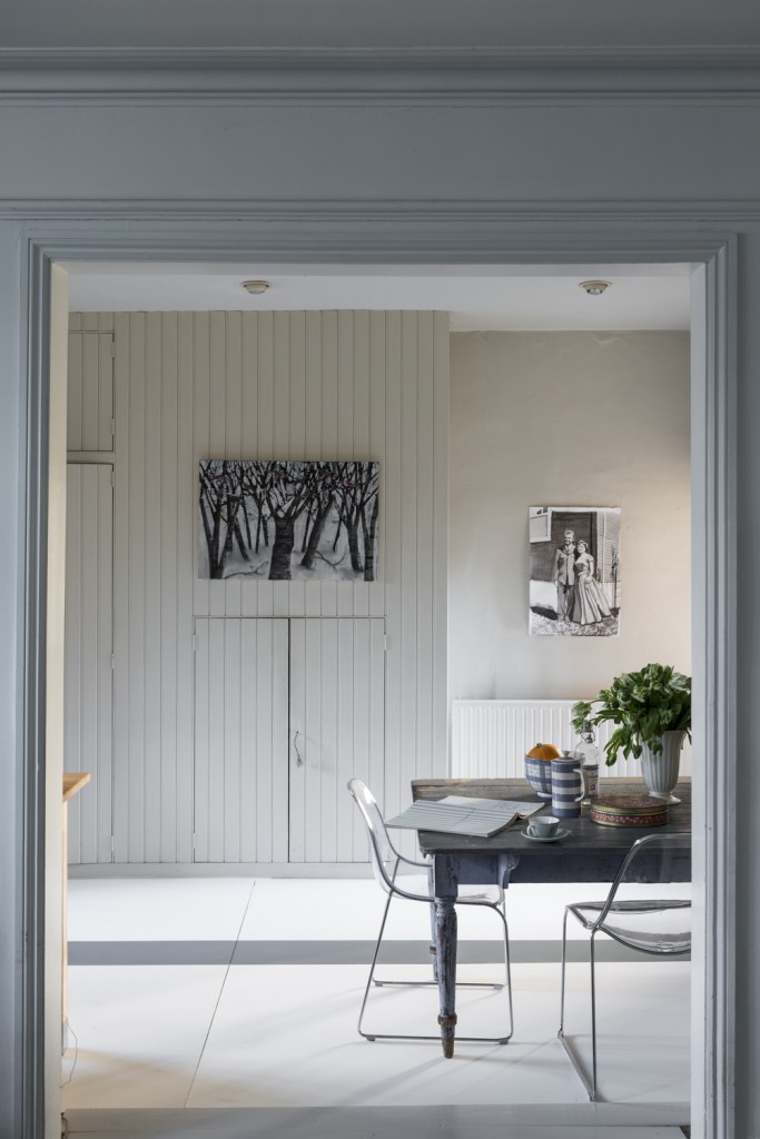
2004EE_5EEG_S Farrow-Ball-White-2 Farrow-Ball-white-1 Farrow-Ball-white-2001 EE_228EEG Farrow-Ball-2005DF_22EEG_S Farrow-Ball-2005EE_2005EEG_2005FP_S F&B_FloorPaint-23 F&B_Modern_Emulsion-8 farrow-ball-white-3

Naturally, I gravitate toward that sunny white office with wood plank floors! Isn’t it lovely?

What do you think? Would you paint your children’s room – or other rooms – fully white?

Thanks to Rebecca M. at Farrow & Ball for arranging this interview.


Interview: Robert and Cortney Novogratz

Robert and Cortney Novogratz do keep themselves busy. Not only have they been successful and inspirational designers for more than two decades, this dynamic duo has also been sharing their knowledge of design through the medium of television, most recently on HGTV’s Home by Novogratz. They’re also the authors of the successful book, Downtown Chic.

Robert & Cortney Novogratz (via)

Oh, and if you haven’t already heard, they have seven kids to take care of too!

The Novogratz Family

I recently had the opportunity to ask Robert and Cortney some questions about their approach to design. Before I share their responses with you, I thought we could have a little peek into their own homes (yes, multiple). I really love seeing how designers design for themselves (and, of course, how they incorporate white).

In New York…

via Novogratz

via Novogratz

via Novogratz

via Novogratz

In Great Barrington…

via Novogratz

via Novogratz

In Brazil…

via Novogratz

The Novogratz also bring in quite a bit of white into the spaces they design for their clients.

via

via

via

I just love that while this couple obviously loves high-impact colours, industrial design, and a variety of materials, they also use white to make their designs complete. I recently asked them about their fondness of white, among other things, and I am happy to share their responses with you today.

***

1. What is one of your favourite spaces to design?

We love all different kinds of spaces. Homes, stores, schools – we are always looking for a new challenge.

2. What are two of your best organization tips, tricks, or tools?

Two great tricks for instantly improving your space: 1. Get rid of clutter and watch your room open up and feel more spacious. 2. A new coat of paint can work miracles. Don’t be afraid to try a little colour (or more) if you are feeling bold.

3. What three elements define a well-designed space?

Does it work for the people using it? Is it comfortable? Is it chic?

4. What are four of your best ways to avoid clutter?

Get rid of what you don’t really need. Kids don’t have to have boxes and boxes of toys. Just keep their favourites and what they use regularly. Donate the rest, give it to friends or family, or have a tag sale! For what is left – get some good storage. Make it easily accessible to the kids. The same applies to adults. If you have a collection of something you really love, or books you don’t want to part with, find a cool way to display them that does not look cluttered. Closed-cupboard storage is great for things you really need but don’t necessarily want out for the world to see.

5. What are five of your favourite white accessories/objects/pieces of furniture (that you own or that you often use in your designs)?

We love white candles, white flowers, and white walls. They are all excellent for different reasons. Because we love bright pops of colour in our design, white is a really good way to make art, accessories, and brightly-hued walls pop. We have great white vintage dining chairs made from washable leather so they are easy to clean. The floors in our country home are painted white, which really opened the space. White is classic and always looks good.

6. What are your six top shopping destinations (i.e., for home, clothing, food, etc.)?

We have lots of shopping destinations. We love a good flea market anywhere in the world and the one in Brimfield, MA, is one of the best. We also love shopping for vintage pieces in Hudson, NY, and several locations around NYC. For decor items that are affordable, CB2, IKEA, Target. For clothes and food, there are nine of use, so the shopping choices are quite diverse.

7. What are seven of your kids’ favourite toys/books/objects?

Legos (especially Star Wars) are big with our twin sons, who are six. One of our sons loves music and musical instruments. Our girls love to read. Our oldest is an athlete so many of his favourite things are in that arena. Our three year-old has a stuffed dog he likes quite a lot.

***

Many thanks to Robert and Cortney Novogratz for taking the time to respond to my questions. Thank you to Sarah Stevens at Shaw Media/HGTV Canada for arranging this interview.

Read more about HGTV’s Home by Novogratz here.