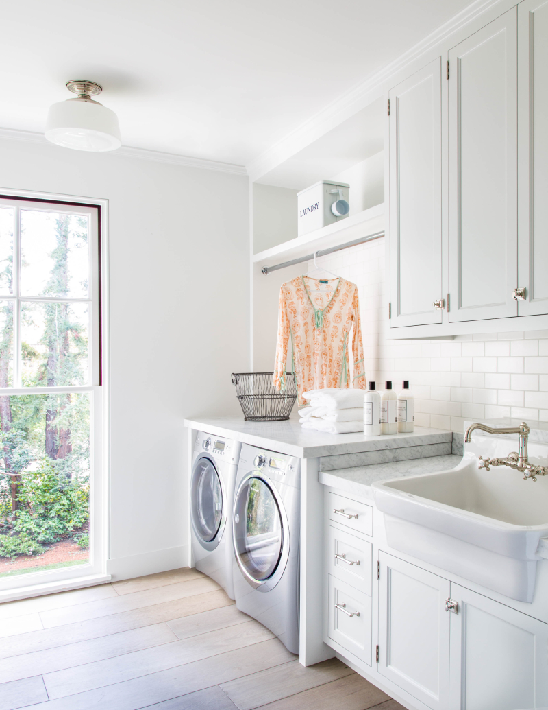
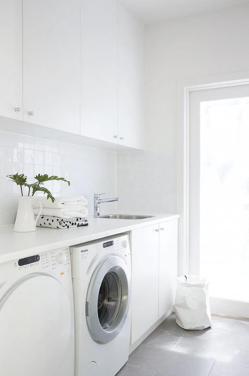
Design: Grout Colour Options

You’ll see an increase in reno-focused posts over the next little while as I have quite a bit on the go at my house, and I like to share. I hope you’ll enjoy learning about the reno process, too.

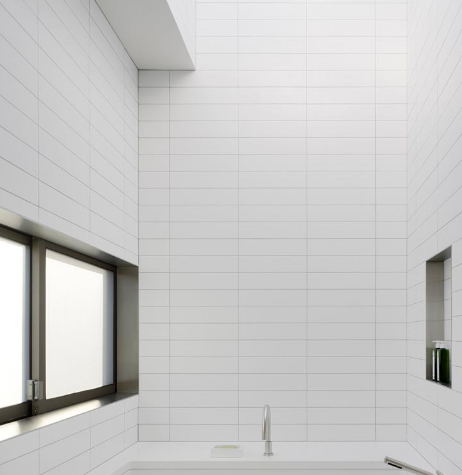
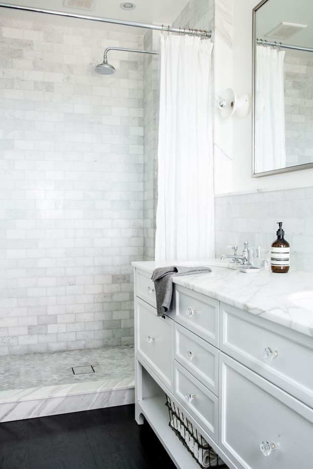
In my new bathroom, there will be white subway tiles in the shower. This means that I need to settle on the grout colour. Originally, I was all for white grout, but considering the hard water we have in Waterloo, my lack of desire to scrub showers, and a conversation I had with my tiler, I’m reconsidering the white (dramatic, I know!).

Here are the options:

Option 1: white (subway) tile + white grout
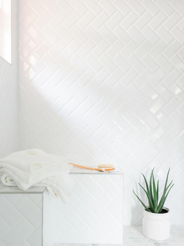
HGTV

Apartment Therapy

via

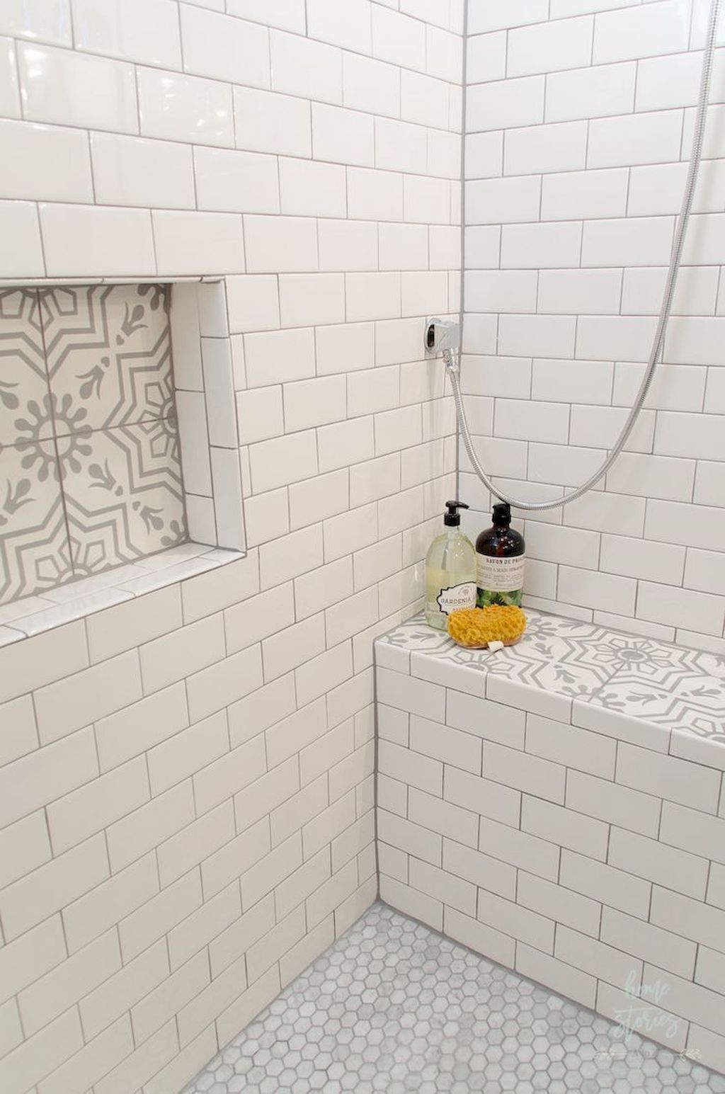
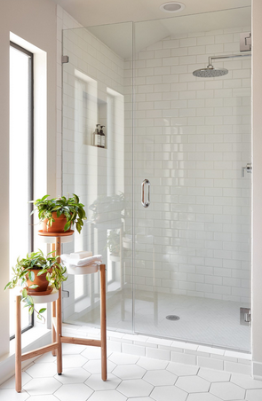
Option 2: white subway tile + grey grout
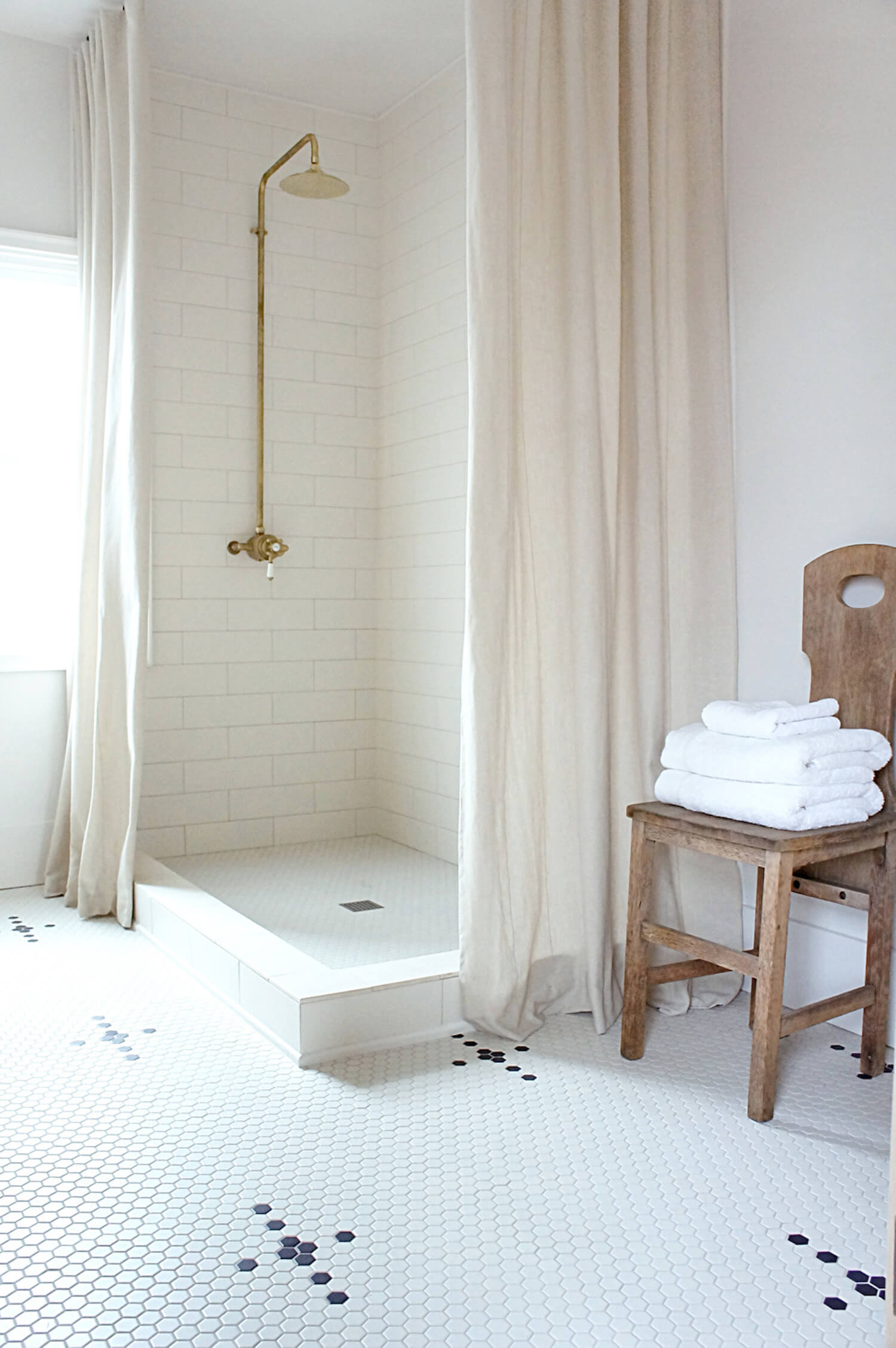
Est Living

Decorecor

Sarah Baynes

Sweeten

Apartment Therapy

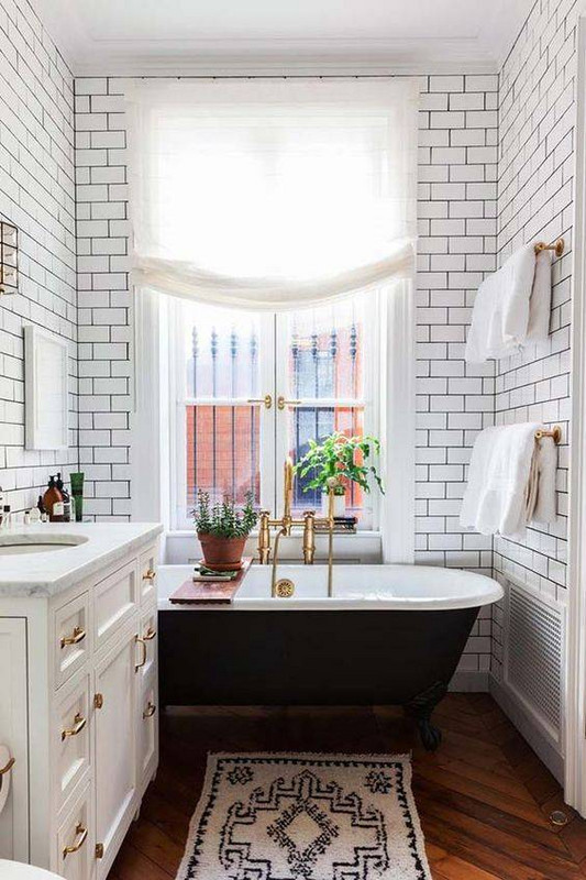
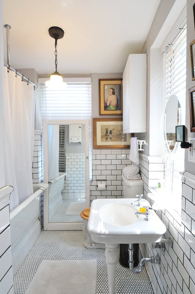
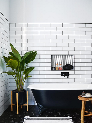
Option 3: white subway tile + black grout
Inside Out

Domino

Apartment Therapy

Love Create Celebrate

I do prefer the white-on-white because the grout lines would just blend in with the tile, but I really want this space to be clean for a long while, so I’m almost certain I’ll go for grey grout. I think the grey will look nice with the flooring, too.
Design: White Subway Tile

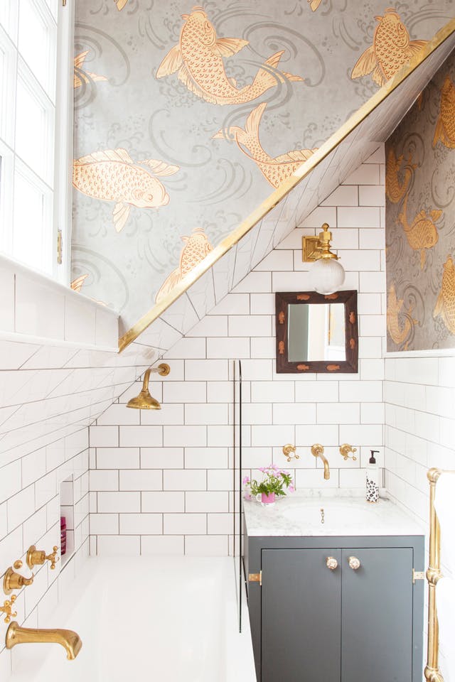
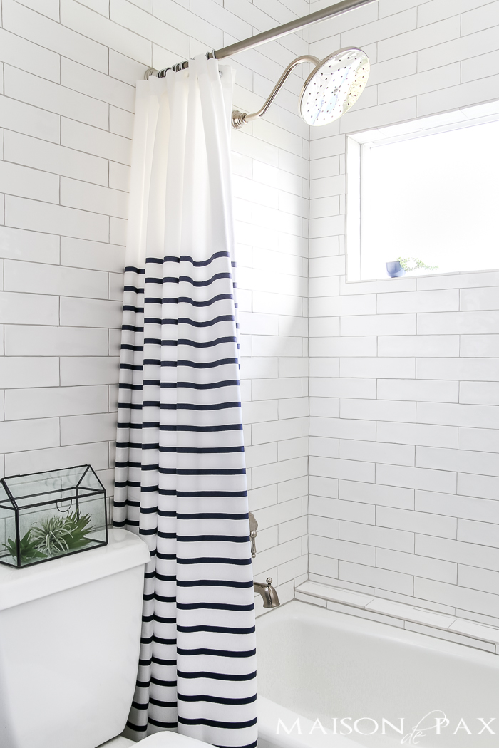
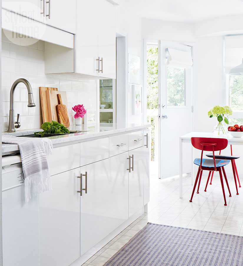
What are your thoughts about white subway tile? Are you sick of the look? Are you tired of seeing yet another bathroom with white subway tile? As for me? I’m definitely not tired of them. Year after year (after year), I come across images of gorgeous spaces that use them, and I always think that it’s a beautiful, clean, classic tile option for a kitchen backsplash or bathroom.

Magnolia

my kitchen – featured in Style at Home

Decorist

Maison de Pax

I’ve picked up a 4″ x 12″ white tile for my new laundry room/bathroom, and I think it’s going to look great. I know patterned tiles are very a la mode at the moment, but they just don’t fit well with my aesthetic. White subway tiles on the other hand? I can’t get enough of them!

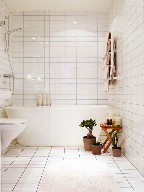
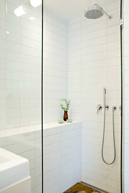
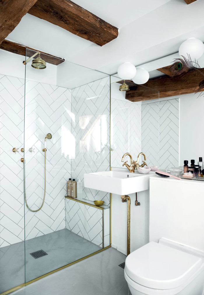
Although I prefer the tiles (small or large size) to be installed in a brick formation, I do like the look of the stacked installation as well.

Anna G

Studio Karin

CCS Architecture

Sabrina Smelko

What do you think? Do you have strong feelings about white subway tiles?

Uptown: Laundry Room Design Ideas

2018 is going to be the year I tackle my laundry-bathroom renovation. The space has been stuck in the 80s/90s what with its floral wallpaper and really old everything else. I am so eager to get it back to its studs and start fresh!

I haven’t bought everything, but one thing is completely set – my sink and faucet. I’m lucky to be working with Blanco on this reno, and it really wasn’t hard for me to settle on two essential pieces items – the Blanco Liven laundry sink and Blanco Urbena faucet – both in white, of course!

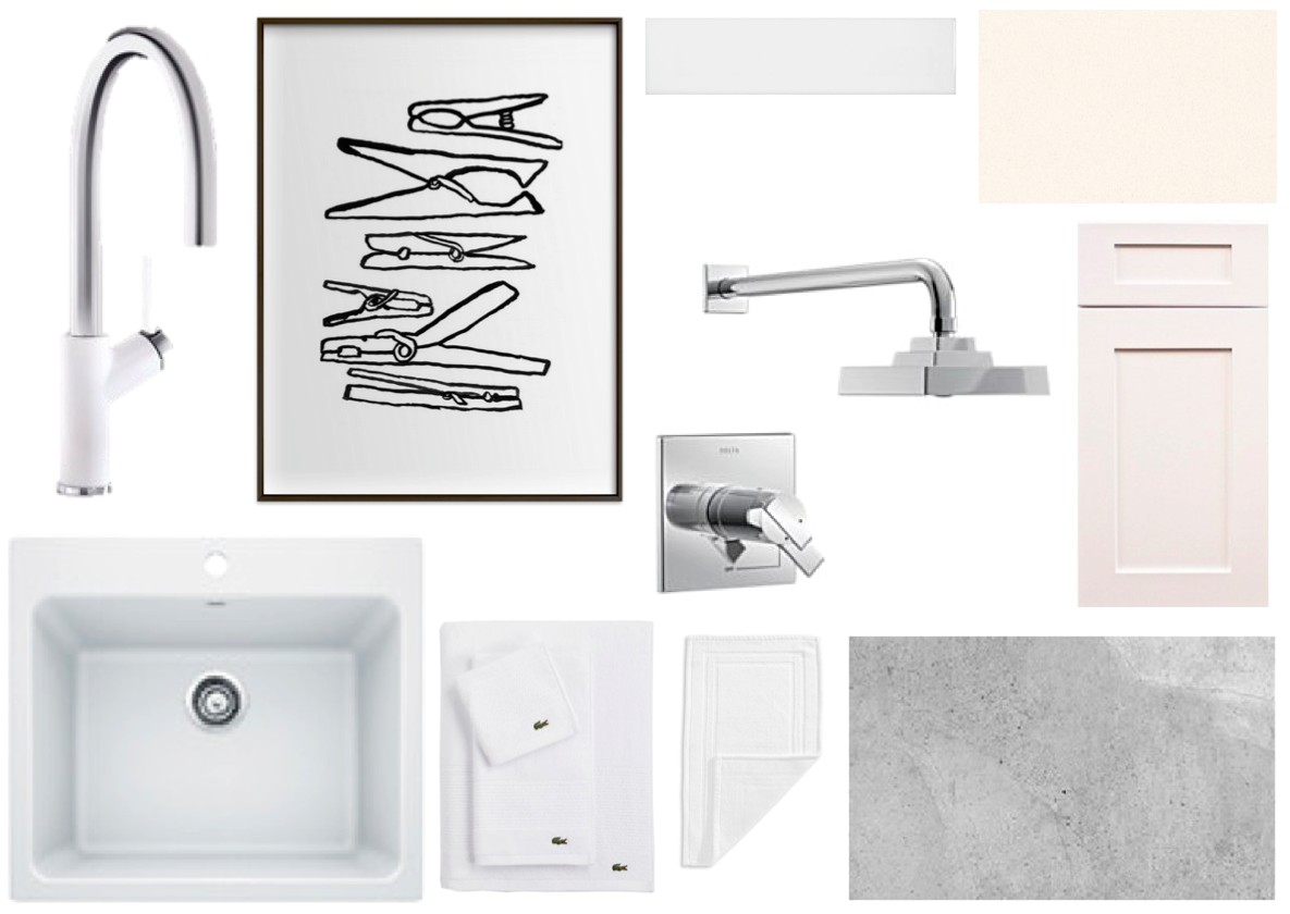
Beyond these two pieces, I’ve been collecting ideas about other items as well. Here’s one of my design boards.

laundry sink, faucet, wall tile, floor tile, art, cabinet door, countertop, towels, shower trim, bath mat

As you can see, I’m going for a simple, modern space with white as the main colour (of course!). I think I’ve settled on white subway tile (but I might go for a larger version) for the walls and a grey-ish floor tile. I think I’ll need to go custom for the cabinet and counter, but I haven’t finalized that yet. And I have to settle on a laundry/dryer combo (not pictured), too. Much to do!

All of these are the pretty things. In addition to them, I (or people) will replace the insulation, install a ceiling, redo the door framing, improve the plumbing, and who even knows what else. That’s how renos end up going, right?

Thanks to Blanco for sponsoring this project. All opinions are my own.

Design: White Bathrooms

2018 is the year of a couple of reno projects at my home. These are big renos that I’ve been putting off for a while, but this is the year. One of the projects to tackle is my basement combo laundry-bathroom (I’ve talked about this room here and here). It’s a well-used space, but it’s poorly designed. The sink is too small, the wallpaper is too floral, and it is well-past its 1990’s look.

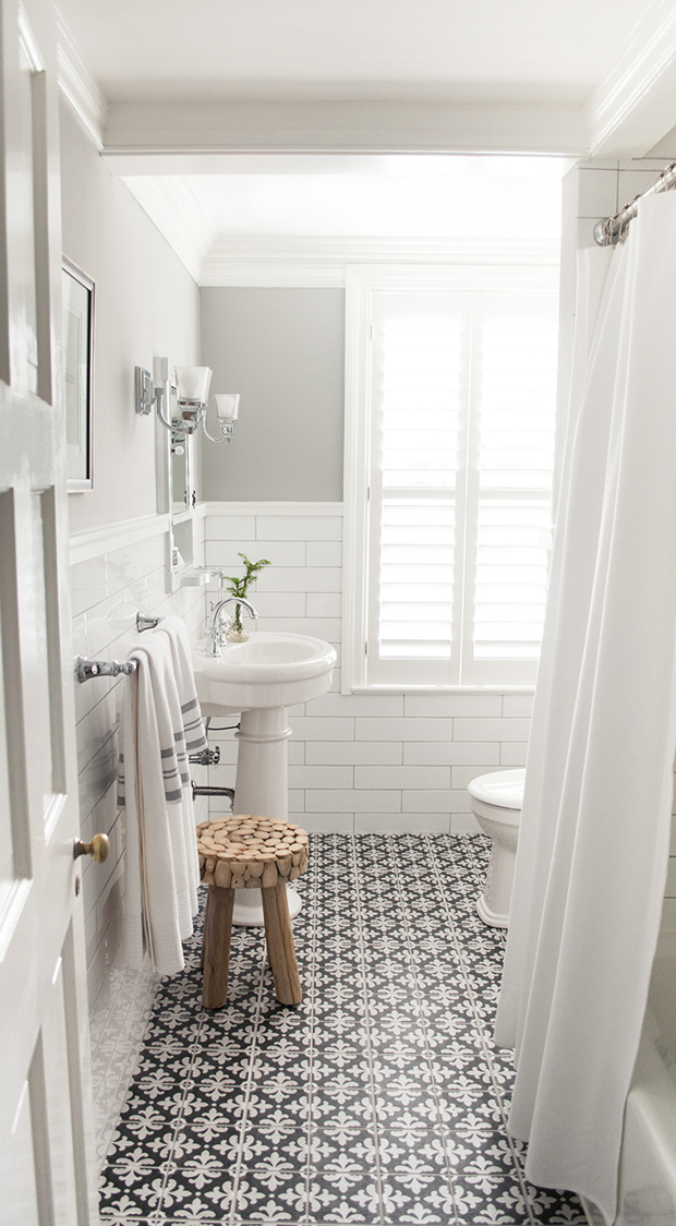
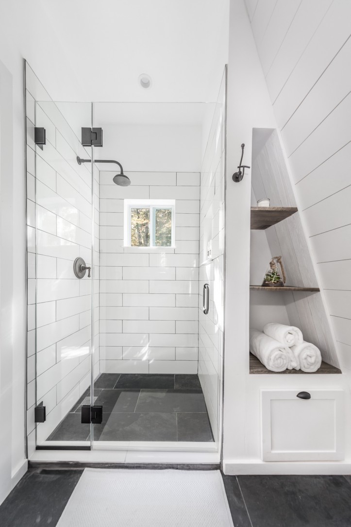
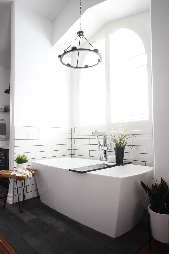
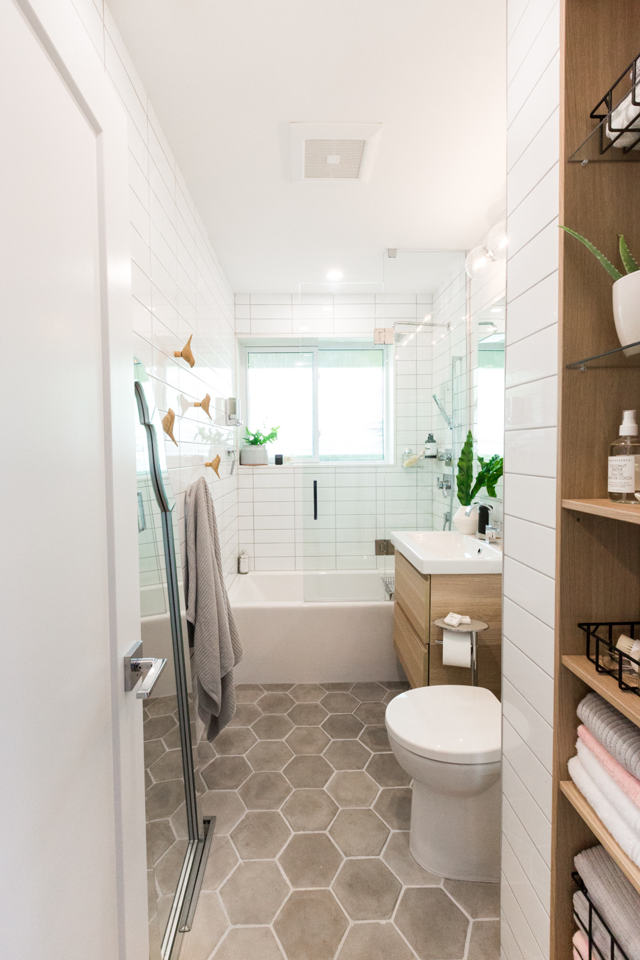
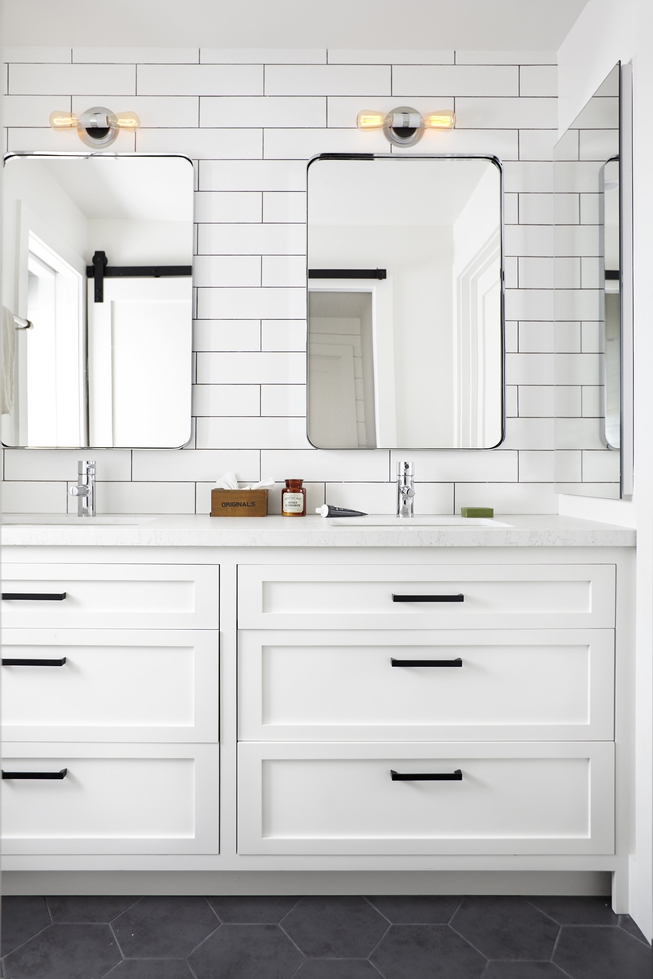
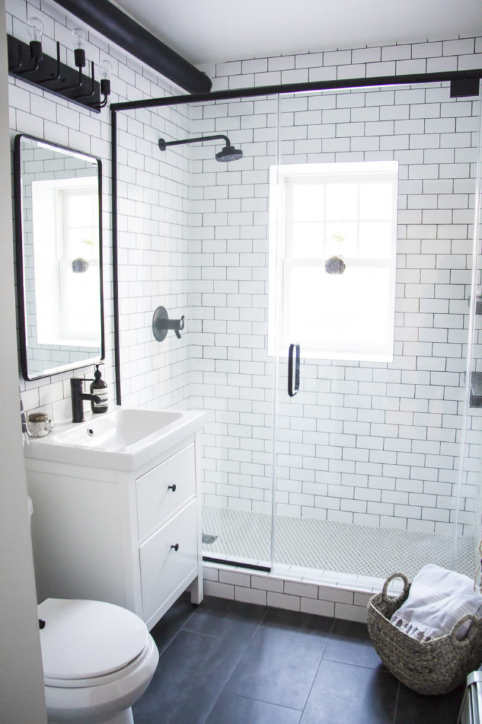
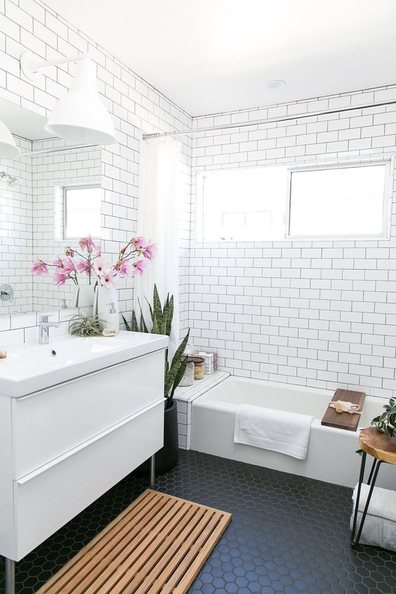
I’m not going wild with my design – white, white, white – with hints of grey and black. I’m drawing inspiration from these spaces that have some common elements: white subway tile walls and grey/black floor tiles.

via Sarah Baynes

via Decorist

via Kristina Lynne

via DigsDigs

via Residence Mag

via Velvet and Linen

via DecorPad

I think I’m set on chrome fixtures, and I’ll have a fantastic white laundry sink. I’ll be replacing my 90s washer/dryer and installing a stacked washer/dryer system (either separate units or an all-in-one). There’s much to do, that’s forsure! Care to follow along this makeover story?