As I was browsing through some of my daily and weekly reads (cue blogroll), two bathrooms caught my attention. I thought I’d share them with you in case they haven’t yet made their way to your computer/laptop/other device. Feel free to weigh in on what you like or dislike about each space.
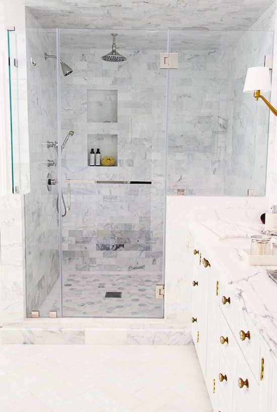
The first bathroom was featured on Sue’s The Zhush. The bathroom (and home) was designed by Irene Lovette of Designstiles. I adore the marble in this bathroom as well as all of the fixtures. The shower is stunning, and please hop on over to see the bathtub. Just gorgeous!
While the colour palette here is simple, neutral, and white, the space is interesting because of all the patterns of the various marble pieces. This bathroom does not shy away from mixing metals either, and I think we are going to continue to see this in interiors in the years ahead.
 (photo by Sabra Lattos Photography)
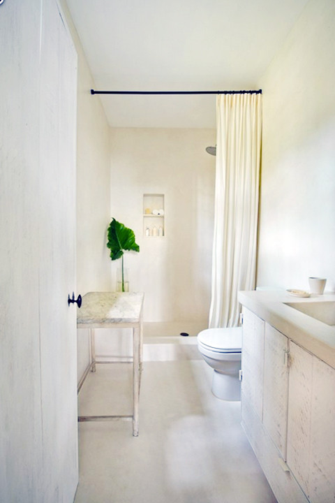
I spotted the second bathroom on Jacquelyn Clarke’s Lark and Linen. It’s one room (of many) in Calvin Klein’s Miami beach house, and it is very minimalist in design. It was designed with super straight lines, one colour scheme, and only faint lines of pattern (e.g., marble on the side table). The shower luxe curtain and black curtain rod certainly got my attention.
 Zillow via Lark & Linen