Event: Brian Gluckstein & the Princess Margaret Show Home

As if my fondness for Brian Gluckstein could grow? Well, it did. Last week. Let me tell you about it.

I drove to Oakville one evening after work to attend a preview of the Oakville show home for the Princess Margaret Cancer Centre Welcome Home Sweepstakes. The house – from top to bottom – is pretty darn gorgeous. While it wasn’t all white, there was a lot of white and I was happy to see it. The open concept kitchen, family room, office, and a few bathrooms (I lost count of them, to be honest) were quite white. The other spaces were full of muted blue, grey, violet, and yellow. Each room was quite beautiful. It wasn’t the “don’t touch this because it’s so precious” kind of beautiful but more like the “have a seat, stay a while, get comfy, can I get you a coupe of champagne” beautiful. Ok, that’s kind of fancy too; but it didn’t feel untouchable.

WhiteCabana-BrianGluckstein-PrincessMargaret-6

main floor living room

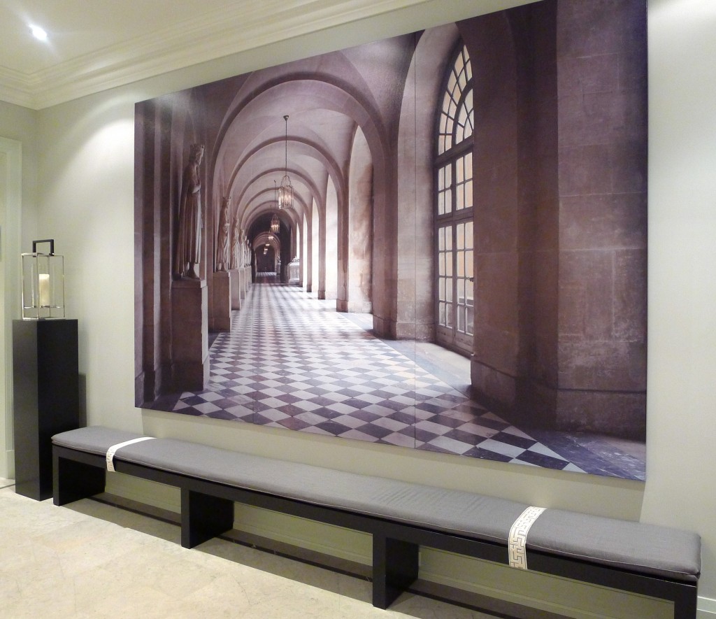
WhiteCabana-BrianGluckstein-PrincessMargaret-4

upstairs grand hall

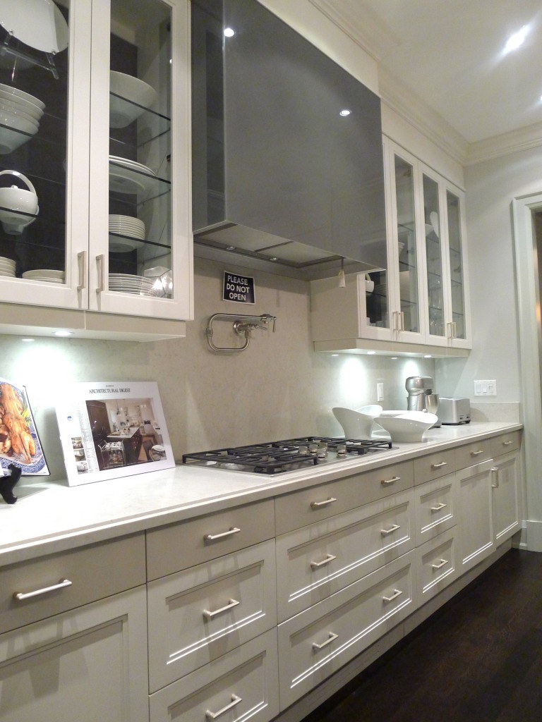
WhiteCabana-BrianGluckstein-PrincessMargaret-18

kitchen

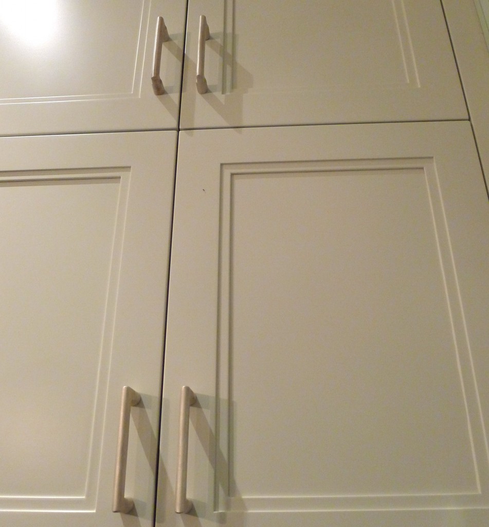
WhiteCabana-BrianGluckstein-PrincessMargaret-15

kitchen cabinet detail

The furniture and many of the accessories is all from the Brian Gluckstein collection and the art was sourced from around the world. I didn’t sit on any of the furniture out of fear that I’d mess up a pillow and Brian would have to come and expertly re-chop it (chopping pillows is still in style, in case anyone wanted to know). But if he wasn’t around, I probably would have tested out every seat in the house.

WhiteCabana-BrianGluckstein-PrincessMargaret-3

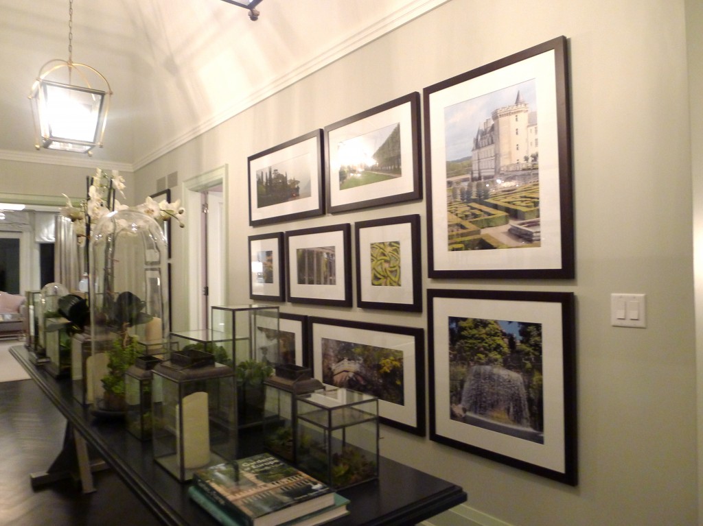
main floor – grand hall

WhiteCabana-BrianGluckstein-PrincessMargaret-2

GlucksteinHome details

WhiteCabana-BrianGluckstein-PrincessMargaret-12

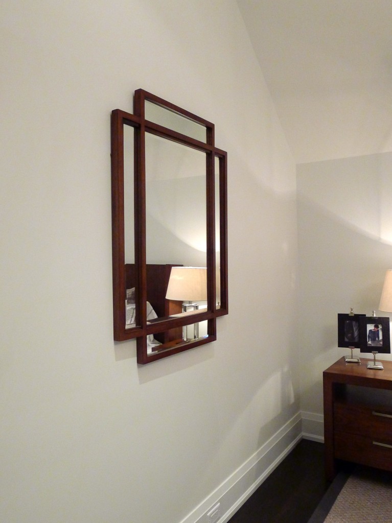
upstairs bedroom mirror

WhiteCabana-BrianGluckstein-PrincessMargaret-11

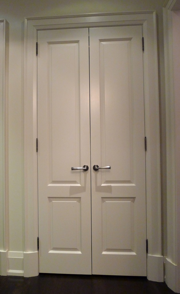
substantial doors in a bedroom

WhiteCabana-BrianGluckstein-PrincessMargaret-22

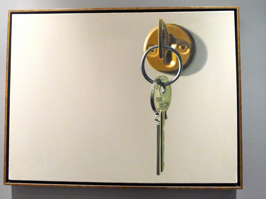
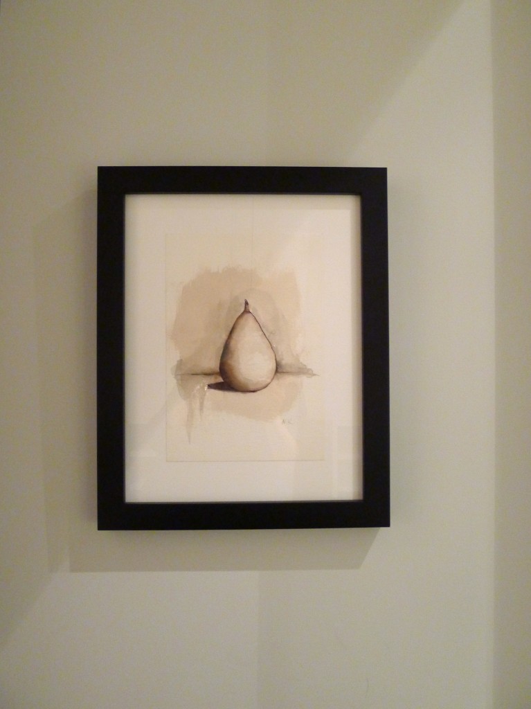
possibly my favourite piece of art in the house; Key by Tritan Braho

WhiteCabana-BrianGluckstein-PrincessMargaret-19

pear art

WhiteCabana-BrianGluckstein-PrincessMargaret-14

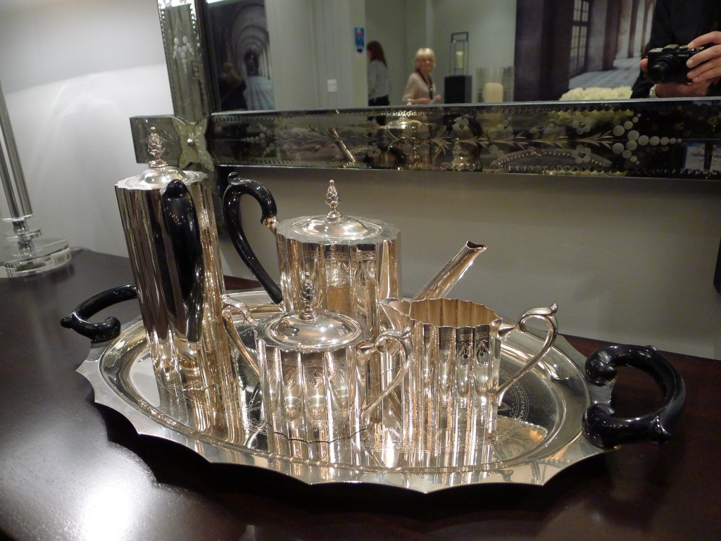
dining room details; my mom has this same antique tea set

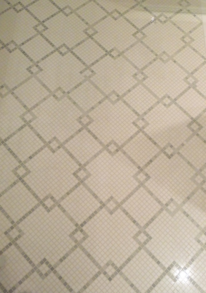
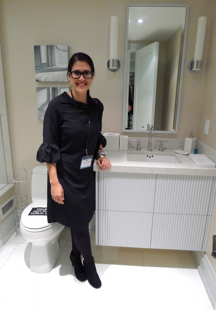
I really eyed the details in all the bathrooms to see what details I could translate into my own home. The tile work and use of mirrors was lovely. And the towels were so new and fluffy.

WhiteCabana-BrianGluckstein-PrincessMargaret-9

tile floor in the master bathroom

WhiteCabana-BrianGluckstein-PrincessMargaret-21

basement bathroom; photo snapped by April

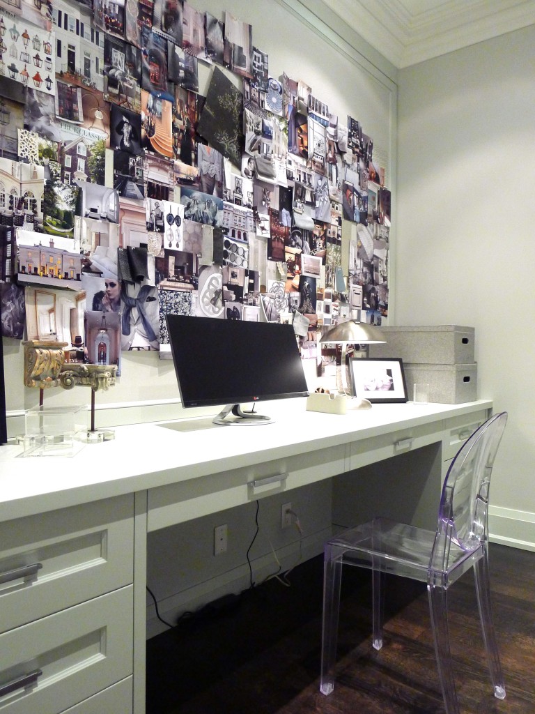
Ever the academic, I had to check out the office. I loved that it had a great big cork board (old school Pinterest) and a wall-to-wall desk. I’d really put that thing to work.

WhiteCabana-BrianGluckstein-PrincessMargaret-1

main floor office

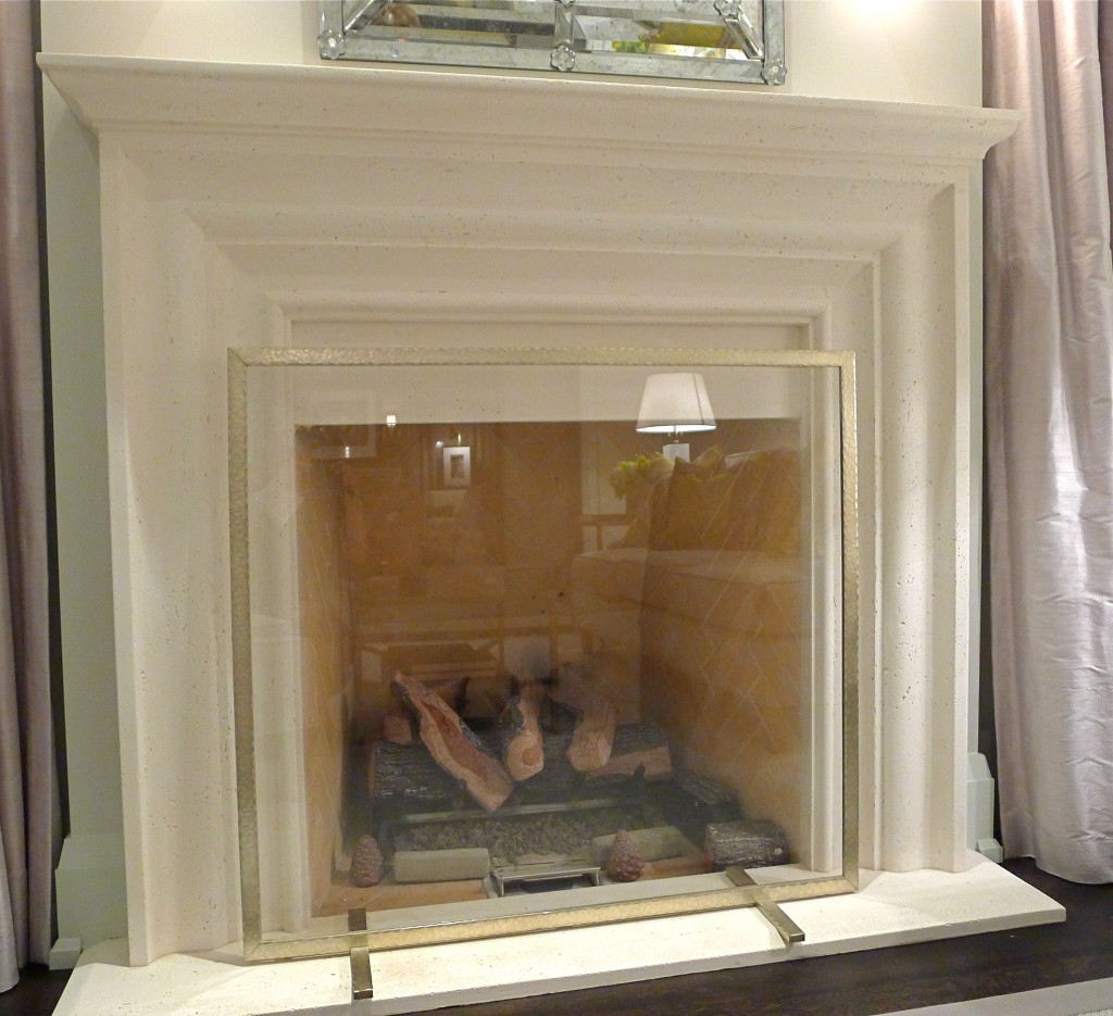
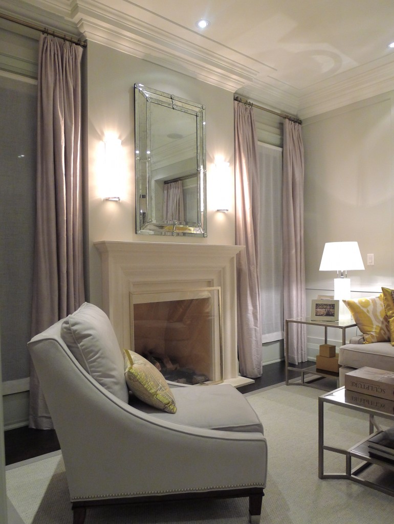
The mouldings, the fireplaces, the tiles, and the lighting were all very impressive.

WhiteCabana-BrianGluckstein-Lighting.jpg

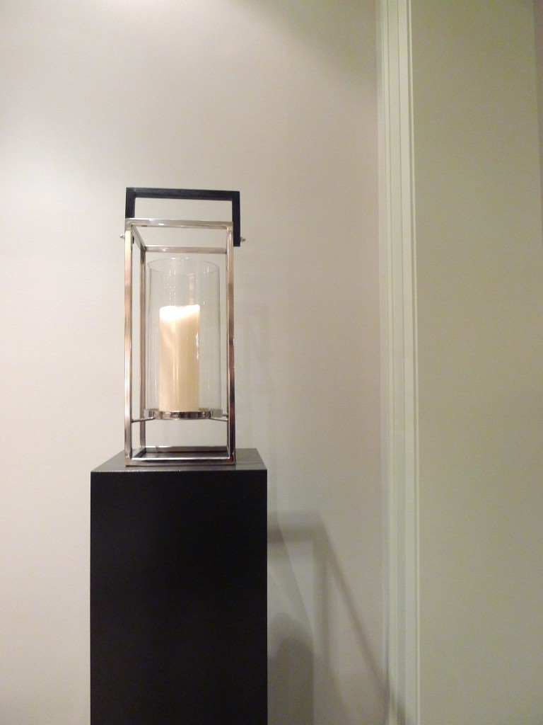
 lighting around the house

WhiteCabana-BrianGluckstein-PrincessMargaret-17

fireplace in the main floor living room

So is there anything I don’t like in the home? Yes – two things. One: The wine cellar was a nice addition but I probably would have cut out the exercise room and made the wine cellar a whole lot bigger. Two: What really annoyed me as I walked through the house were all the TVs. Oh my goodness. There were a gazillion TVs in the house. They drove me crazy! Brian, Brian, Brian – why? How many TVs does one beautiful house need?

Overall, the house is really beautiful and the work that went into building it (in only 5 months) is incredibly impressive. Brian, the architect, the tradespeople, and all the other people who had a hand in this really did a phenomenal job.

WhiteCabana-BrianGluckstein-PrincessMargaret-13

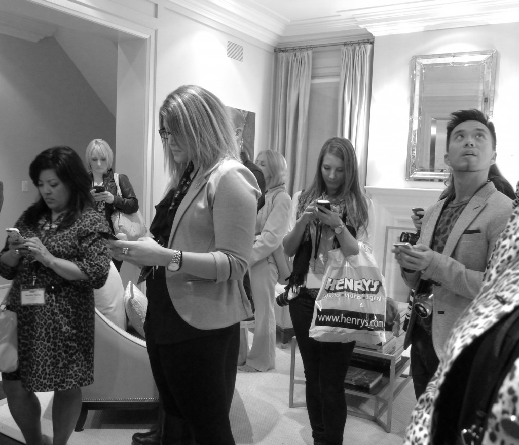
Did all bloggers listen to Brian Gluckstein and tweet at the same time? (I spy Jennifer, Leigh-Ann, Brittany, & Tim)

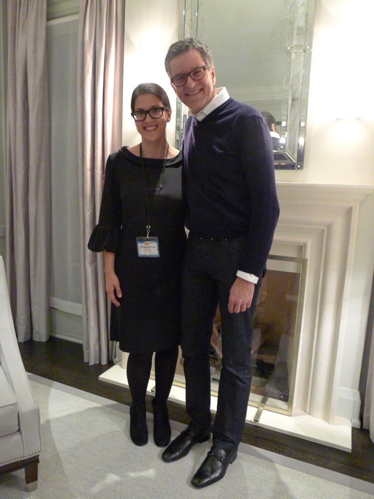
Mr. Brian Gluckstein remained friendly, warm, and funny as he talked about the house and his design career with all the guests. Oh – and I couldn’t leave the home without taking a photo with him. I also took the opportunity to ask him if the bathroom in his own home is still as beautiful as it was when it was photographed for House & Home. The answer? Yes. The books are all real and they’re still there.

WhiteCabana-BrianGluckstein-PrincessMargaret-16

Me and Brian; photo snapped by Leigh-Ann

So? Did I convince you to buy your ticket? Good luck!

Many thanks to Brian, Cheryl, and the Princess Margaret Oakville show home team for welcoming us so warmly!

Related posts:
1. Remember when I toured the product design office of GlucksteinHome? That was fun!
2. Did you see that Brian Gluckstein was featured on The Coveteur? 

Photos by Jordana.
Marketplace: Delta Faucets

By now you must know that I am very devoted to Delta Faucets. So, there you have it, my bias. Not only do they have a great selection of well-designed and reliable faucets, but the company has been really supportive of the blogger community, they’re quite forward thinking, they seem willing to try new things, and they hire some exceptionally efficient people. It goes without saying then, that I’m pretty excited to share some news from the faucet department for all of us white lovers out there.

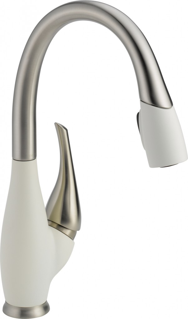
DELTA_Fuse_SnowflakeWhite

The Delta Fuse in Snowflake White

The Fuse Collection is something new from Delta Faucet and it pairs stainless and snowflake white (or cracked pepper, or chilli pepper). It is an interesting option for those wishing to highlight and combine their favourite colours and finishes.

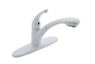
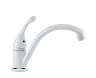
Other white options from Delta include:

Delta-Signature

Signature faucet

Delta-Collins

Collins faucet

I learned a few years ago that Delta is a division of Masco Canada. The Masco company includes brands like Brizo and Hansgrohe. These brands also carry some beautiful white faucets.
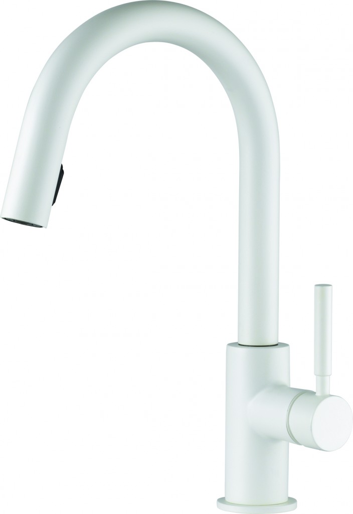
BRIZO_Solna_wht

Brizo Solna in White

The Solna is a new addition to Brizo’s collection of fixtures. It’s a modern statement of luxury. I love its crisp look and the fact that it is available with Touch2O® Technology.

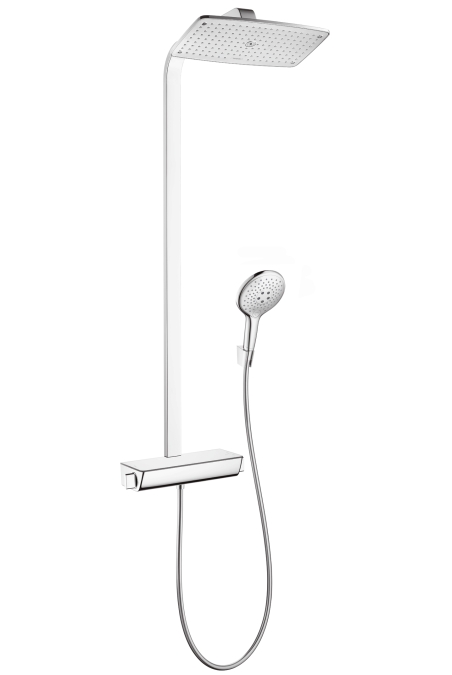
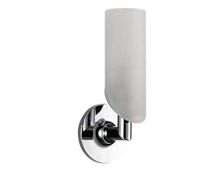
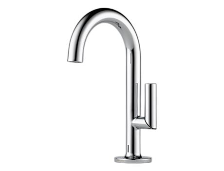
Additional statement pieces for kitchens and baths from Brizo and Hansgrohe include:

37__hpu53459_tif

Raindance Select Showerpipe, Hansgrohe

697075-PC-B1

Odin Light Sconce, Brizo

65675LF-PC-B1

Odin single handle lavatory, Brizo

When I bought my house I thought that I would just replace the faucets in the bathrooms but now that I’m living in the space, I’m eager to change the vanities as well. My Delta Tommy faucets are going to look great against new white vanities. I’m looking forward to sharing photos of the progress!

Design: Paris Hotels

I recently learned that I’ll be off to Paris for about a week in February. I can barely believe it. While I have been to Paris many times I am always eager to return. To say I’m excited about this trip – yes, even though it’s in the winter – is an understatement! I’m just thrilled!

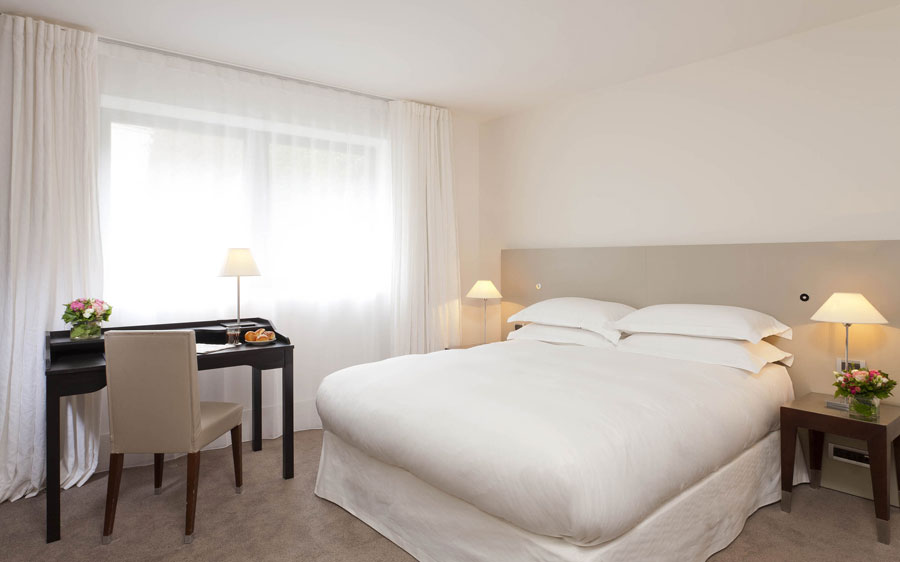
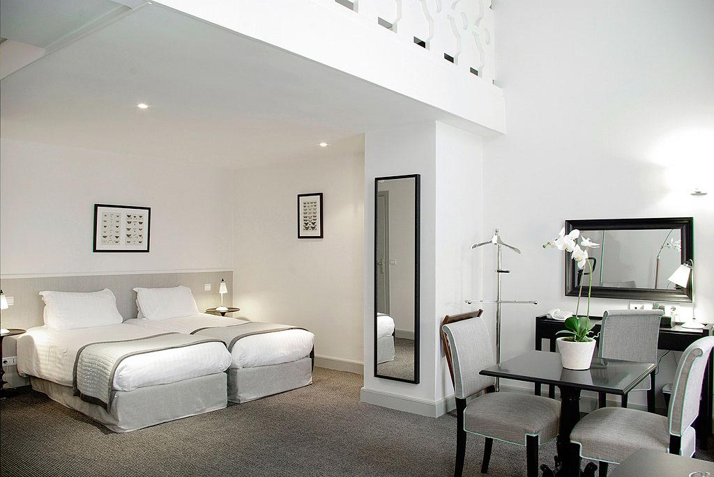
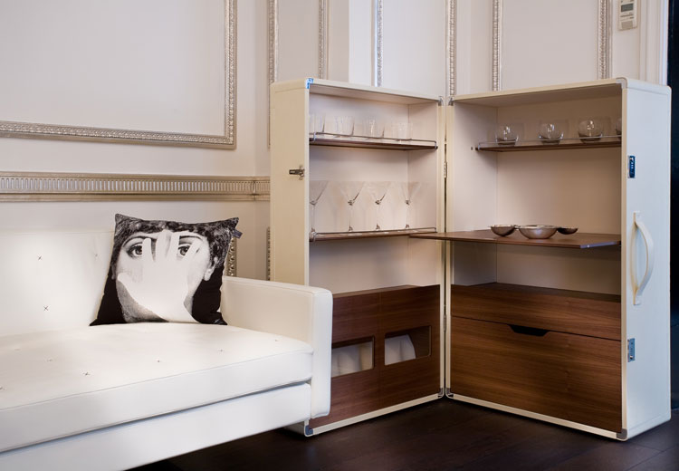
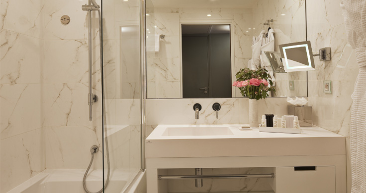
I’ve been having some fun researching hotels all over Paris. There are some amazingly beautiful spaces out in Paris that I’m just drooling over. And now you can too…

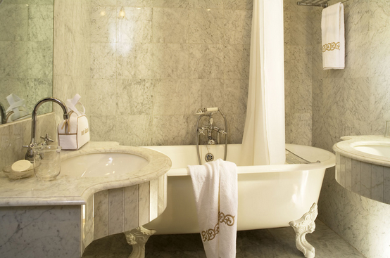
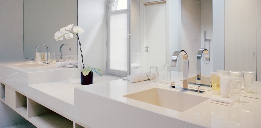
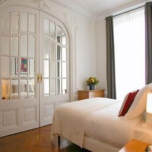
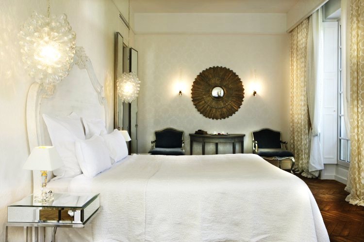
Intercontinental Paris Marceau

Intercontinental Paris Avenue Marceau

Maison_Champs Elysees

La Maison Champs Elysées

020-Hotel_Malte_Opera_-_APPT

Hotel Malte

Ares_White Lounge

Ares

7-Eiffel-hotel-salledebain

7 Eiffel

bath-hotel-west-end-paris

Hotel West End

LR_PAR_Appart_09

La Réserve

Opera-stockholm-bridgestreet-paris

Opéra Stockholm by BridgeStreet

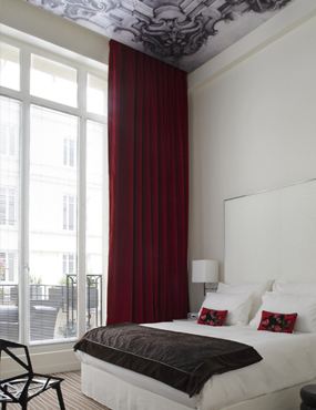
St James_root-deluxe-room-bed

Saint James Paris (the full website is definitely worth looking at)

Le Placide

Le Placide

Shangri-La Paris

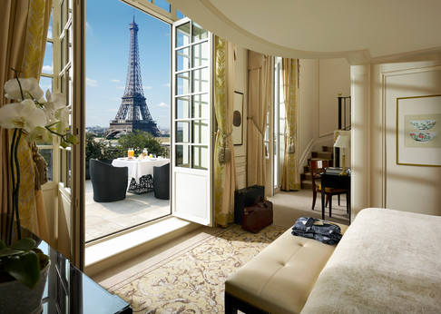
Shangri-La Paris

Hotel Lancaster Paris

Hotel Lancaster

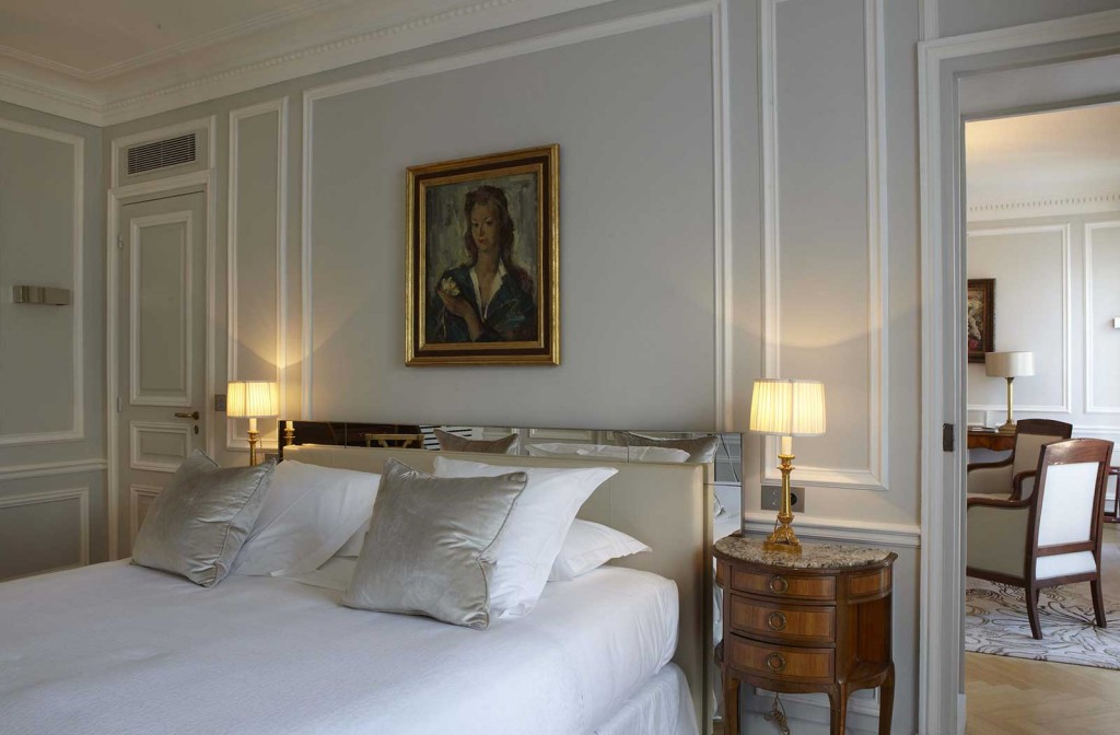
Aren’t 4 and 5 star hotels the best? I love the mix of modern and traditional decor of these Parisien hotels. And mostly I love the windows because I know many of these suites offer beautiful views of the city.

The Friday Five: Bathrooms

I love the variety of design in the bathrooms that I’m featuring in today’s Friday Five.

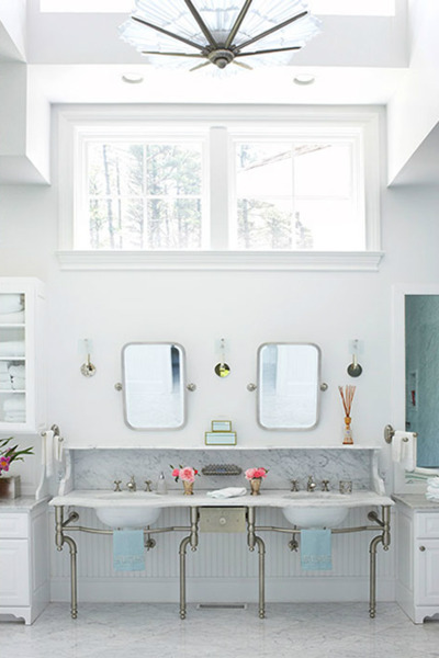
1. The tendency is toward vintage in this bathroom’s design. The art-deco chandelier, the simple mirrors, and the marble counters make this bathroom a winner from top to bottom.

what-a-bathroom

via Sojorner

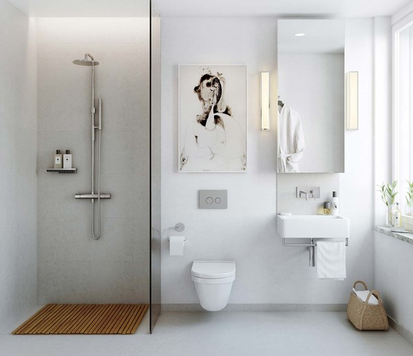
2. This bathroom is modern, modern, modern. The artwork, the shower faucet system, and the floating sink and toilet make this bathroom sleek and clean.

po-view10_131_513327b29606ee32db848e1f

via Emmas DesignBlogg

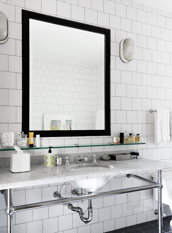
3. Exposed plumbing is one of the things that I’m attracted to in this bathroom. The simple oval sconces seem to add an industrial feel to this space.

bathroom_badrum_brooklyn_2

via Desire to Inspire

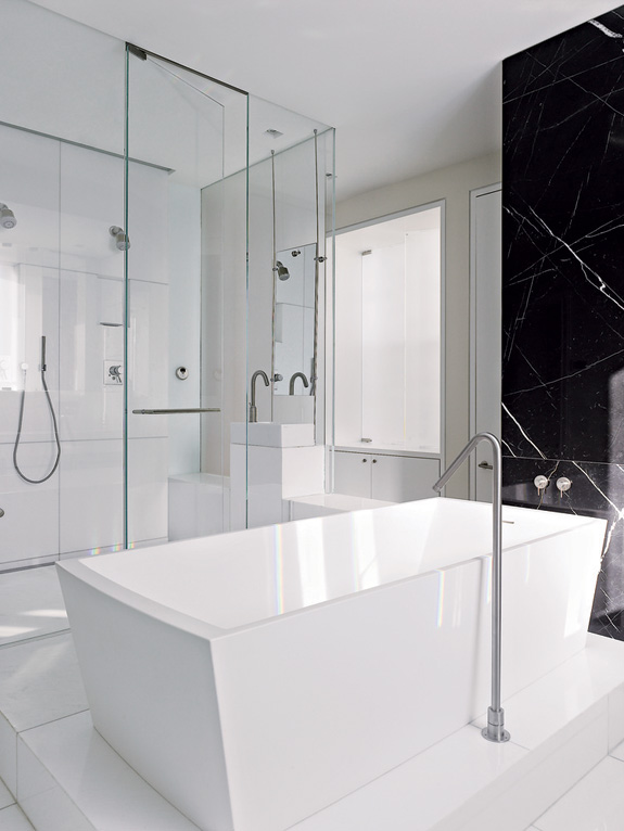
4. Shimmer and shine through the use of glass doors and walls makes this bathroom modern. The hard-edge tub and the simplicity of the stand alone faucet are two of the many elements in this space that make it stand out.

09-MH0509_ALPER_35Chicago residence by Dirk Denison Architects, via Desire to Inspire

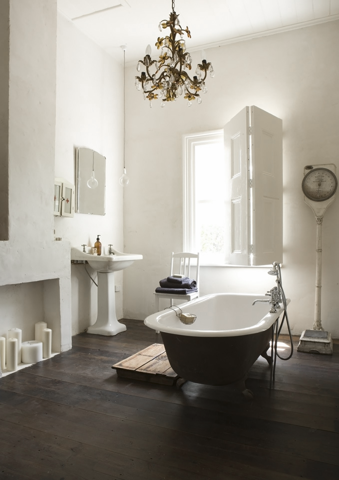
5. My favourite feature in this bathroom is actually the window because it reminds me of France. I love the addition of the antique scale and the simple light ball fixture over the sink. It’s a little bit rustic and a whole lot of calm.

bathroom

via 79Ideas 

Happy Friday!

Have a great weekend everyone!

Interiors: Repetitive Forms in Bathrooms

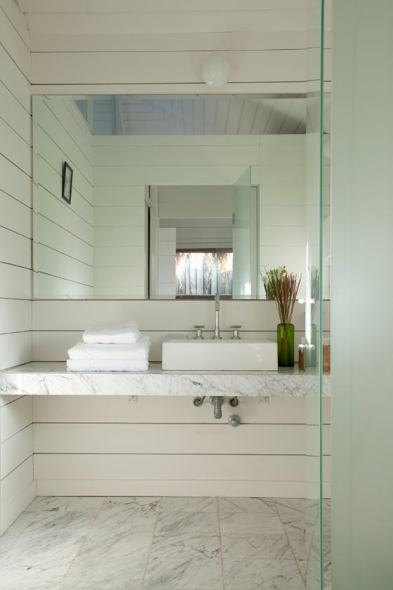
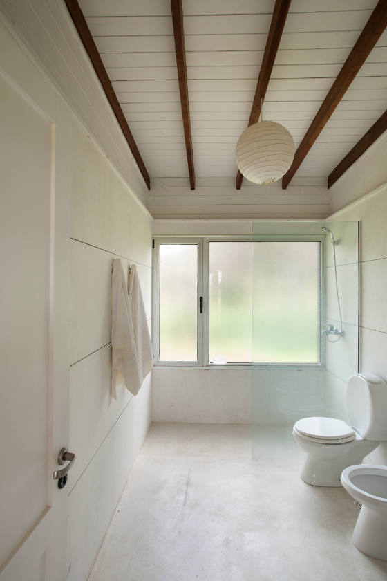
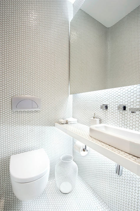
I love the textures and patterns in each of these three bathrooms. Horizontal lines, marble veining, and an abundance of small tiles make each of these spaces pleasing to the eye. Repetitive forms and white design is a winning and classic combination. Wouldn’t you agree?

bathroom designed by Martin Gomez Arquitectos, via Desire to Inspire

bathroom designed by Martin Gomez Arquitectos, via Desire to Inspire

bathroom designed by Eque y Seta via Desire to Inspire