I hope all my Canadian readers are having a wonderful Thanksgiving!
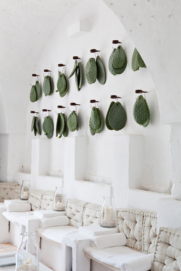
 Puglia’s Masseria Cimino, photo by Carla Coulson
I hope all my Canadian readers are having a wonderful Thanksgiving!
 Puglia’s Masseria Cimino, photo by Carla Coulson
I currently have two large canvases leaning against my office wall waiting for me to paint. My parents commissioned me. (Can I pretend it’s a real art gig?). While I’m not quite ready to paint them (lack of free time as of late), I am ready to share some of the interesting pieces art I’ve been eyeing lately.
Jenny Andrews Anderson – Moontower, $625, via Citizen Atelier
Jenny Andrews Anderson – Pearlseed, $625, via Citizen Atelier
Robert Mapplethorpe – Bike Couriers, $4500, via Caviar20
Jenny Holzer – Top Secret, $3500, via Caviar20
Joseph Albers – I-S VV 1, $4000, via Caviar20
Berenice Abbott – Sumner Healy Antique Shop, New York, 1936, via 1stDibs
Keith Carter – Boy with Bee, $1600, via 1st Dibs
Mario de Biasi – Trattoria Le Pergola, Milano, $2000, via 1stDibs
Life – Natural Curiosities, $1988, via Domino
There’s more black than white in most of these pieces, and I love how different they are from one another. The “top secret” piece is so amusing (to me, anyway).
Brian Gluckstein. Damn, he’s good.
This past weekend, Brian Gluckstein and the Princess Margaret Welcome Home Sweepstakes invited a group of bloggers to attend Brunch with Brian at this year’s Oakville Showhome. Our private event included an detailed tour led by Brian, delicious food by Chef Logan, drinks from Pluck Teas and Rosewood Wine, and an amusing Q & A session with the man of the hour.
So, let’s go on a photo tour, shall we?
The foyer and grand staircase in the Oakville showhome is beautiful. It reminds me of entrances I’ve seen in France. I love the iron railing and the massive windows. The light in this foyer – and throughout the house – is enviable.
front foyer with grand staircase and herringbone porcelain tiles
Just off the foyer is one of my favourite spots in the house (but too dark for White Cabana). Believe it or not, the all-black powder room really caught my attention. Luckily, the dark powder room has natural light coming through, which makes it more moody than dreary. The tile work also reminded me of European homes. (Sorry, I don’t have any photos to post. You’ll have to go to the showhome to see what I’m talking about!)
Just to the left of the foyer is the grand living room. The see-through fireplace that connects the front foyer to the living room is a beautiful addition. It was manufactured in and shipped over from Portugal. Classic shades of cream made this space bright and classy, and the floor-to-ceiling windows are impressive.
white mantle in the front living room
the see-through mantle in the front foyer
bright and white in the living room
the living room and dining room viewed from the staircase
Q & A session with Brian Gluckstein
How many pot lights around the perimeter?
Everyone and their sister is talking about the indoor tree in this showhome. Yes, an actual tree…planted in the ground! I was fascinated by Brian’s explanation about the amount of thought went into this tree; flooring, ventilation, etc. were all considered when Brian designed this room around the tree. I’m such a sucker for offices, as you may know, and this one is stunning.
a house built around a tree
This house is full of interesting art and gorgeous skylights.
one of the many beautiful pieces of art
one of the many skylights
The kitchen’s toaster wall is completely unique. The collection of toasters from the 1930s turned into a beautiful art installation and feature wall in the reasonably-sized white kitchen.
toasters – just for looks
there’s a fridge behind these doors
Of course, the La Cornue stove adds to the beauty in this space. I could make killer scrambled eggs on that gem, I’m sure!
La Cornue + Pluck Teas
There is more delight upstairs. The master bedroom is big and airy. The white bedding and layers of pillows add luxury to this space, the sofa adds comfort, and the walk-in-closet is, well, pretty much perfect.
white linens in the master bedroom
creamy details in the master bedroom
Who wouldn’t love this closet?
Brian is a wizard when it comes to bathroom design. The tile work in each bathroom in this house (I lost count of how many there actually are…six maybe?) is something to really note. The master bathroom is generously sized and the layout is flipped. Here, the vanity is in front of the windows and the bathtub is floating on the other end. I loved it when Brian talked about the affordable route he took to install the vanity mirrors. Brian and affordability – not the combo you’d really predict, right? Although it looks like the mirrors are framed in steel, they’re actually framed in painted wood. The bars are made of shower rod holders and pipes. That’s where the affordability ended, though. The cast iron Kohler bathtub costs a pretty penny! It’s the same one that Brian has in his own home.
here I am in the master bathroom
double vanity surrounded by natural light
white monogrammed towels in the bathroom
floating Kohler tub in the master bathroom
floor tiles in the master bathroom
my favourite light fixture in the house
the jack-and-jill bathroom vanity
here I am in the white jack-and-jill bathroom
Also upstairs is a sweet little office. Brian maximized storage in here with floor-to-ceiling shelves. In fact, this space was originally a hallway, but Brian suggested that the walls be bumped out (and a foot taken from each of the rooms on the other side of the walls) to make it a useable room. The skylight provides loads of natural light. And, yes, I could see myself working in here as well. I’m a sucker for offices, remember?
a white hallway leading to the office area
a bright place to work on the second floor
Another one of my favourite spaces in this house is the wine cellar. Just look at it.
I want one.
Brian, the wine cellar, and the exercise room
You can work off the calories you drink in your private exercise room.
The basement family room is darker than I normally like, but I’m wondering if this is something I should consider for my own basement. Would I dare go dark? The white matting on the gallery wall art brightens up the room as does the sofa and the lighting.
the basement family room (it doesn’t feel like a basement, does it?)
The white and grey laundry room in the basement is spacious and has top of the line machines. The cabinetry, we learned, is from a big box store that was painted and framed with additional moulding.
laundry room details
the spacious laundry room in white and grey
Brian was kind enough to take photos with all his blogger fans. Here we are…
Brian Gluckstein and Jordana
Other things I learned during #BrunchWithBrian that might interest you:
1. Brian eats the same breakfast every day: yogurt and berries. Brian, I eat the same thing every day, too (toast, berries, and a latte).
2. Brian enjoys Pinterest just like the rest of us!
3. About 60-70K people come through the Oakville showhome each year.
4. Brian can’t imagine a space without art.
5. Brian reads the blog The Blue Remembered Hills.
6. Brian’s design influences include Billy Baldwin, Jean-Michel Frank, Edwin Lutyens, and Kalef Alaton.
7. It took less than a year to buy the Oakville showhome lot, demolish the original house, build a new house, and decorate it.
8. Brian did not shy away from mixing metals in this house.
9. Brian is as classy, approachable, and intelligent as you may imagine.
10. The foyer drapes are 30 feet in length and the trim is made of one continuous piece.
As if you need any more convincing! Order your ticket!
Photos by Jordana. For more photos (really beautiful ones) of the Oakville showhome, click here.
To see the 2013 Oakville showhome design by Brian Gluckstein, click here.
Remember the time I toured the GlucksteinHome design office? That was fun.
Many thanks to Brian Gluckstein, Cheryl K., Laura Z., Chef Logan, Rosewood Wine, Pluck Teas, and the Princess Margaret Lottery Foundation for hosting a classy and fun brunch.