Art: Nithikul Nimkulrat’s Paper World

Some people have talent!

A colleague recently introduced me to the work of artist and textile designer Nithikul Nimkulrat after seeing her present at an academic conference in Europe. I am amazed at the intricacy of Nithikul’s white woven pieces of paper string and the way she thoughtfully and carefully combines art and research.

The Chandelier No. 2

The Glass and the Straw

The Cradle

The Coal Rake

The Birch Tree

The Man

The Chair

Isn’t it absolutely incredible what Nithikul can do with paper string? You can see more of her work here. She has also written this book which I’m sure does not disappoint.

Images courtesy of Ini Creation. Many thanks to Catherine D.H. for sending this my way.

Friday Five: Living Rooms

It’s Friday! I’m ending the week here on the blog with five inspiring living room spaces and sharing with you what I like and dislike about each space. I welcome your opinions too so feel free to comment below!

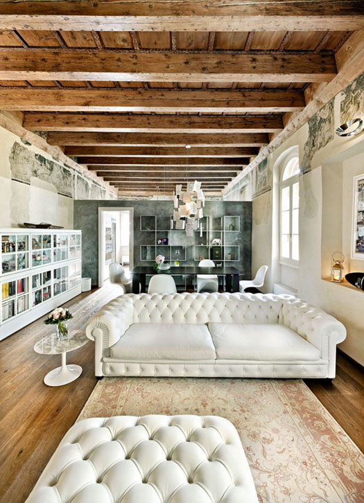
1. There are a few great aspects in this first space. The juxtaposition of old and new is attractive to me as is the awesome tufted white couch. I could to without the rug in this space though as I think it should be a touch larger.

Le Case di Elixir via Desire to Inspire

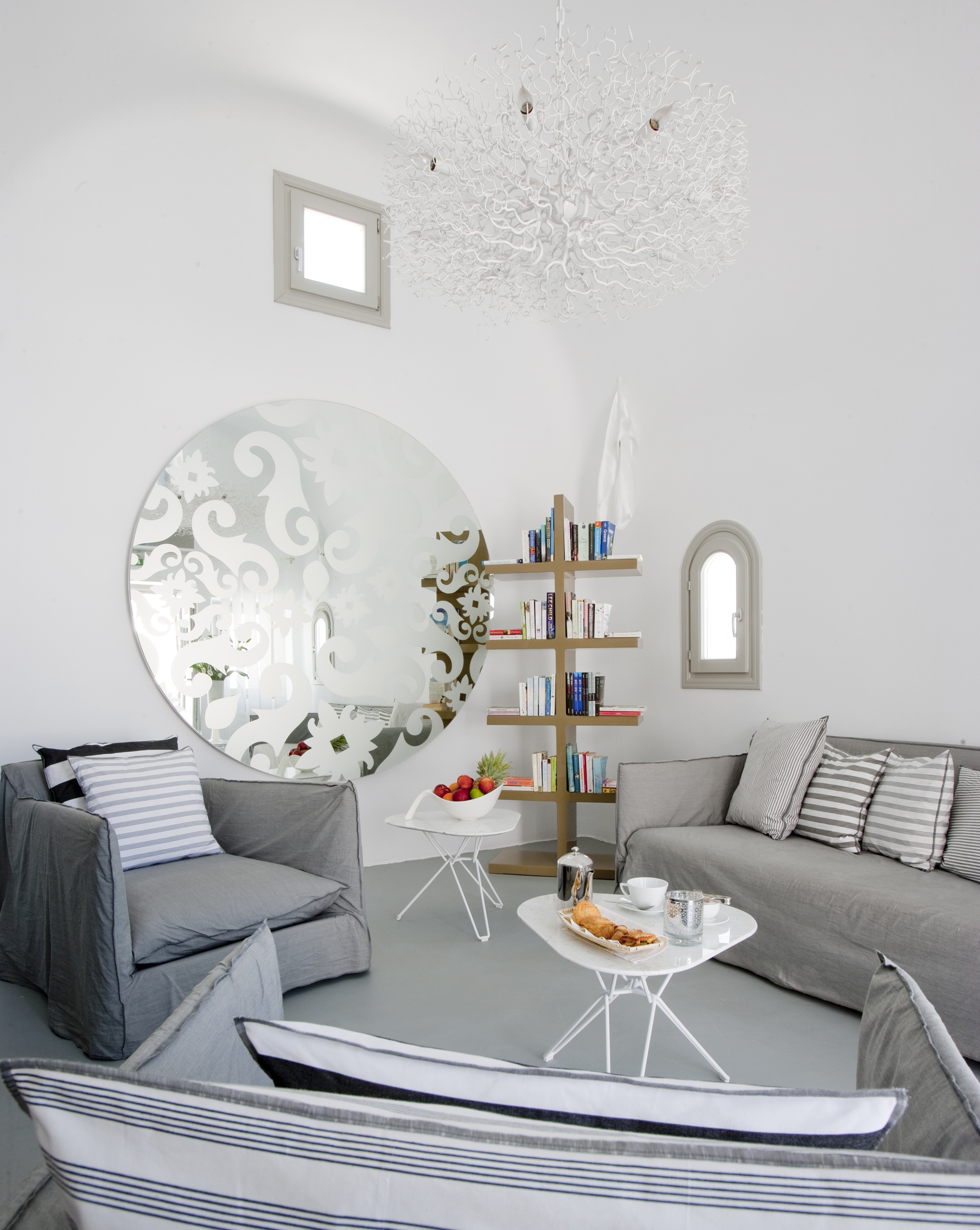
2. In this corner at the Grace Hotel in Santorini, I love the white, white walls and the high curved ceiling. I also like the sculptural light fixture and sweet curved window. I would get rid of the mirror though and maybe add some art in its place.

Grace Hotel Santorini

3. I love almost everything in this third space. The layered art pieces leaning against the paneled wall and the comfortable side chair are very appealing. The substantial stone fireplace is a beautiful feature in the room and the variety of textures in the room draw me right in. I would probably opt for a different sculpture although I can’t say that I completely dislike cupid.

via EclecChic

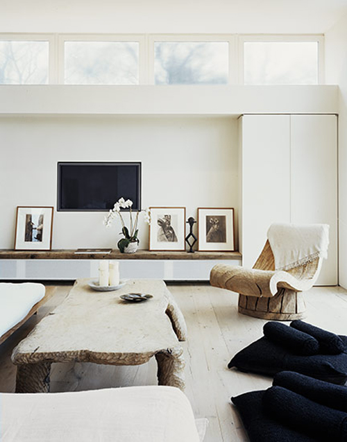
4. In this Douglas Friedman space I love the mix of textures – wood, lacquer, soft fabrics. I also like the clean lines of the high rectangular windows. I do wonder, though, how comfortable the side chair really is.

Douglas Friedman via The Style Files

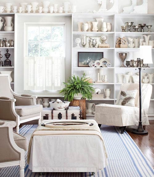
5. In this last space I think the collection of white trophies, goblets, and vases is incredibly impressive. I love multiples and I am always curious to see what people collect. The layers of shades of white is also attractive to me. I do wonder if there are additional touches of blue throughout this space or if it is restricted to the striped carpet. I am a fan of a comfortable couch so it’s a bit disappointing that there’s no couch in this space (or as far as the photo shows).

via The Painted Hive

Let me know what you think! And have a wonderful weekend! Happy Friday!

Design: Andy Martin Studio + Thonet

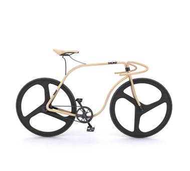
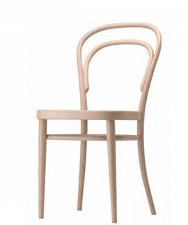
The collaboration between London-based designer Andy Martin and furniture manufacturer Thonet has resulted in a beautiful beech-framed bicycle. Yes – beech as in the wood. Isn’t it incredible how the form of the bicycle mimicks the classic Thonet bentwood chair? Simply gorgeous.

Andy Martin + Thonet = beech wood bicycle

Thonet’s classic steam-bent beech wood chair

Images courtesy of Andy Martin Studio.

To do: The Design Exchange

Here’s something for the upcoming rainy weekend in Toronto: check out the new and ongoing exhibits at the city’s  Design Exchange (DX).

Located in the spectacular space formerly the hectic trading floor of the Toronto Stock Exchange, the Design Exchange “is Canada’s only museum dedicated exclusively to the pursuit of design excellence and preservation of design heritage.”

I highly recommend dropping by to see what’s in house and on display at the DX, and if you have no time for a proper tour, the gift shop is a mecca of cool finds, unique books and design gifts. I’ve always found a DX visit inspiring and refreshing and I know if you’re reading this blog, you’ll like your visit.

A few current exhibits you will enjoy at the DX:

Vertical Urban Factory, Sep. 3- Dec. 9. Looking at more than 30 factories to consider their integration within urban settings such as Detroit and New York, with case studies such as the American Apparel factory in L.A. and the VW “Transparent” factory in Dresden, Germany. (paid exhibit)

Considering the Quake: Seismic Design on the Edge, Sep. 13 – Dec. 9. “Design meets practical application. Examples: From ARUP’s Hermès Building featuring the work of Renzo Piano Architects in Tokyo, Japan and their York University Subway Station with Foster and Partners in Toronto, to Daniel Libeskind’s Contemporary Jewish Museum in San Francisco, to Cast Connex’s seismic technology that will be included in New York City’s World Trade Center 3 design.” (included with general admission, about $10)

Permanent/ongoing exhibit –  the Must-See:

DXUNCRATED

This exhibit features iconic pieces from the Design Exchange’s permanent collection, which celebrates Canada’s rich industrial design history from 1945 to the present. Spanning over five decades, the Design Exchange’s permanent collection covers more than six hundred industrial design objects and archival materials including furniture, housewares, textiles, electronics, and lighting. DXUNCRATED illustrates political, technological, and social changes that occurred following World War II to present day. Items on display will include the famous Clairtone Project G Stereo (pictured below), Thomas Lamb’s Steamer Chair, and Russel Spanner’s Dining Chair.
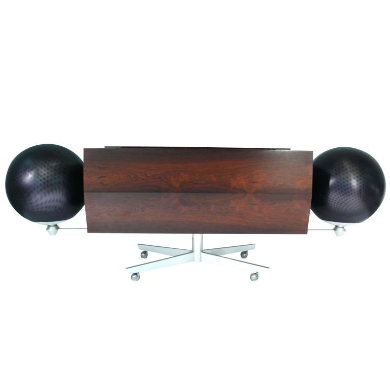
The Clairtone Project G stereo produced by Clairtone from 1964-7 is a Canadian design icon

To celebrate all that is design and Canadian ingenuity, this year’s annual fundraising party coincides with the DX’s relaunch on November 16, featuring interactive design installations, fancy food from celebrity chefs, and today’s big names in Canadian design. Find out more here.

Origami chair

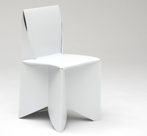
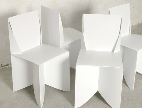
The lovely life-sized origami-style Folder chairs by designer Stefan Schoning are assembled by folding them just like an origami creation. How cool is that?

The ‘Folder’ can withstand your weight since it is made from paper-thin polypropylene, which means the look is very cool and the construction lightweight, rigid and tough. The chairs more durable than wood, plastic or metal and have been exhibited around the world: the National Design Museum in NY, Nike Design Library in Oregon, Colette in Paris, Salone Satellite in Milan, and 100% Design in London, UK.

What’s not to love?

Images courtesy of Stefan Schoning.

1 42 43 44 45 46 47 48 72