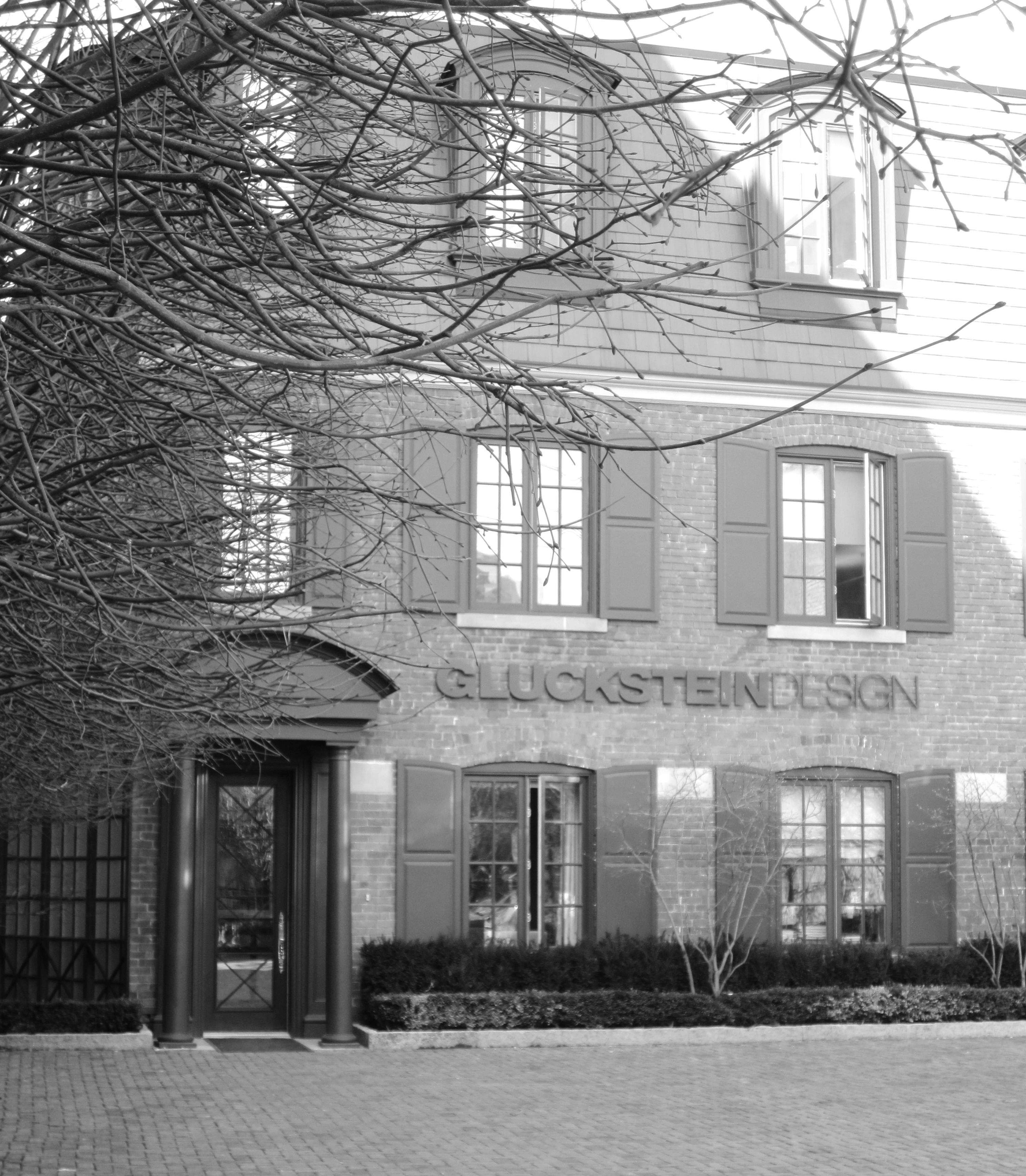
As a blogger I sometimes get the opportunity to do some pretty cool things. Most recently, I was invited to visit the Toronto offices of GlucksteinHome. (Hooray!)

I feel so grateful that the GlucksteinHome team stopped their work for a while (don’t tell Mr. Gluckstein) to show me around their all-white space. And of course I am thrilled to be able to share my photos with all of you.

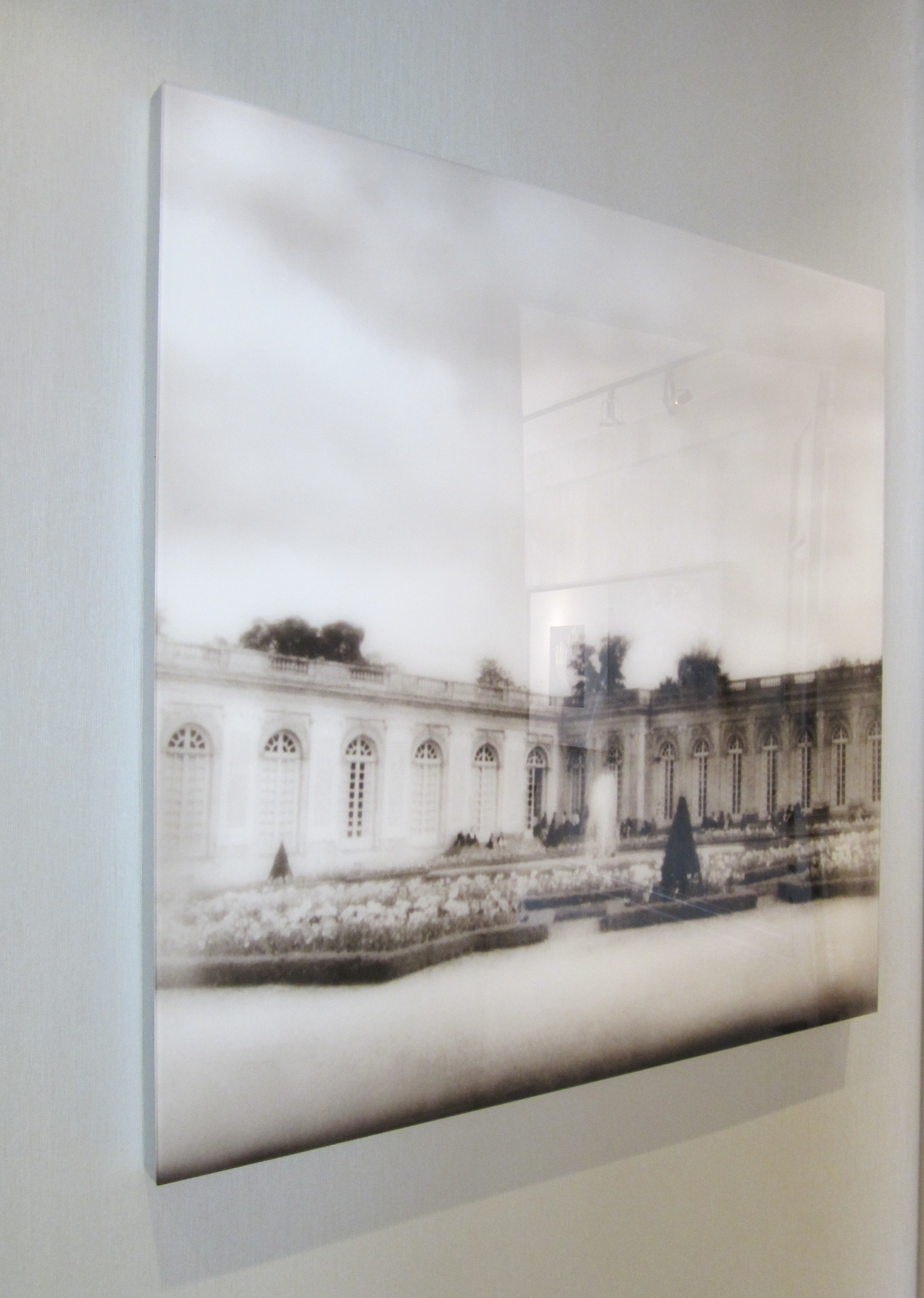
White artwork at the GlucksteinDesign offices

GlucksteinHome product planning
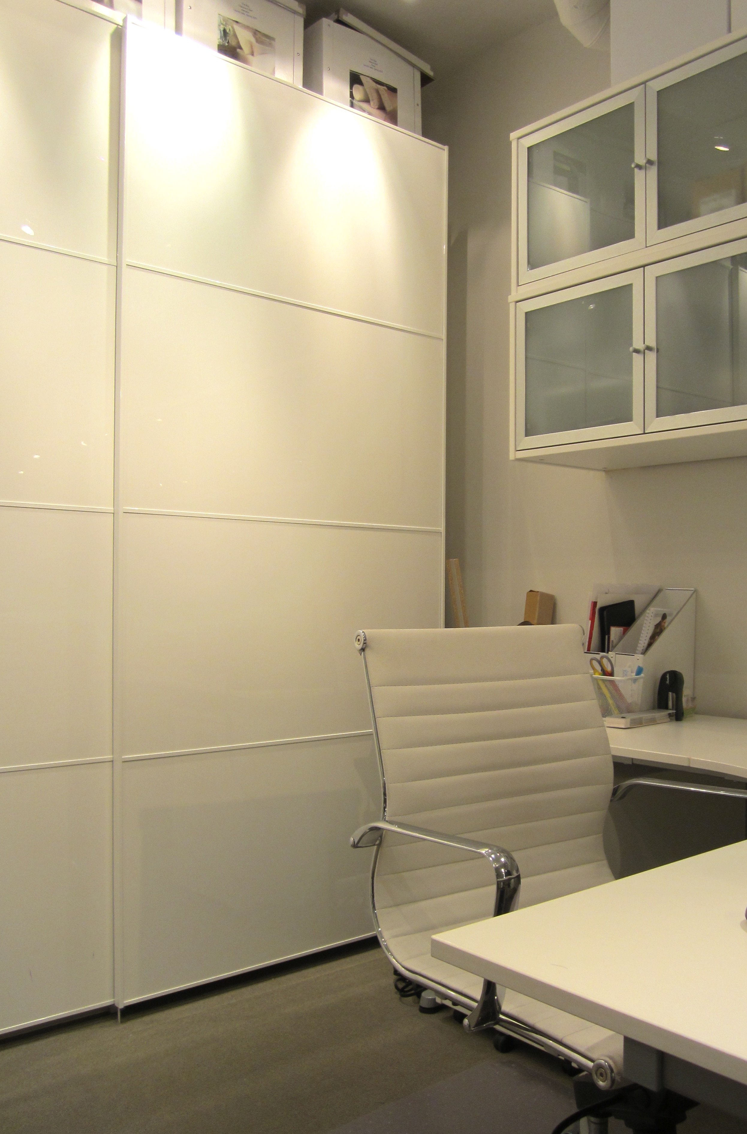
Now, if you know the work of Brian Gluckstein, you know that he’s pretty much a traditionalist. Gorgeous neutral fabrics, rich woods, and perfectly placed accessories come together to create the most inviting spaces. What you may be surprised to learn is that the office space of the GlucksteinHome division is a super sleek, well-designed, modern, all-white work space that is filled, almost floor-to-ceiling, with IKEA products.

GlucksteinHome work station

Corner cabinet at the GlucksteinHome office

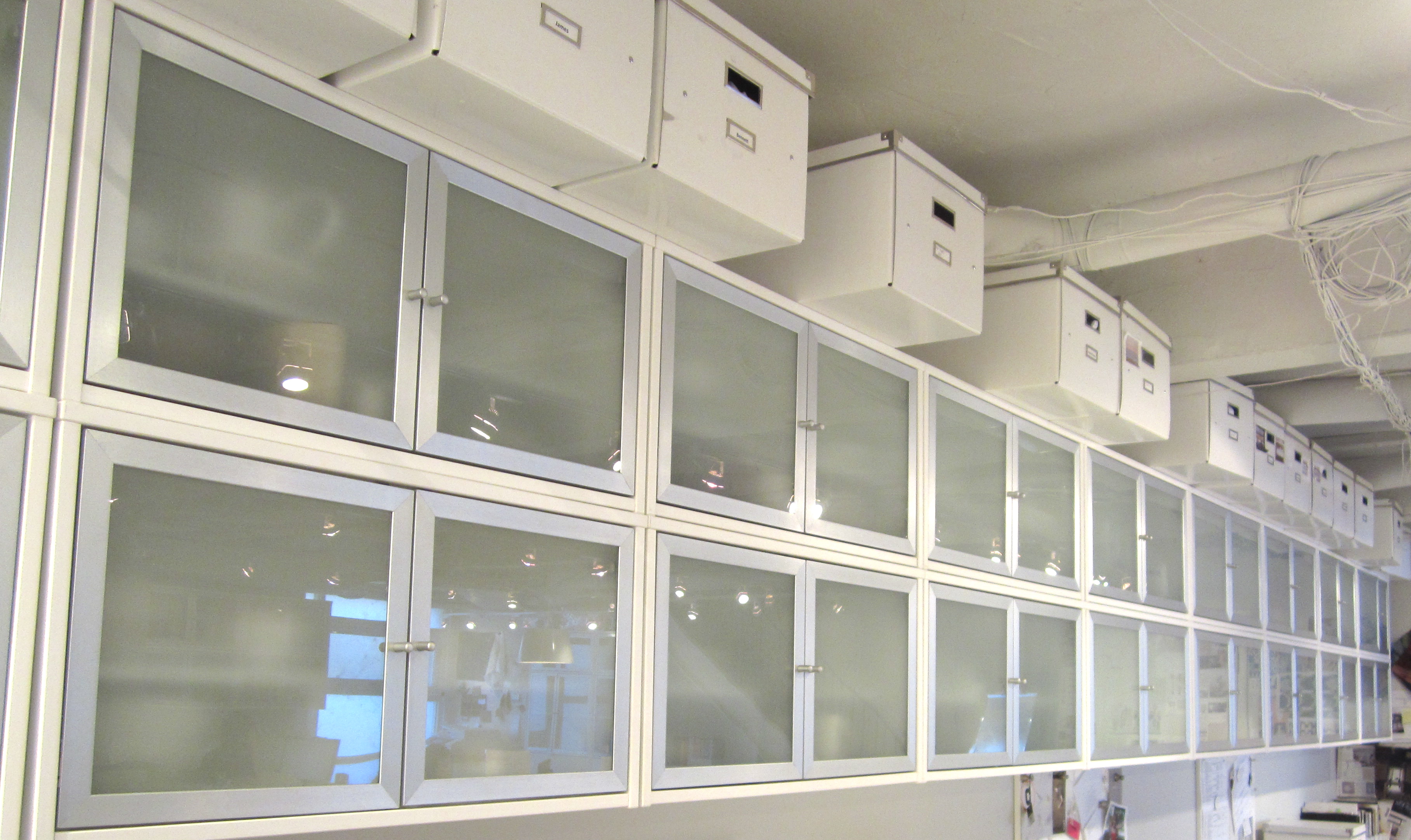
Amazing storage solutions at the GlucksteinHome office

A perfect meeting space

Organized Pantone colours for upcoming collections

Gorgeous fabric swatch

A lot of white paper at GlucksteinHome

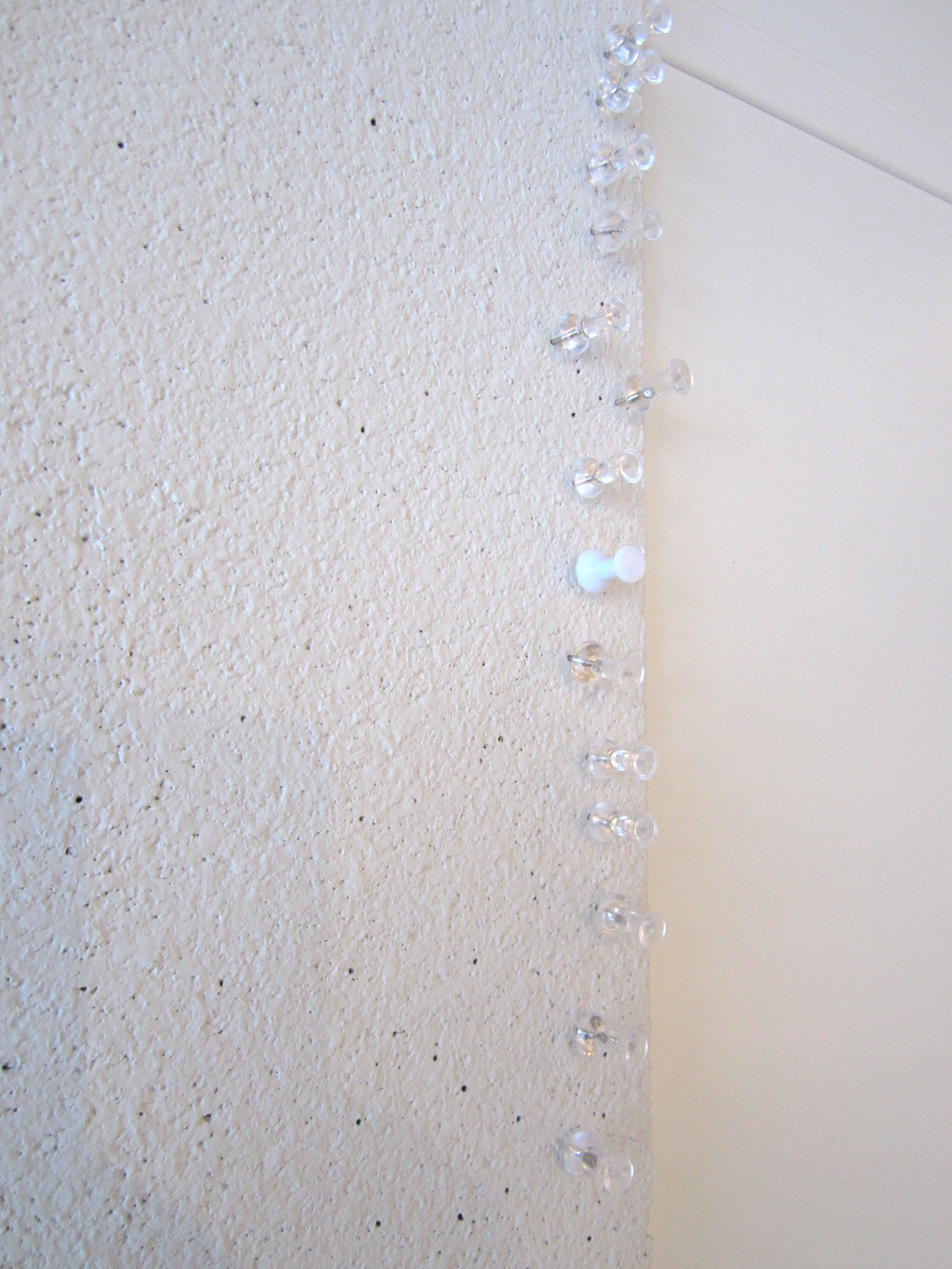
Even the pushpins at the GlucksteinHome office are white and clear

Product designer Lauren hard at work

Lauren, me and Cheryl, the GlucksteinHome PR pro

Me at the GlucksteinHome office – with a little bit of Pantone colour

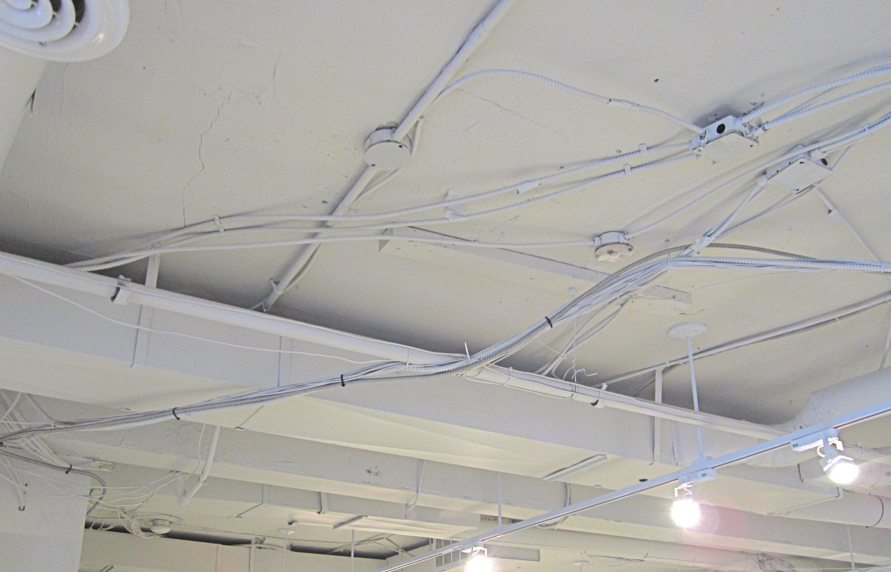
Yes – even the ceiling and wires are white. This makes me smile.
I feel so lucky that Cheryl, Lauren and the whole GlucksteinHome team welcomed me so warmly into their work environment. I have to admit that I’m pretty envious of their lovely white space. But of course, with Brian Gluckstein at the helm why should I expect anything less than perfection?
Many thanks to Cheryl and the whole team at GlucksteinHome for welcoming me in, showing me around, and treating me to an all around fabulous afternoon.
Photos by Jordana.


