Stationery: Daniella Marie Stationery & Design

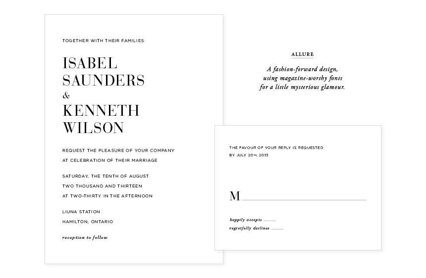
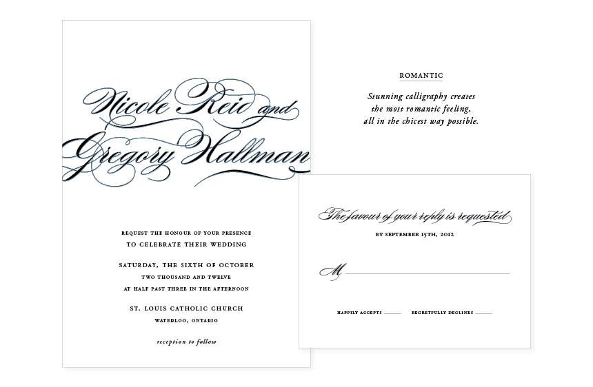
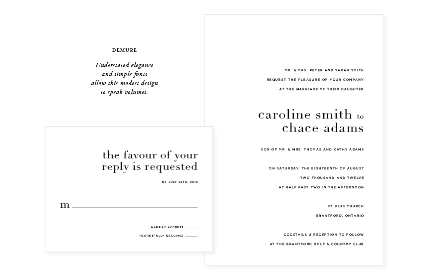
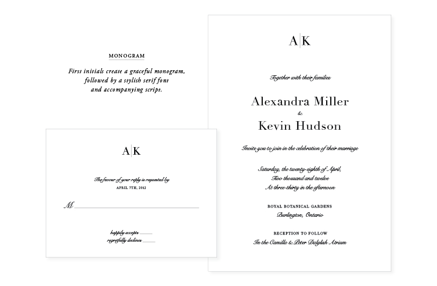
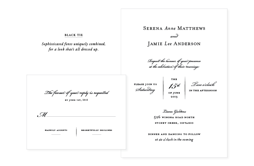
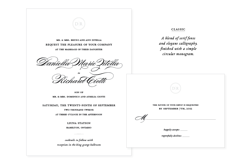
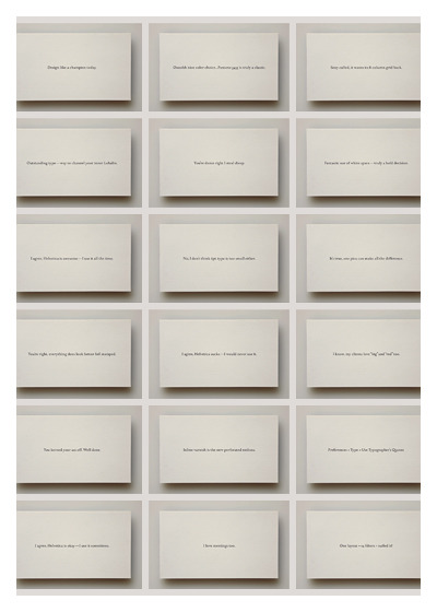
Contrary to what some believe, invites, in my opinion, are one of the most important details of a wedding. They set the tone for the whole affair and they are the first thing to welcome your party guests. Canadian blogger and designer Daniella Marie recently opened up her stationery and design business and her wedding invite collection (it’s letterpress, of course!) is just beautiful.

dmd_blogpages_invitepages9


Alluredmd_blogpages_invitepages5

Romanticdmd_blogpages_invitepages6

Demuredmd_blogpages_invitepages4


Monogramdmd_blogpages_invitepages2

Black Tiedmd_blogpages_invitepages


Classic

Everything – like wording and colour – is customizable which gives couples the opportunity to have their invitations reflect their personalities and style.

Congratulations Daniella on your new venture!

All images courtesy of Daniella Marie Stationery & Design.

Travel: Expedia Ad Campaign

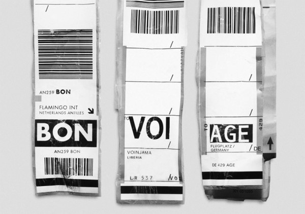
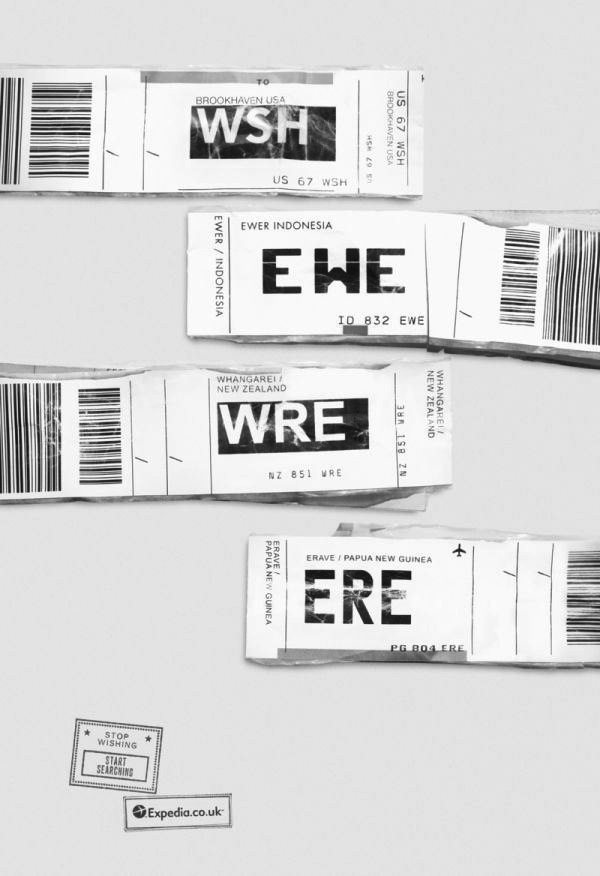
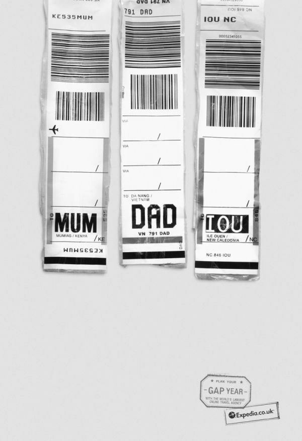
I just love this ad campaign created by Ogilvy & Mather for Expedia. Clever, clever, clever!

travel-tag-texts-campaing-for-expedia-600x422 travel-tag-texts-campaing-for-expedia-1 travel-tag-texts-campaing-for-expedia-7via Lotta Agaton

But then again, it’s not like I really need an ad campaign to convince me to travel. My passport is always ready! (And fyi – I most often than not use Expedia for flight, car and hotel bookings because it’s cheap, convenient, and provides good customer service.)

A central square with a hint of pink

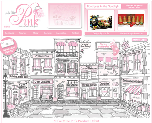
I adore today’s feature pic: an illustration designed for graphic design firm Cottage Collections‘ website. No wonder the site won a design award back in ’08.

Isn’t this European market square space sweet and charming, and a perfect space to enjoy a Mayan hot chocolate with your loved one on Valentine’s Day?

Or a glass of pink bubbly would do.

Make-Mine-Pink


Image courtesy of Cottage Collections


Celebration: White Cabana Gets a Makeover!

I am so happy to reveal White Cabana’s new look! It’s a bit more sleek and a bit more white (yes!).

There are a few more things to work out over the next little but for now please note that the new web address is whitecabana.com.

I would like to extend some very heartfelt thank you to some people who have helped make this all possible:

Shannon from AKA Design – Thanks for convincing me that a blog redesign was something that I could actually handle. It worked! Thanks also for taking the time out of your very busy life to answer my questions!

Patricia from Mira Belleza – Thanks for designing such a beautiful site…and for answering my ongoing list of questions.

The Namespro team – Thanks for making the blog transfer process so easy. Your technical support team was so incredibly supportive and clearly answered my never-ending questions!

(Is anyone noticing a theme here – my questions!?)

White Cabana’s fabulous contributors – Johanne, Mackenzie & Troy – thanks for being an awesome and very intelligent team!

My family – Thanks for giving me the thumbs up on all the blog design previews I sent you!

White Cabana’s readers – Thanks to you for stopping by the blog on a daily basis! I am so happy to share my love of white with all of you!

And before I leave you to enjoy a very lovely Monday, here’s a look back at White Cabana’s style…
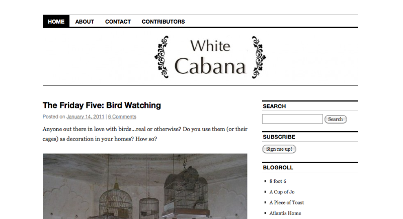
White Cabana – the original header designed by Johanne
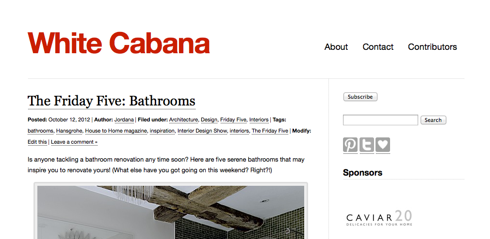
White Cabana – live until October 2012
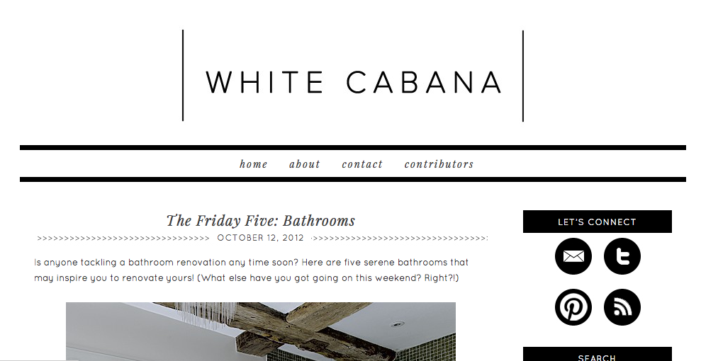
White Cabana – live since October 2012