This kitchen is so calming and sleek.
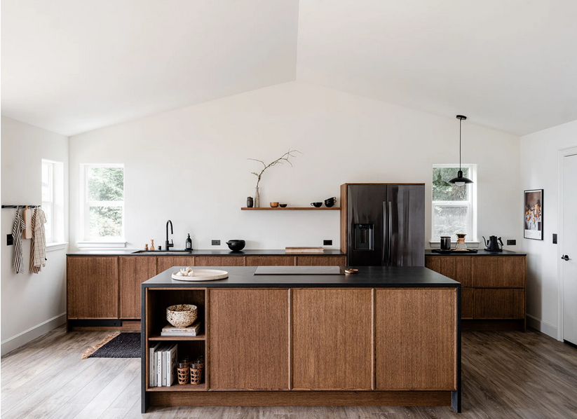
You’ve got to check out the before photos.
Design by Erin Hiemstra. Styling by Cassandra LaValle. Photos by Kara Mercer. Via Style By Emily Henderson.
This kitchen is so calming and sleek.

You’ve got to check out the before photos.
Design by Erin Hiemstra. Styling by Cassandra LaValle. Photos by Kara Mercer. Via Style By Emily Henderson.
When I look at the photos I’ve been taking and saving recently, there are some commonalities. One common feature is the black and white checkered floor.
I seem to have always been keen on checkered floors; I wrote this post about checkered floors back in 2016! My plan is to add a checkered floor to our entryway (hopefully I’ll get to it this spring). I think it’ll be so pretty.
I have been spotting very similar designs in my travels online. Look at how closely these items resemble one another.
This…

and that…
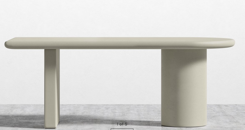
This…
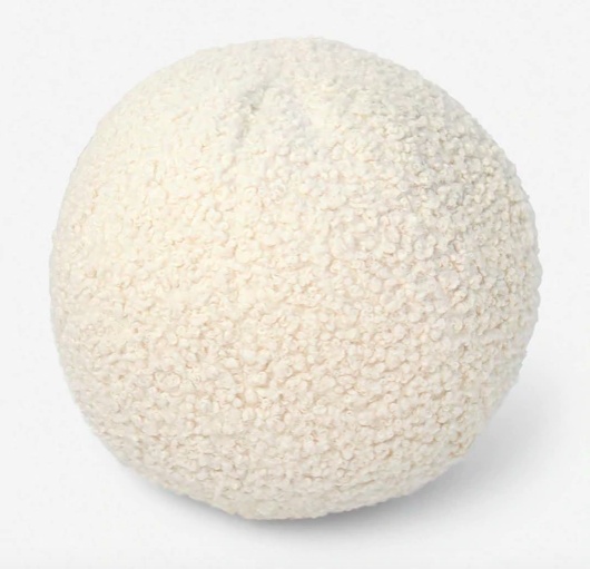
and that…
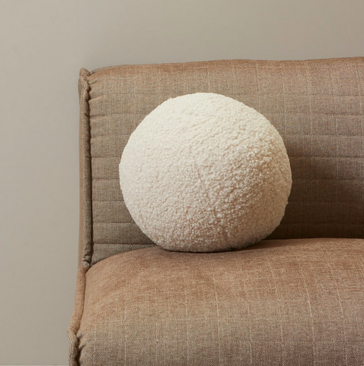
This…
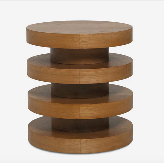
and that…
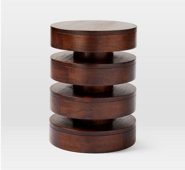
This…
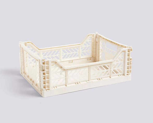
and that…
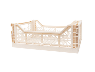
This…

and that…
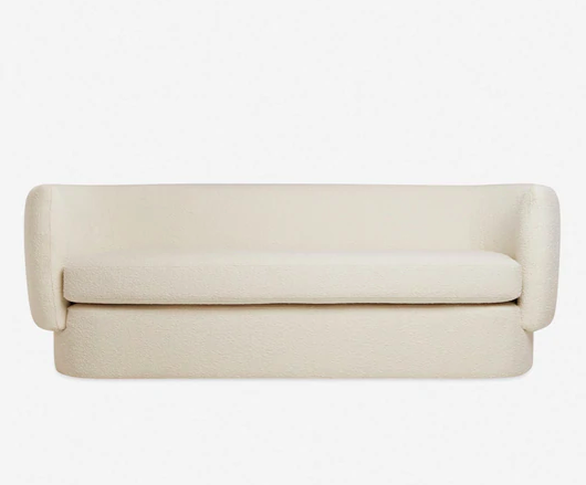
As I’ve said before, our house needs very little in terms of renovations. Our largest renovation projects would be the kitchen and the backyard. And even then, the renovations aren’t essential…they’d just make me enjoy our house even more than I already do! 🙂 So the projects we’ve been slowly doing at the house are small tweaks to increase functionality and aesthetic.
One of the spaces that I’ve spent a bit of time working to improve is our main floor powder room. It was a white box that I knew could get even whiter.
Here’s what the space looked like when we moved in:
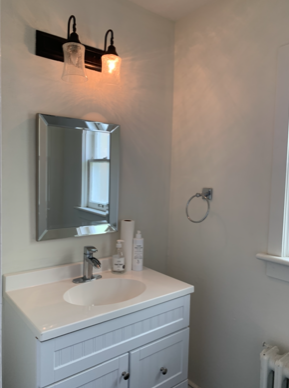
The bathroom was white and bright, but the light fixture was broken, the mirror was small, and the towel ring wasn’t my aesthetic.
We didn’t want to put too much money and effort into a massive renovation (like installing a custom vanity), but I knew we could do a few things to make it nicer. So we did!
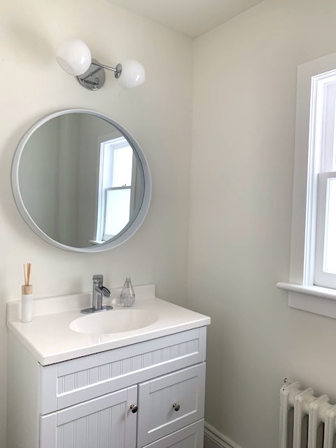
One of the best things I did was to repaint the walls. They weren’t in the best shape, so I patched up a lot of holes, smoothed out a few gouges, and gave the whole room a fresh coat of white paint (leftover Benjamin Moore Simply White). The new paint job – like so many people often say – made a world of difference to this room. Magic!
Beyond the painting, I polished the window hardware (more magic!), hung a round mirror, and installed a modern light.
Seeing the before and progress photos makes me grin. A few tweaks has made a huge difference in the function and aesthetic of this space.
That said, the room transformation isn’t quite complete. The towel bar and toilet roll holder will arrive next month, and we have to decide on art. I’ll be happy to share more photos when all the pieces are in place.
I didn’t intend to inject my basement with shades of pink, but some things were just meant to be. I couldn’t fight it. I didn’t want to fight it.
After I wrote about Minted’s collection of large-scale art, I was just about certain I was going to get a black and white piece for over my day bed. Instead, I was mesmerized by this piece, and I couldn’t say no. Minted generously sent over the gorgeous abstract art, and it hung vertically above my day bed for many months as I made progress on my fireplace redo.
*** Warning: Pink is about to make a brief appearance on White Cabana. ***
Once my fireplace makeover was complete, I turned my attention back to the daybed area of my space. I opted to rehang Katie Craig’s print horizontally, and I think it works much better in my space.
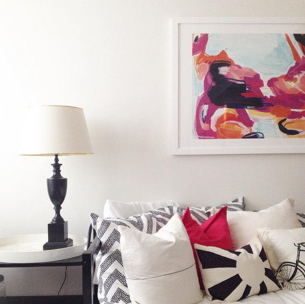 I adore the large-scale version of Katie Craig’s print. It’s bright and dramatic and bring a whole lot of interest to my space. As you can see, the room is still very much dominated by black and white even though there’s colourful art on the main wall. The addition of fuchsia brings me joy, so I think I’ll keep it.
Here’s what (most) of the room looks like now:
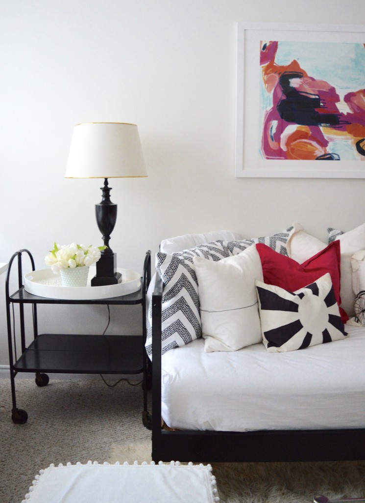
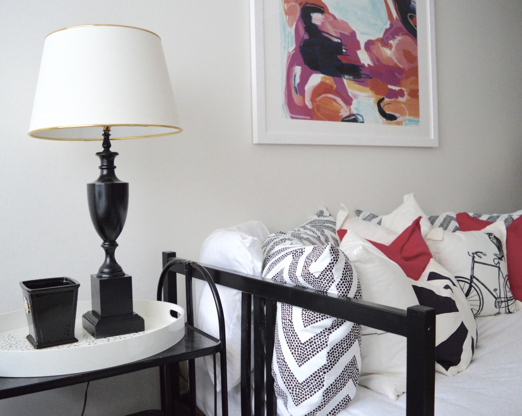
I painted the Fjellse bed frame (made from two twins that came with my house) high gloss black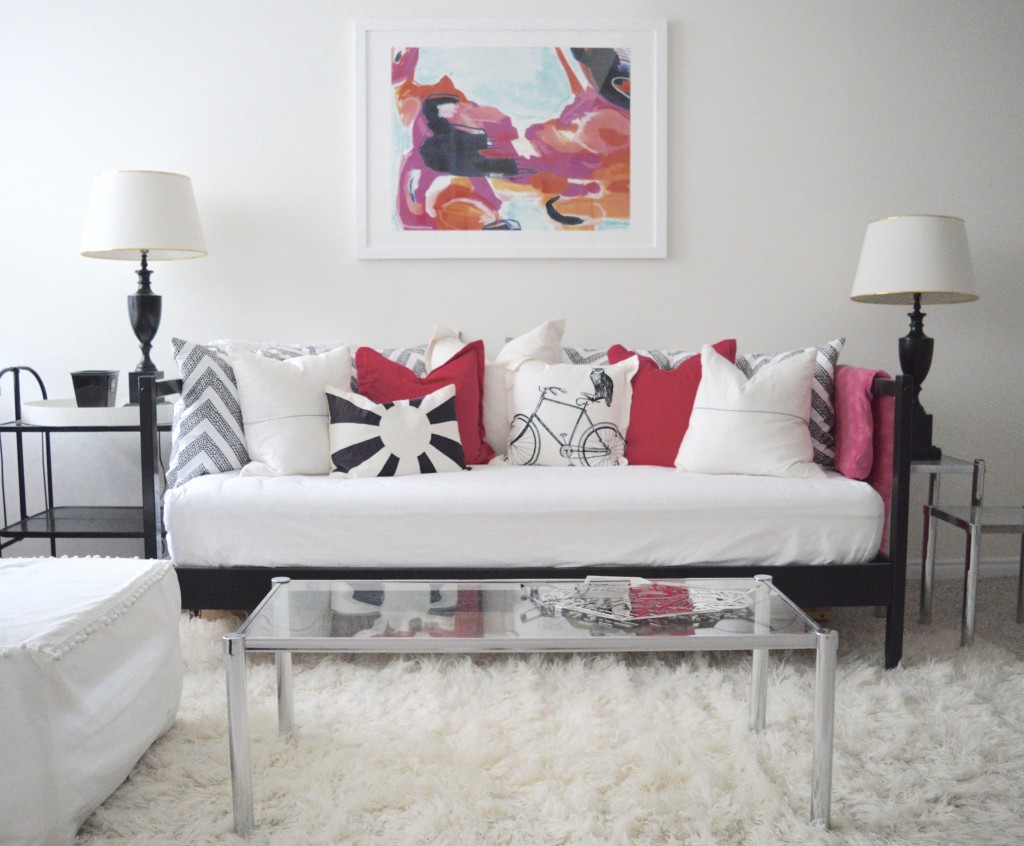
(I’m still on the lookout for two side tables of the same height)
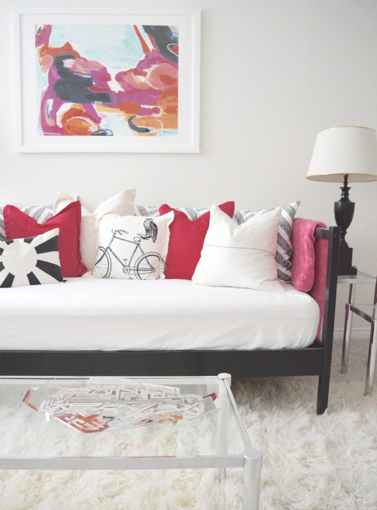
(featuring my most recent Alessi addition – Karim Rashid’s Hellraiser tray for Alessi)
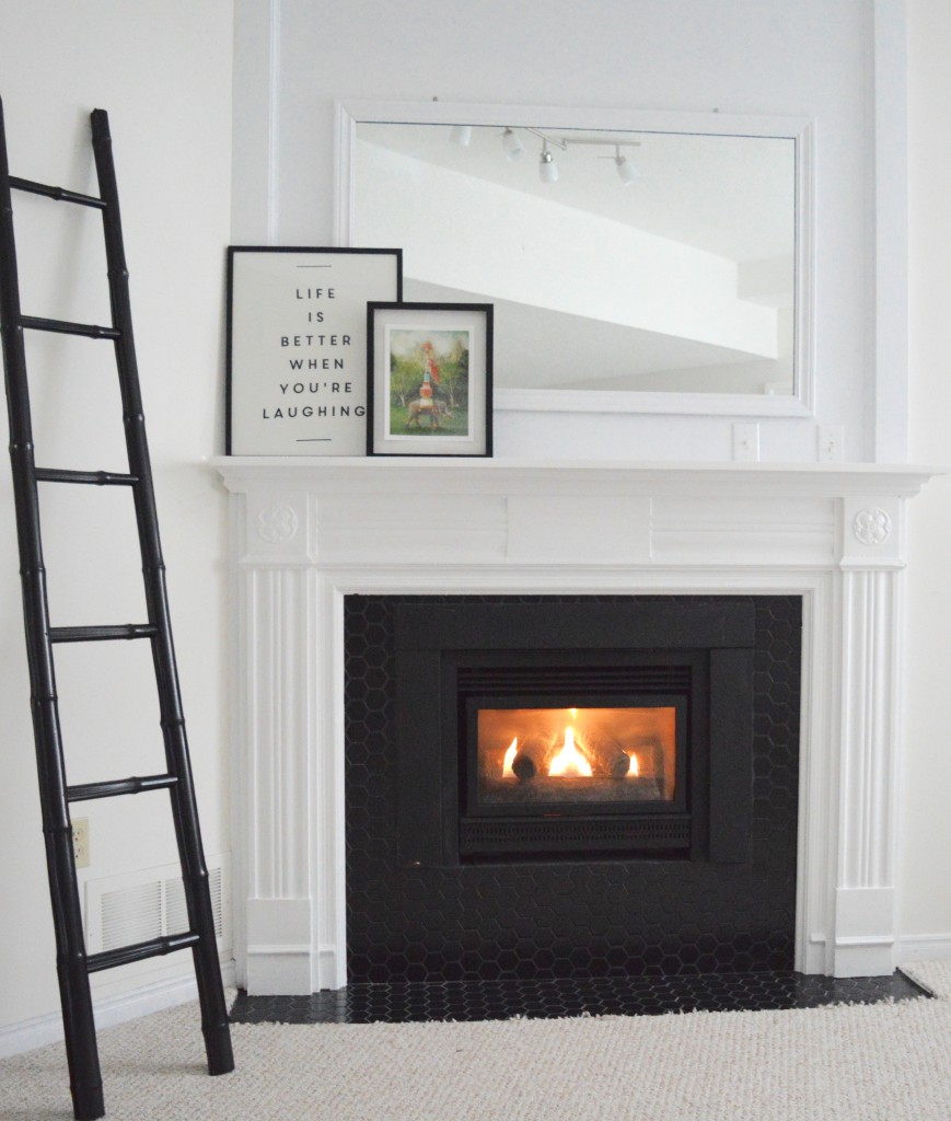
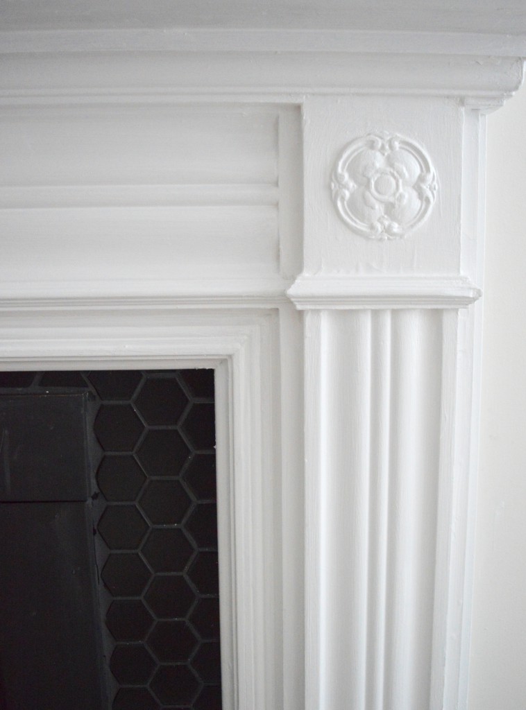
see how I transformed my old 80s fireplace into this beauty
I have recently published this makeover on Domino. If you click here, you’ll see a couple of before photos.
Many thanks to Minted for sponsoring this post.
Sources: art – c/o Minted; day bed (two Fjellse singles joined and painted high gloss black) – Ikea; wall paint – c/o CIL; white tray – Style at Home; black side cart – Market Road Antiques in St. Jacobs; chevron pillow cases – Target; bicycle pillow case – Urban Barn; coffee and side tables – Kijiji; shag rug, lamps – vintage; silver tray – Alessi; fireplace mantle – vintage; bamboo ladder painted high gloss black – garage sale; ceiling light – Ikea; art on fireplace – Janet Hill Studio, Chapters Indigo (tea towel); hex fireplace tiles – Twin City Tile