The Friday Five: Vaulted Ceilings

Okay…I’m a day late with this post…but hopefully the gorgeous interiors I’m featuring today will make everyone forget the fact that today’s Saturday.

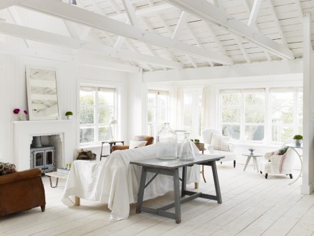
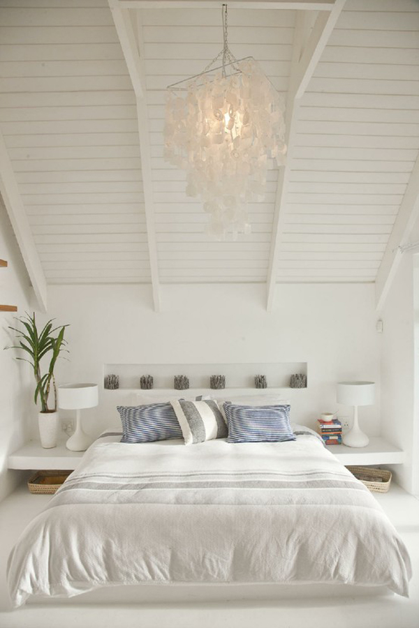
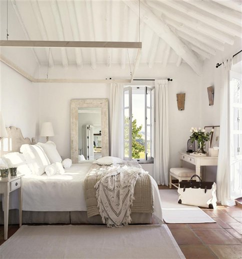
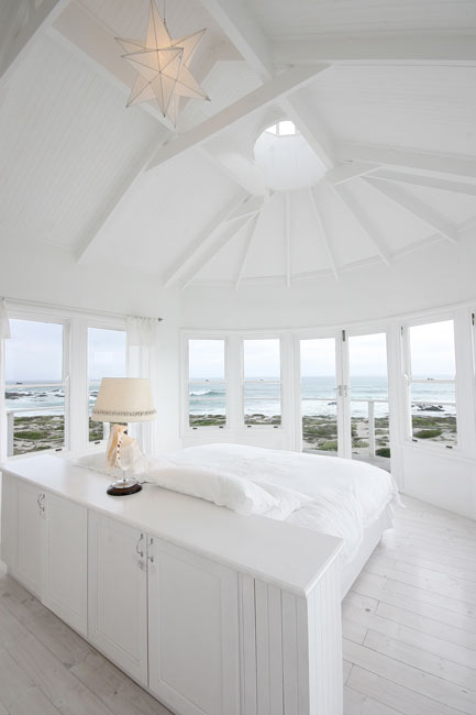
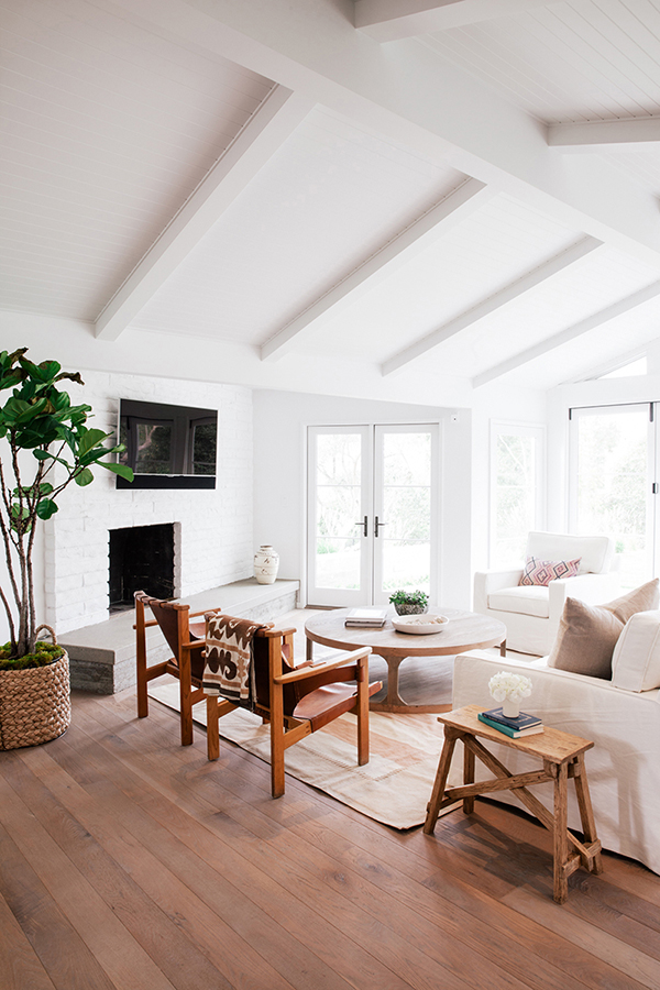
I was planning on writing a post featuring stunning beach houses, but then I got distracted by vaulted ceilings and exposed beams. Check out the homes below and you’ll understand why my post plan altered.

jcs-esertsstudio-montecitoresidence-14Montecito, California, photo by Jessica Comingore

Winchelsea_023beach studio, East Sussex, UK

casa-sanchia-5Casa Sanchia, Cape Town, South Africa

dormitorio_principal_-_cama_484x519El Noque, Spain (via Inspiring Interiors)

b2lgThe Lighthouse, South Africa

Aren’t these spaces gorgeous? The high ceilings make them so breezy.

Have a great weekend, everyone!

The Friday Five: Bathrooms

I have a feeling I’m going to be talking about bathrooms for quite some time here. Let me know if you’re bored. I’ve got two bathrooms in my house that I need to do something with. I’ve ripped off the wallpaper and although I don’t have the budget to do full-on makeovers, I do need (want) to do some updating. I’d like to replace the vanities in each bathroom asap. The paint, faucets, and lighting are also pretty big priorities. Eventually I’ll replace the floors and figure out a better use of space in the main bathroom upstairs. I’ve been floating around online searching out some great white bathrooms for inspiration. Mine are going to be white…no surprise there.

In this first space I love the free-standing tub. This is definitely on-trend for 2013 (and a few years after that, I predict). My own main bath is big enough to do the same so when I get more money (a big lottery win?) I may consider doing something like this. It’s so sleek!
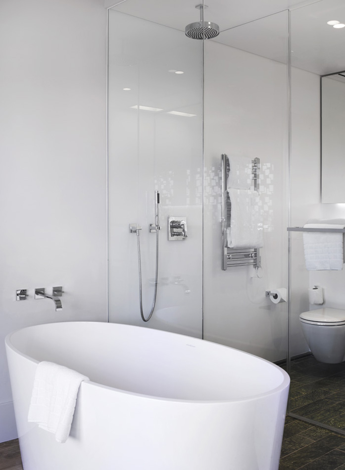
Mandatory Credit

Town Hall Hotel

In this second bathroom I love the thought of putting the mirror over the wall of windows. The windows act as an artistic backdrop for the gorgeous gold mirror.
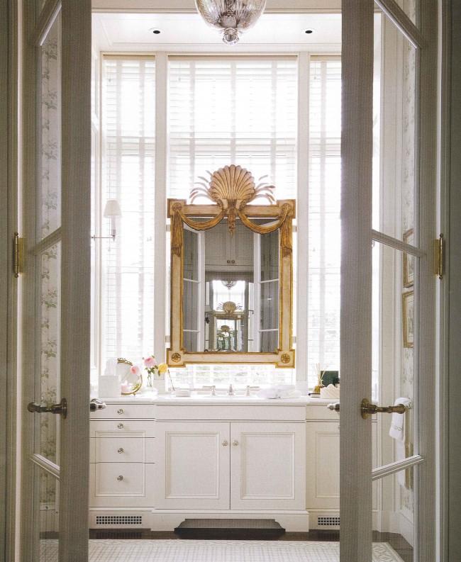
white-bathroom-via waterworks

via The Perfect Bath

I think the layout in this third bathroom is pretty unique. It looks like the shower was installed in between the two vanities. I think this is a pretty interesting use of space.
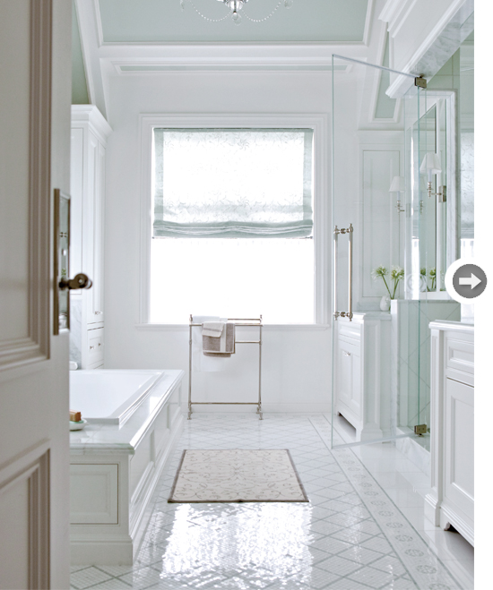
TIME-20

via Style at Home

The fourth bathroom has the most incredible window and molding details. It’s just so striking. The vanity seems too small for the space and the grand ceilings though. What do you think?
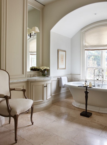
10-juliecharbonneau

Julie Charbonneau’s home via House & Home

Finally, in Sarah Richardson’s design, the tiling is an obvious eye-catching statement. I love the shades of white used in this space and the vanity is beautiful. But am I the only one who thinks that the sconces and mirrors are completely out of proportion in this space?
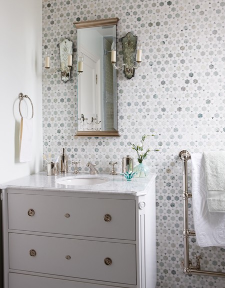
house-home-sarah-richardson-design-gustavian-kids-bathroom-photobystaceybrandford-march2012

Sarah Richardson design via House & Home

So, I’m curious – what are your essentials for a worthwhile bathroom reno? Do you go for the whole room or is it possible to update the space without tearing out all of the existing fixtures?

Have a wonderful weekend everyone! It’s a long one here so I’ll see you back on Tuesday if I am too relaxed to post on Monday!
Marketplace: Violette Boutique

I was in Victoria, British Columbia for the first time last week to present at an academic conference. Usually when I travel – for work or pleasure – I tend to plan ahead, make note of a few things I want to see, and have a map (or two?) in hand. This time, however, I was completely overwhelmed with life that I basically boarded the plane without a clue as to where I was really going (shame, I know).

When I ventured downtown after work one day I was pleasantly surprised by Victoria’s lovely shops and the wonderfully friendly people I met. I was directed to the jewelry store Violette, for example, from the saleswoman in Emporia after I told her about my obsession with white (what, doesn’t everyone talk to strangers about their favourite colour?).

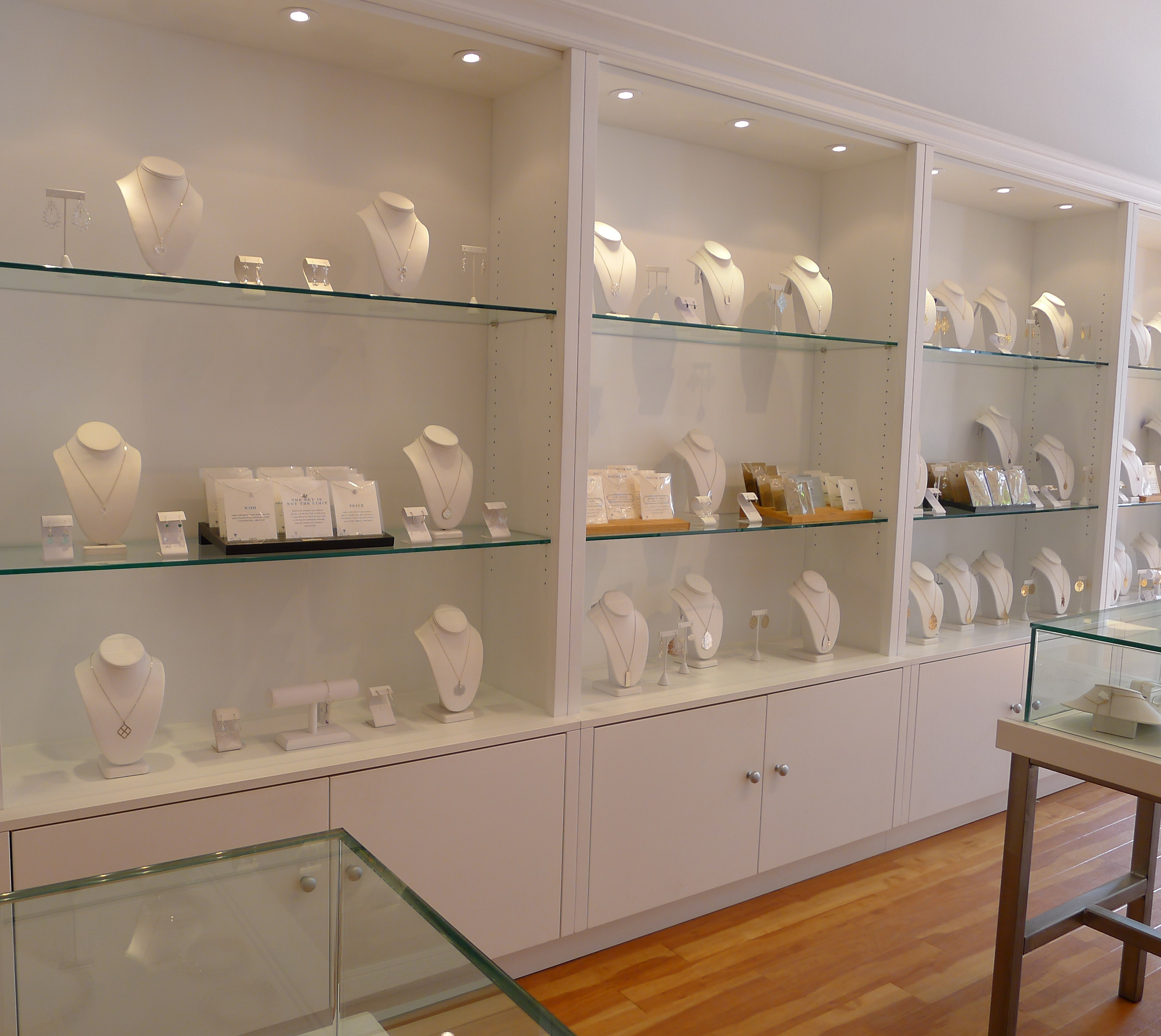
Violette-Boutique-Victoria-British Columbia

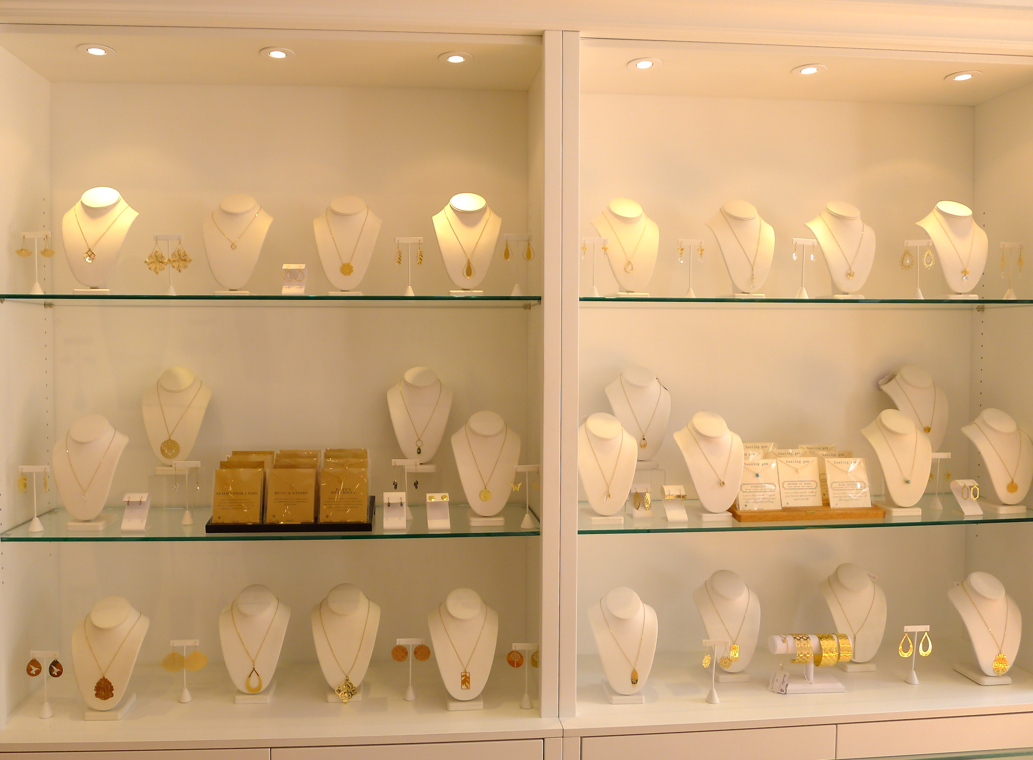
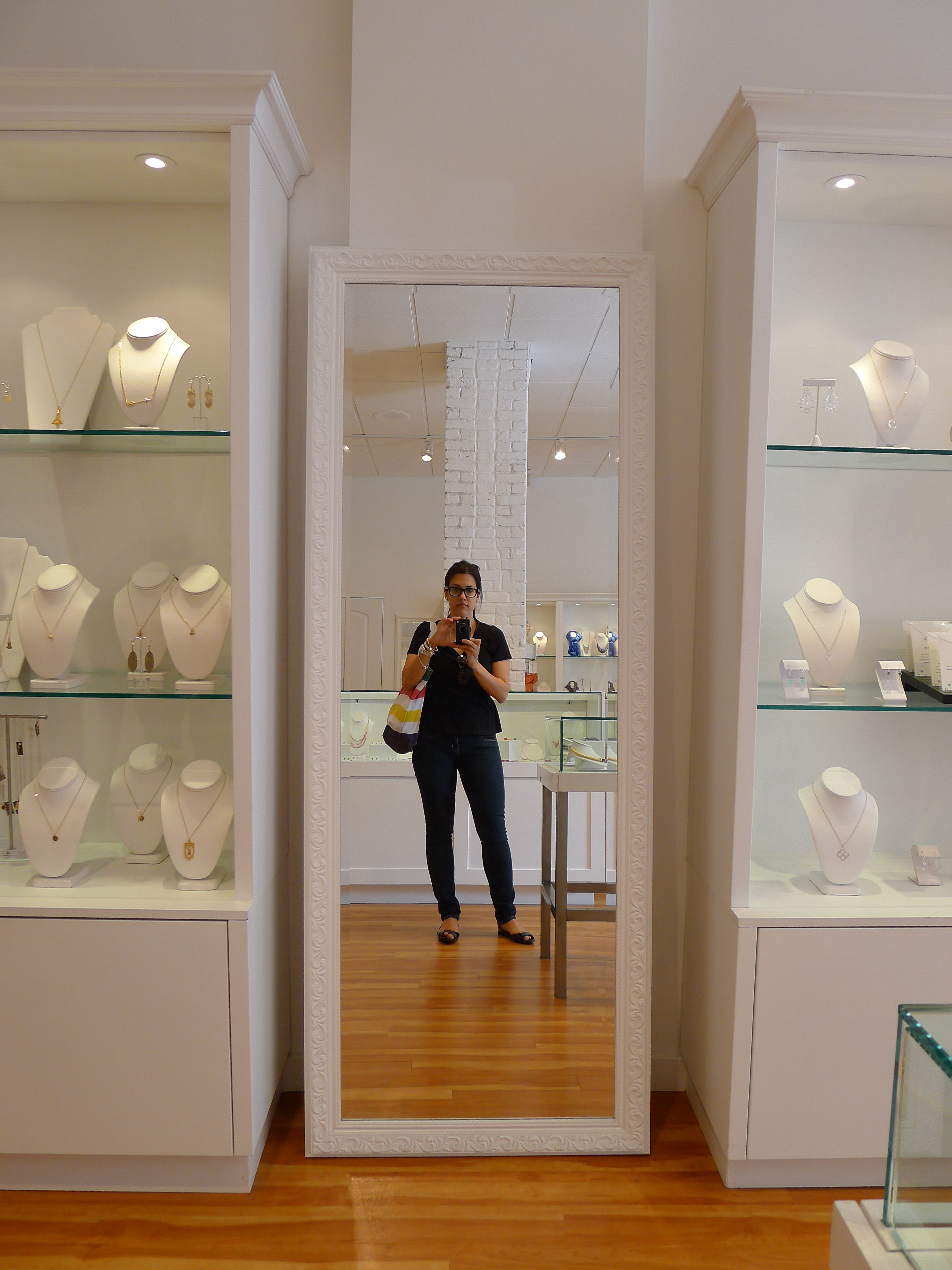
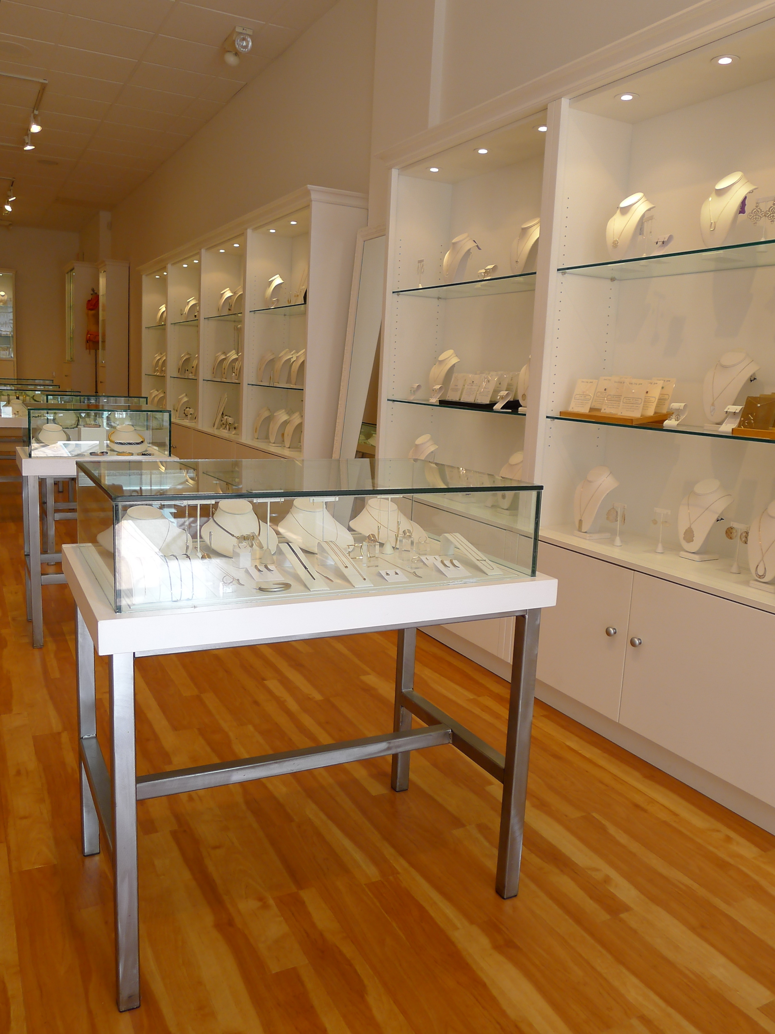
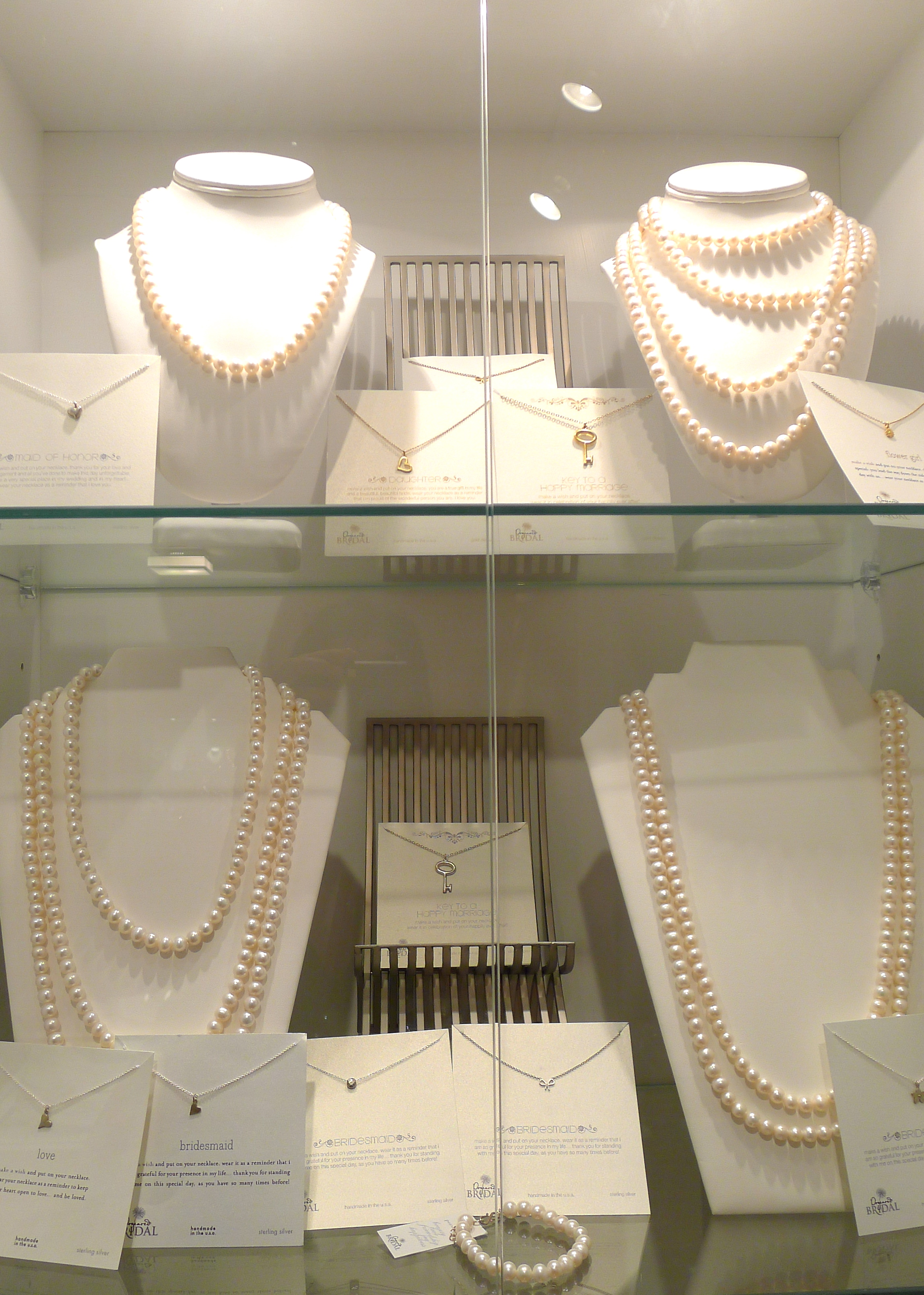
I walked into Violette and I instantly knew it was my kind of place and space. Violette is a bright, white, clean, and spacious jewelry store that is well-designed, welcoming, and, best of all, features some really beautiful collections from designers such as Gabriela Artigas, OGJM, Alexis Bittar, and Giles & Brother

Violette-Boutique-Victoria_British-Columbia_White-Cabana-1 Violette-Boutique-Victoria_British-Columbia_White-Cabana-2 Violette-Boutique-Victoria_British-Columbia_White-Cabana-3 Violette-Boutique-Victoria_British-Columbia_White-Cabana-4 Violette-Boutique-Victoria_British-Columbia_White-Cabana-5Isn’t Violette a perfect place to showcase modern jewels? The white display cases make everything look just perfect.

Many thanks to the saleswoman at Violette (I’m sorry I didn’t get your name) for showing me around!

Photos by Jordana.

Lofty projects

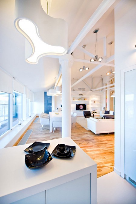
Yes folks, I’m really about to embark on building a loft.

I’m not going at it alone and I’m hoping it will all come together smoothly with no accidental ly-hammered fingers. The project date: Good Friday. Wish me luck! I’ll do my best to capture the uprising on cam and report back.

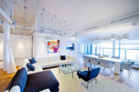
Highly-Contemporary-Loft-Design-by-GAS-in-Chisinau-MoldovaSome lofts are fancier than others, this one is tops. Designed by GAS in Chisinau, Moldova

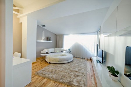
More pics:

Highly-Contemporary-Loft-Design-by-GAS-in-Chisinau-Moldova-2

Highly-Contemporary-Loft-Design-by-GAS-in-Chisinau-Moldova3Highly-Contemporary-Loft-Design-by-GAS-in-Chisinau-Moldova-4


The Friday Five: Offices

I know it’s Friday and the last thing many of us want to do is to think about the office but trust me when I tell you that the offices I have featured below are worth your time (and stares). While they are quite different in style an aesthetic, each office is pleasing because of the minimalist (and complimentary) colour schemes, interesting textures and forms, and unique architectural details.

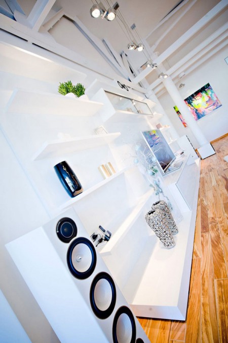
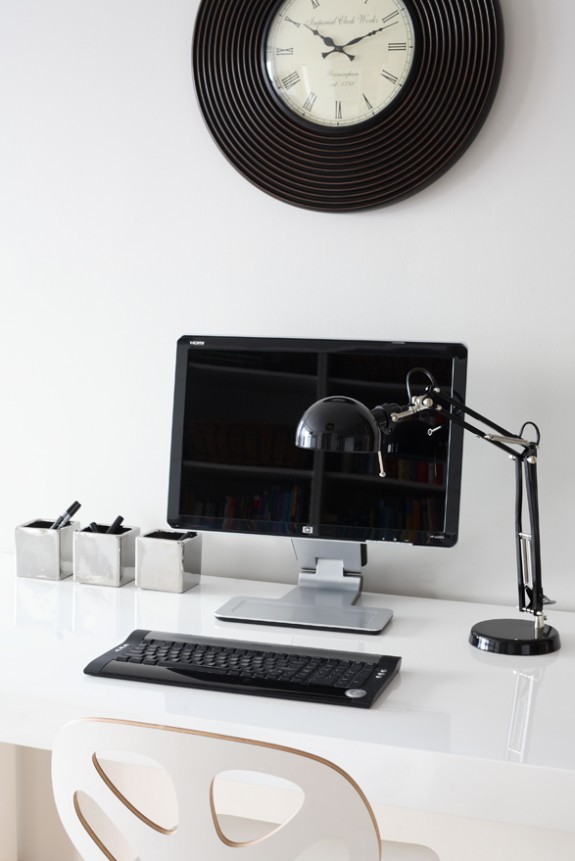
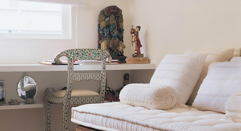
I’m taking you to office spaces around the world today beginning with a room of contrasts which includes the sleek Air Desk from Chicago-based Casa Spazio. Next is the minimalist black and white office area designed by Morpho Studio in Poland. The final three spaces, created by Brazilian designer Maristela Gorayeb, showcase amazing collections of books and artifacts in a pleasing and inviting way.

Casa Spazio via Escapade

apartment in Krakow, Poland; designed by Morpho Studio

interior design by Maristela Gorayeb, via Desire to Inspire

interior design by Maristela Gorayeb, via Desire to Inspire

interior design by Maristela Gorayeb, via Desire to Inspire

Happy Friday!

1 2 3 4 7