Last weekend, I had the opportunity to go on a tour of the Princess Margaret Lotto Oakville Showhome. As Canadian readers may already know, the Princess Margaret Cancer Centre’s Welcome Home Sweepstakes is a huge fundraising event with incredible prizes to be won. Tickets are $100 each, $250 for 3, or $375 for 5. Each year, many local residents, Princess Margaret supporters, and the generally curious crowd anticipate the reveal of Oakville Showhome. The home is always in an exclusive Oakville neighbourhood (Oakville is about 30 minutes from Toronto, for the non-local readers of this blog), it includes top-of-the line electronics/appliances/gadgets, and it is designed by one of my all-time favourite Canadian designers, Mr. Brian Gluckstein.
For the past few years, I’ve been lucky enough to preview the home, and each year, I’m blown away. This year was no exception. Mr. Gluckstein – or Brian, as I like to call him (um, first name basis with Brian!? Crazy!) – and his team worked magic once again. The house is beautiful. Rooms include traditional lines, soothing colour stories, beautiful artwork and objets, and a few surprises thrown into the mix as well.
I know I’m a day late with this week’s Friday Five, but here are five things that I learned about this year’s Princess Margaret Oakville Showhome:
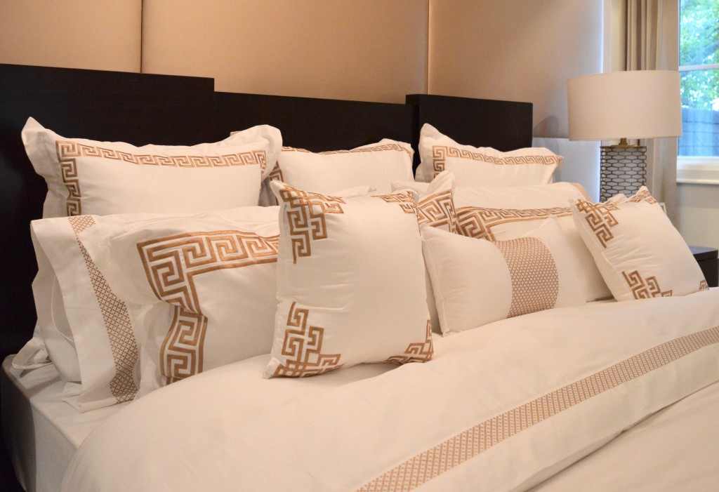
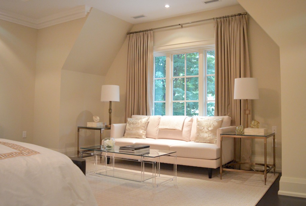
1. A white bedroom is always in style, and when it includes a gorgeous lucite table, it becomes a little more special.
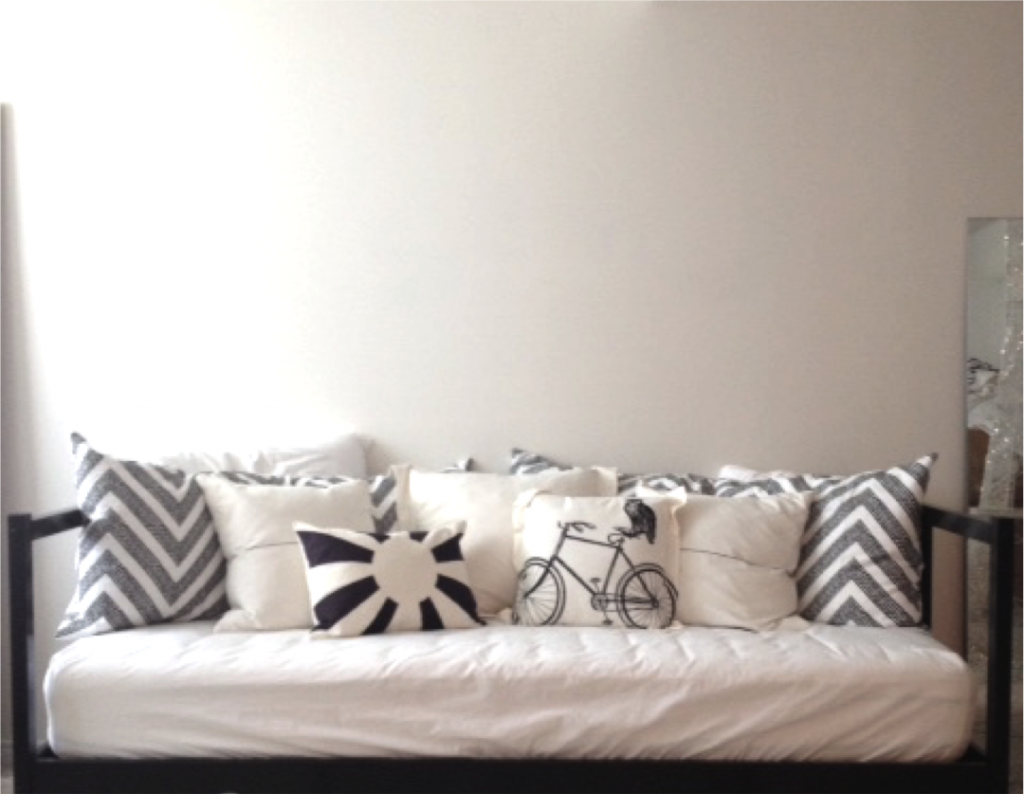
 10 pillows – how many do you have on your bed? (I have 5)
 seating area with lucite coffee table in the master bedroom
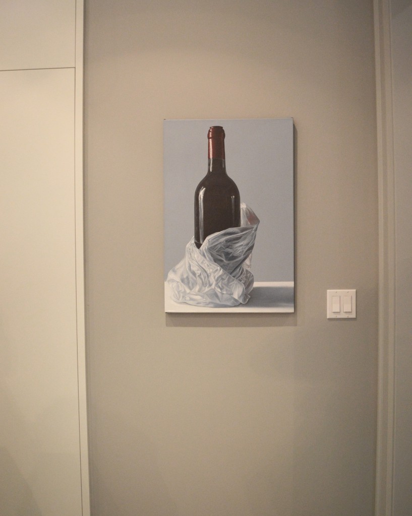
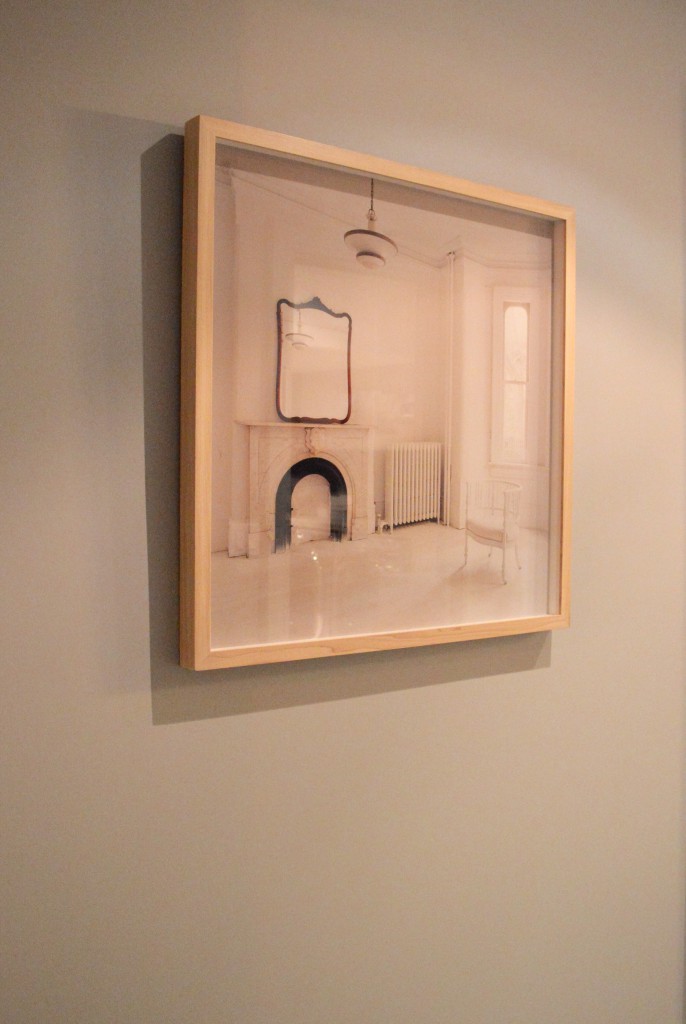
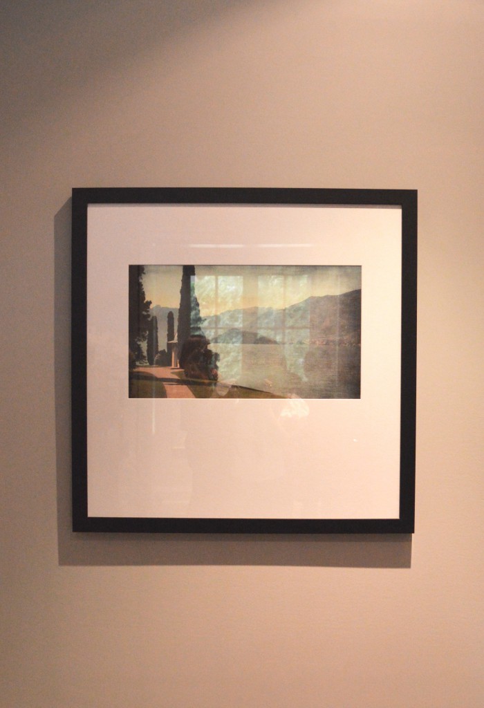
2. Art is essential. Brian’s designs always include some stunning pieces. Here are some of the ones that caught my eye.
 art in the kitchen
 art beside the massage room (see #3)
 art in the hallway
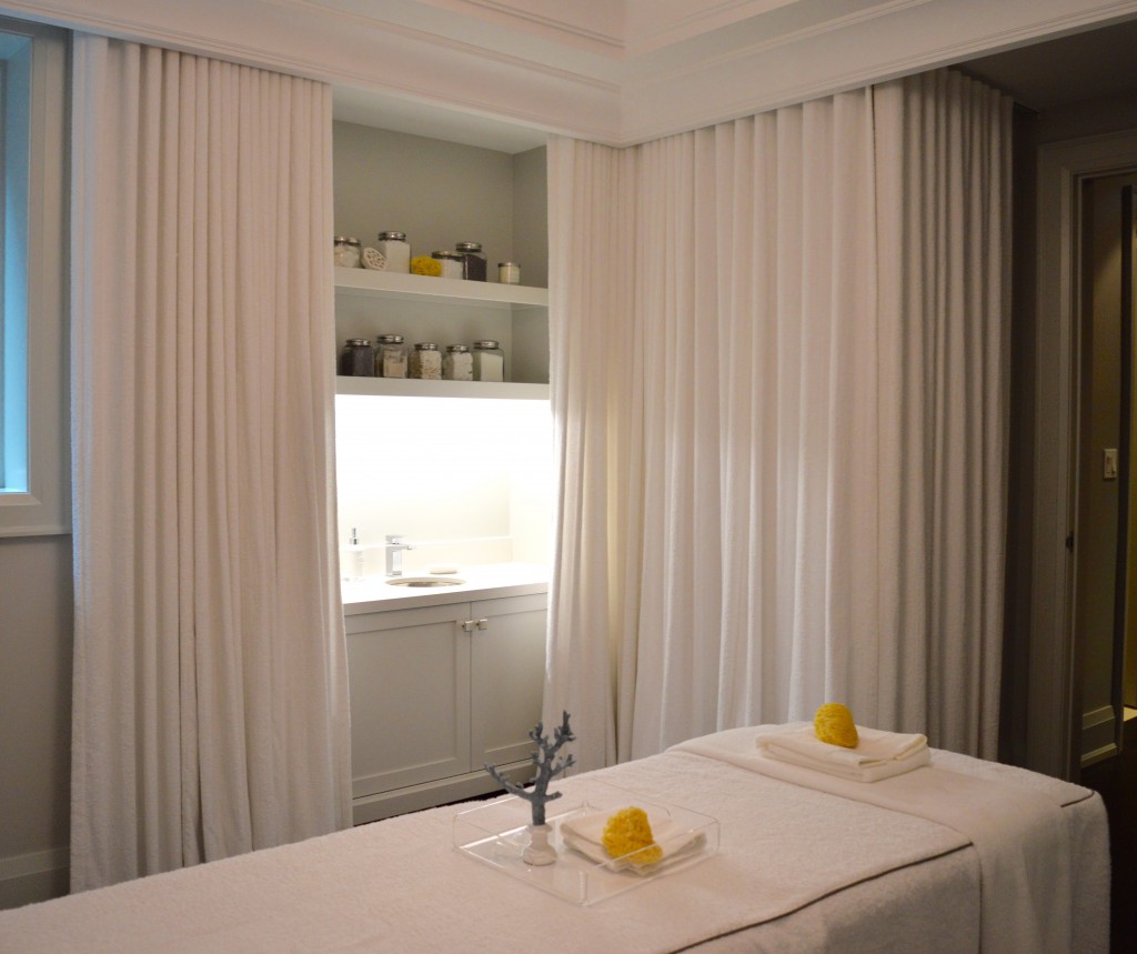
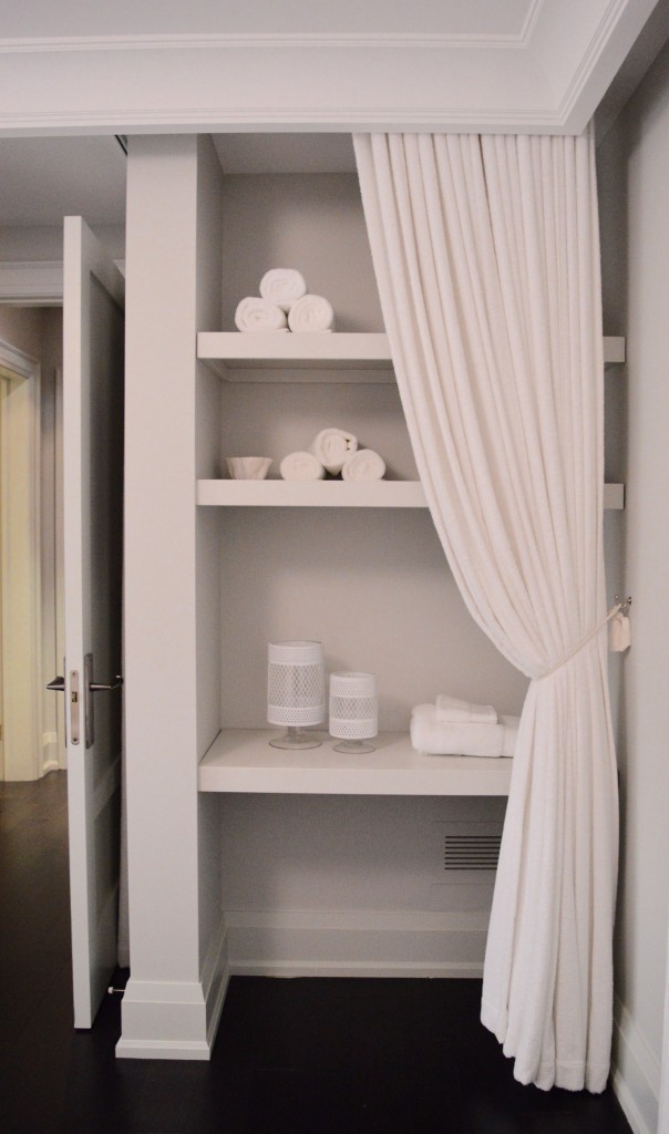
3. A massage room is a ridiculously luxurious room to have in a home. I have never had a massage myself, but if I had a room for it, you can bet I’d be taking advantage of it! I adored the fully-lined walls in this space. The wall curtains are made of terrycloth fabric, and Brian told me that it was only around $3 a yard. Adding texture to the wall in this way is brilliant, in my opinion.
 the massage room
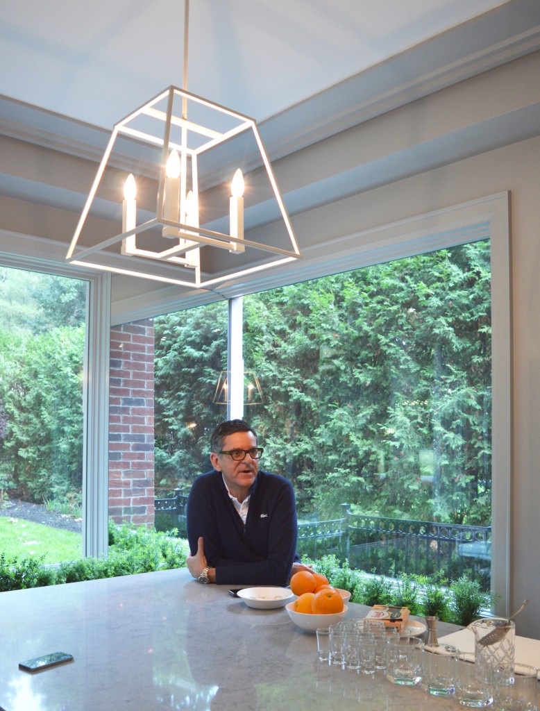
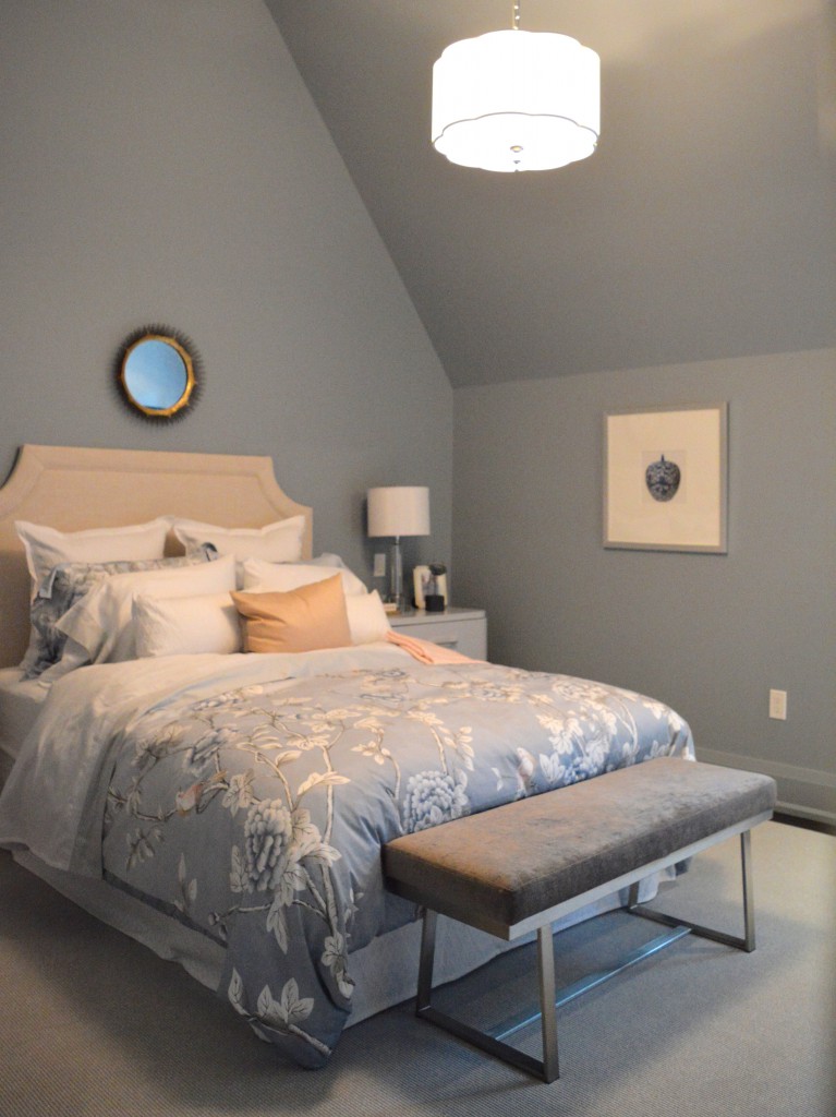
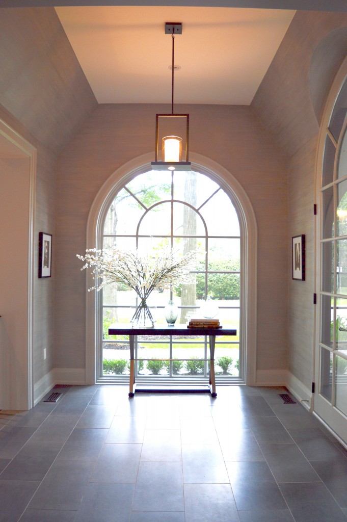
 4. Brian makes interesting lighting selections for the Oakville Showhome each year. This year, three pieces caught my attention. First – the kitchen light was formerly black and brass, but Brian (or his people) sprayed in white. Yes! Second – the light in one of the bedrooms had a pretty scallop which made it a pretty addition to the already-delicate room. Third – the chandeliers that lined the entrance hall are light and airy. Floating cubes of goodness, really.
 white pendant in the kitchen
 scalloped light in a bedroom
 airy chandelier in the entrance hall
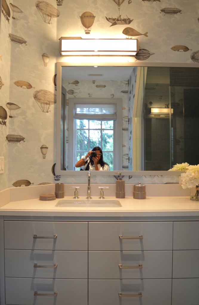
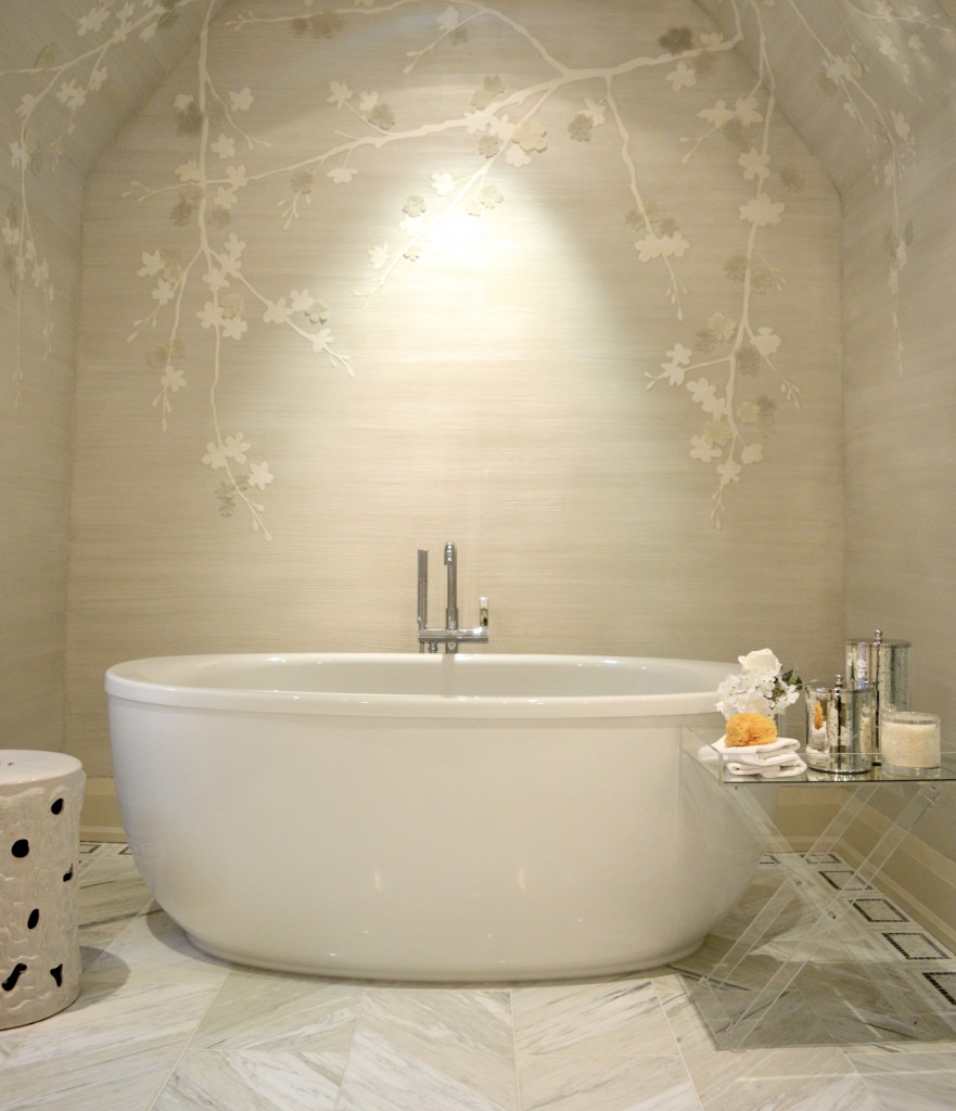
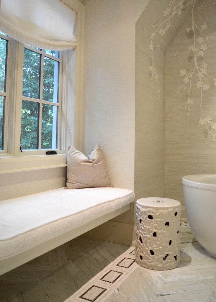
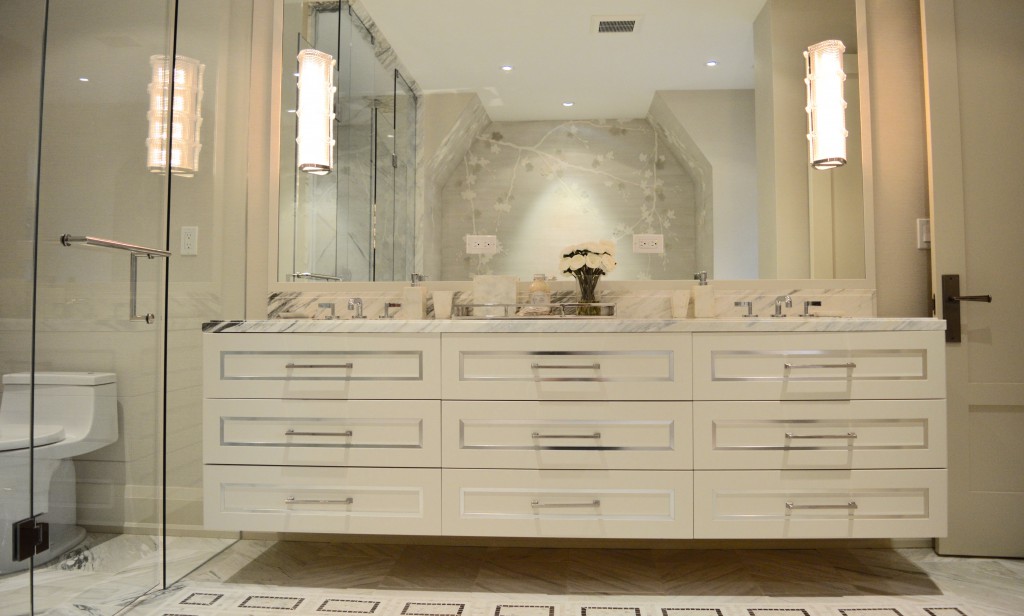
5. I am the first to admit that wallpaper makes me nervous. I much prefer plain walls and art work to wallpaper. I’m pretty sure it’s because I was traumatized by the 80s wallpaper chaos that I had to deal with in my own home. The wallpaper designs that were included in some of the bathrooms in the Showhome, however, caught my attention.
In the jack-and-jill bathroom, the wallpaper is whimsical yet serene.
 Hi there!
The blossoming wallpaper in the master bathroom creates a cozy nook around the stand-alone bathtub.


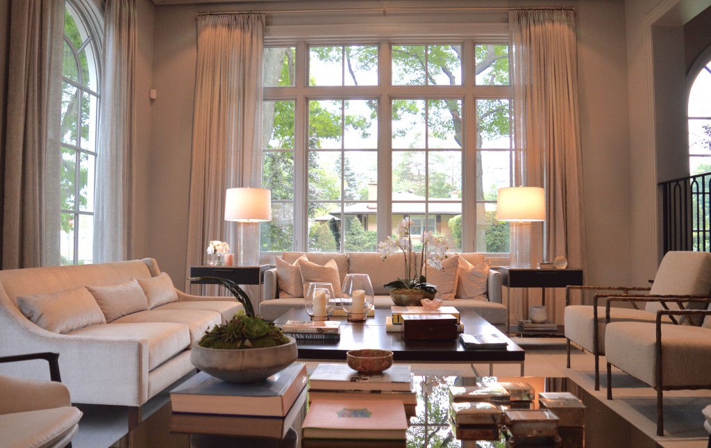
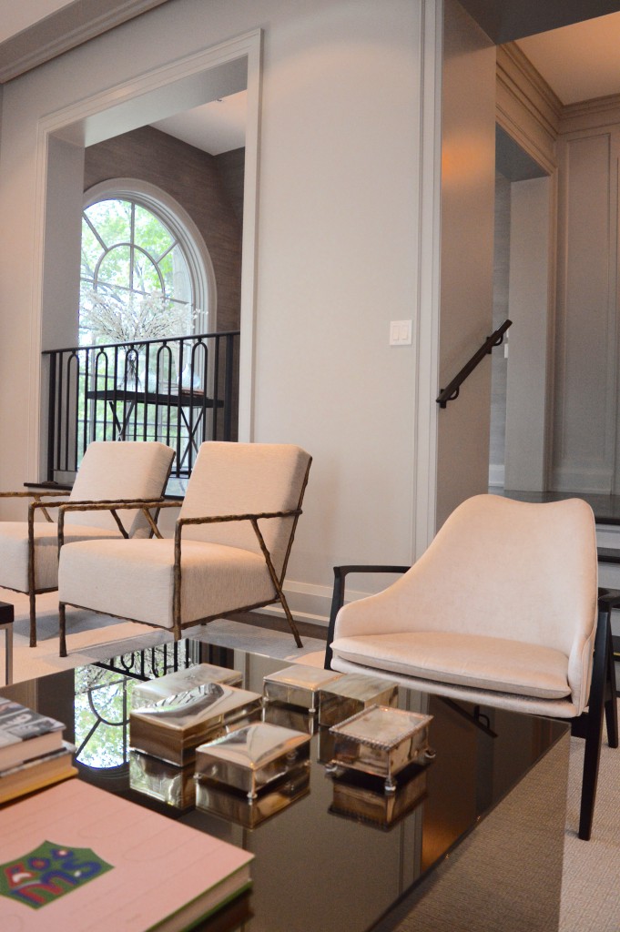
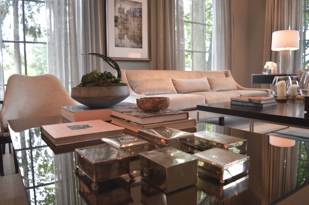
 Bonus: Since it’s Saturday, I’m going to make the executive decision to add one more item to today’s list. I could not leave the living room out of today’s Showhome recap because it is such a magnificent space. The oversized windows mean that light fills the room, the walls are a beautiful tone of grey, and the furniture placement (in true Brian fashion) is symmetrical. This room also includes a mirrored coffee table with a perfectly-arranged collection of silver boxes and luxurious drapery to match the wall colour.


 There you have it –
 five six things I adore about this year’s Princess Margaret Oakville Showhome designed by Brian Gluckstein. The golf room and library fascinated me, too!
Photos by Jordana. For more photos of the preview event, check out #BrunchWithBrian on Instagram and Twitter. You can’t win this house if you don’t buy a ticket – tickets can be purchased here.
