Design: Michelberger Berlin

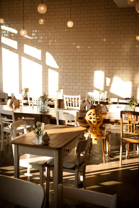
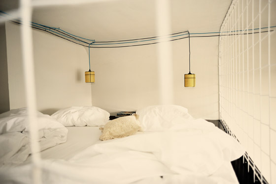
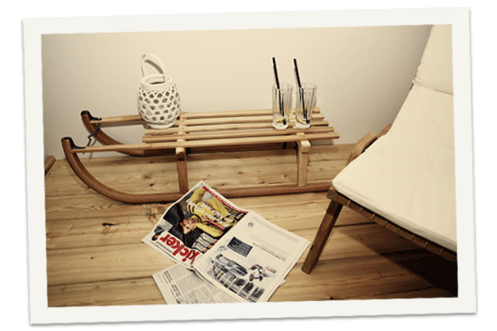
I must have travel on the brain (again) because I keep being drawn to very cool hotels. Today we travel to Berlin and check into the stylish Michelberger Hotel.

Michelberger_Berlin gallery detail gallery detail-1 Michelberger_Hotel_Rooms_Luxusview_02

images via Michelberger Hotel

I’ve travelled a fair bit around Europe (most often Switzerland and Paris: read this, this, this, this, this, this, and this) but I have yet to visit Berlin. What do you think? Should I add it to my travel wish list?

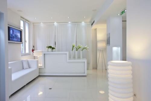
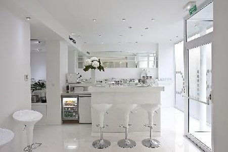
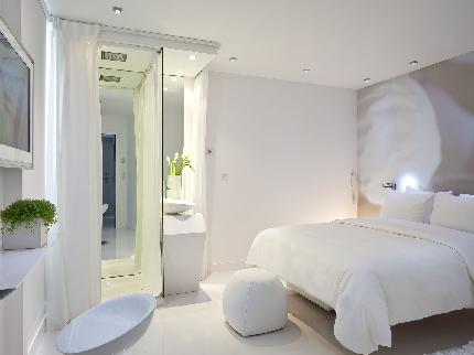
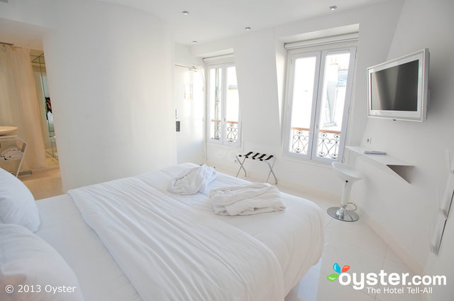
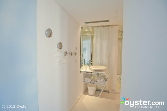
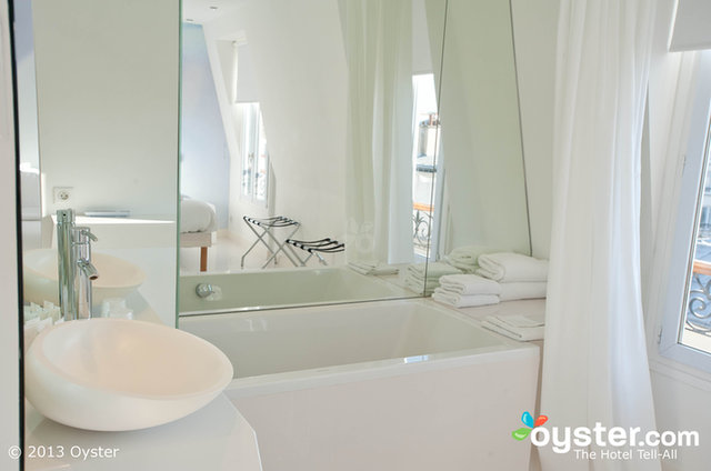
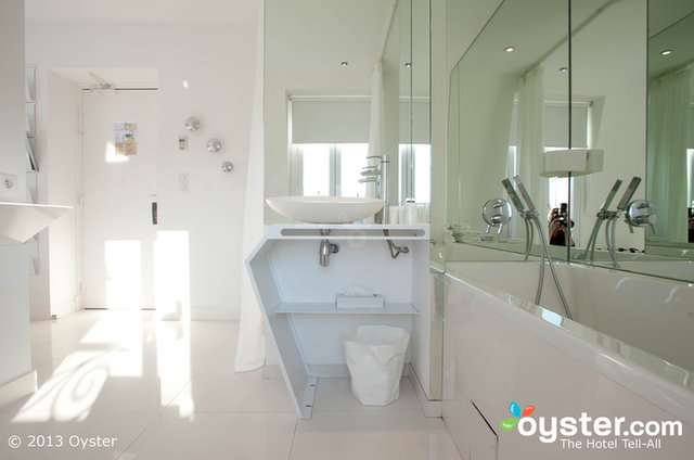
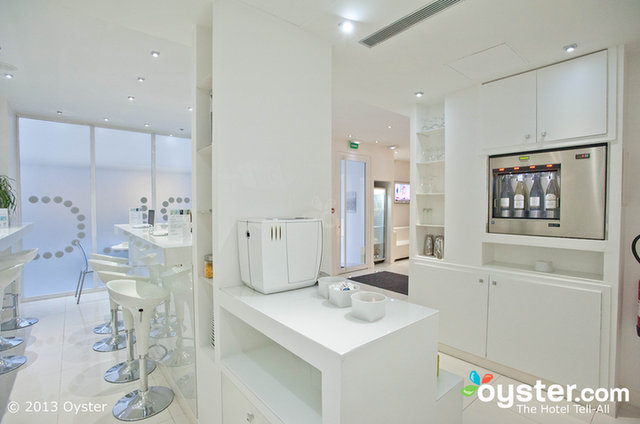
Design: BLC Design Hotel Paris

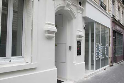
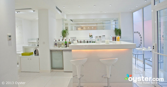
It’s no secret that Paris is one of my all-time favourite destinations. I have been lucky enough to have visited a dozen times or so and there’s always something interesting and to discover. Inspiration is endless! So when my friend Andres sent me a link to the BLC Design Hotel, first I drooled over all of its whiteness, then I decided that I just had to post it! I want to go!

BLC Design Hotel_1 BLC Design Hotel_2 BLC Design Hotel_3 BLC Design Hotel_4 BLC Design Hotel_5 BLC Design Hotel_6 BLC Design Hotel_7 BLC Design Hotel_8 BLC Design Hotel_9 BLC Design Hotel_10

Images courtesy of BLC Design Hotel and Oyster.

Many thanks to Andres for sending this my way.

Friday Five: Living Rooms

It’s Friday! I’m ending the week here on the blog with five inspiring living room spaces and sharing with you what I like and dislike about each space. I welcome your opinions too so feel free to comment below!

1. There are a few great aspects in this first space. The juxtaposition of old and new is attractive to me as is the awesome tufted white couch. I could to without the rug in this space though as I think it should be a touch larger.
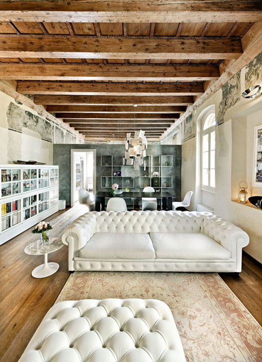
Le Case di Elixir via Desire to Inspire

2. In this corner at the Grace Hotel in Santorini, I love the white, white walls and the high curved ceiling. I also like the sculptural light fixture and sweet curved window. I would get rid of the mirror though and maybe add some art in its place.
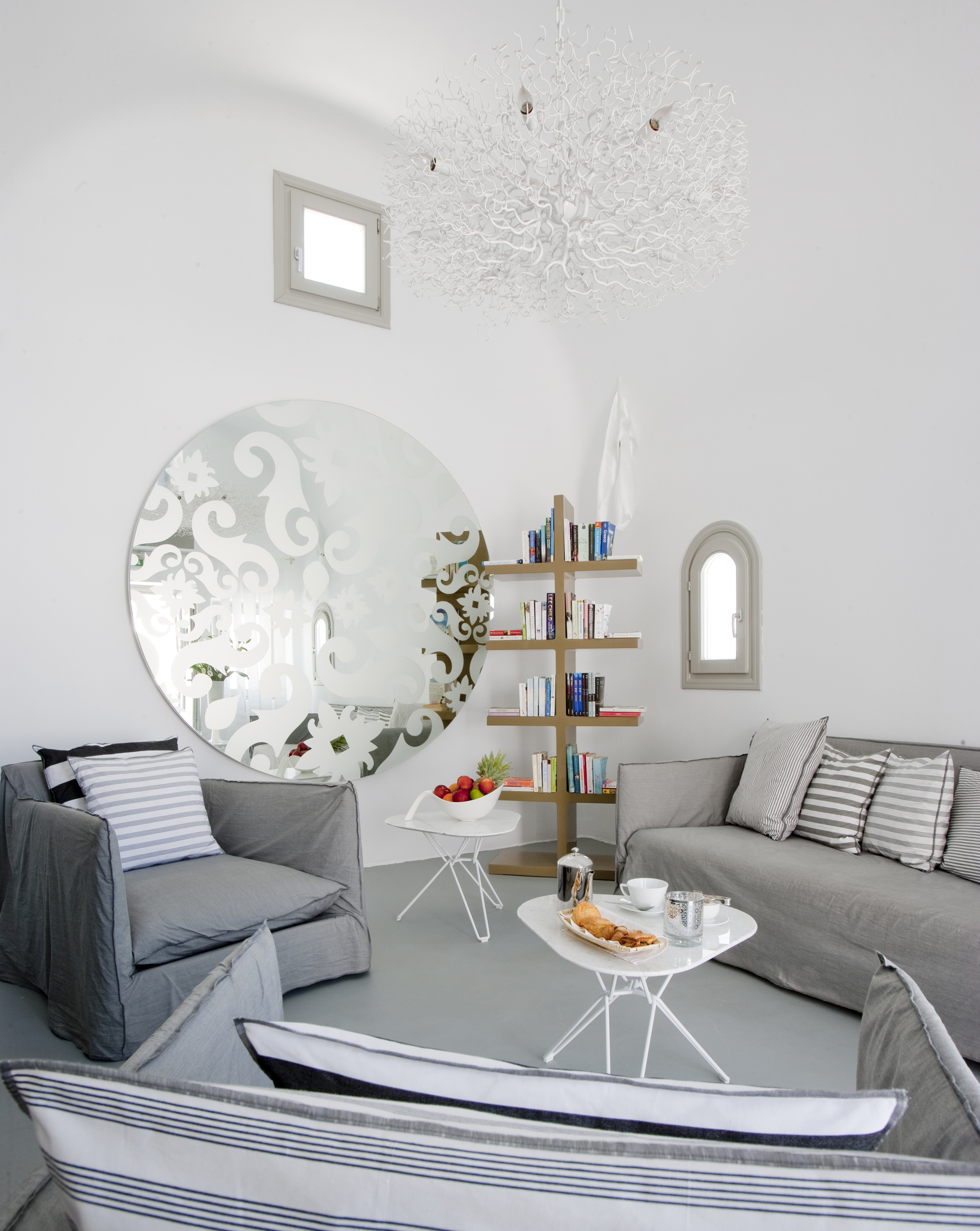
Grace Hotel Santorini

3. I love almost everything in this third space. The layered art pieces leaning against the paneled wall and the comfortable side chair are very appealing. The substantial stone fireplace is a beautiful feature in the room and the variety of textures in the room draw me right in. I would probably opt for a different sculpture although I can’t say that I completely dislike cupid.

via EclecChic

4. In this Douglas Friedman space I love the mix of textures – wood, lacquer, soft fabrics. I also like the clean lines of the high rectangular windows. I do wonder, though, how comfortable the side chair really is.
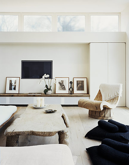
Douglas Friedman via The Style Files

5. In this last space I think the collection of white trophies, goblets, and vases is incredibly impressive. I love multiples and I am always curious to see what people collect. The layers of shades of white is also attractive to me. I do wonder if there are additional touches of blue throughout this space or if it is restricted to the striped carpet. I am a fan of a comfortable couch so it’s a bit disappointing that there’s no couch in this space (or as far as the photo shows).
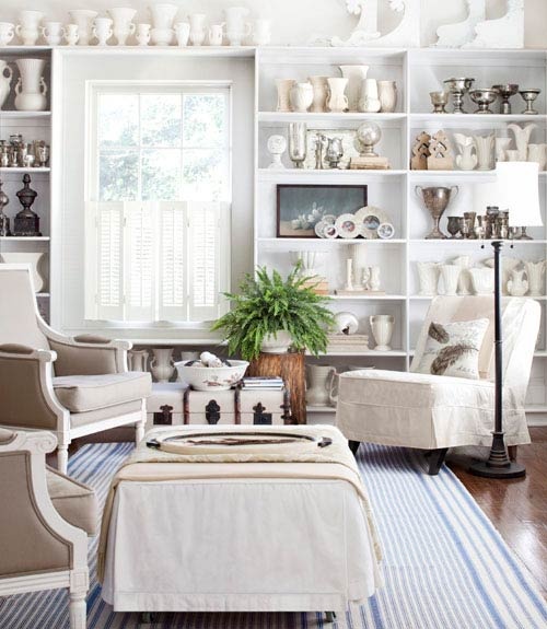
via The Painted Hive

Let me know what you think! And have a wonderful weekend! Happy Friday!
Design: So-An Architecture

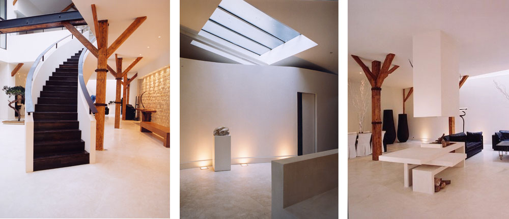
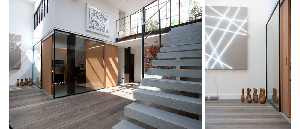
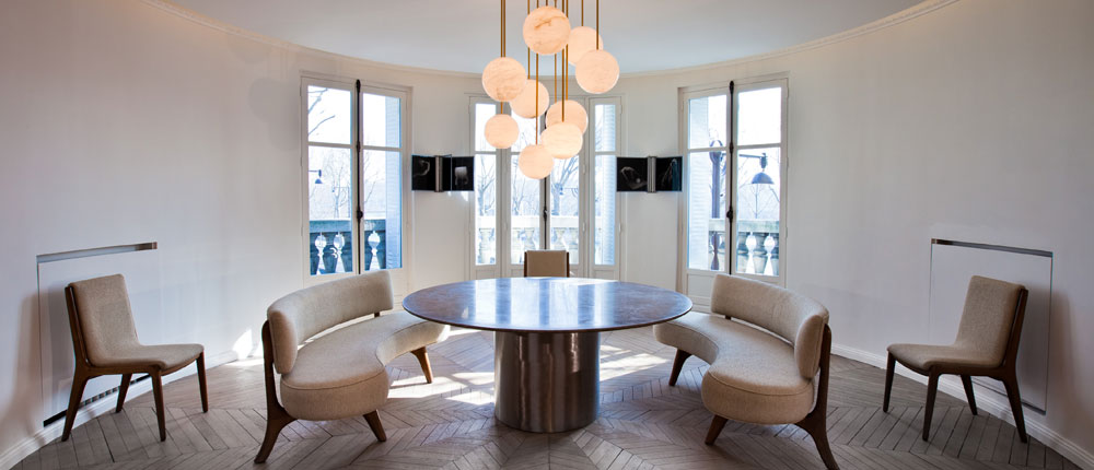
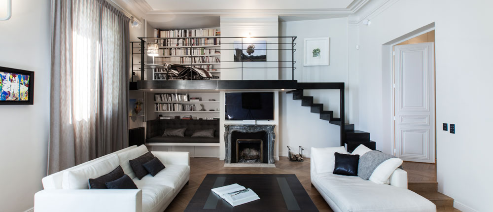
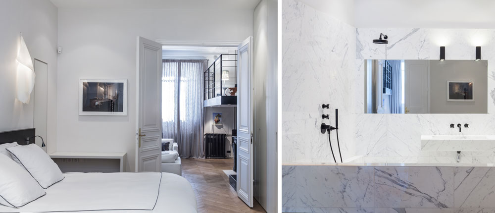
Isabelle Stanislas and Leiko Oshima are the design duo behind Paris-based architecture firm So-An Architecture. Their work, which can be found beyond the borders of France, is mostly modern with a few quirky twists. The firm creates dramatic dramatic spaces which are filled with rich products and neutral colours. So-An has completed incredible projects in architecture, interior design, retail spaces and events and have worked with companies including Cartier, Zadig and Voltaire and Novotel. Let’s have a look, shall we?

white loft

Rue du Mail

Rue le Notre

Rue le Notre

Place des États-Unis

Place des États-Unis

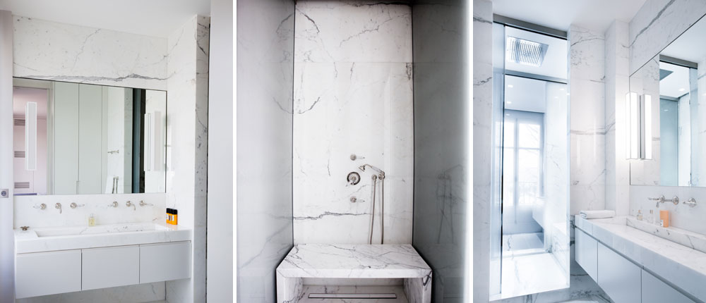
I love the marble-clad bathroom in the last space. Black matte fixtures are so in vogue!

Which of the above spaces are you most attracted to?

Photos courtesy of So-An Architecture.

Many thanks to Alessandro V. for sending this my way.

The Friday Five: Canadian Designer Series – Brian Gluckstein

Happy Canada Day!

In honour of today, Canada’s 144th birthday, I’m going to be doing something a little different with the Friday Five. In a series of five posts throughout the day, rather than in one single post, I will be featuring five fabulous Canadian designers. These  designers, and many many other talented Canadians, bring creativity, beauty, and good design to diverse spaces in Canada and abroad.

First up is the talented Brian Gluckstein.

Brian Gluckstein’s classic aesthetic caught my eye when I first “met” him on CityLine back when Marilyn Denis used to be the host. I am always impressed by his professionalism and style. He has been been named Canada’s favourite interior designer by the readers of House & Home which may not come as a surprise to many readers who know his work.

Forest Hill bathroom

Georgian Estate

Neoclassical home

Brian has a collection of homewares which are available at The Bay. Click here to see the full Gluckstein product line.

Peyton

Studio

As if his interior design company and home collection isn’t keeping this guy busy enough – Brian’s blogging too – see what he’s up to here.

photos via Gluckstein Design Residential Portfolio & Gluckstein Home