This kitchen is so calming and sleek.
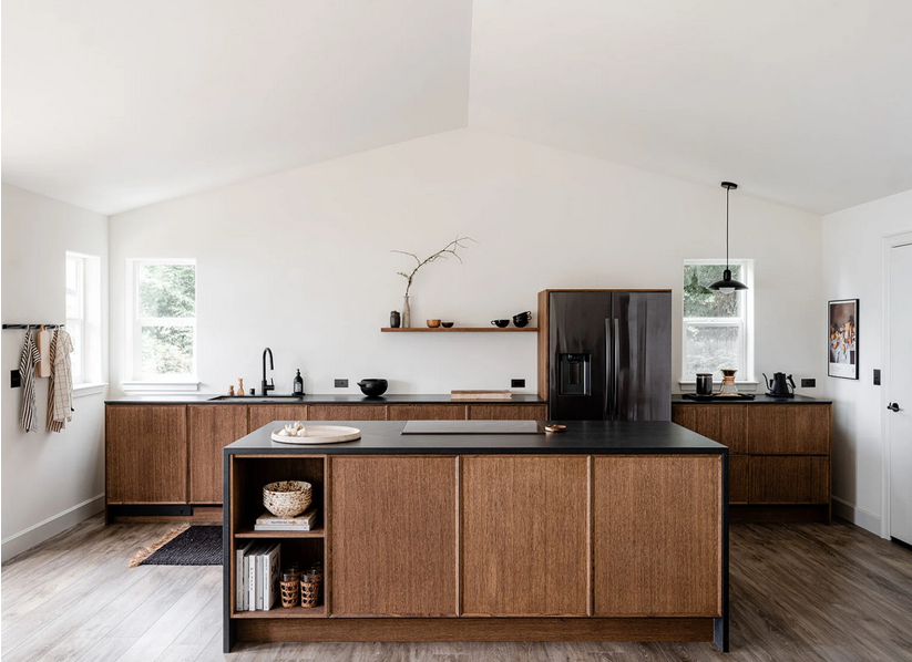
You’ve got to check out the before photos.
Design by Erin Hiemstra. Styling by Cassandra LaValle. Photos by Kara Mercer. Via Style By Emily Henderson.
This kitchen is so calming and sleek.

You’ve got to check out the before photos.
Design by Erin Hiemstra. Styling by Cassandra LaValle. Photos by Kara Mercer. Via Style By Emily Henderson.
When I look at the photos I’ve been taking and saving recently, there are some commonalities. One common feature is the black and white checkered floor.
I seem to have always been keen on checkered floors; I wrote this post about checkered floors back in 2016! My plan is to add a checkered floor to our entryway (hopefully I’ll get to it this spring). I think it’ll be so pretty.
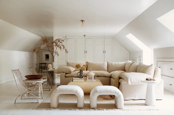
Two interiors I’d like to see more of are:
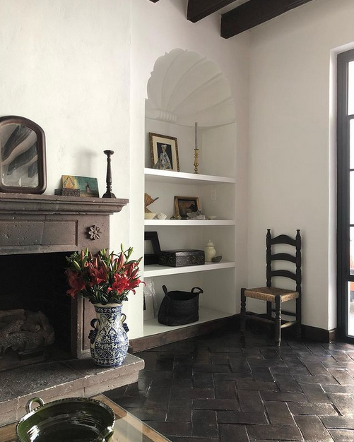
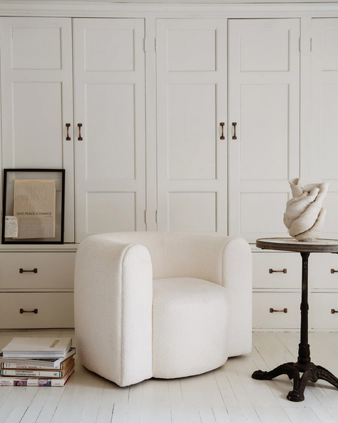
2. Leanne Ford‘s all-white spaces everywhere!
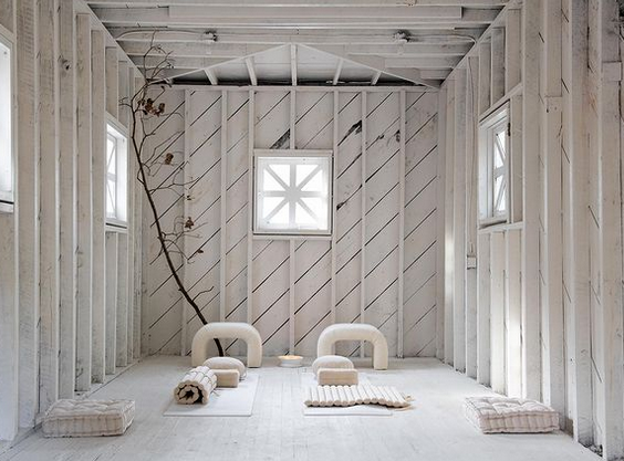
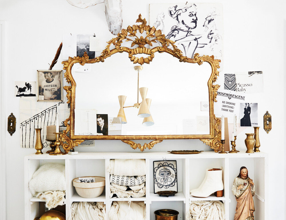
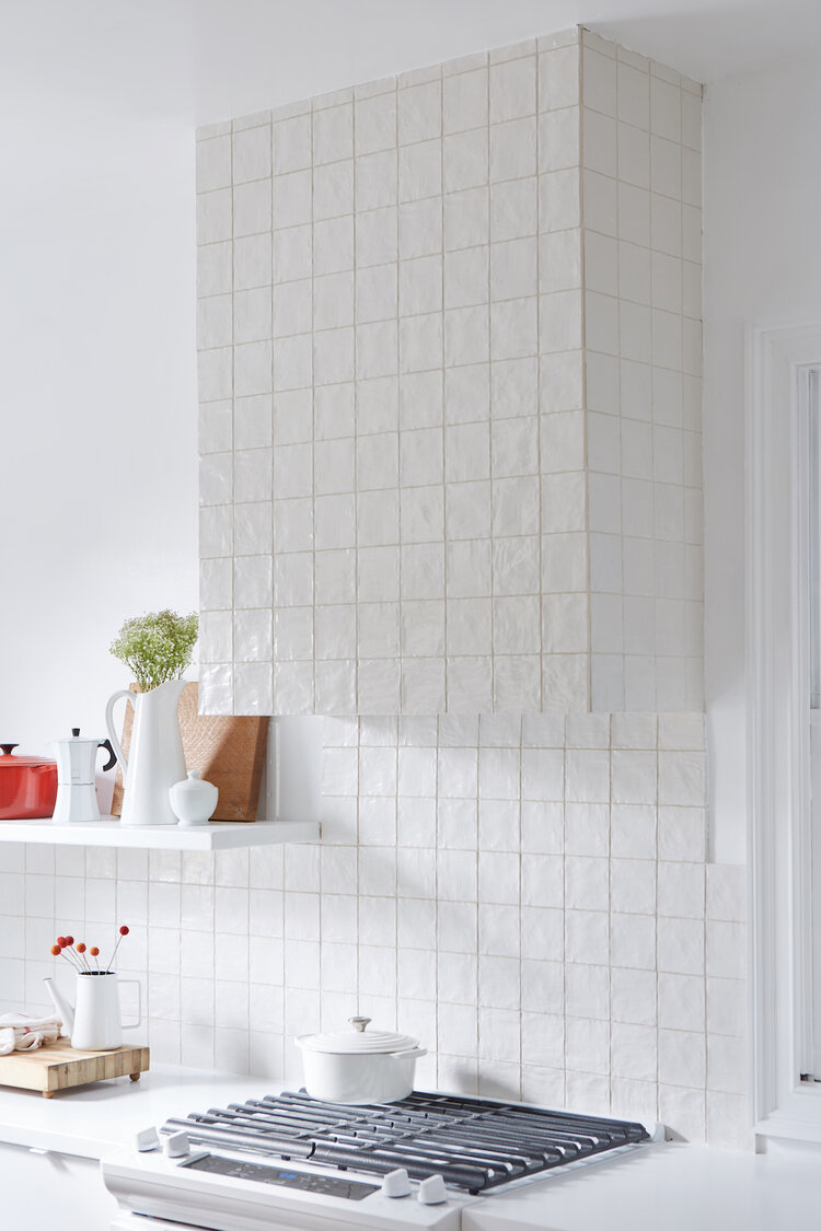
As I’ve said before, our house needs very little in terms of renovations. Our largest renovation projects would be the kitchen and the backyard. And even then, the renovations aren’t essential…they’d just make me enjoy our house even more than I already do! 🙂 So the projects we’ve been slowly doing at the house are small tweaks to increase functionality and aesthetic.
One of the spaces that I’ve spent a bit of time working to improve is our main floor powder room. It was a white box that I knew could get even whiter.
Here’s what the space looked like when we moved in:
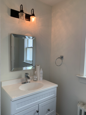
The bathroom was white and bright, but the light fixture was broken, the mirror was small, and the towel ring wasn’t my aesthetic.
We didn’t want to put too much money and effort into a massive renovation (like installing a custom vanity), but I knew we could do a few things to make it nicer. So we did!
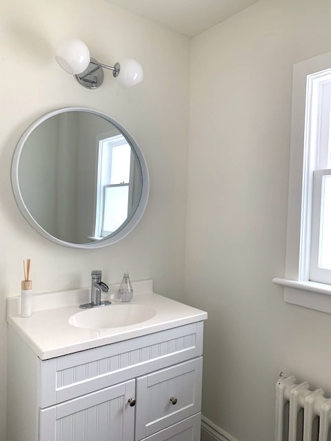
One of the best things I did was to repaint the walls. They weren’t in the best shape, so I patched up a lot of holes, smoothed out a few gouges, and gave the whole room a fresh coat of white paint (leftover Benjamin Moore Simply White). The new paint job – like so many people often say – made a world of difference to this room. Magic!
Beyond the painting, I polished the window hardware (more magic!), hung a round mirror, and installed a modern light.
Seeing the before and progress photos makes me grin. A few tweaks has made a huge difference in the function and aesthetic of this space.
That said, the room transformation isn’t quite complete. The towel bar and toilet roll holder will arrive next month, and we have to decide on art. I’ll be happy to share more photos when all the pieces are in place.
Our front hall currently looks like this:
Are you surprised to see so much colour? Me, too! Thankfully, the walls in our house are bright white, which is the perfect backdrop for some new additions in our furniture collection. To break up the traditional elements – the sideboard and the rug – I knew I wanted to add white accessories. I started with a pair of bubble lamps – super fun if you ask me!
Soon after I posted the above photo on Instagram, I received direct messages of other bubble lamps.
Here’s Kelly Wearstler’s version (perhaps the original bubble lamp?):
And here are some other bubble lamps (brands unknown), including a DIY version, too.