Design: Dalmatian Dots

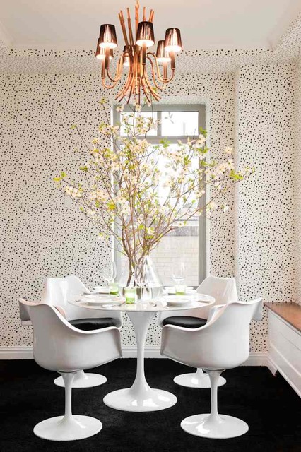
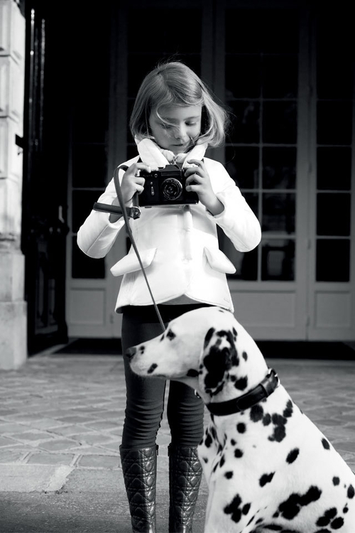
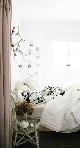
No, I’m not getting a dog. But I do think dalmatians are beautiful, and I love how dalmatian dots inspire art and interior design.

contemporary-dining-room

via Houzz

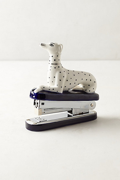
dalmation-stapler-anthropologie

Dalmation stapler, $24, Anthropologie

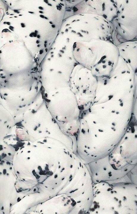
a6a99bf37794e713b111d17b2f496354

via Pinterest

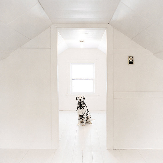
il_570xN.549121544_63s5

dalmation photograph, $27, Etsy

naomi-campbell-dalmatians-vogueus_90

Naomi Campbell, photo by Peter Lindbergh for Vogue US 1990; source

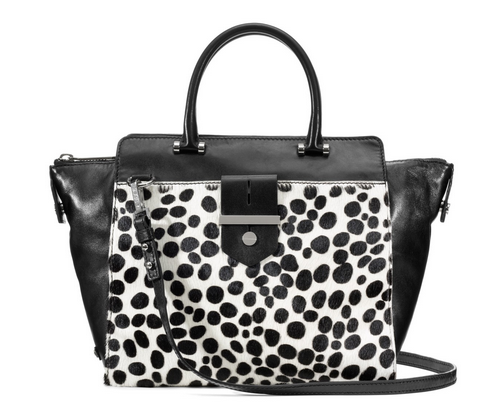
Milly-dalmatian-tote

dalmatian tote, $225, Milly

29079355567

via Twirling Clare

882709111146_hi

Dalmation print, $7, Chapters-Indigo

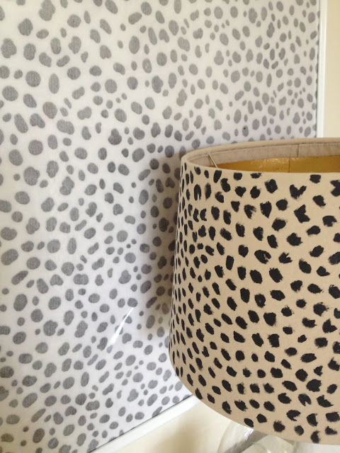
fabric_with_spotted_lampshade

via Inside Out Design

51b6b155fb04d67b4a001e06._w.540_s.fit_

via The Design Files

DIY: How to Make an Inkblot Gallery Wall

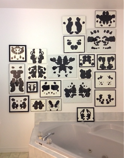
My big bathroom was a disaster when I moved in to my house last year, but I knew I couldn’t spend a whole lot of money on a full bathroom reno. Instead, I opted to make minor, but high-impact changes, to the space. I ripped off the silvery wallpaper (ugh!), painted out the wood trim on the 80s vanity, installed a new countertop and over-mount sink, and replaced the faucet, mirror, and lighting. I also cleaned the heck out of everything. The renos definitely improved the space, but the grey/cream linoleum flooring and the grey tub and tile surround were distracting. Rather than trying to change these things, I decided to create a high-impact gallery wall to divert people’s (and my) attention. I think it’s working, too!

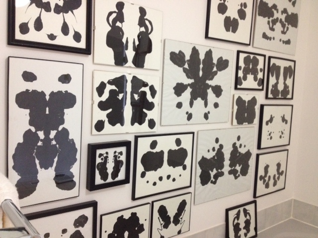
I’ve been slowly filling in my Rorschach-inspired gallery wall as I come across frames of different sizes in thrift stores, yard sales, and stores. When I’m out and about, I try to find frames that might fit an empty space on the wall. When I have a few frames, I start painting the inkblots. And then I hang them where I feel they might look best (I only created one extra mistake hole so far…yay). I can be quite impatient so I didn’t wait until I had all the frames/art to start hanging them up. I constantly add to the wall. Here’s what it looks like now:
White-Cabana-Rorschach-gallery-wall-art


inkblot-wall-White-Cabana

The upper left corner still needs to be filled in. Other than that, the wall is just about done.

Making inkblot art is super easy. Here’s my step-by-step process:

1. Find a frame (I only use black frames or borderless frame).
2. Cut a piece of white paper to fit inside of the frame. (I tend to use bristol board because it’s strong and thick and the paint won’t seep through.)
3. Fold paper in half.
4. Plop/drip/spread gobs of black paint on one half of the paper (I use artist’s acrylic paint, but craft paint from a dollar store also works fine).
5. Refold the paper in half.
6. Rub your hand over the folded paper. Smoosh the paint around through the paper.
7. Unfold the paper. (I love this step!)
8. Surprise! What do you see? (This is the best part!)
9. Let the paint dry.
10. Frame your art.

What do you think? Do your eyes – or your brain – hurt from staring at the wall too long? What do you see in the inkblots on my wall?
Design: Three Kitchens that Shine

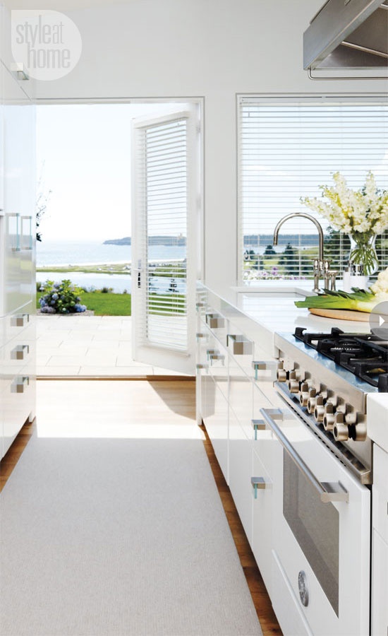
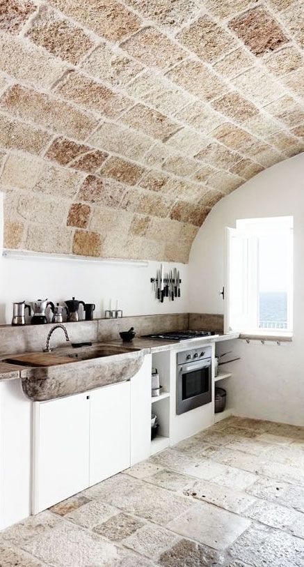
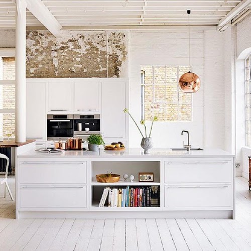
White kitchens are classic and inviting year-round, but I think they are especially beautiful in the summer when natural sunlight warms the space and the whiteness offers a clean backdrop for colourful food prep.

These three kitchens are beautiful in their own ways. The first is bright, airy, and has an incredible walkout and view. The second kitchen is more rustic than I’m used to, but it’s relaxed, sturdy, and has an awesome espresso machine collection. Finally, the third kitchen barely even looks like a kitchen. Until you spot the wall ovens, you might not even realize that this space is a kitchen. I love that.

white-kitchen-beach-Style-at-Home

via Style at Home

summer-kitchen

via

tumblr_mjc0ioAhen1r4gct3o1_500

via Snob

Marketplace: Industrial Chic at Etsy

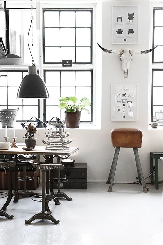
How do you all feel about “industrial chic” style? I could pretty much move into any of these rooms even though I generally prefer things to be a little more delicate.

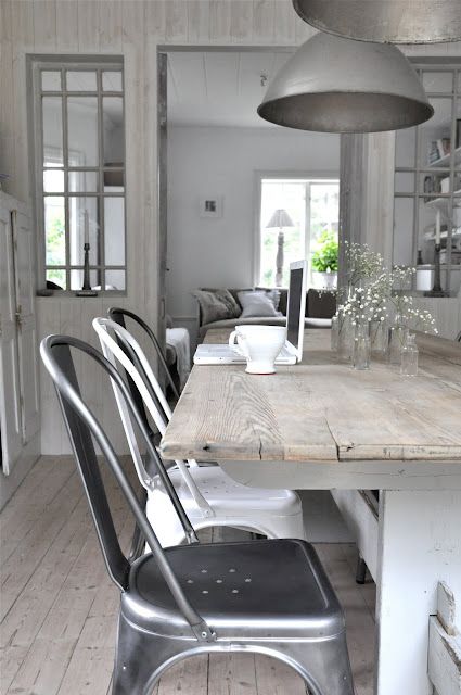
industrial-chic-design

via Trendenser

industrial-chic-dining

via Soft & Chic

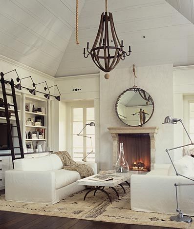
living-room-industrial-chic

via Pinterest

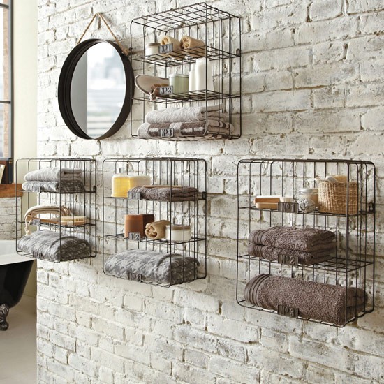
Metal-shelving-from-Next

via House to Home

Warm woods and soft textures do effectively tone down hard-core industrial spaces. While I’ve never really embraced this style, I do sometimes find myself drawn to industrial-type lamps and accessories. If you type “industrial chic” into the search bar on Etsy or Pinterest, you’ll get pages upon pages of industrial items and ideas. Here are some from Etsy that I found interesting:

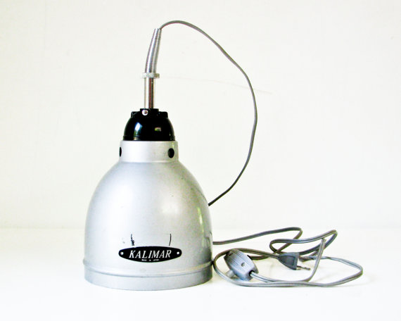
il_570xN.614442108_2jyn

vintage industrial pendant light, $215

il_570xN.467493128_kriw

New York water tower print, $29

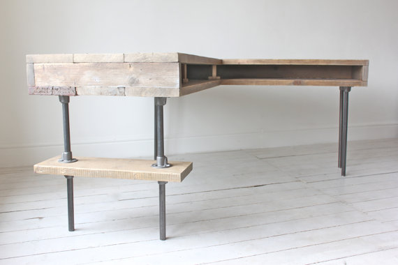
il_570xN.546787087_as6o

L-shaped desk, $2087

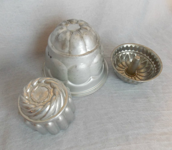
il_570xN.541824092_d2ei

vintage molds, $15

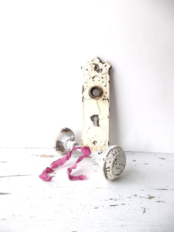
il_570xN.583065664_8pmb

vintage door knob & hardware, $35

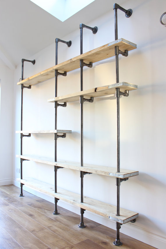
il_570xN.522595024_sbwn

shelving unit, $2384

So, tell me, what’s your take on this approach to design?

1 13 14 15 16 17 18 19 28