Two interiors I’d like to see more of are:
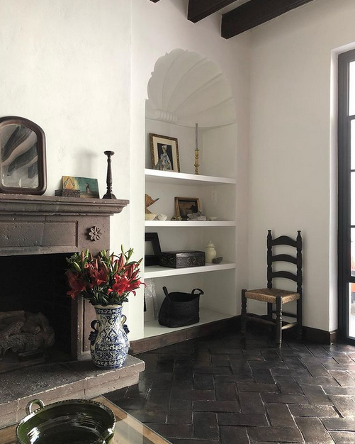
- Suzanne Dimma‘s recently overhauled home in San Miguel de Allende, Mexico.
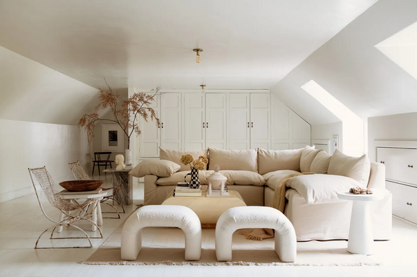
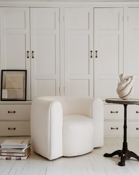
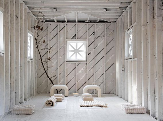
2. Leanne Ford‘s all-white spaces everywhere!
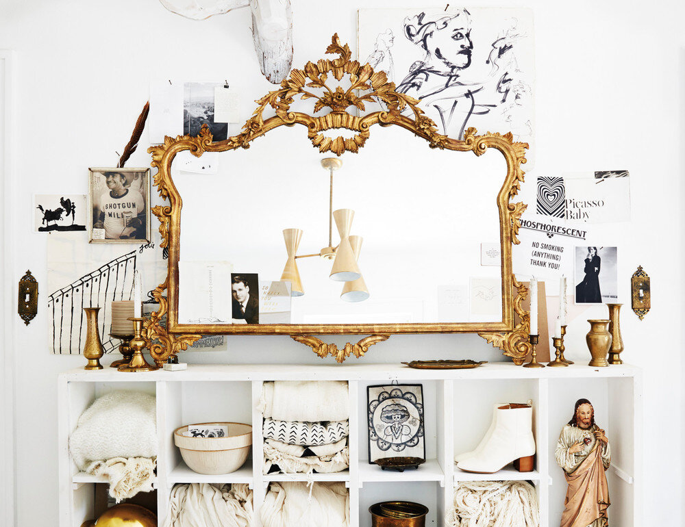
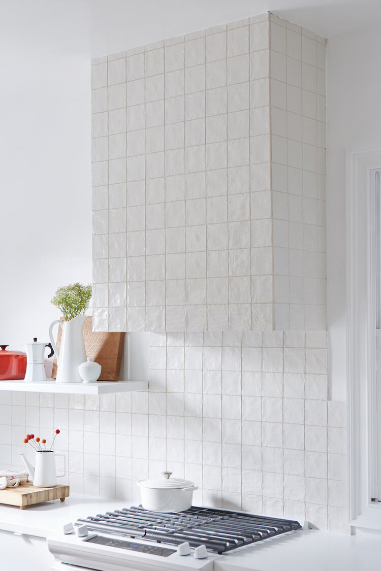
Two interiors I’d like to see more of are:

2. Leanne Ford‘s all-white spaces everywhere!


Ideas. Inspiration. Innovation. What more does one event need?
My experience at this year’s Interior Design Show began with The Party, continued with BlogPodium, and ended with a lot of photos and information about what’s new and exciting in the design world. Mix these elements up with designer talks, the Studio North exhibit, and a crowd full of beautiful people and it’s no wonder that I’m still on an IDS high.
Reports and reviews of cool design, innovative products, and designers’ takes on trends have been circulating around the web for a few days now and hopefully you’ve had time to read some of them. As for my recap? Well, here it is…all in white!
At the entrance to the Metro Toronto Convention Centre, event goers were greeted by Strip Tease, the collaborative effort of RAW and Mark Tholen. Not only were the hundreds of white felt strips interesting to look at, but they doubled as a projection screen. A white welcome…yes, please!
La Clôture is a hold all for coats, hats, mail, umbrellas, and anything else you might want to drop off – or pick up – at the entrance to your home.
 La clôture, $149.95, Six Point Un
It was wonderful to see Tahir Mahmood’s beautifully crafted pieces in person and I appreciate having the opportunity to chat with Tahir about his background, his design process, and his plans for future projects. While many of his designs are colourful, my eye was drawn to this wood and white spinner.
 Spinner by Tahir Mahmood
Like almost everyone at IDS, I fell in love with the space designed by Italian architect and designer, as well as International Guest of Honour, Piero Lissoni. Ah – those books!
While many of us are now used to our stainless steel appliances, Jenn-Air is bringing back white and making it super sleek and simple.
I can always count on IKEA for injecting a dose of white into a space and this time was no different. The white kitchen (with black counters and back splash) was in classic IKEA style – storage galore, simple design, and repeated forms. I could really use a wall of cabinetry like the one below for my growing shoe collection.
The display at Eurolite was gorgeous overall but it was this white fixture’s layers and form that really caught my eye.
The Hansgrohe faucet is sleek and sophisticated. Gorgeous.
The texture on the chairs at the Andrew Richard Designs exhibit was just lovely.
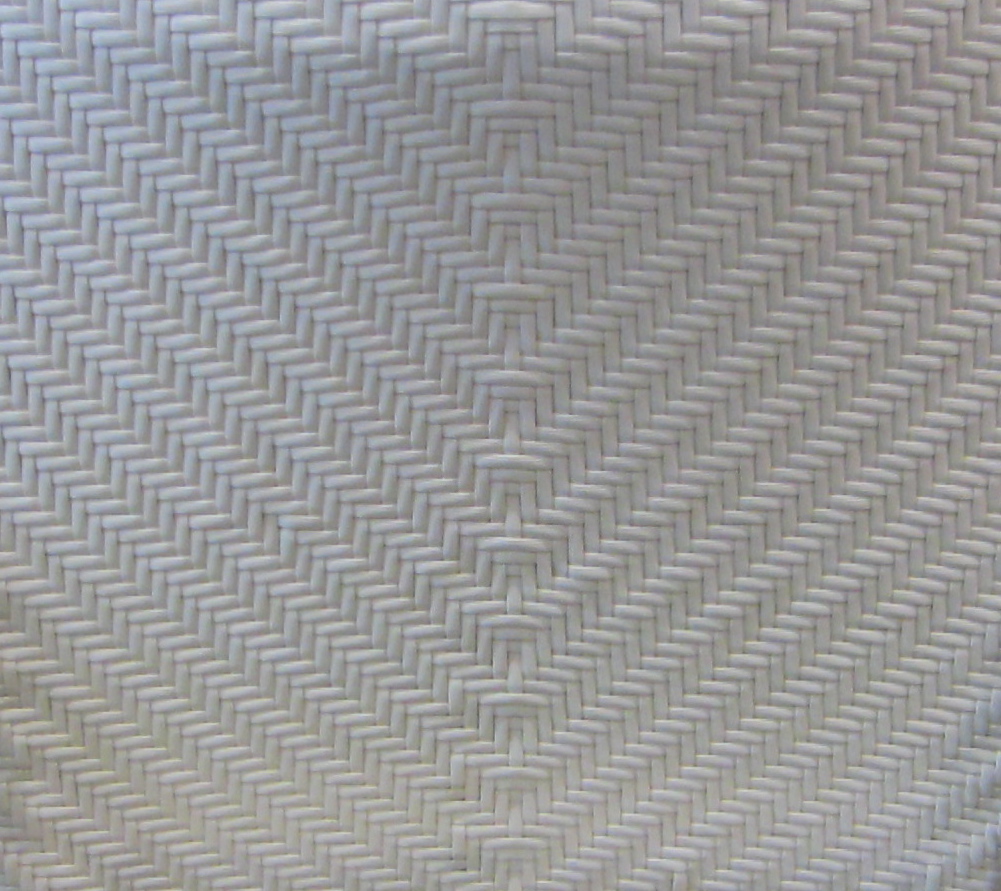 patio chair at Andrew Richard Designs
The Magus Julius chair was transformed by a selection of designers for Cherish, an auction in support of the ONEXONE non-profit children’s foundation. I wonder who were the winners of these two white chairs.
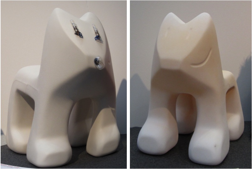 Magis Julian chairs in white (right: with lights; left: textured)
And, of course, the people were great!
 Troy Seidman, Mazen el-Abdallah, Suzanne Dimma at the How do you live? exhibit
So, there you have it. My recap in white. What are your thoughts? Did you attend IDS this year?
Photos by Jordana.