Two interiors I’d like to see more of are:
- Suzanne Dimma‘s recently overhauled home in San Miguel de Allende, Mexico.
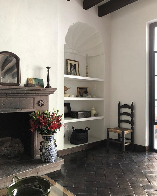
2. Leanne Ford‘s all-white spaces everywhere!
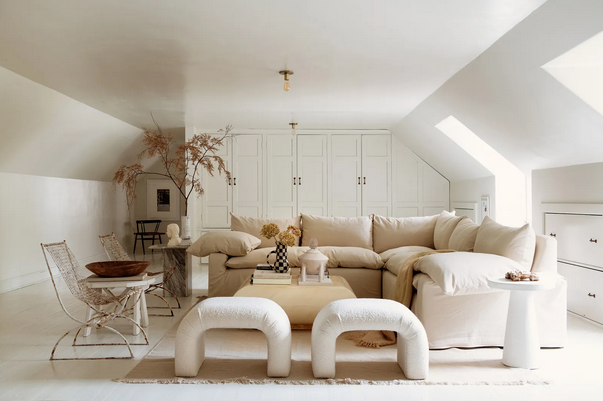
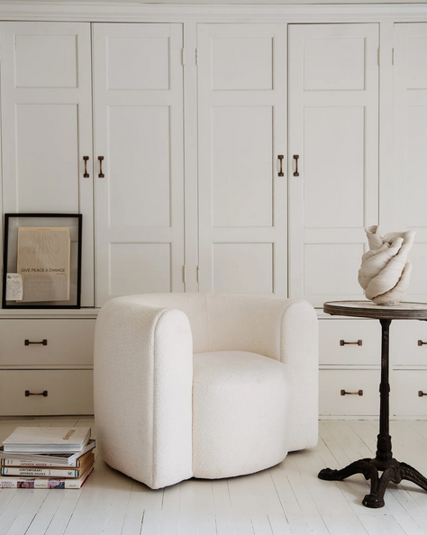
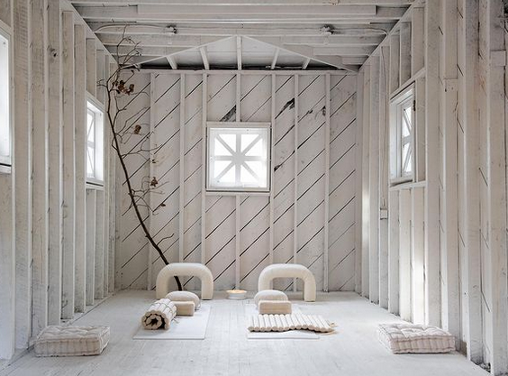
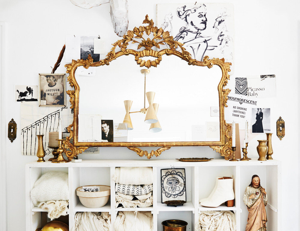
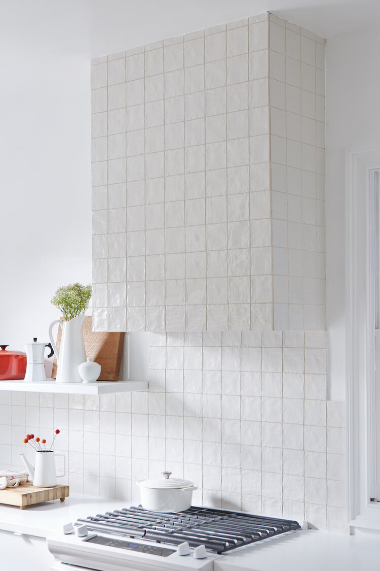
Two interiors I’d like to see more of are:

2. Leanne Ford‘s all-white spaces everywhere!


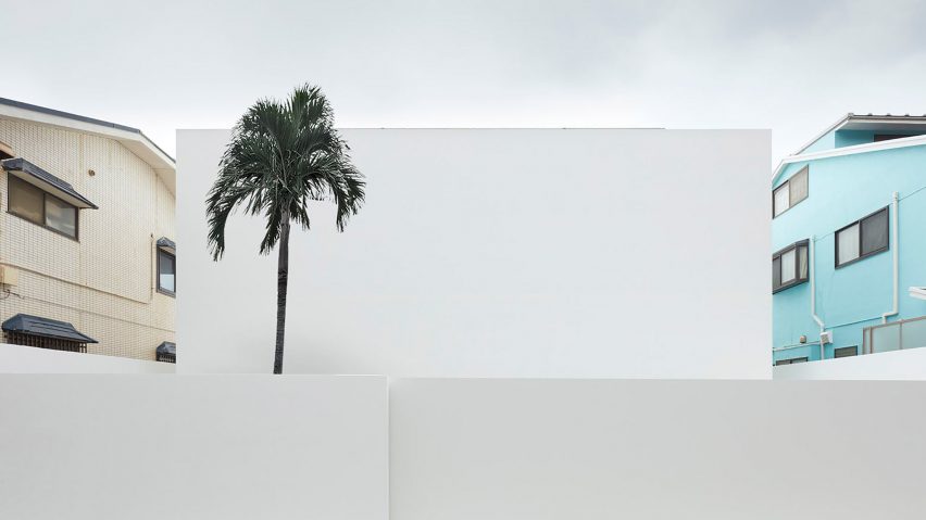
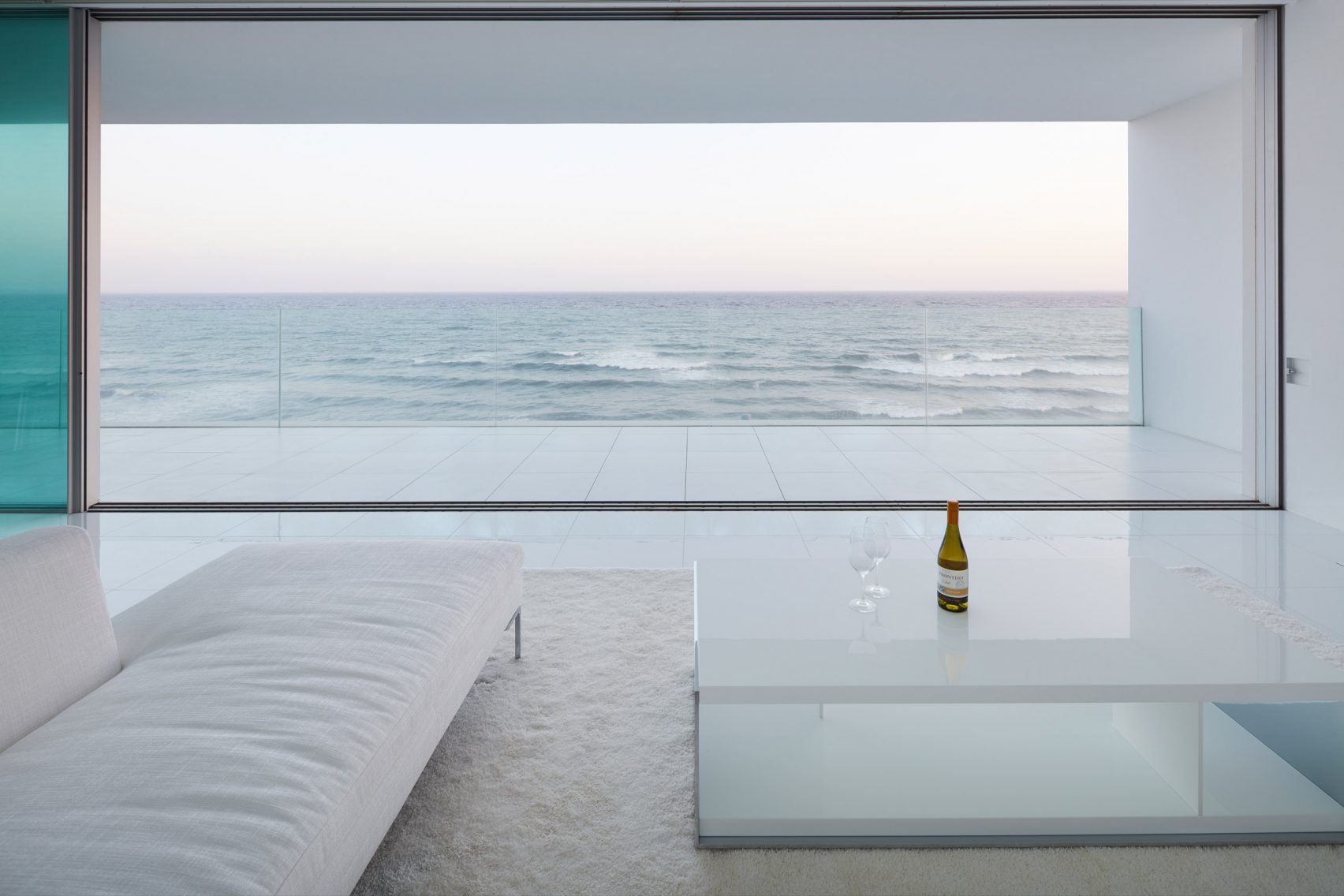
One one side, there are no windows. On the other, there are multiple. Look at this gorgeous white home in Kanagawa, Japan by architects Sinichi Ogawa & Associates.

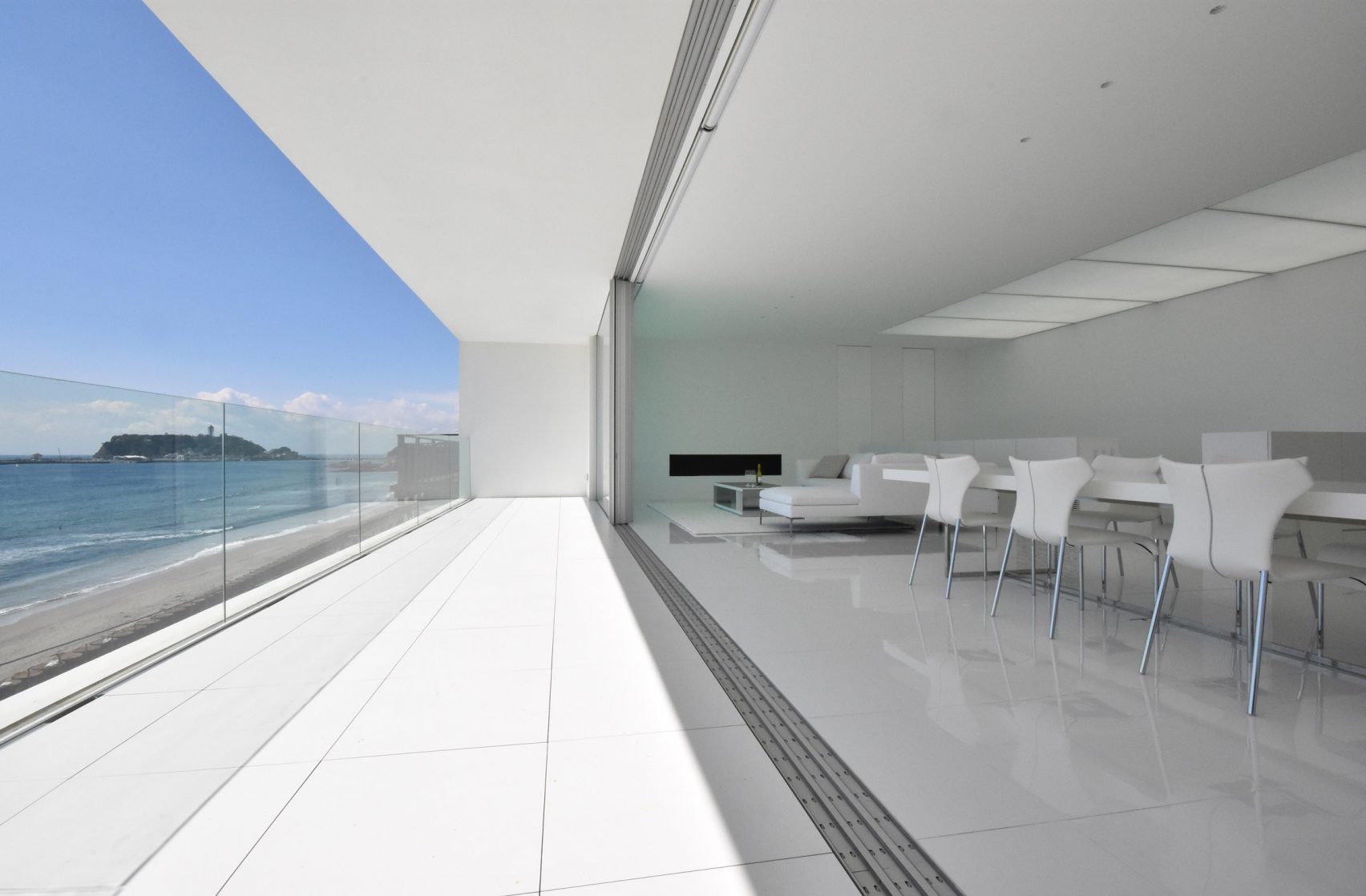
via Dezeen
About a decade ago, I travelled to the Canary Islands, and on the island of Tenerife, I was struck by the architecture of the El Auditorio. The Auditorio de Tenerife was designed by Spanish architect Santiago Calatrava, and his architecture is the focus of today’s post.
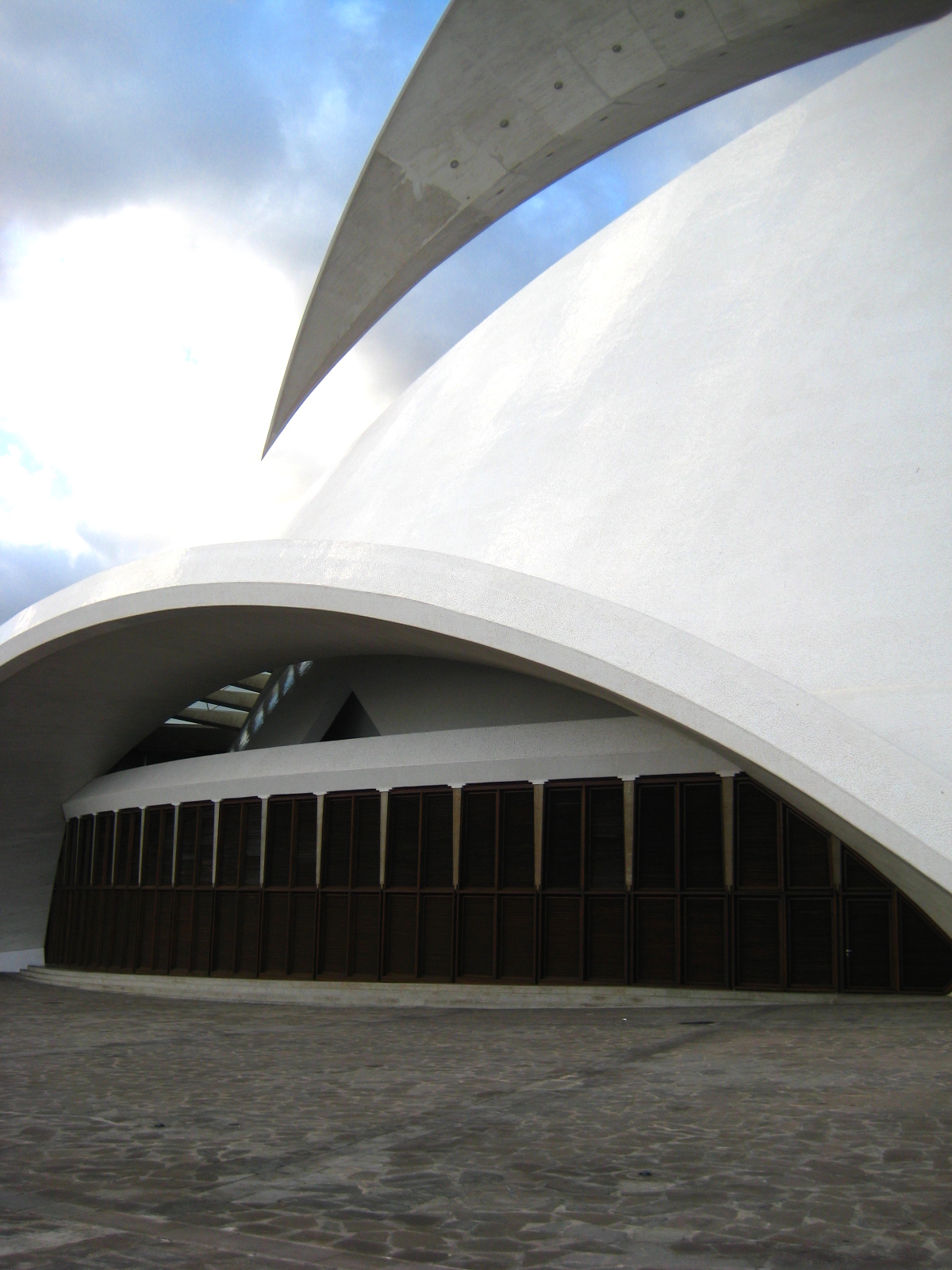
White Cabana (a few more photos of my trip to the El Auditorio)

Here are five other favourites from Calatrava’s extensive collection of white projects.
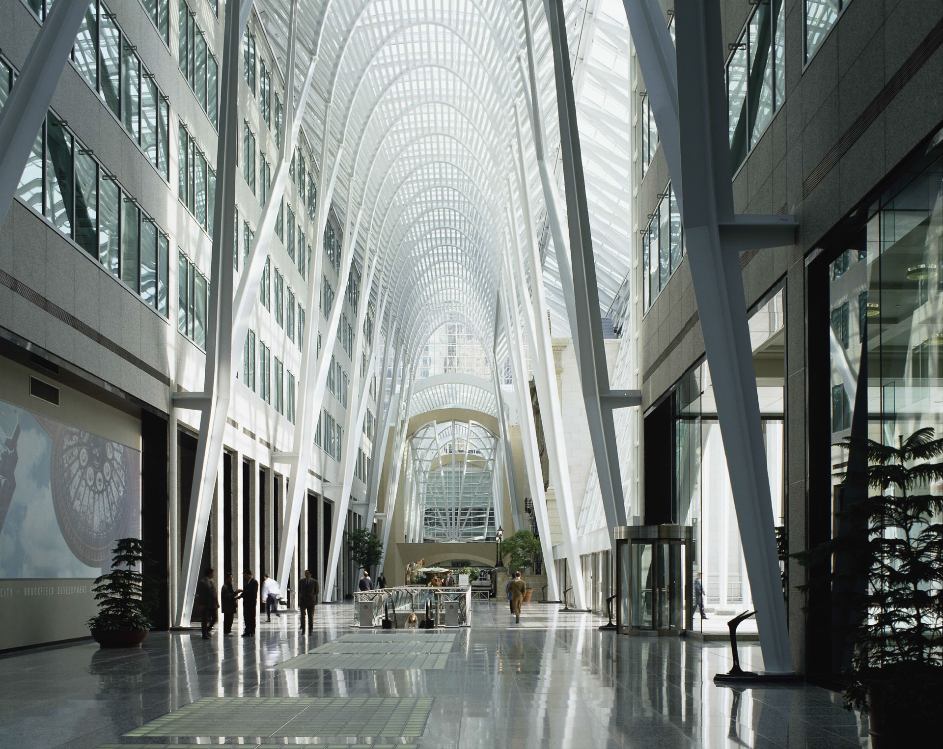
If you’re in Toronto, you may recognize another Calatrava – the BCE Place Galleria (built in 1992). I remember going to BCE Place when I was young, and I was in awe of the light that came through this building. Another visit is long overdue!
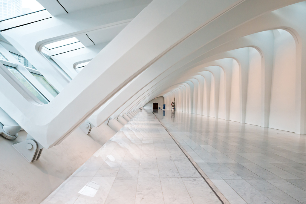
In 2016, Calatrava created the transportation hub at the World Trade Center in New York City. The structure looks like it’s about to take flight.
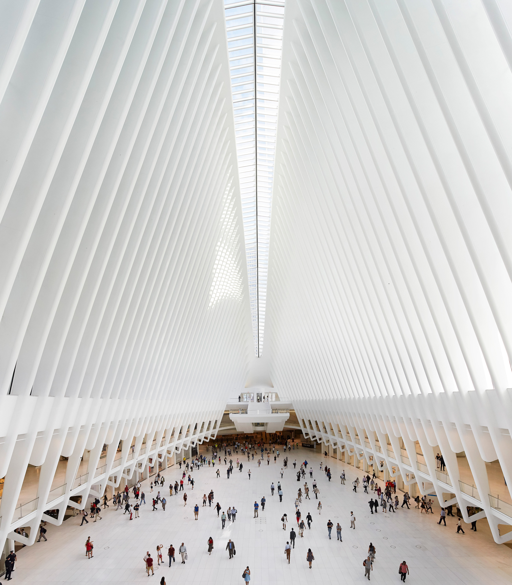

via Dezeen
I love the repetition of shapes on this building in Valencia, Spain.
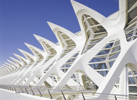
Ciudad de las Artes y de las Ciencias
The Milwaukee Art Museum is striking, too, with its dramatic points and curves.
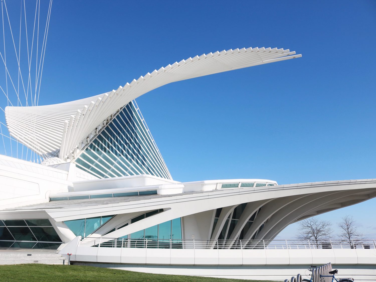
via Simply Sinova
Finally, this building at Florida’s Polytechnic University easily caught my eye. In fact, it caught my eye a couple of years ago on a drive from Tampa to Orlando, but I never pulled over to investigate it up-close. Maybe I’ll get an close-up view if if I end up taking the same road trip in a few weeks!
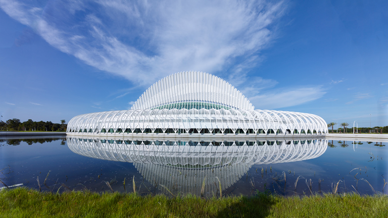
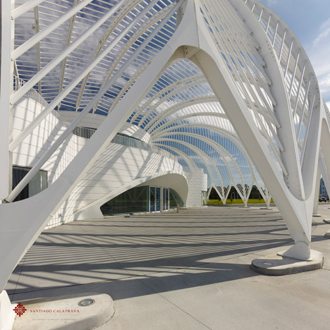
via Dezeen
Have a great weekend, everyone!
I took a double-take when I came across Zaha Hadid‘s Heydar Aliyev Center in Azerbaijan. Why? Because not a single straight line was used. Curves. This building has curves and only curves!

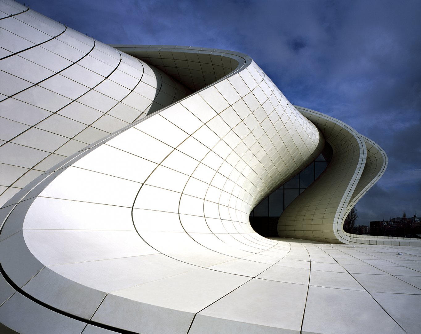
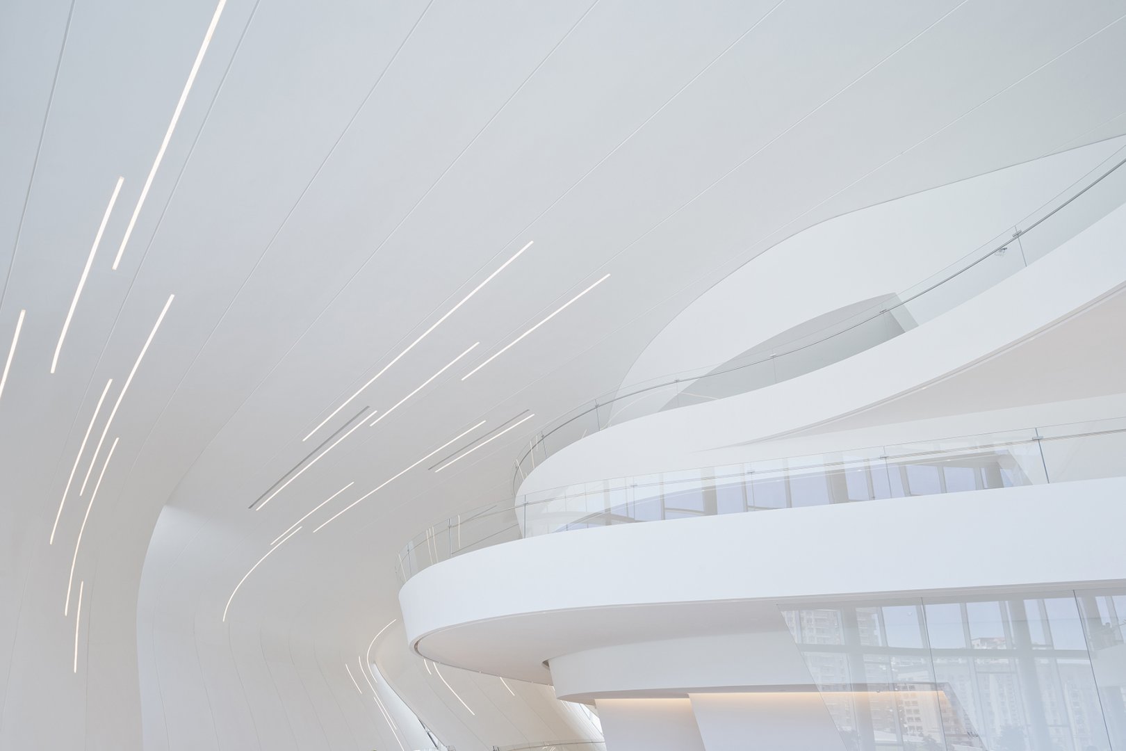
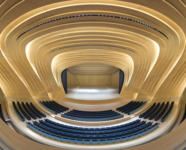

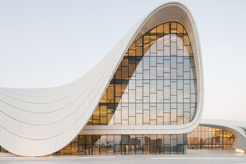
It’s pretty cool, isn’t it?
If my nephews had their way, they’d live in this Lego House. But they’d probably want it to be all blue or green or red. And have life-size Lego Ninjago out front, too.
I, of course, prefer the Lego House as it is in white. Isn’t it amazing?
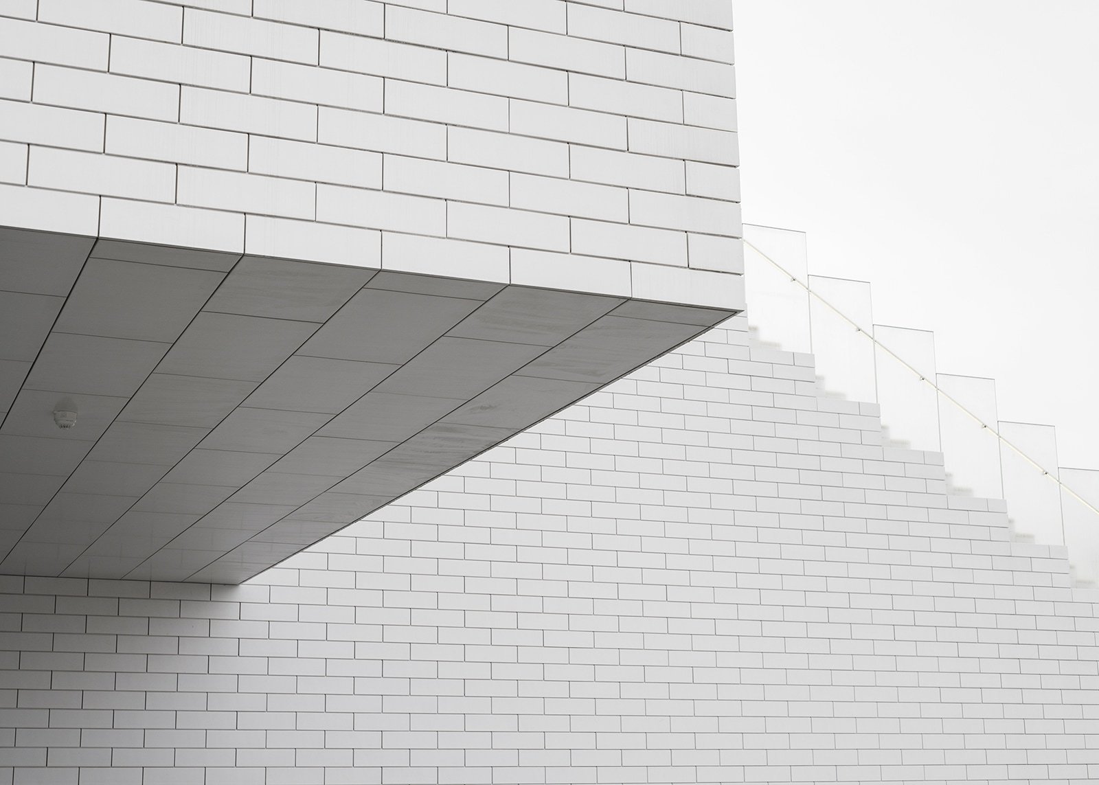
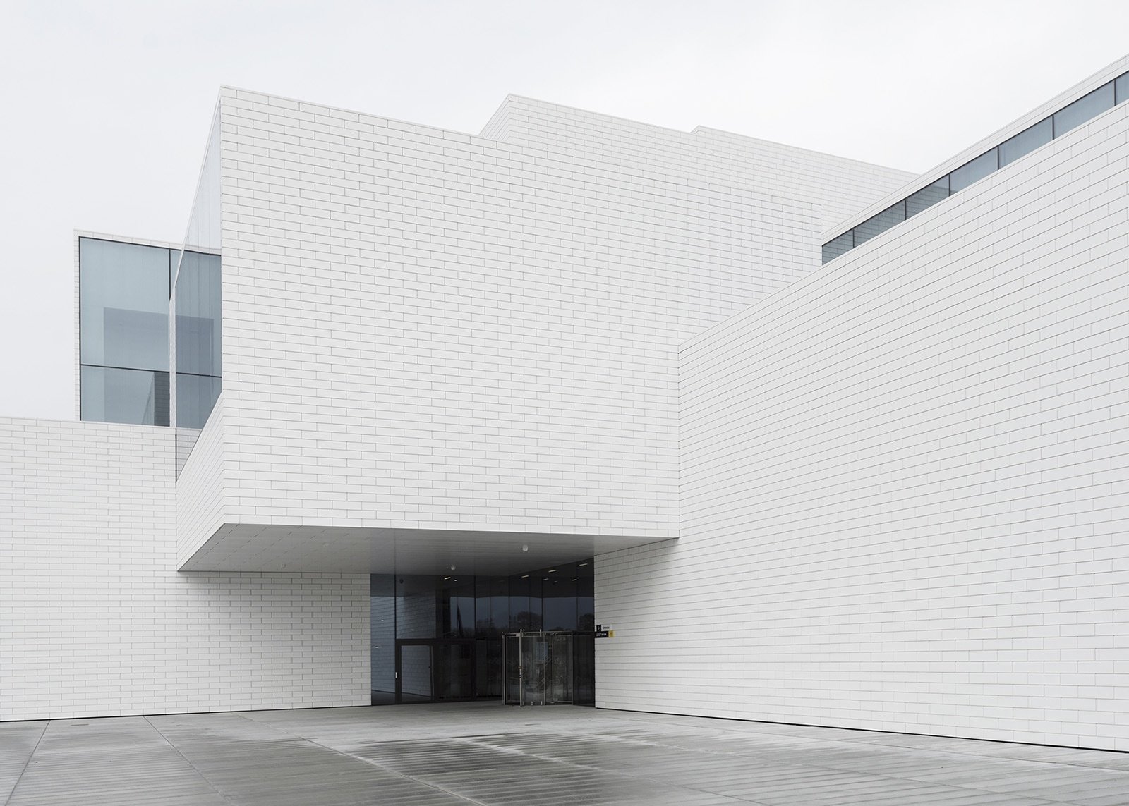
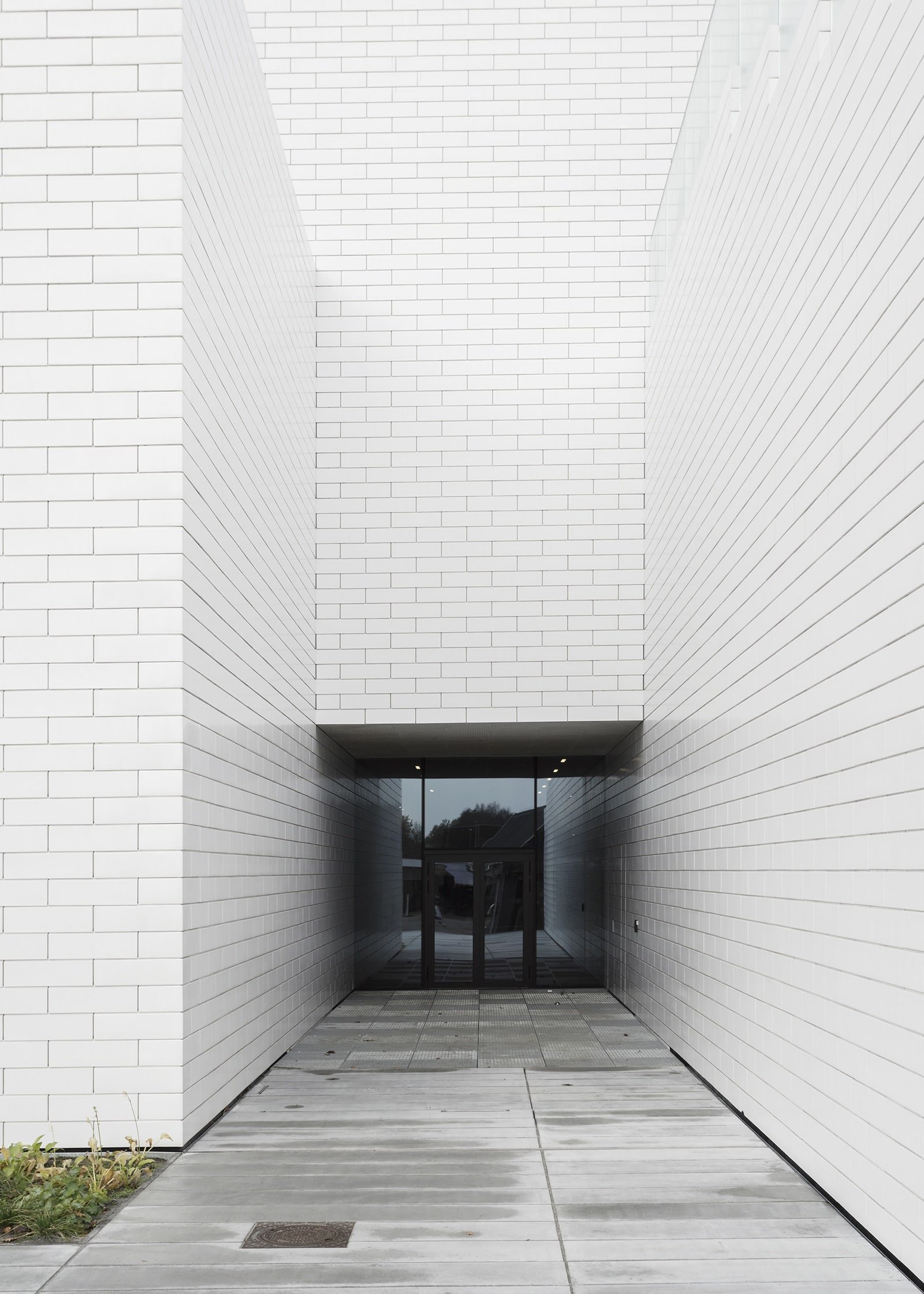
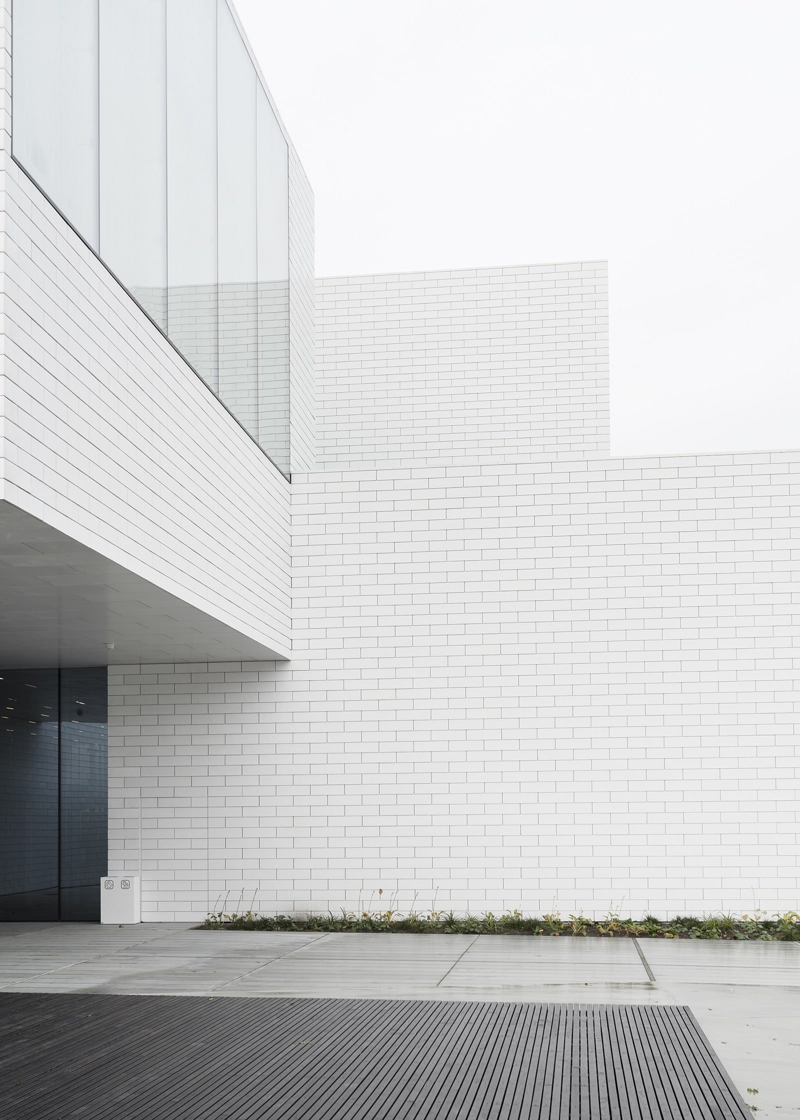
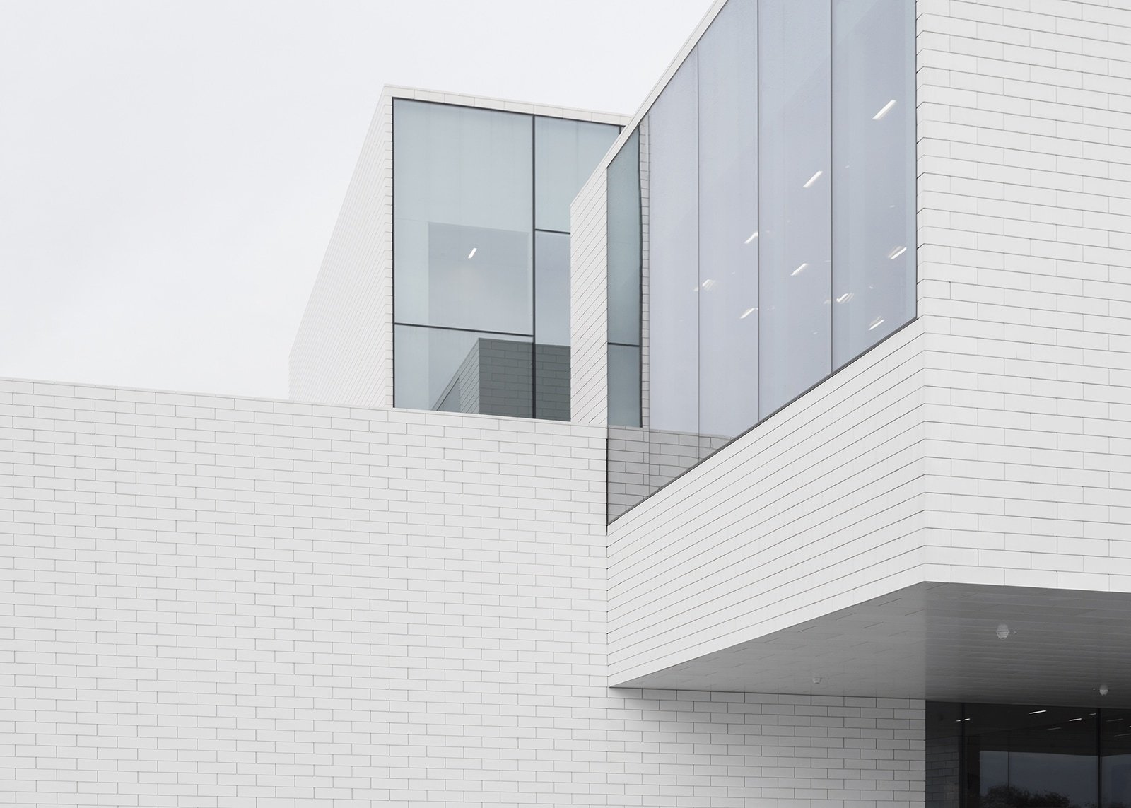
Lego House, designed by Bjarke Ingels Group, via Minimalissimo