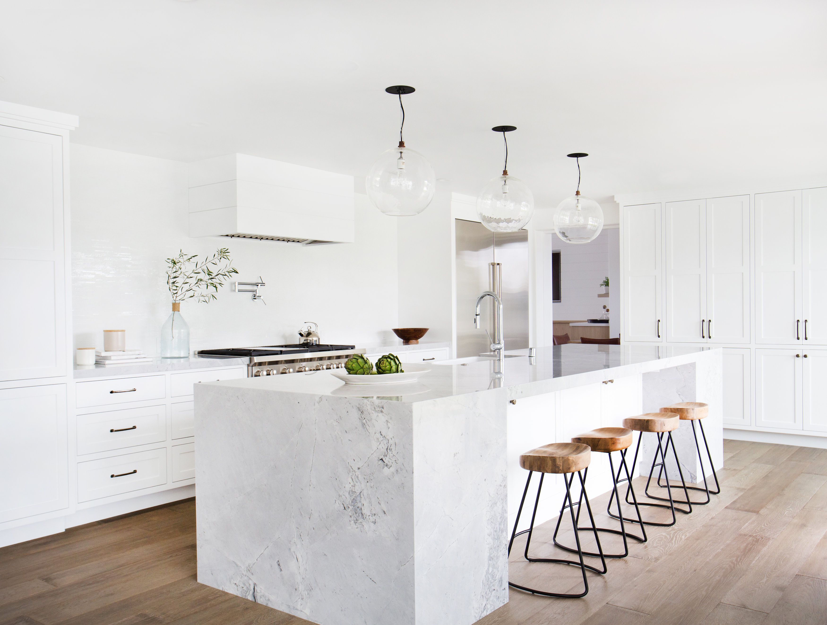
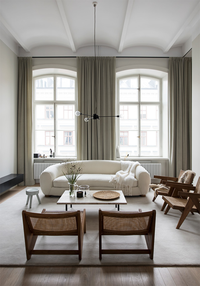
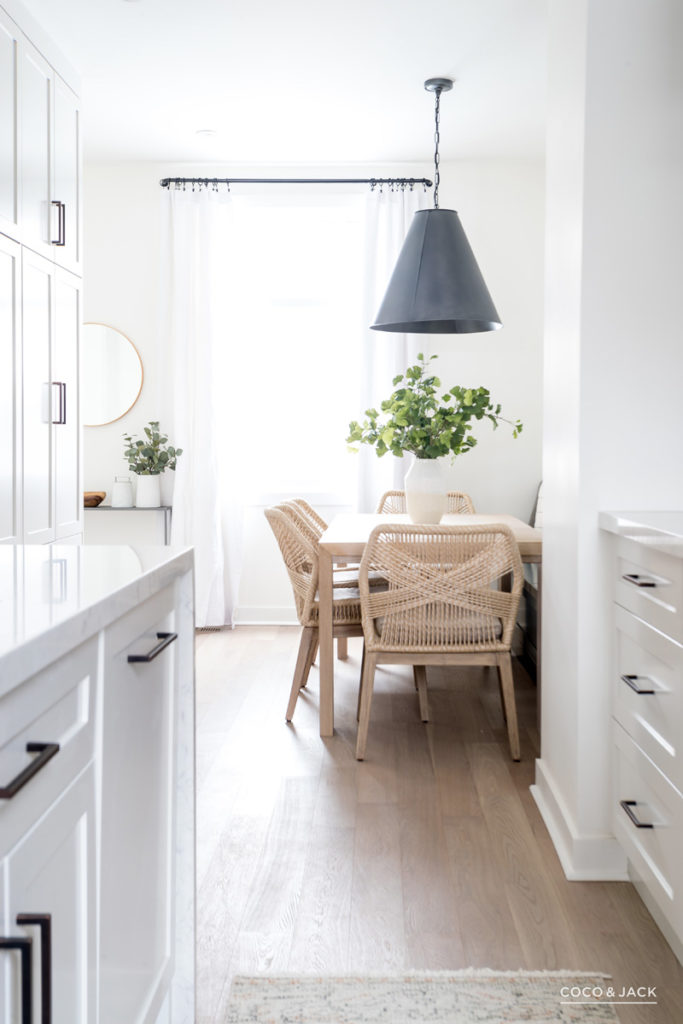
Do you remember when I shared our kitchen mini makeover design plans? The faucet really started the whole project. Its lack of functionality was driving me nuts. Then I learned that the sink was driving my beau nuts. Then we decided to do a mini remodel by replacing the faucet, sink, countertop, and backsplash but keeping the existing cabinetry and layout. We added an antique French armoire for an additional pantry, which has been functional and beautiful. Slowly but surely, this mini makeover is taking shape.
I know some people will think that a mini remodel is a waste of money, but I’m not one of these people. I’d rather spend a bit of money now and enjoy a space for the next few years (or longer!?) until we finalize plans and budget for a larger remodel.
As you may recall, I am working with BLANCO Canada on this project. They have provided me with a BLANCO UNIT – a faucet, sink, and accessories combination that coordinate seamlessly together. Now that everything has been delivered, I’m getting even more excited about the change.
Getting here took some time. While I thought I was the only one with strong opinions about design (and function), my beau proved me wrong. He has strong opinions about function (and design).
When creating our BLANCO UNIT, specifically selecting the faucet and sink, we discussed:
- What we liked and disliked about our current faucet and sink.
- What we needed and wanted in a future faucet and sink (e.g., a sink that would fit in our existing cabinet).
- What the pros were of the BLANCO Canada faucets and sinks (that matched our needs and wants).
- What potential accessories would add value to functionality with our faucet and sink combo.
My beau is mostly all about function. He disliked the existing shallow sink. On his wish list: a deep sink, two bowls, a high faucet, a high-pressure faucet.
I am about design and function. I disliked hated our faucet (too low and the spout barely returns to its position). I also disliked the shallow sink, the 3/4 size bowl, and the cut-out to house soap/sponge. On my wish list: an undermount deep sink, one bowl, and a high-pressure, stylish faucet that makes me feel like a chef. I also wanted to experiment with a white sink (BLANCO Canada is known for its SILGRANIT), which I envisioned working well with a white stone countertop.
Luckily a BLANCO UNIT offers both design and function. We were able to select a sink and faucet combo that met my design needs and my beau’s desire for increased functionality! Here’s the BLANCO Canada faucet and sink combination we settled on:
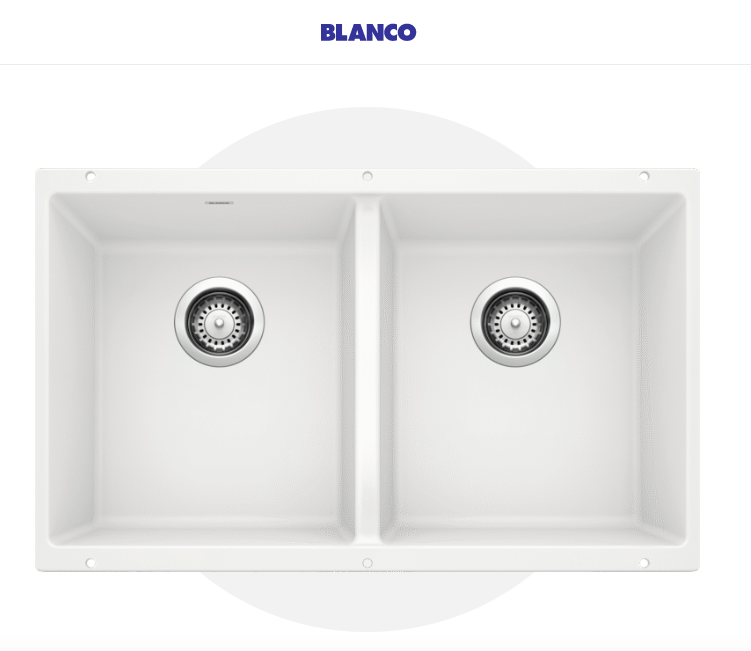
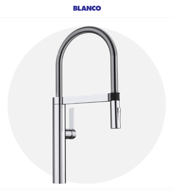
Sleek, right?
Both items as well as a few accessories (i.e., the sink grid) have now arrived at our house. The next step for us will be to finalize the countertop and get everything installed. Eek! These improvements are going to make such a difference to how we enjoy and use our kitchen!
